The Alien Legion, June 1985
1985: The Black Dragon
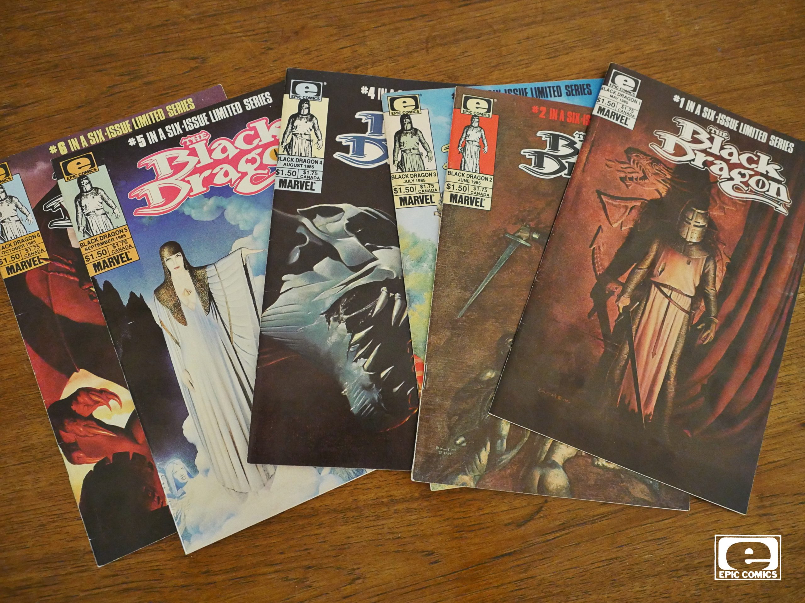
The Black Dragon (1985) #1-6
by Chris Claremont and John Bolton
“Hey,” you could be saying now. “Surely Groo was published before The Black Dragon? See it says here!” And if you did exist, and you said that, you would indeed be correct: This post should have been about Groo, all 120 issues of them. But unfortunately the person I bought a collection of Groos from (on ebay) first sent me an email that they had back problems, so the package would be late, end then they ghosted me. So I’ll have to re-buy the issues and do a blog article about them later. I think this is the first time that’s ever happened to me on ebay?
¯\_(ツ)_/¯
Anyway: Claremont and Bolton had just done Marada the She-Wolf for Epic Illustrated, so I guess it makes sense for them to keep going with a new mini-series at Epic Comics.
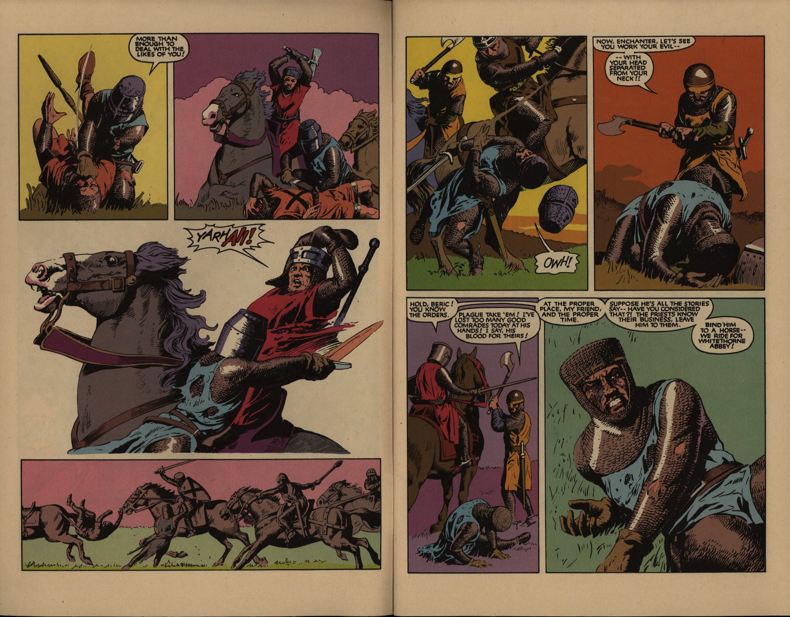
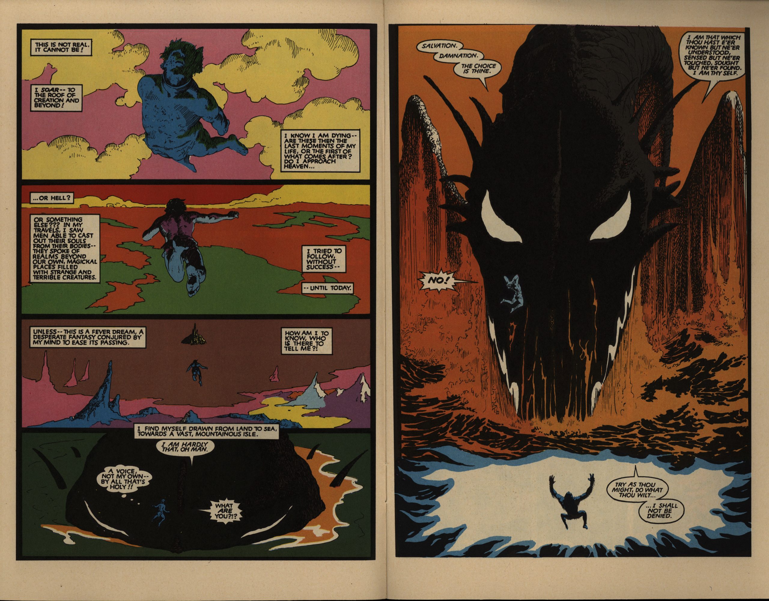
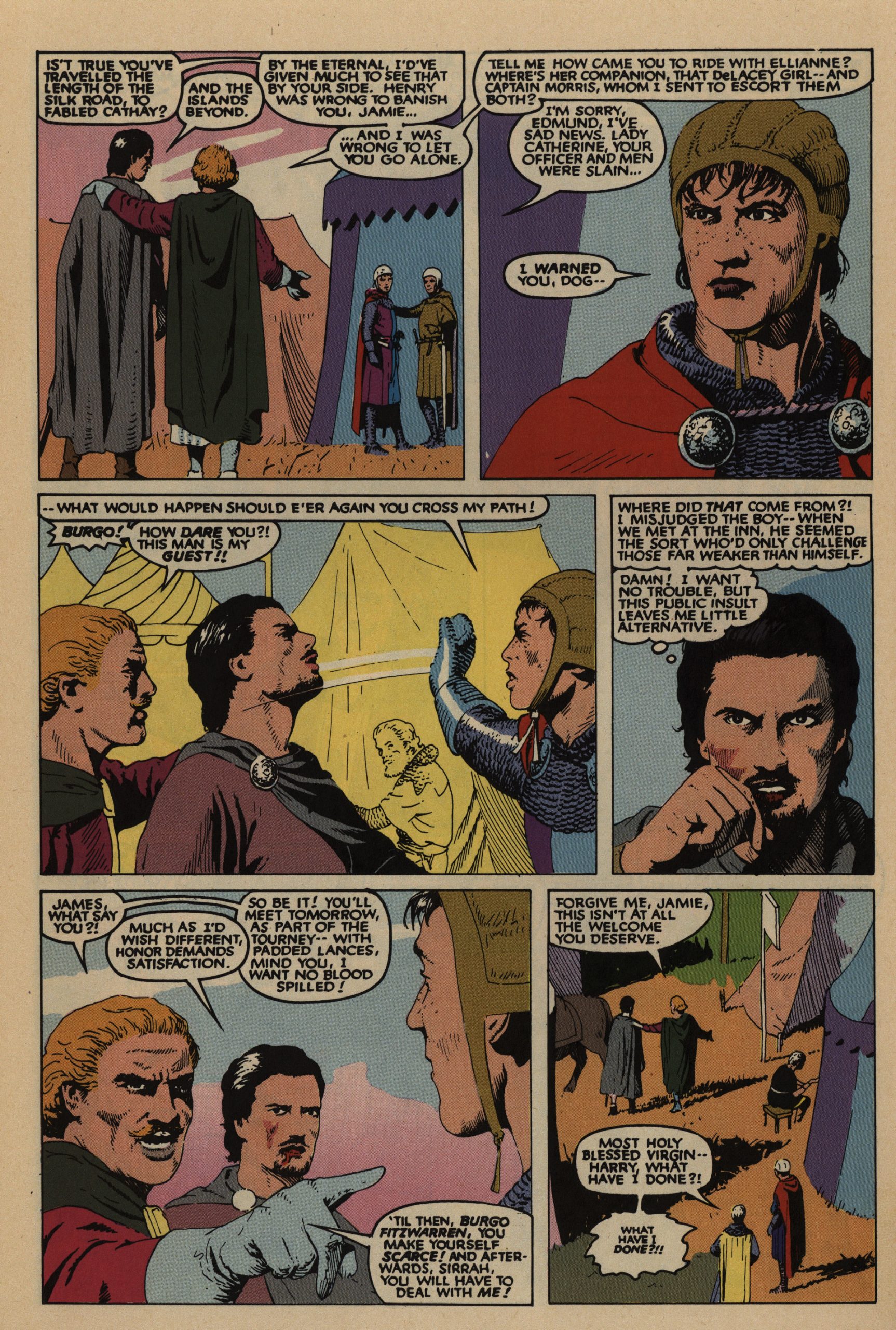
The immediately striking thing about this Camelotian thing is… the colouring. No colourist is listed, so I can only assume that Bolton himself did this. It’s standard “mechanical separations”, but the colours are… er… vivid? Is he going for more of an emotional instead of illustrative thing here? Or is he just trying to cover up that he hasn’t bothered to draw any backgrounds in most of the panels?
I mean, here it makes more sense. It’s still bizarre, but it makes sense.
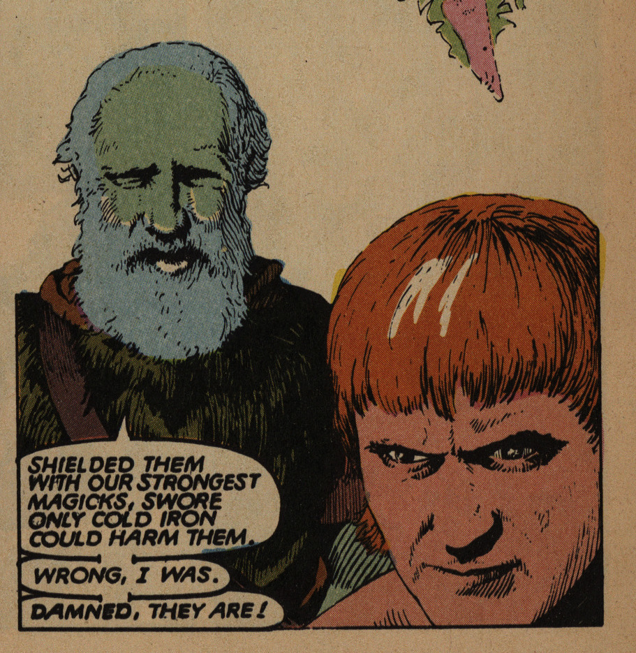
And when doing fantasy scenes, it’s kinda… appropriate? But man, it does look like he’s just trying to use all the colours that exist here.
ANYWAY. Here’s how I see this book happening. Bolton: “Hey, I wanna try drawing something like Prince Valiant, but with dragons. Can you write something like that?” Claremont: “Sure! I’ll throw in Camelot, Morgan le Fey, Robin Hood and demons, too. Sound OK?”
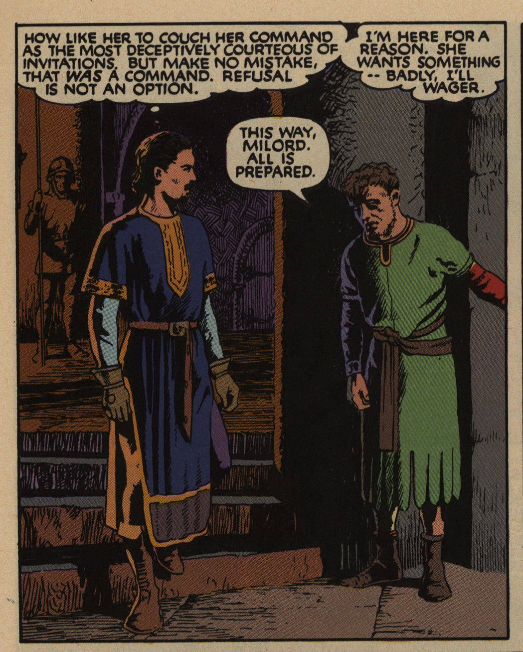
Claremont does his usual thing with all the thought balloon and the dialogue; constantly having characters spew verbiage about their motivations and what they think other people are thinking. In a soap opera setting like Uncanny X-Men, it was a successful approach. I don’t really think it works here.
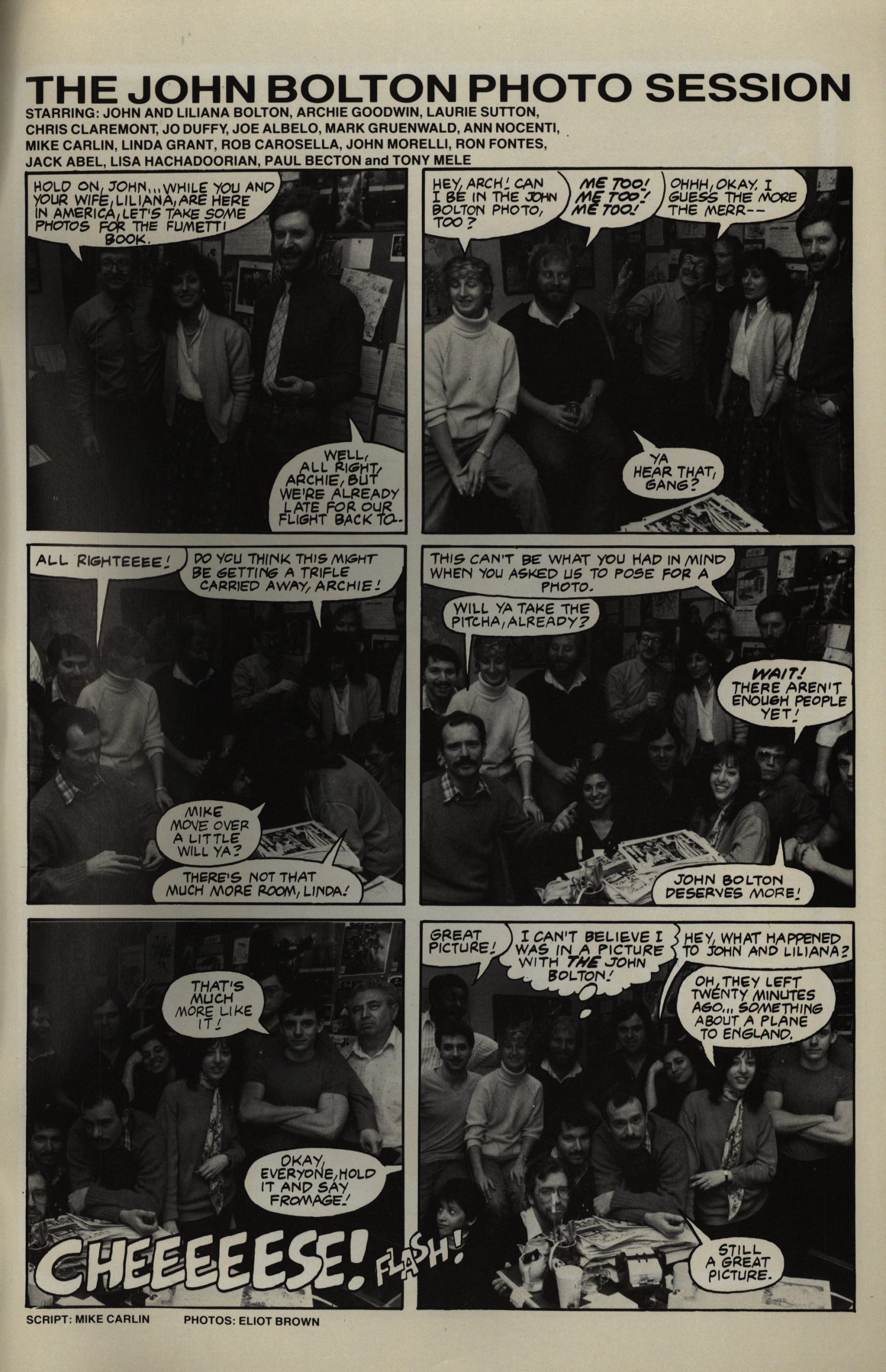
Bonus surprise fumetti!
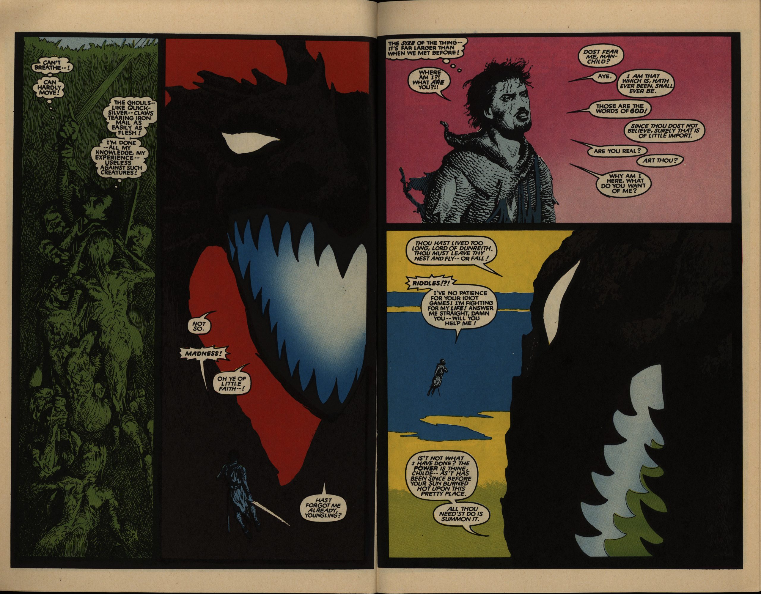
Oh wow. That’s a nice dragon. And I totally think Bolton’s colouring approach works on the page to the left. On the page to the right… not so much?
OK, I am going to stop going on about the colouring, but… here the guy in the red cape is the one challenging Our Hero, and then in the bottom panel he has a yellow cape? This kinda puts a different spin on the colouring extravaganza — is he just mixing up what colours should go where or something?
Yoda, he is not.
OK, now it’s just getting silly.
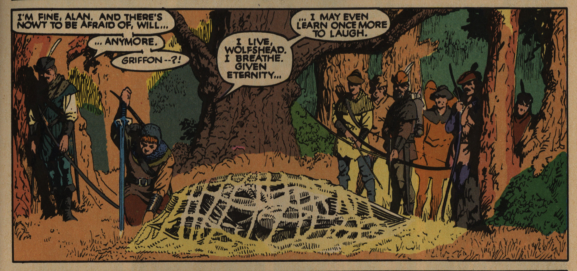
I don’t mean to rag on this series too much. As riffs on Arthurian tropes via Prince Valiant go, it’s not bad. The artwork is indeed very nice, with some really striking depictions of the dragon and the demons. Having grown up with Claremont’s writing since I was a child, “… I may even learn once more to laugh” doesn’t give me hives, even though it should.
So… it basically delivers on what you think you’d be getting. But it’s not actually good.
That’s pretty good, though. More people should draw feet.
But what did the critics think?
This is a top-notch historical fan-
tasy, depicting events immediately
following the death of England’s
Henry II, and presenting Jamie
Dunreith, the Black Dragon—-
knight, nobleman, alleged sorceror,
and something more.[…]
It’s a tour-de-force
that makes me sorry that Claremont
seems unable to forego the various
rewards of the X-Men to devote more
time to this kind of work.
Bolton’s art takes the best of 19th
century illustration and applies it to
the comic art form, much as Hal
Foster did with Prince Valiant.
Unlike Foster’s sometimes static
work, however, Bolton uses the
entire range of comic-book effects—
word balloons, the occasional well-
placed sound effect, and shifting
camera angles. The result is some
of the best fantasy art in comics in
the last ten years.
If every Epic title were as well-
written and drawn, and as hand-
somely packaged as The Black
Dragon, there would be more than
this one series from the line in this
list.
Somebody (RA Jones?) writes in Amazing Heroes #74, page 59
[…]
So begins the long-delayed lim-
ited series The Black Dragon. I
entered this issue with high expec-
tations. Medieval Europe is yet
another area of interest to the
history buff in me; particularly
England of the Middie Ages, with
its foolhardy but enthralling
Richard and the legendary Robin
Hood (with the attendant cinema-
tic imageof Errol Flynn). Moreover,
the series is produced by the team
oi Chris Claremont and John
Bolton who, in addition to their
fine individual efforts, had previ-
ously collaborated on the excellent
“Marada the She-wolf” stories for
Epic Illustrated.
Perhaps, with such high expectae
tions, I was doomed to fee! a sense
of disappointment. There was a
very ponderous feel to this script, a
listlessness that set in after the first
half dozen pages. Every character
presented seemed almoSt unreten-
tingly grim. Even the slightest touch
of humor would have helped tre-
mendously, but Claremont has an
extremely difficult time dealing
with anything in a humorous way.
While a certain amount of the
slowness doubtless came from the
necessary task of establishing both
the premise of the book and its
characters, some way surely could
have been found to inject more life
into the proceedings. One gets the
feeling here that even so mundane
a task as taking a bath would have
been turned into a life-or-death
situation.
iNhile wading through the script
proves to be an enervating chore,
one at least has the solace of look-
ing at lovely illustrations. John
Bolton is yet another of the ex-
tremely talented British artists now
doing work for the American com-
ics industry, and eminently quali-
fied to draw this strip.
Yet, white I admire his work
tremendously, even here there is
an unaccustomed stiffness. For
what little emotion they show, the
faces of the characters are prac-
tically interchangeable. The color-
ing, while first rate in spots, is also
sub-par for Bolton, with far too
many panels presented in flat
tones.The series has been reprinted in collected editions at least twice. Let’s see whether there’s any review of those (or the original series) on dar interwebs…
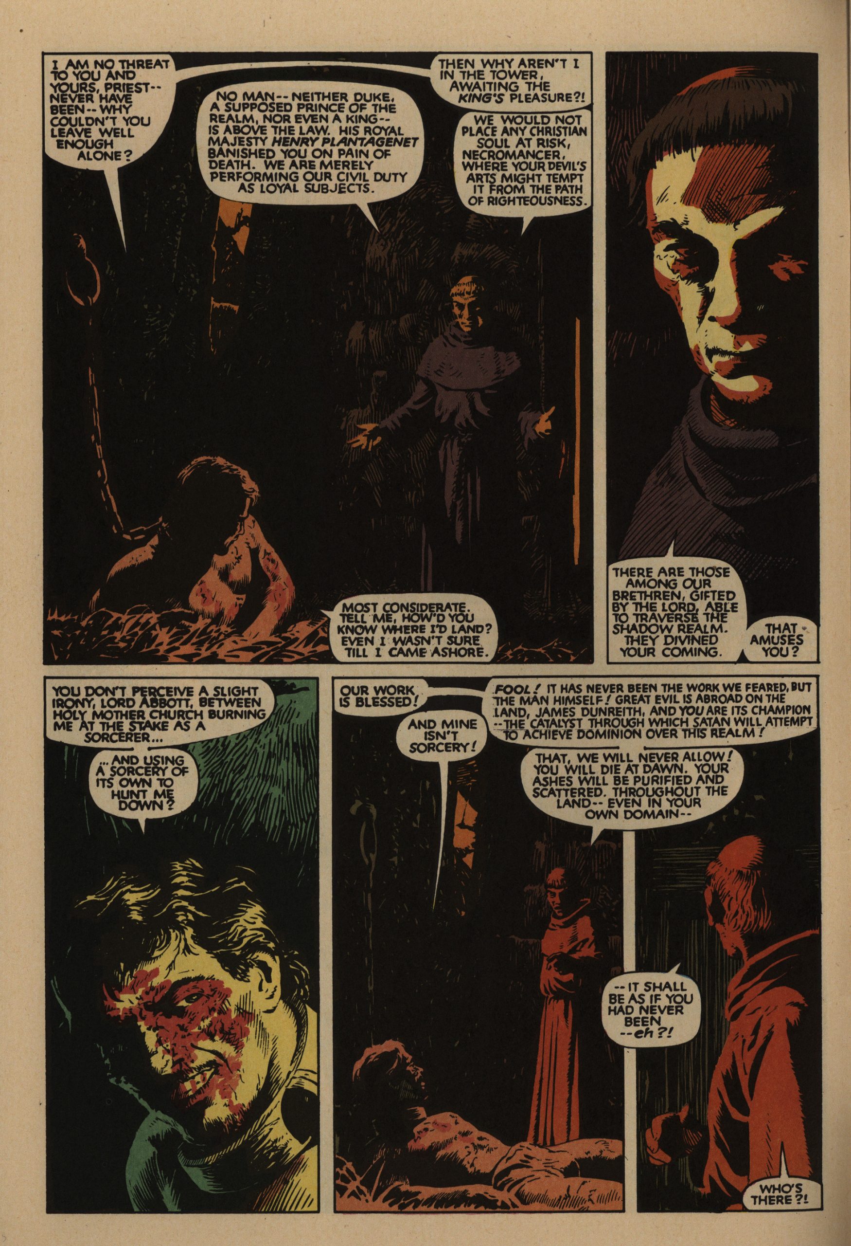
I also find Bolton’s inking distracting. Sometimes, like in the undead ghouls dragging James Dunreith into their underground grave, it’s really strong and helps support the action. But much more often, his thin and reedy lines and excessive hatching weaken the figures instead. Here, for instance, the lead female character Ellianne DeValere speaks, again under threat of assault by excessive word balloonage:
I like the phrase “under threat of assault by excessive word balloonage”.
Hm… The latest edition was in black and white? I think that makes sense.
This one’s not very impressed:
And that’s the nub of it – it is really not sure what it wants to be, and by halfway, I was just bored. Sorry folks, but give this one a miss; it’s not bad, but it’s no great shakes, either.
Accurate.
