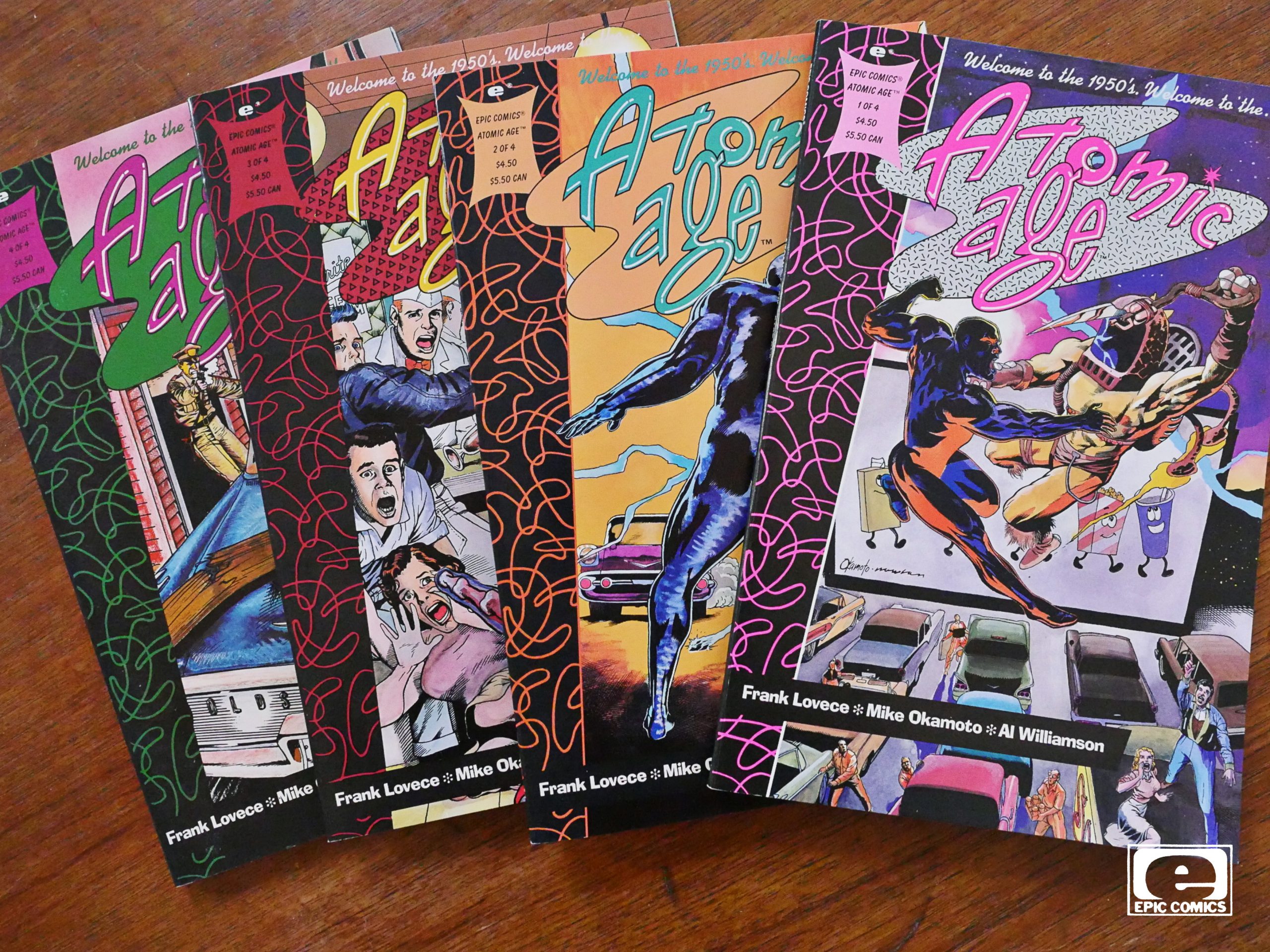
Atomic Age (1990) #1-4
by Frank Lovece, Mike Okamoto and Al Williamson
Man, where to even start…
This is a really bad book. It’s like one of those comics that showed up during the black & white boom, where nobody involved had any idea how a comic even worked. But here they’ve got Al Williamson (!) inking and Steve Oliff (!) doing the colours, and it’s a four part squarebound “prestige” publication from Epic comics.
How did this even happen?
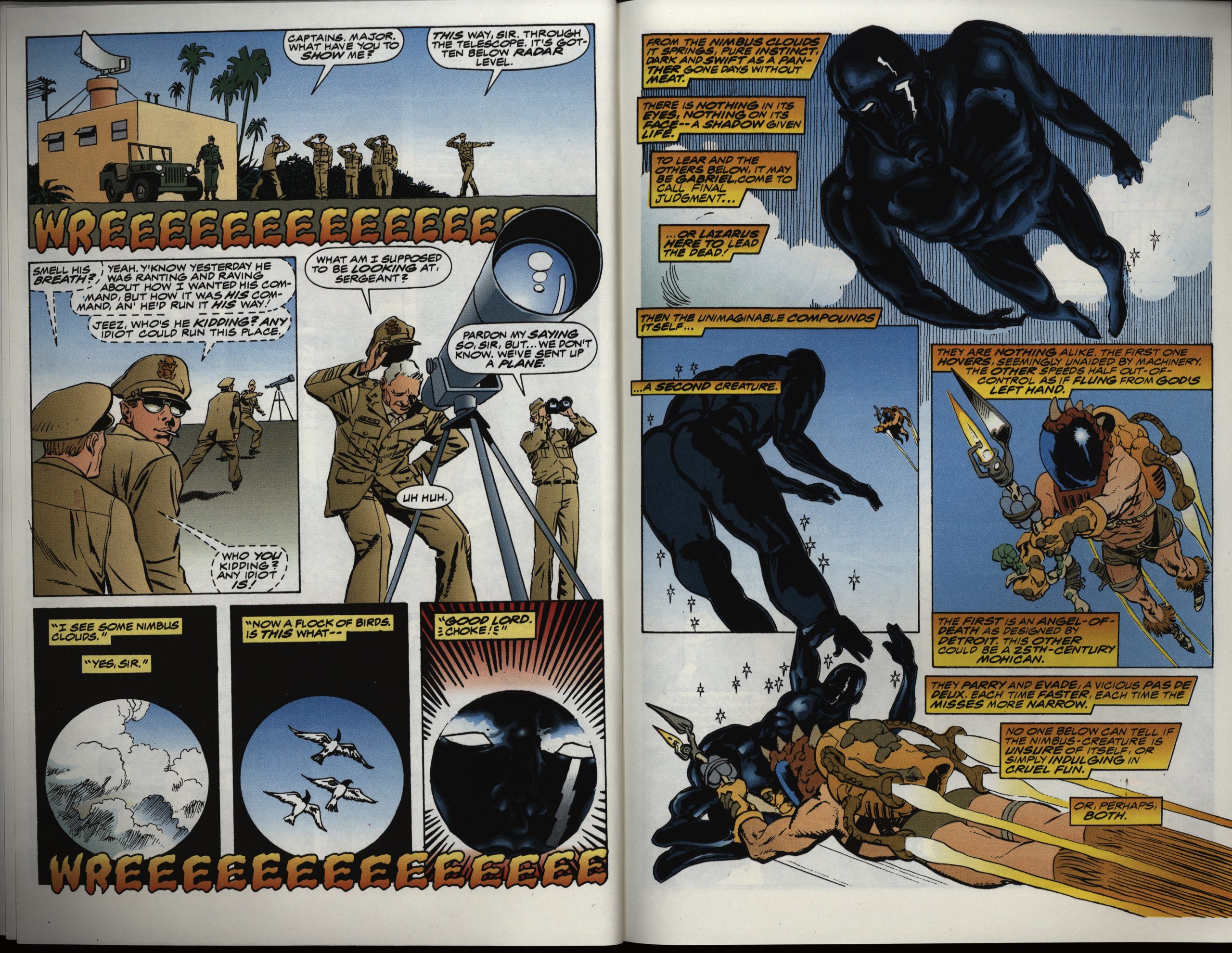
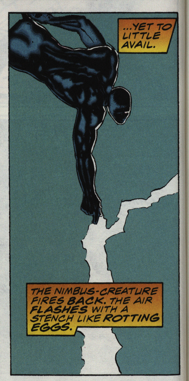
Because electricity smells like rotting eggs.
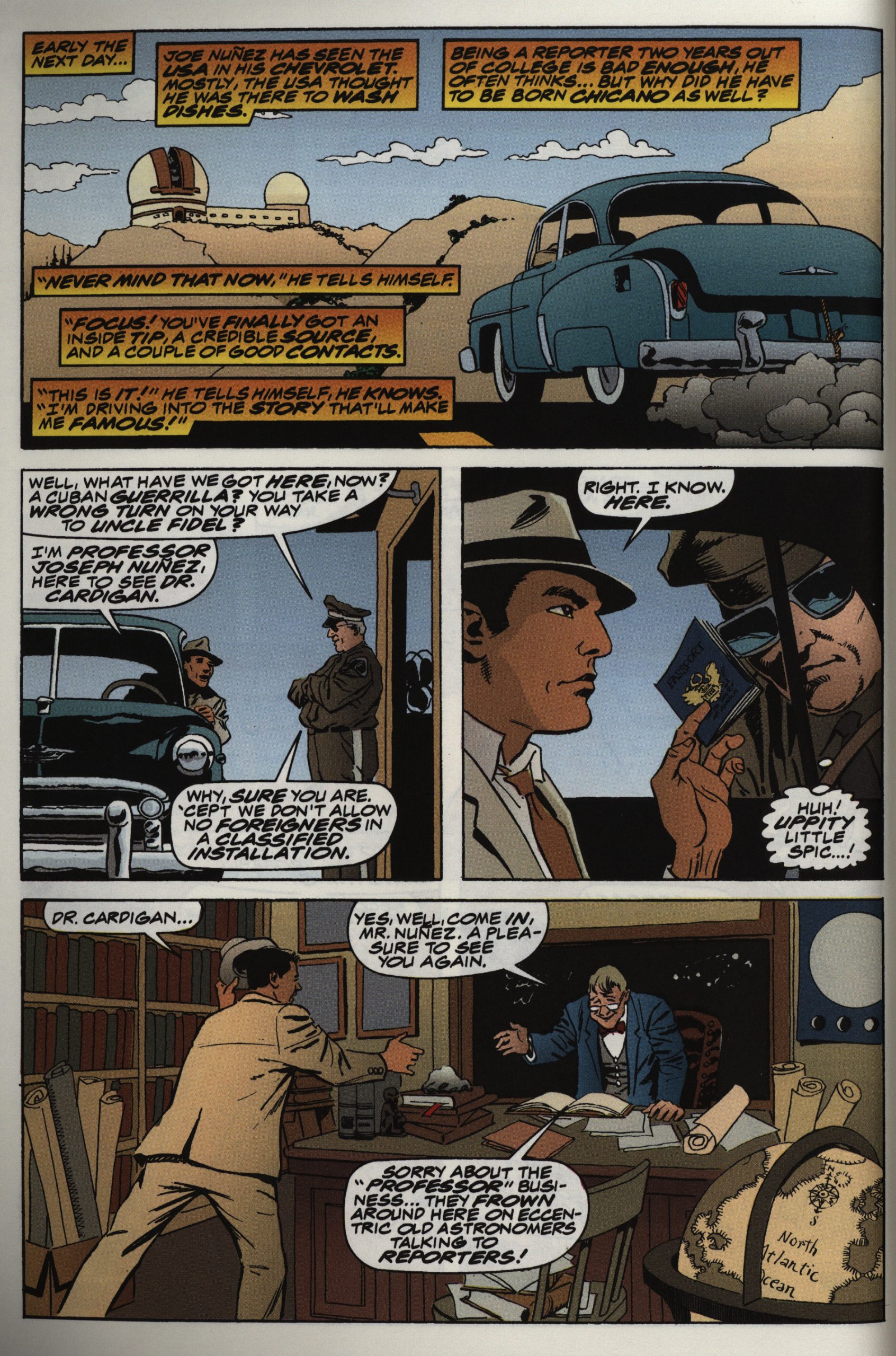
There’s a lot going on in this story. There’s Earthly racism (the protagonist is Hispanic), alien racism (it’s about one group of people keeping another one as slaves), aliens zapping each other, a spunky reporter, a love plot, a Colonel who’s plotting, some scientists…
But it’s all tedious. There’s a lot of jokes in here, and I think I picked the very best above. Yes, they’re that bad.
There’s endless exposition, and we go over the same plot points again and again.
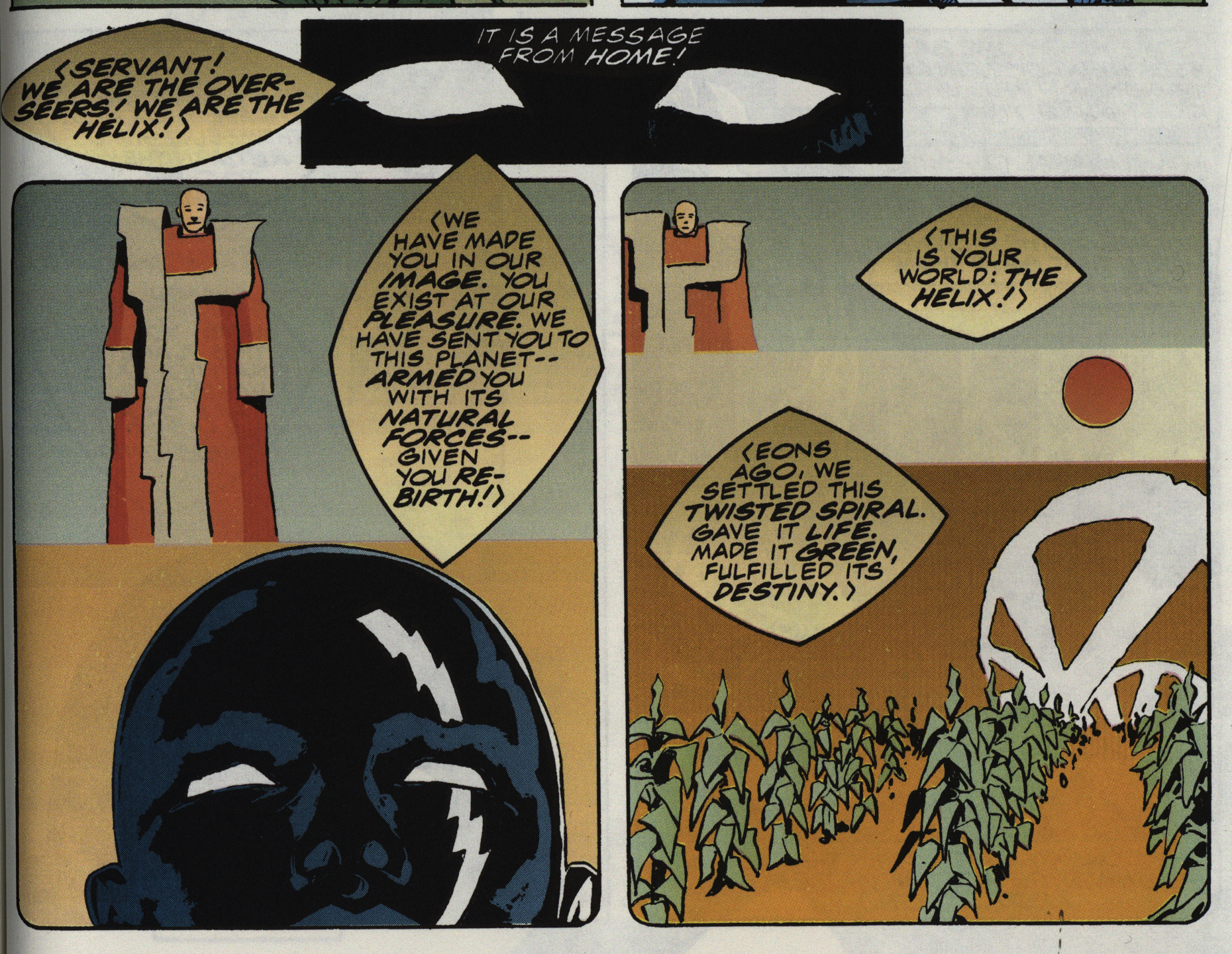
The artwork is mostly amateurish and awkward, but I have to say I do like the design of the aliens and their outfits.
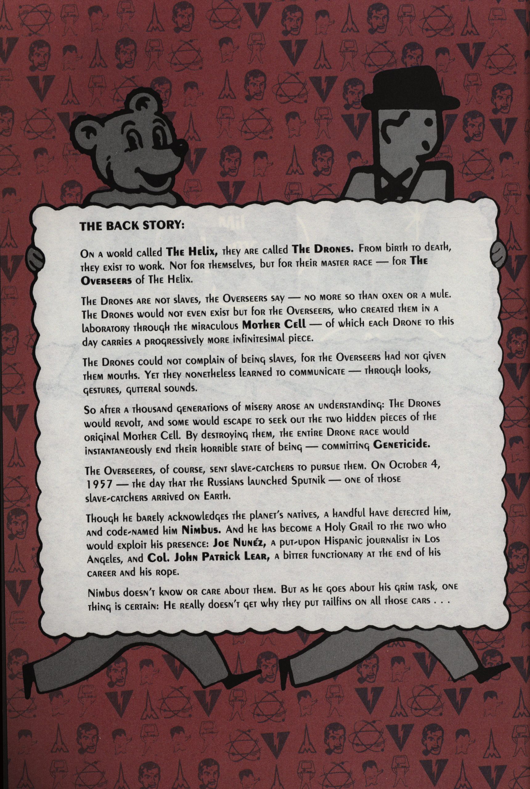
I didn’t really want to subject you to the backstory, but I just wondered: Are those figures from the 50s or something?
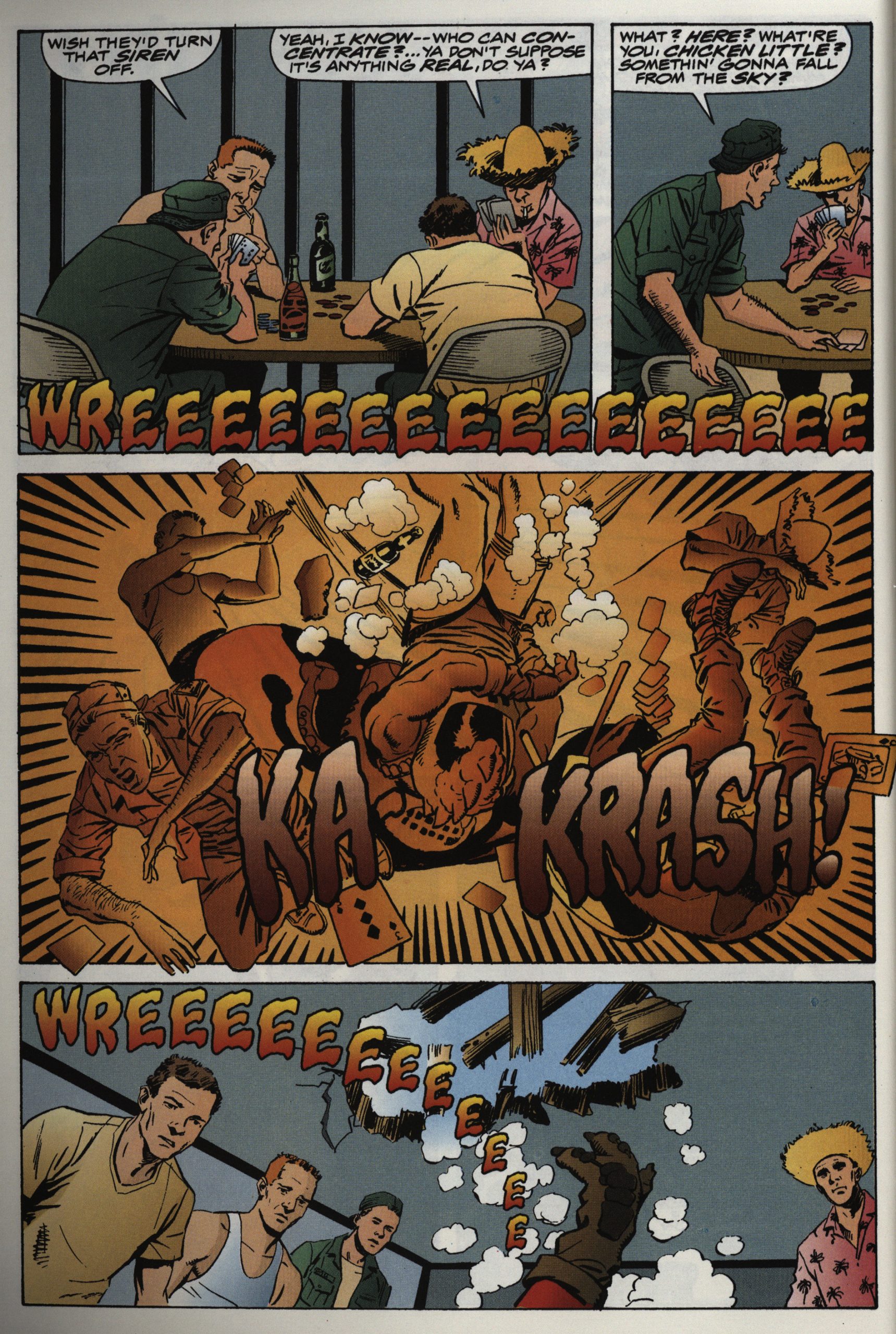
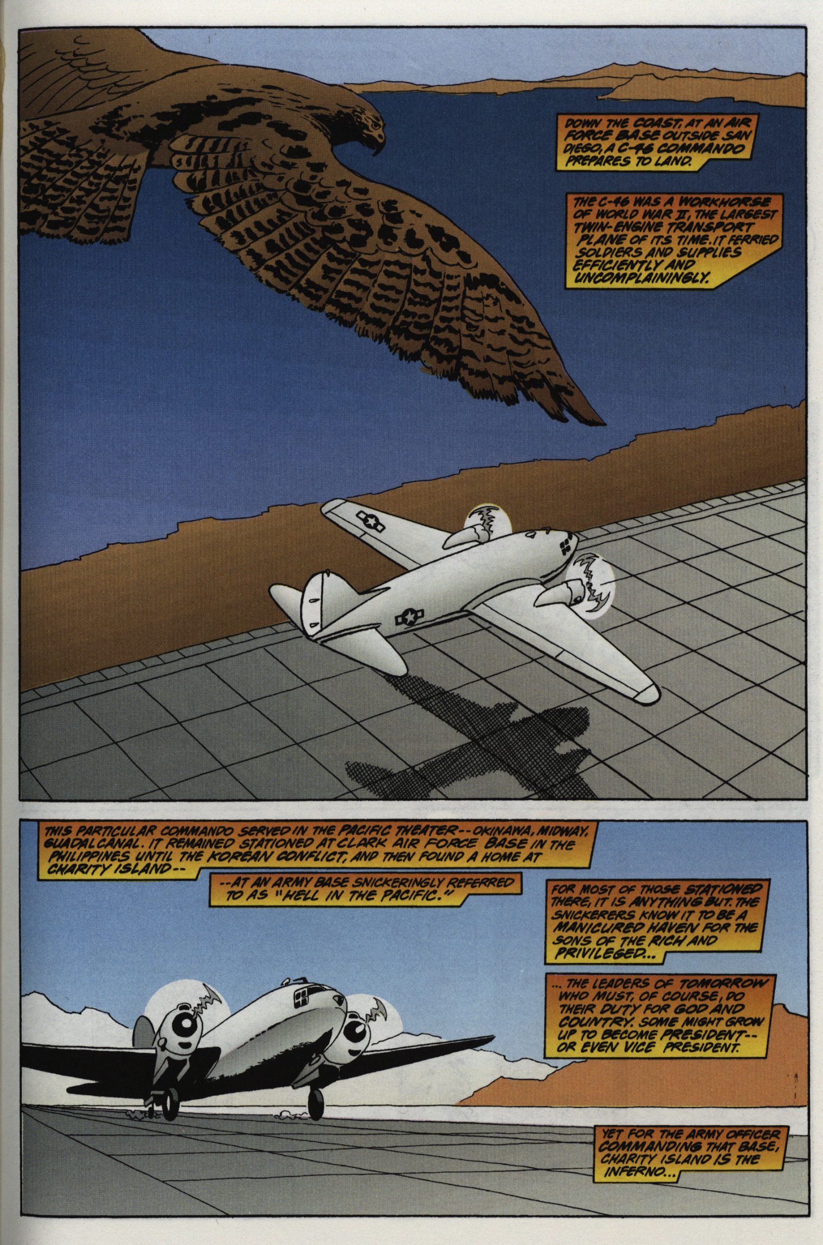
The artwork is mostly really uninspiring, but all the missing backgrounds and details at least meant that Williamson didn’t have to spend a lot of his precious time on these pages. But that’s a nice bird.
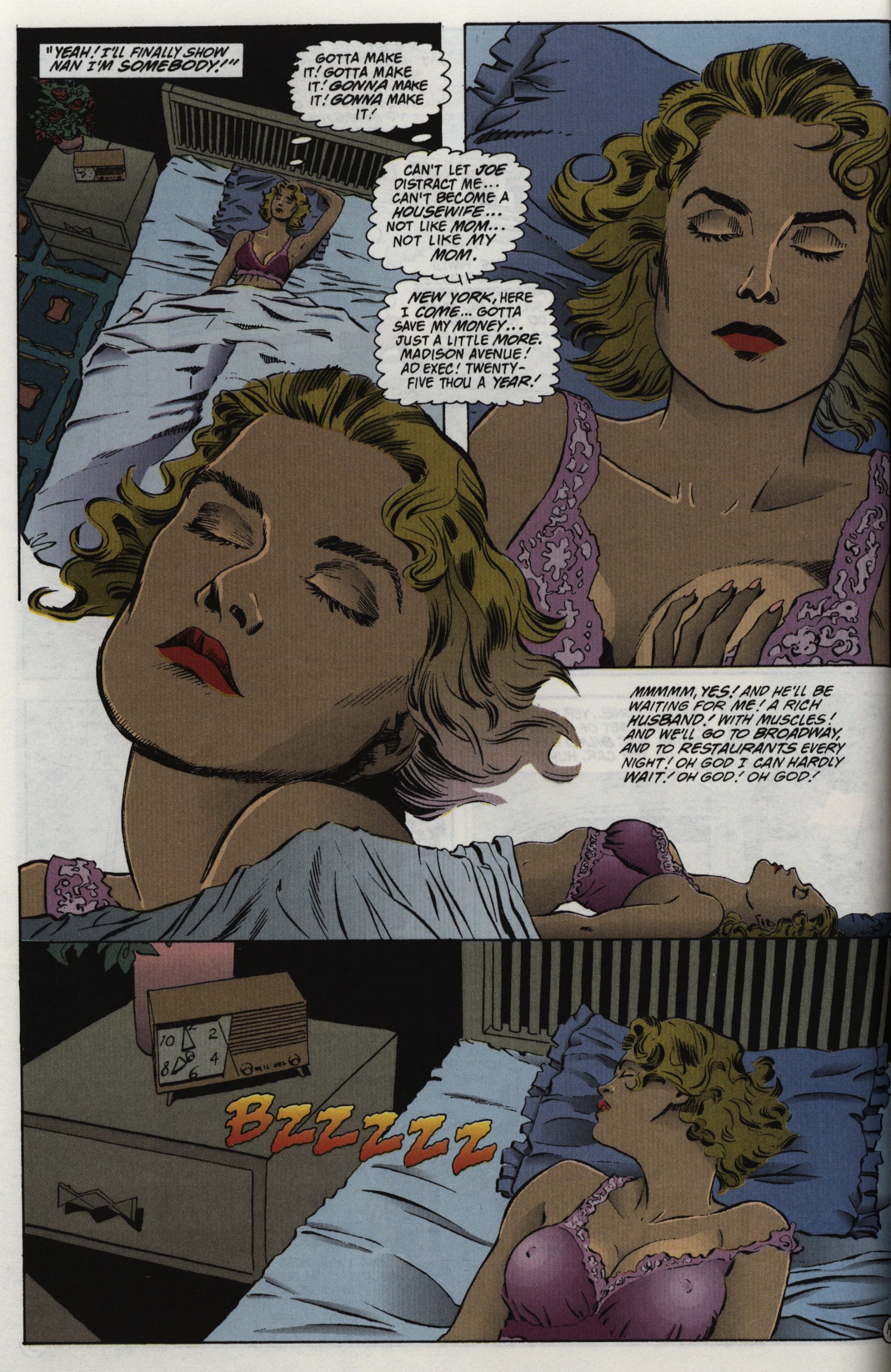
And this is the only page in the book that’s competently done, and it’s… a page of that woman masturbating, for some reason or other.
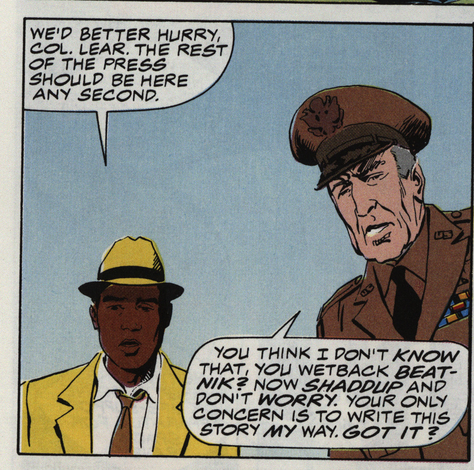
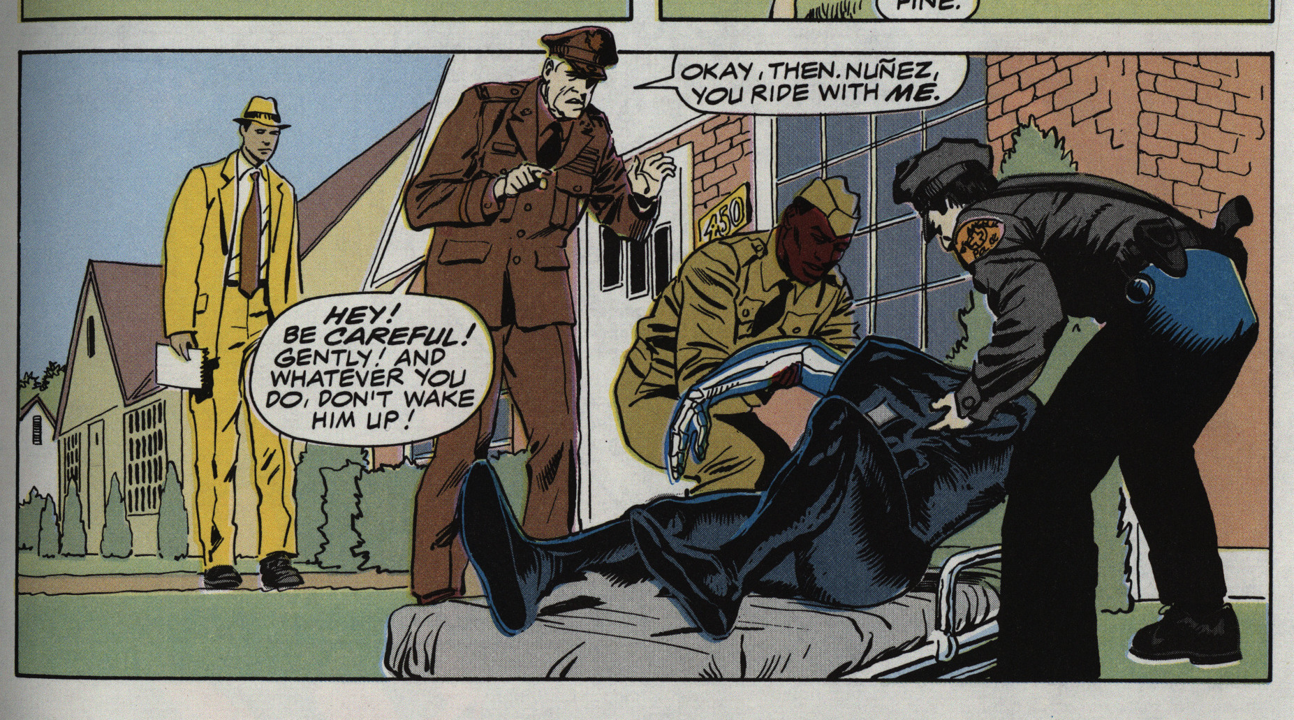
They get a new colourist in issue #3 who apparently didn’t get the memo that the reporter is Hispanic. And, oh yeah, there’s racial slurs all over the series… but it’s the bad guys doing them, so it’s OK, see?
Well, the colourist has covered all the skin colours here…
Getting through this series was a chore.
But what did the critics think?
Kevin W Hall writes in Amazing Heroes #192, page 73
While I’m usually a fan of science
fiction, that was the least appealing
aspect of this mini-series, The straight
scenes of. 1950s life, with its racial
problems, romantic tangles, and gor-
geous cars were very realistic, and the
highlights of the three issues. Person-
ally, I felt it would have been more
interesting as a straight look at 1950s
America.
Artistically, newcomer Mike Oka-
moto is greatly aided by the most un-
derrated inker in comics, A1 William-
son. Together they give Atomic Age
#1-3 a snappy layout, nicely drawn
characters, and a well-formed flow of
action.
Finally, while Atomic Age #1-3 isn’t
perfect, it does possess an intelligent
story and some excellent art by
Okamoto and Williamson. Maybe
Marvel can be persuaded to do a
straight series about 1950-60s
America. I’d buy it.
Paul Carbonaro writes in Amazing Heroes #191, page 117
Atomic Age is a pretty worthwhile
series, encompassing thoughtful writ-
ing and attrpctive art,’ smartly pack-
aged for the slightly steep price of
$4.50. My contention that the price
is steep is on the cost in relation
to the quality of writing and art.
Certainly, all efforts on the series
are earnest. Yet the most striking thing
about Atomic Age is Nimbus, the cen-
tral character. Visually arresting, his
entire body is as black as coal, and
probably much harder. After using his
powers, parts of his skeleton show
through as signs of energy depletion.
Also striking is the cover logo—
especially on issue It has flair and
style and captures the character of the
’50s well. Further, it hints strongly at
the topsy-turvy adventure to be found
inside each issue.
Writer Frank Lovece should be
commended for striving to make every
one of his characters highly distinct
from one another. He achieves this
through individual motivation and
dialogue and personal background. Of
course, he is aided in this endeavor by
the art team of Okamoto and William-
son.[…]
A fair deal has been written about
Lovece’s efforts. The armork comple-
ments it quite effectively, and is
downright attractive at times (the
splash page of issue #2 is the best
example, I think). However, Okamo-
to’s pencilling seems crudely simplis-
tic in places. It’s fair to say, perhaps,
that the experienced refinements of A1
Williamson’s inks help overcome the
weaker sides of the pencilling. An-
other rather negative aspect is that the
art appears static more often than not.
Still, things could be woqse. At least
Okamoto creates an effective ’50s feel.
Credit must go to Jim Novak for
typically fine lettering and to ‘Steve
Oliffand Olioptics for splendid color-
ing that enhances the series’ presen-
tation considerably.
Collaborator Al Williamson won the 1991 Eisner Award for Best Inker for his work on it and other series that awards-year, with Okamoto winning the Russ Manning Award for most promising newcomer.
The series has never been reprinted.
