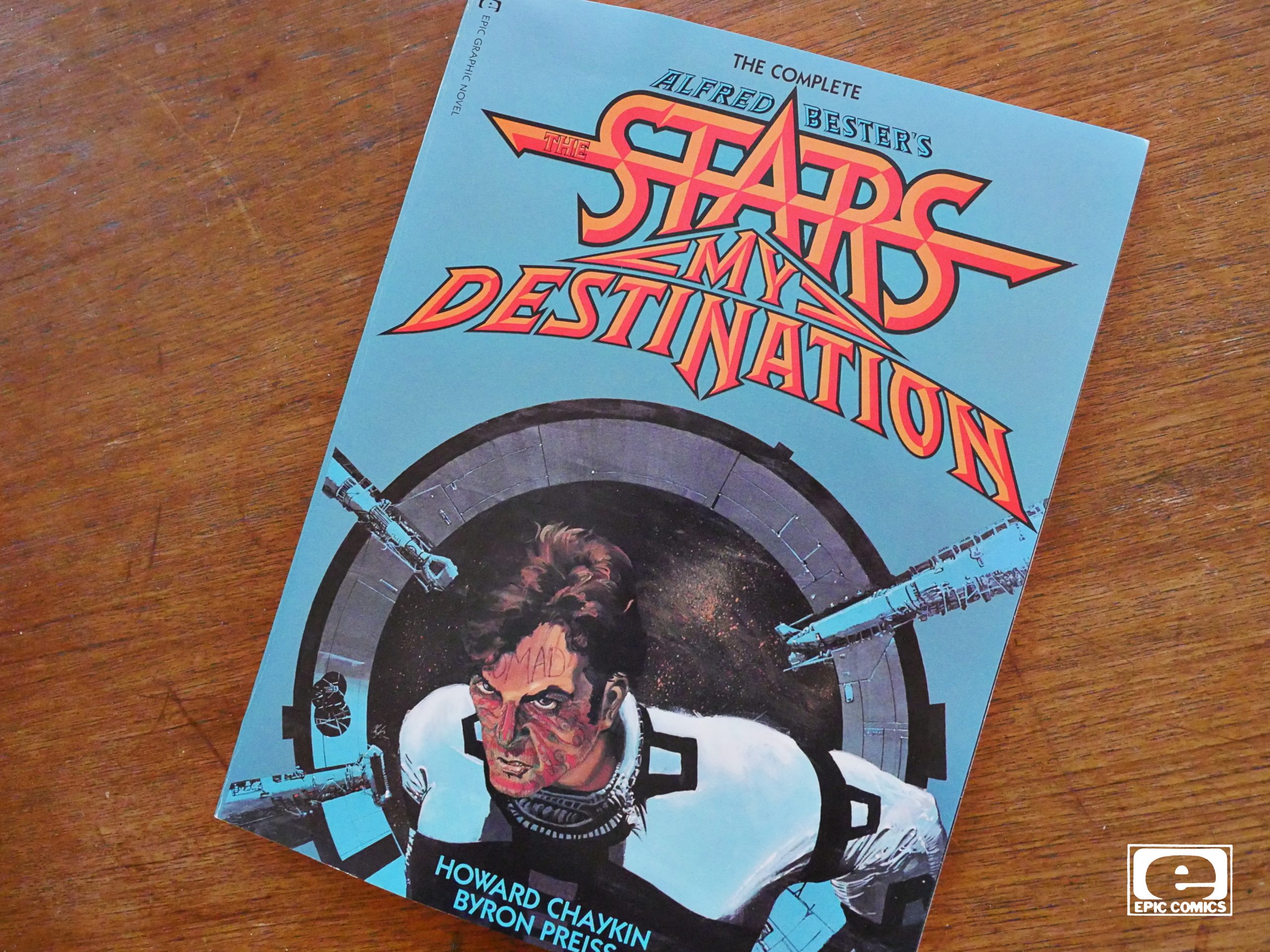
The Complete Alfred Bester’s The Stars My Destination (1992)
by Howard Chaykin and Byron Preiss
“The Complete”… “Alfred Bester’s The Stars My Destination”? What’s that about? I flipped to a random spread in this hefty softcover:
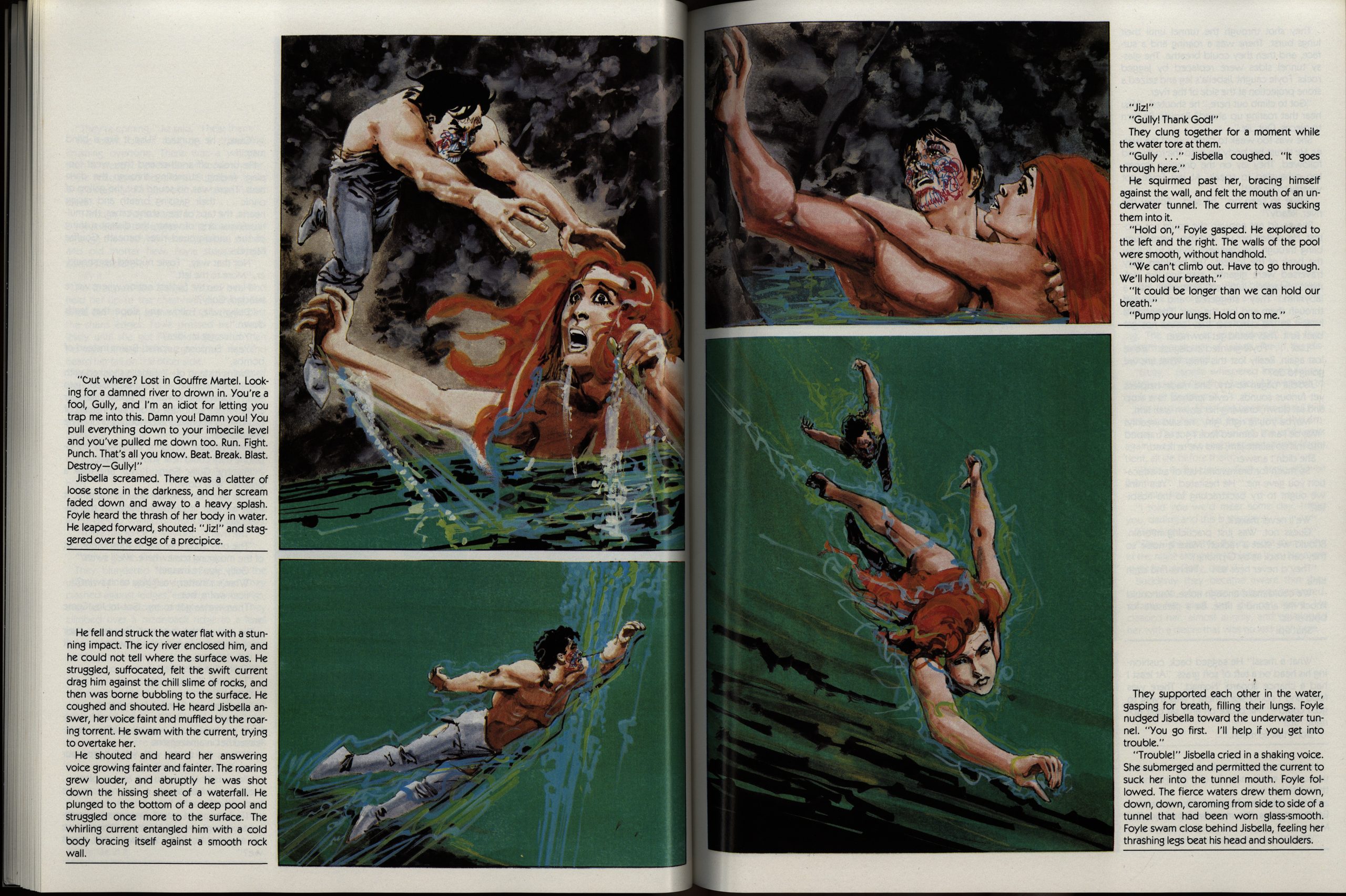
Oh, wow. Does “complete” refer to the text of the Bester novel?
OK, let’s go back to the beginning and read the introduction by Preiss:
No, it refers to only the first half being published back when. The publisher went bankrupt after publishing it. Preiss adapted the novel by cutting down the test and doing the layouts.
Preiss was (in)famous back in the 80s for trying to push new ways to make comics more literary, and the “in-” part comes from then usually not being too successful.
Which this is another example of, but you have to give him credit for trying? I guess?
The default configuration here is that you have one column of text and then some illustrations next to it on the page. And then sometimes you have more comics-like silent panels.
The problem is that this is really awkward to read. When reading the column, it’s so easy to forget to look at the panels next to it, so there’s this constant annoyance with flipping back and forth. And since so much of the text from the novel is here, the illustrations seem mostly superfluous, exacerbating the problem.
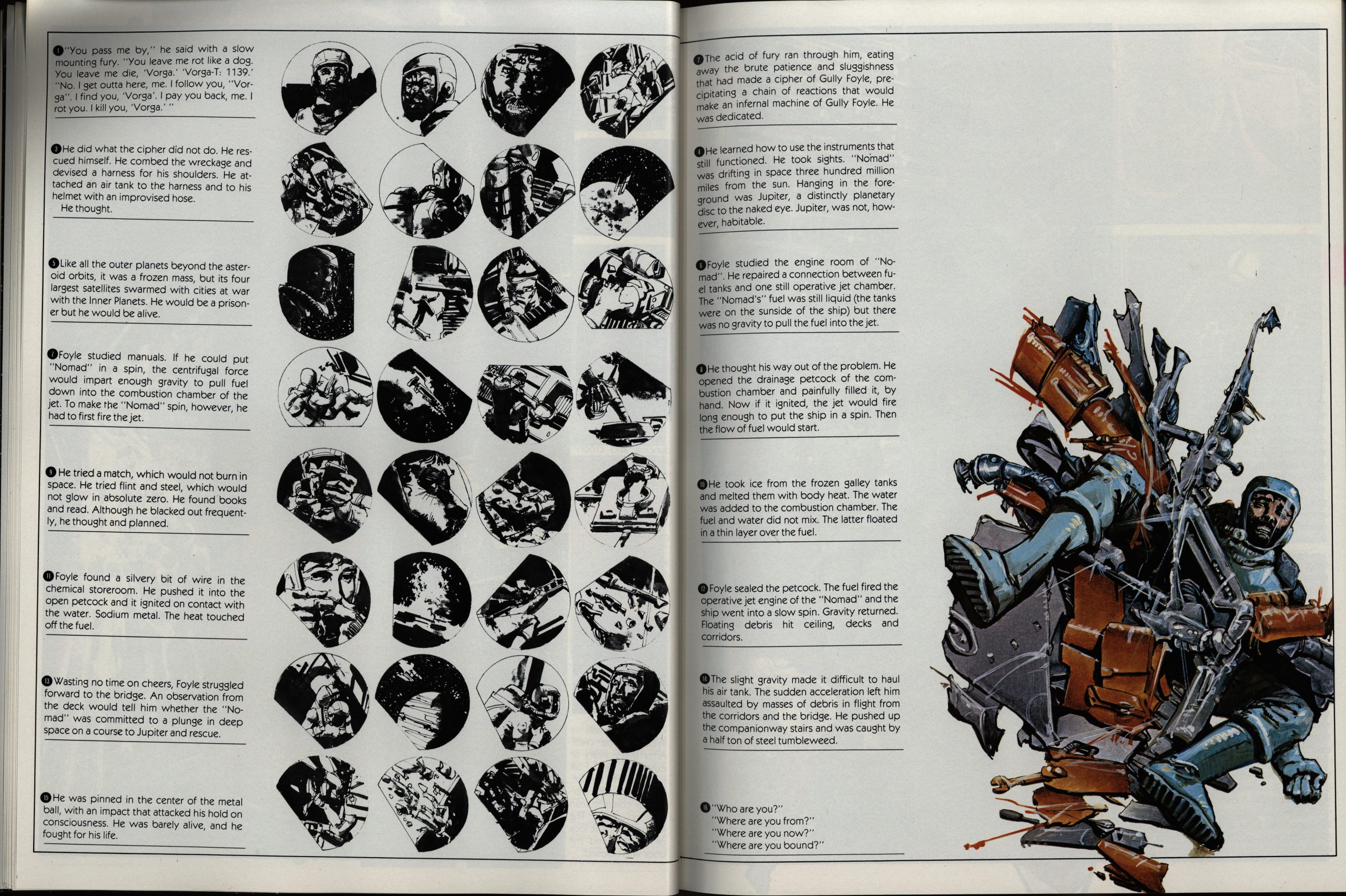
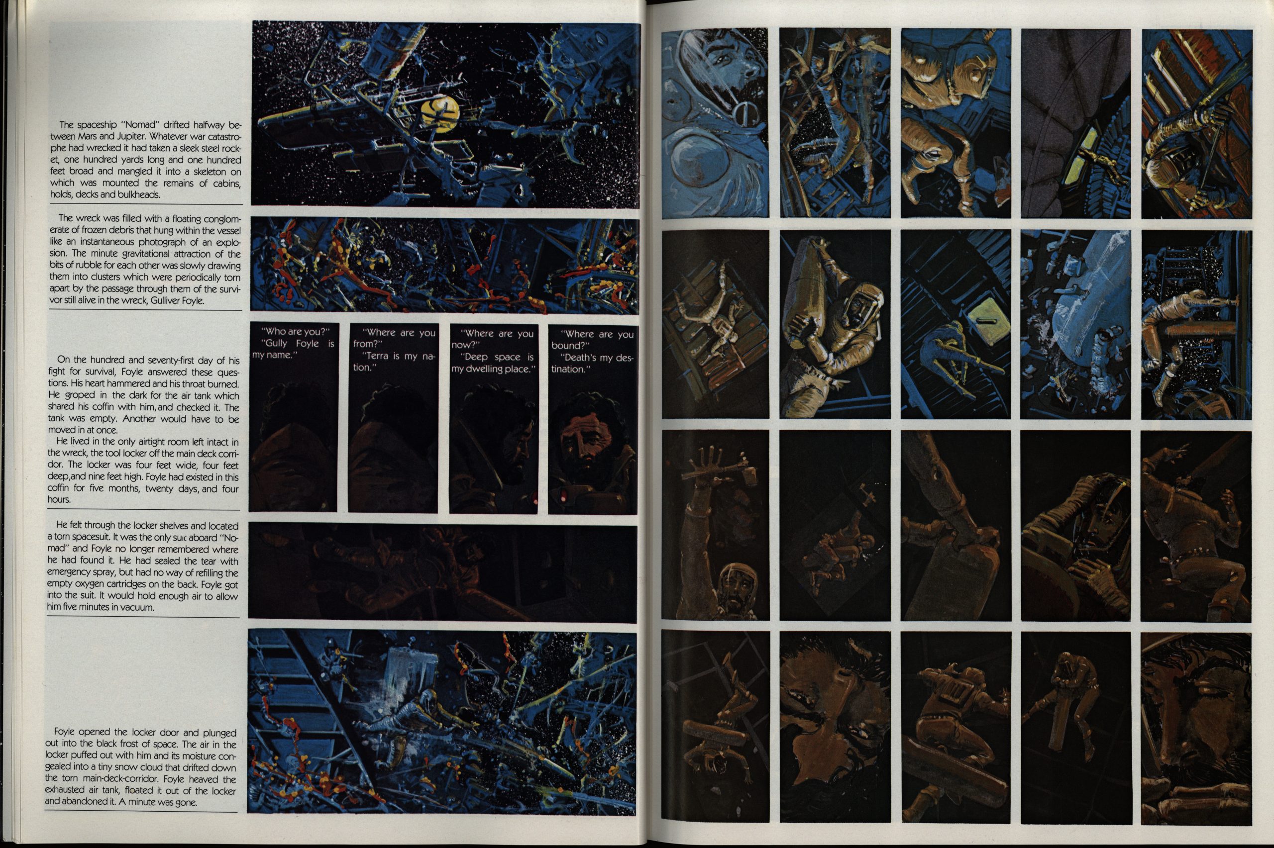
C’mon. Now Preiss is just fucking with us — the text is meant to be read by skipping back and forth between the pages? (See the numbering of the boxes.)
It’s like every other page is a puzzle to determine the reading order, which takes you out of the story, all the time.
Preiss says in the introduction that Chaykin agreed to this new edition if “the book would state that it was done ten years ago”, so he stated that… in the introduction. *sigh* But I’d guess that means that Chaykin is less than chuffed by his work here, but I think it’s fine. Especially the colours are very pretty.
But… I found this mostly unreadable, and stopped reading a quarter of the way through. I’d much rather re-read the novel.
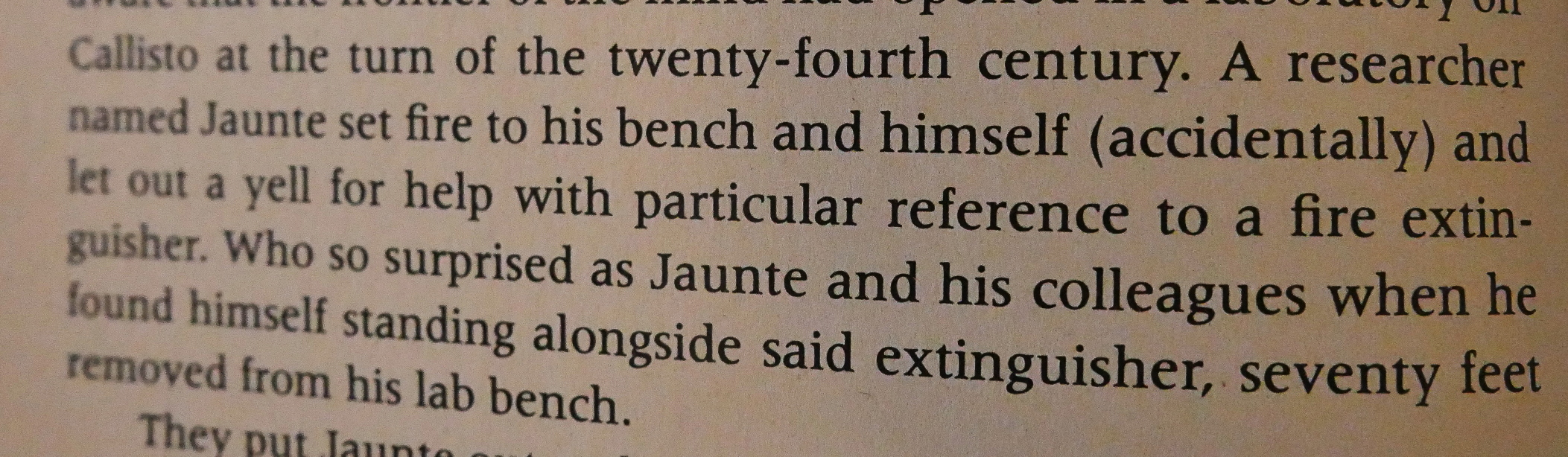
Let’s have a peep at Preiss’ editing of the text. Above a bit from the novel (the Vintage edition, which is British, if that makes any difference)… As you can see, the language is pretty playful and bordering on the idiosyncratic.
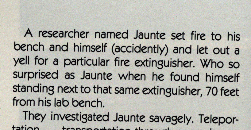
And here’s Preiss. He’s basically deleted words to get the length down, so “and let out a yell for help with particular reference to a fire extinguisher”, which is a pretty fun part of a section. That’s now “let out a yell for a particular fire extinguisher”, which means something else, and isn’t fun at all, and sits uneasily next to “Who so surprised as Jaunte” which follows in the same mode in the novel, but not in the adaptation.

Here’s another, slightly longer section.
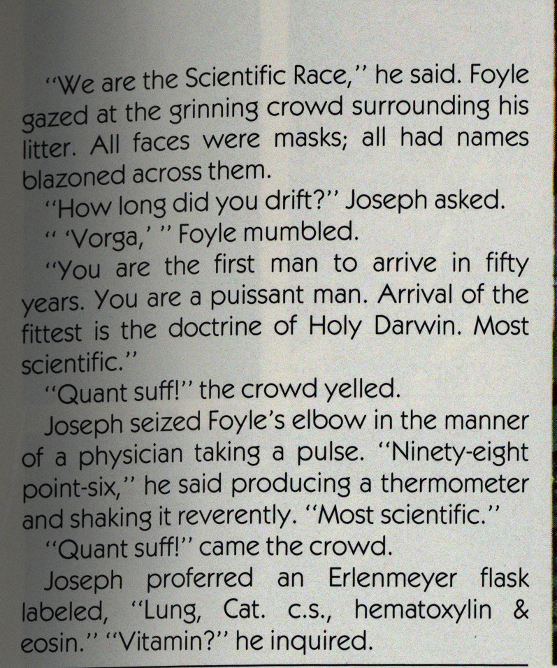
“We are The Scientific People” is now “We are the Scientific Race”? What? OK, I don’t know whether “people” is a thing from the British edition; it’s possible, I guess.
Here’s the version from google books:

So… “race” was Preiss’ invention? Perhaps because “race” is two characters shorter than “people”?
And… “All faces were masks” was “All faces were tattooed into devil masks”; but I guess we can see that they are tattoos from the art? But can we?
OK, I’ll stop there: I find that Preiss’ take on Bester’s engaging prose style makes everything leaden and boring and often confusing.
Perhaps it would be a nice project to re-do the entire project by reinstituting the entire Bester text and re-flow the artwork…? Probably not.
Here’s from an interview in The Comics Journal #51, page 67:
CROTH: Can you talk about how your approach
differed from The Stars My Destination and a regular
comic book?
CHAYKIN: You’ll have to be more specific.
CROTH: The Stars My Destination was totally removed
from a regular, standard comic book. The words and
pictures were integrated in an entirely different way.
CHAYKIN: Well, that was Byron’s job.
CROTH: How closely did you work with Preiss on the
layo ut ?
CHAYKIN: I had nothing to do with the layout except.
an occasional agreement or disagreement. The book is
Byron’s. I illustrated the book. I had very little input in
terms of the physical design of the book. designed the
characters, obviously , and I designed all the internal
pictures within the panels. but I didn’t do anything in
terms of designing the pictures themselves .
CROTH: DO you mean that Preiss gave you layout
board with the panels blocked out?
CHAYKIN: Exactly. Exactly.
CROTH: Would you prefer to design your own pages?
CHAYKIN: Obviously.
CROTH: DO you foresee doing that in the future?
CHAYKIN: That’s what I’m doing now, Gary.
“Obviously.”
A news item in The Comics Journal #55, page 21:
NEWSWATCH
Baronet Cancels Second “Stars My Destination”
Because of financial set-
backs, Baronet Books has
suspended future publi-
eations, including the
entire Spring 1980 list.
Among the books which will
not be published is The
Stars My Destination,
Volume Two, the second
part of Byron Preiss and
Howard Chaykin’s visual
adaptation of Alfred
Bester’s novel.
According to Norman
Goidfind, the decision not
to publish the second
volume (the first appeared
in 1979) had “nothing to do
do” with the sales on the
first one, but was purely
a result of the financial
situation of Baronet. He
did , however, term the
sales “disappointing”
compared to those of
Preiss’s previous produc-
vtions for the company ,
The Illustrated Roger
Zelazny and The Illustrated
Harlan Ellison. So far, the
first volume of Stars has
sold of its first print
run of 12 , 500 (paperback
version) .
Baronet is at present
unable to return money to
those people who have
ordered the second volume
(according to Locus ,
approximately 800 advance
orders were taken on the
book): “Much as 1 would
like to take every penny
that people paid and give
it back to them, I just
, ” Gold find stated. “l
just don’t have it. There—
fore, Baronet will be
offering customers $20.00
worth of books from their
inventory—S5.00 more than
the price of the second
volume. A letter has been
sent out to subscribers ,
most of whom have been,
according to Goldfind ,
very understanding.
Where will the second
volume be published, if at
all? “At the moment we
can’t do anything,” Byron
P reiss stated. “It’s tied up
with Norman. He’s not out
of business. We have to
wait and See What happens
with Norman. ” Preiss
emphasized his good feel-
ings toward Goldfind , who ,
when he was Vice President
for Pyramid Books, pub-
lished some Of Preiss’s
earliest productions ,
including Steranko’s
Chandler.
Fred Patten writes in The Comics Journal #57, page 50:
The Stars My Destination one of the
greatest SF classics ever written.[…]
In a way, my fanaticism for
Bester’s original novel compromises
my ability to review this Chaykin/
Preiss adaptation objectively. I’m
too used to the mental images that I
built around the novel. It’s the
familiar Story of any newly illustrated
version of a classic; Tolkien, for
example. “Yes, the pictures are
nice, but that’s not the way L had
imagined them! ”
Byron Preiss has actually done a
superb job of editing Besteros text.
It’s almost as good as the original.
He has been completely successful
in condensing Bester’s vivid imagery
into only half the word-space with-
Out diminishing its impact. When I
opened this book I was recaptured
by the words again. I read through
this as I would any novel, only
glancing at the art.
That’s the book’s problem. I hate
to say this, considering how much
effort Howard Chaykin obviously put
into the drawings, but they’re super—
fluous. They are not necessary to
the story. They weren’t even strong
enough to take my attention from the
text. First I read (re-read) all
Bester’s words On each page. Then
I paused to look at the art .
It’s pretty art, but nowhere nearly
as powerful as my mental image of
what’s happening on these pages.
It’s busy art, too cluttered with
detail to convey a sharp picture at
first glance. static art, complete-
ly lacking the dynamism Of the text.
It’s clashing art. a polychromatic
montage of often six or more panels
per page in tricky layouts devised
by preiss. Most of these pictures
are nice in their own right. They’re
colorful. They’re artistically well
balanced. But they do not assist the
now of the story. They do not blend
well with the text; they remain apart
from it. I can appreciate this art
intellectually—and I would like to
see Vol. 2 someday—but I already
appreciate the story emotionally on
a gut—level that the art doesn’t
near reaching.
so: The Stars My Destination,
Vol. 1 is not bad, but neither is
it particularly good. It’s a book that
I’d certainly leaf through at the
bookshop. but would probably
consider not worth the price. It’s
certainly not a substitute for Alfred
Bester’s original text. It’s a good
gift book; something to buy for
somebody else. My advice is to buy
and read a copy of the latest paper—
back edition Of Bester’s novel. Then
look at this pictorial work and decide
whether it offers enough for you to
be worth the cover price.’
An interview with Harlan Ellison in The Comics Journal #53, page 88:
GROTH: I see your point. I don’t know, though, if
Preiss can totally “cape responsibility for rewriting things,
for designing the layout.
ELLISON: I didn’t say he escapes responsibility. But,
you see, producers are producers. That’s what Byron is
—he’s a producer. Producers have to get the product out.
The artist- should be concerned about the quality of the
art. Byron mistakes himself. He divides himself. He thinks
he’s an artist. He’s not. He is a creative producer. It’s his
job to put the package together, to sell it. to produce it
in the way that is most rewarding. And to do that he must
be overseen by the artist and the writer working in
collaboration with him. And if they want to do something
that can’t be done, he should say to them , “It can’t be
done. Sorry, I can’t do that. We’ll have to find a way
around that.” And if they care about the work they will
find a way around it. So, I’m not saying he escapes
responsibility. No, Byron probably should not have
rewritten. Except Byron will now come back and say, “I
had to rewrite! There wasn’t space. or it wasn’t this, or
it wasn’t that.” He probably has what he thinks is a per—
fectly valid reason for it. We look at it and say , “Jesus ,
what terrible layouts.” Or Howie Chaykin would say, “Gee ,
what horrible layouts.” But Howie Chaykin did the layouts!
I mean, those lines didn’t appear on paper magically,
Byron didn’t put them there. Howie did it. Howie Chaykin
is not a weak, simpering. What we’re postulating here is
this monstrous Simon Legree—like character, Byron Preiss,
who locks Howie Chaykin into a dark closet and beats him
with a cat-o’—nine—tails until he does shitty layouts. C’mon,
folks.
CROTH: I think it’s more of a case of Preiss giving
Chaykin the layouts and saying. “Put drawings inside
these panels. And if you don’t do it. I’ll find someone who
will.
ELLISON: Well, then that’s what Howie should have said.
But I don’t think Byron would ever say that. I cannot
conceive of Byron saying, “If you won’t do it, I’ll find some—
one else who will.” Byron’s not like that. This is a terrible
thing to call him , but Byron frequently is a pussy. If you
are firm , and you say, “No, Byron, sorry, this will not
go, and I do not want this this way. Now either I do it,
Byron, or cancel the project,” Byron will find another way
to do it.
GROTH: I do know Howie would have preferred to do his
own layouts on The Stars My Destination.
ELL’SON: Then Howie should have done them. I mean
if Howie Chaykin is the great creative artist that we know
him to be—and I have nothing but respect for Howie
Chaykin, as does Mike Moorcock. I mean, Mike holds him in
the highest esteem, and he says he’s a very fine man
personally. I’m not sure I ever net Chaykin, but I’ve
talked to him. Howie Chaykin should take the responsibility
too. Because it’s his name on it. Y’know , 10,000 years
from now when the cockroaches take over and they dig up
that book, what do they know from Byron Preiss? What do
they know from the guy who did the review and said ,
“This is shit”? They know from Howie Chaykin, and they
know from Alfred Bester. A guy gives something over to be
adapted, I mean, that’s happened to me a couple of times.
I didn’t know any better in the first few things. Gerry
Conway did an adaptation of “Delusion for a Dragon Slayer”
—I thought I’d die. I thought I’d fuckin’ die, man.
couldn’t believe it. It was beyond belief and beyond
redemption. It was just terrible.
One more thing. suppose what I’m speaking to in this
apart from my saying that Byron Preiss has almost always
played fair with me, and when say “almost always,” there
have been a couple of times that things have happened that
I have been unhappy with. Byron found himself in a box and
“We are taught to be cowards, all our lives.
he had to do things that I was not happy with, but I can
understand the boxes he was in. And I am not a terribly
forgiving person. as you know , but I hold no beef against
him. He’s a good guy as far as I’m concerned. What I guess
I’m talking about here is artistic responsibility. Again and
again return to that word’. Responsibility. And courage.
Responsibility and courage. Ethics. I cannot separate the
artist from the responsibility of the art. These reviews
praise the people who are the current guys and
pillory the ones who don’t have the cachet.
The book has never been reprinted, so finding current reviews isn’t easy, but here’s a recentish one:
Chaykin’s illustrations are an able interpretation of the visual images described in the text. Their variety and quantity are impressive, particularly in light of the fact that they were done in the era prior to the advent of computer – assisted graphics.