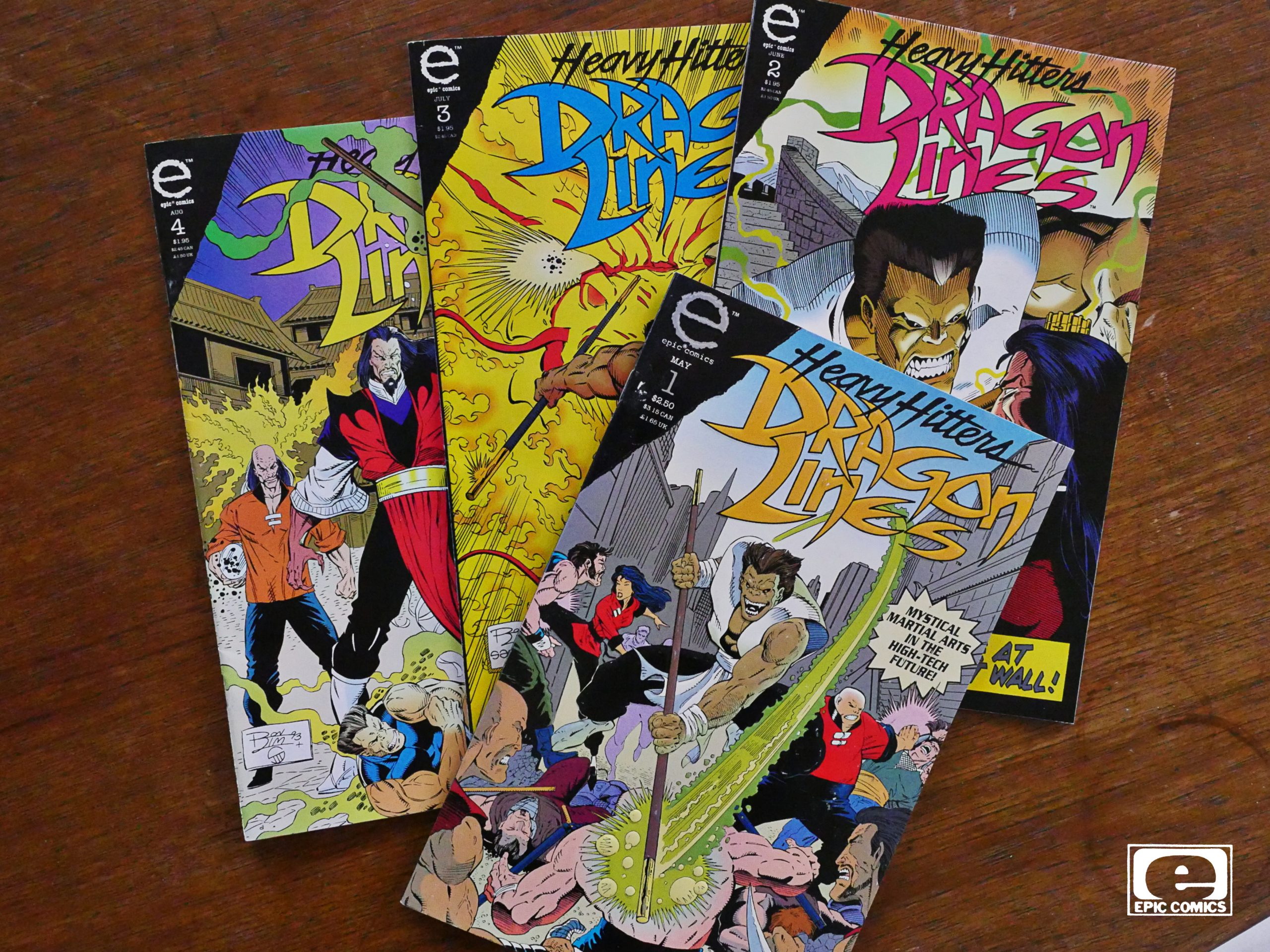
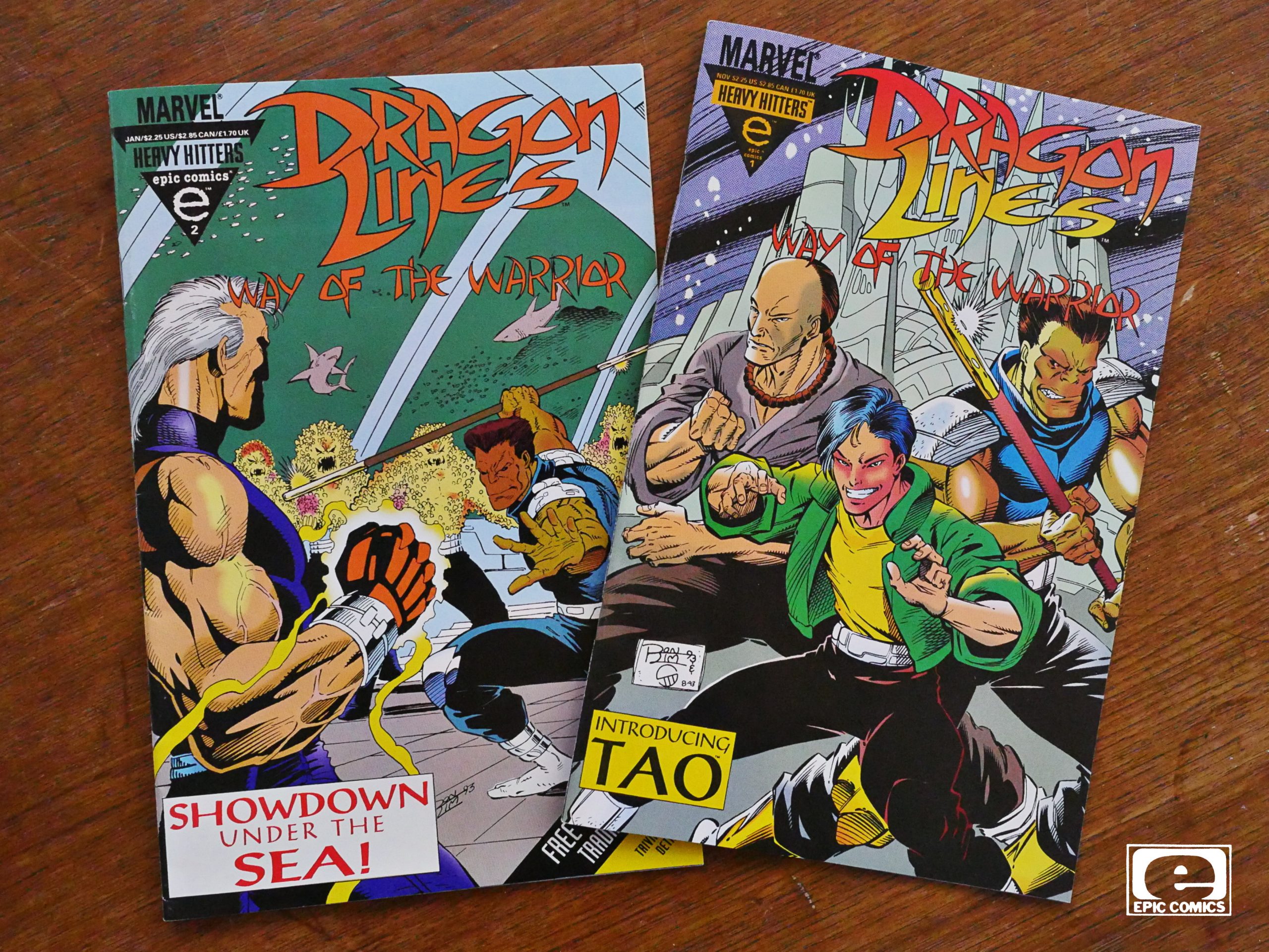
Dragon Lines (1993) #1-4,
Dragon Lines: Way of the Warrior (1993) #1-2
by Ron Lim, Peter Quiñones and James Sanders III
Here we go! The dawn of Epic Comics’ final phase: Being Image Comics.
As you know, Bob, Epic started off as a way to lure Marvel creators back from indie publishers (primarily Eclipse Comics) by promising them ownership of their comics. It was successful in luring the creators back, but commercially, the ship had already sailed: The direct market, which was hungry for new stuff in the early 80s had already seen a downturn with retailers concentrating more on super-hero comics again, and the offerings from Epic didn’t do very well, which lead to Epic trying other publishing strategies.
And this is the final one before Marvel decided to just drop Epic entirely.
In 1992, Image Comics became the new hotness, so I’m guessing “what can we do to get some of that sweet action?” and then somebody remembered that they still had the Epic imprint, so they used that?
The problem is, again, that Marvel was too late to the party: By 1993, Image Comics was already starting to founder (I think?) and would almost take down the entire US comics industry the next year.
This entailed giving Epic a new, horrible, ugly logo, and putting “HEAVY HITTERS” on every cover, because that’s cool and stuff.
And being in a more collectors-oriented universe, almost all of these Heavy Hitters comics come in an embossed cardboard cover, and most of them have metallic ink (first issue only, of course).
Weirdly enough, the only thing that has metallic ink here is the Epic logo itself, which seems like a weird decision.
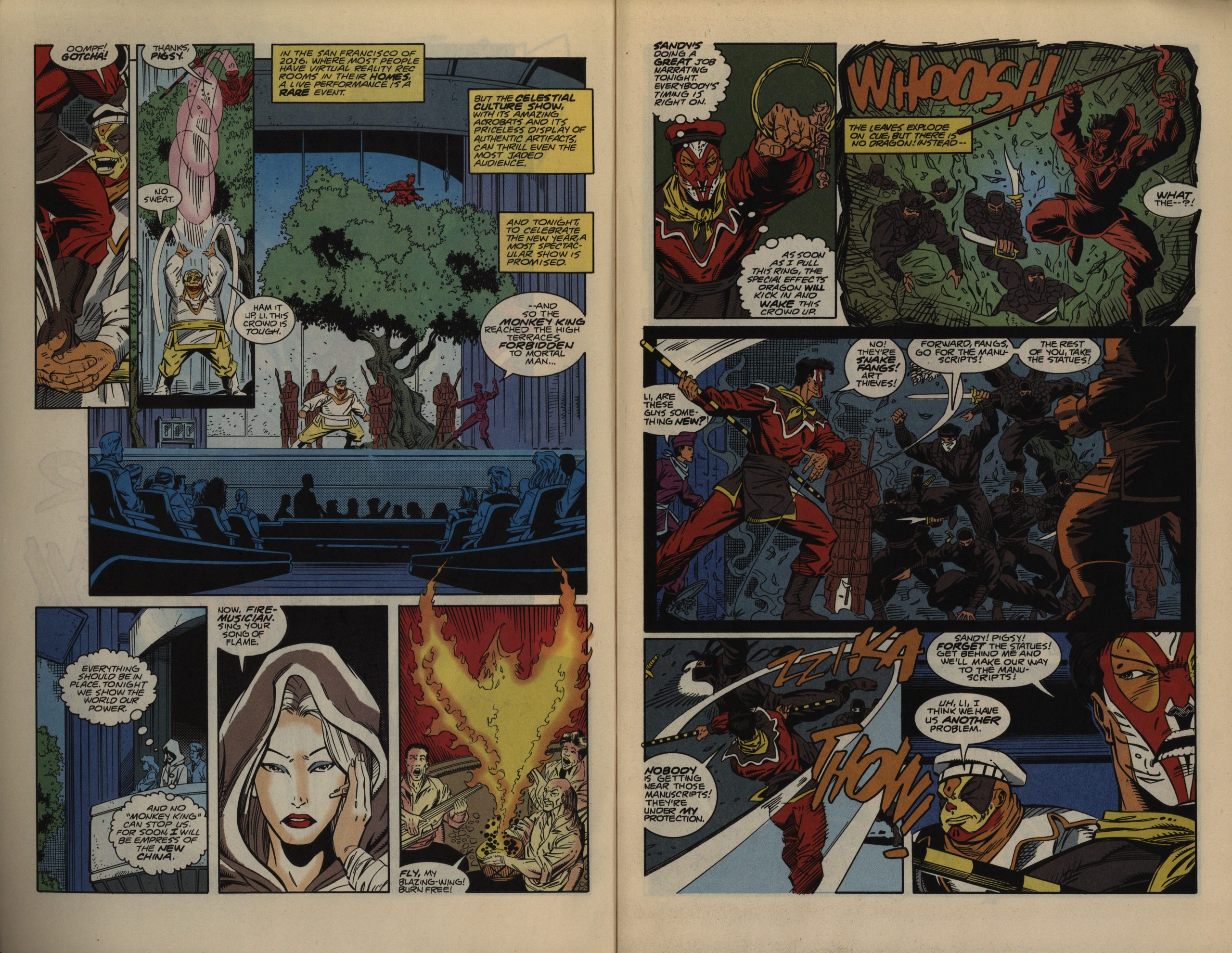
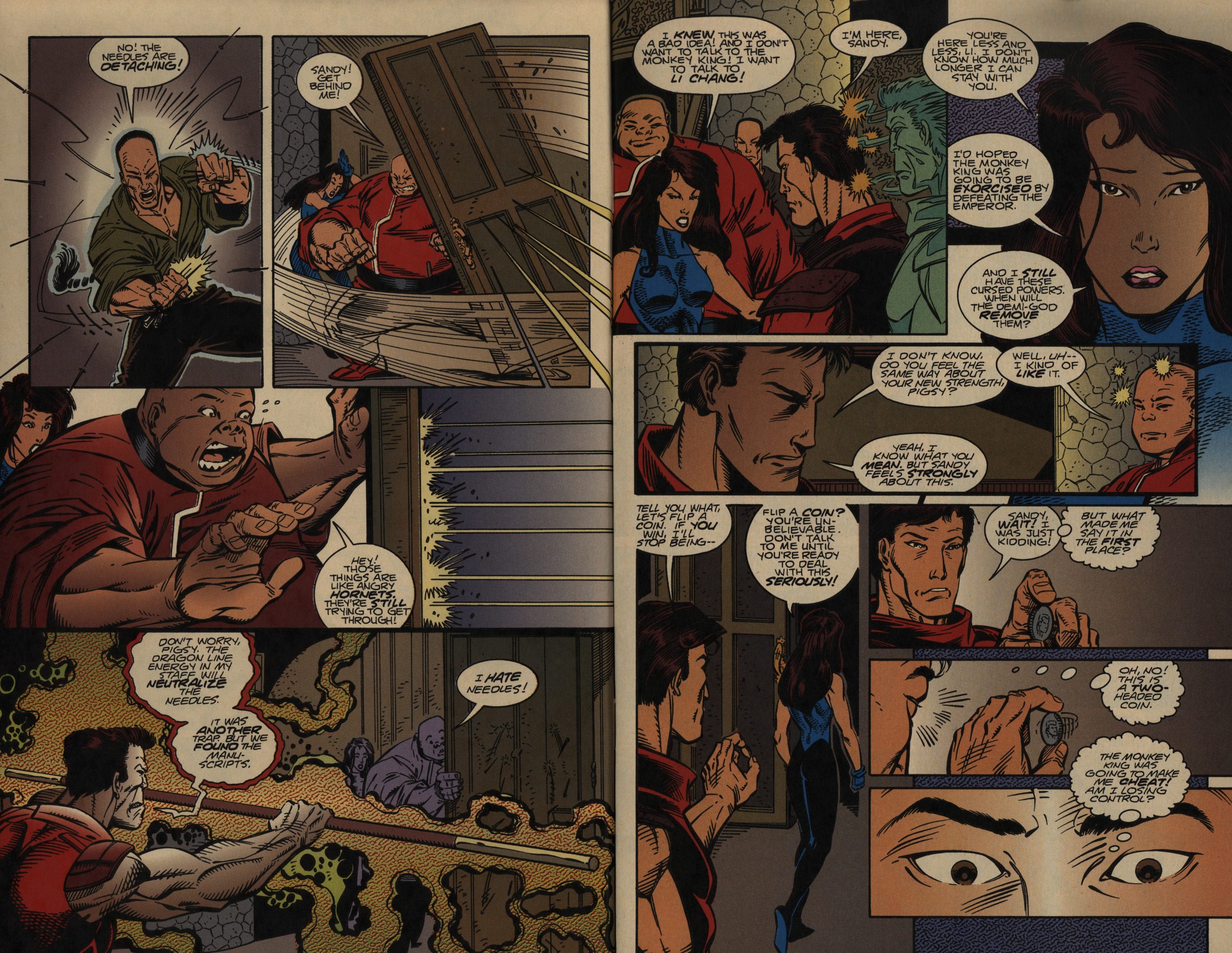
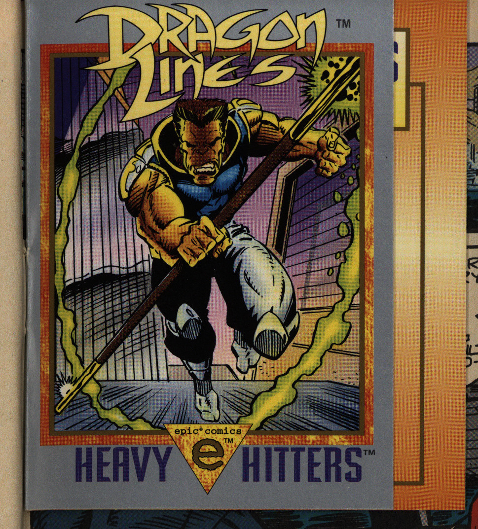
So what’s this, then? Artist Ron Lim is co-creator of this book, but I’m guessing (without any knowledge) that he’s the impetus for the book. His artwork is 100% Image-aligned, although he does know how to draw feet.
And there’s so much going on here. These are pages 2 and 3 of the first issue, and we’re introduced to I-don’t-know-how-many characters, given motivation for their actions both in captions and thought bubbles, and get a theatre performance and some ninjas and a fire bird attacking…
It’s a lot.
It has that feeling of someone having thought about the concept a lot, and it’s all going to get on the page.
I’ve enjoyed my share of Claremont-style over-writing in my years, but this comic almost broke me. It took me a week to get through these issues, because it’s just so fucking boring. Whenever I sat down and tried to read these pages, my eyes would just glaze over and I’d grab a novel instead. Which is nice; I got through five books at the same time I got through these six issues!
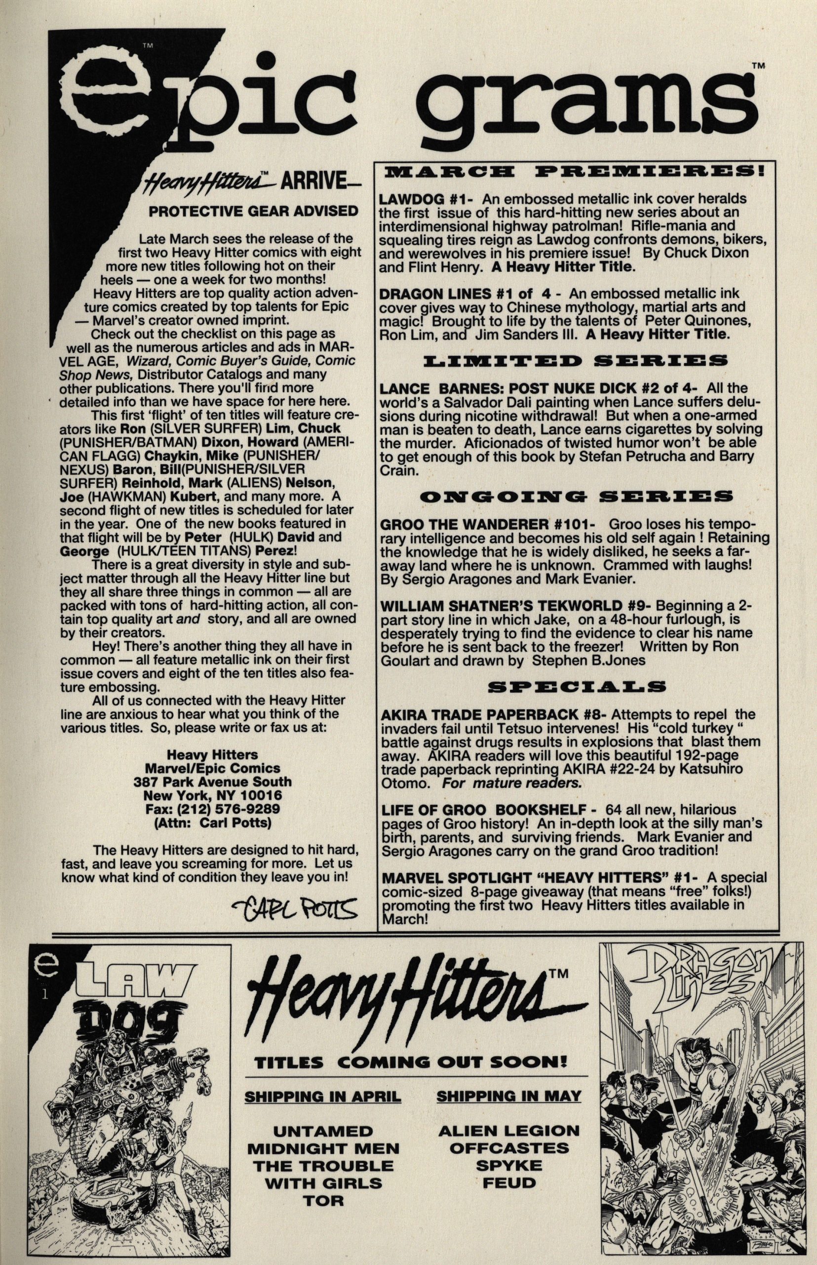
You can’t fault Marvel’s launch of these Heavy Hitters series (and they’re almost all mini-series): For the first “wave”, there’s one new series per week! Marvel wanted to make a splash…
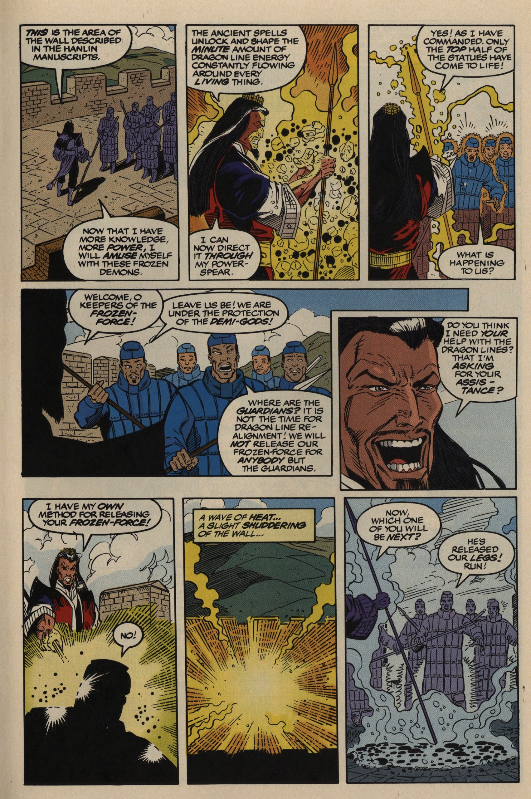
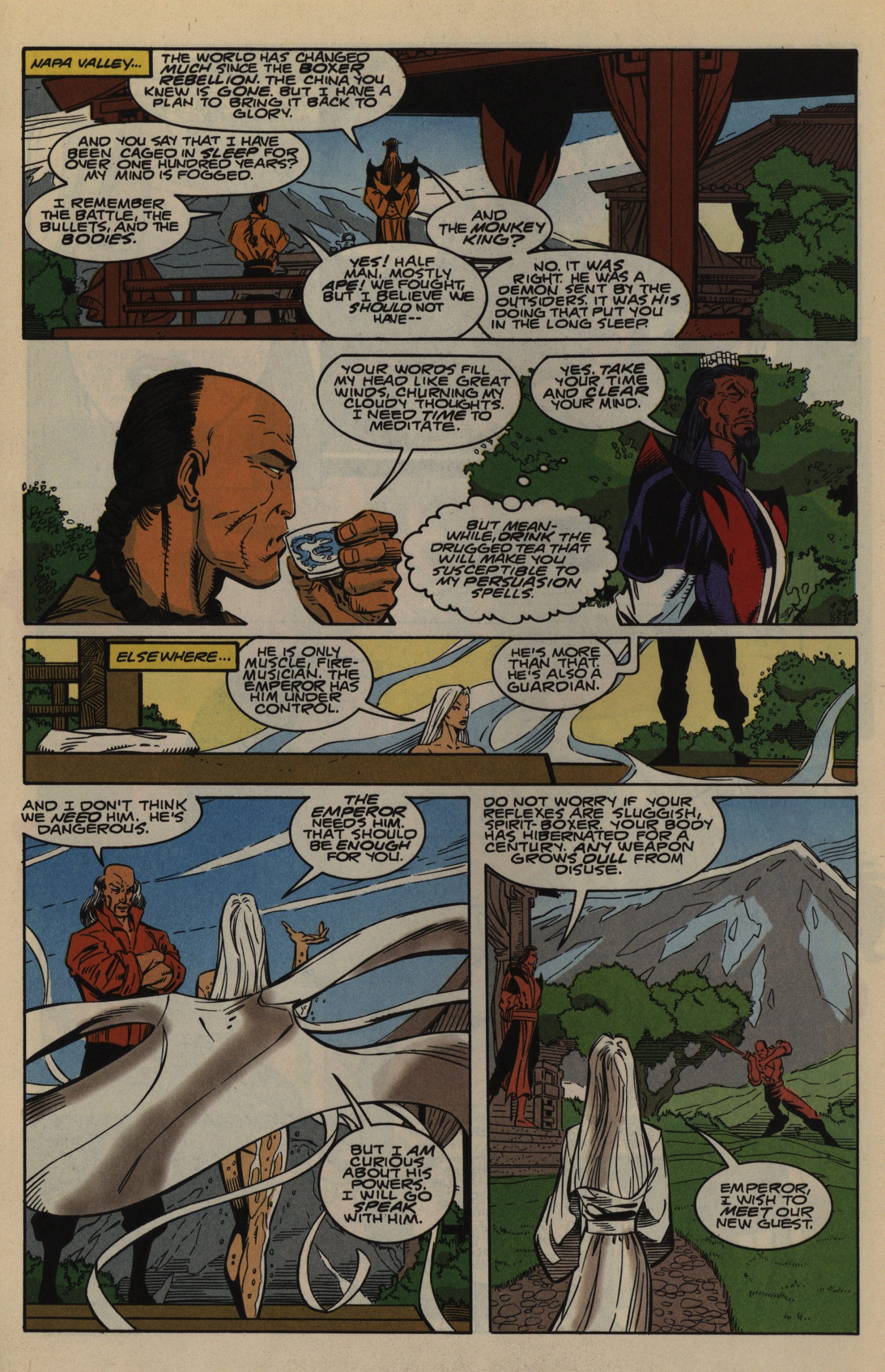
As bizarre evil guys go, the one in the first mini-series is pretty bizarre. “Only the top half of the statues have come to life!” Sure, whatever gets you through the day…
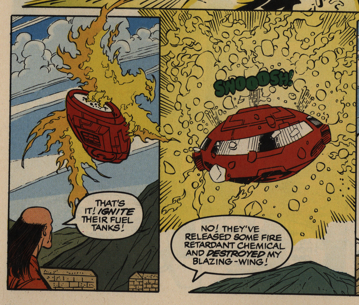
There’s so many lame micro-action scenes. How’s that for setting up tension and resolving it? Very… efficient? Yeah. Efficient. I think that’s the right word.
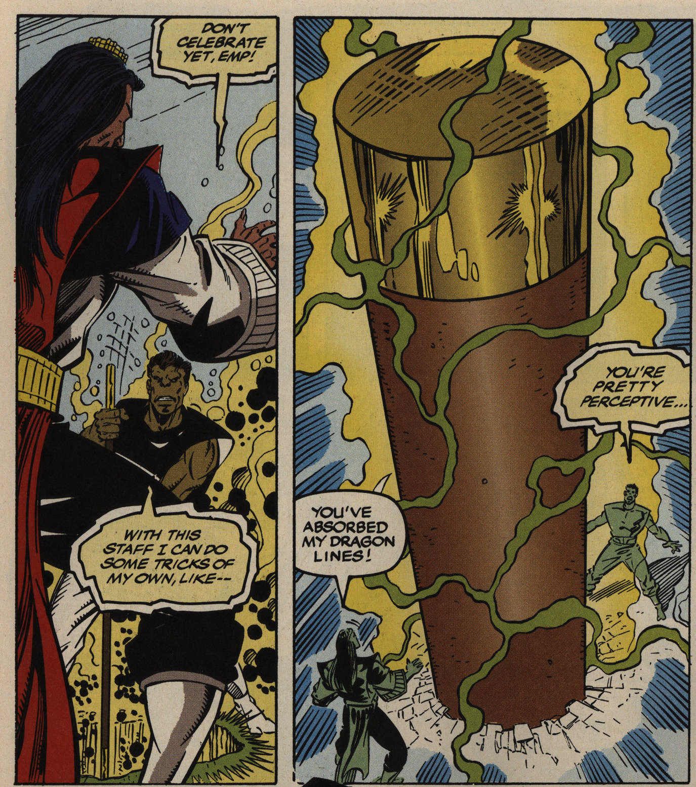
Oh, yeah, the hero has a “magic staff” that can do tricks. Here we see his staff getting engorged. I’m sure any angles and placement between heroic stances is purely coincidental.
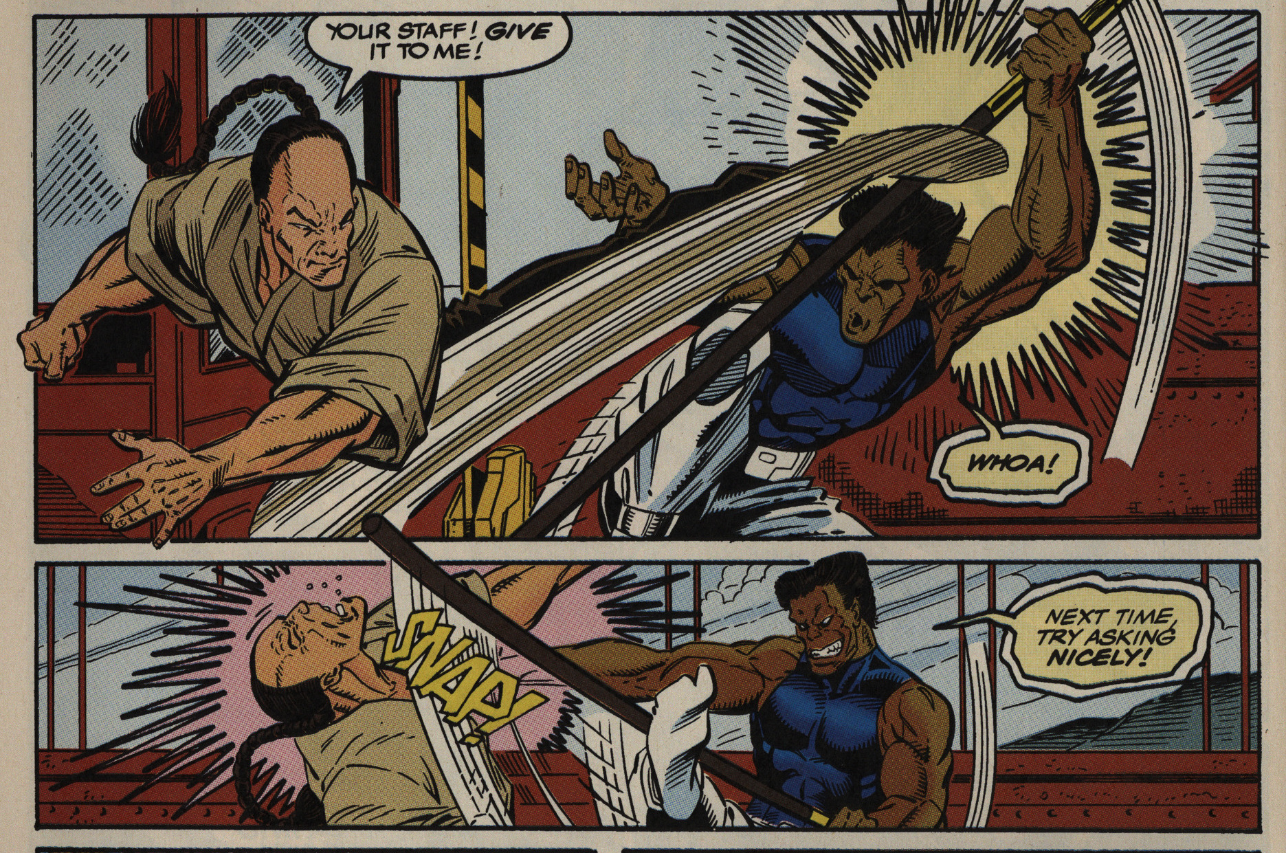
People sure are thirsty for that staff.
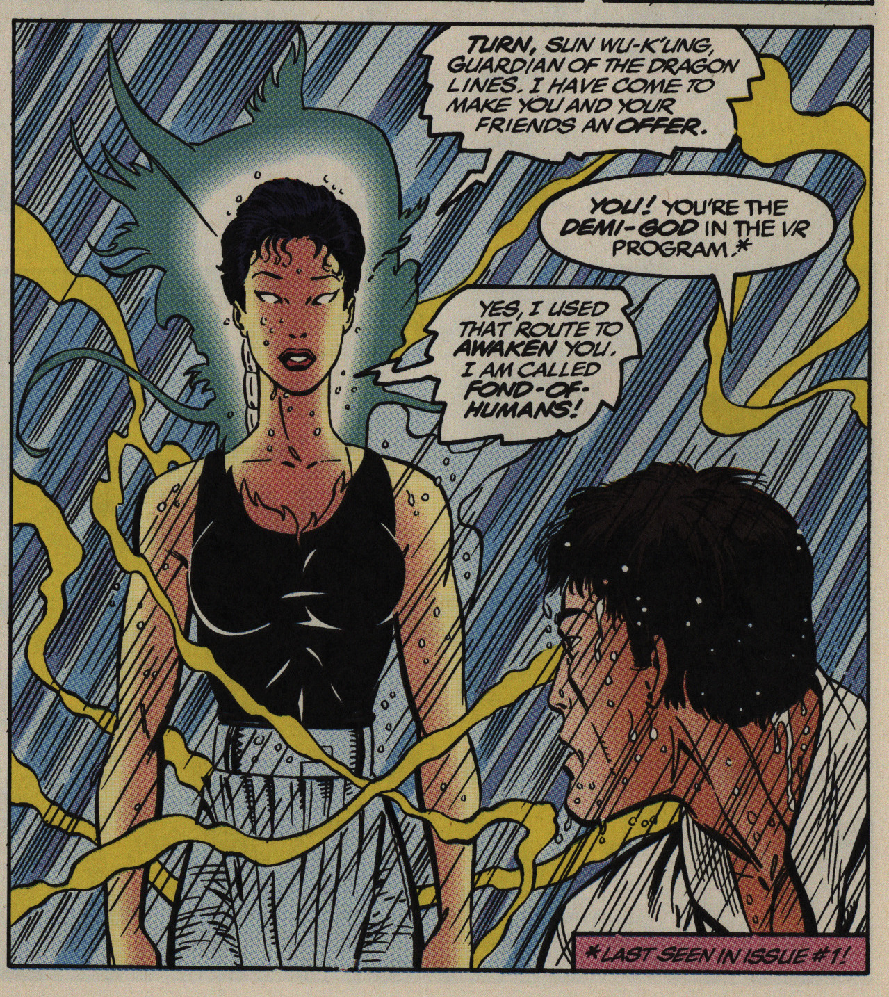
It is really hard to parse how this is to be read. Is it supposed to be standard-issue super-hero action with attempts at snappy repartee (ages 9-13), or is it supposed to be “ha ha” funny? I mean… “Fond-Of-Humans”?
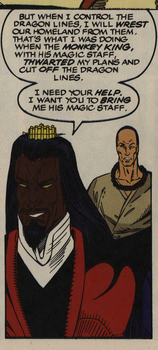
Suddenly the colourist decided that the villain is black?
Anyway, the first mini-series was a total bore.
Perhaps the second one, released later in the year, will be better?
Somehow it doesn’t seem like Marvel is that confident in the new Epic branding any more, which I take to mean that the Heavy Hitters comics aren’t selling very well.
The writing in the second series is better than the first, but that’s not saying much. I have to say that the artwork is pretty appealing, though, as these things go.
But then we come to the real selling point here: All the Heavy Hitters comics now have trading cards!
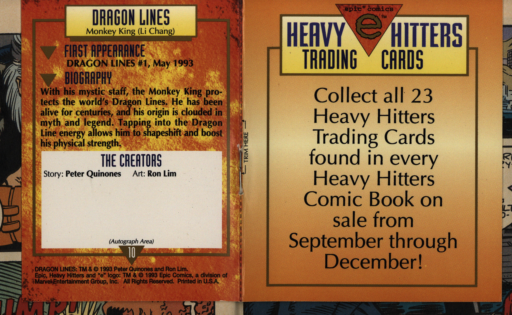
As a nice touch, they have room on the back for collecting autographs.
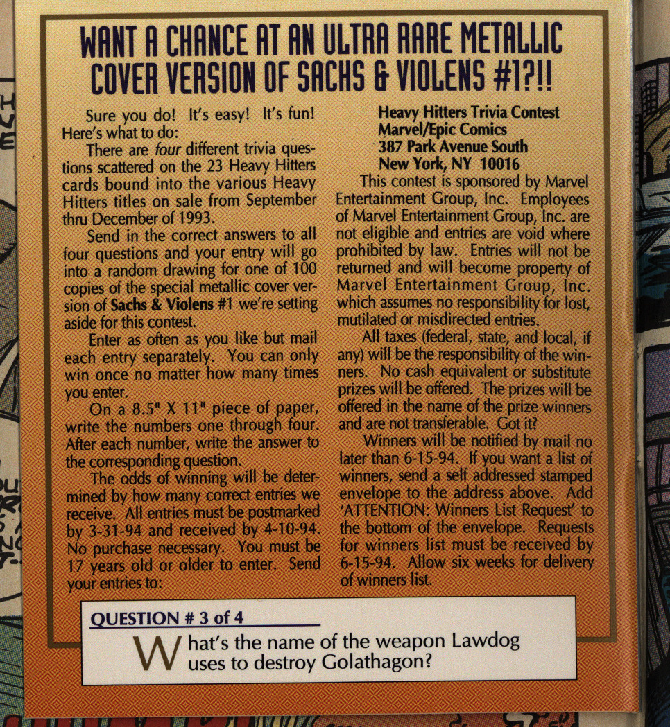
And there’s a competition (asking questions about characters from other Epic books; nice touch).
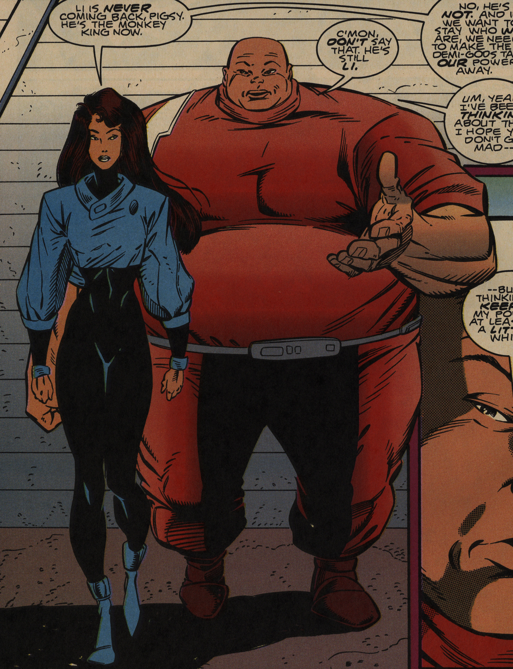
Very diverse character design! And I see that Lim has now adjusted his foot rendering to be more in line with the Image standard.
The writer attempts witty repartee throughout, and I think this is the best one. I like it.
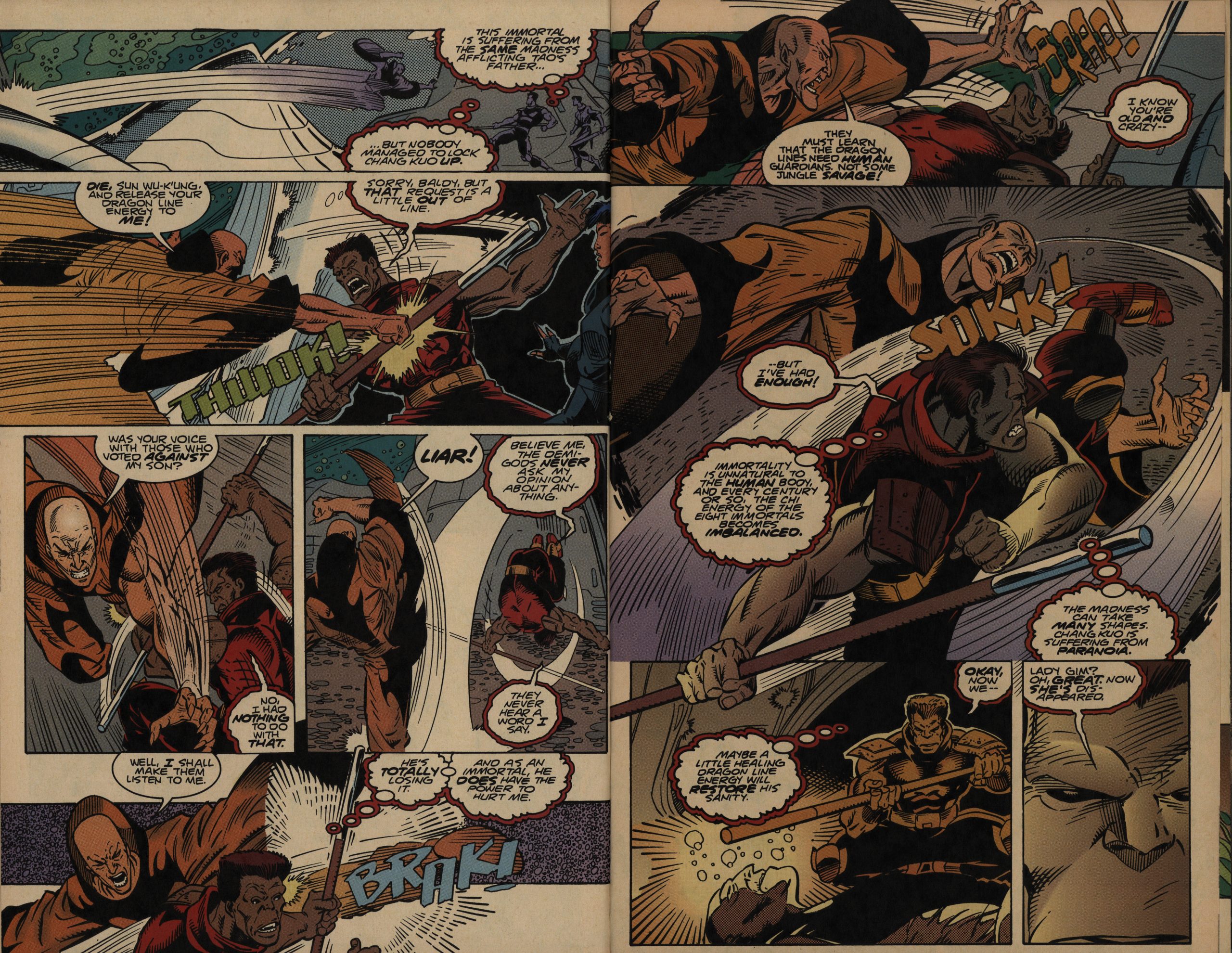
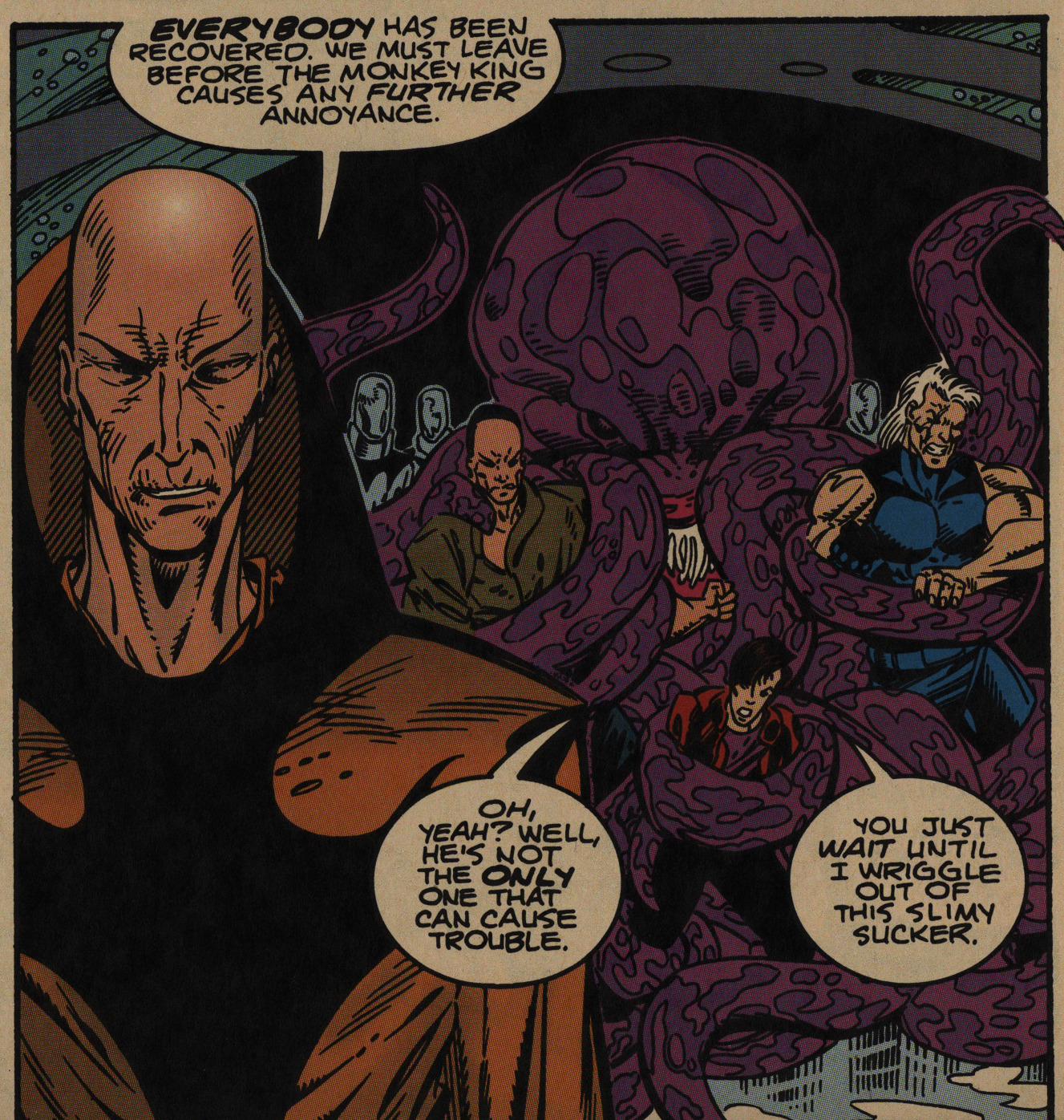
The writing probably isn’t the point here, though, as well-rendered fight scenes are what was selling in 1993. And Lim does render each panel attractively, but I don’t really get much sense of the choreography of the fight scenes. It’s hard to tell where are, or even what positions they have in relation to each other, which is a shame.
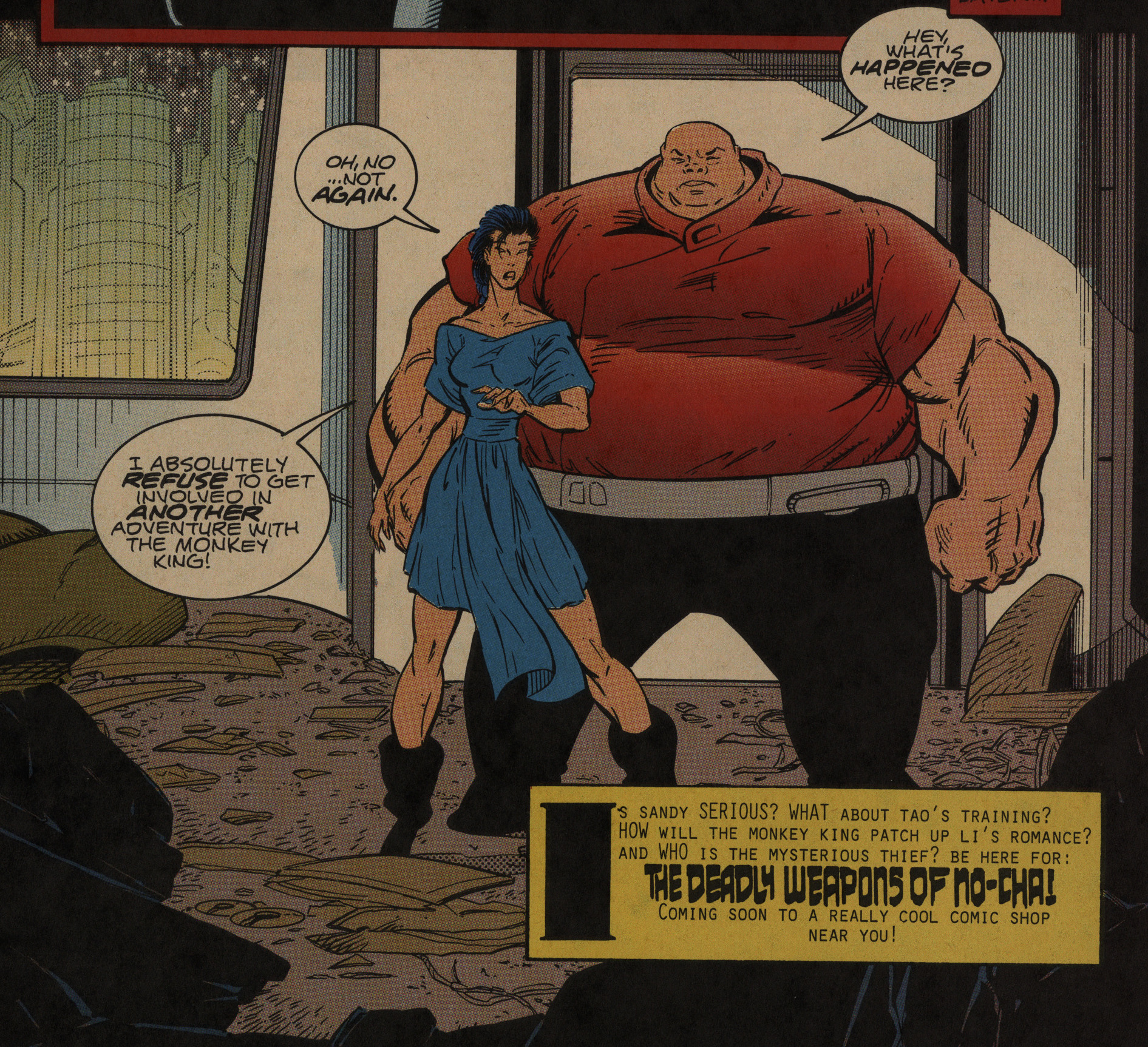
I didn’t really follow the plot of the second series at all; it was pretty messy. But we’re told that there’ll be something called The Deadly Weapons of No-Cha! coming up… in a type face used nowhere else in the book, so I’m guessing it’s a last-minute substitution for something else.
I can find no trace of that phrase on the interwebs, so I’m guessing it never happened.
It doesn’t look like Dragon Lines was ever reprinted or collected.
It’s almost impossible to find anybody talking about this series on the net, but here’s somebody:
His Dragon Lines was a bit of a disapointment. Wasn’t that the one with a modernised Monkey King? It was tooo Super-heroish & lacked alot of the Chinese/asian design sensibilites that really stand out in the Jade-man stuff & some of those recient films…
So I’m guessing the book wasn’t a major hit.