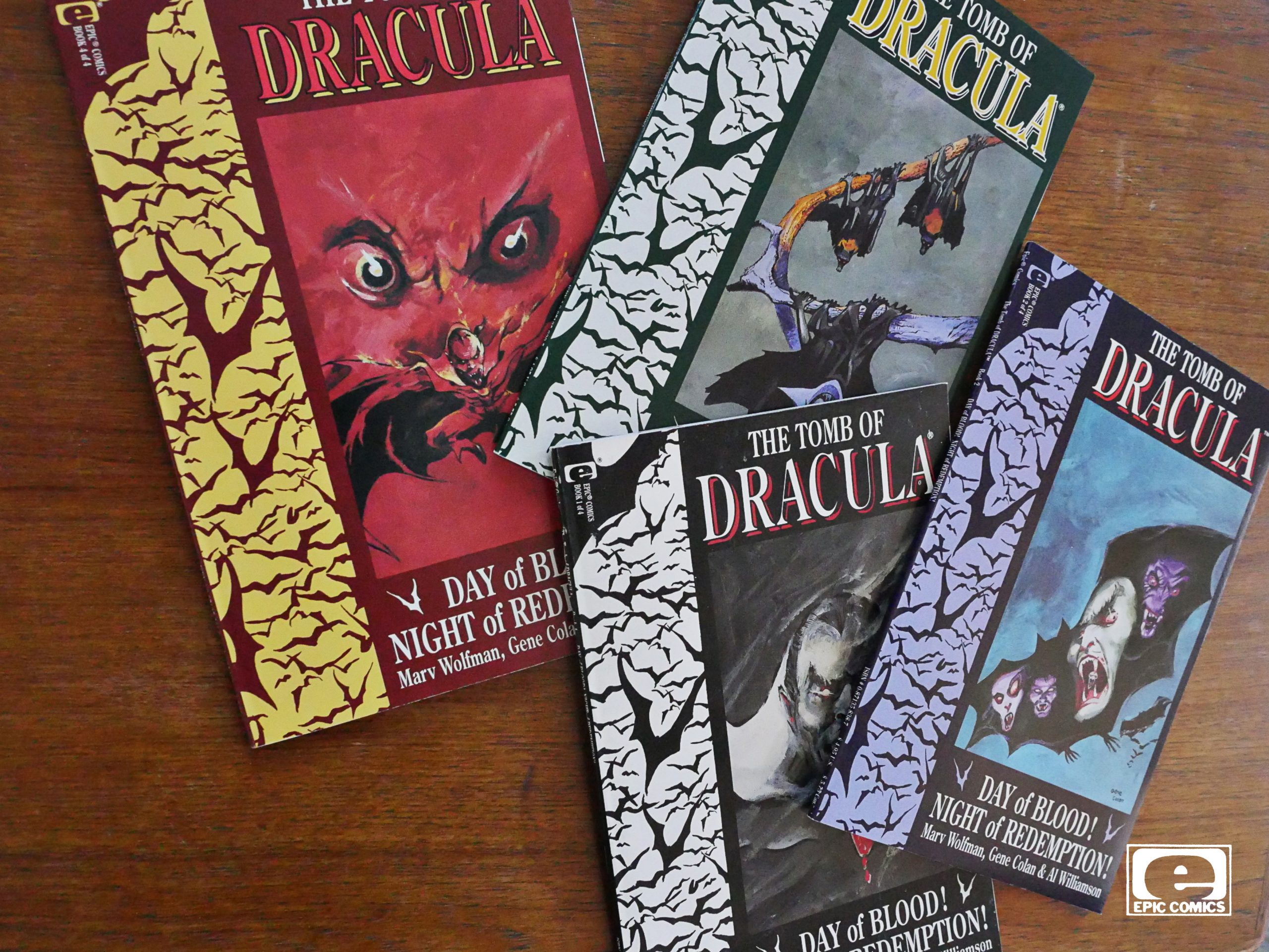
Tomb of Dracula (1991) #1-4
by Marv Wolfman, Gene Colan and Al Williamson
I remember reading Tomb of Dracula (the 70s (?) series) as a child. I remember kinda… liking it? I think it was all kinds of weird? Less of a horror series than a soap opera about this Scooby Gang that tried to kill Dracula for… a lot of issues?
I may be totally off-point here; I haven’t read those comics since I was, like, twelve. But I do remember liking those comics, and I remember the artwork by Gene Colan being a real treat. Inked by… Tom… uhm… Palmer? Geez. I remember more than I thought.
Anyway, here’s most of the team back together again, and I’m looking forward to reading these comics.
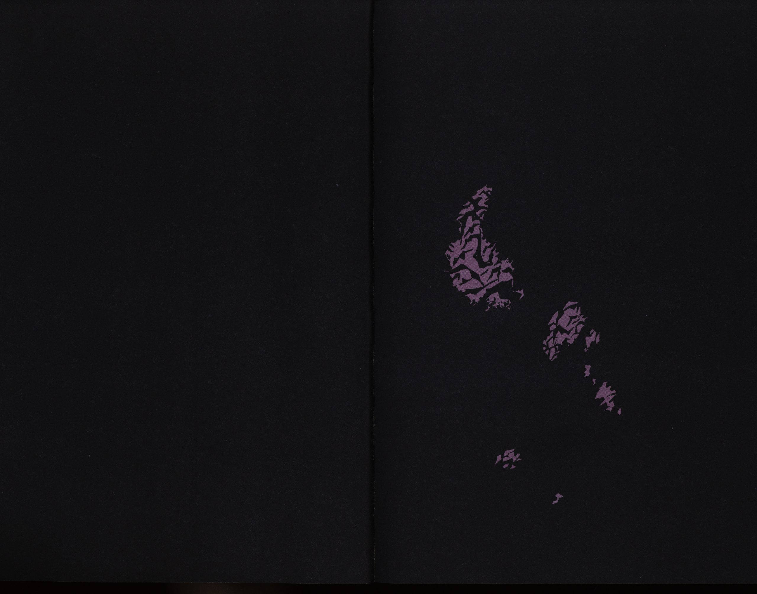
This is a four-issue “prestige” (i.e., squarebound) 48 page series, so with almost 200 pages to go, there’s room for designerly touches like opening with an almost-black two-page spread.
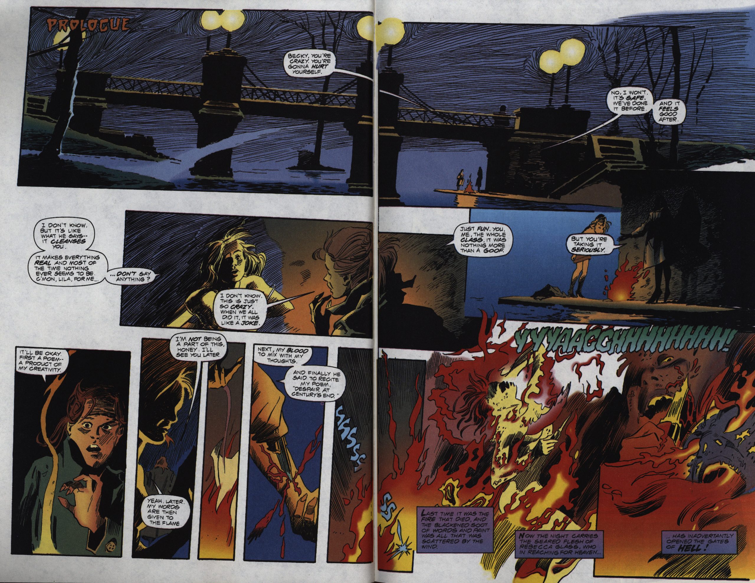
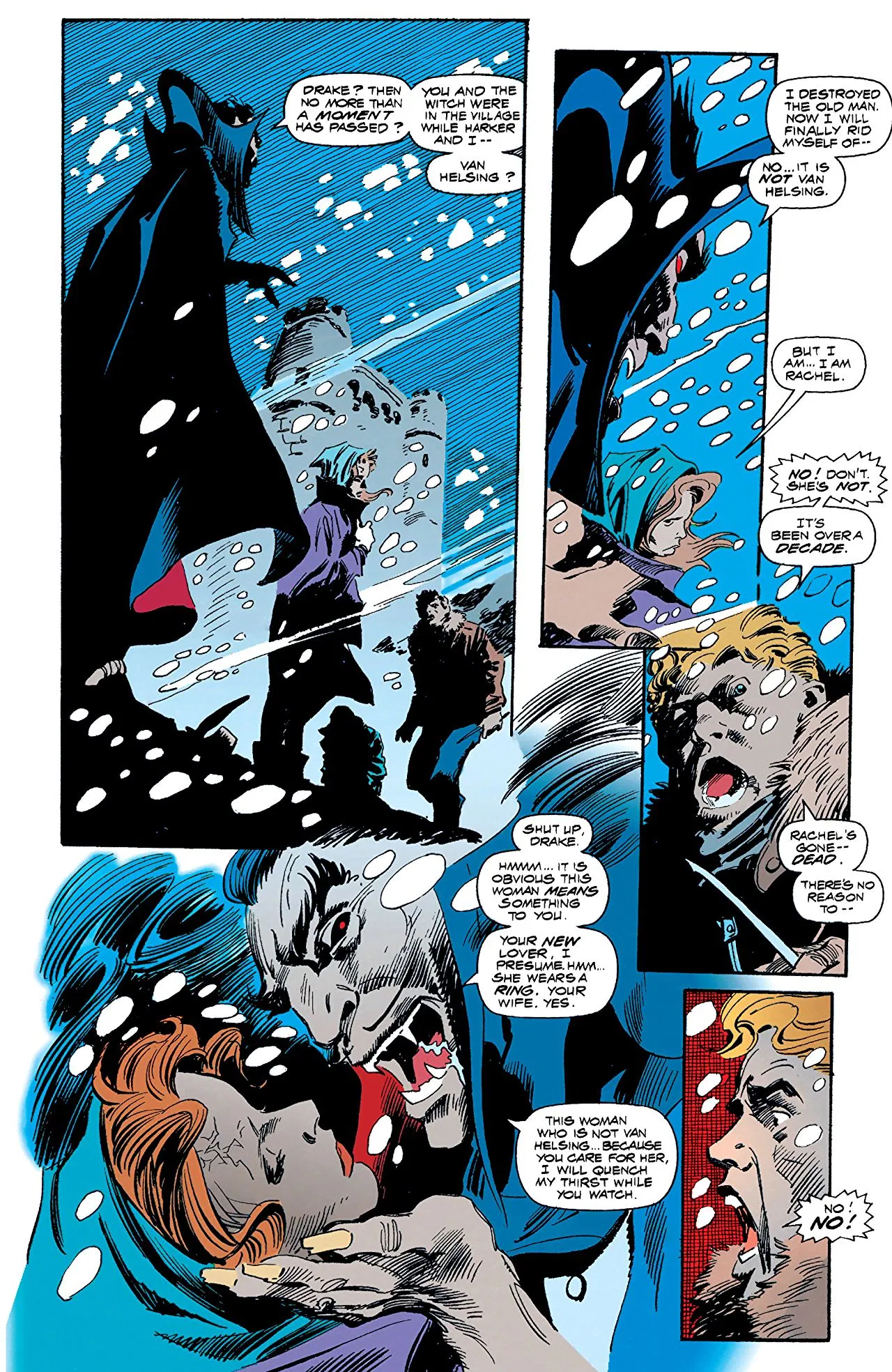
Ah, yes: Colan’s inimitable odd layouts and splashes of black everywhere. Just like I remember, but with better colouring (from Lovern Kindzierski, perhaps best-known for his work with P Craig Russell).
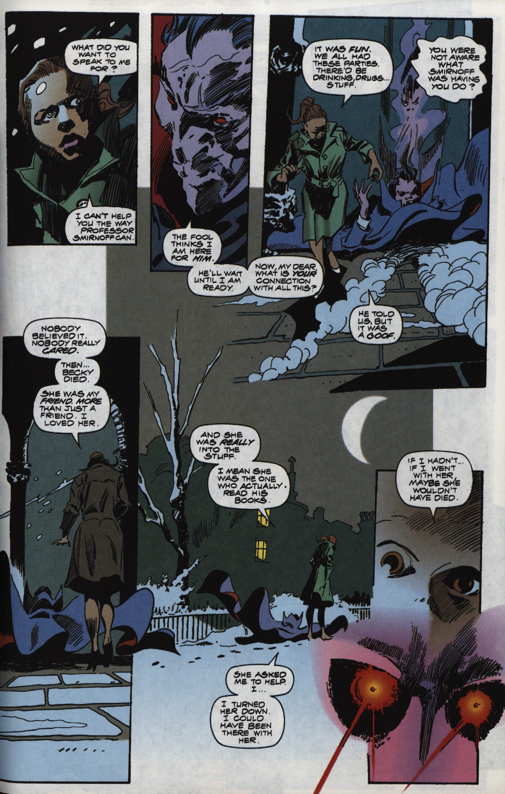
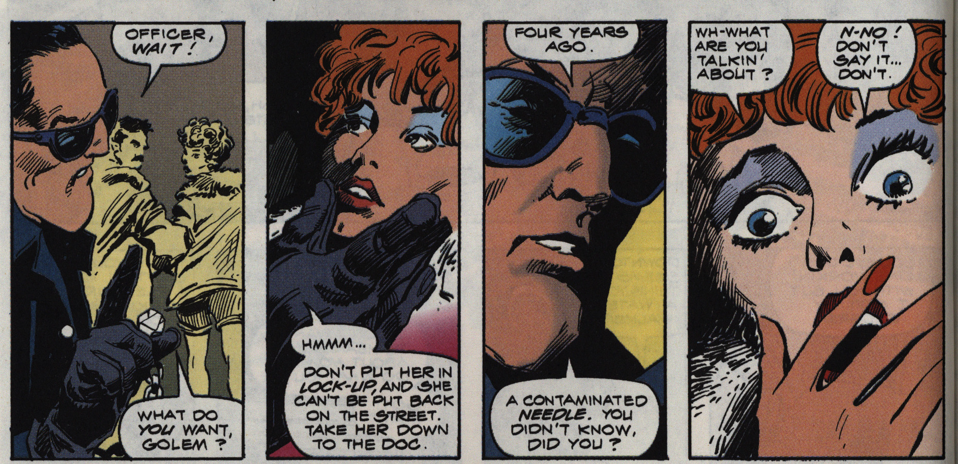
Also note new, more edgy plot points: Here’s a lesbian couple (one killed immediately, the other becomes Dracula’s lover later (and then killed)).
*sigh*

That’s a weird-looking rat. Anyway, we’re dropped straight into a vague kind of nightmarish setting with an mysterious professor who’s probably up to no good, and nothing much is explained, and we do not get a recap of what happened in the 70s series. Which I like. I do wonder whether I’m supposed to recognise some (or all) of these characters, though.
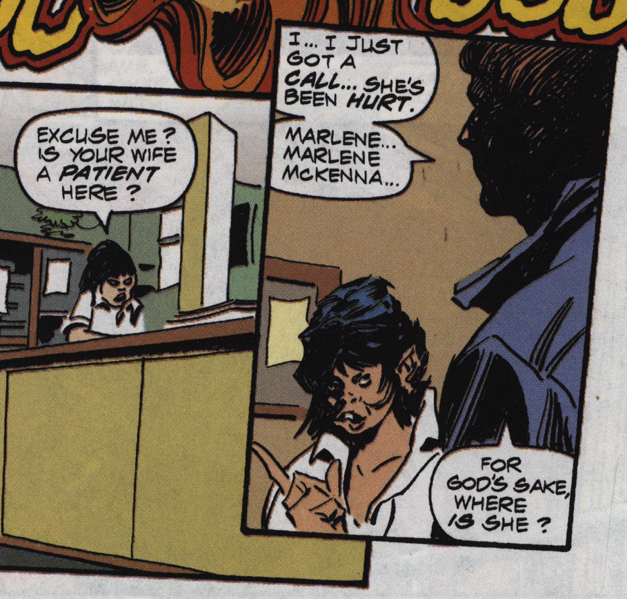
That’s not supposed to be a monster — it’s just a random nurse, and somewhat illustrates the problem of having an inker that’s as sharp and precise doing his work over a penciller that’s as vague and (well) impressionistic as Colan: I assume that she didn’t look that weird in the pencils, but looked more like a sketch of a face, and then Williamson picked a random pencil line to ink, and there you are.
Kindzierski has a similar problem when choosing where to taper off people’s heads — Colan often just draws the faces and then some hair over the faces and then things taper off into fog, but Kindzierski often just fills out the panels to the edges with whatever hair colour is going on. Sometimes it just looks odd.
Several publishers tried to print Colan’s pencils uninked in the 80s to varying degrees of success, and that’s very understandable, because his pencils are lovely in all their miasma of feverish Gothic scribbliness, and trying to pin them down in a more precise manner is sometimes less than satisfying.
OK, after a while we start getting some infodumps and (re-)introductions to a bunch of characters, so I guess we weren’t really supposed to remember who everybody was from the 70s.
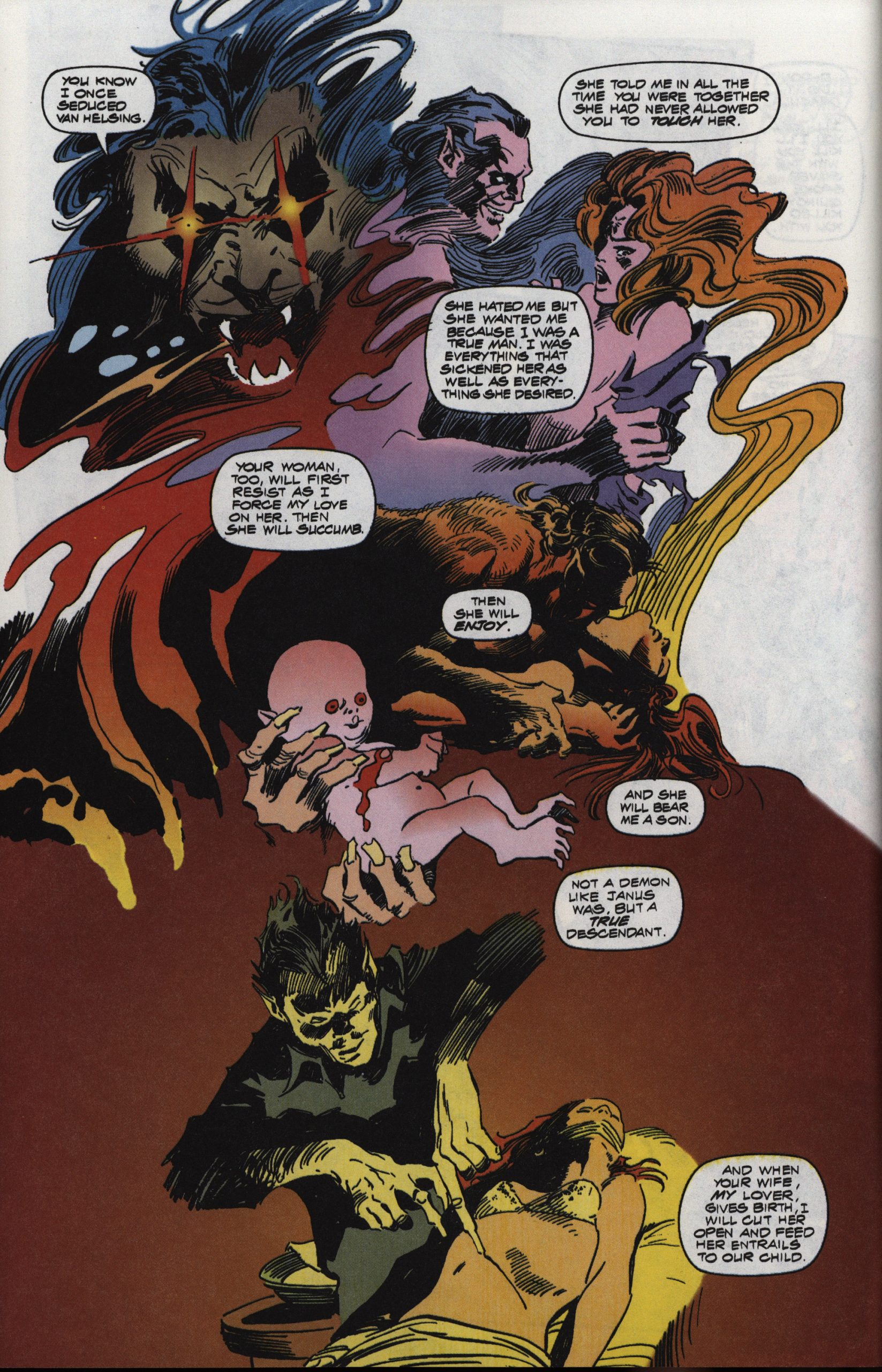
It’s like… Dracula’s not a nice guy here, eh?
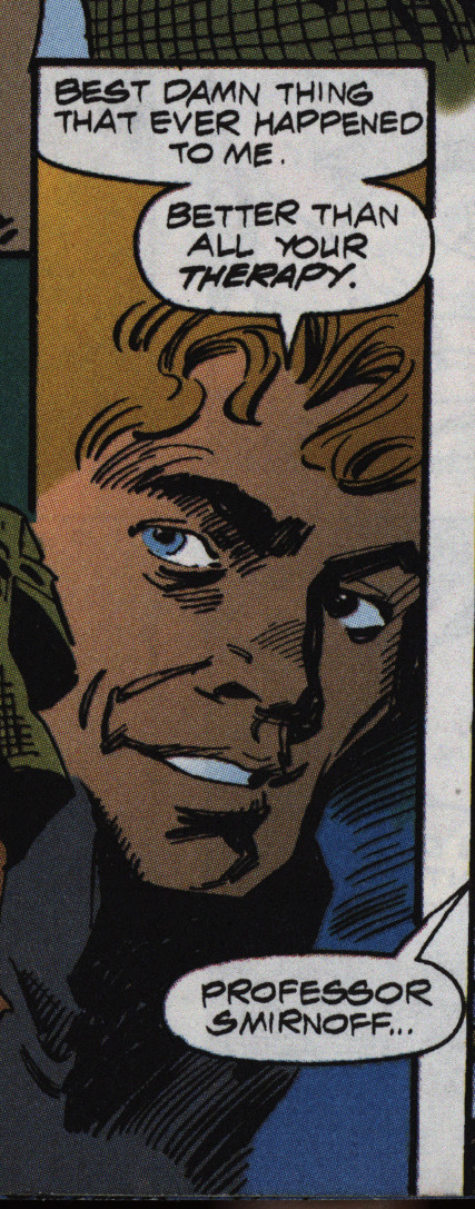
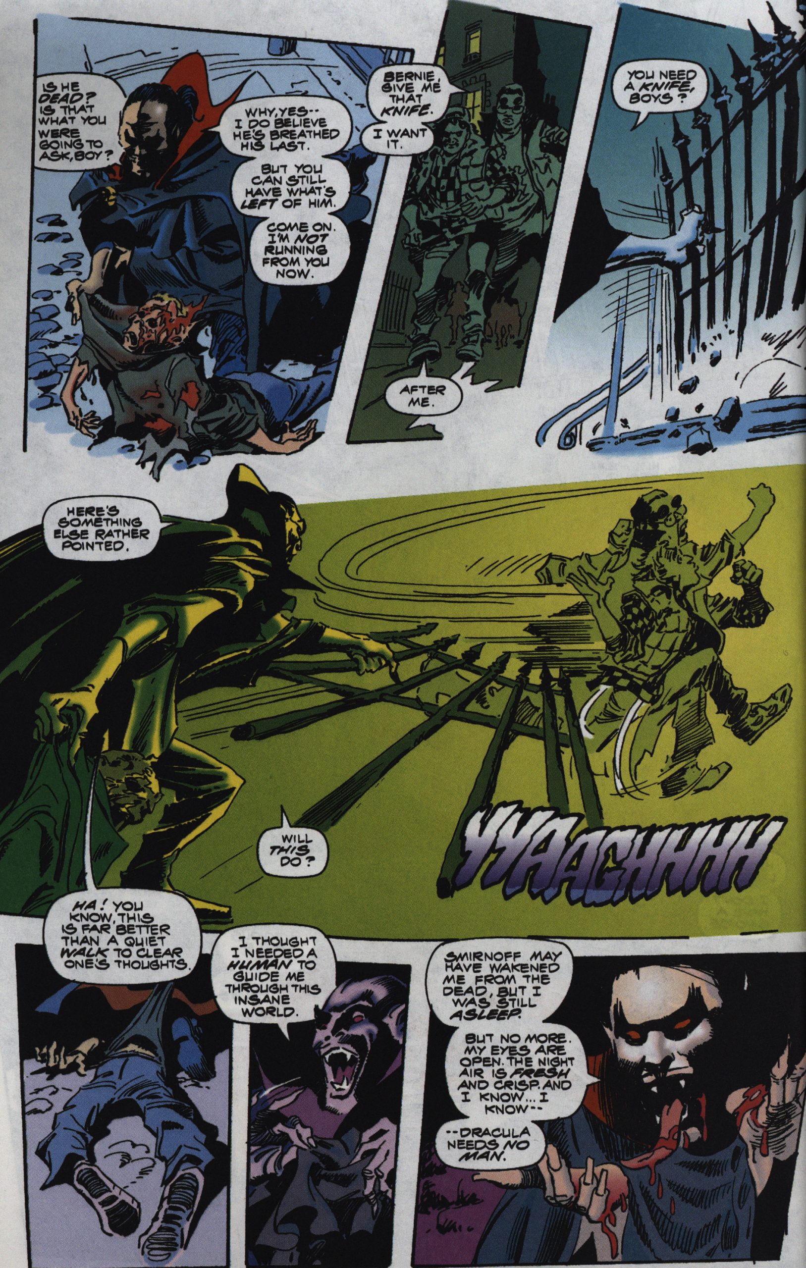
Oh, right, Blade…
I did enjoy this book to start with, but it’s like everything has to be so intense all the time that it starts to lose tension. Blade is always smacking the other people around, even if they’re on the same side, for instance, at it gets tiring.
The strangeness is also unrelenting, but I kinda like that. I mean, why did Dracula make most of his body into fog and then just have his head float near the ground in that scene? I don’t know? I guess Colan just wanted to draw it that way?
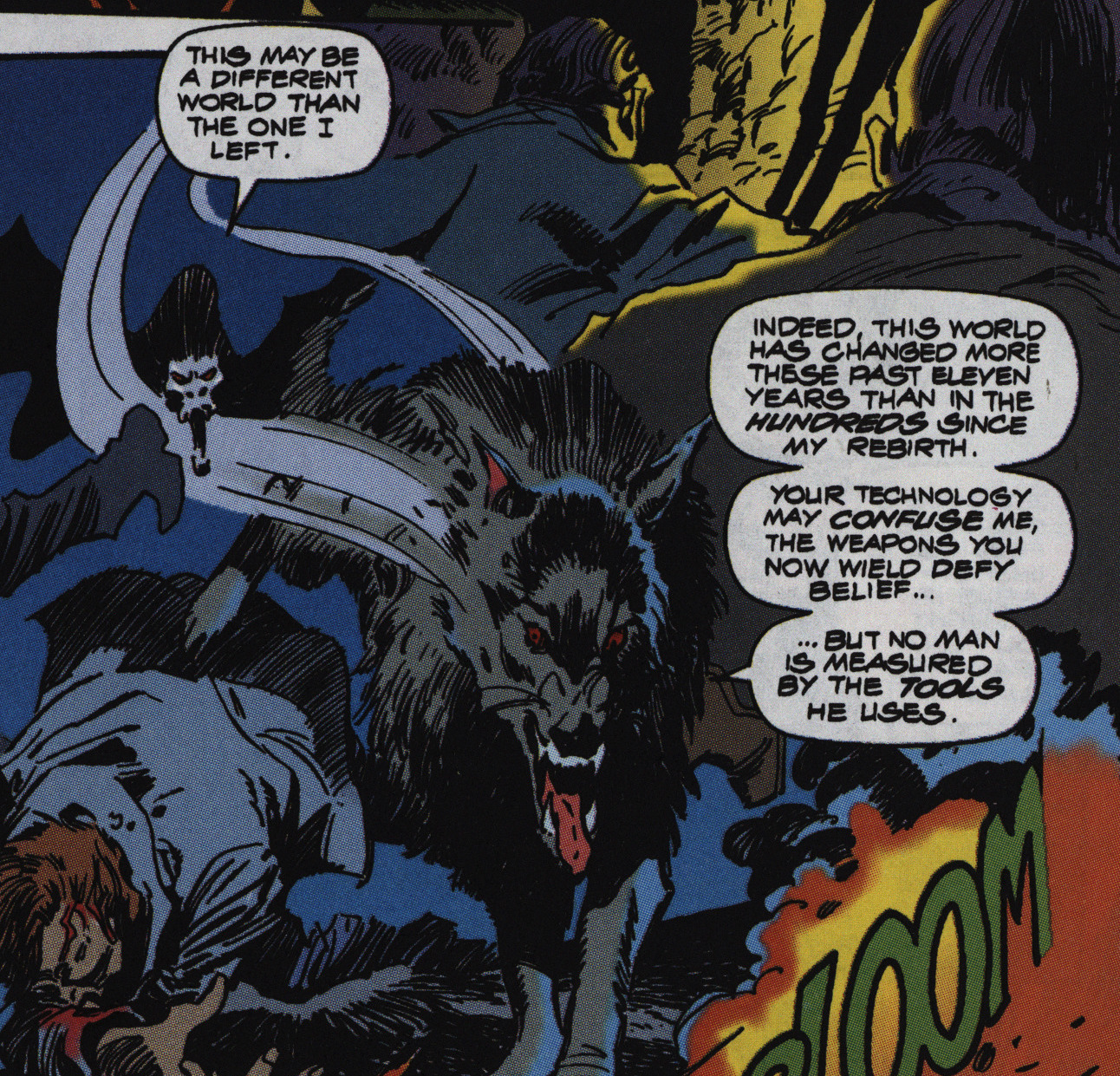
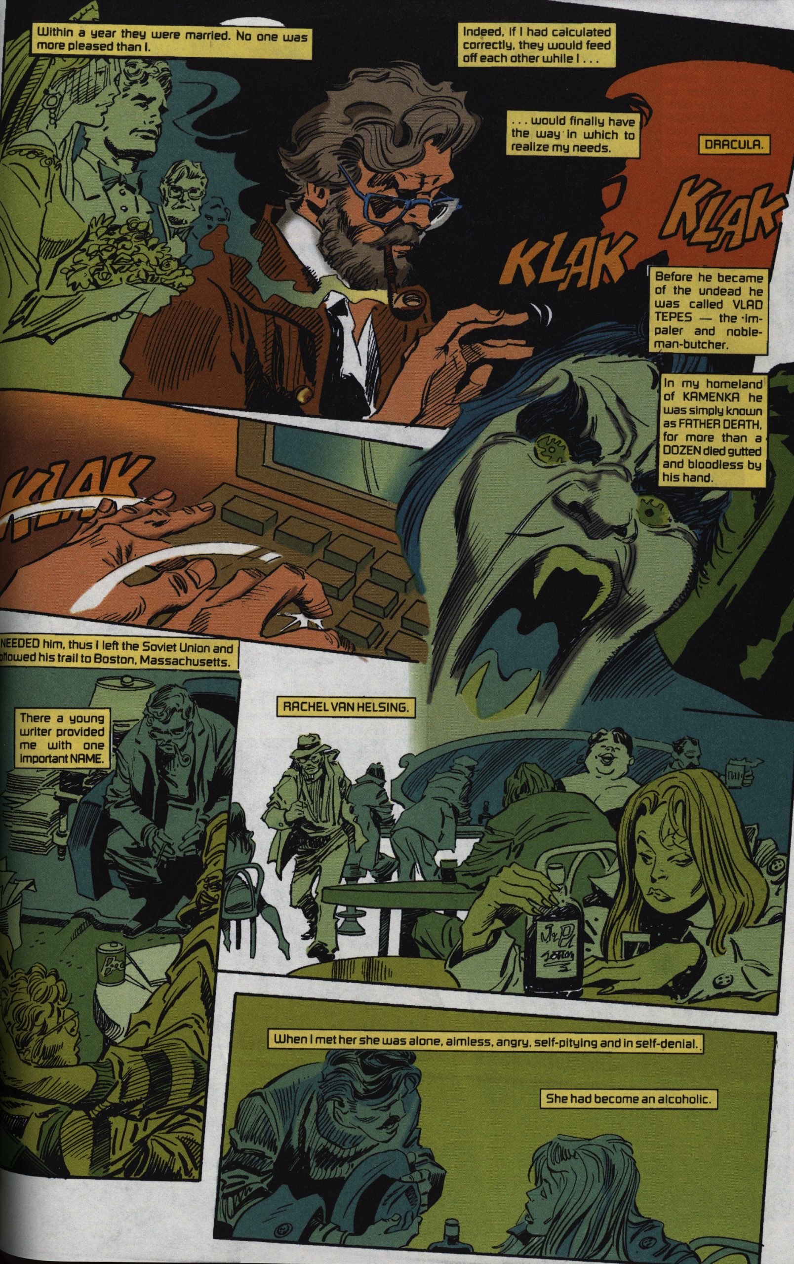
This plot point is harped upon again and again: More has changed since Dracula was last alive (in the 70s) than now, eleven years later, than has changed since he became a vampire in the 1500s. Let’s see… that’s the end of feudalism, the industrial revolution, a couple world wars…. That’s less of a change than from 1979 to 1990? That’s… let’s see… VHS rental stores… video games… the PC… The CD player?
Is this comic really about how Marv Wolfman isn’t able to set the clock on his CD player and he’s unhappy about how he’s not able to set the clock on his CD player?
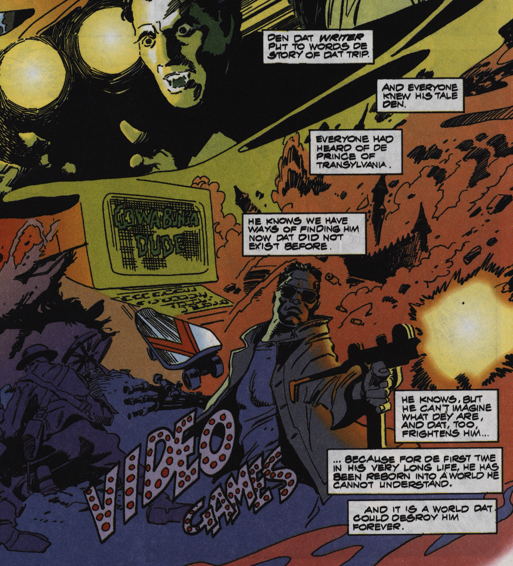
YES! YES IT IS! LOOK AT ALL THE THINGS THAT HAVE CHANGED AND NOW MAKE IT IMPOSSIBLE FOR DRACULA TO SURVIVE IN THESE MODERN TIMES!
Video games and skateboards.
And… robots firing guns? Was that a part of the 80s I didn’t live through?
I like that slapstick run-away-thing. But does Dracula’s tongue grow ever longer?
The story is a bit of a mess. Not much really happens, and what Our Heroes do doesn’t really matter that much, because Dracula blows himself up. (OOPS! SPOILERS!) But even more stranger than that is that in the final issue, we’re introduced to this supernatural cop (who can smell AIDS off of hookers; see above) that we spend some time with, who then does… nothing…
Did Wolfman just have some extra pages to fill? Is he setting up a sequel? The final scene seems to point towards it, but it’s still a really shitty set-up.
Jason Sachs writes in Amazing Heroes #200, page 83:
All of this is a long way of coming
to Marvel’s four-issue revival of its
most beloved horror series, Tomb of
Dracula. Featuring terrific character-
ization by Marv Wolfman and spectac-
ularly spooky art by Gene Colan, the
70’s Tomb is a cult classic (no pun
intended). In this age of Clive Barker,
Anne Rice, and Stephen King, bring-
ing back the King of the Undead
seemed to be a great idea. Putting the
original Wolfman/Colan team on the
book must have seemed a natural.
The first two issues aren’t bad. The
plot involves a cult leader bringing
Drac back to life and Dracula coming
to America. It’s not the most original
plotline, but Wolfman handles it with
finesse. Some of the supporting char-
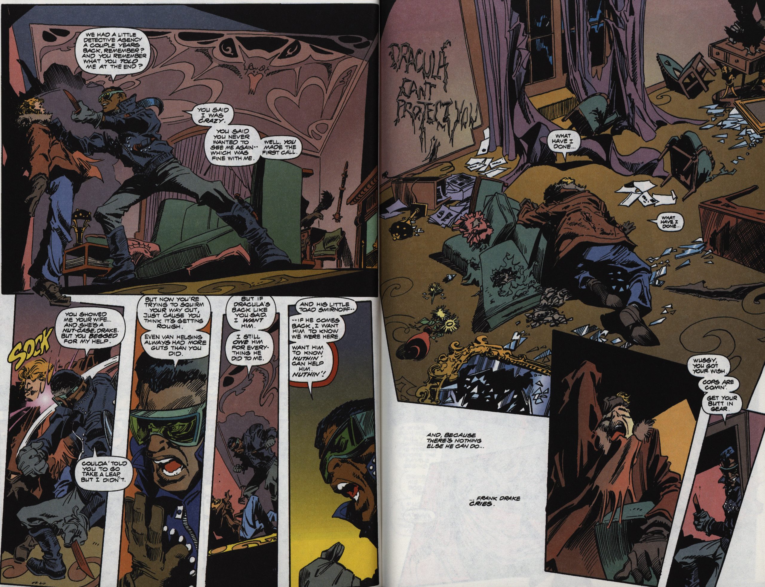
acters, especially Frank Drake, are
weak personalities, but Frank’s whin-
ing doesn’t detract too much from the
book.
Gene Colan’s art is, unfortunately,
somewhat weak. In recent years,
Colan, who has been illustrating
horror comics since the last days of
EC Comics in the 50’s, has gotten
sloppy. Colan, however, is still a
master at making characters seem
peaceful or horrific, and is one of the
finest cartoonists around at conveying
the weight of his characters. Colan
people have mass. When they stand,
they seem to have almost stepped out
of real life and onto the comics page.
However, too many of his characters
seem to have chubby, round faces with
dislocated jaws. And too many panels
are sketchy and hard to decipher.
So Tomb of Dracula is an above
average, not great, horror comic.
Well, that’s fair, I guess.
Marvel finally released a paperback reprinting of this series last year. The colouring seems…
… really bright?
After the somewhat steep curve of understanding and then enjoying the story this book is a lot of fun. It has all the gore and panache of a 70s horror film.
So the basic plot is kind of off. Some characters, like Blade and Dracula himself, don’t really seem like themselves. Gene Colan’s art generally evokes his classic style, but sometimes looks overly cartoony and is often cartoonishly gory. We have the weird lesbian vampire ‘cure’. And a character, Judiah Golem, who is introduced for no reason.