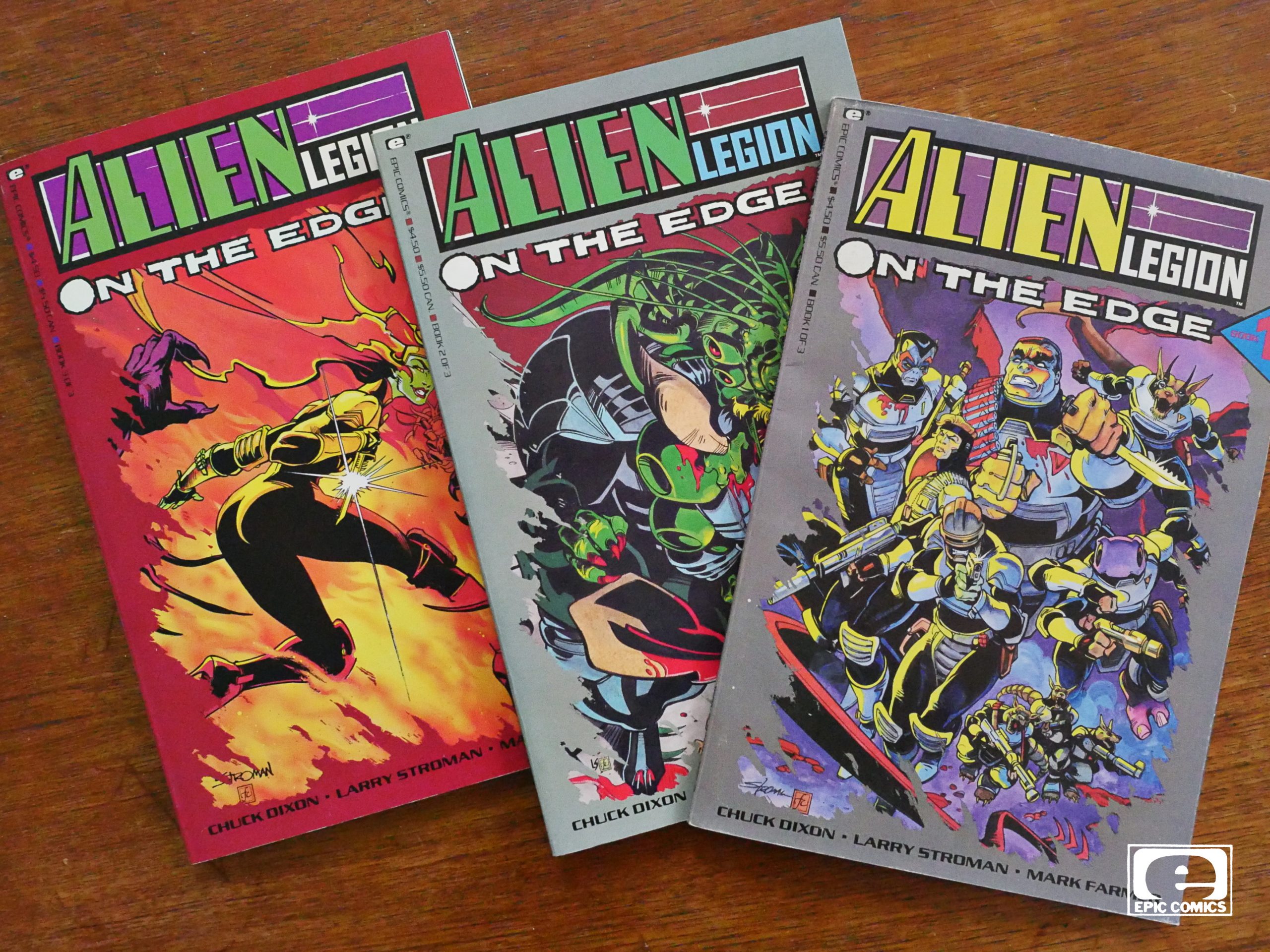
Alien Legion: On the Edge (1990) #1-3,
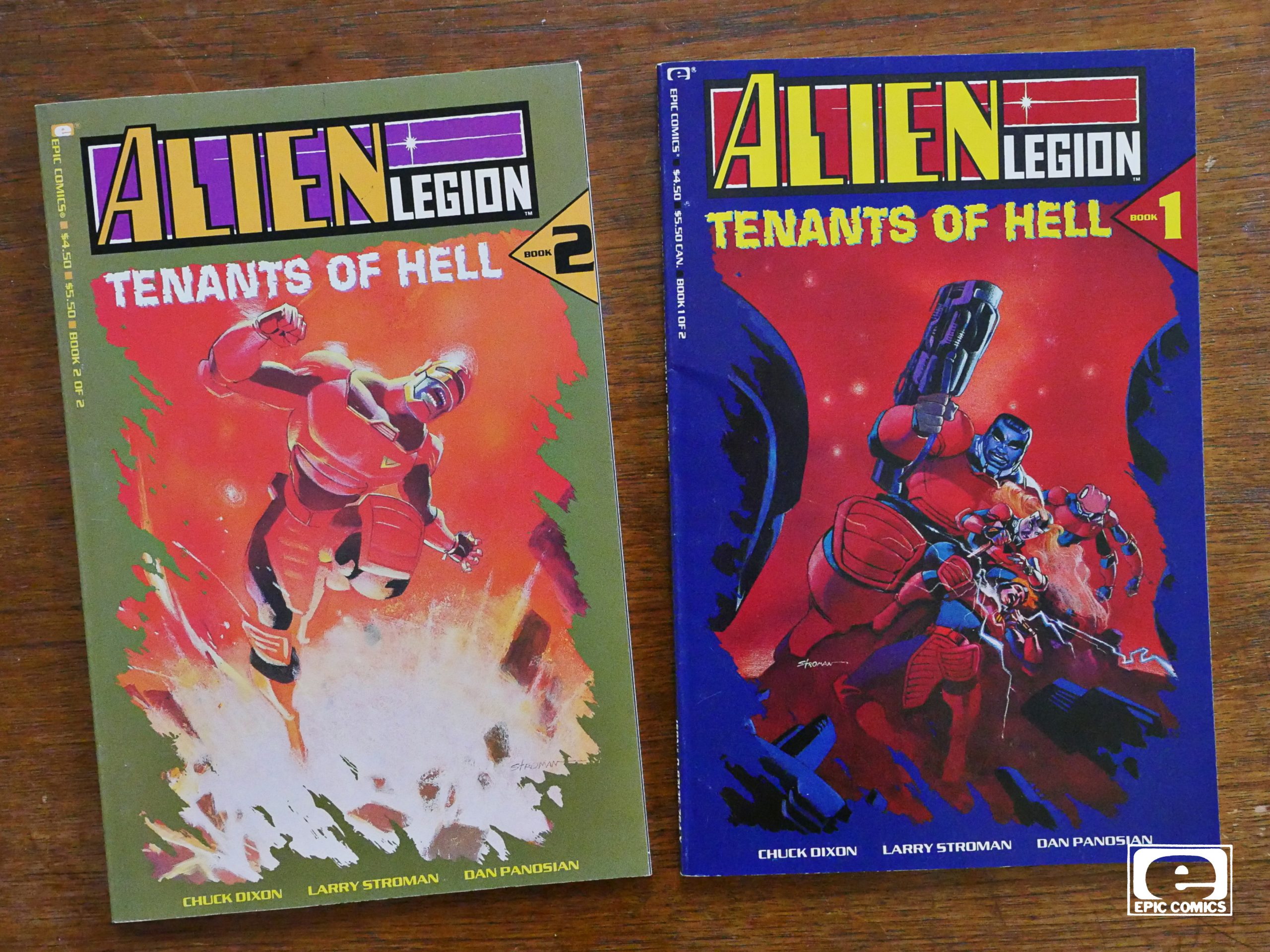
Alien Legion: Tenants of Hell (1991) #1-2,
Alien Legion: Jugger Grimrod (1992),
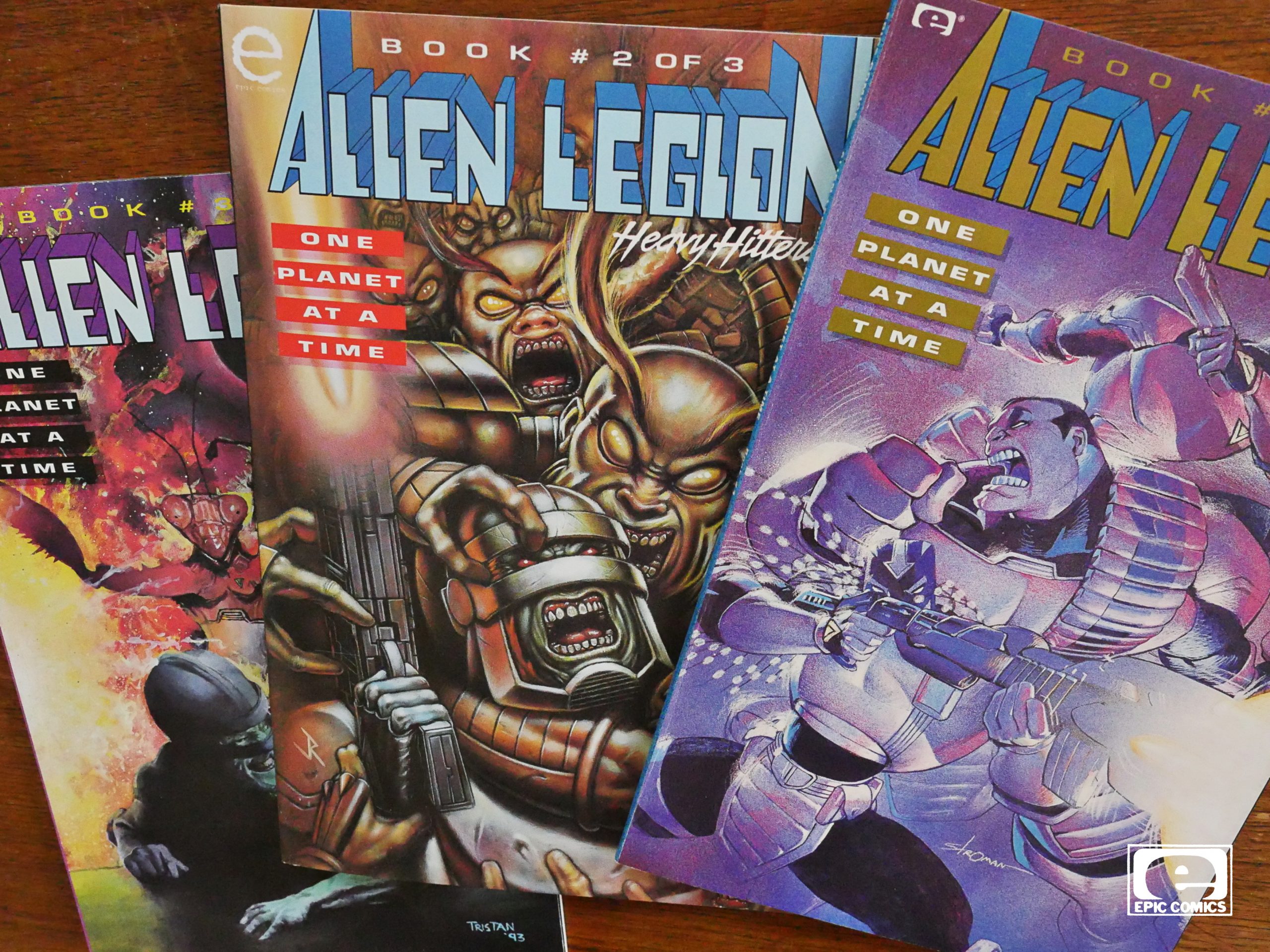
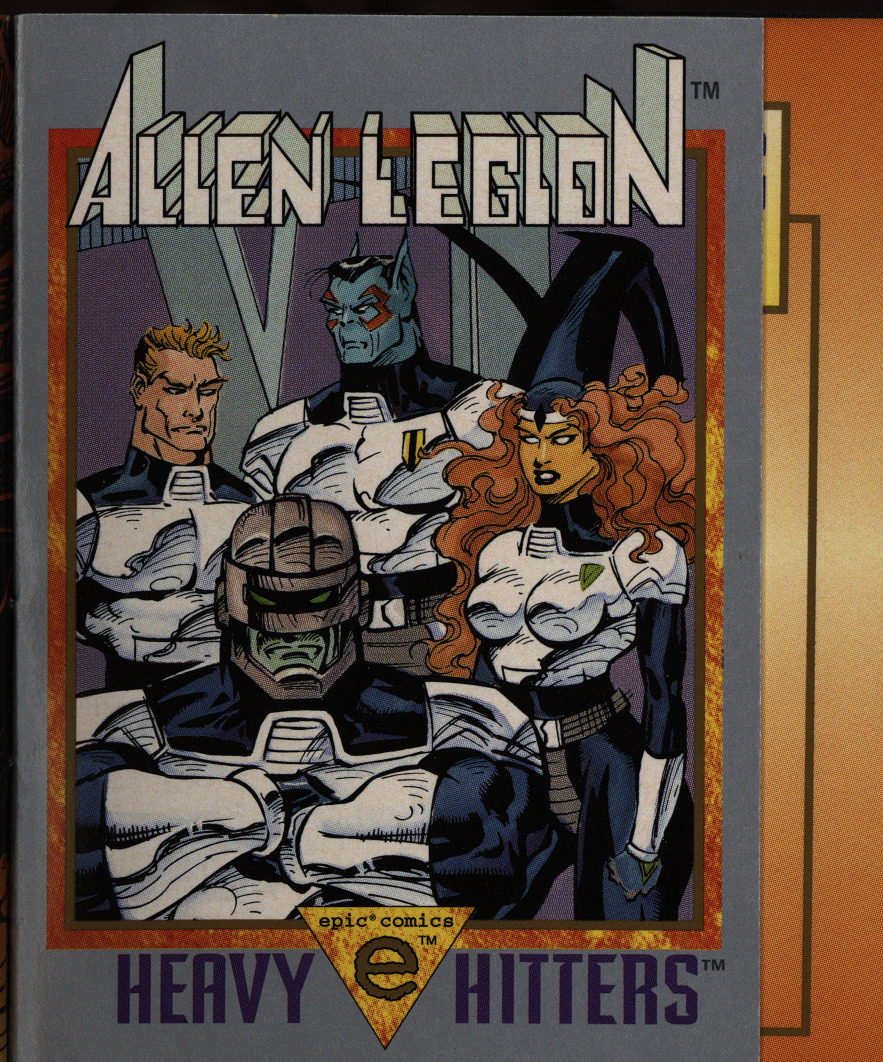
Alien Legion: One Planet at a Time (1993) #1-3,
Alien Legion: Binary Deep (1993)
by Chuck Dixon and others
Man, perhaps I should have called this blog “Alien Legion and Some Other Comics”. I mean, this is the third post about Alien Legion.
To recap: First there was The Alien Legion (quite OK, I think) and then Alien Legion (a grittier reboot; didn’t quite work, I think), and now a series of prestige-format mini-series.
Spoiler: I think this time they nailed it.
One thing that has plagued Epic since the very start is that creators (especially artists) leave pretty quickly. This is really odd since Epic was supposed to be all creator-owned and stuff, but so many things Epic has published start off swell, and then take a dismal turn after somebody else comes after a couple of issues. This happens even on mini-series, which is really odd.
Anyway, after Goodwin left Epic, apparently the new editors (Carl Potts is the new head honcho) have different priorities, and more often than not, we get total consistency, with the entire team (including colourists) staying on for the project.
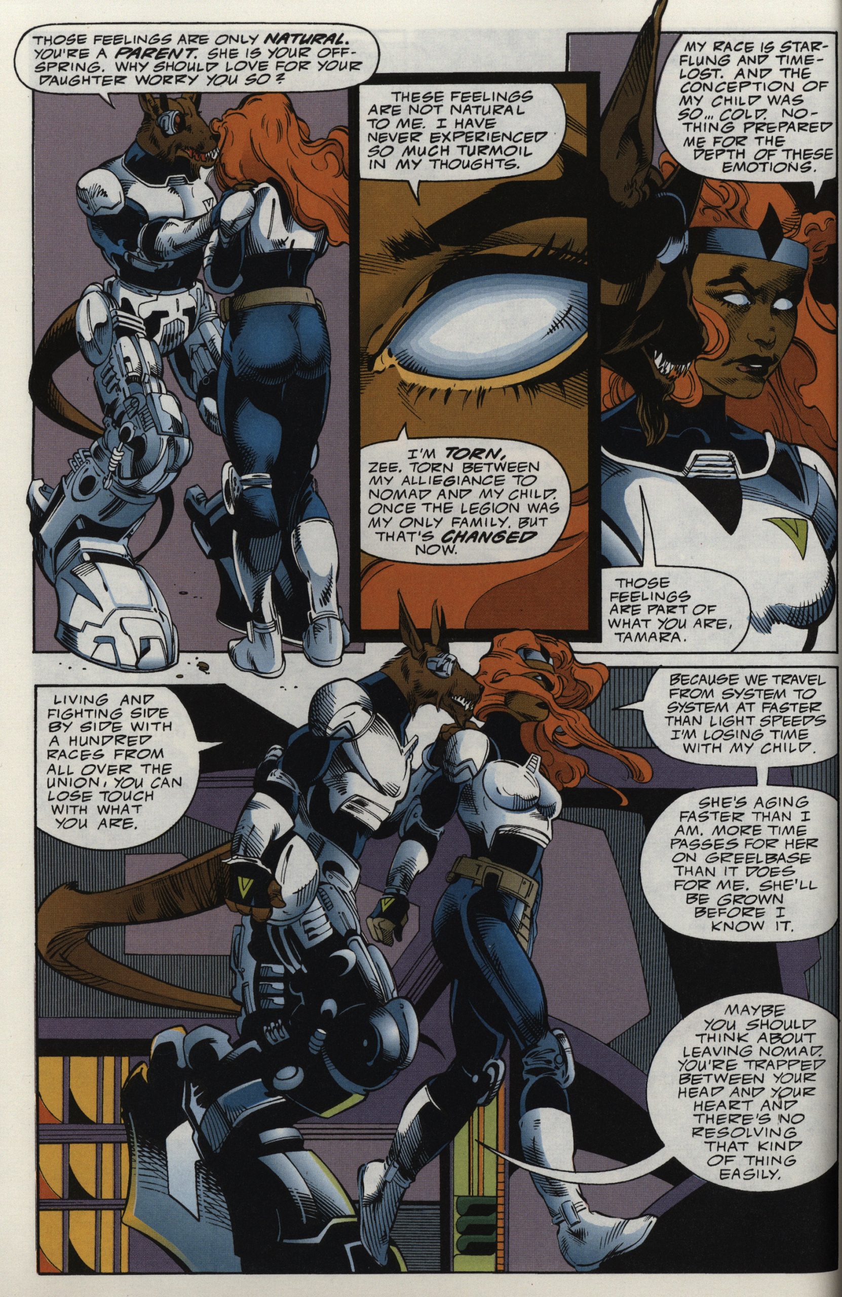
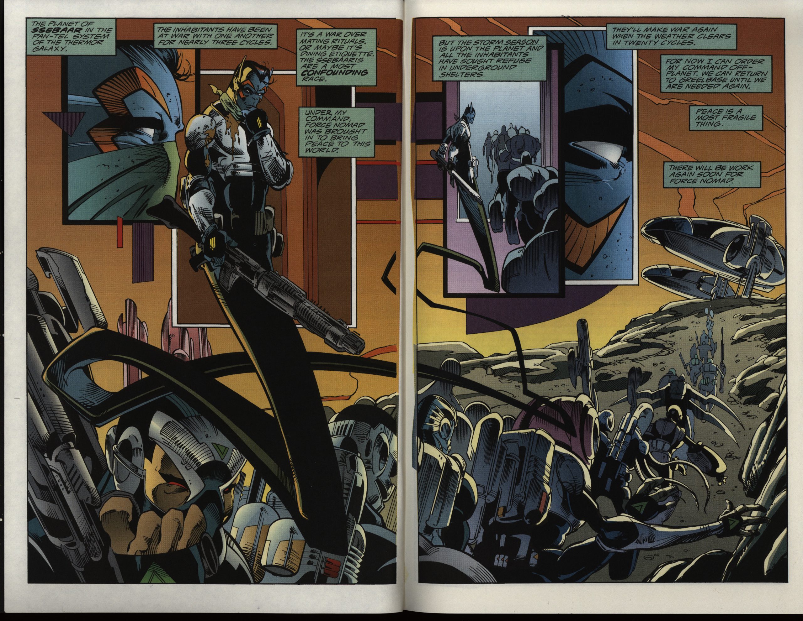
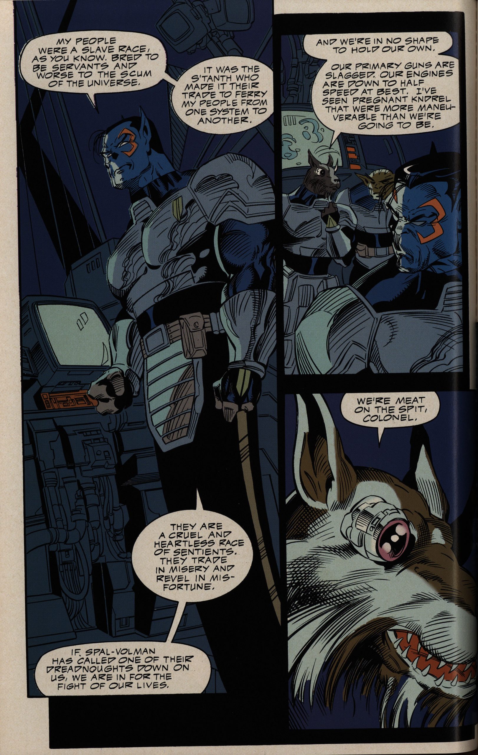
So for this first mini-series (three 48 page “prestige” format books), we get the art team of Larry Stroman, Mark Farmer and Gloria Vasquez, and they’re perfect for the book. They do the soap opera scenes with equal aplomb as the sci-fi action scenes.
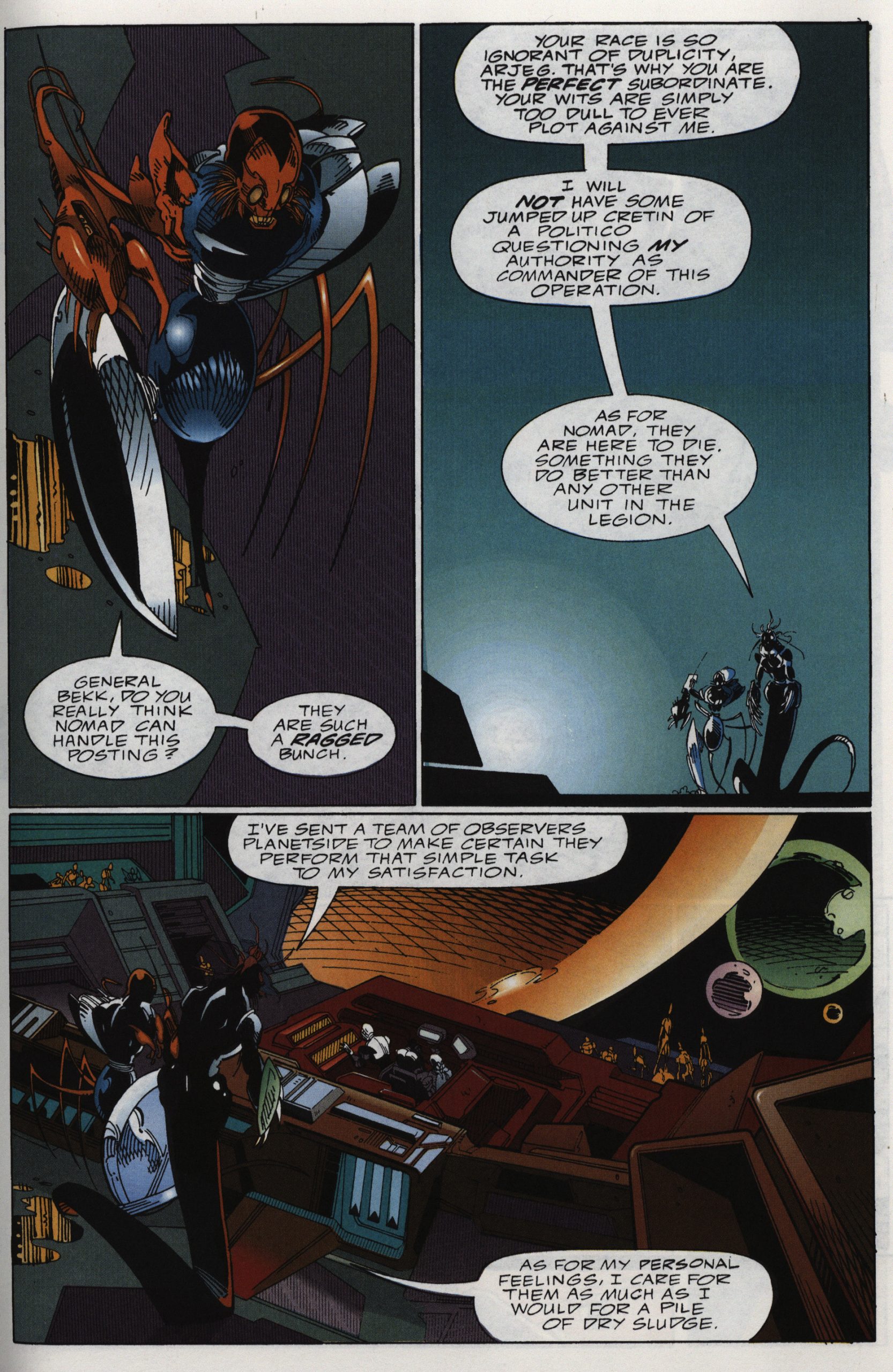
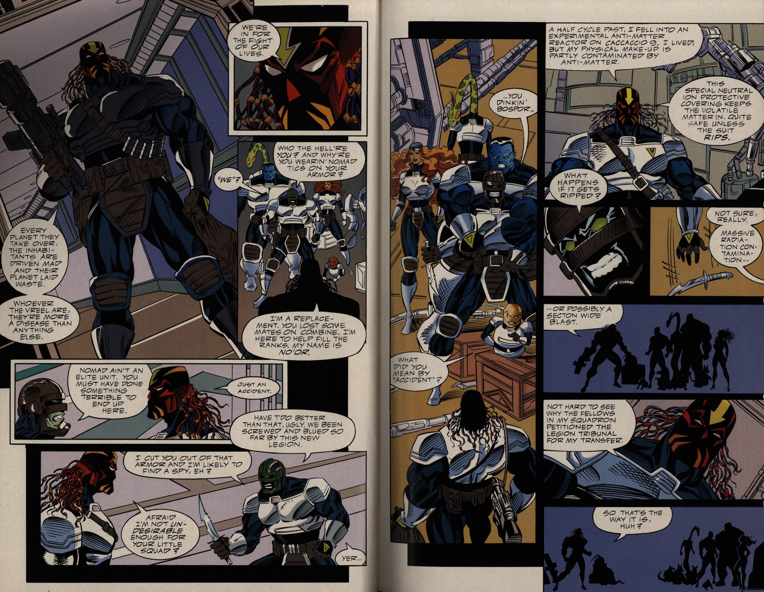
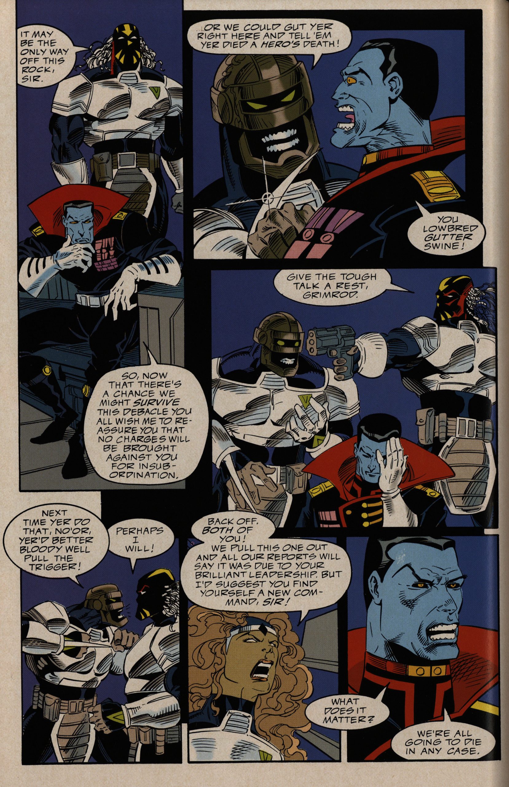
Chuck Dixon is the writer on all these, and has a pretty good handle on these characters by now. (Oh, in case you didn’t know, Alien Legion is about a peacekeeping force, and the group of people we’re following is “the best of the worst”; i.e., a group of misfits placed into one squad. You know. It’s a pretty standard setup.)
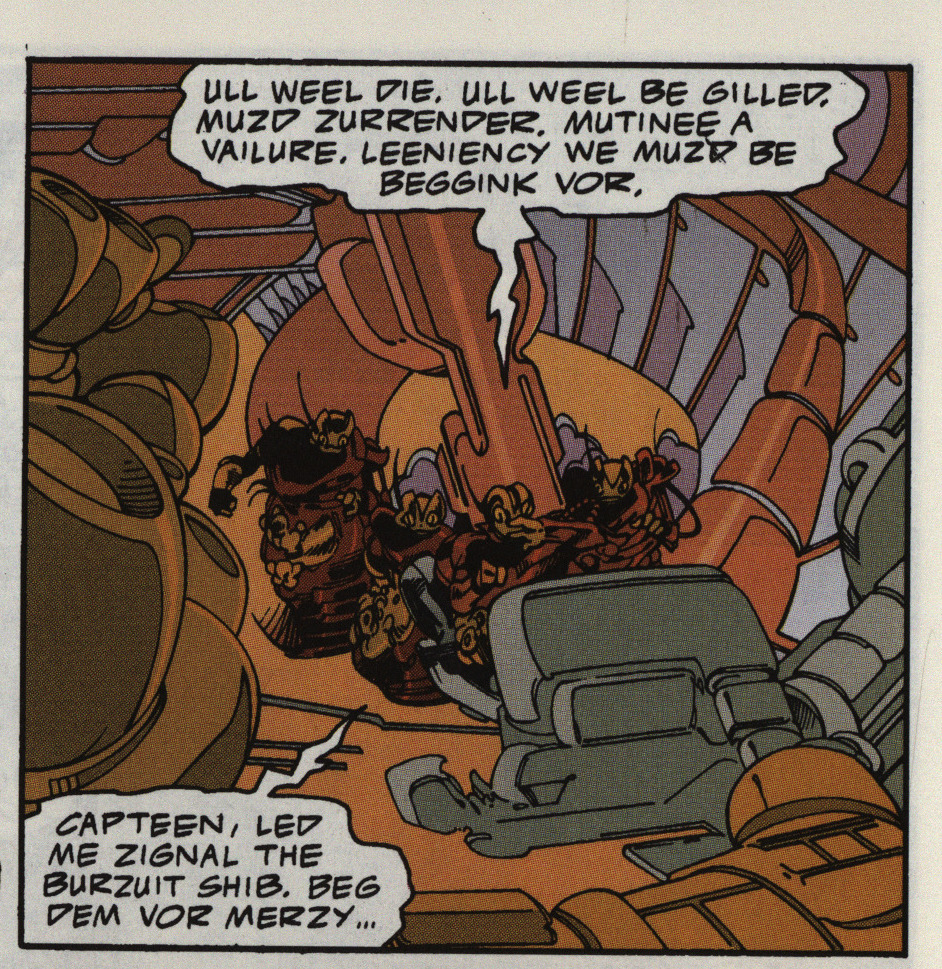
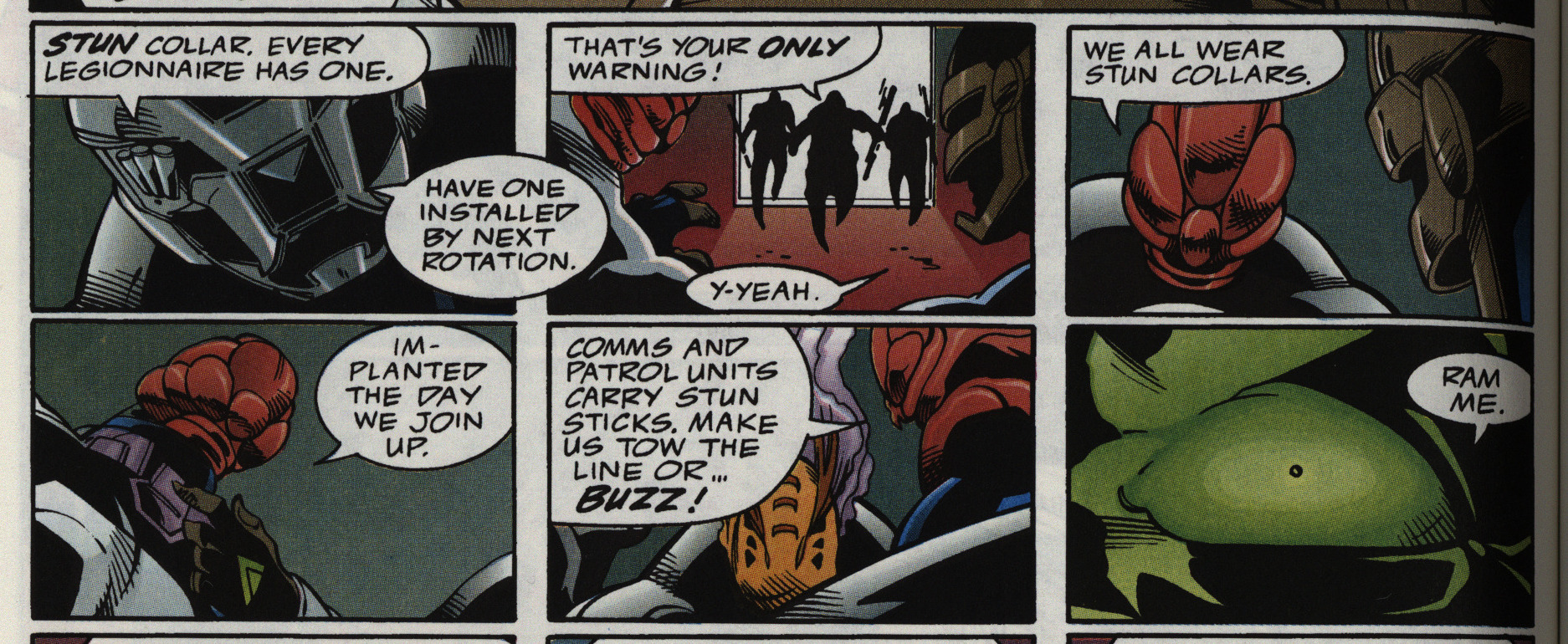
The only thing that’s annoying here are the “dialects” Dixon comes up with for some of the sentients (that’s what they call them here). Most of them just read like they’ve got stuffed noses, because that’s how far Dixon’s sense of wordplay goes.
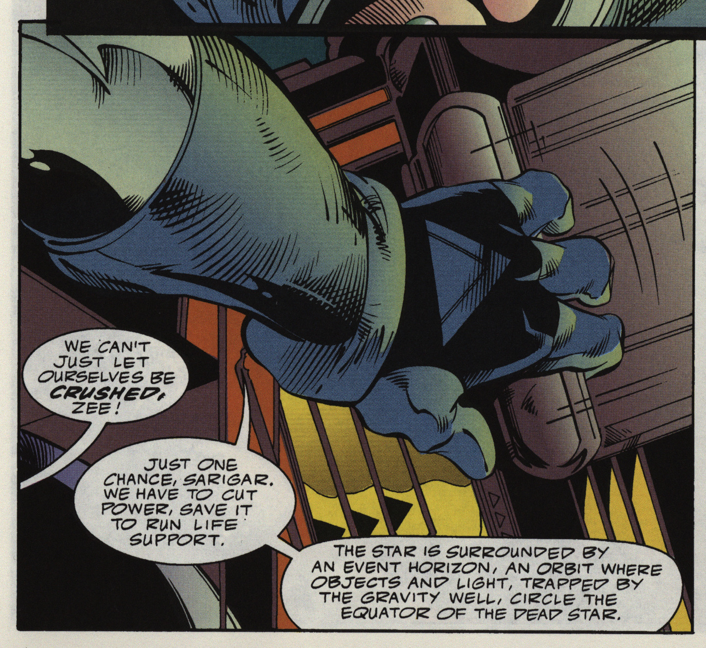
There isn’t much “sci” in this sci-fi, either. That’s… not what an event horizon is. That’s not how any of this works. But it’s pretty indicative of Dixon’s method: Take some halfassed understanding of something that sounds cool, and then build a story around it. And the thing is… it works. It doesn’t matter that it makes no sense — the restrictions of this setting are fun.
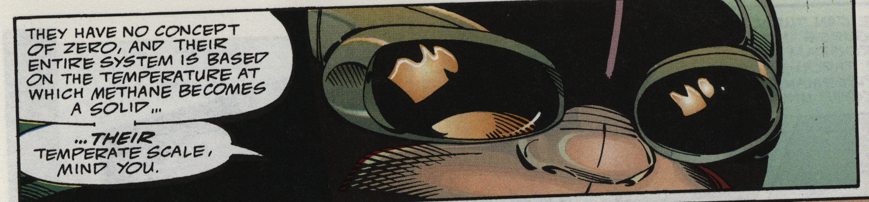
Like: To describe an utterly incomprehensible alien race, the best Dixon could drag up is… that they have no concept of zero, and that … the zero point… of their temperature scale… is different than ours.
I mean, what are you going to say? Even calling this “stupid” is to sound churlish, because it’s not even stupid; it’s just babble.
But it sounds cool?
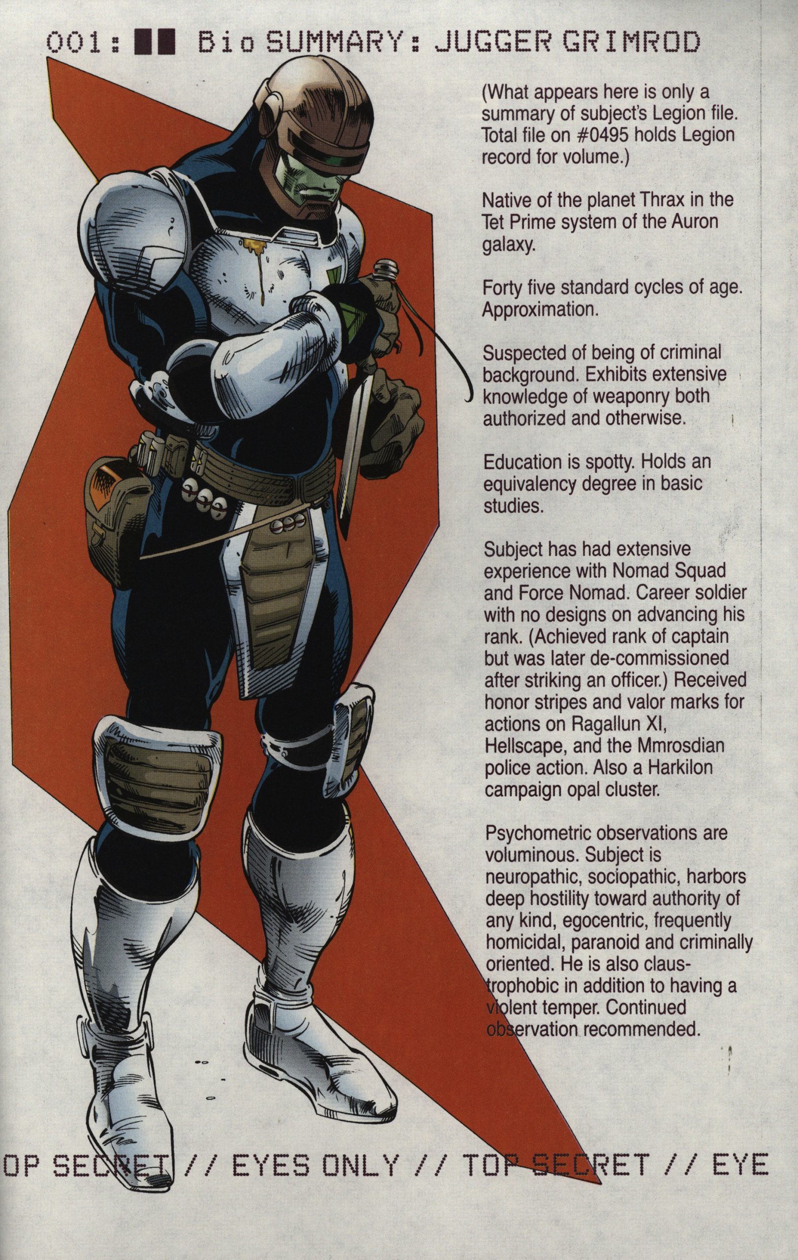
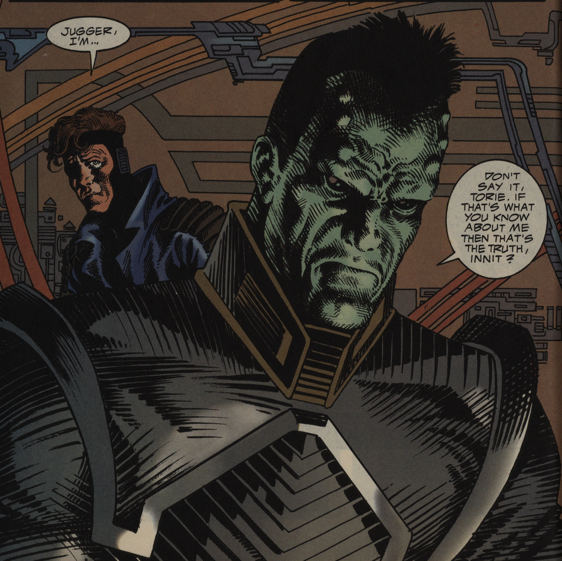
The minis continue the tradition of doing info pages on the characters. I think he’s called “Grimrod” because he’s er grim and he’s a bit of a dick.
Stroman has plenty of fun with his layouts, and I think it works well here.
Sometimes it is, though, like the gravitas he imparts on this romp is a bit over the top, but, you know. It’s very readable.
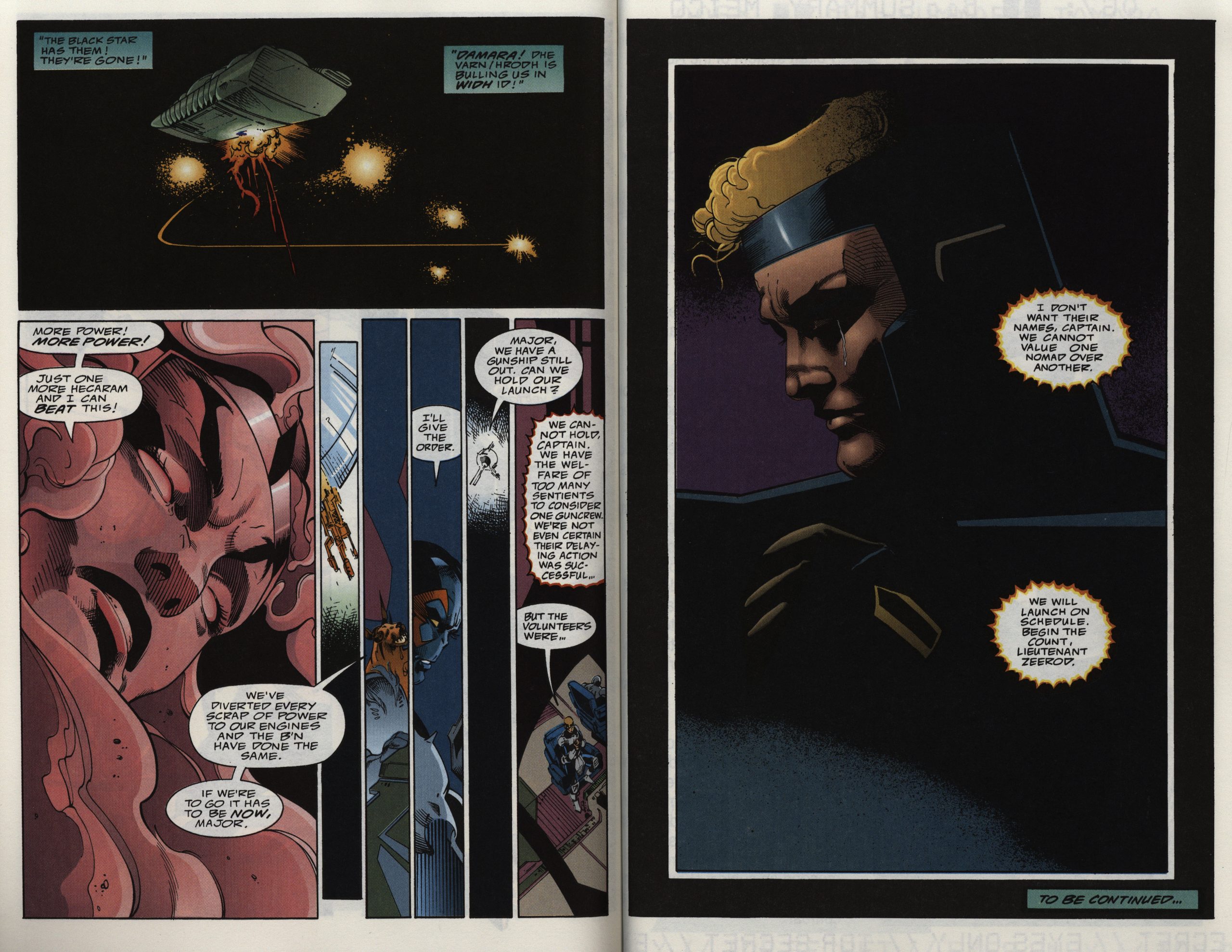
The first mini is a good, solid, sci-fi action thing, but it has some structural problems. The climax comes at the three quarters point, and then we sorta kinda start a new story, and then that ends. I wonder whether this was written as the start of a new ongoing series?
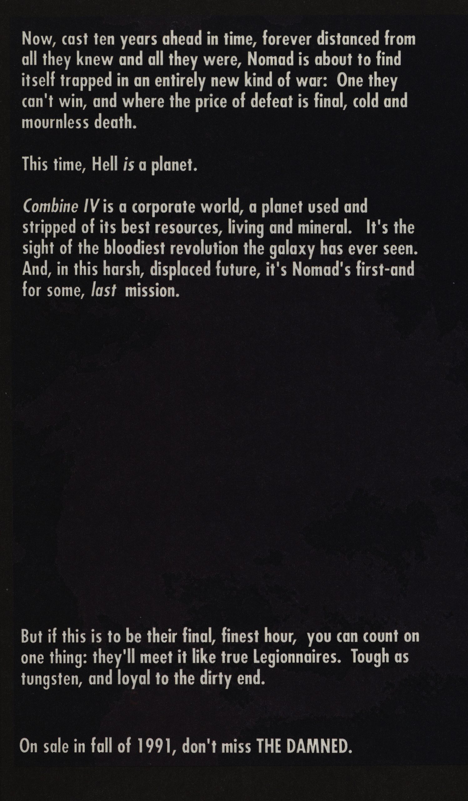
And then we’re told that there’ll be a new series, and it’s called THE DAMNED.
They changed their minds, but the gist is the same.
And it’s the same art team, although the inker is new: Dan Panosian.
Stroman is absolutely insane with his character designs. Most of them don’t look like they’d ever work as a living being, but they’re fun to look at.
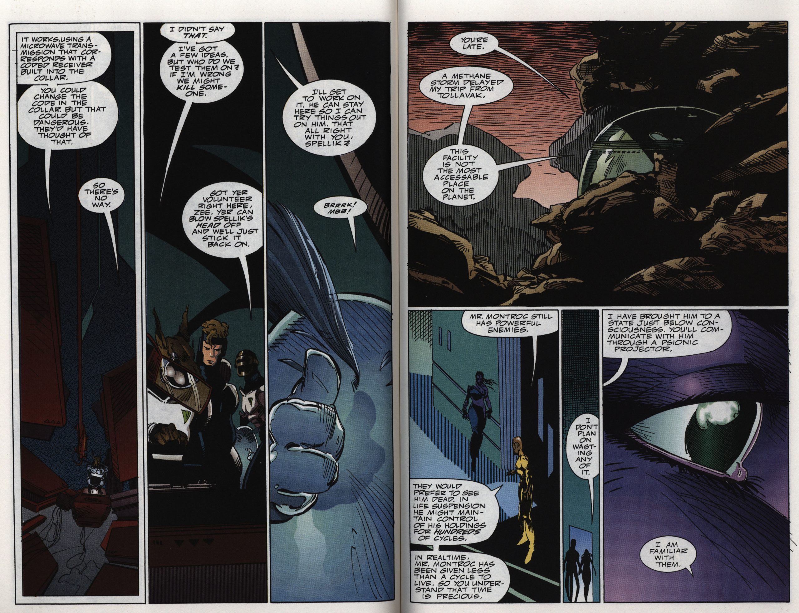
The layouts continue as before (i.e., no page looks the same), but the colours are even better than in the first series.
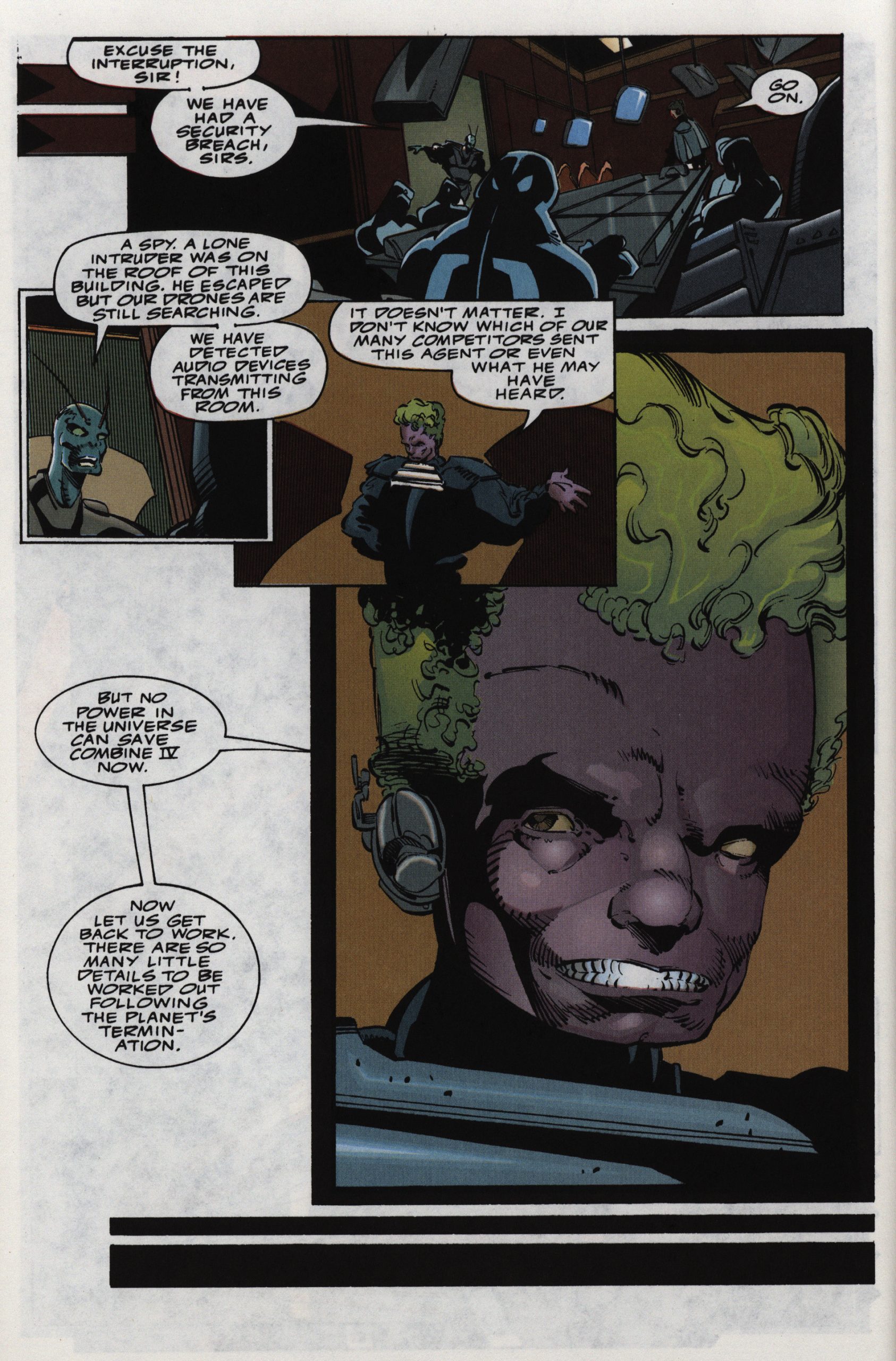
As before, the plot doesn’t make that much sense (these eveeeeil corporation guys are going to blow up a planet to collect the insurance, but they don’t care who know? Not even the insurance company?), but as before, it doesn’t matter.
Because the action is invigorating, and the soap opera drama is involving, and… it’s just, you know, solidly entertaining. Perhaps the lack of sense in the plotlines would be more annoying in a TV show, but there are other distractions here.
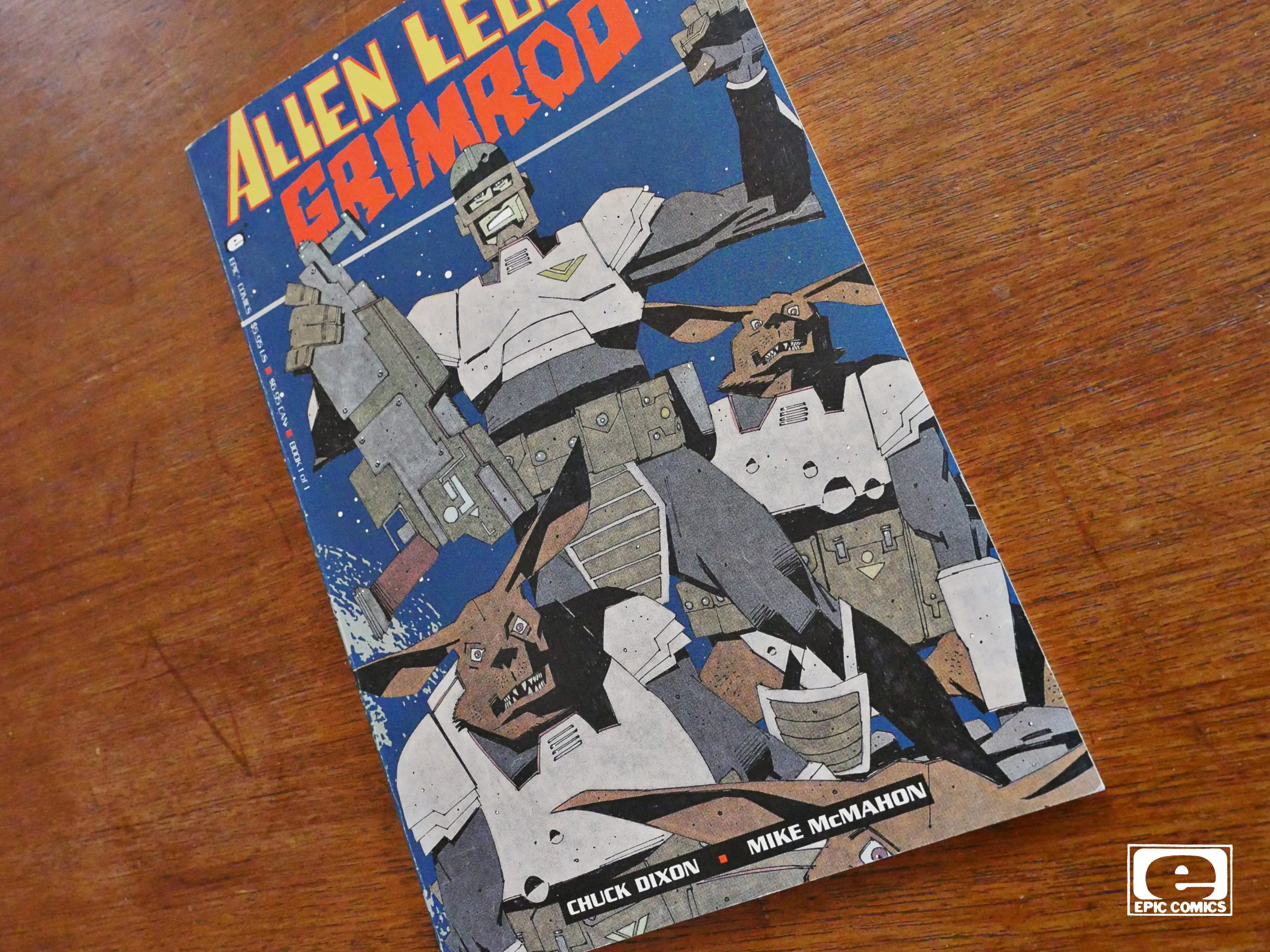
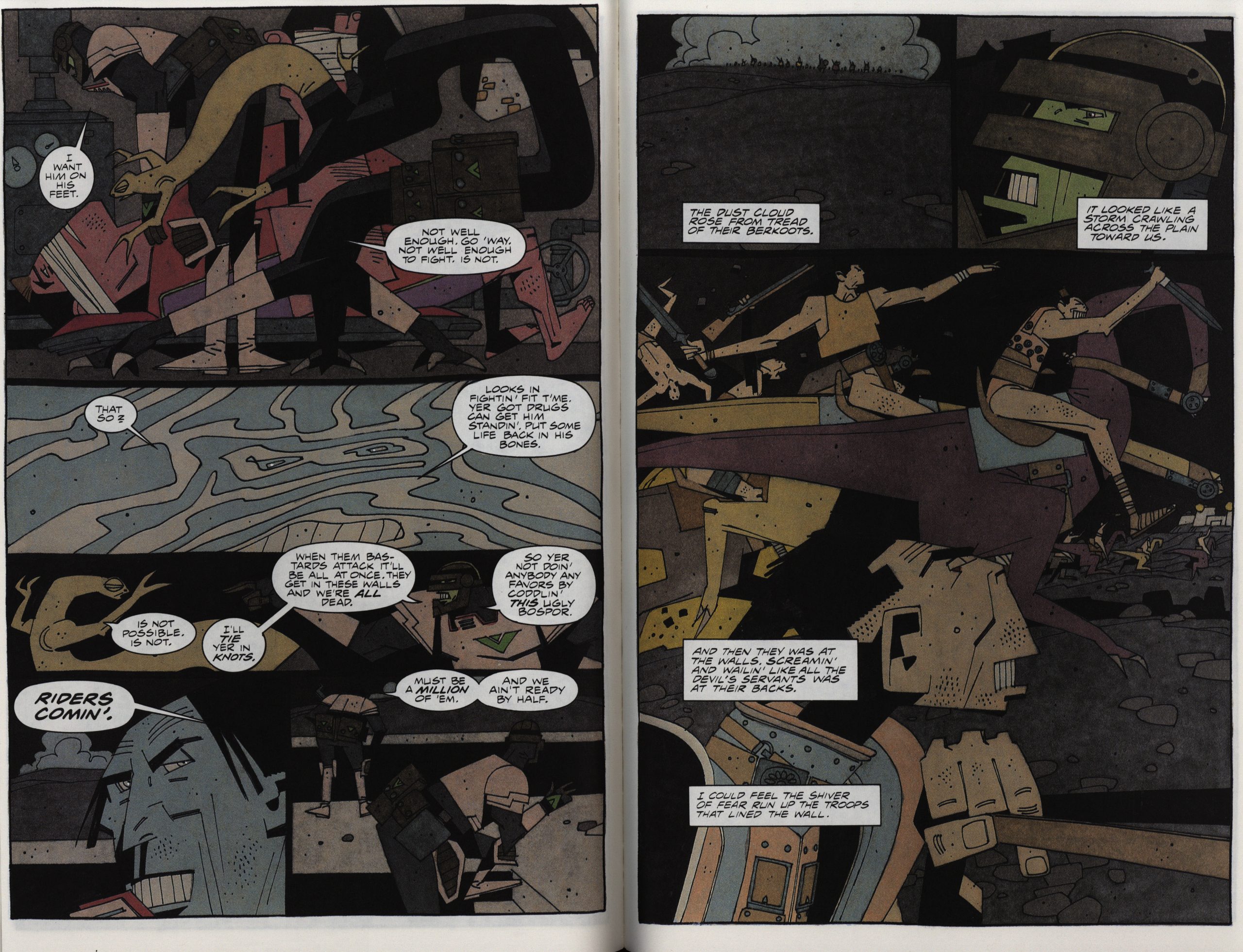
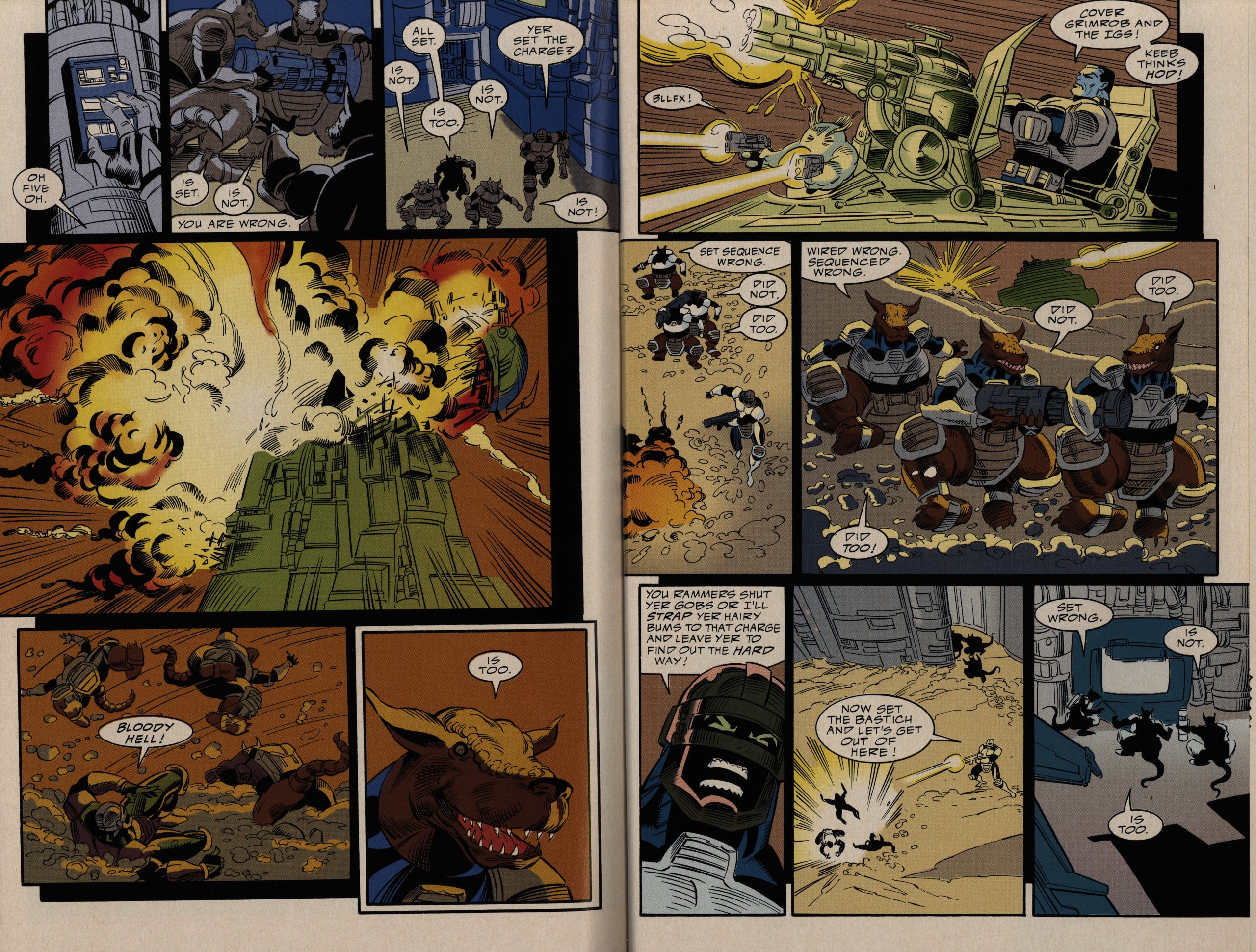
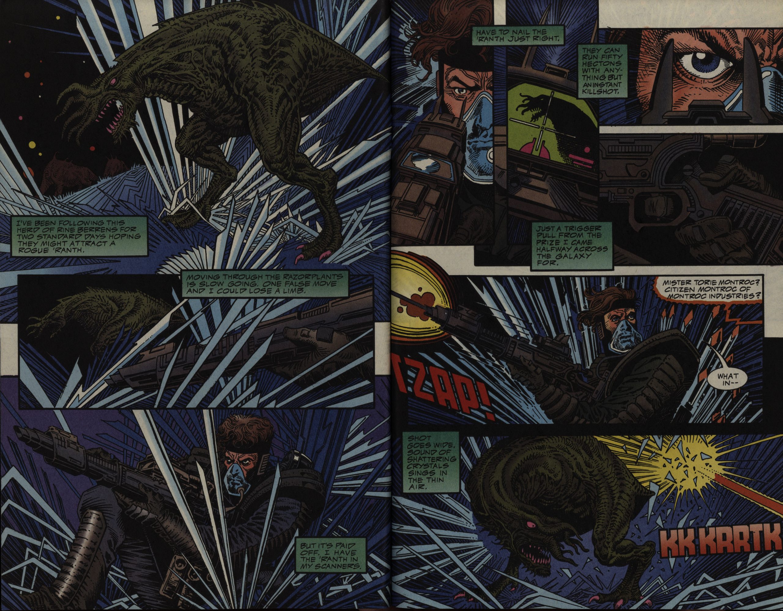
Then a Grimrod one-shot, with art by… Mike McMahon?
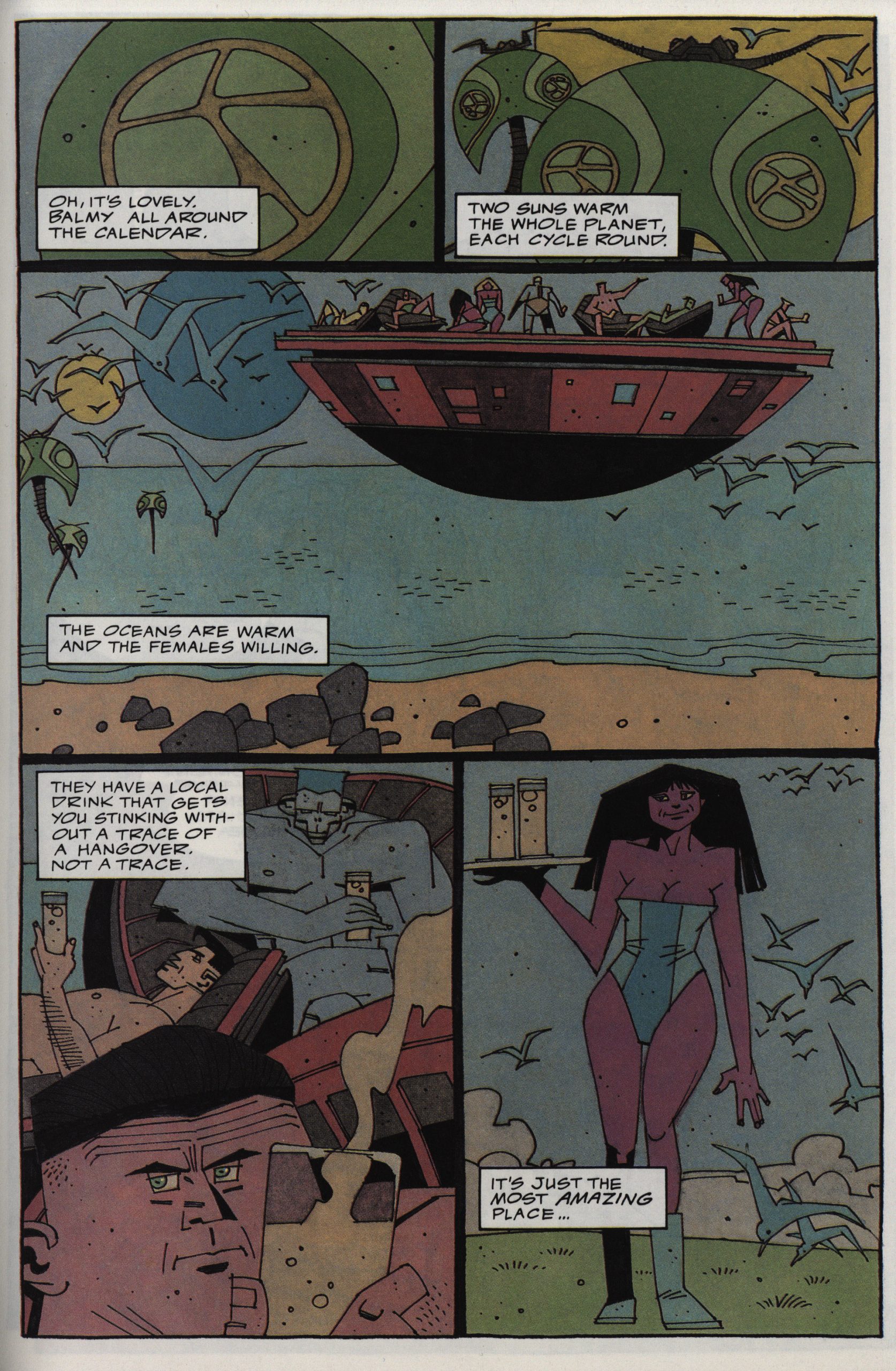
It is! It’s Mike McMahon! I would never have guessed that he’d be doing something like this, but he is, and it’s awesome.
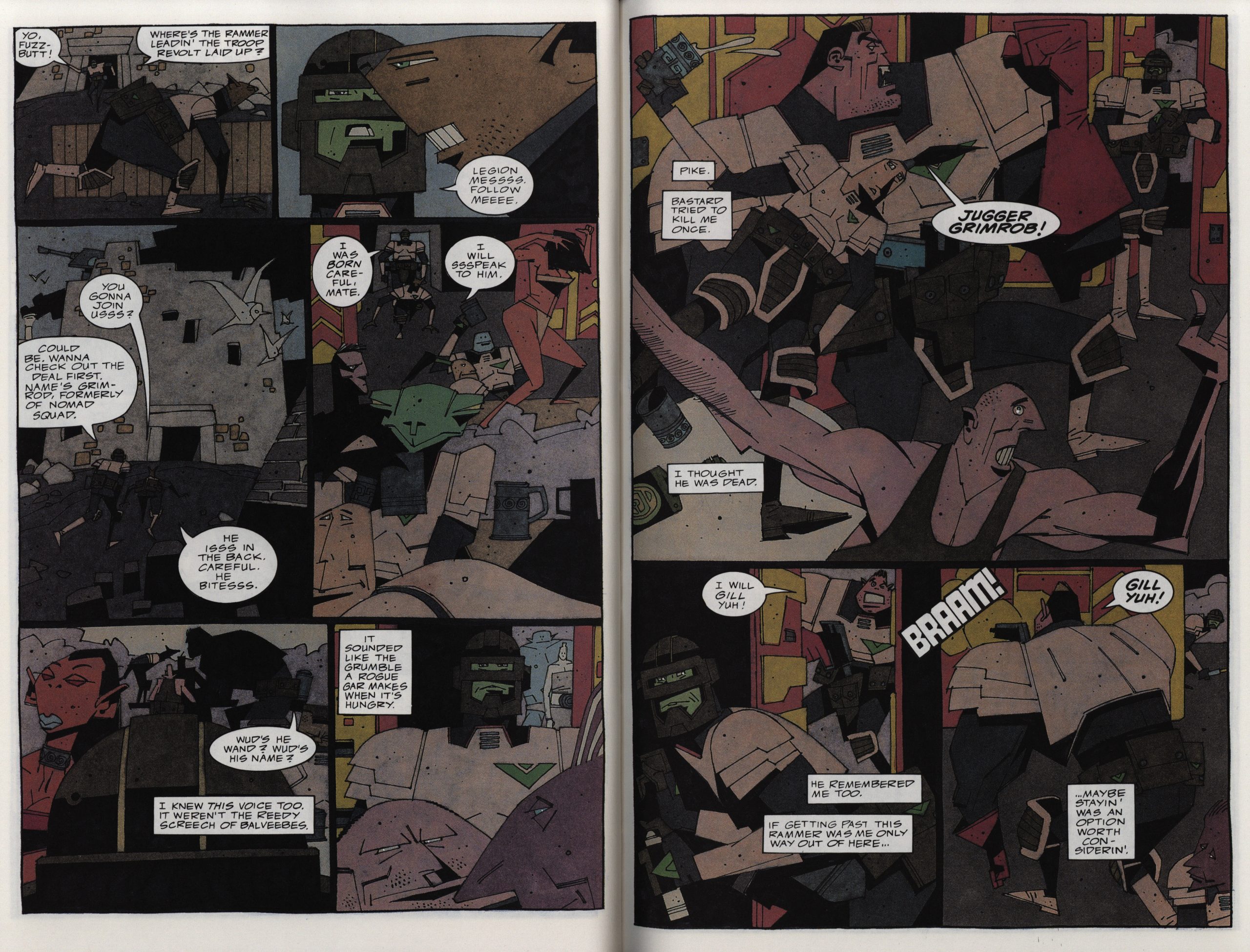
I mean! Look at this! Just look at this! There’s not a square millimetre of the spread above I don’t love. I love all the angular characters, the thin line, even the colouring, which isn’t one I’d expect, either: Something more bright and shiny, perhaps, but this muddy, dirty look is just perfect.
The story is, somewhat surprisingly, the most emotional in the series. I mean, it’s about Grimrod, but it turns out (SPOILERS) that he’s not so grim. Or dickish. I mean, it’s a cliche, but it’s well executed.
And I almost thought they were going to do a 180 and reveal that the villains were the heroes, too, but this book isn’t that deep.
New miniseries. Artists on this one is Hoang Nguyen, Scott Hanna and Gloria Vasquez…
… and it’s the least distinctive of the series. I mean, it’s fine, but the layouts are more standard and the character designs are more… Image… than Stroman’s.
With the second issue, we switch to “Heavy Hitters” designation and get the new, pug-ugly Epic logo design.
I guess we’ll find out what Heavy Hitters mean when we get to that chronologically in this blog, but I’m guessing “grittier” and “no sense of design”.
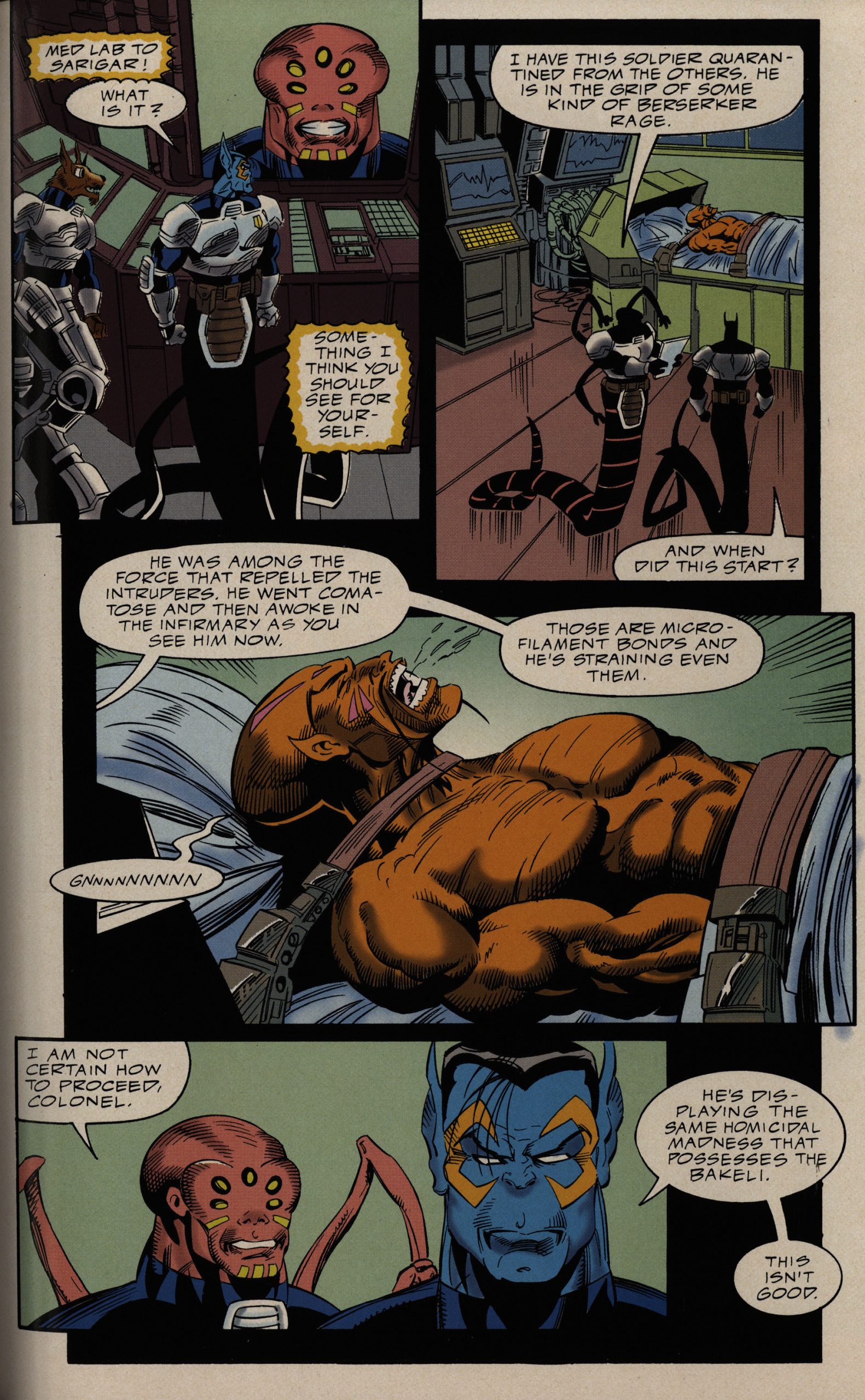
The storyline is good, though: They keep heaping on the challenges our poor legionnaires have to overcome in a most satisfying way.
Yeah, yeah, and the soap opera continues. But it’s fun!
That they print some pages out of order makes it a bit more confusing that it has to be, though.
No spoilers, but for this kind of stuff, the ending is really satisfying.
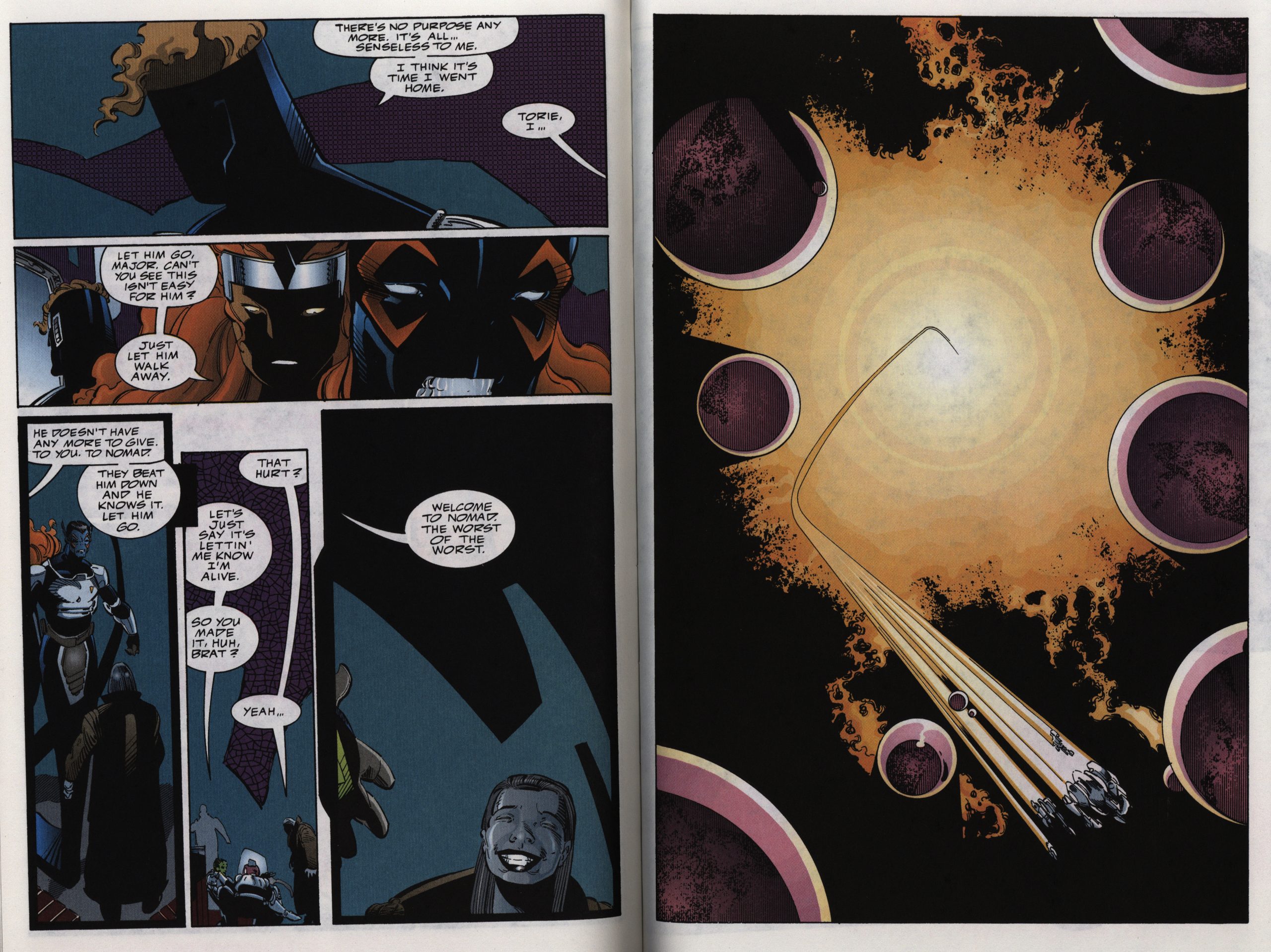
And finally: The one-shot that ends it all. It’s a bit of an outlier, since we mostly follow a guy who’s left the Legion, but it ties up some plot points (that I didn’t really know needed to be tied up).
It’s the only one not in squarebound format, and it’s $3.50 instead of $5.
It also comes with … cards?
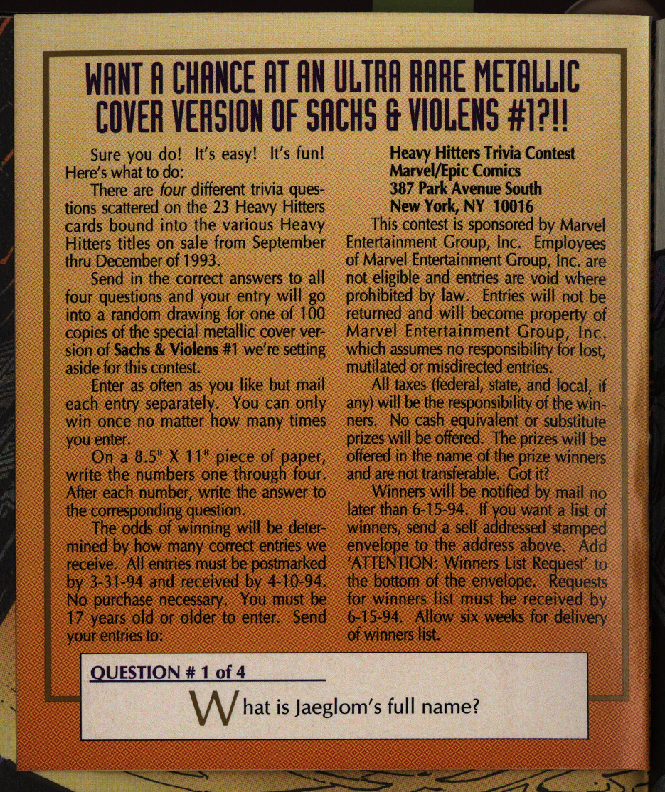
And you can win prizes? OK, I guess this will all be explained when we get to 1993..
The artwork here is by Alcatena and Maria Parwulski…
… and it’s the first time somebody has drawn Grimrod as an actual possible being.
Nice.
The story’s entertaining, too, and ends on an unusual note of hope for the universe.
So… Reading these comics was an unexpected pleasure. They’re not big or clever, but they’re solid entertainment, with more good artwork than you’d imagine.
But what did the critics think?
Alex Chun writes in Amazing Heroes #197, page 78
One of the intriguing
aspects of the Legion had been the
interchangeability of characters, but as
of late, the book has locked into a few
selective characters who have become
stagnant. Jugger and Sarigar never
changed, and Torie Montroc, once the
Legion’s idealist, has settled as the
Legion’s cynic. What’s worse is that
all of Nomad has gotten old. In every
issue it’s Nomad against the world—
just a bunch of grunt soldiers being
slowly ground dmvn in a system where
they no longer fit. And there’s no
longer that underlying scxial issue that
used to permeate the stories. I guess
a case could be made that Tenants of
Hell is about howybig corporations
don’t care much for the little man, but
if that’s the best they can do, it’s time
for me to resign from the Legion.
Fred Patten writes in Amazing Heroes #191, page 117
The regular Alien Legion comic ended
in August 1990. Three months later,
along comes the first three-book mini-
series. What’s the difference? Instead
of 28 pages for $1.50, it’s 42 pages for
$4.50. Less than double the number
of pages for three -times’ the price.
That’s the economics of publishing
these days.
But for space opera fans, it’s worth
it. The 42-page length allows for
better plot development. Chuck Dixon
builds the story smoothly, from a re-
laxed start to a gradual increase in
tension, instead of having to jump
directly to the action. This first vol-
ume ends with a particularly sus-
penseful cliffhanger. There’s also
room to show the personalities of the
main cast, so that they’re more than
just a mob of space legionnaires
crowded together.
Larry Stroman’s art isalways
A $4.50 comic should have better,
coloring than usual, but many comics
don’t know how to take advantage of
it. Gloria Vasquez does; there are fine
shadings and highlights, all sharply
printed. You feel that you’re getting
good value for your $4.50.
There aren’t too many space opera
comics being published. Alien Izgion
has always been one of the best. It’s
good to know that it’s still with us.
I think most (or all?) of these have been published in collected editions.