Moebius (1987) #1-9
by Moebius
As anybody European of a certain age, I was agog by Moebius as a teenager… and that’s never really stopped. What stopped was translations of his work being available. It seemed like we had virtually no work translated after the late 80s (except the Jodorowski stuff), which seemed a shame. The floodgates have opened now, and I never understood why there were these two decades with no translations, but read some rumours about his agents being very difficult, or something.
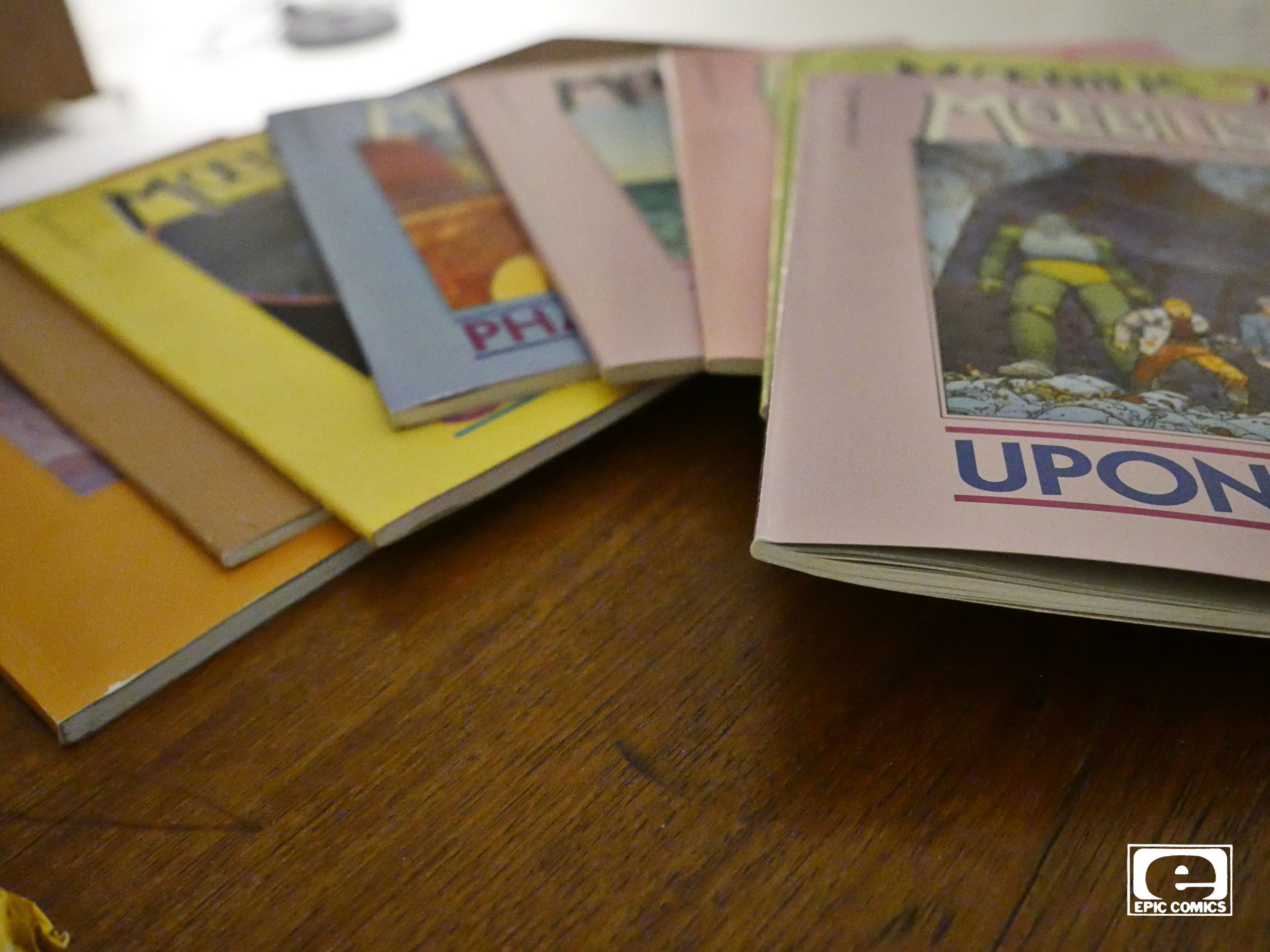
Anyway! This was in the 80s, and I bought most of these at the time (even though I had much of this in other languages already). I lacked a couple of the albums, and they were surprisingly expensive to buy via ebay, so I guess these are very popular still.
But it’s totally understandable why: These are really nice editions, and the selections are pretty spot on. Nice designs, excellent printing, etc, etc.
The only annoying thing is that we’re usually not told when or where these pieces originally appeared. Moebius’ artwork changes a lot over the years, though, so it’s usually easy to tell, but it’d still be nice to have your guesses confirmed.
When Marvel started Epic, I don’t think anybody would have guessed that what Epic would be best remembered for 30 years later would be two translated works: This and Akira. They were both really influential for future American comics artists: These days, it seems like half of younger US sci-fi comics artists have memorised these albums. And, of course, Akira took the US appreciation of Japanese comics to another level.
I wondered while re-reading these was whether Marvel would be censoring any of the stories. I couldn’t remember one way or the other.
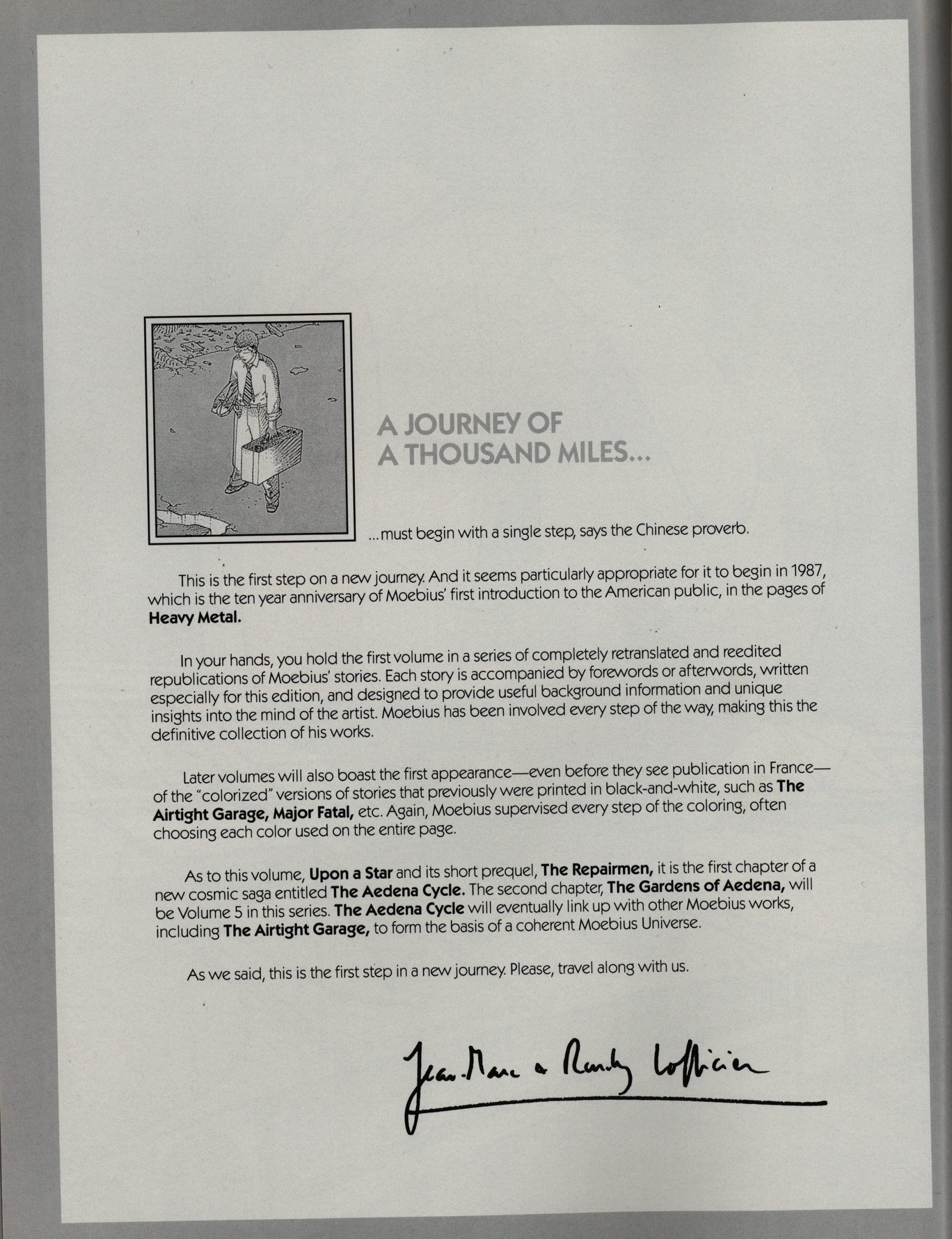
The Lofficiers (they’re the translators) do the introductions to every issue.
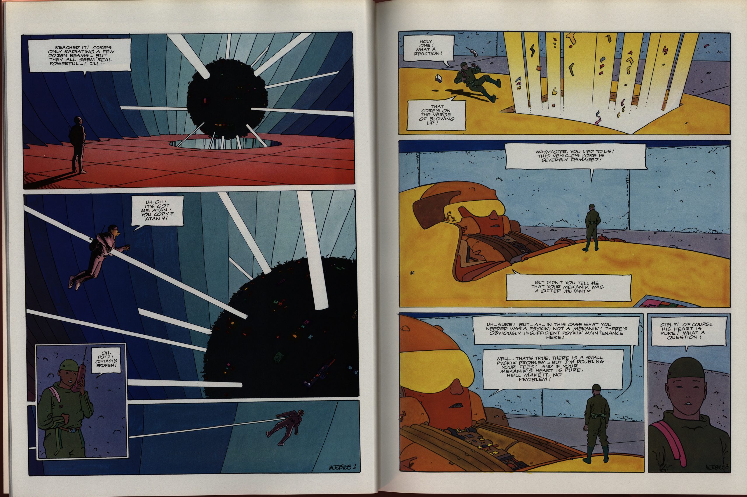
That’s gorgeous, dude. I love the colouring: It’s not contoured or anything; it’s flat… ish. It’s just kinda perfect.
Let’s compare to the Danish edition published a couple of years ago: Completely identical. I remember somebody releasing an edition of the Incal a decade ago where somebody (Beltran?) had added 3D colouring everywhere. It was a horrendous shit show.
The Danish edition has one major problem: It uses a horrendous font (based on Moebius), and breaks words without any rhyme or reason. The American hand lettering looks very nice, even if it’s not very close to Moebius’ lettering.

Moebius himself was obviously very involved with the making of this edition: The ones that are newly coloured he usually supervised, and he provides some text about every story here. It’s pretty chatty and informal, and it’s fun to read, but I can’t help think that the stories would have had greater impact if we weren’t reading an explanation of these stories (many of which are pretty f-ing ineffable).
The new Danish editions do have some of the same problems, but there the texts aren’t written by Moebius, so I just skipped them.
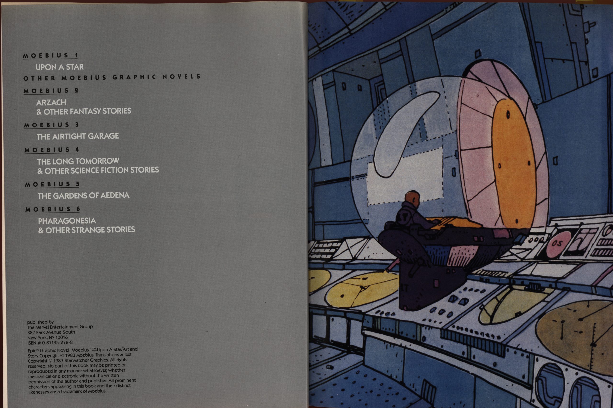
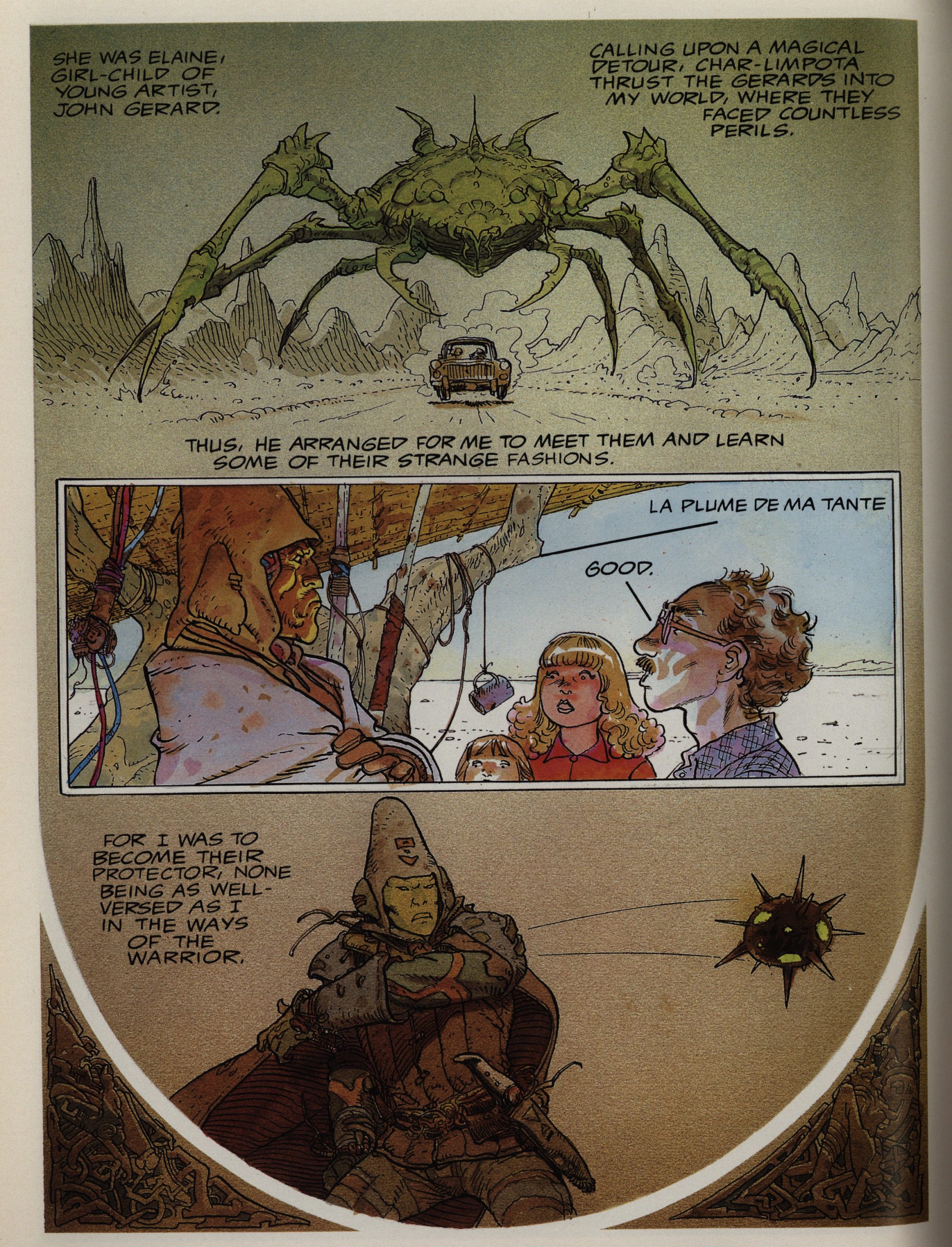
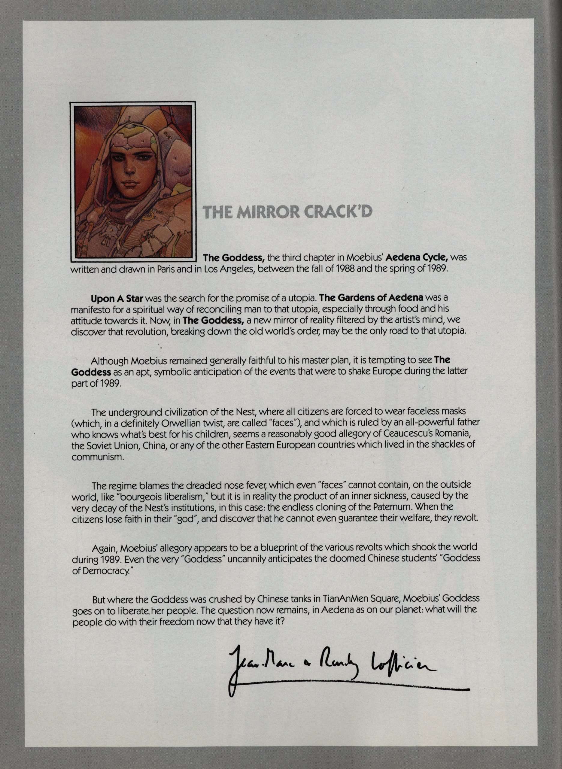
The weirdest origin of a story is Upon a Star, which was a commission by Renault (which you can see above). It was originally meant to be a four page story, where Moebius was only going to do the layouts, but he expanded it to 40 pages and did it all himself. And then this was the start of the Aedena cycle, which ended up being five and a half albums.

Moebius wanted to draw in a simpler style, but make each line better, I guess.
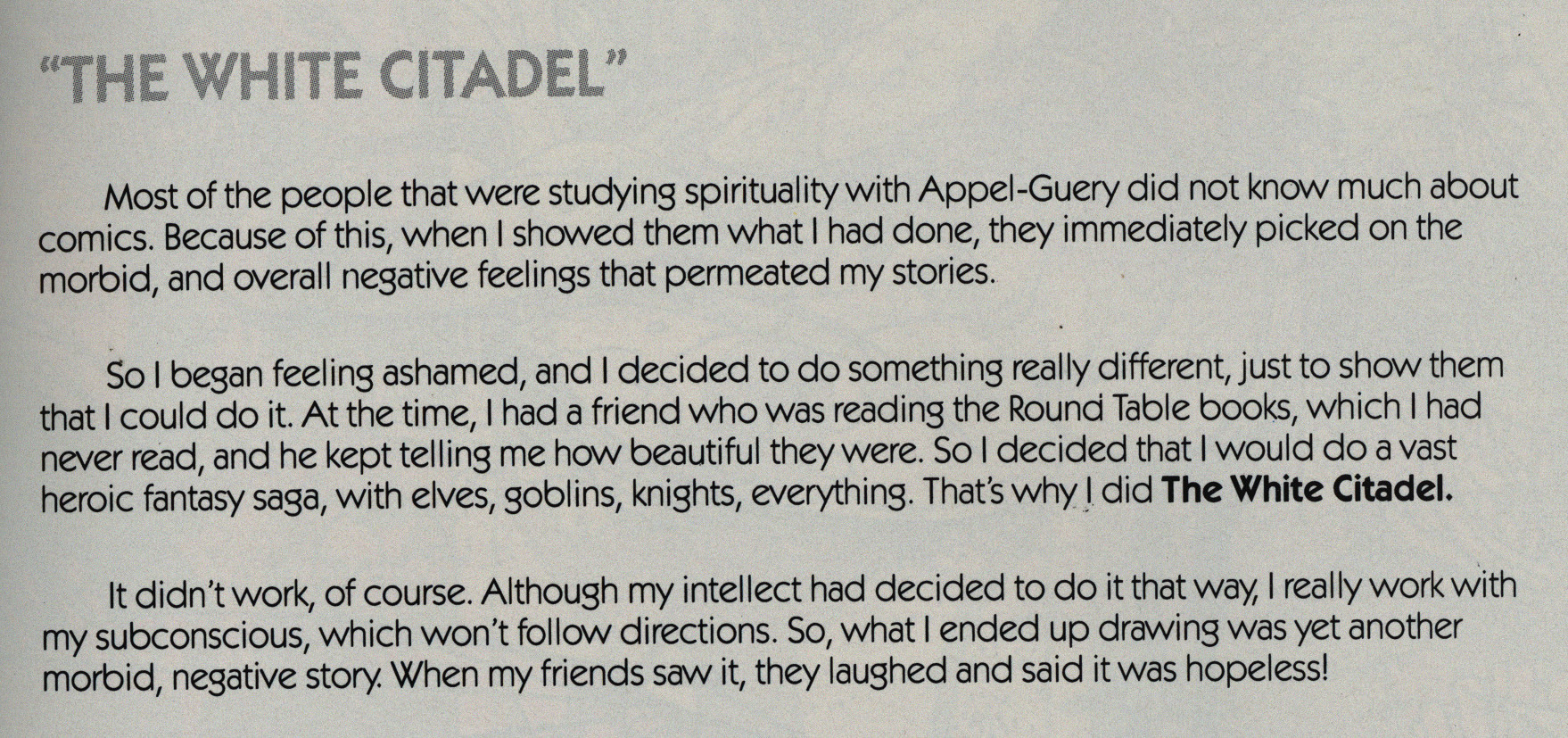
As with many French comics artists that had done really interesting work in the 70s, in the 80s he got all spiritual. Appel-Guery was his guru, I guess?
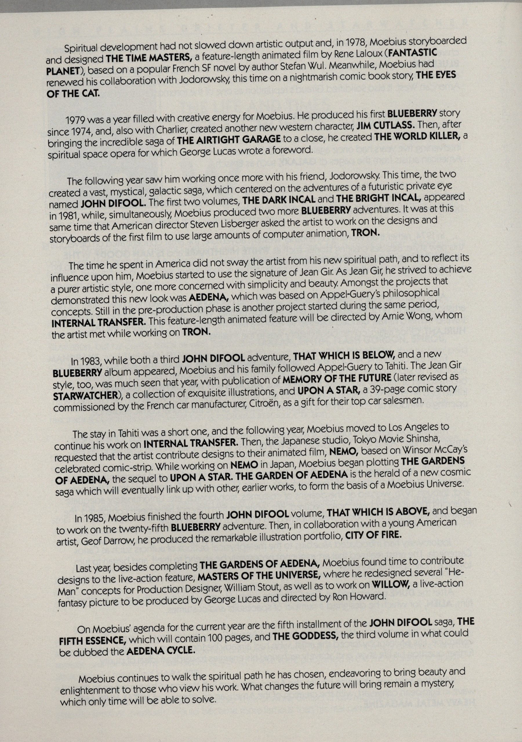
I had no idea that Moebius was this productive in the early 80s.
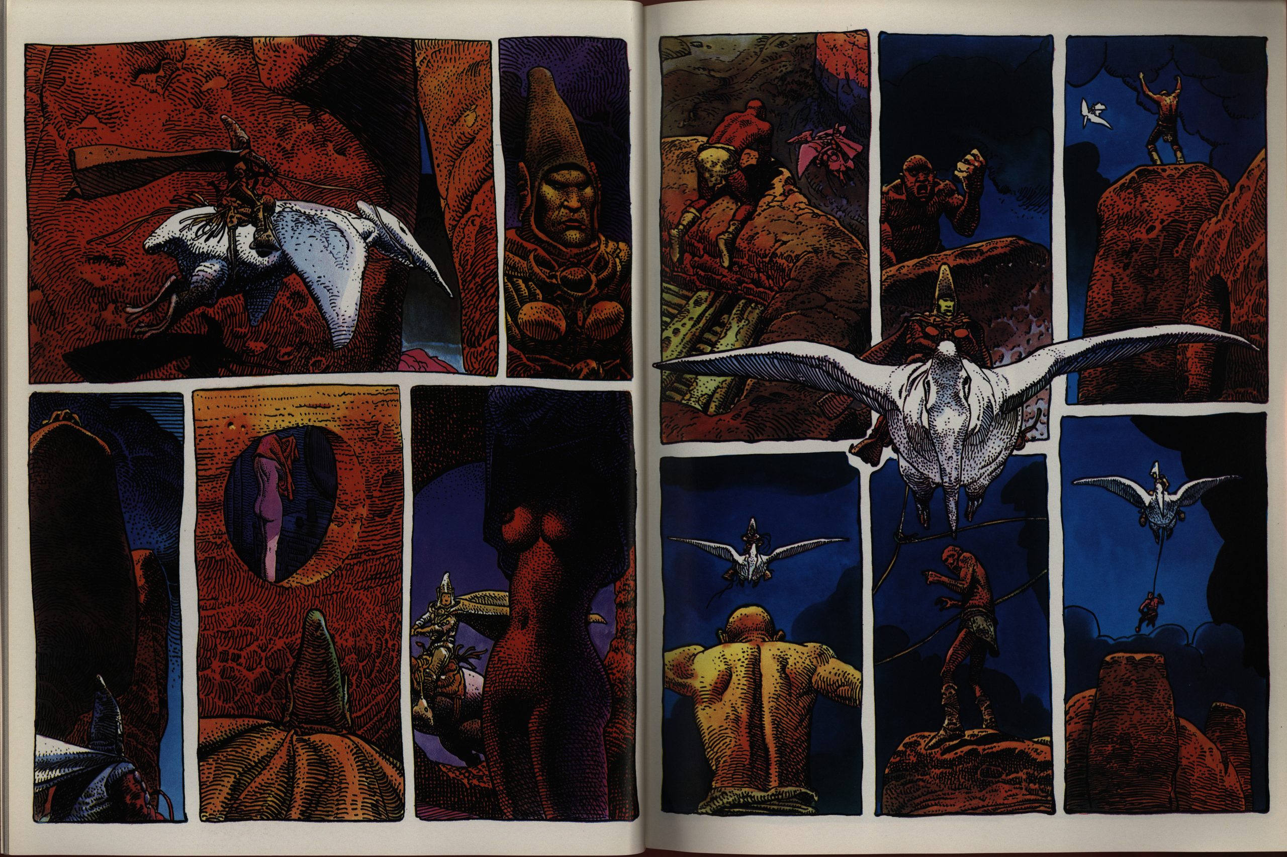
The Epic albums are vaguely arranged according to some theme or other, so we get all the Arzach stories.
And I guess this answers my question: Marvel didn’t censor these comics. I wonder whether there were any repercussions?
Hm… can’t find any. Perhaps these non-floppy comics flew under the radar of the people who want to Protect The Children.
Virtually all of the pieces here were either in colour originally, or were re-coloured for this edition. But they did leave this one in it’s original black-and-white awesomeness. It would have been a crime to slather it with colour, because it’s mind-blowingly detailed.
Typical!
There’s a new Arzach story, penned by the Lofficiers. They were thinking about pitching Arzach as a movie, but that didn’t happen. And it’s the worst piece in the entire Epic series.
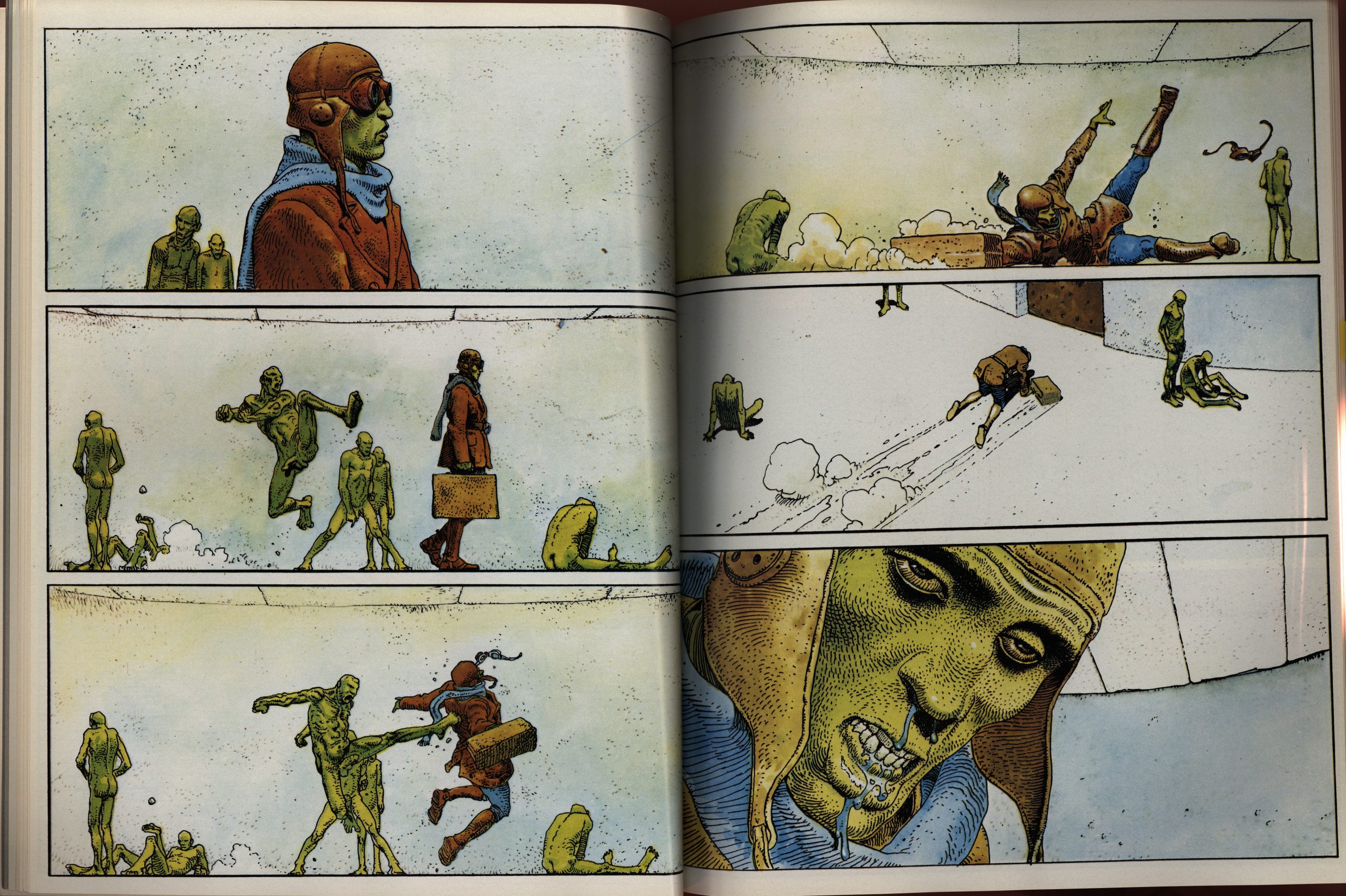
Moebius’ most famous longer piece is probably The Airtight Garage, which originally ran in Heavy Metal. (And Metal Hurlant.) It starts off in a style half-way between Giraud and Moebius, but goes all Moebius after a while.
It was very improvised, and it reads like it, too. I probably got my first edition of this when I was like twelve, and I remember it being something of a head-scratcher at the time. Not that I didn’t like it: I totally adored it.
But it is basically all like that, and it was obvious to me, even at twelve, that there wasn’t really much point in putting any effort into trying to follow the “plot”. It’s a goof, and it’s fun, and it’s very pretty.
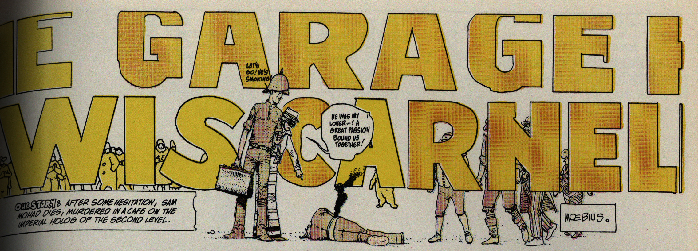
The weird thing here is that they’ve renamed Jerry Cornelius to Lewis Carnelian. Jerry Cornelius was a Moorcock character that a bunch of people used in the 70s, mostly as a kind of in-joke. I’d guess that Marvel’s lawyers were leery about using somebody’s copyrighted character this prominently, so they had him renamed?
The names are somewhat similar, so they didn’t have to redo all the title bits (and there are many of them). Oddly enough, the “A” (that replaces the “O”) in the last name is a different colour from the surrounding letters, which suggests that this substitution was done after they did the colouring originally? I’m just guessing.
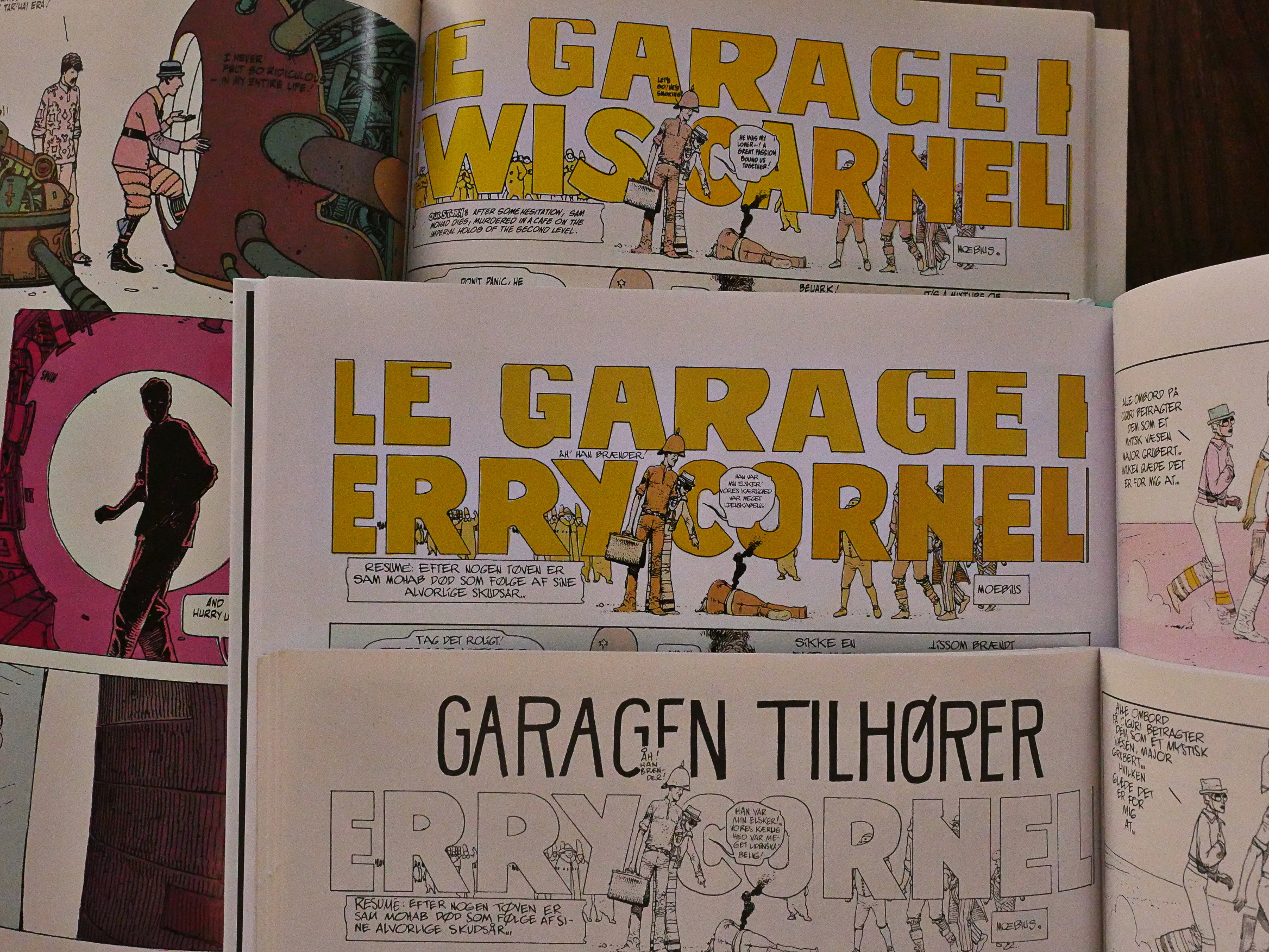
Hey, I’ve got three editions of this. The bottom-most is the black-and-white one I bought in 1980, the middle one is the new Danish edition, and the top is the Epic edition.
Lofficier explains that the substitution of the name is something that Moebius totally wanted himself.

I love the “paf”. Moebius likes genre, and he loves to make fun of genre.
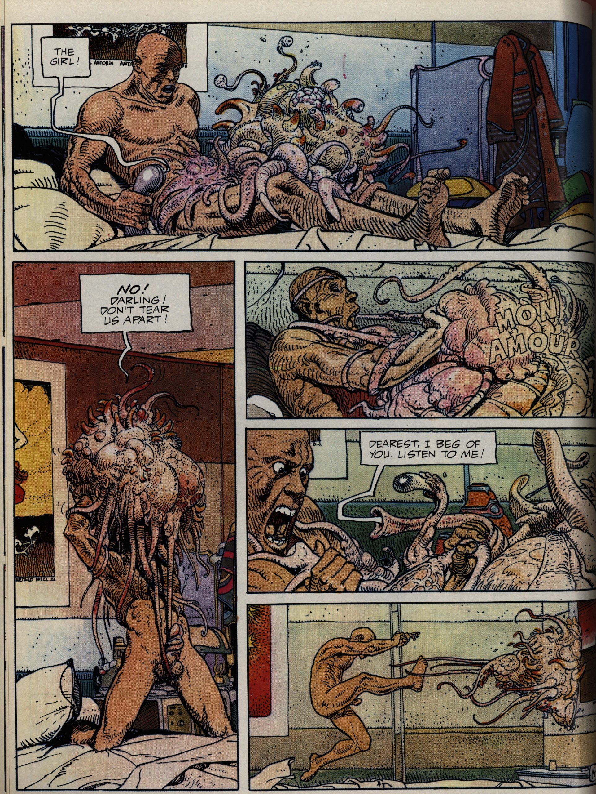
There are very, very, very few women in Moebius’ work, and when they do appear, they’re often… not… very… nice. (That blob was more human on the previous page.)
And is this the only ejaculation that Marvel has published? Inquiring minds etc.
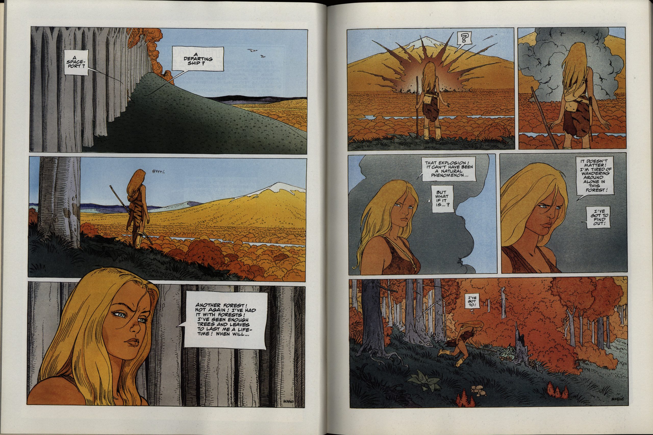
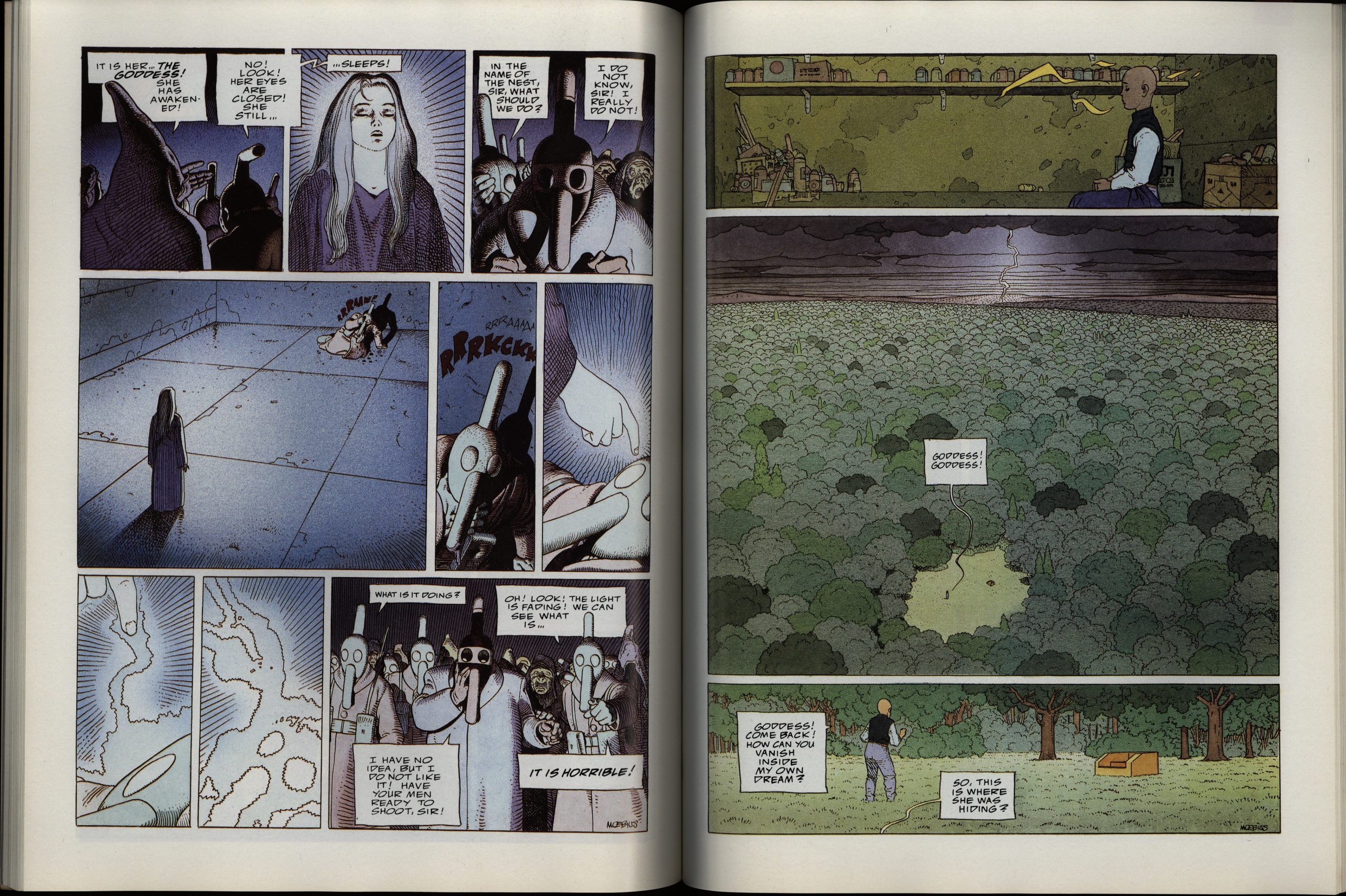
The Aedena work sure is pretty.

But this homage to Tardi is a lot funnier.
I’ll say!
The production on these albums is usually top notch, but there’s some pages here and there that have these glitches. Somewhat disturbing when everything is so beautiful otherwise.
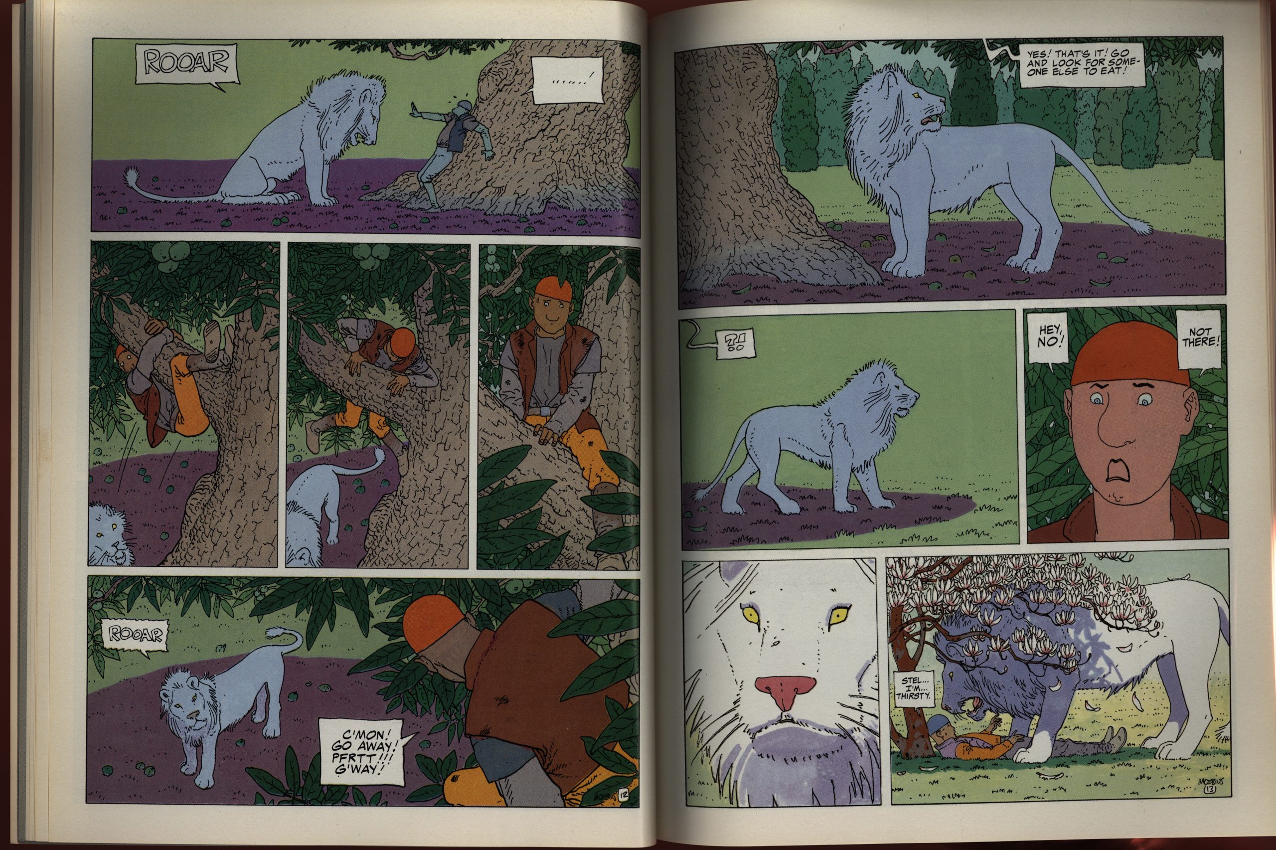
This series of albums was originally projected to have six volumes, and they were released by Marvel at a steady clip in 1987 and 88. The final volume, oddly enough, has the two Moebius strips that people remember: White Nightmare and Rock City. White Nightmare is Moebius’ only really overtly political work, and it’s a stunner. You can’t forget it once you’ve read it.

Rock City is something completely different, but is equally mind-blowing.
So why put the two strongest pieces in the (projected) final volume? Perhaps Moebius was tired of people always talking about his earlier, stronger work, and wanted to emphasise his newer, more zen work?
But what did the critics think of this original run?
Carter Scholz writes in The Comics Journal #119, page 30
Upon a Star (Epic, $9.95), the first in
a project series of six reprint volumes
of the work of Moebius, confirms what
one has long suspected: Moebius is a
bore. Taking his work in the two- or
six-page doses found in Heavy Metal
does not make this clear. There, sur-
rounded by less apt draftsmen, his
oblique, underwritten fantasies had a
look of panache and almost of serious-
ness. Despite which, they were often dif-
ficult or impossible to understand,
and—far more damning—to remember.
Like a dope-induced insight, ten
minutes later you were unenlightened
again. I stopped following Moebius’s
work because of a notion that, like pot,
it might be destroying my short-term
memory.
The most substantial piece in Upon
a Star is a 40-page strip first published
as a promotional book for Citroen. One
would hardly expect a work produced
for such an occasion to have much
depth, but Moebius has given it place
of honor—title story of the first book
in the series—and has prefaced it with
an introduction saying how much he
likes it.[…]
Any three pages of this are nicely
wonky. But if you’re wonky for long
stretches of time without modulations,
you turn into Cheech and Chong at
Vegas, or late Salinger. I’m sure the art
director at Citroen was delighted with it,
but I don’t see why a general reader
should put up with it.[…]
All this could be easier to take were
it presented as mere footling entertain-
ment, but the production is clothed in
shabby grandeur, rags of pretension.
Moebius’s introductions and afterwords
are disingenuous at best and self-serving
at worst. He claims he’d planned
“Upon a Star” to be four pages, but
when he started drawing layouts it just
all came out—all 40 pages—in one
half-hour sitting. One is meant to ex-
claim, “0 prodigieux, maitre!” I say,
balls. A man with a four-pager in mind
doesn’t start by drawing panels of that
size. In the second wlume we read that
‘ ‘Arzach… really was a small revolu-
tion in the world of comics,” and,
“‘The Detour’.. .is a classic, funny
story.” This kind of appreciation is
really best left to someone Other than
the creator of the work.
Well! I never!
OK, back to the albums: Volume 7 arrived two years later, in 1990, and things continued as before: With an introduction by the Lofficiers that pre-interprets what we’re going to read. Always my favourite.
This is a continuation of the Aedena cycle, and Moebius’s artwork has changed a bit again. But perhaps the biggest change here is that the colouring has gone all … painterly and stuff, instead of being painted-as-flat.
But, I mean, it’s still gorgeous.
In the 70s, Moebius did stories that didn’t have much story to them. They were either improvisational exercises or sci-fi jokes. With this, though, he’s doing quite traditional sci-fi comics (as French sci-fi comics go). Everything seems plotted out carefully, and things are logical, and there’s character development and stuff.
It’s a bit on the spiritual side for my tastes, but it’s pretty entertaining… but it’s not as shockingly awesome as his 70s stuff.
Moebius is always Moebius, but it’s fun to see how much he develops and how much of a magpie he is. Like this sequence that got more than a smidgen of Japanese comics going on.
Oh, that explains the colouring.
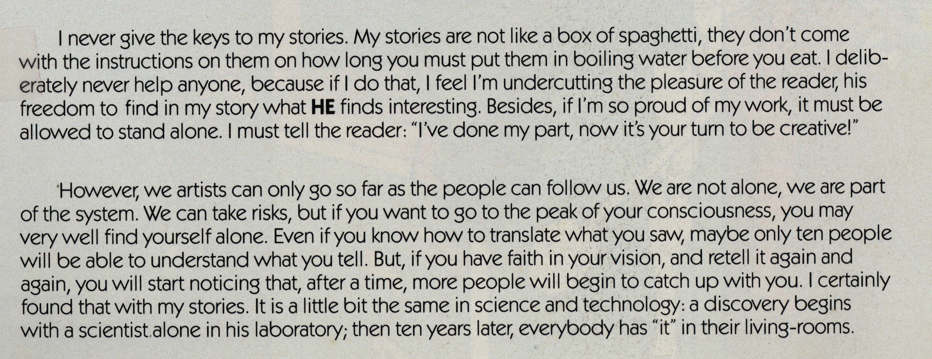
For someone as chatty as Moebius seems in these text pieces, it’s a bit rich seeing him write that he “never give[s] the keys to my stories”. He pretty much explains most of what’s going on, even for the smaller pieces.
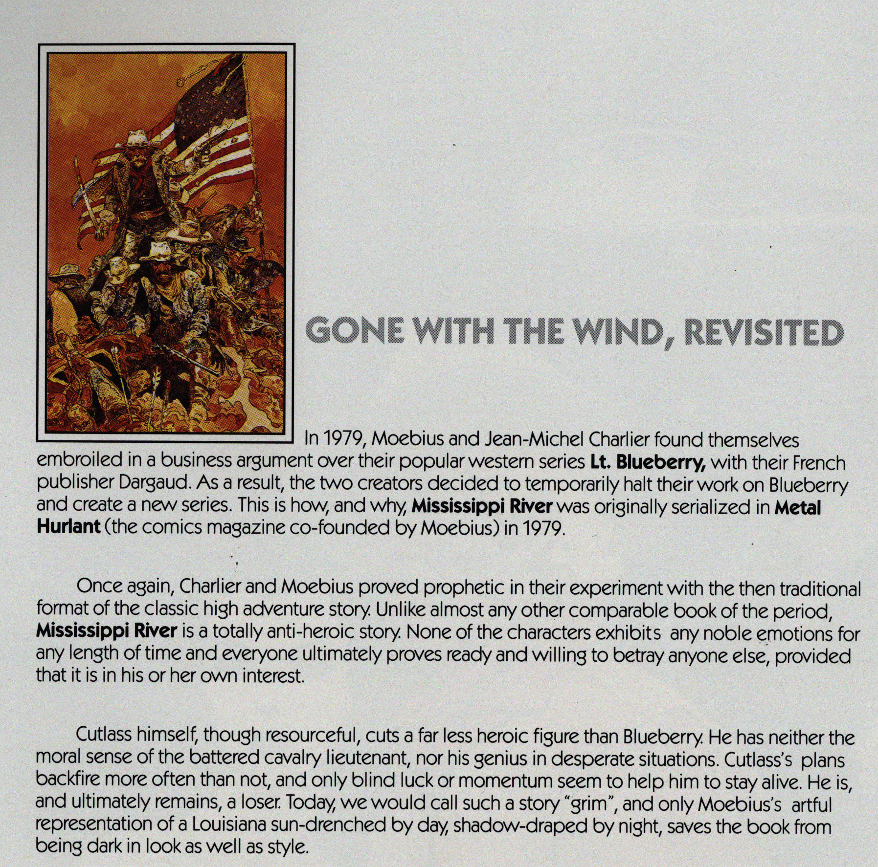
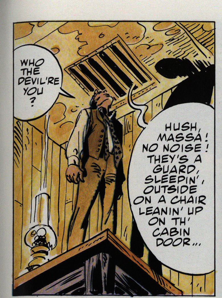
In the eighth volume, we get to something I’ve never read before: The Jim Cutlass series. The Lofficiers explain that Charlier and Moebius had some drama with their publisher over Blueberry, so they … did a Blueberry-with-the-identifying-marks-covered series for Metal Hurlant. I mean, they don’t say the latter: Instead they emphasise how different this is from Blueberry. It’s “grim” and stuff.
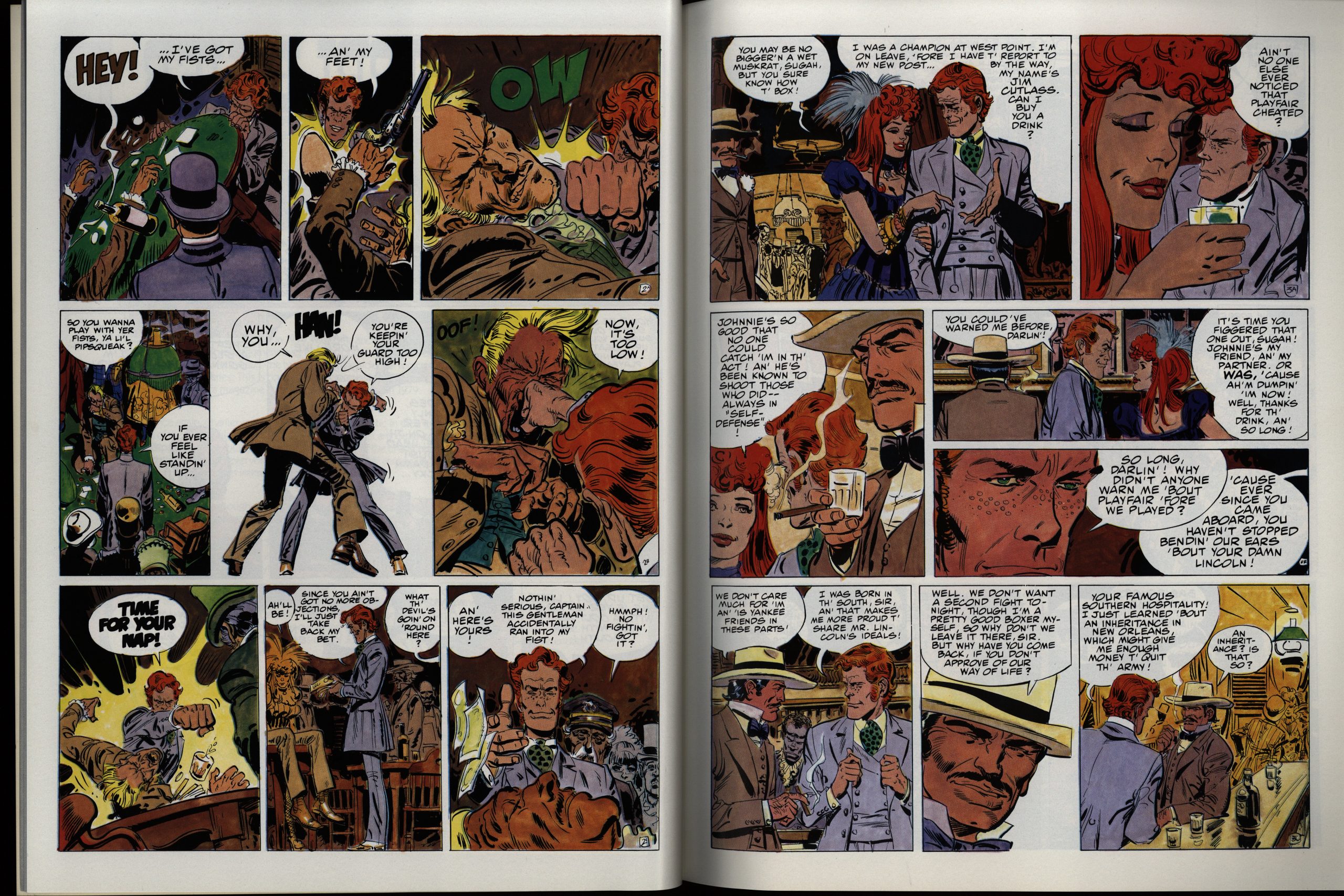
And I guess it is a lot more depressing than Blueberry, but the protagonist is basically Blueberry with red hair. He’s even in the army. (A captain, while Blueberry is a lieutenant, which is a huge difference, I guess.)
The artwork is totally in Moebius’ Giraud style.
One weird thing here is that the letterer varies the size of the lettering apparently by how much space he has to fill up, so you have people who are whispering while it looks like they’re shouting.
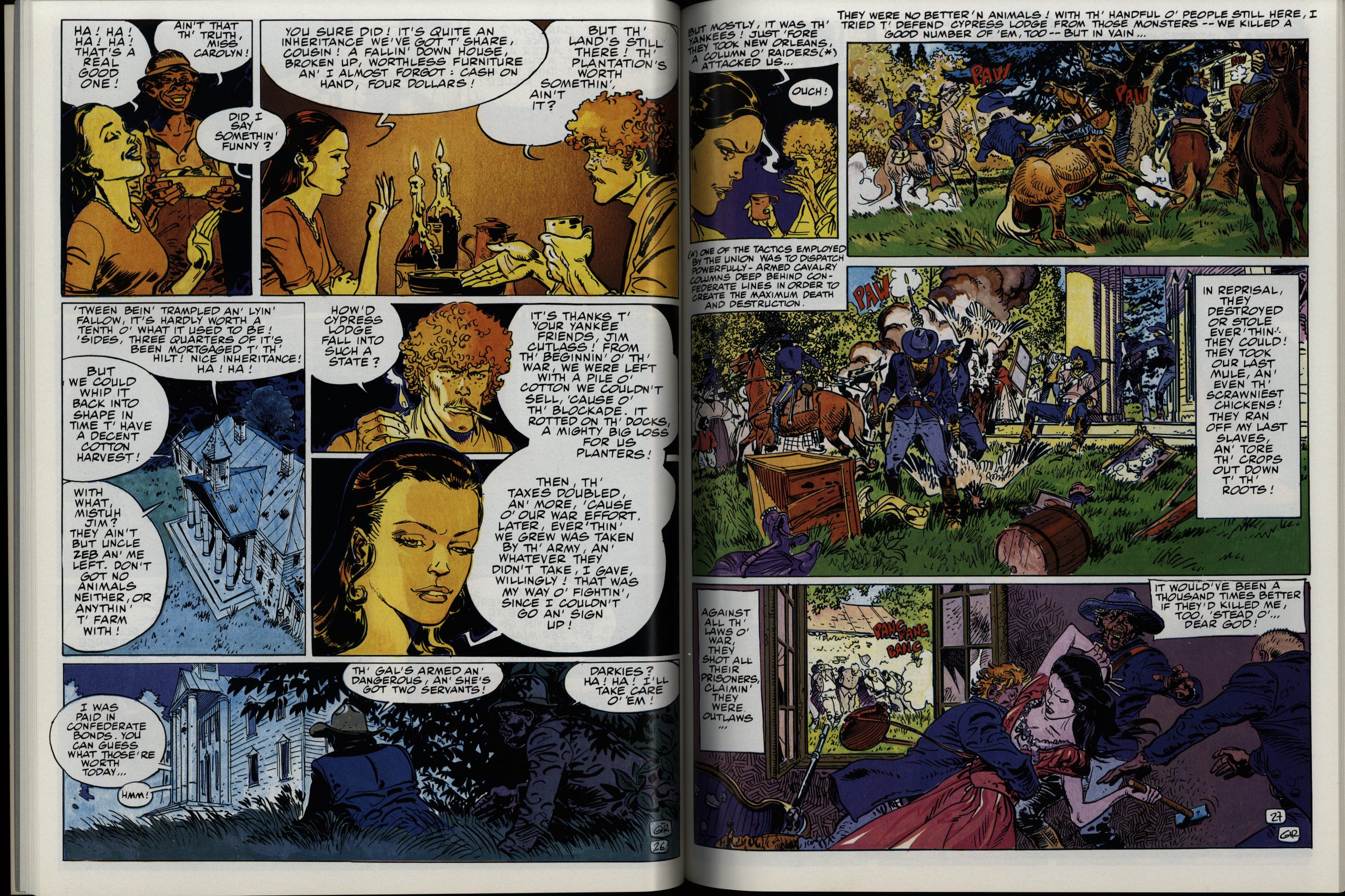
But, yes, the grim parts. Cutlass is a hapless crusading hero just like Blueberry, and like Blueberry, he usually doesn’t reap any benefits from his heroism. But what makes this volume grim is that we seem to be submerged i a totally nightmarish milieu: All the Southern white males are either spineless cowardly bystanders, or they’re racist, murdering assholes… and then it turns out that the men from the North aren’t much better.
It may be an accurate portrayal, but it’s rather unpleasant to read, so I guess they do have a point about this not being Blueberry. Because that’s more fun.
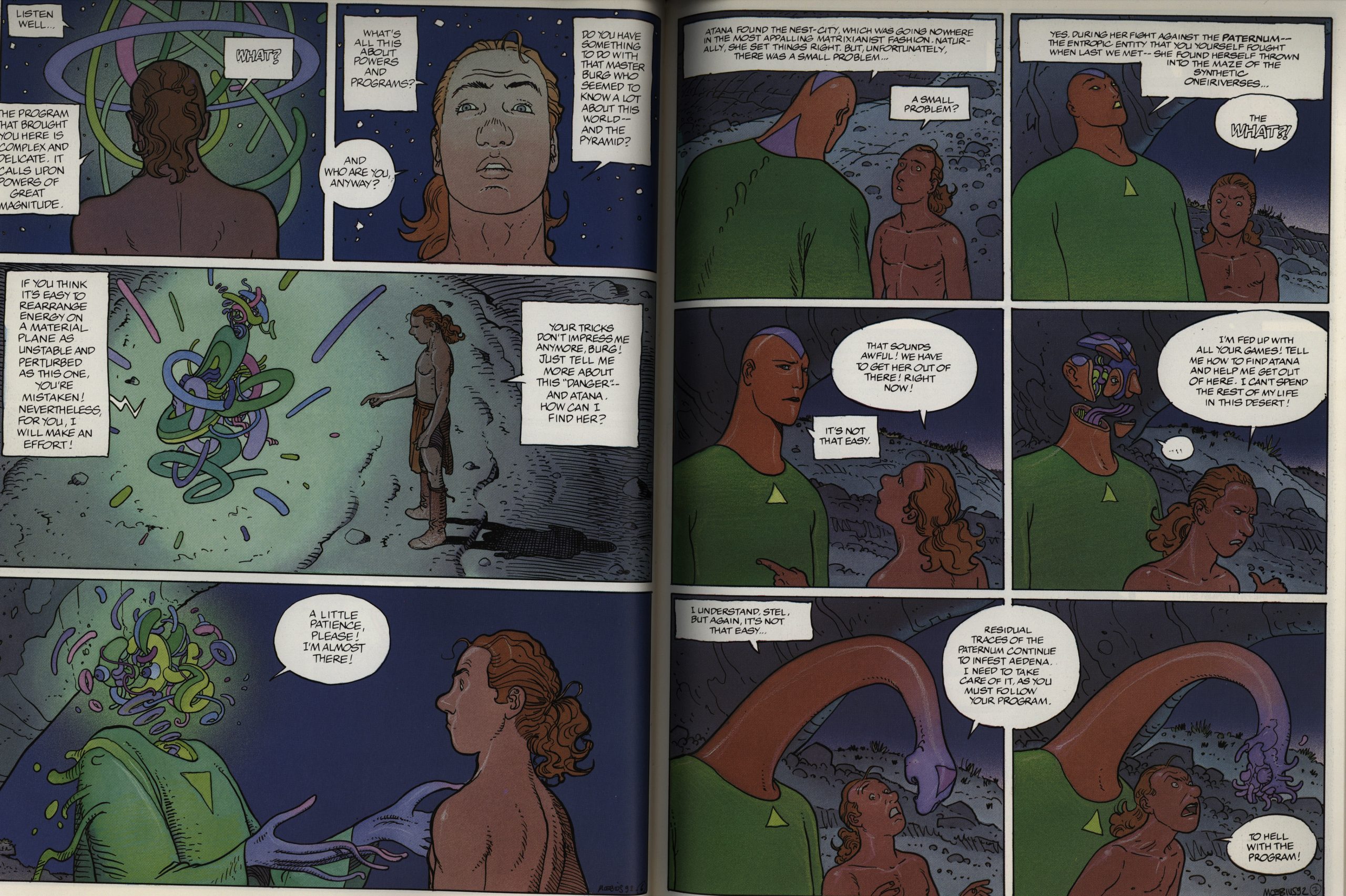
OK, then we have the final volume, and it’s another Aedena book. Storywise, it’s quite like the previous one: Focused, linear, etc. The colouring gets even muddier, but the strange thing is that this is published in a slightly bigger format than the preceding eight volumes, for no particular reason. The artwork is perhaps the most streamlined of all the volumes.
And it’s printed on matte paper, while all the previous volumes were on shiny paper, which also doesn’t help much with the colour reproduction.
Perhaps the Marvel production people involved with the previous volumes had left? It was published three years after the previous volume, in 1994, and was the next-to-last thing published under the Epic banner in the 90s, as far as I can tell.
We get a Moebius-in-English bibliography, and it includes things published by Marvel and otherwise. It includes things like this:
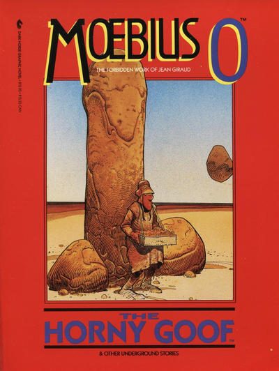
Published by Dark Horse, but using the exact same layout as the Epic series.
It’s nice of Marvel to include them, I think?
Anyway! In this series, Marvel brought over 800 pages of Moebius to the US, and you have to applaud them for that. In later blog posts, we’ll cover the other Moebius things Epic did, including The Incal, art books, some floppies, Blueberry, and… more.
I’m glad I bought as many of these as I did at the time, as they are way out of my price range now! For some reason, The Goddess and Stel seemed to be impossible to track down and much more costly than the others. Thank you for the great commentary and presentation. Really enjoyed it!