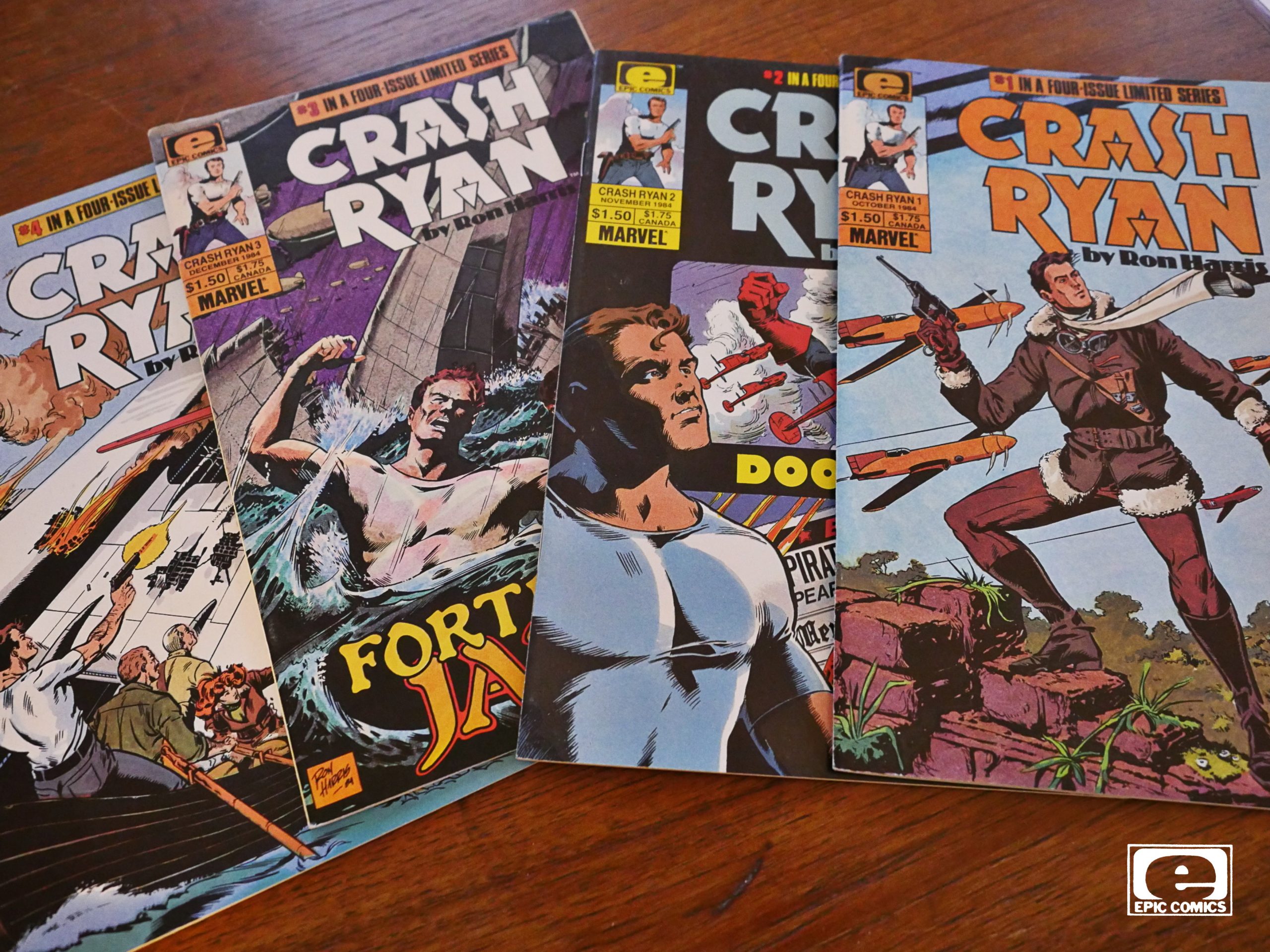
Crash Ryan (1984) #1-4
by Ron Harris
I was supposed to do Six from Sirius today, but the package containing that series hasn’t arrived yet, six weeks after I ordered it. So I guess I’ll have to do that one out-of-sequence.
But you know when you’re reading something and you can’t quite make out whether it’s a parody of something or whether it’s indeed that something? That’s the Crash Ryan reading experience.
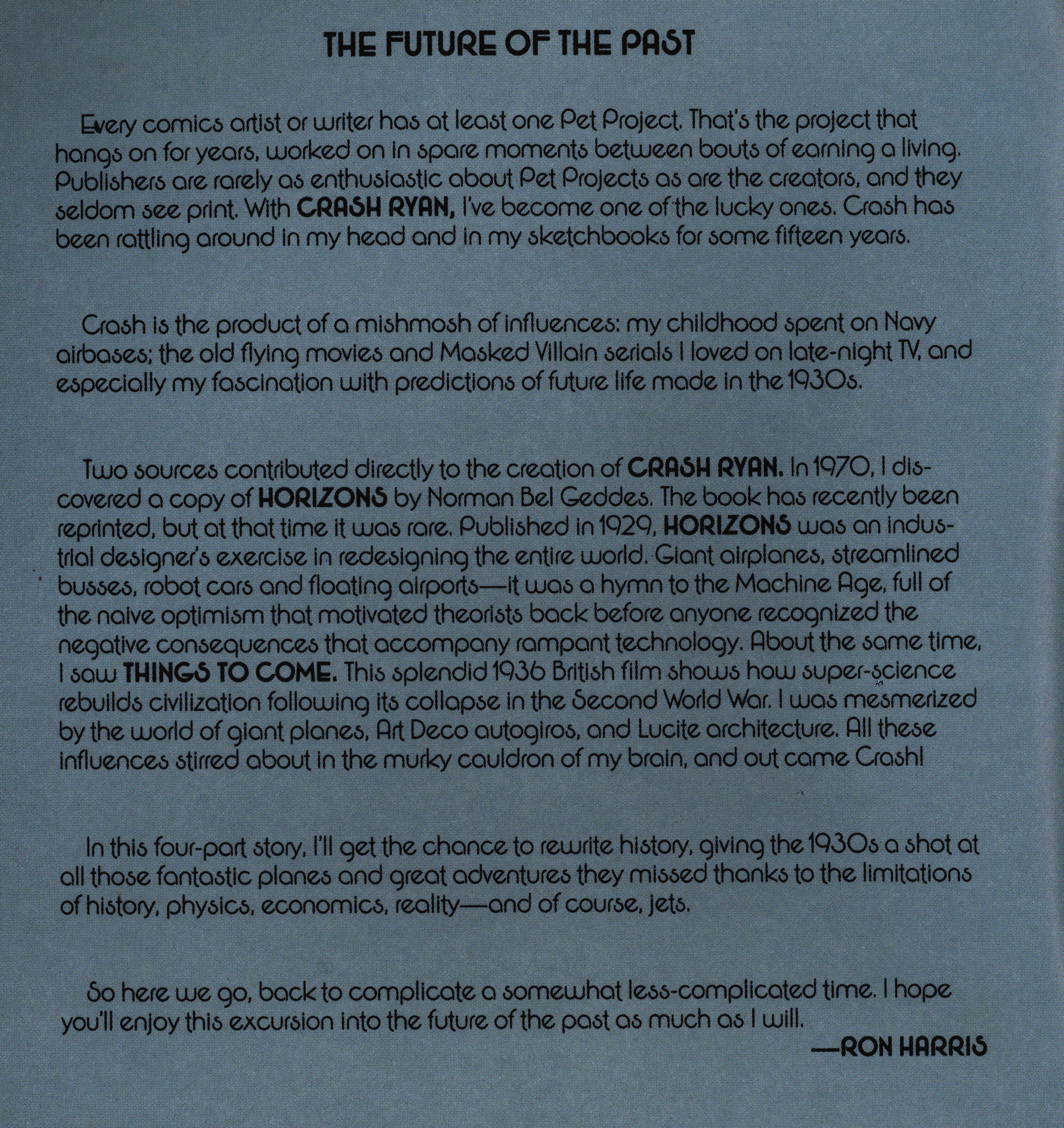
I don’t know who Ron Harris is, but he seems to have an affinity for oldee tymee comics, doing various Roy Thomas DC projects. And the seems like a natural fit, because he seems to have an enthusiasm for 30s/40s adventure stuff. He explains in the introduction that Crash Ryan was something of a passion project for him: He wanted to do a comic about what futurism looked like in the 30s.
So we get a story based on that concept: Outlandish planes that would never actually be practical, but that (hopefully) looks cool. Coupled with a story about a scrappy fighter pilot and a maniacal and evil villain. Sounds like a good setup, right?
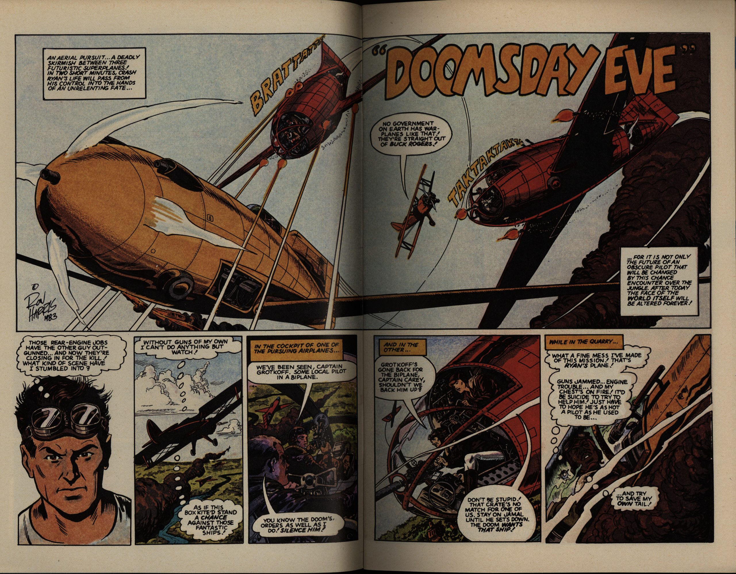
One of the problems is that instead of being outlandishly futuristic, each design just raises all these questions. Like — how are planes supposed to land on a runway that’s moving perpendicularly to the direction you’re trying to land in? And that’s a gigantic plane — wouldn’t some bigger propellers have been a good idea? Or is the concept that these planes have anti-gravity installed and are just hovering there? That would make sense, but in a different scene the pilot was warning of stalling the plane, so it’s not that either?
I KNOW I KNOW IT”S NOT SUPPOSED TO BE PLAUSIBLE. Sorry caps lock. But it’s just a lot to take in, and every other page presents a conundrum like this, and the only way to get past it is to try not to think about what you’re seeing on any level.
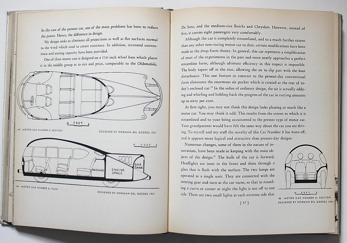
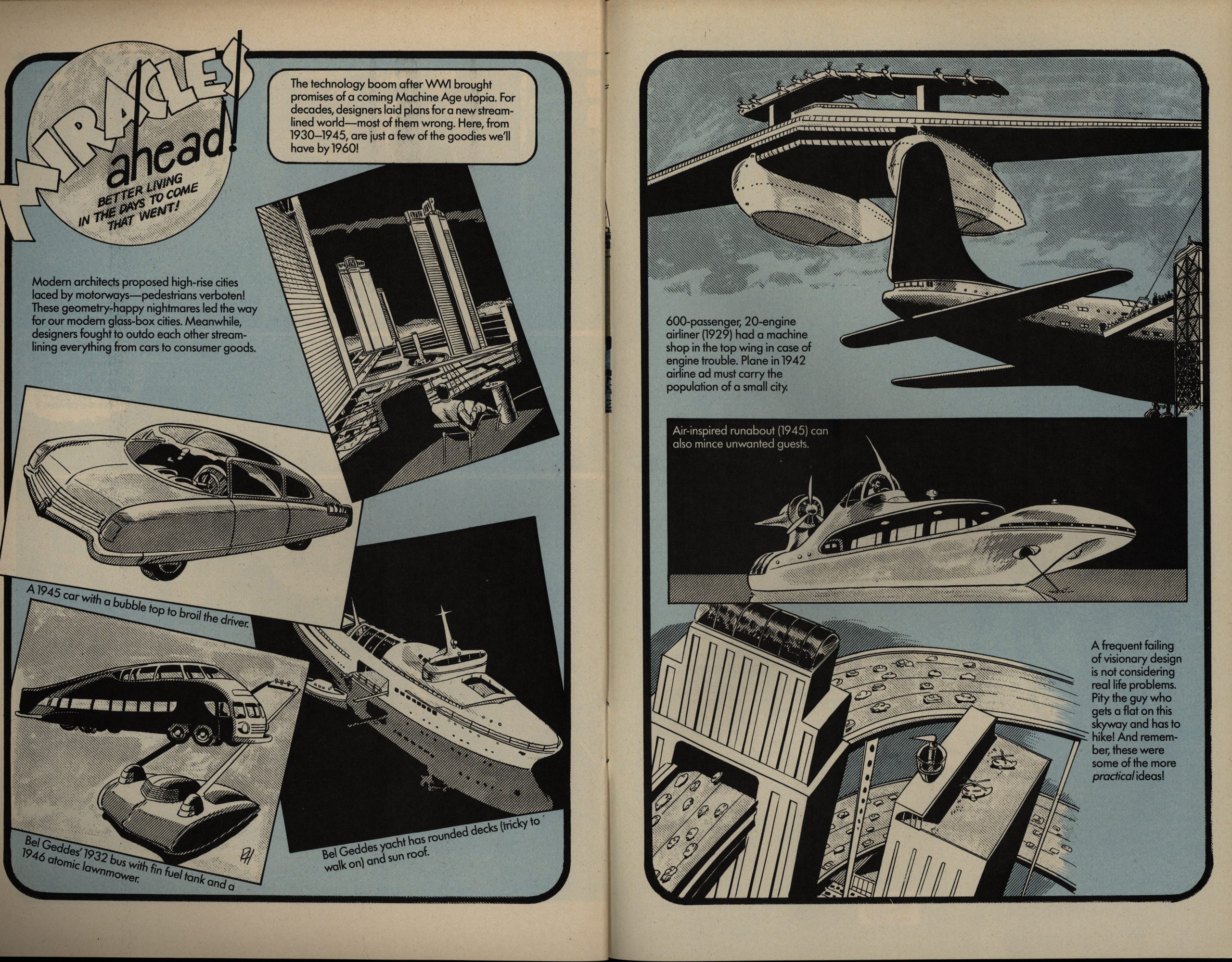
For reference, here’s a couple of pages from the book he references:
See? Not violently stupid, just … impractical. There’s a difference.
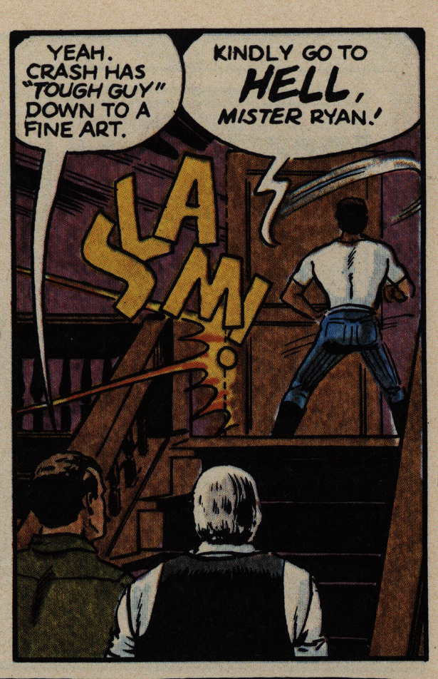
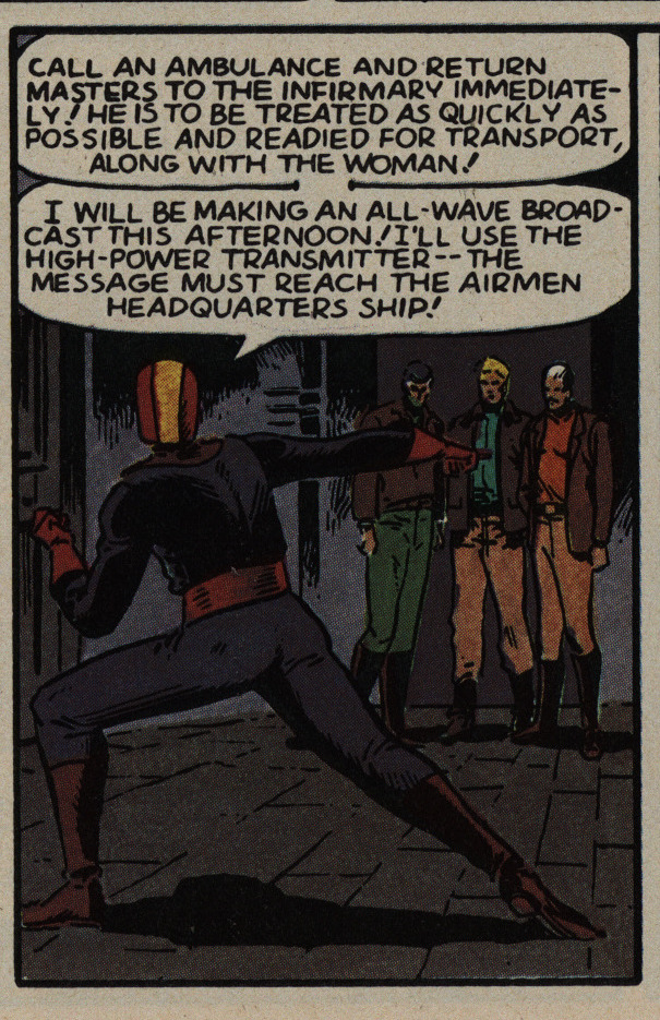
OK, I’ve whined enough about the designs of the planes, so how about bitching about how weird the cartooning is? Sure, there’s heroic stances and there’s heroic stances, but is that guy sinking into a split? Is he really a ballet dancer limbering up while arguing? Is that what “tough guy” means? Being able to drop into a split at any moment? That’s the only way I can interpret that panel.
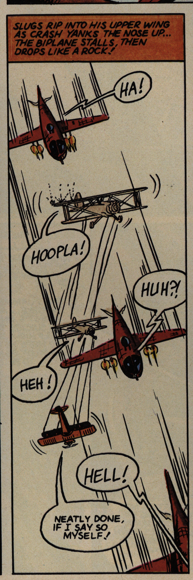
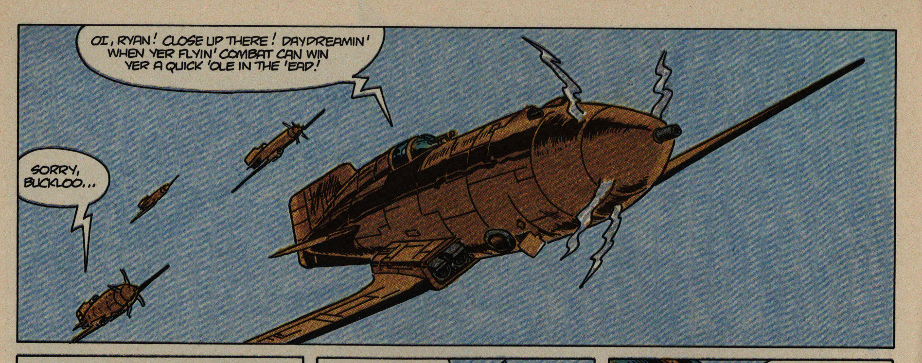
But we didn’t come to this book for the postures, did we? Aerial combat, that’s where it’s at. And to quote on of the villains: “Huh?!” Because they’re mostly like this: Not very exciting, mostly because they’re … bad. And confusing. I mean, could you have made out what’s supposed to be going on in that panel without the caption? And why does the biplane change colour anyway?
Le puzzlement.
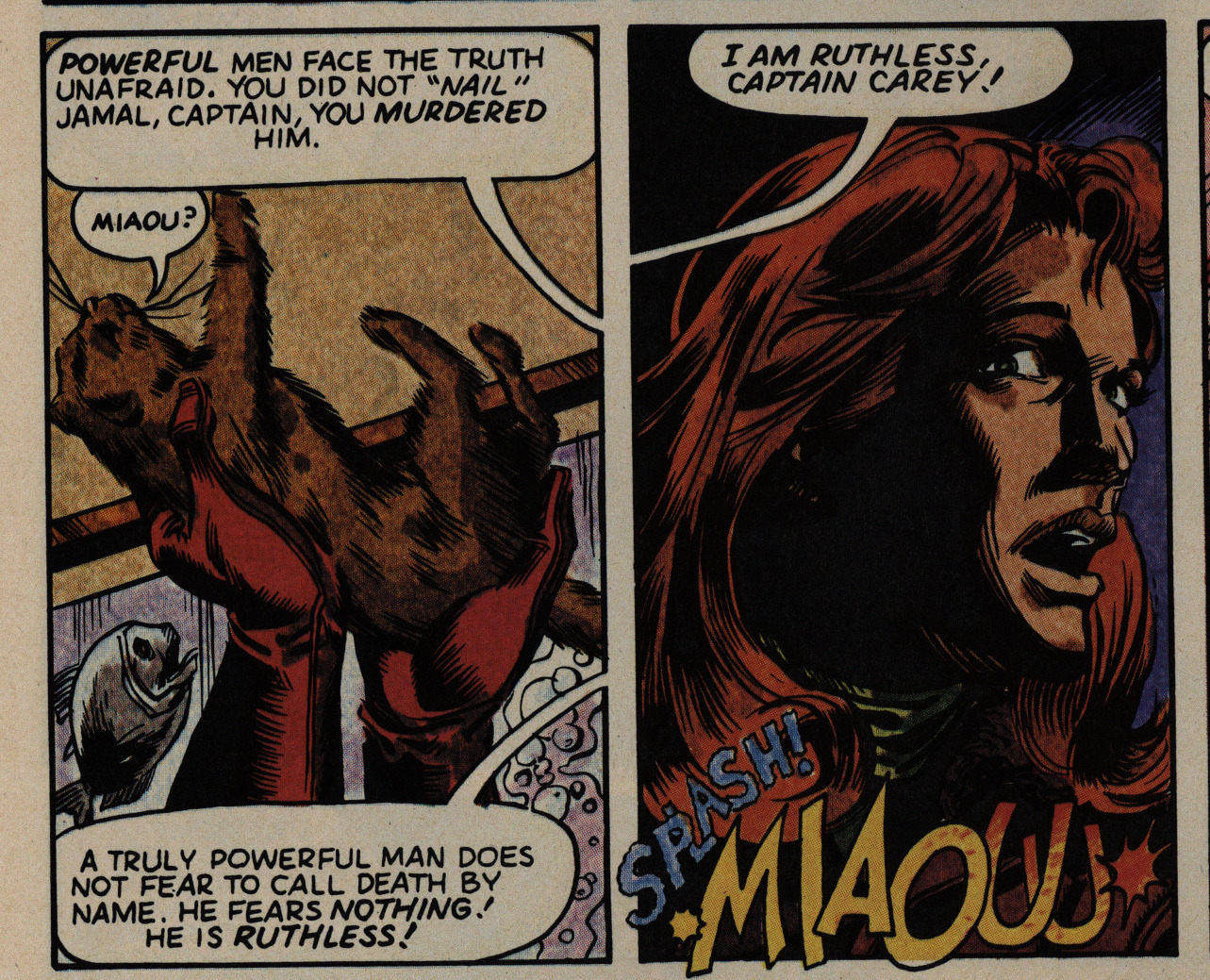
The villain, helpfully called “The Doom” is easier to read. Above you have him feeding a kitten to his piranha, because what else would villains do?
So we return to the question I started with: Is this a parody of a 30s adventure comic, or is it trying to grittily up the stakes? Because I can’t tell. If it is a parody, it’s not really a very effective one, and if not, it’s kinda embarrassing.
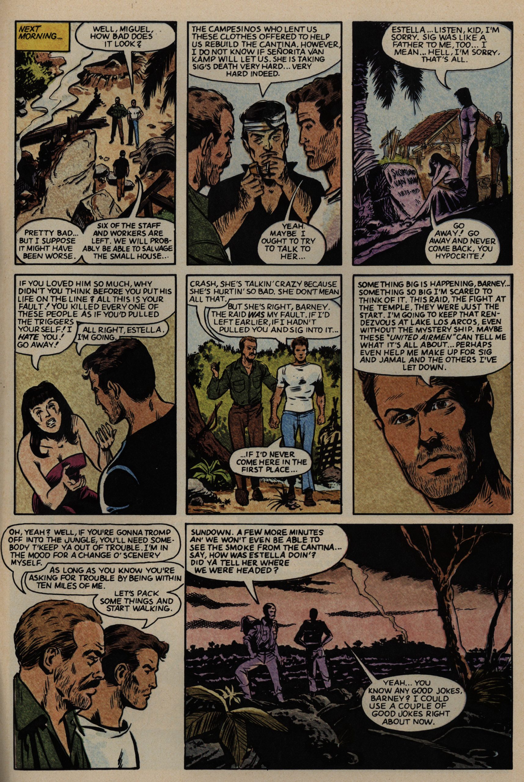
And dear lord, the verbiage. It goes on and on and
While we’re nitpicking: That’s a weird way to draw propellers. When you look at propellers in real life, outdoors without any electric lights, you see either a blur or (blinking your eyes) the propellers as they really are, right? It’s only in movies you get the interference patterns with the frame rate. So these… murder spikes… are just weird.
But, OK, drawing propellers isn’t really a solved problem.
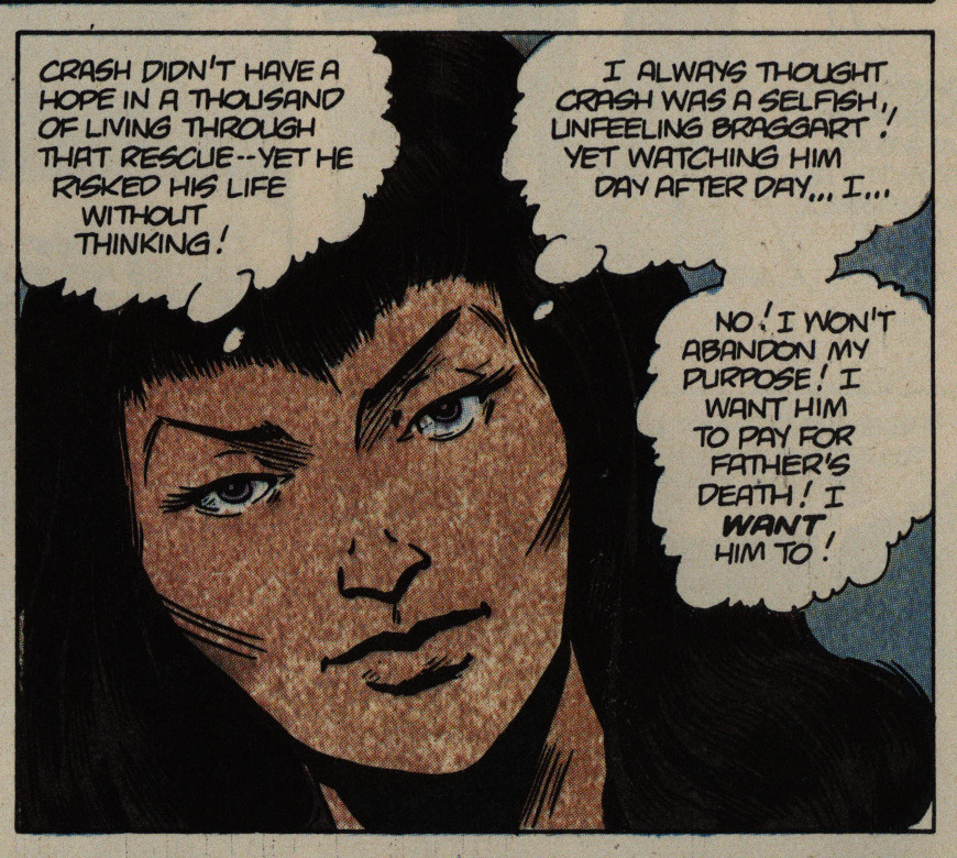
And neither was colouring at this point. All the publishers were trying out new methods to get away from mechanical seps… but whatever unholy technique Marvel was using here, it’s horrible, horrid and horrendous.
Unless she’s meant to have leprosy. In that case: Carry on.
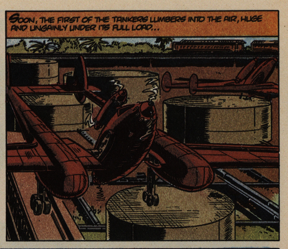
I’m all for doing outlandish designs, but coupled with Harris’ inability to distinguish foreground from background in any way (line weight, colouring, good perspective, anything) panels are frequently very difficult to read. I first interpreted that as a VTOL plane sitting on one oblong box and one round box, before reinterpreting it as a plane hovering far above structures on the ground.
It makes reading a slog.
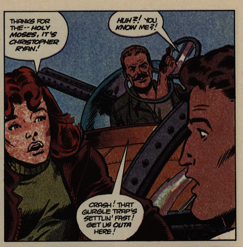
You have to applaud Harris for his diverse cast, though. For instance, here you have a pilot who has an arm growing out of his chest, and nothing is more diverse than that.
Harris presents some examples of fun designs from the past, and I can definitely see the inspiration.
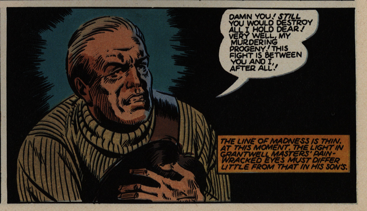
It’s not just the hero who’s a dancer: The villain is also training for Swan Lake, apparently.
OK OK, me could continue kvetching about just about any panel in this series, but some of we have better things to do. (Obviously not I.)
So I’m going to stop this performance of Old Man Rants About Thirty-Five Year Old Comic Nobody Has Ever Heard Of right now.
Harris would bring back the characters in a four-part story that ran in Dark Horse Presents #44-46 (September 1990 – November 1990)
But it’s never been reprinted, for some odd reason or other.
What did the critics think?
Somebody writes in Amazing Heroes #60, page 61:
Action is the byword in this
newest limited series from the Epic
Comics line. Creator Ron Harris
was strongly influenced in his work
by both the speculative fiction and
motion picture serials of the 1930s.
There seems little doubt that the
success of, Indiana Jones also
played a hand in the decision to
give this project a green light.
The story fails on many levels.
There are long, sustainwed action
sequences, but they fail to generate
any real excitement. Dialogue is
forced and contrived. As a char-
acter, Crash Ryan comes off as
vain, selfish, reckless, irresponsi-
ble, and often shockingly indif-
ferent when it come to placing the
lives of others in danger. He is
more stupid than heroic.
It was a perfectly viable idea for
Harris to attempt to emulate the
pulp fiction of 50 years past, but
unfortunately his pencils also draw
substance from the comic art Ofe
that era. It is stiff and simplistic,
with dark coloring that often nearly
obscures the pencils.
This series also raises a question
in my mind. t thought one of the
purposes of Epic Comics was to
provide a platform for artists and
writers with established, note.
worthy credentials (such as
Moench and Gulacy on Six From
Sirius). What are Ron Harris’s
credentials? Or, for that matter,
Steve Perry’s on Timespirits? Before
learning of this book, I had never
heard of Harris.
In the final analysis, though, Hare
rists past credits, or lack thereof,
are irrelevant. What matters is the
material at hand. Crash Ryan
doesn’t have wings, and I feel its
flight would soon be aborted if it
wasn’t a limited series.
Harsh, dude.
R. Fiore writes in The Comics Journal #96, page 34:
I like it, it’s screwy. Crash Ryan is a cross
between ’30s adventure serials and (though
writer/ artist Ron Harris may not know it)
the apocalyptic fantasies of the turn of the
century. The plot involves a war between
the huge private airqeets Of the mysterious
Mr. Masters and arch-villain the Doom,
who turns out to be (gasp!) Masters’s son.
The Oedipus Airman angle can be over-
looked in favor of Harris’s love for yester-
day’s technological dreams, particularly
the ones that didn’t work. To be sure, Har-
ris.is not quite as good at drawing people as
he is at machines, but since this is the big
battle issue that’s less of a problem than it
might be. Won’t make anyone forget The
Rocketeer, though.
Mellow, dude.

I just LOVE this limited series. I totally disagree with your take. You are probably one of those that think new trek is actually good.