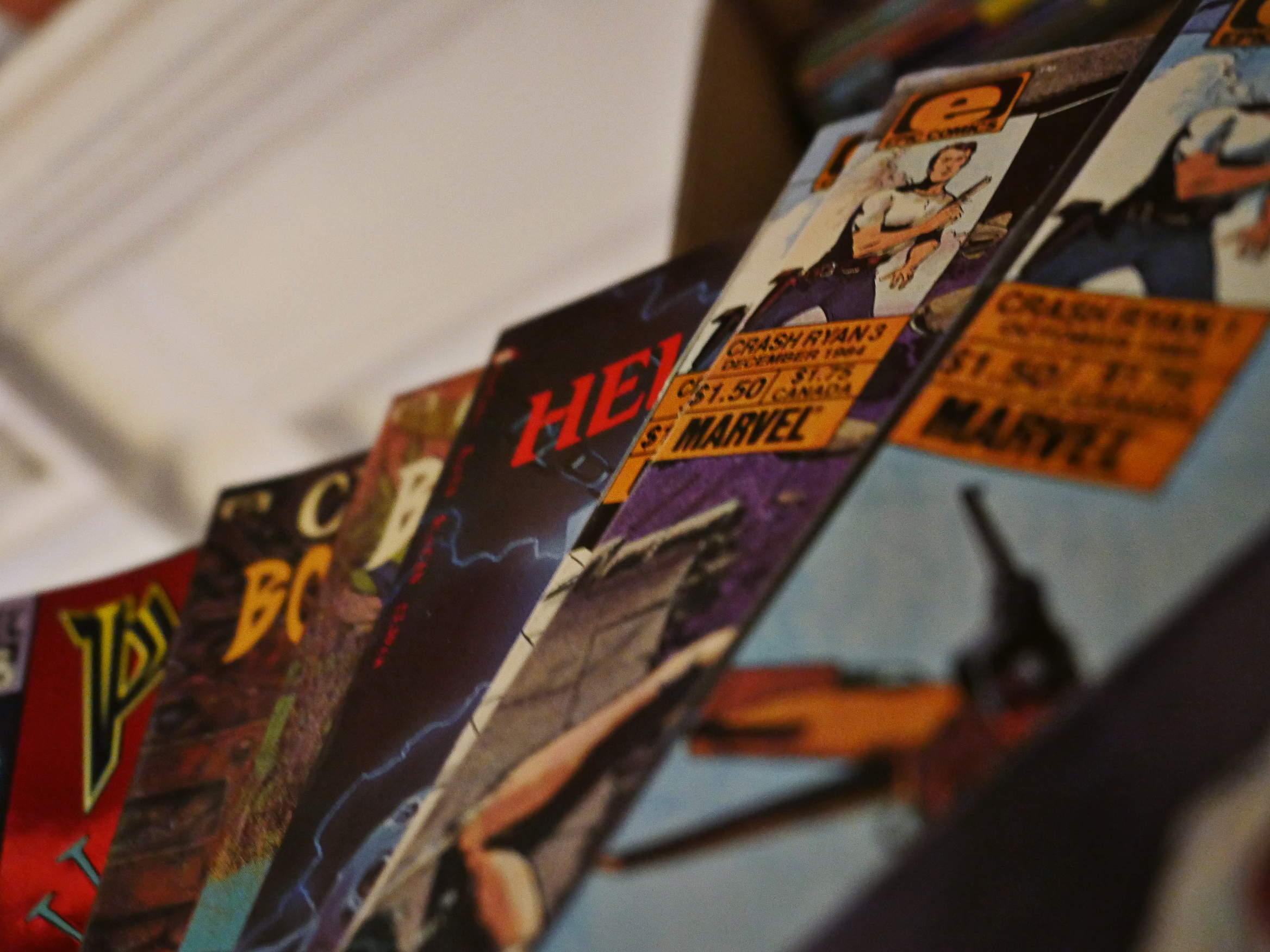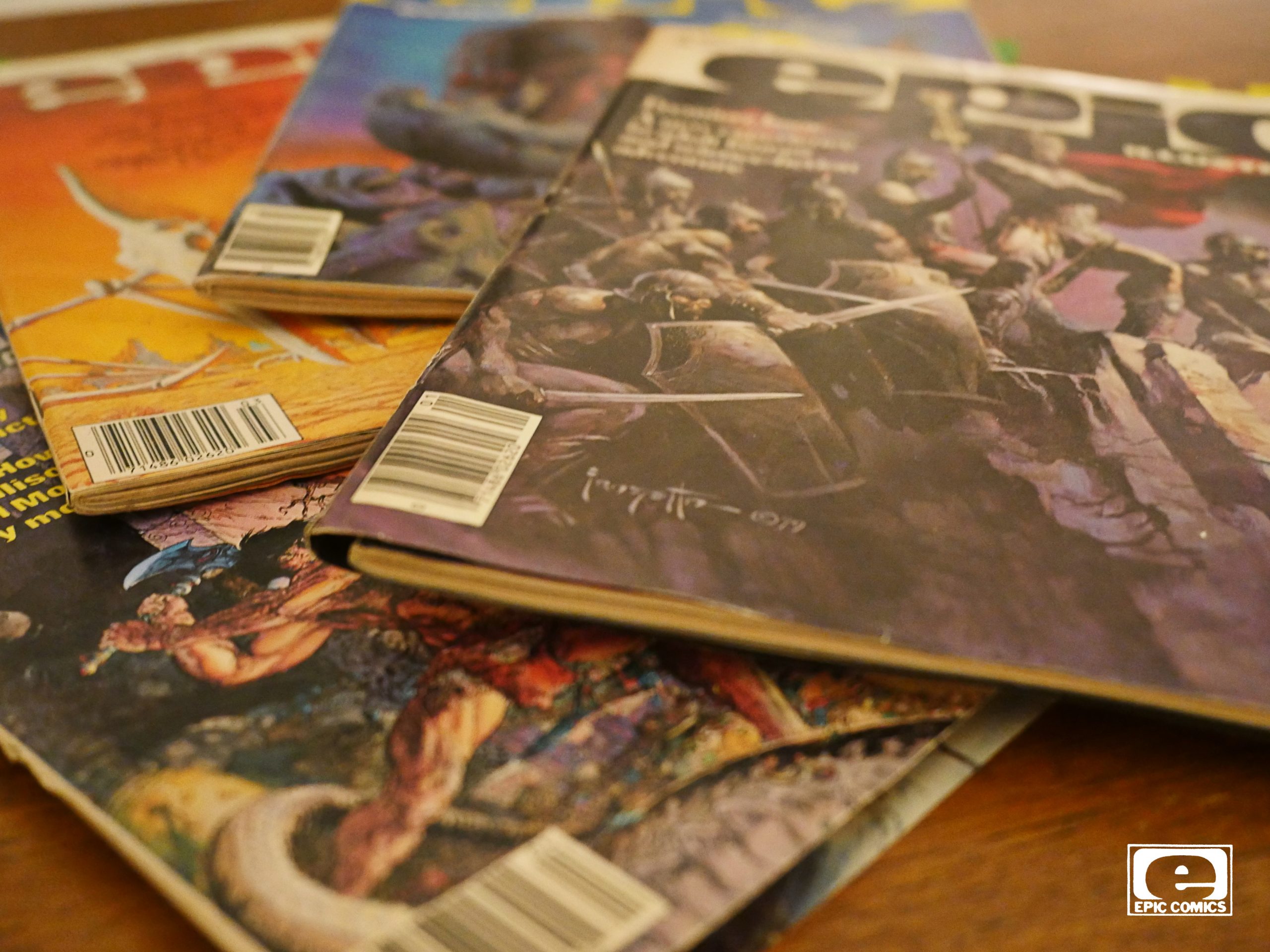
Epic Illustrated (1980) #1-34
edited by Archie Goodwin
“What?!” you’re saying. “Isn’t this supposed to be a blog about Epic Comics? Epic Illustrated wasn’t published under the Epic Comics imprint! Epic Illustrated a couple of years before Epic Comics was created! I feel cheated and I’m angry!”
Yes, I agree. I’m a bad, bad blogger.
However, Epic Illustrated’s editor, Archie Goodwin, was the main guiding force for Epic Comics, so I thought it might be interested to look how Marvel handled the concept of “creator owned properties” before they turned it into a line of periodicals.
So: Epic Illustrated. If you’re not interested, you can skip the next handful of posts, because it’s going to take me a while to go through these.
It’s 3200 pages, in total, so it’s going to take me at least a week to read these comics, and I’ll do… let’s say… one post per EI year? That’s about 4-600 pages per post for me to read?
OK? OK.
Of course, Epic Illustrated is a rip-off of Heavy Metal. Marvel tried tipping off everybody who seemed to make money, which explains the mid-70s Comix Book magazine, where they tried to publish undergrounds (after the entire underground thing was over). And, of course, they couldn’t be as raunchy as real undergrounds were, so it didn’t really appeal to anybody much.
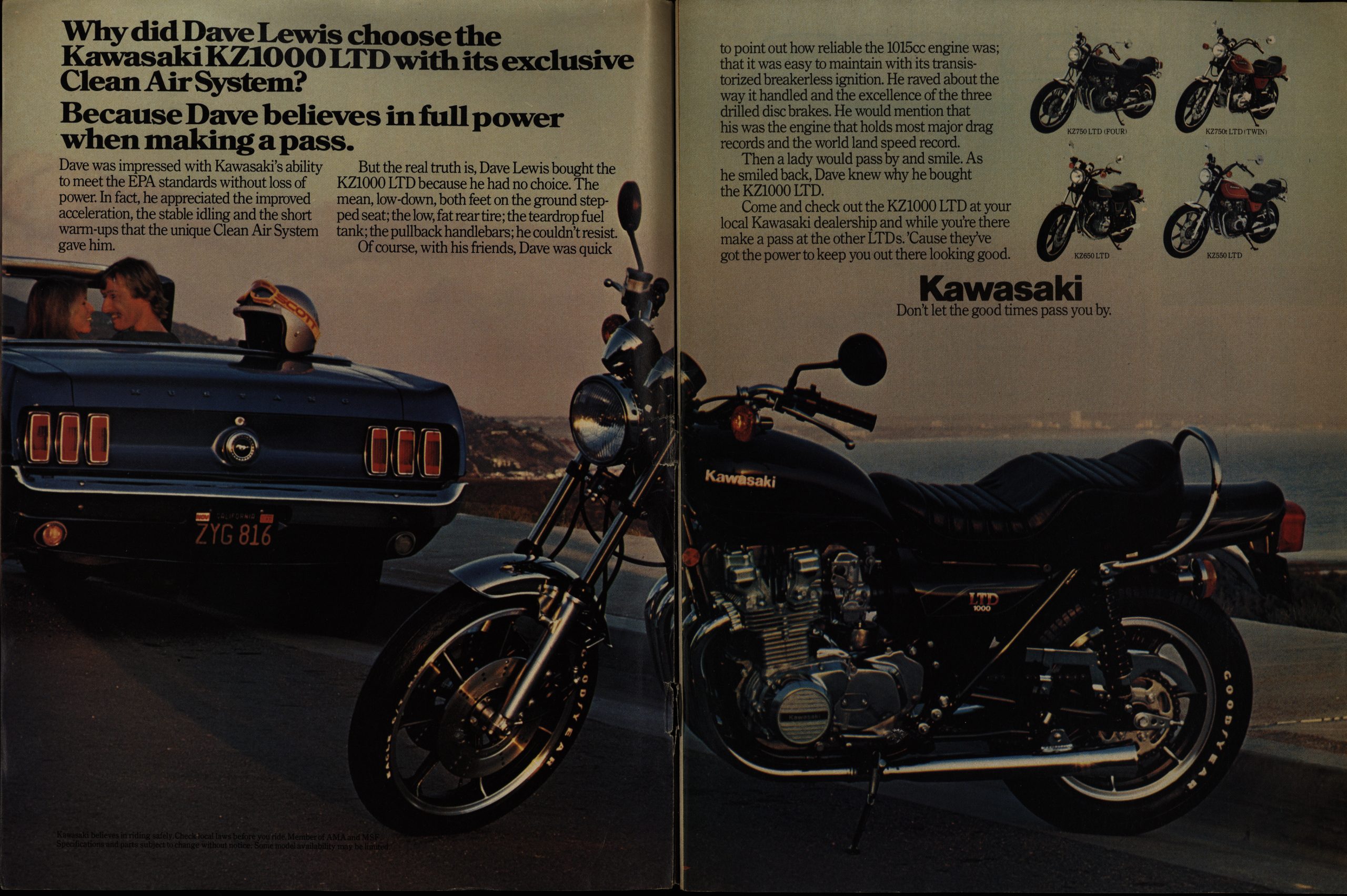
The attraction of Heavy Metal was that you had sexy sci fi stuff, but again, Marvel couldn’t really get into the “sexy” bit beyond showing some boobs, but it’s interesting how they’ve sold the concept to advertisers. Above you have a smarmy Kawasaki ad about “making a pass” (ha ha, I’m dying no seriously), and then you have
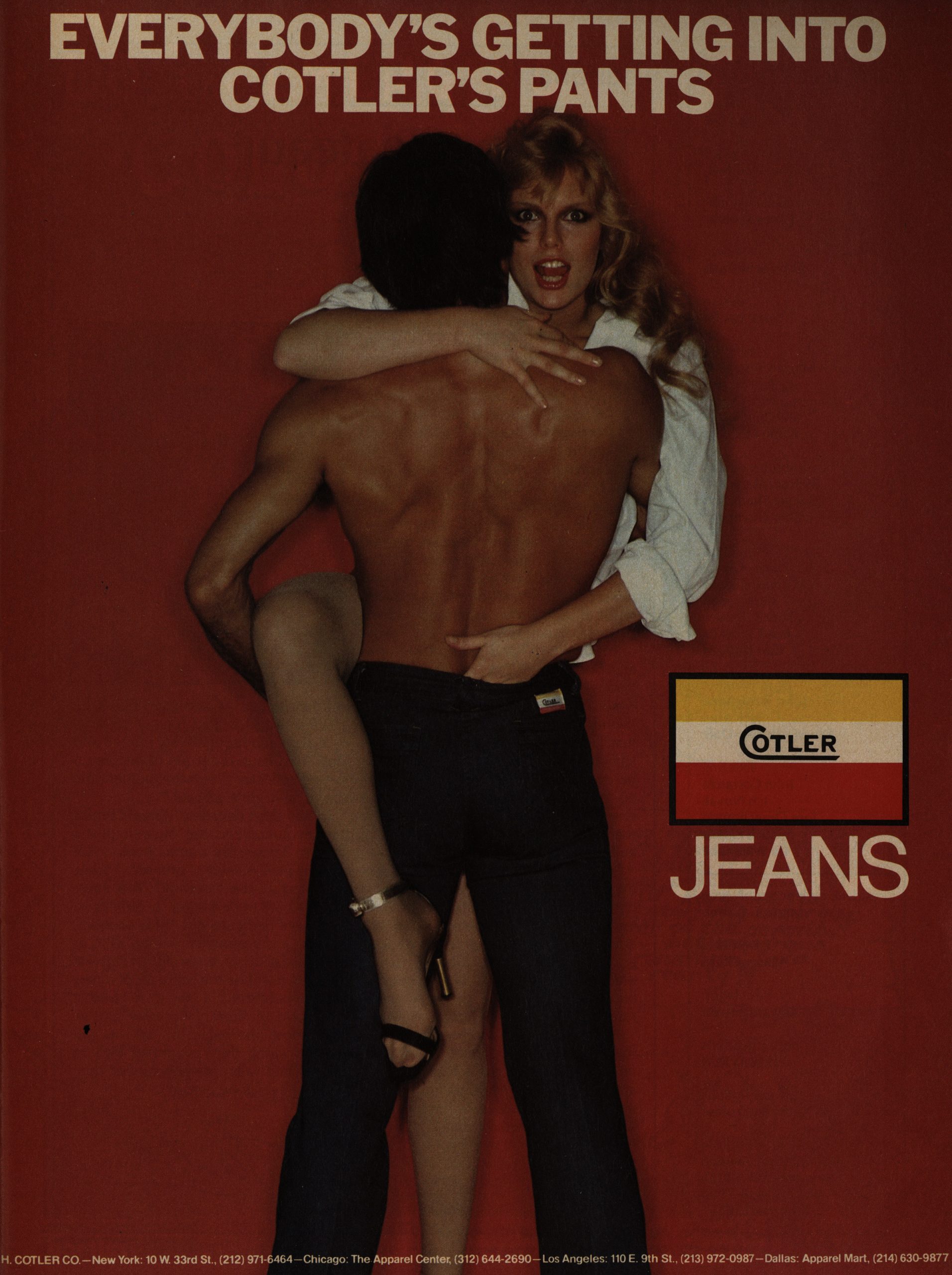
this nice ad for Cotler Jeans. So the Marvel salesforce had obviously been on the phone to everybody saying “it’s going to be like Heavy Metal! People will be jerking off to it for sure! I promise you!”
But this is Marvel, and that’s not realistically going to happen. I think?

Stan Lee is credited as the editor, and Goodwin is the “editorial director”. I think this means that Lee got some money but was otherwise not involved much? I’m just guessing: All the input seems to be very Goodwin-ey otherwise.

Yes yes, we are going to get to the comics, but not yet. I’m just fascinated by this ad. What is it even for? Was there a loudspeaker system called “Hartley”? Or is this an ad for a shop that sells stereos?
It exists! It has a very… minimal? Web page.

Not at the same address, though.

They have a letters page in the first issue, and it seems like they’ve sent a request to some famous people to get some feedback on what they think about their publishing plans. Neal Adams seems positive, but a bit standoffish: “Will Marvel really go through with a creator-owned magazine?” I think is what he’s trying to say.

This style of American ad has always befuddled me. Did anybody ever read these walls of text? For… I don’t even know what, because I didn’t read that wall of text, but it’s for a… filter? Oil filter? I don’t know.
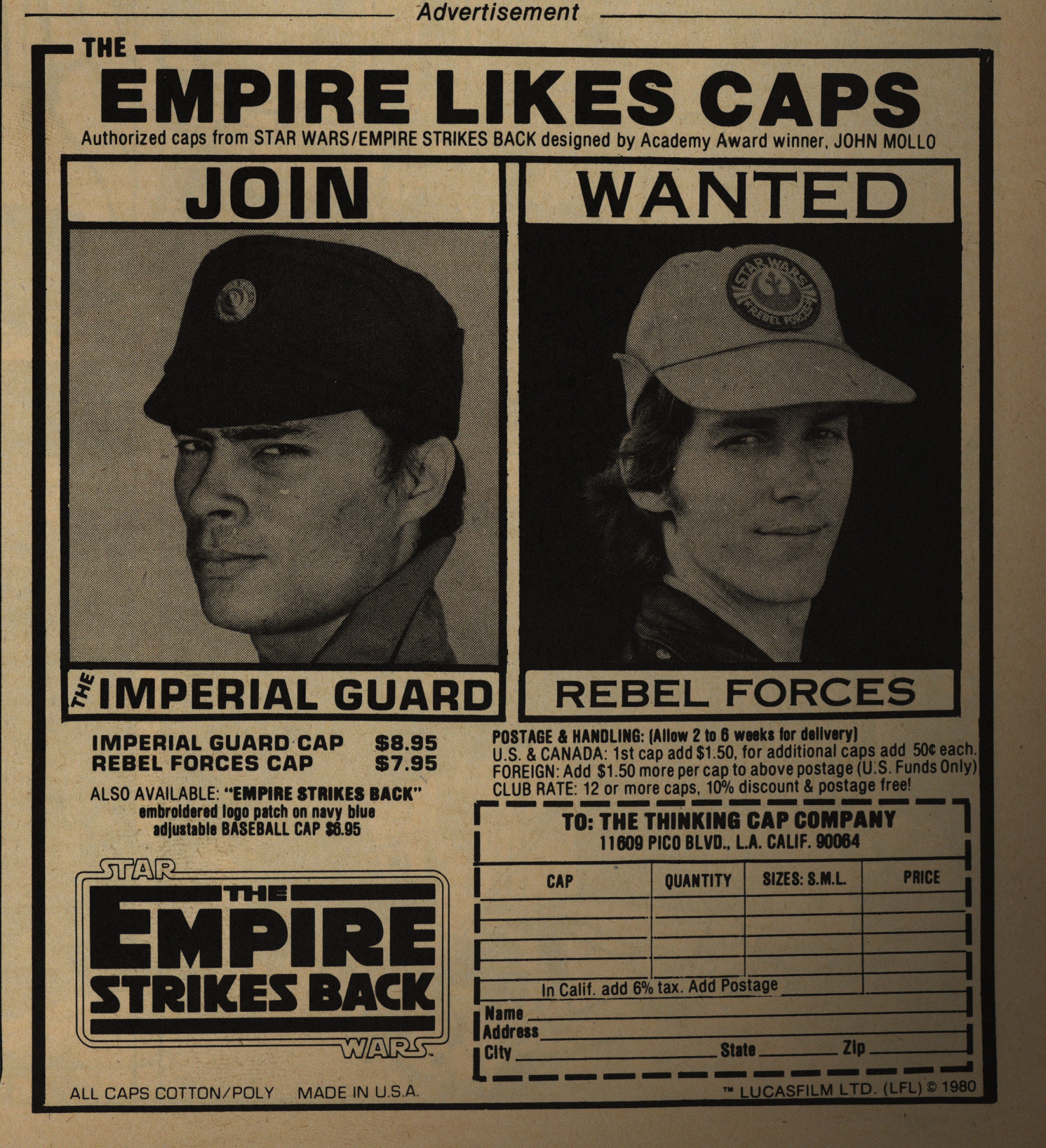
But from the ads, you can see the demographic they’re going for: Over 18, male, no taste, somewhat dumb. And that’s fine.
Oh. Comics!
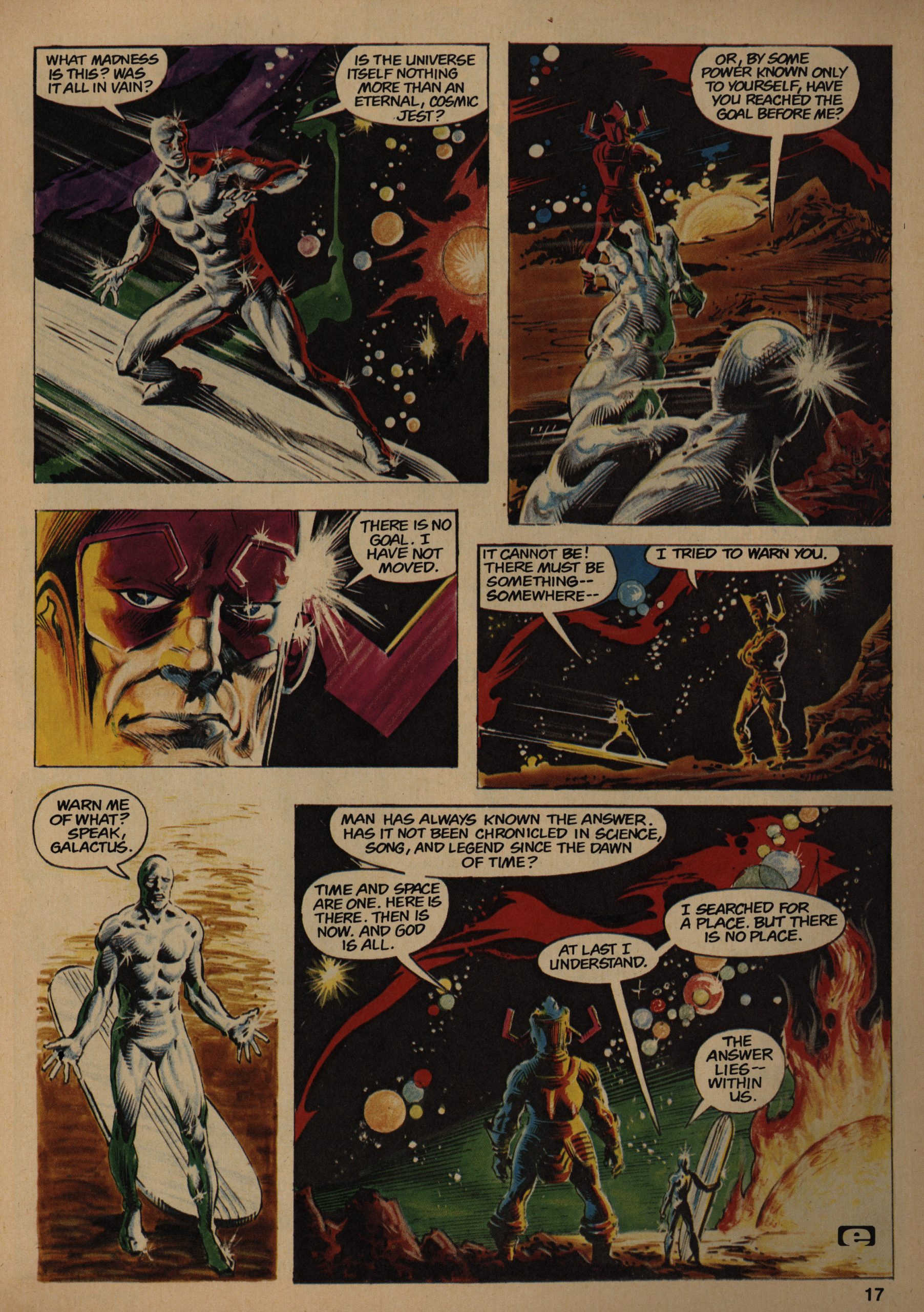
The very first story of the very first issue of a magazine of creator-owned stories is… A Silver Surfer story written by Stan Lee (art Buschema and Veitch).
Isn’t that ironic?
Don’t you think?
But more problematic is that it sucks. Looks nice, though.
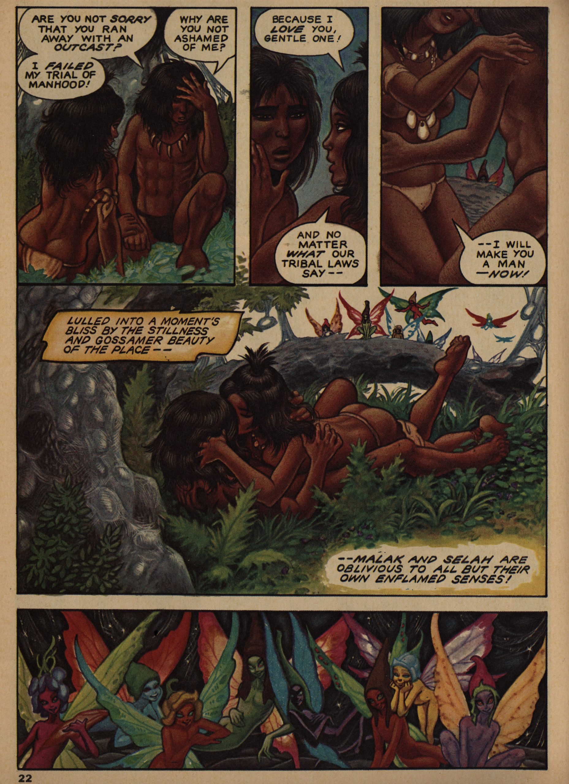
The first issue (as Goodwin points out in the editorial for all subsequent issues) isn’t quite what he’d hoped for, and I see what he means (the mixture of bits is odd). But I think it’s a fine read. Wendi Pini, for instance, contributes some backstory on a pair of lovers found in Elfquest, if I remember correctly? It’s pretty and sweet and ironic and stuff.
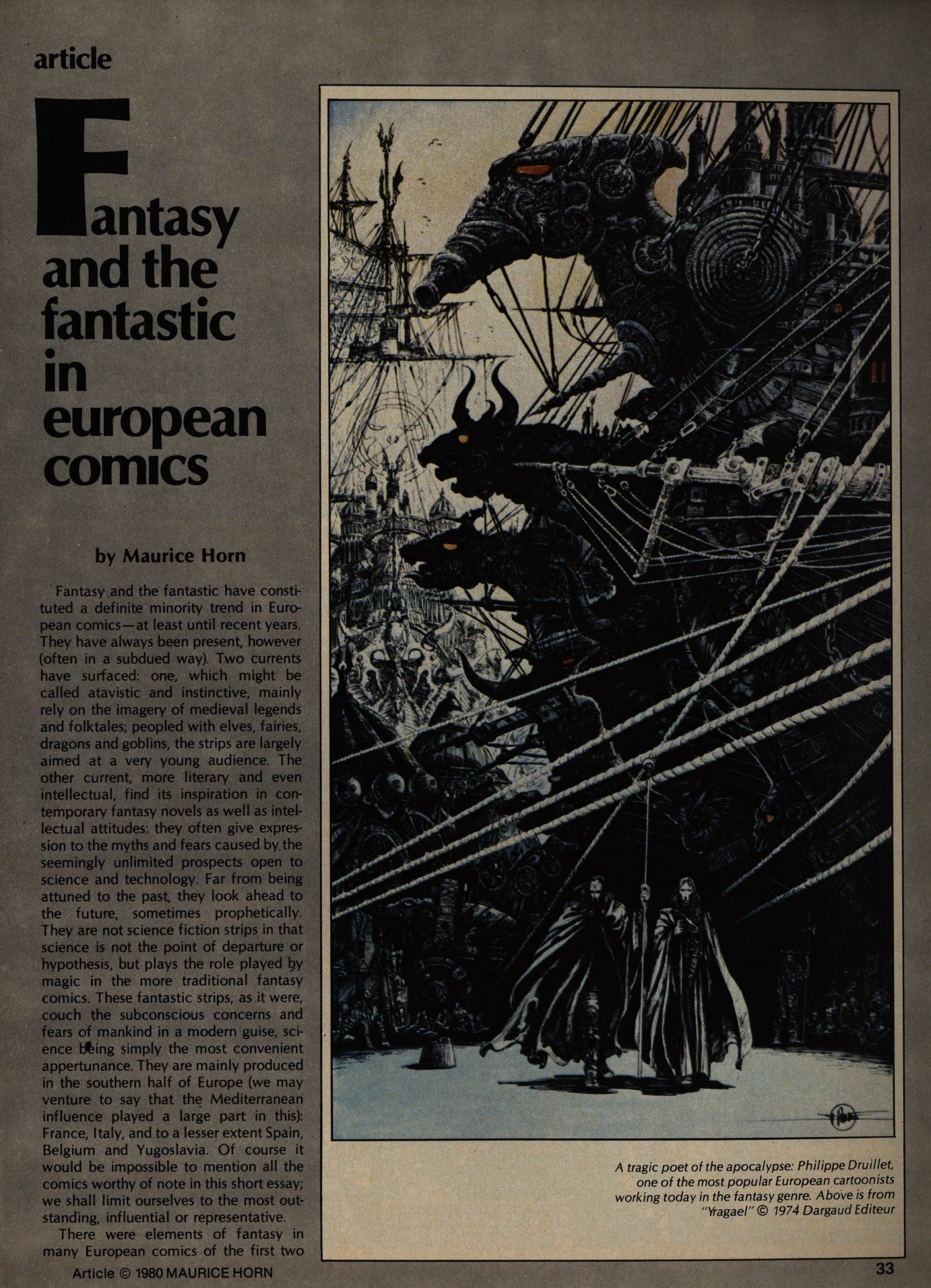
One thing I wondered about was whether Goodwin would try to avoid using European creators in EI to differentiate wrt. Heavy Metal more, and… he does mainly stick to Americans, but he does drop in shorter pieces by furriners, like this Leo Duranona piece. Which is very unusual in other respects, too: It’s a metatextual goof, basically. Goodwin seems to be very focused on narrative pieces, so formal playfulness isn’t EI’s thing. (In Heavy Metal, of course, it was all over the place.)
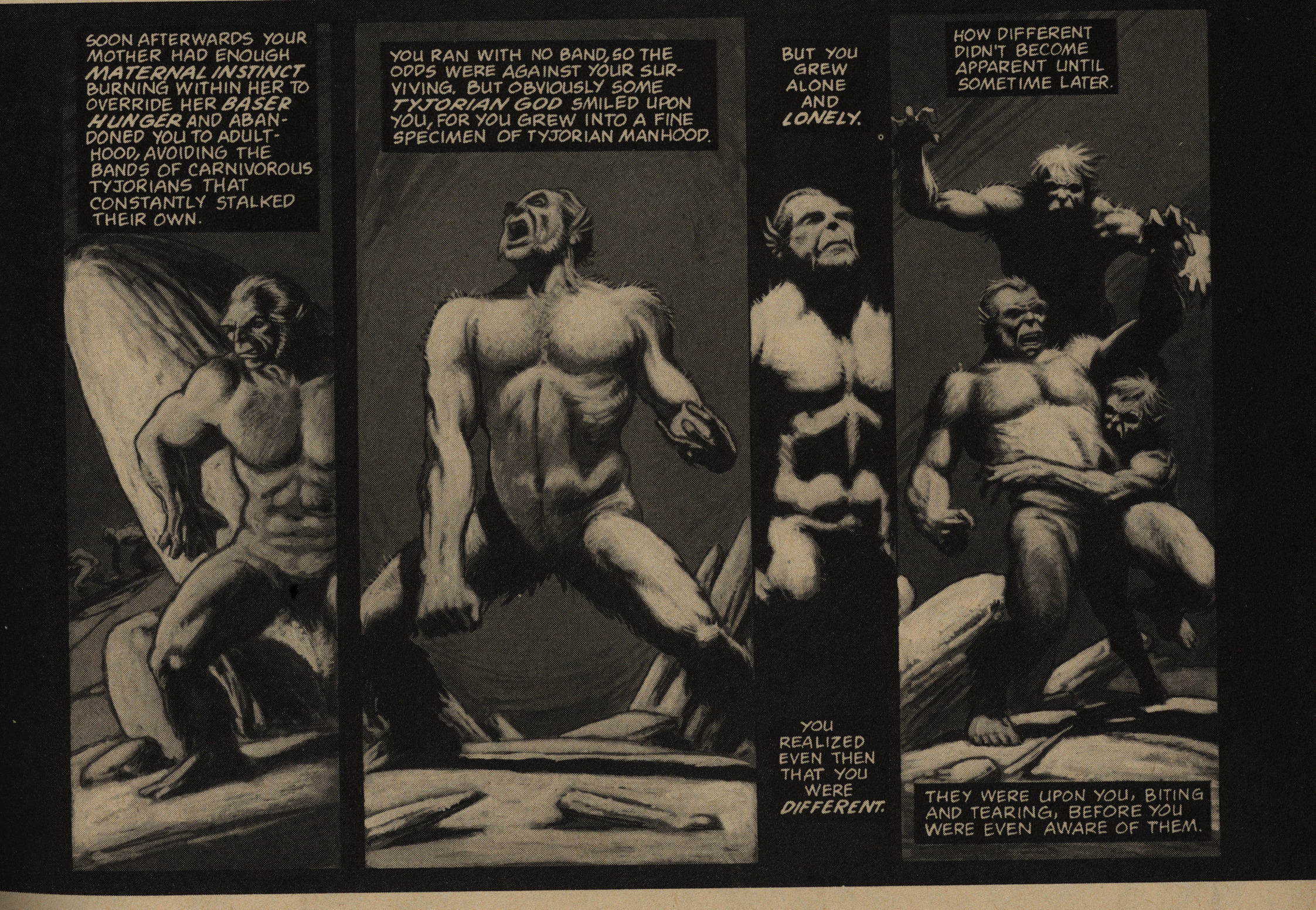
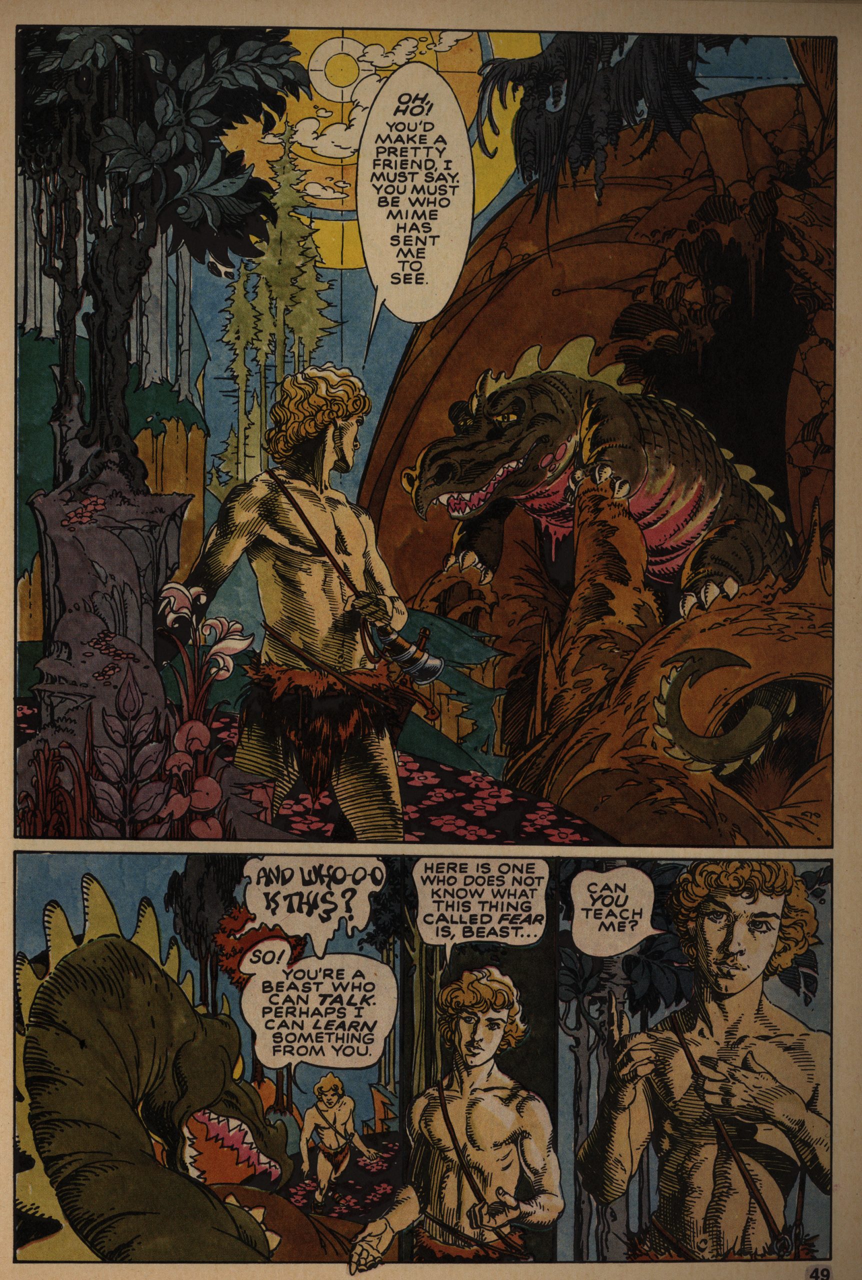
The major serial in EI is “The Metamorphosis Odyssey” by Jim Starlin, and I’m going to go ahead and guess that luring him back to Marvel was one of the reasons EI was created. Starlin had left Marvel for greener pastures over at Eclipse (and elsewhere), but he was successfully brought back into the fold: After doing this serial for a dozen issues in EI, he continued it as an Epic Comics periodical as Dreadstar.
As expected, most of the other stuff are professionally drawn but not very interestingly written fantasy shorts, like this Ray Rue thing.
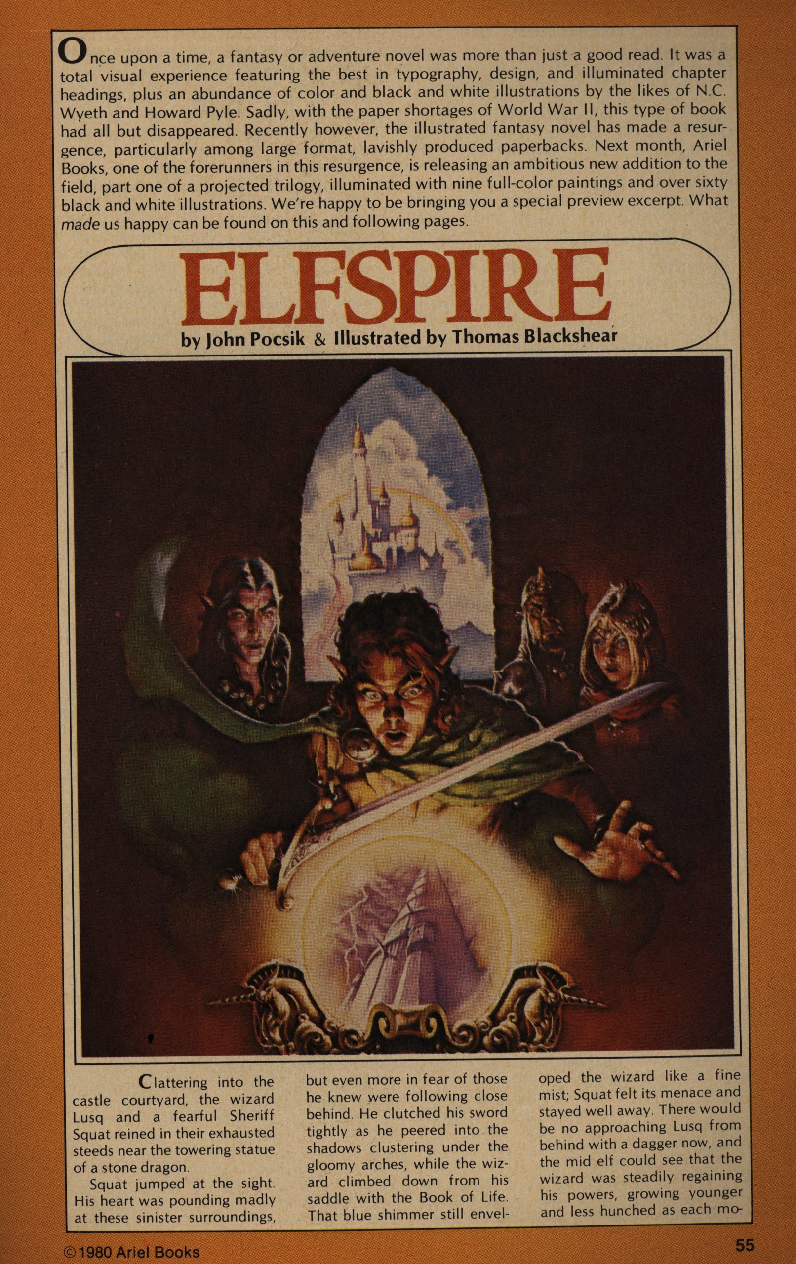
And, my favourite: Really badly written prose stuff with bog-standard fantasy illustrations. Here’s a preview of… something to be published by Ariel Books? It’s unreadable.
More random European stuff… and it’s pretty random, dude.
Deep.
But I do like the artwork.
Rounding out the issue, we get a shaggy dog story by Ernie Colon, which wouldn’t have been out of place in any of the Warren magazines, which surely isn’t what they should be aiming for here.

So much text! Americans are weird.
In the first issue, we get three chapters of Starlin’s Epic epic, which initially seemed odd, but Goodwin explains the logic in a later editorial: Since EI is published quarterly, he wanted to draw people in by hooking them on Starlin, which I think makes sense.
The other thing I wanted to point out here is: No penises.

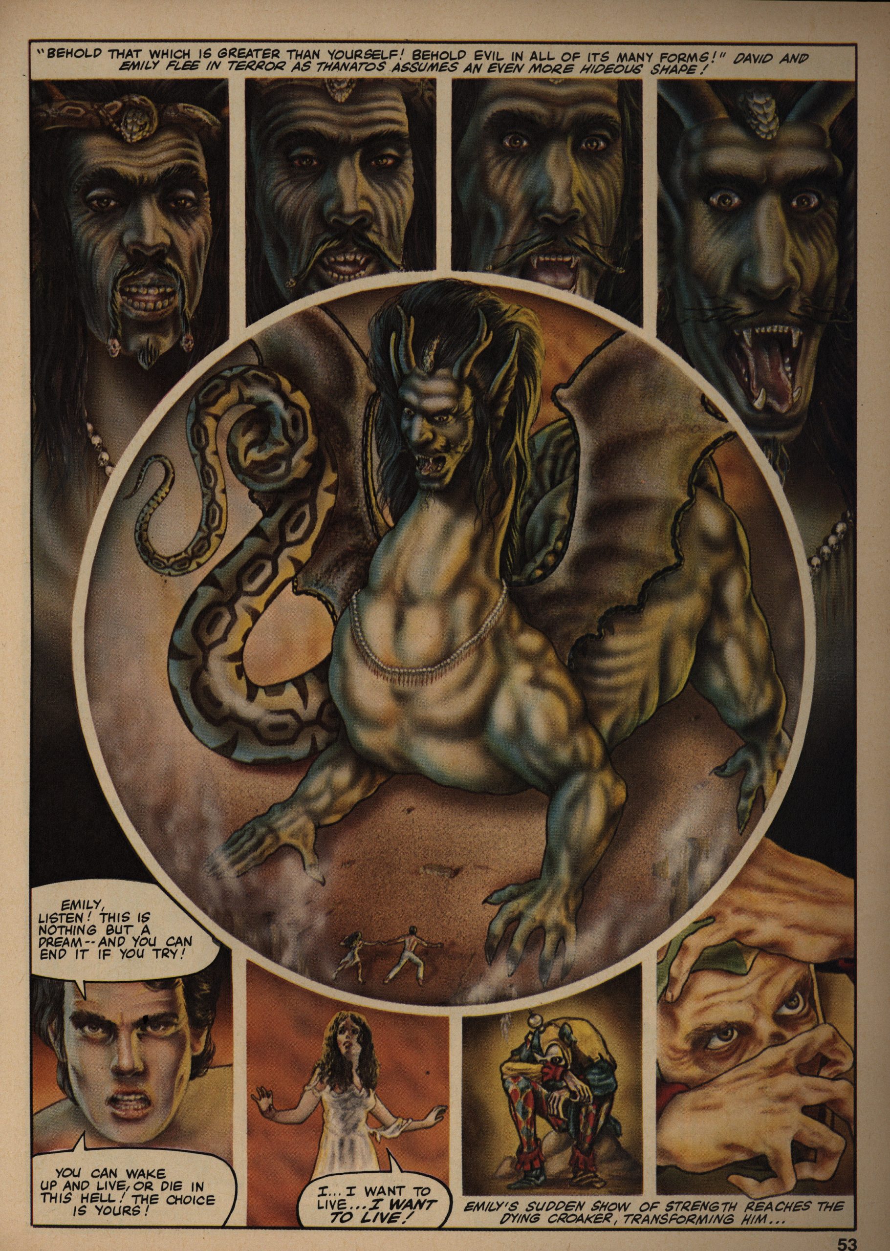
The worst part of EI is this kind of stuff: They bought an illustration, and then asked the illustrator to write a little story to accompany it. The result is usually a kind of lame joke told way too slowly.
Carl Potts delivers a nonsensical three-parter, and I mention it for two reasons: Potts would later become the Epic Comics head honcho (if I remember correctly), and: A boob harness. There’s a lot of boob harnesses in EI, and none of them really make much sense from a support standpoint.
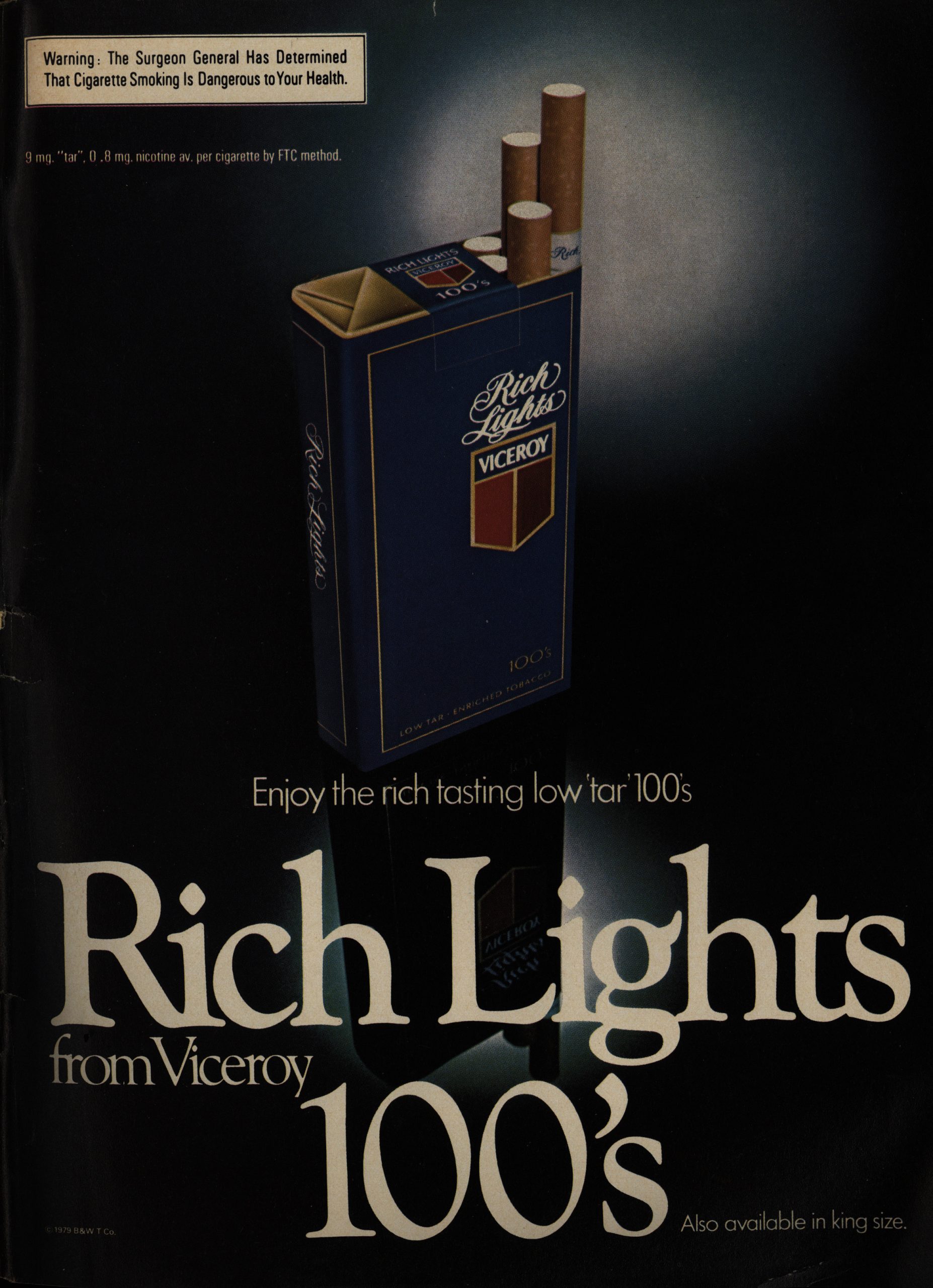
OK, back to the ads, just to nail the projected audience: Rich Lights from Viceroy…
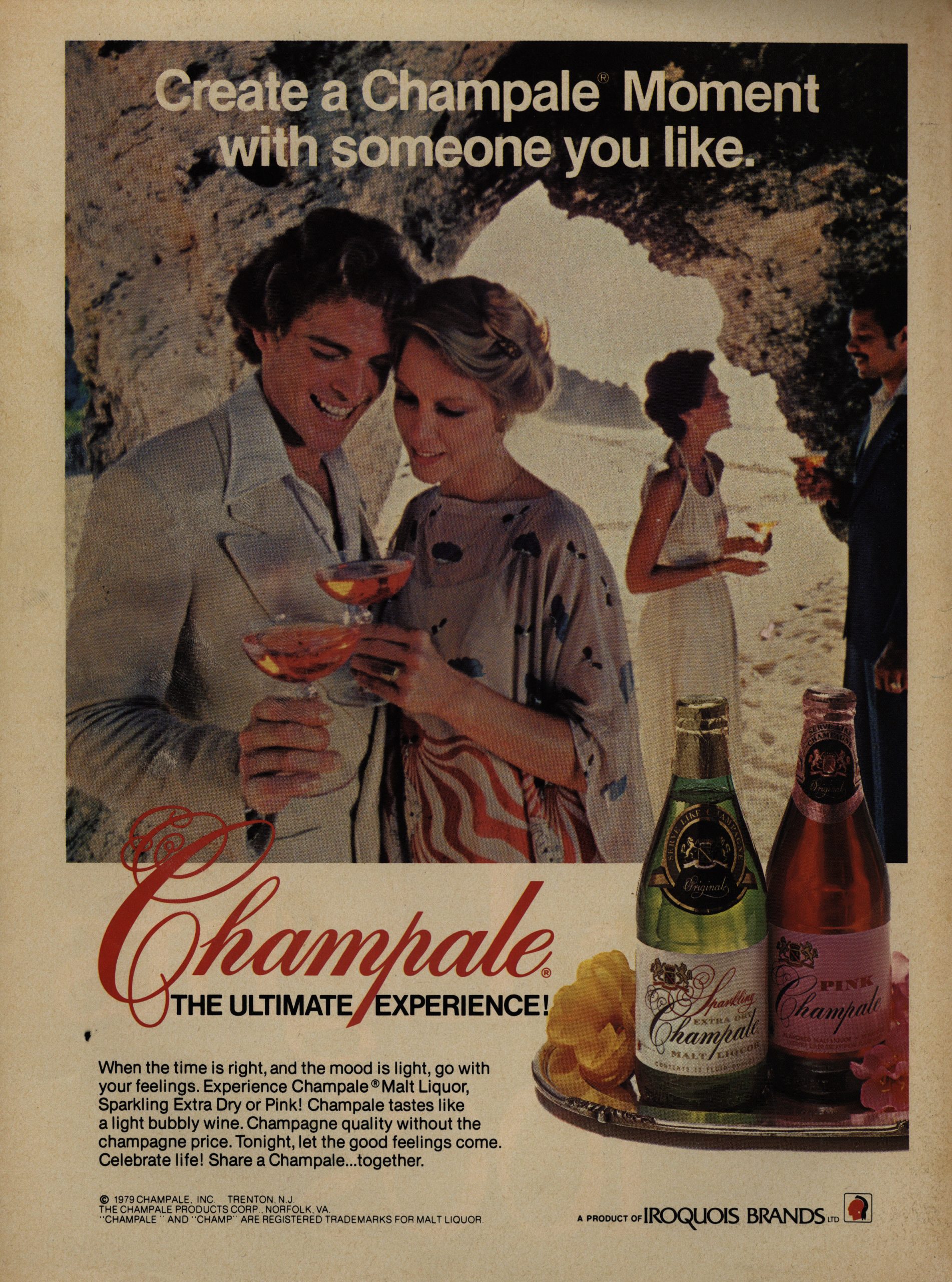
… and Champale… A Malt Liquor… that’s Champagne quality but cheap enough that people who read comics can afford it (I’m translating)…
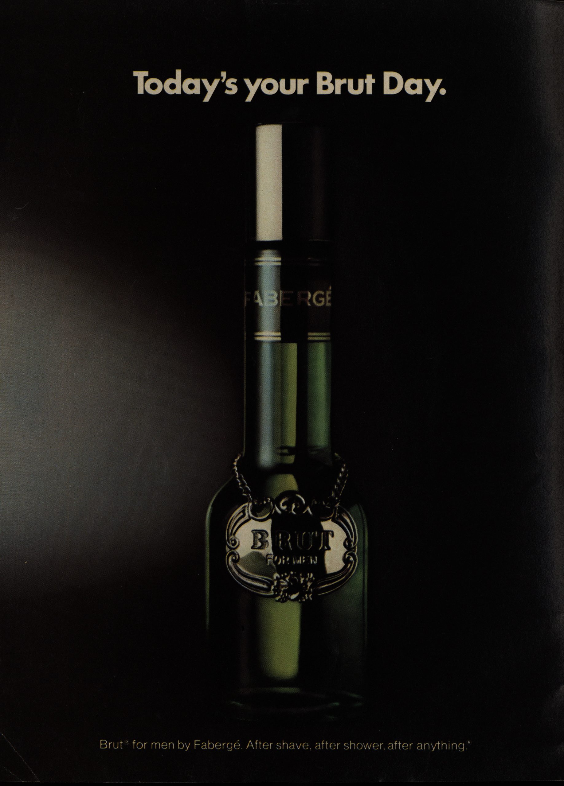
… and Brut for men by Fabergé, which apparently is an aftershave!? That looks like a champagne bottle? This is apparently still a thing.
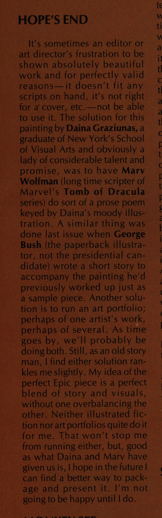
Goodwin explains what’s up with these illustrations and accompanying texts. Here’s the piece he’s talking about:
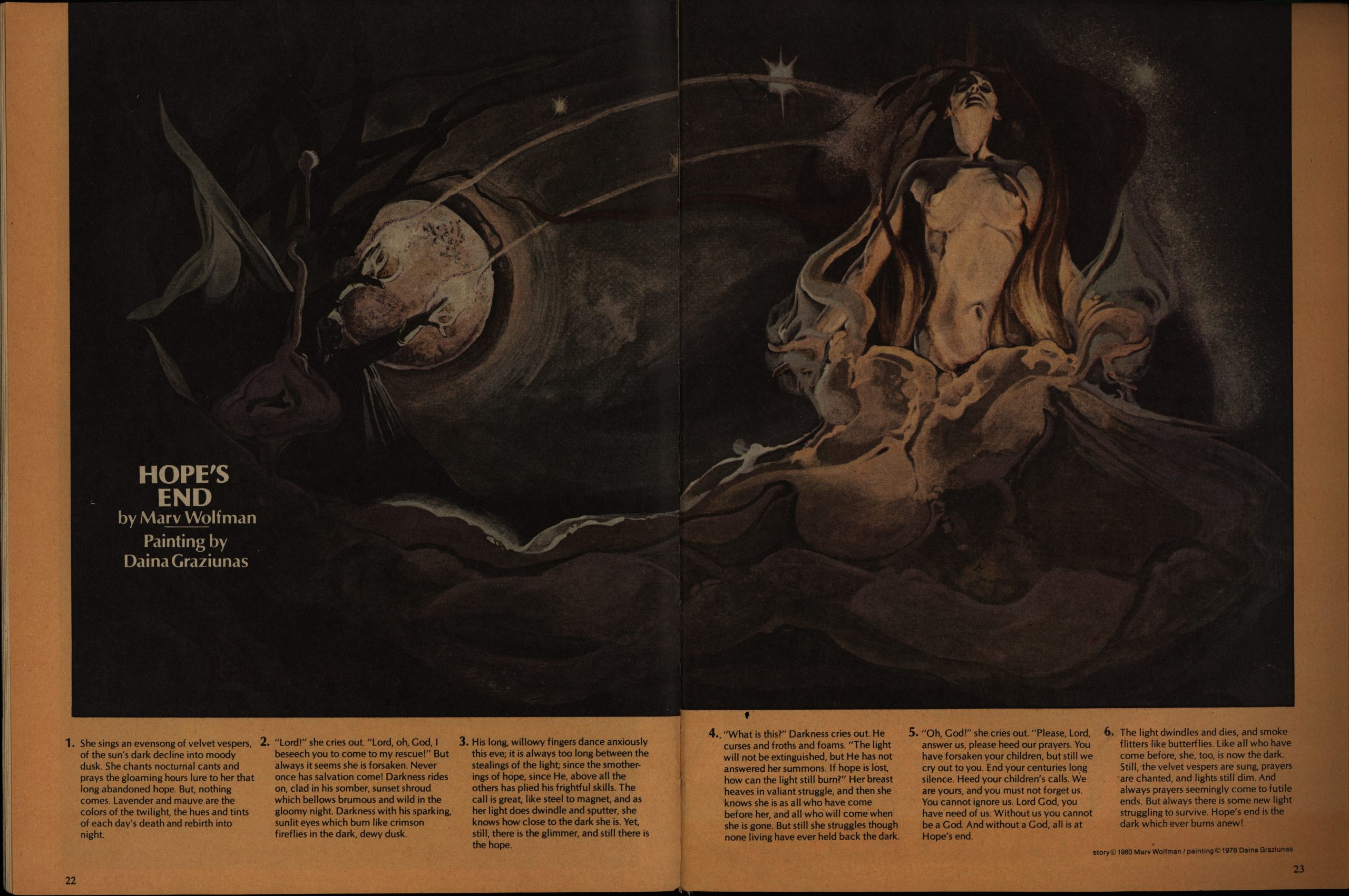
It just seems like a bad idea to me.
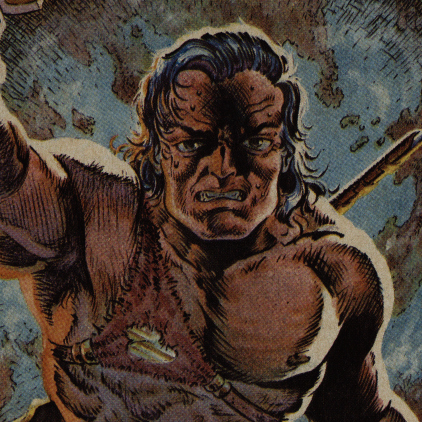
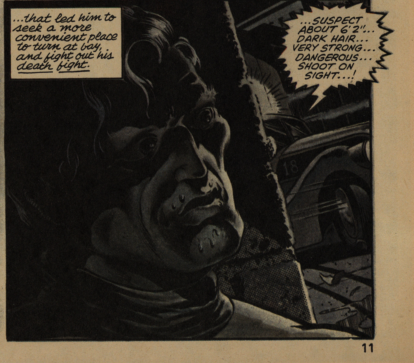
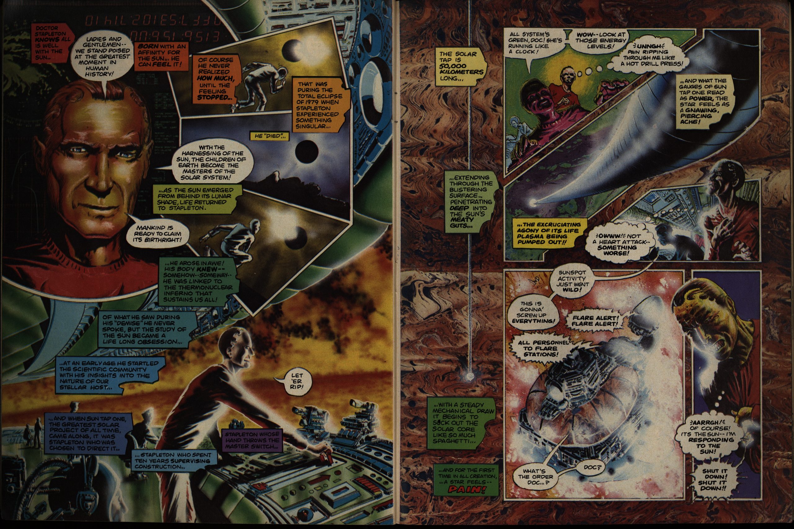
Goodwin starts putting in more serials. By issue four, about half of each issue is taken up by serials, which I think it pretty strange. I mean, for a quarterly. Tim Conrad illustrates yet another Roy Thomas adaptation of some Howard nonsense, and it’s the worst of the bunch. Conrad can draw some wonderful sci-fi stuff, but his barbarians just look like they have to use the toiled all the time.
Or is he going for a super-modelled homage to Fletcher Hanks? It’s bonkers, but not in a good way.
This barbarian is very nearsighted, I think.
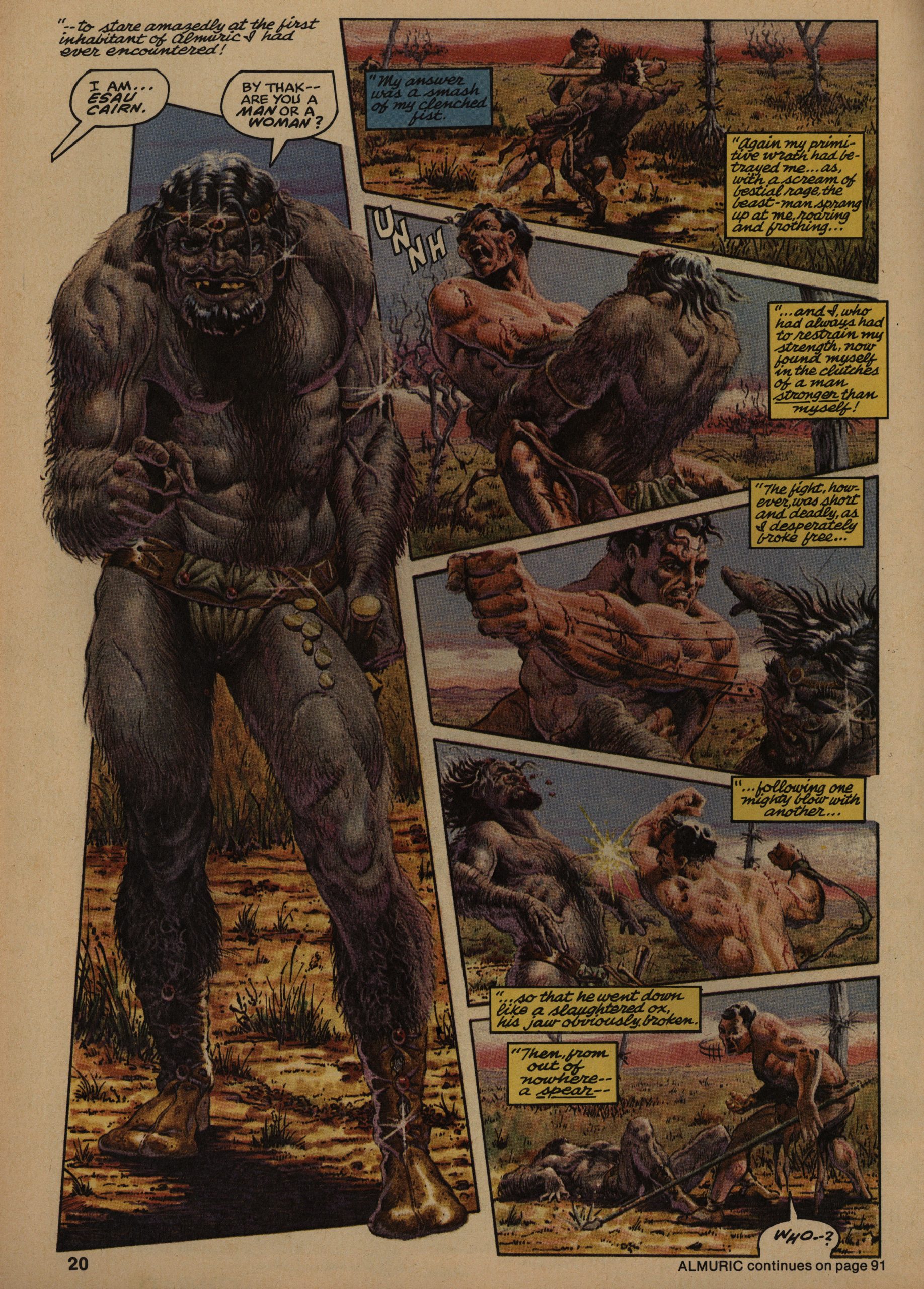
But what I wanted to mention here is the “continued on page 91”, sort of. You don’t see that any more, but back in the days, colour printing was expensive, so if they had some black and white pieces, those were printed separately, and then everything was bound together. So you have to make the stories skip around to skip past the black and white signature pages.
Kids these days won’t believe that if you tell them.
I mean, paper and stuff.
I’ve read more than a handful of the pieces here before: Not because I’ve read EI (I haven’t), but because they’ve been reprinted in collections afterwards. Which is good: It means the creators really were able to take their stuff and make more money off of it after Marvel had published it once.
And I want to mention the printing: It’s really good. Just zoom in on the page above. Oodles and oodled of colour details have survived the printing process. The pages are glossy, but not super-glossy, which I think is the right compromise; it’s pleasant to read (without too many reflections), but it holds the ink well.
Hm. Yeah, like I said, I don’t quite know what made Goodwin choose these furrin pieces to print.
Every issue (that I’ve read today, which is just four) have an essay, and they’re usually about comics. I think that’s interesting: Goodwin was really interested in the art form, and not just in putting together an anthology.
Oo! A P. Craig Russell opera adaptation snippet. Pretty.
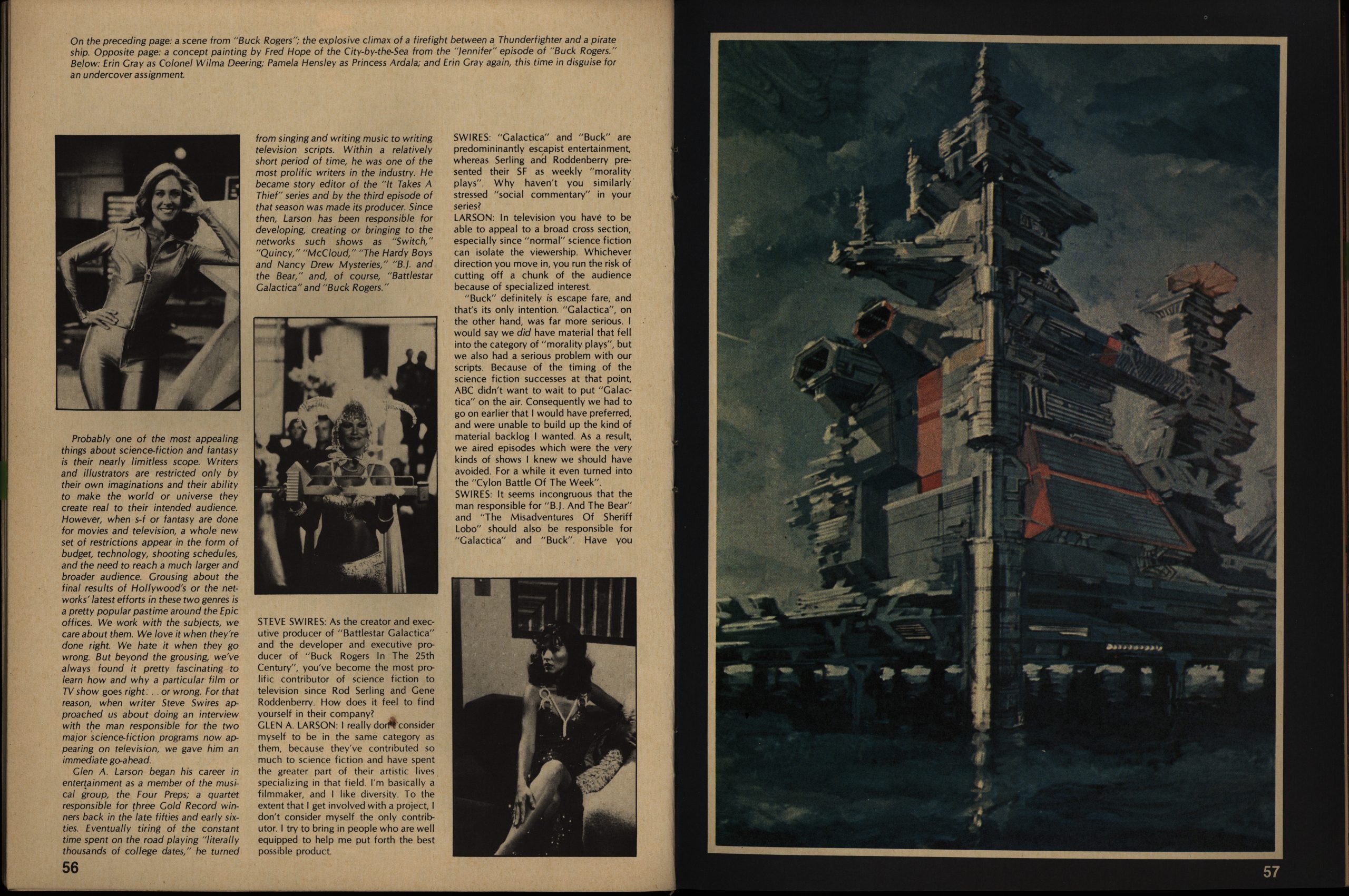
Not all the text pieces are about comics. The rest are about popular culture stuff, like this interview with the guy behind Battlestar Galactica and Buck Rogers. That sounds really dire, right? But he seems like a smart guy and it’s an interesting peek into making sci fi for TV back in the 70s.
Goodwin said they suddenly had four pages they needed to fill, so he reprinted a story he wrote and draw back in the early 70s (I think). He didn’t draw that many comics, so I think that was a fun thing to include. I love the art style: It’s so completely of its time.
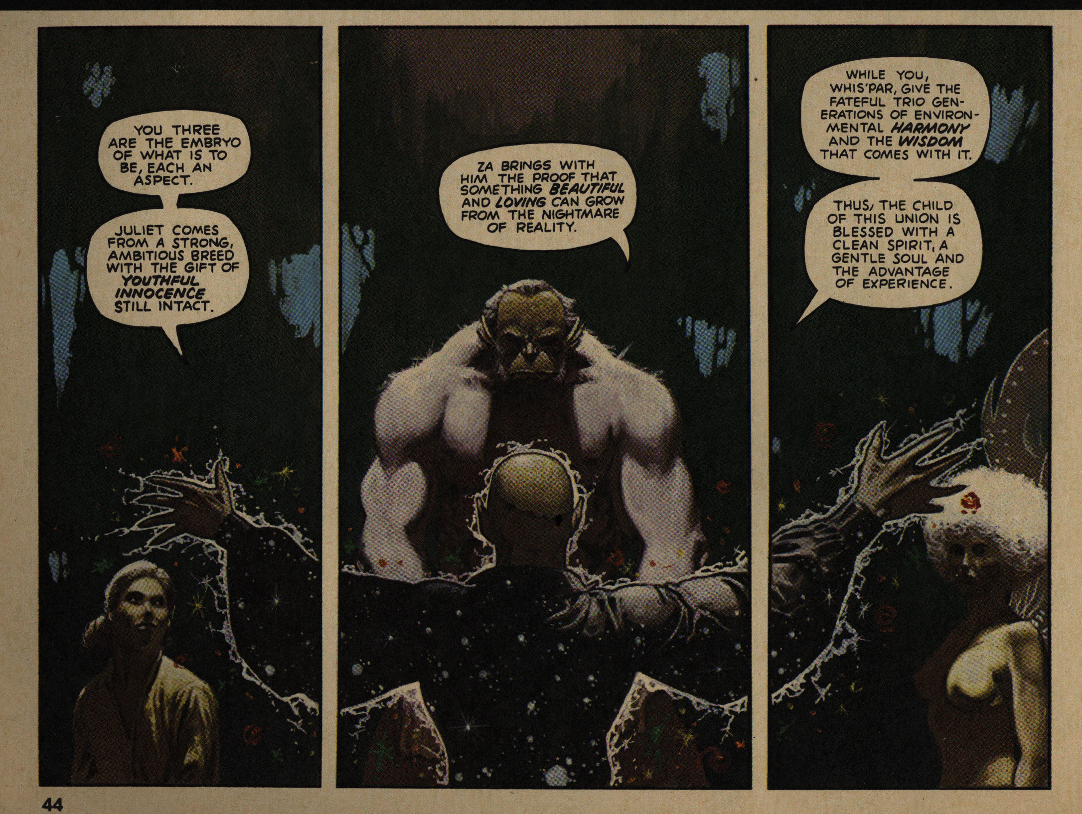
Starlin finally explains what the Odyssey thing is going to be about: There’s this guy who gathers a kick-ass force to defend the Galaxy against some evil aliens. Which was a bit disappointing, but… At least the art’s fun to look at.
Goodwin lays out his editorial vision pretty clearly: He likes narrative pieces.

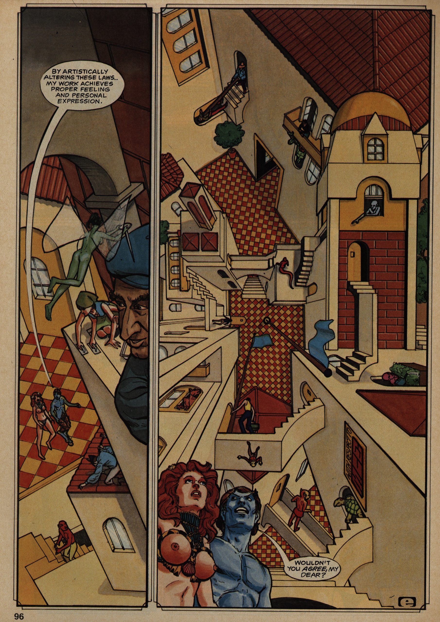
I liked this Samuel Delany/Howard Chaykin piece. Not because the story was that interesting, but look at that artwork! Just look at it!
Archie Goodwin writes a story about fantasy. Of course, it turns out to be a double O Henry, but it’s cute.

Goodwin printed that long and savage beat-down by Richard Ellis on the letters page. The thing is: Ellis is pretty much right about everything he writes, and still… Spending an evening with these 400 pages of Epic Illustrated was perfectly nice. I want to see where Goodwin’s editorial tastes are going to take us, and it’s refreshingly Catholic so far.
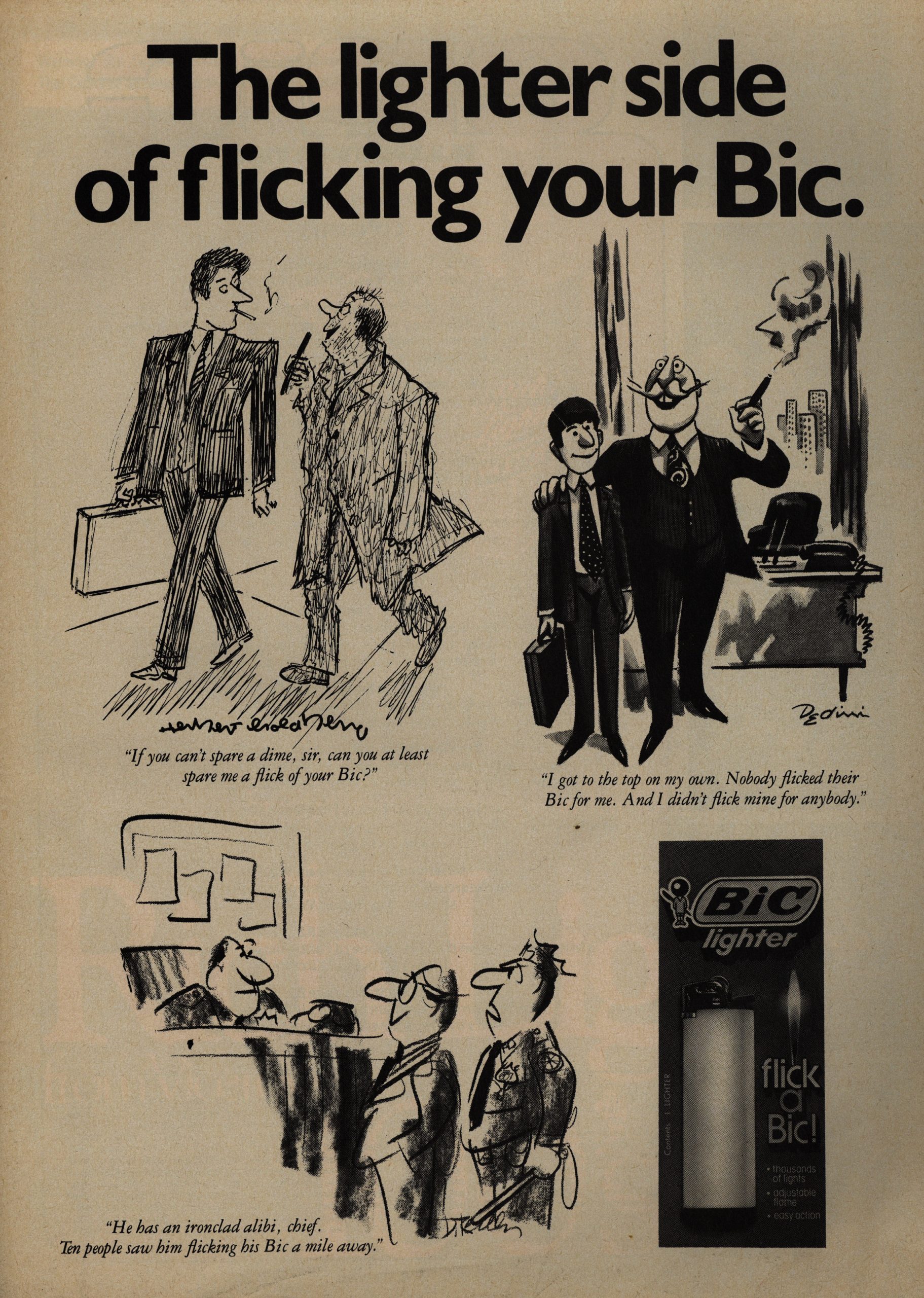
I also want to see what company Marvel’s sales dept gets to place ads with them, because over the first four issues, there’s a total nose dive in price ranges. From a Kawasaki in the first issue to Bic lighters in the fourth… That’s not a good look.
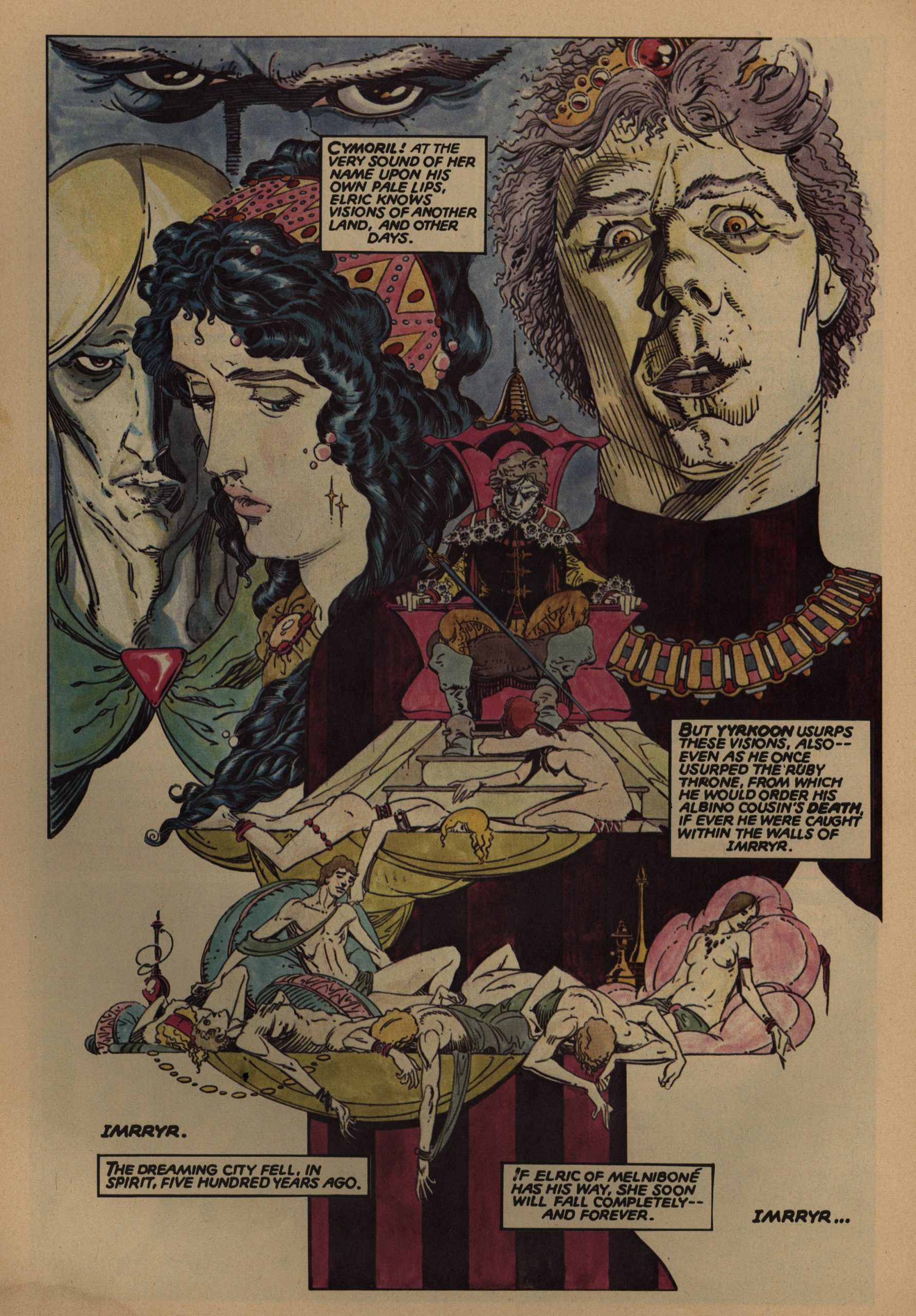
It would be an obvious thing to do to reprint all the serials as graphic novels, but that didn’t happen with too many of them. This Thomas/Russell Elric serial was reprinted toot sweet, but I don’t recall too many more. Marada? I guess we’ll find out.
This Doug Moench/Paul Gulacy thing was intriguing (unusual storytelling elements), but is probably the harshest thing in these issues. And all for an “ironic” twist ending.
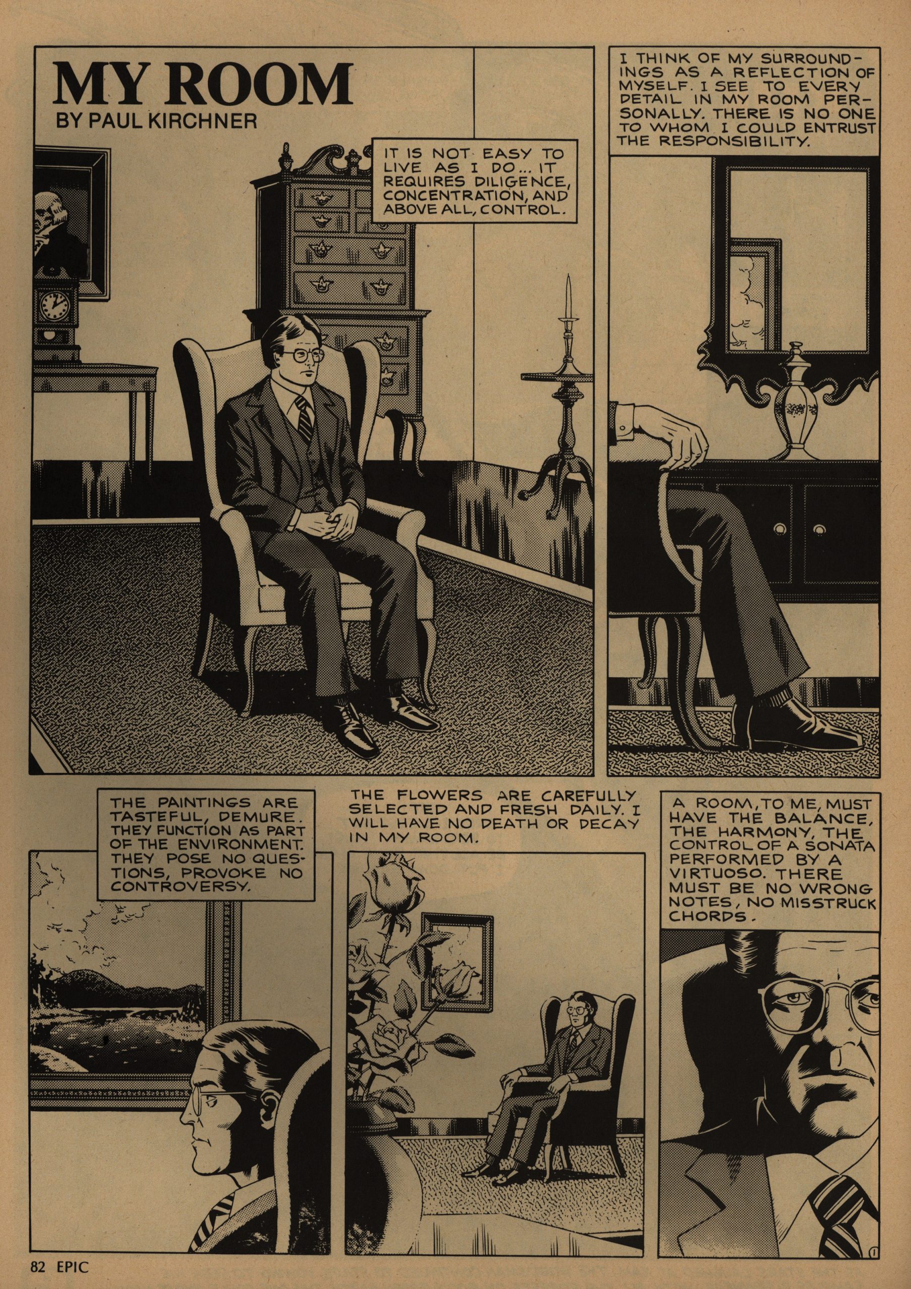
Kirchner used to pop up in Heavy Metal all the time, didn’t he? His artwork is supernaturally sharp, and so at odds with his stories. Really enjoyable.
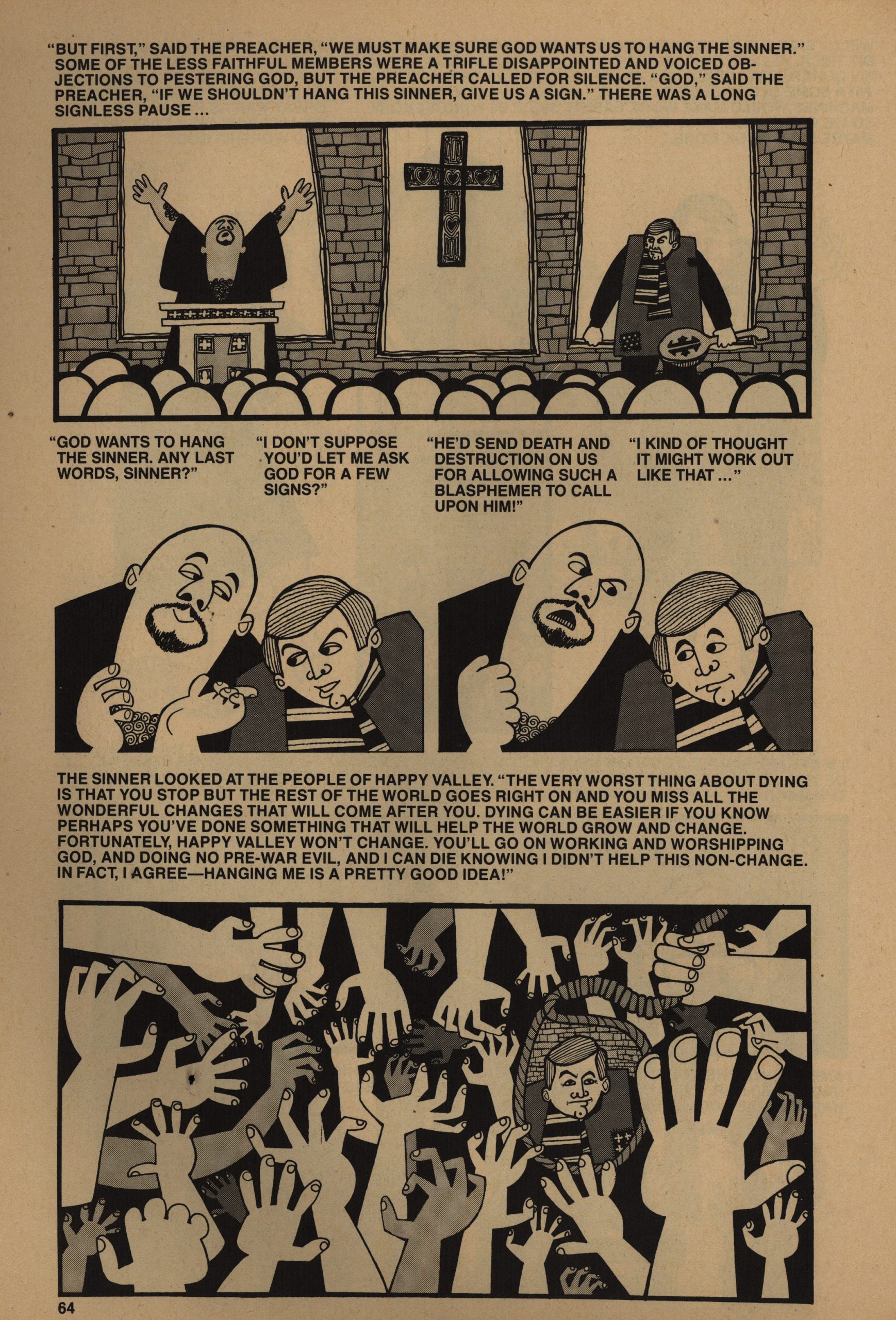
OK, I’m not going to mention everything in every issue or something. That’d be insane. But this story written by Bruce Jones was very Bruce Jones, complete with groan-worthy twist ending and all, but still an enjoyable read.
Aha, using mostly American material isn’t an editorial edict, really, and they’re going to branch out from now on. I guess we’ll see in future issues.
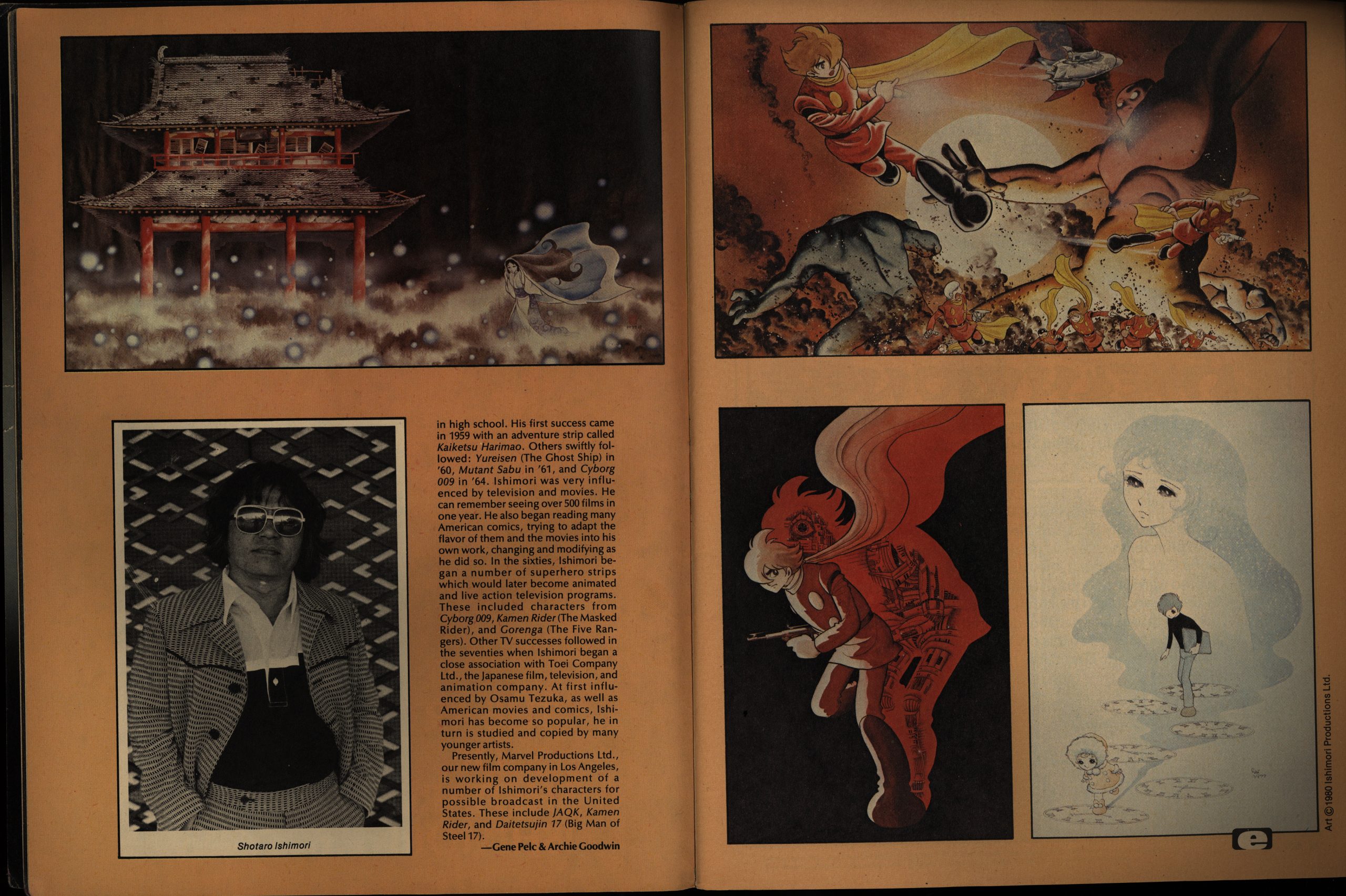
But it’s not like they’re totally American as it is. Suddenly you get a random page of random images from a Japanese artist. Yes, OK, it’s filler, but it’s pretty forward-thinking for a magazine from 1980.

Goodwin writes a long essay about the “graphic novel”.
That ad just made me laugh out loud. Something about the expression on the face of the guy to the left.

OK, I’m fading. I have no idea what I had planned to say about this piece. (It has a twist ending.) Was it something about… boobs? I don’t know.
Rick Veitch appears more than I had expected. I think he’s done something in every issue so far. This is his first solo piece, and it’s got… yes… a twist ending.
This was pretty good: It’s a short story by Harlan Ellison (no great shakes in itself), but illustrated in this way by Ken Steacy, who I’ve always liked. Somehow it works, even when it seems it should be overpowered by the prose.
OK! We’re done for today! That took longer than I imagined: I’m out of practice.
Remember back up there when I said it may take a week to go through Epic Illustrated? Could we extend that to a month?
Thanks.