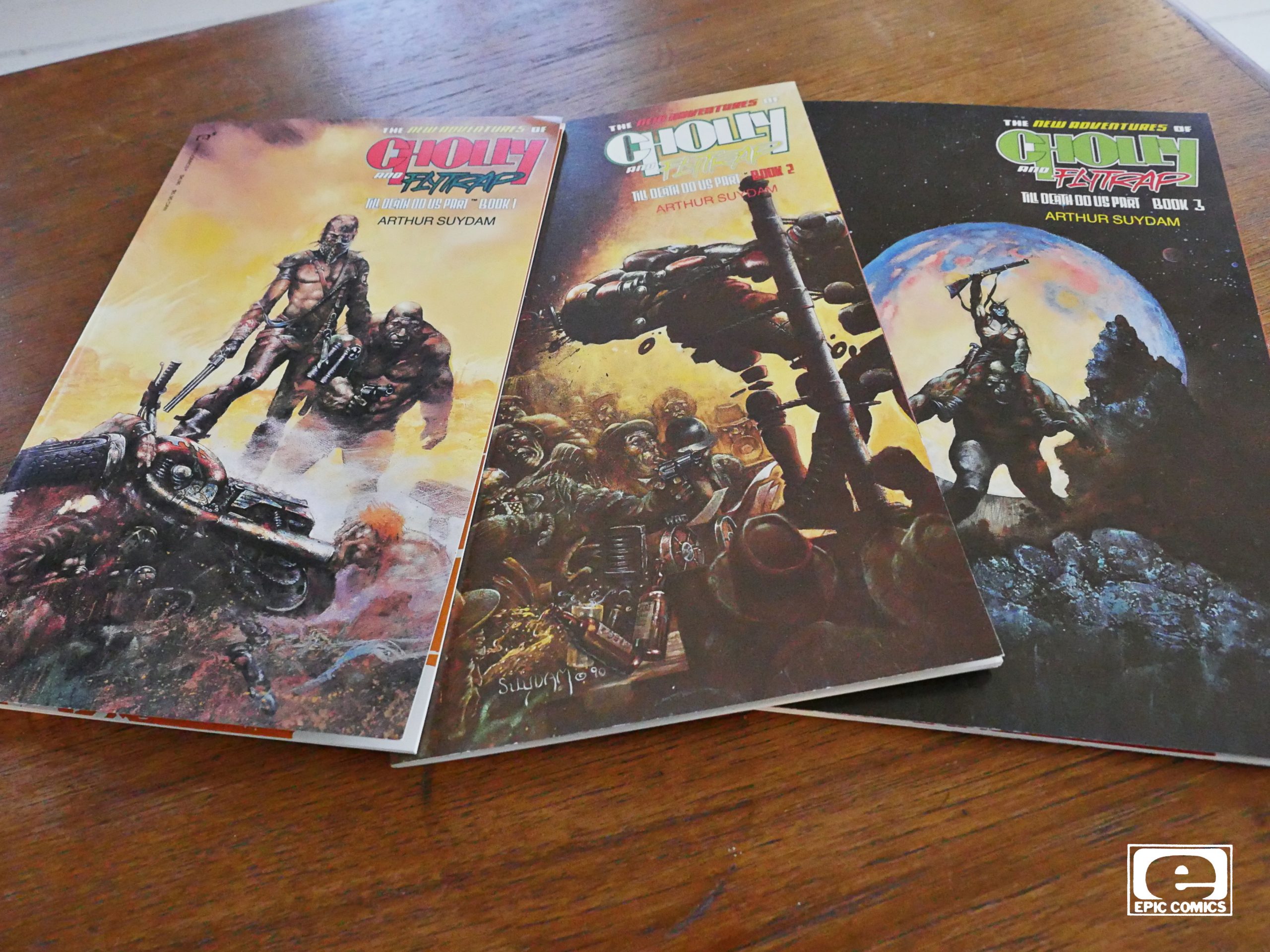
The New Adventures of Cholly and Flytrap: Till Death Do Us Part (1990) #1-3,
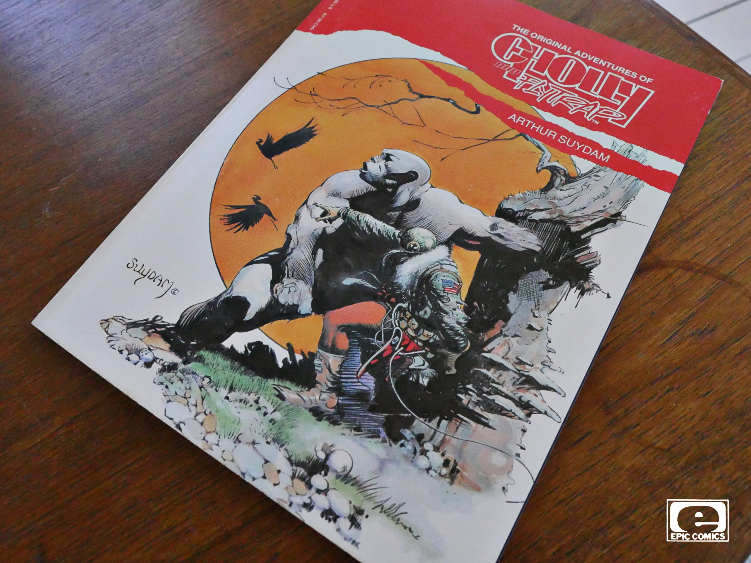
The Original Adventures of Cholly and Flytrap (1991)
by Arthur Suydam
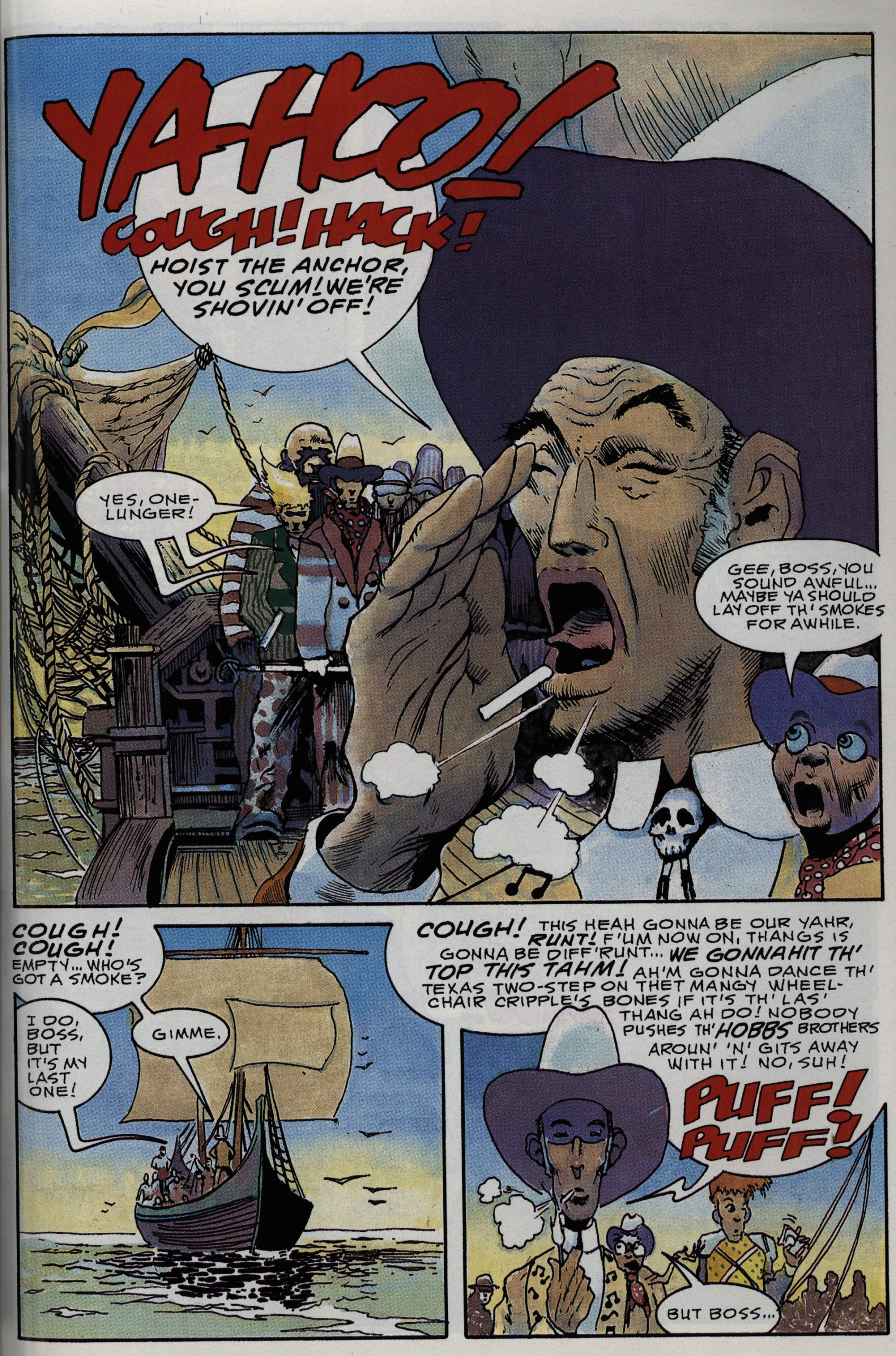
Cholly and Flytrap originally ran in Epic Illustrated in the early 80s. From what I remember, it was a pretty limited concept: It was about two… mutants? or something? … roaming around a very muddy planet, fighting other creatures? And it was nigh-unreadable, as far as I can recall.
But very pretty.
So how on Earth is Suydam going to expand that into 150 pages in this miniseries?
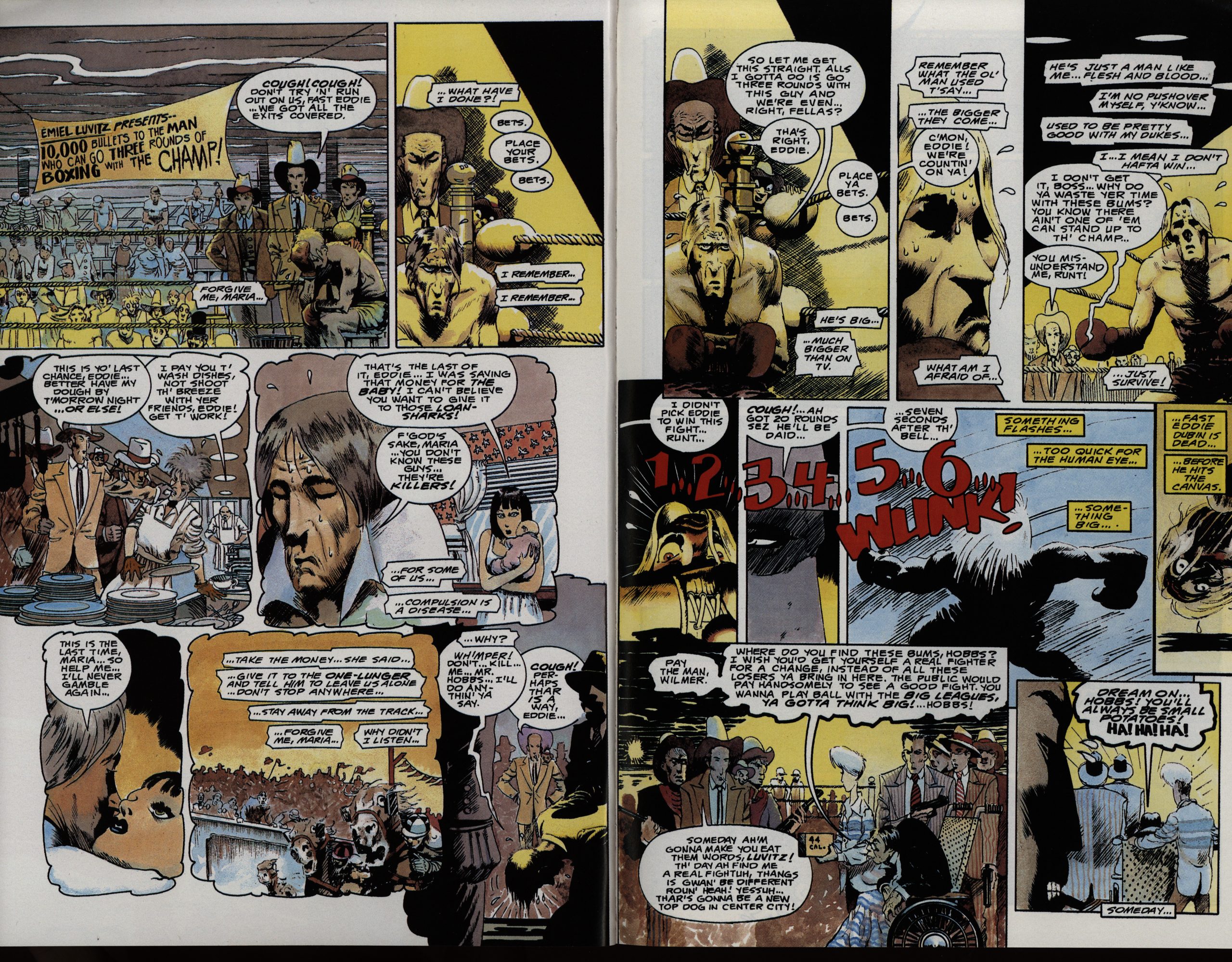
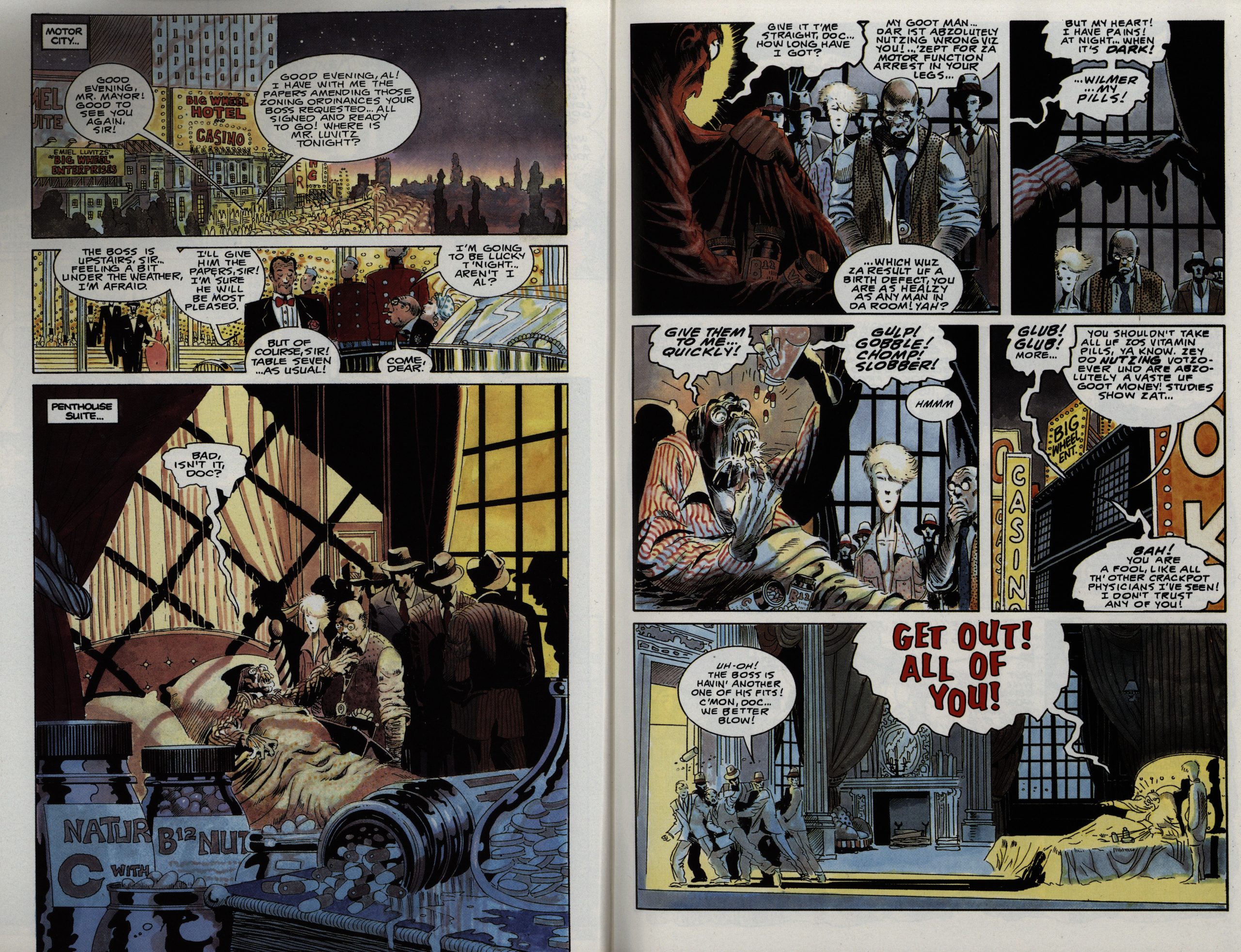
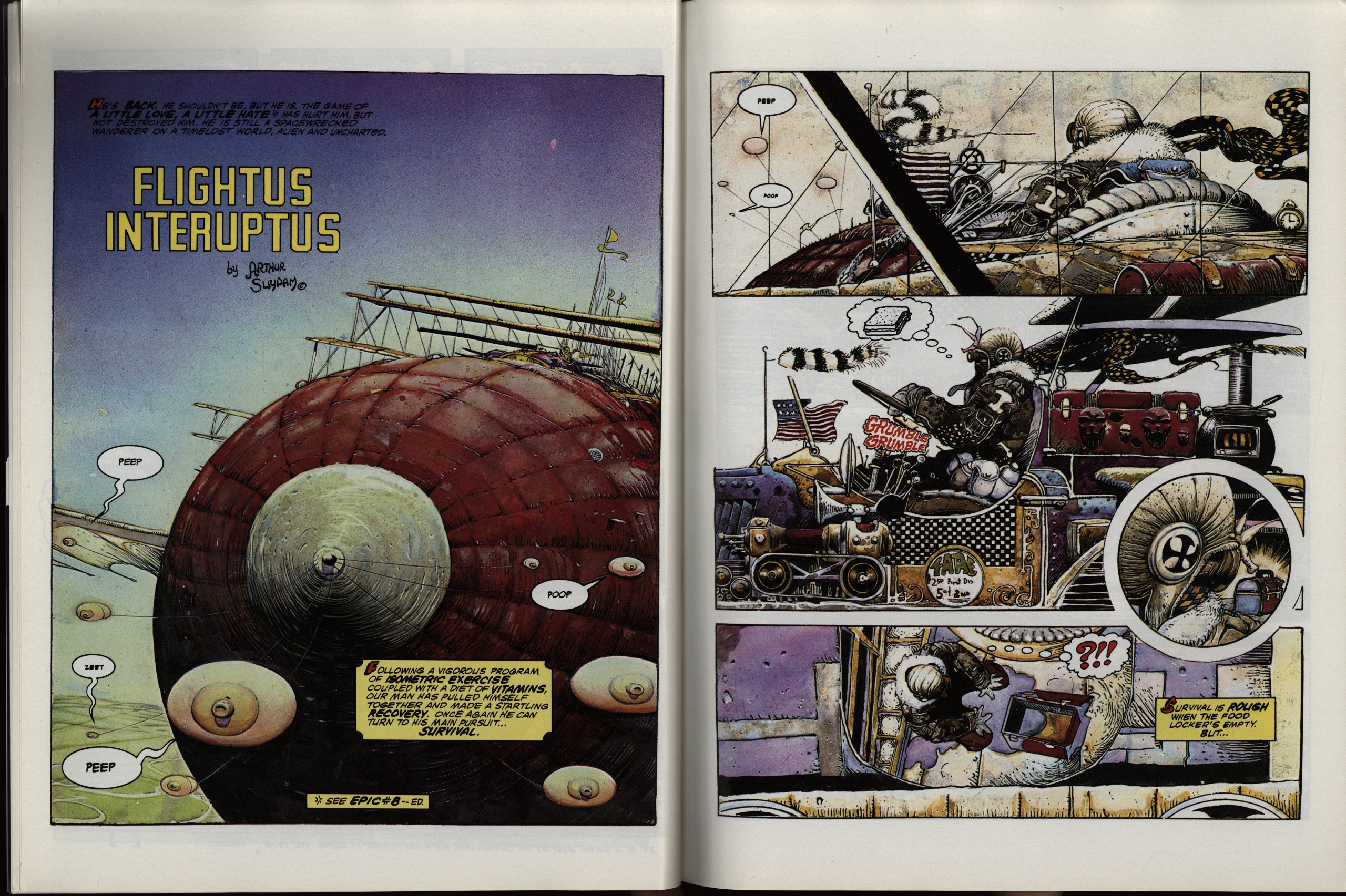
I thought the obvious way was to just spend most of the time in flashbacks back to a place where it’s not just mud and killing, and opening to this first spread, I thought: “Aha! I’m a genius! I guessed it! So… is that… Flytrap? Cholly? What!”
The other thing that’s really obvious upon seeing this spread is that Suydam is going to give us a lot of plot and many characters, and that he’s cutting back on the complexity of the artwork a lot. I mean, it’s still quite impressively gnarly, but it’s nowhere near what he was doing a decade earlier, where every page looked like Frank Frazetta.
But then it turns out I was wrong: This wasn’t really set in the Chollyverse at all: Instead we’re now on a sorta retro-futuristic 50s Earth, and this doesn’t really have much to do with anything that’s happened before. This is basically a (very violent) screwball comedy. A romp where people move all over the planet, kidnapping each other and saving each other, with a couple of crime bosses and lots of boxing thrown in.
Well, I’m aboard with that: That sounds a lot more fun than 150 pages of mud and flashbacks.
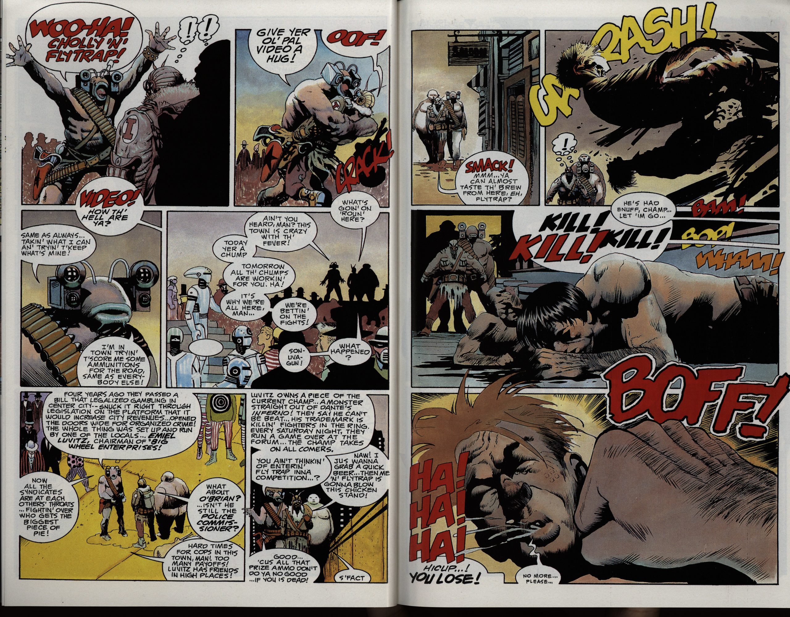
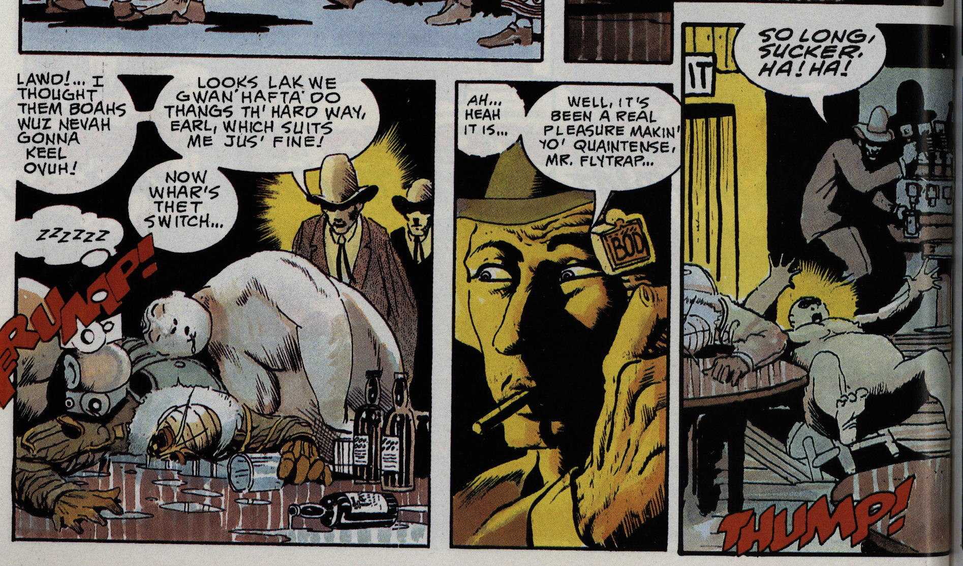
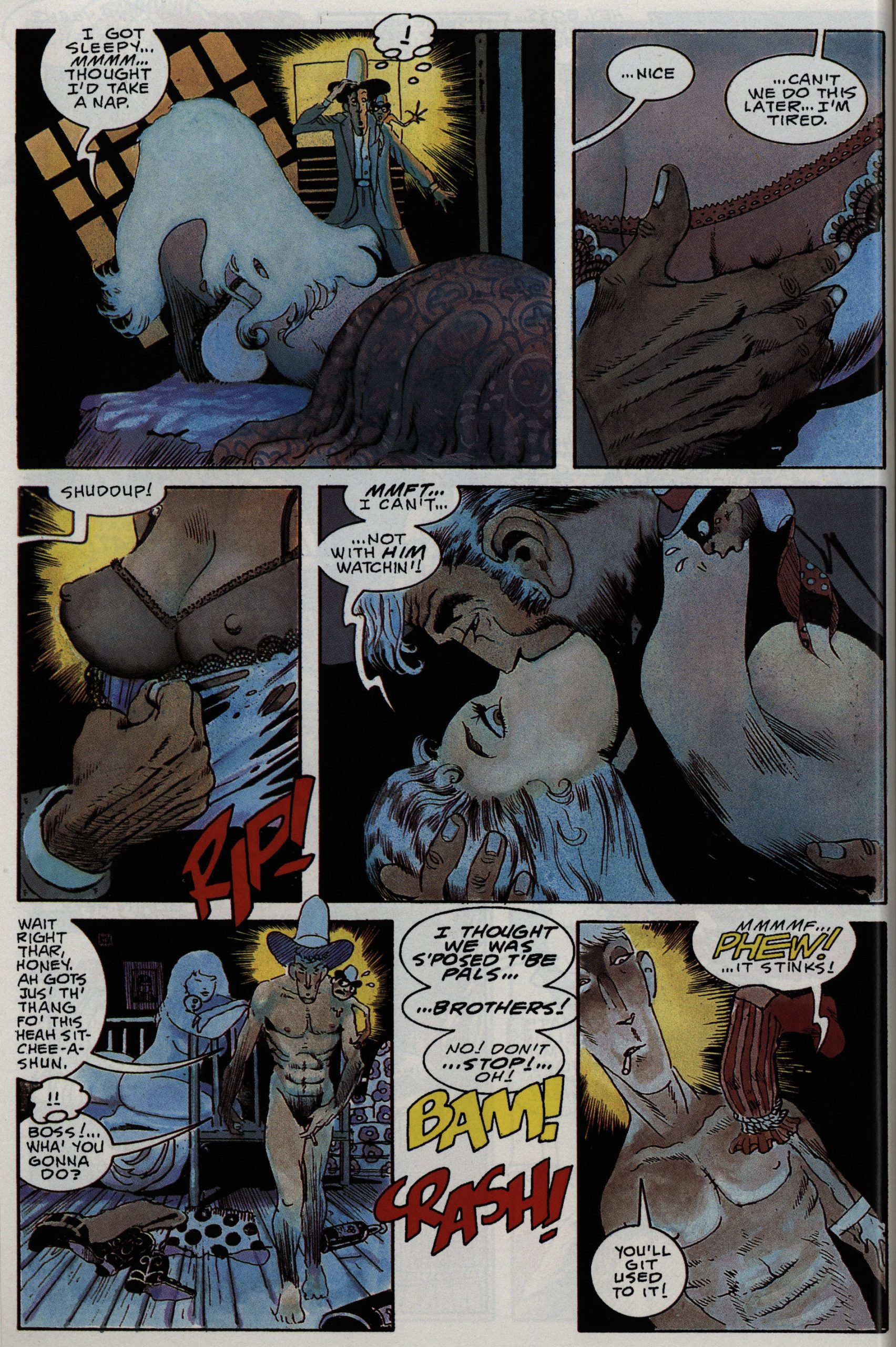
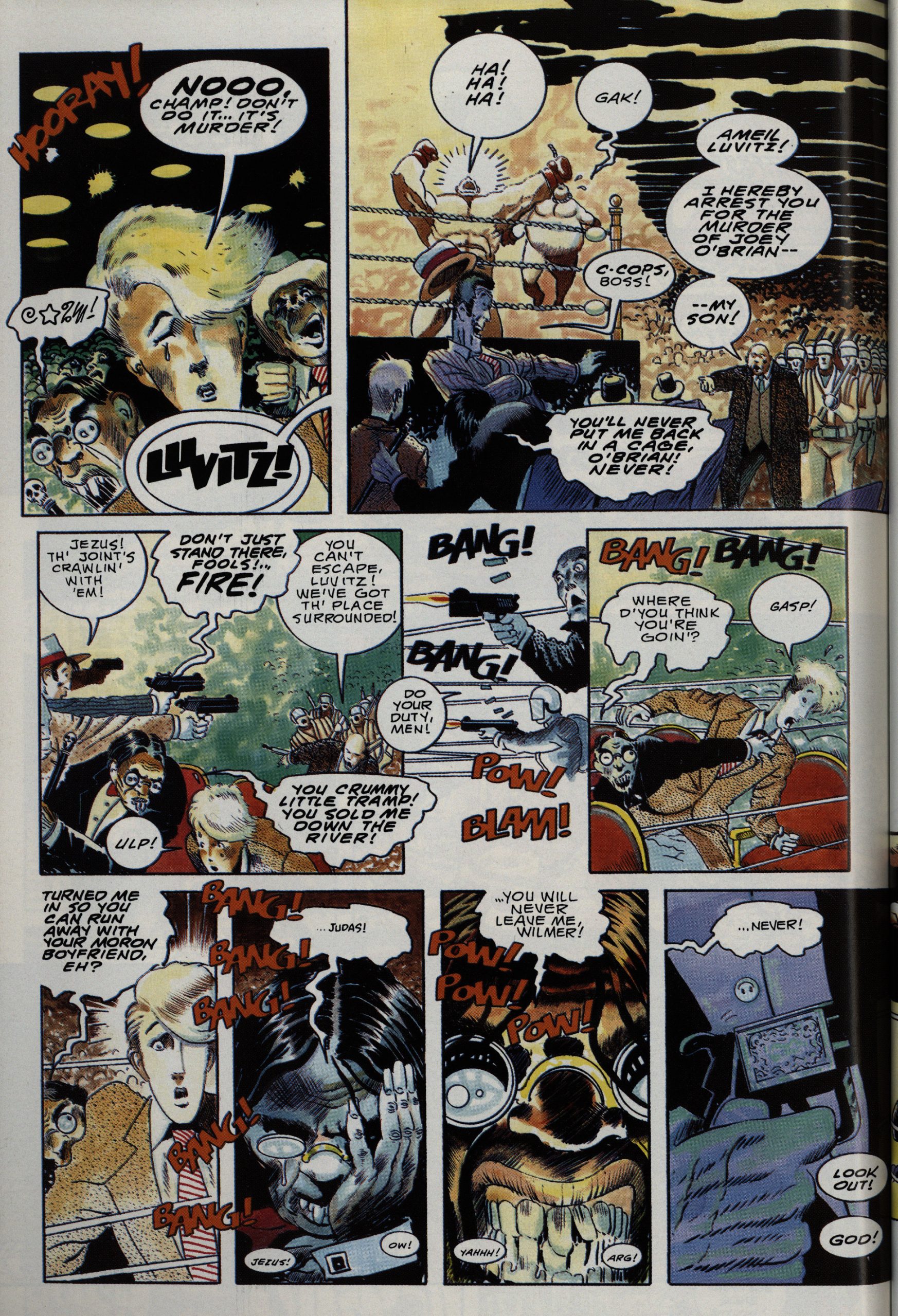
Not that there aren’t problems here. Suydam is very very wordy, and he’s got a lot of plot to fit into these 150 pages. Which means that some of the scenes get rather hard to read, like the above. I had to look at the sequence a couple times before I realised that Flytrap (the fat guy (who varies a lot in dimensions from panel to panel)) fell down a trap door, and didn’t just, like, tip over.
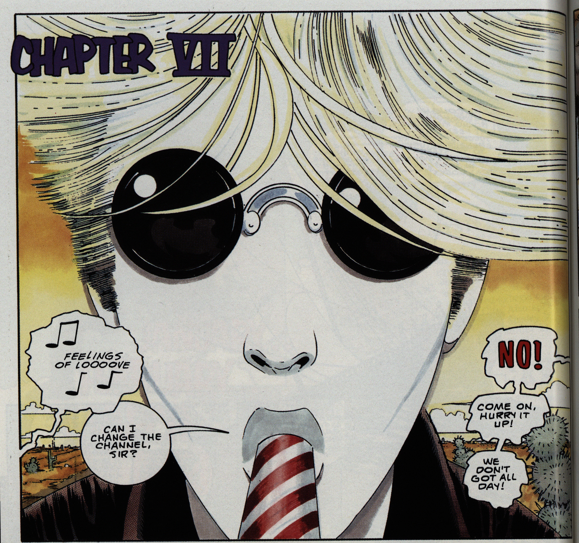
Suydam’s artwork is all about the EC artists… all of them. You can pick them on a panel to panel basis (Williamson, Elder, Engels), but what’s he going for here? My first thought was Moebius, but that’s perhaps mostly because of the colouring, but perhaps it’s… Severin?
OK, so the homunculus was offputting, but the missing penis didn’t bother her? Sheesh! Picky!
This is like… Kurtzman and Elder with layouts by Eisner? I love it.
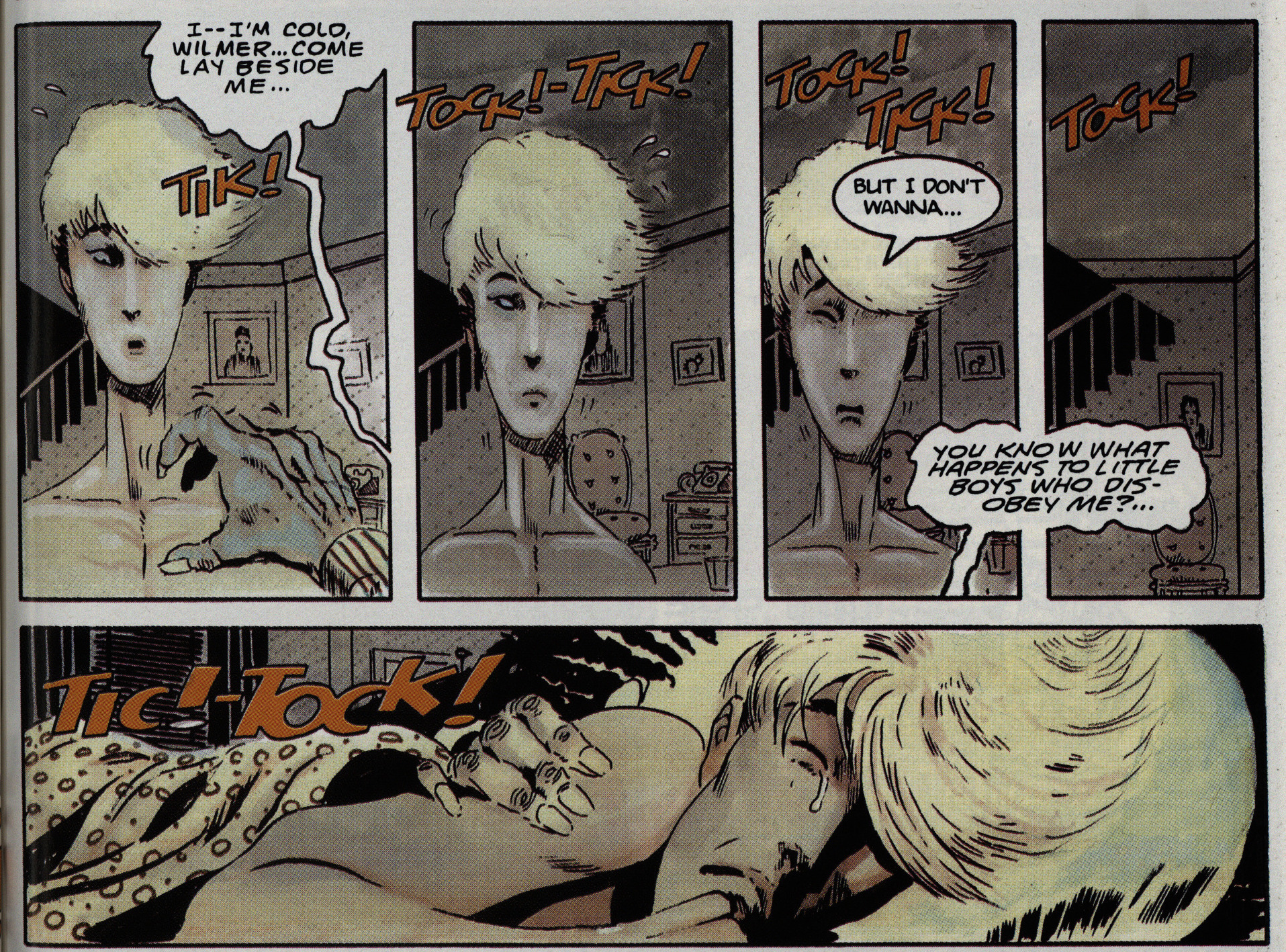
While there’s a lot of the elements here that’d you’d expect in a 50s-throwback hyper-violent screwball heist movie comic book, perhaps the most surprising element here is that there’s a bunch of gay characters here. Mostly played for laughs (but everything here is), and when a guy with “boy toy” on his t-shirt was summarily bludgeoned to death three panels after he was introduced, I was all “eh”.
But Suydam then really goes for a tragic sub-plot of sexual abuse and true love and stuff.
Of course, it ends the prescribed way: (SPOILERS.) All the gay characters are killed off before the end, so…
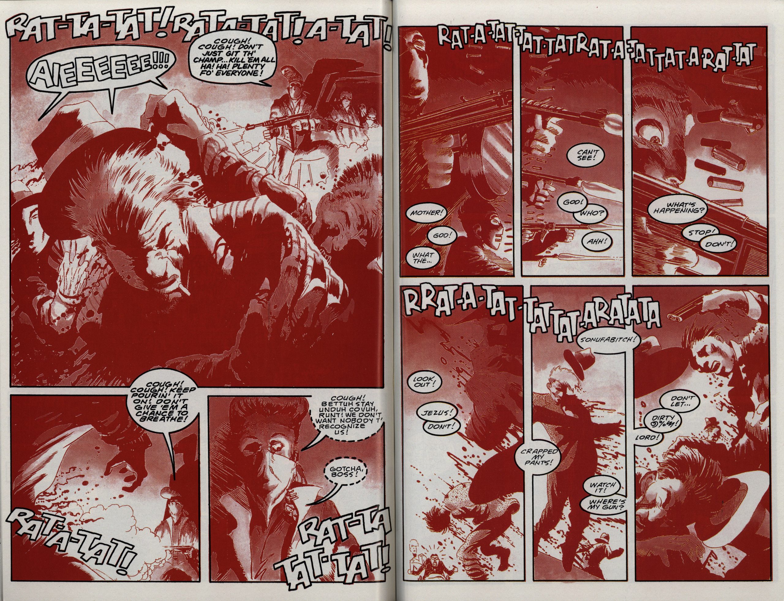
I was really taken by this sudden spread where everything turns blood red and very confusing. As it shouldbe.
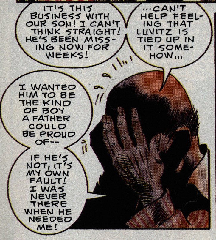
Whenever an action movie takes a break to do some character building, there’s always some young person whining “YOU”RE NOT MY FATHER! YOU WEREN”T THERE FOR ME WHEN I GREW UP!”
Suydam here throws that convention on its head by having the father build character by saying the he wasn’t there for his son while growing up! I’m astounded.
The denouement is suitably chaotic and surprisingly exciting.
So… that’s a really odd 150 pages for somebody to create. It’s pretty original, and while it does conform structurally to how somebody would have made a movie out of this plot in the 50s, it’s surprising in many ways.
The month after the New Adventures had finished, Epic released a collection of the Epic Illustrated material.
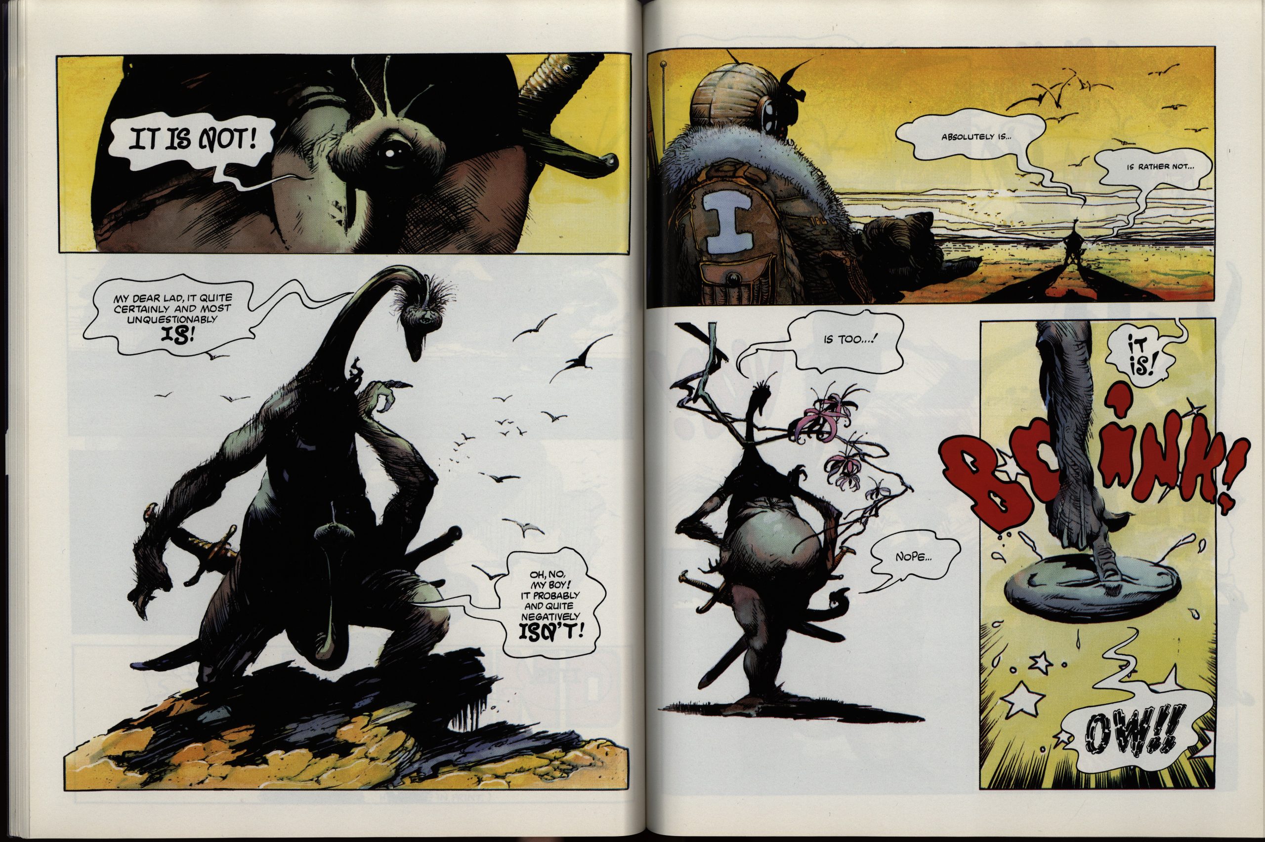
It’s a handsome album-sized reproduction of the material, which is (as you can see) a lot more detailed than the new series.
But the stories basically don’t really go anywhere. I suspect a lot of puffing was going on during the creation of these pieces.
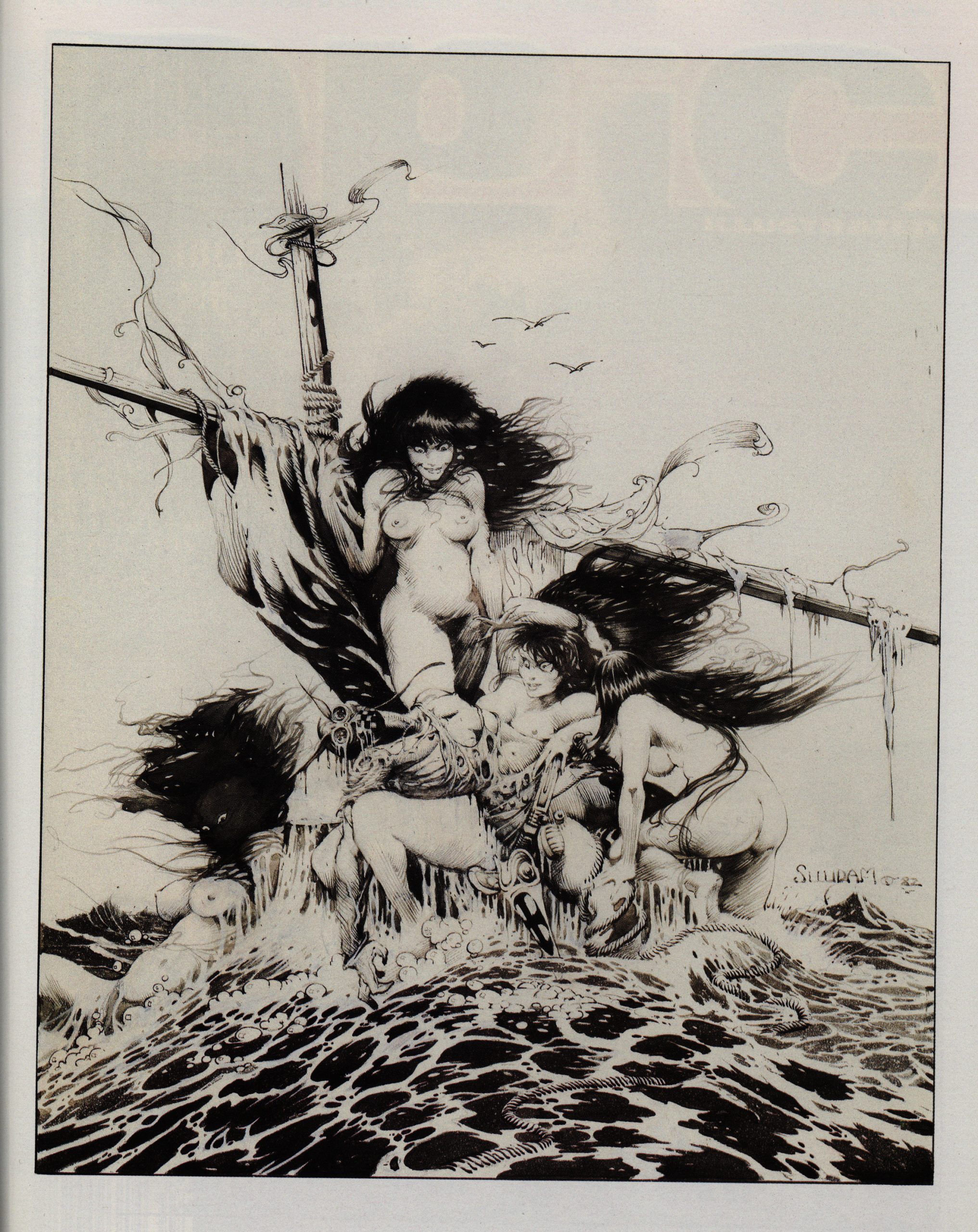
We also get a portfolio of random Suydam artwork.
Alex Chuy writes in Amazing Heroes #197, page 79:
[…]
The Original Alventures of Cholly
and Flytrap is what Epic calls it.
Through this graphic novel compila-
tion from the pages of the nov defunct
Epic Magazine, we get to follow
Cholly and Flytrap through a series
of vignettes; while the tales them-
selves aren’t overly memorable, the
characters, the artwork and the world
that writer/artist Arthur Suydam cre-
ates are. He populates his uorld with
walking slugs, giant insects and flying
breasts. In a battle against a wily
opponent, amid many barbs and much
profanity, Flytrap rises momentarily
to give his adversary the finger, and
promptly gets his hand blown off. It’s
really quite hilarious in a warped sort
of way, and pretty much represents the
tone of the entire book.
Suydam’s line-work and character
poses can’t help but draw comparisons
to Frazetta. The comparisons are even
more evident in a portfolio that
concludes with a haunting image of
a slumped Flytrap with trio of arrows
embedded in his chest.
I was unable to find any contemporaneous reviews of the three-part series, though.
All of this was released in a collected edition by Titan in 2015, and a smaller? edition by Radical in 2010:
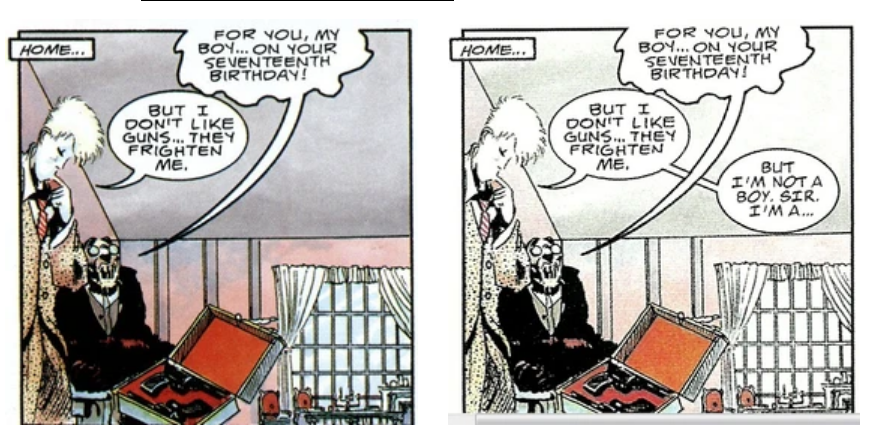
In the original Epic editions, Wilmer was clearly a very effeminate male, who becomes involved in a clandestine affair with the character The Champ. A sympathetic, if stereotyped gay character, but with depth and being portrayed in an gay relationship with bedroom scenes in a Marvel comic book, still a fairly bold step back then.
In the new version, Wilmer is, without any art changes, female. And refers to “herself” as such. Some characters still refer to Wilmer as male, but new text has been added to have “her” object to this. Here are three examples.
Here’s a review of the series:
Cholly & Flytrap isn’t a bad comic, but it’s not a good comic either. It really wants to be good and has quality moments, but its problems hold it back. There’s a lot of enthusiasm here, but that doesn’t save it from doing something wrong. If this comic isn’t a metaphor for how Suydam looked at the end of the table scandal, I don’t know what is.
Table scandal!?
The controversy began Friday morning with creator Jim Zub bringing to attention via Twitter the questionable actions of a then-unnamed creator. “To the ‘big’ name creator who took 4 (!) artist alley table spaces, forcing other people from their assigned spot, you are human garbage.”
Anyway.
