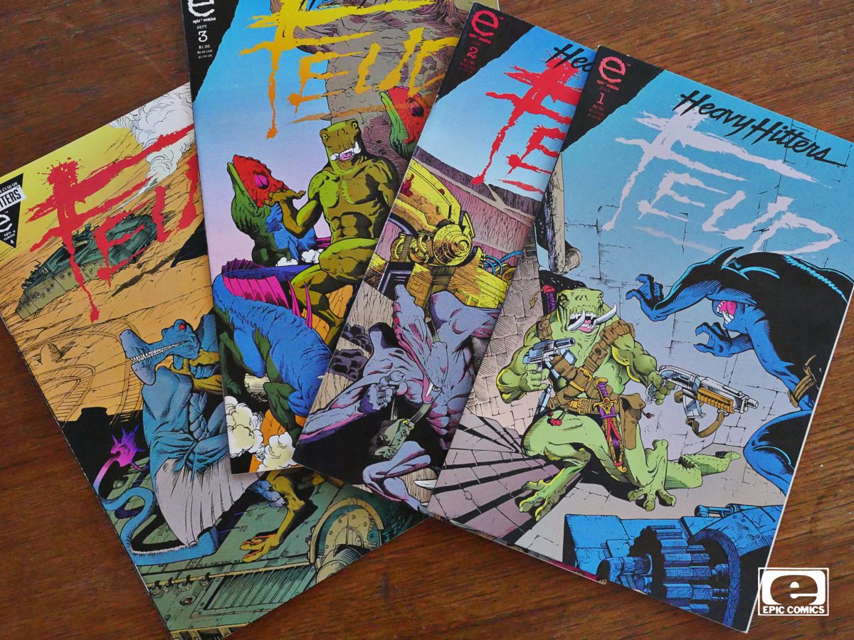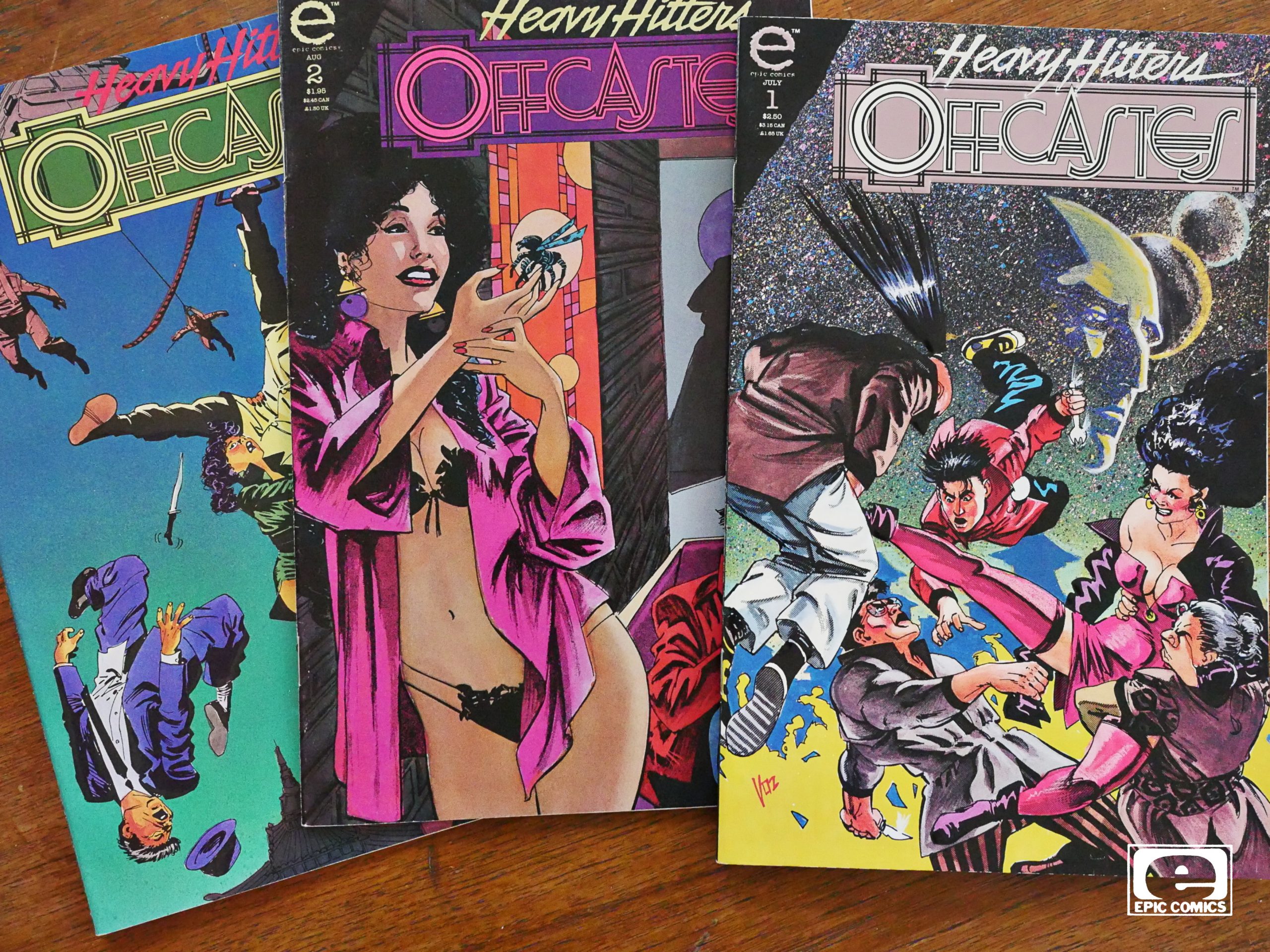
Offcastes (1993) #1-3
by Mike Vosburg
Mike Vosburg… that’s a very familiar-sounding name, but I cant’ quite place it.
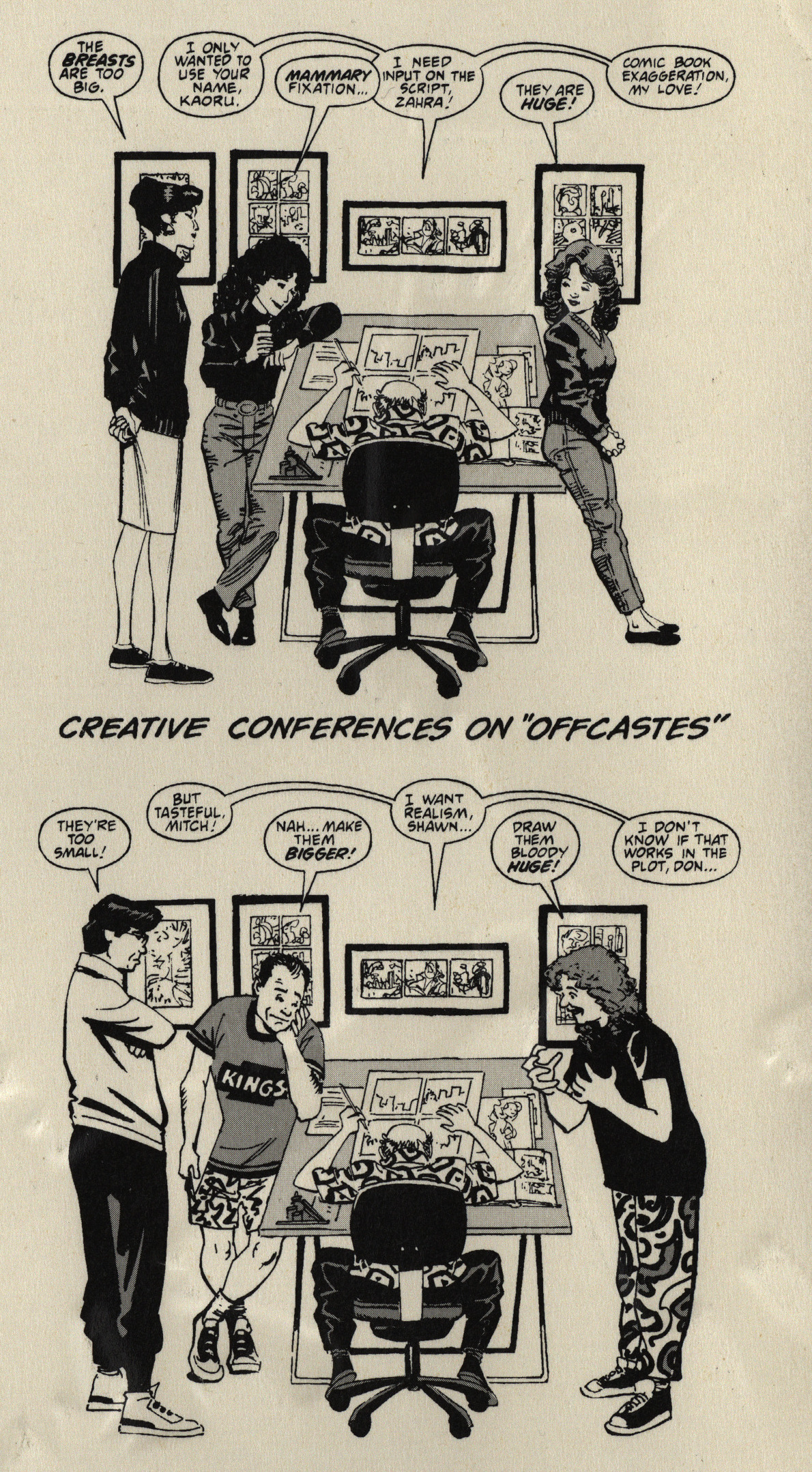
On the inside front cover Vosburg explains about the insightful comments he’s gotten from his friends.
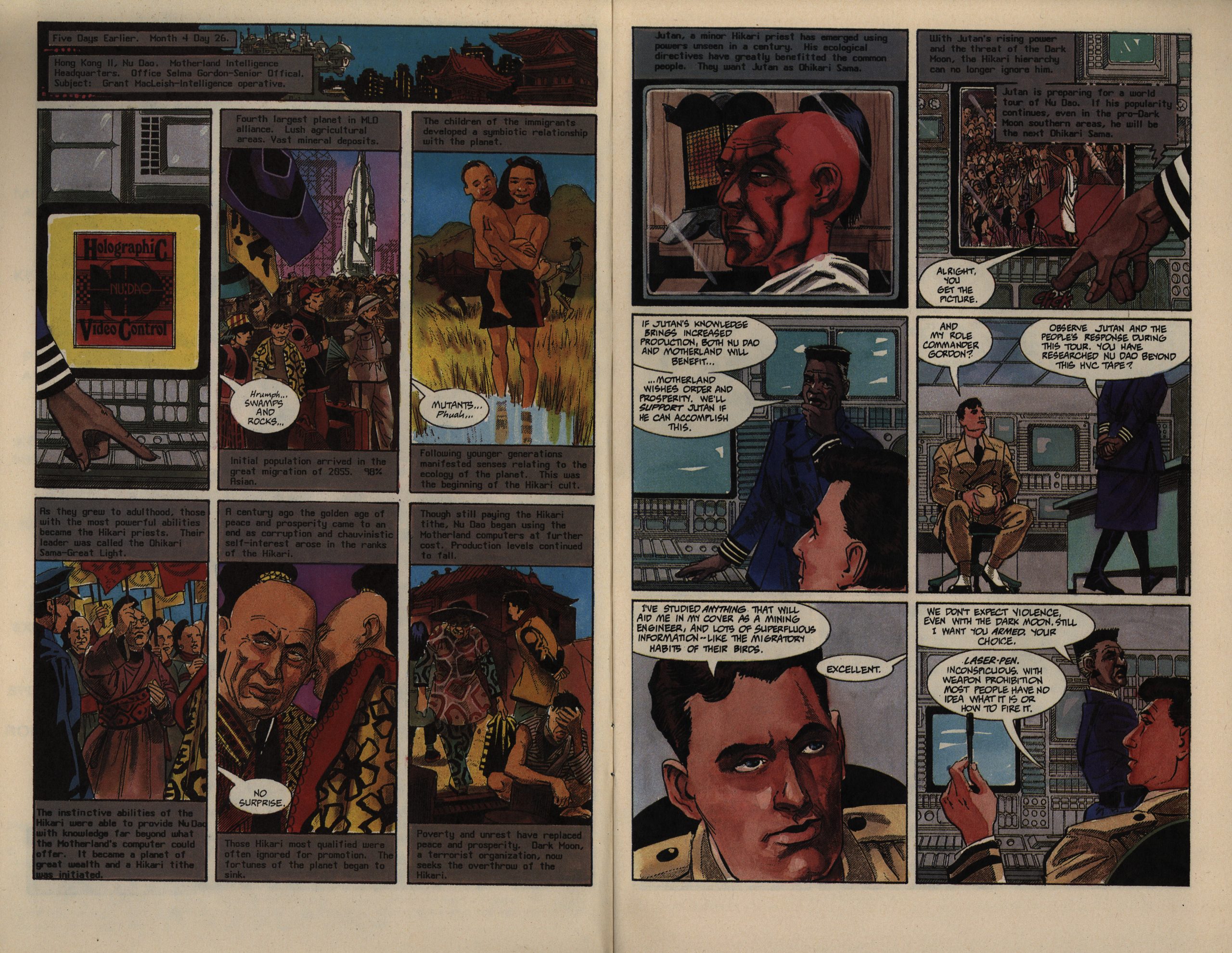
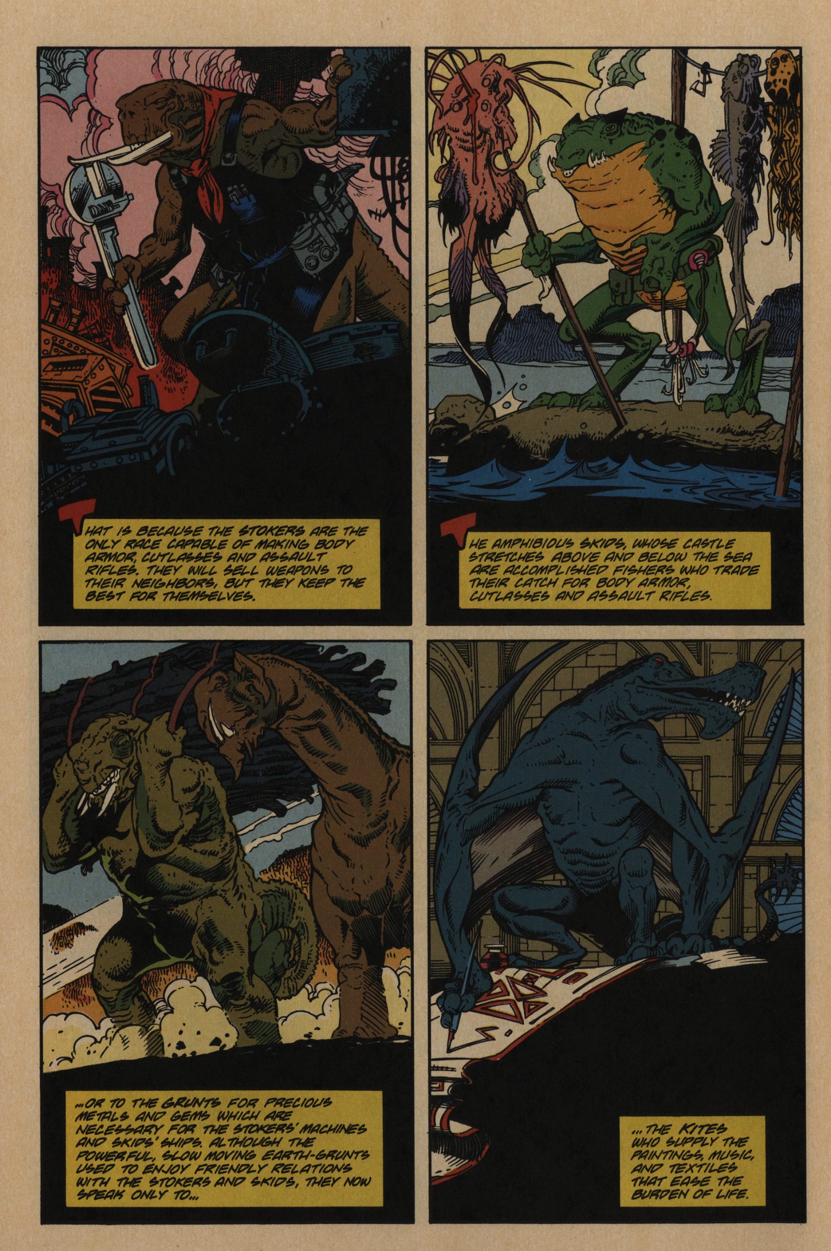
Oh, boy. We start off in deep, deep infodump territory. If there’s something that’s more offputting that starting off on an infodump, I don’t know what. But… somehow… I don’t mind it here? I can’t explain it; I feel like I’m reading a good olde-tymey adventure comic, where that sort of thing is integral, of course. It might just be that the world Vosburg is setting up here seems genuinely complex and interesting, but this opening, surprisingly enough, makes me want to read on.
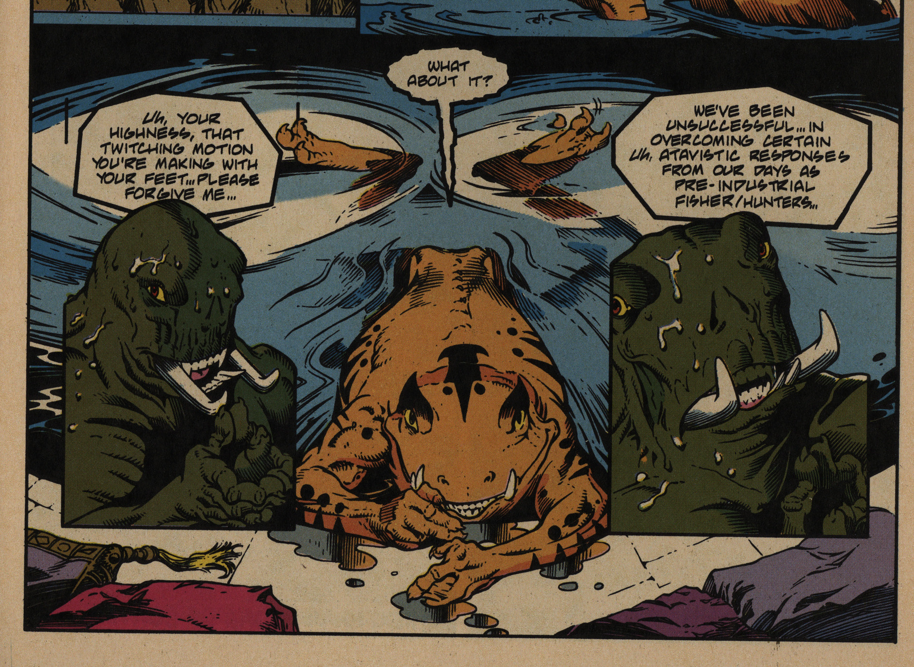
It turns out (on page four) that the presumed protagonist is an agent for a fascist, racist regime, for instance.
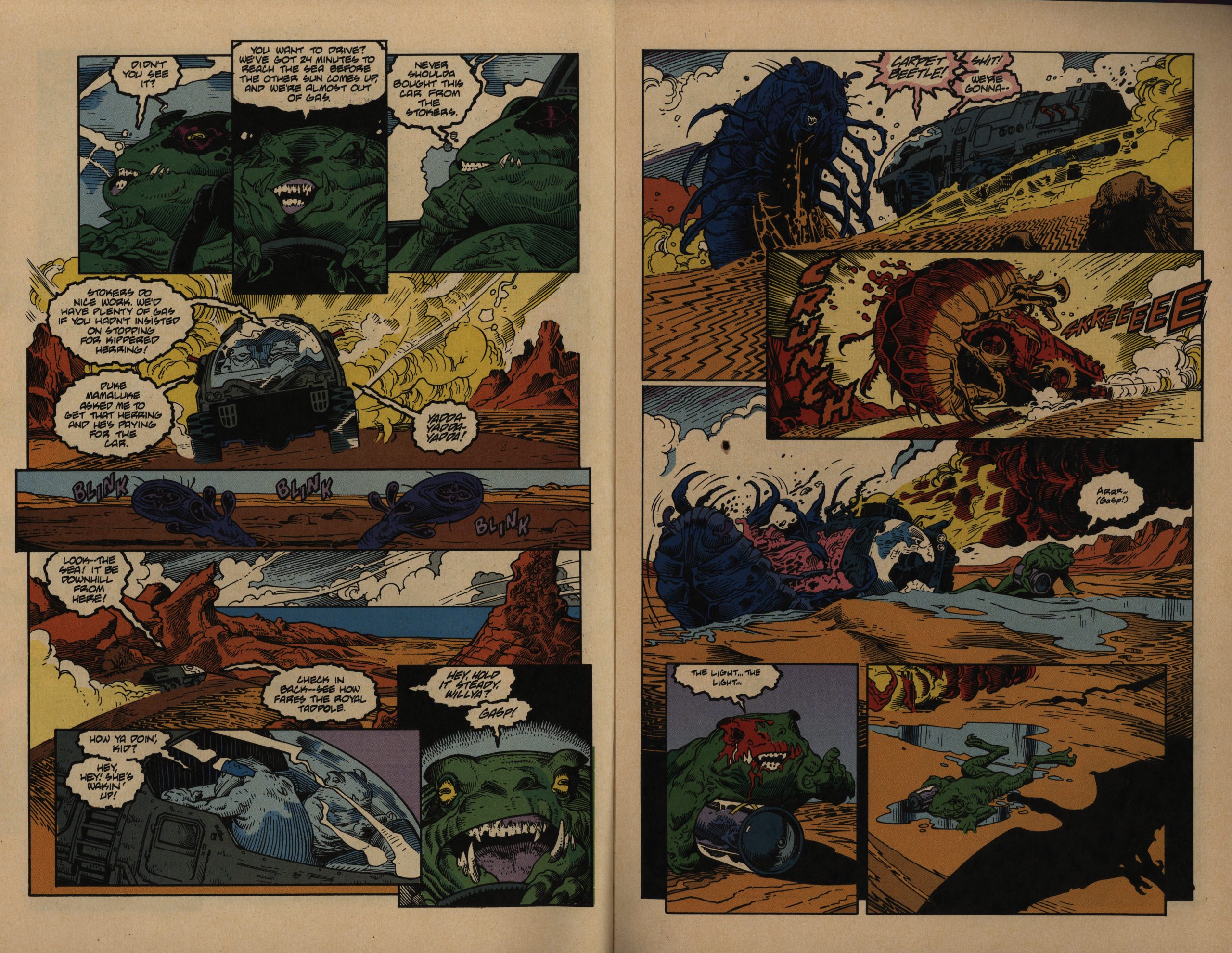
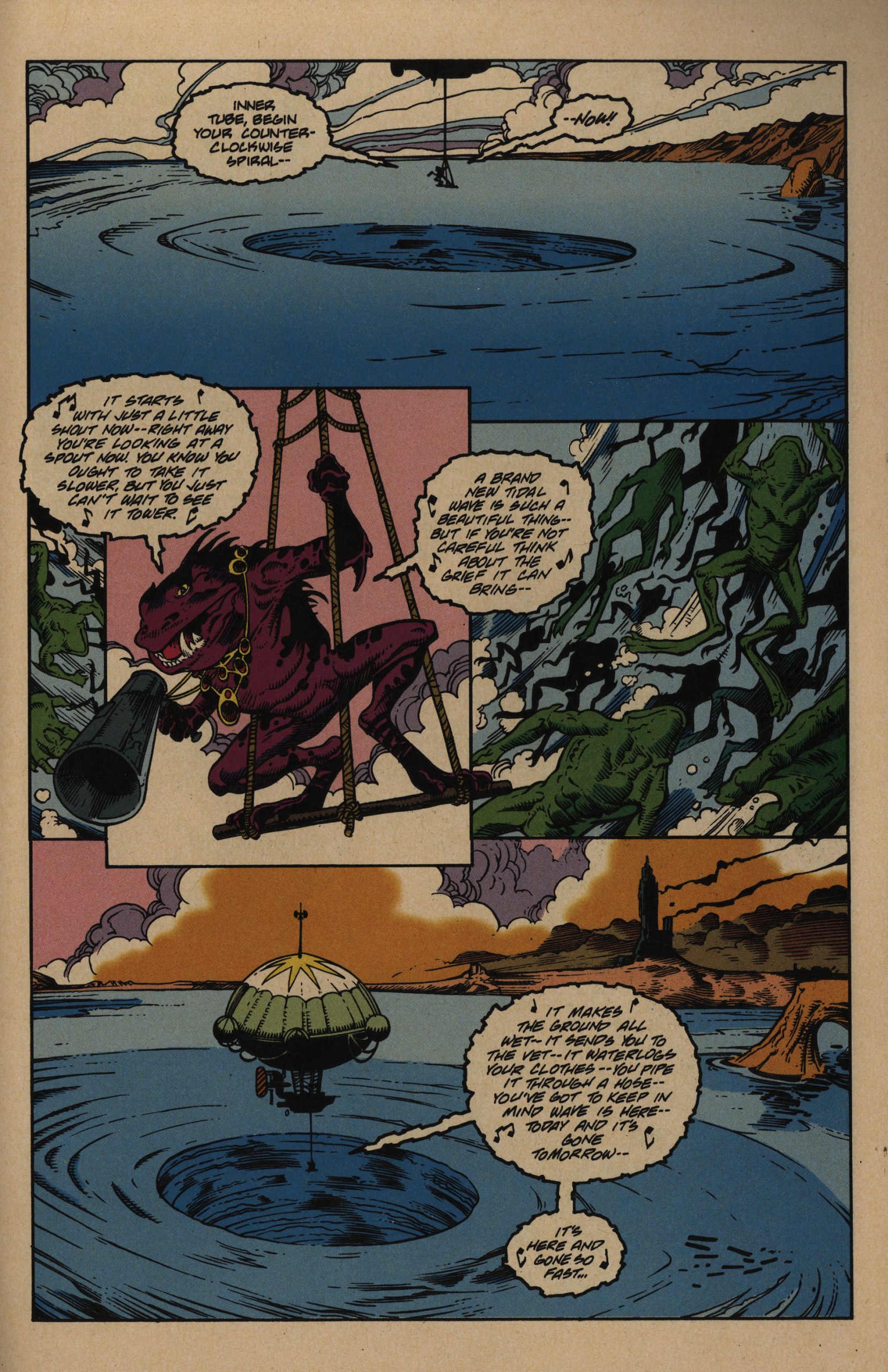
Perhaps a lot of my immediate fascination with this book has less to do with the narrative style and more to do with the artwork. It looks like… Howard Chaykin? But more humanised? I find it quite attractive — varied characters, solid anatomy, backgrounds that are actually there…
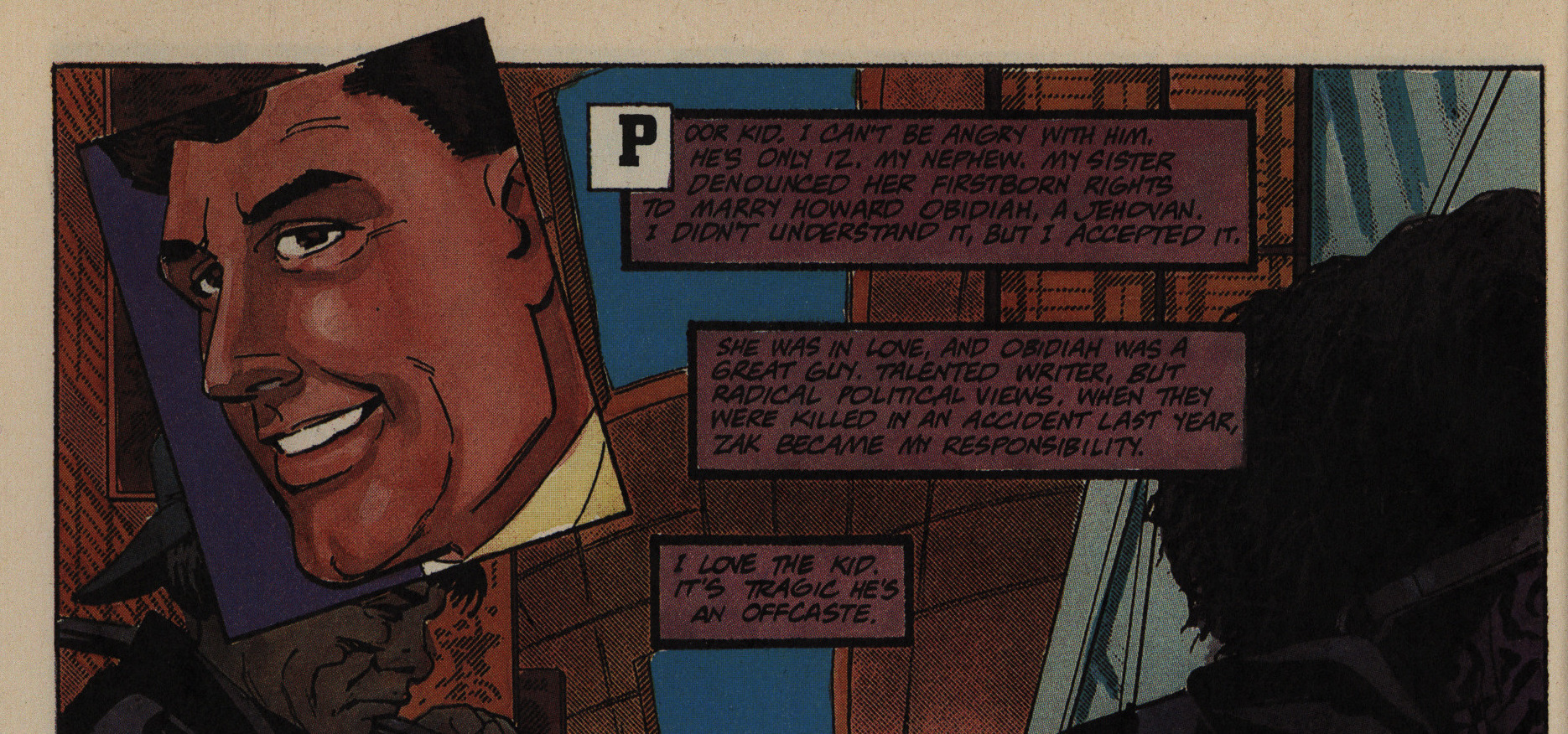
That’s a very Chaykin face, right?
The characters never stop thinking thoughts that are very helpful in explaining to the readers what’s going on. Normally this would totally drive me nuts (I mean, more than usual), but, again, here it just feels very natural, for some readson.
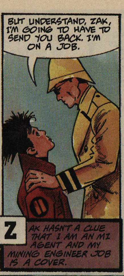
Perhaps it’s because this turns into a surprisingly complex story with a bunch of twists and reversals, and without these reminders this would be a different genre than what it reads like, which is a lighthearted adventure story.
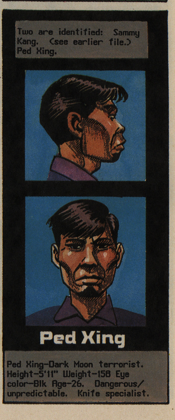
Ped Xing? C’mon.
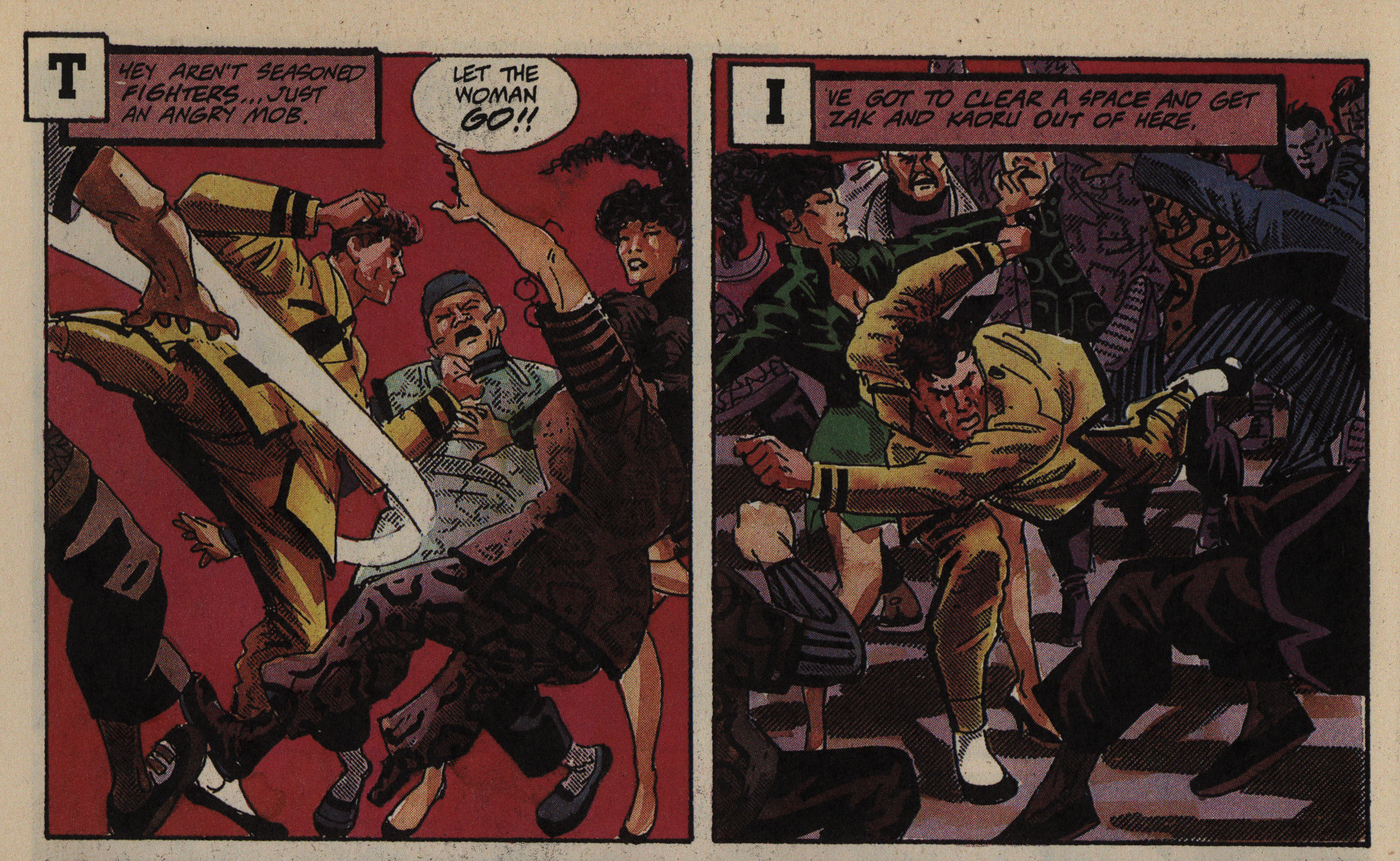
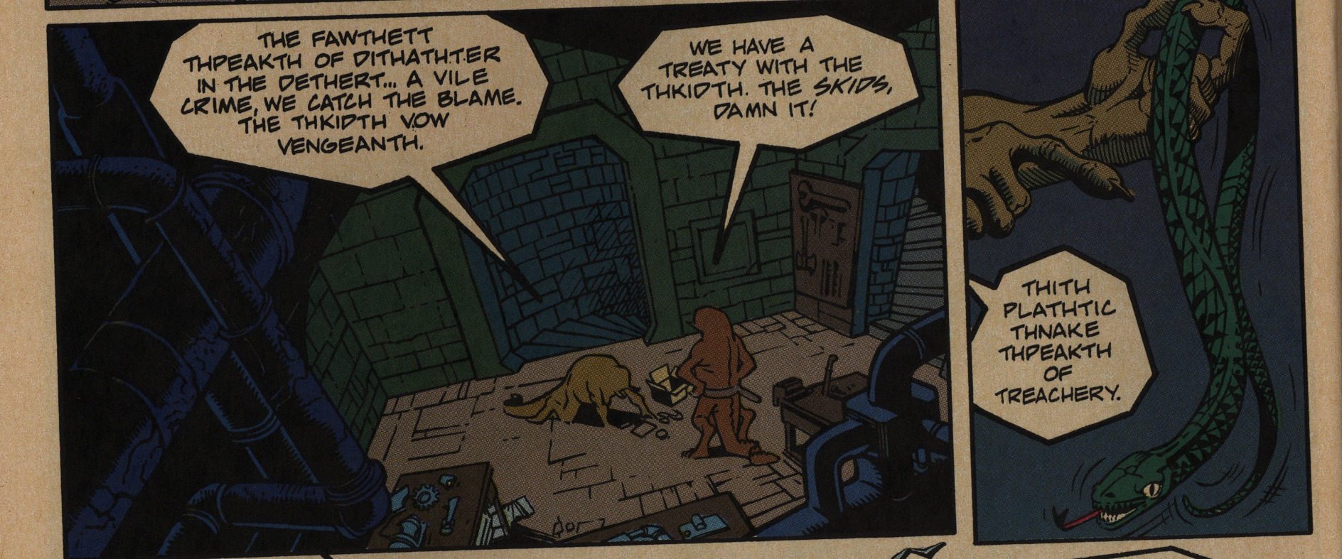
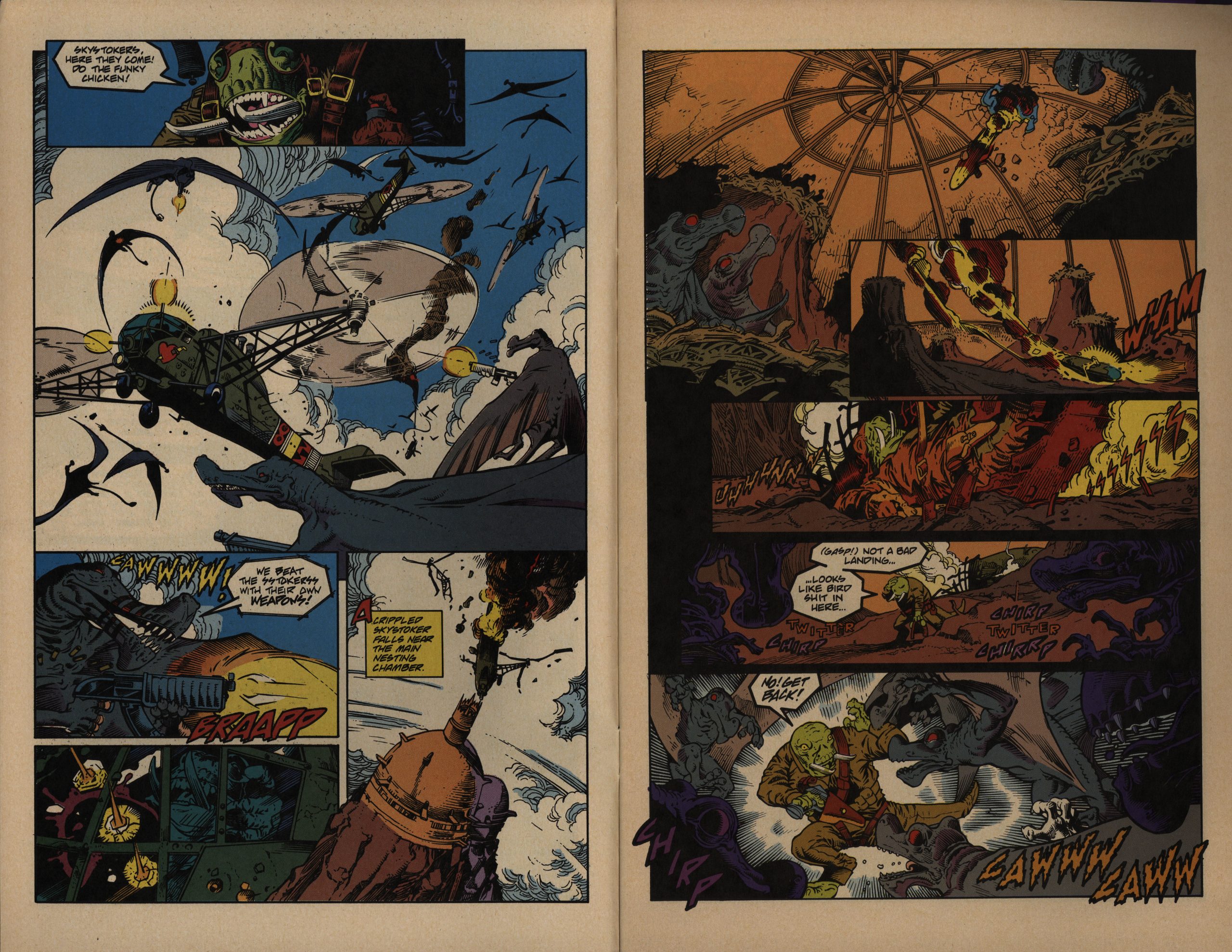
Oh, the thing I said about good anatomy? Not so much in that panel to the right there, I guess…
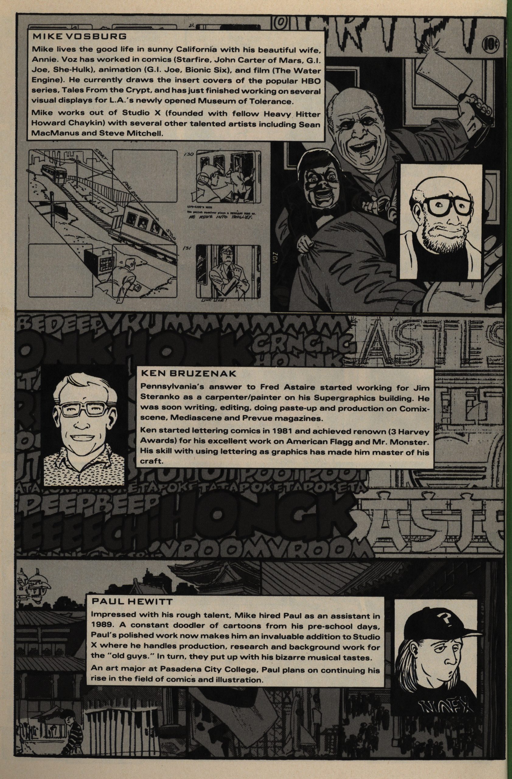
Aha! Vosburg shared a studio with Howard Chaykin. I guess that explains it.
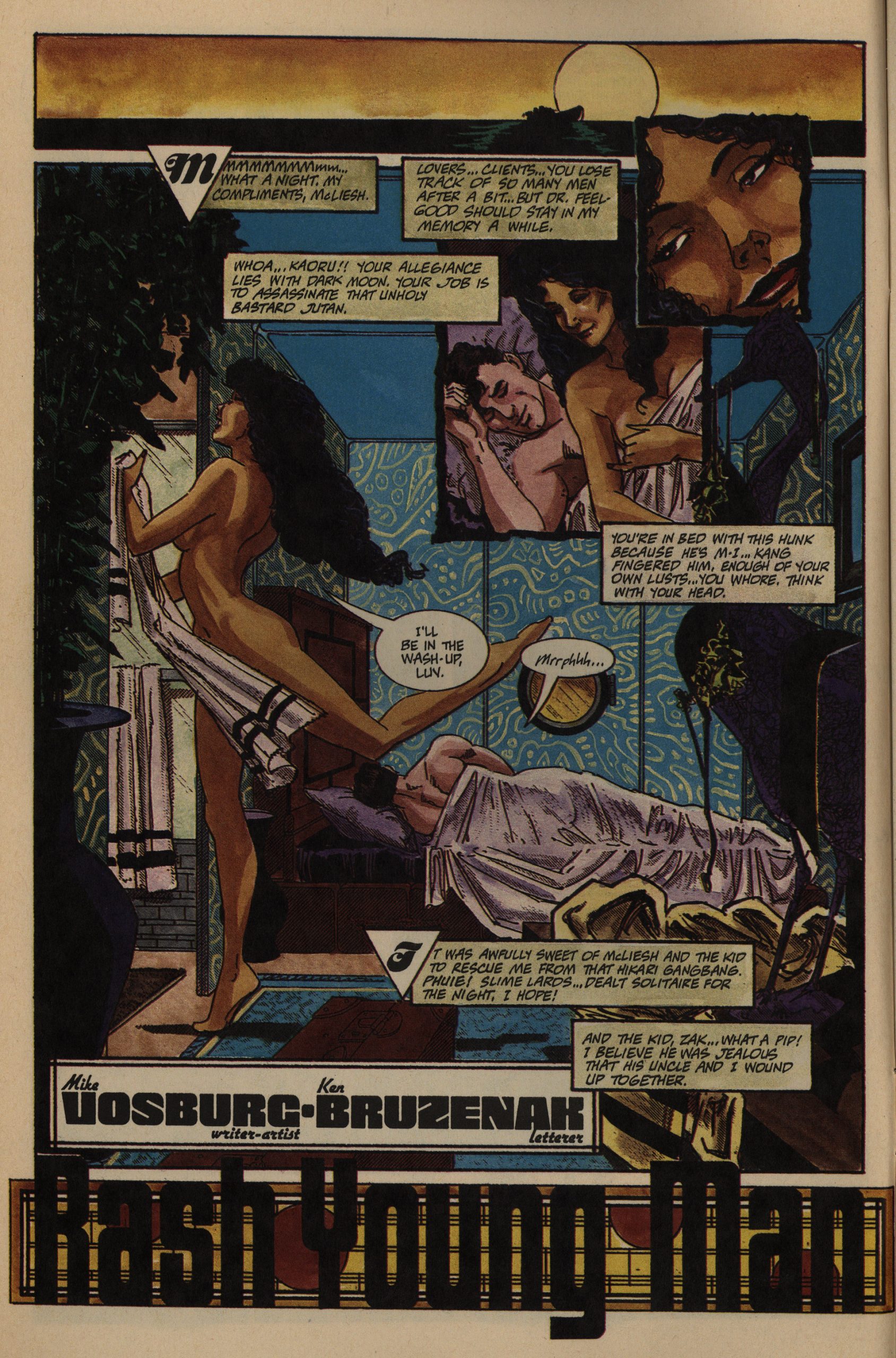
I really like the designs on these pages. They’ve got a natural flow even when the reading direction flows from the right towards the left, which is a difficult trick to pull off. The colours (also done by Vosburg) are also great. Just the right degree of modelling, and with a consistent (and very pretty) colour scheme.
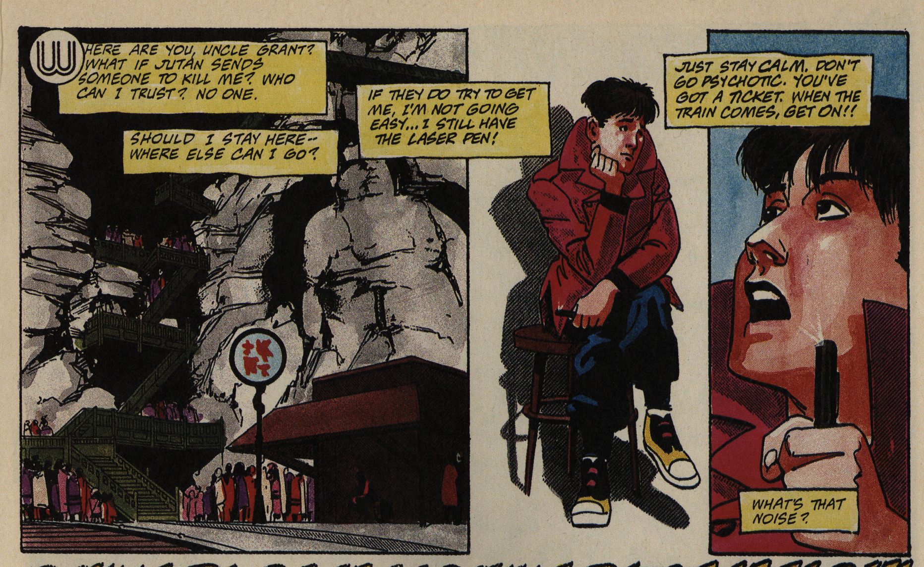
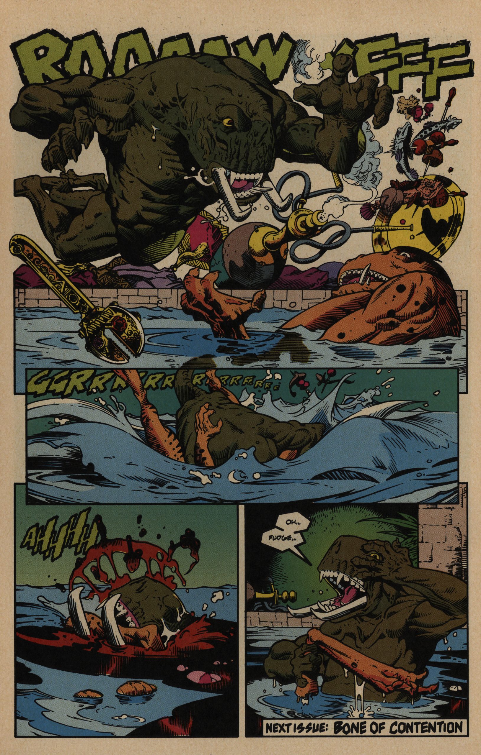
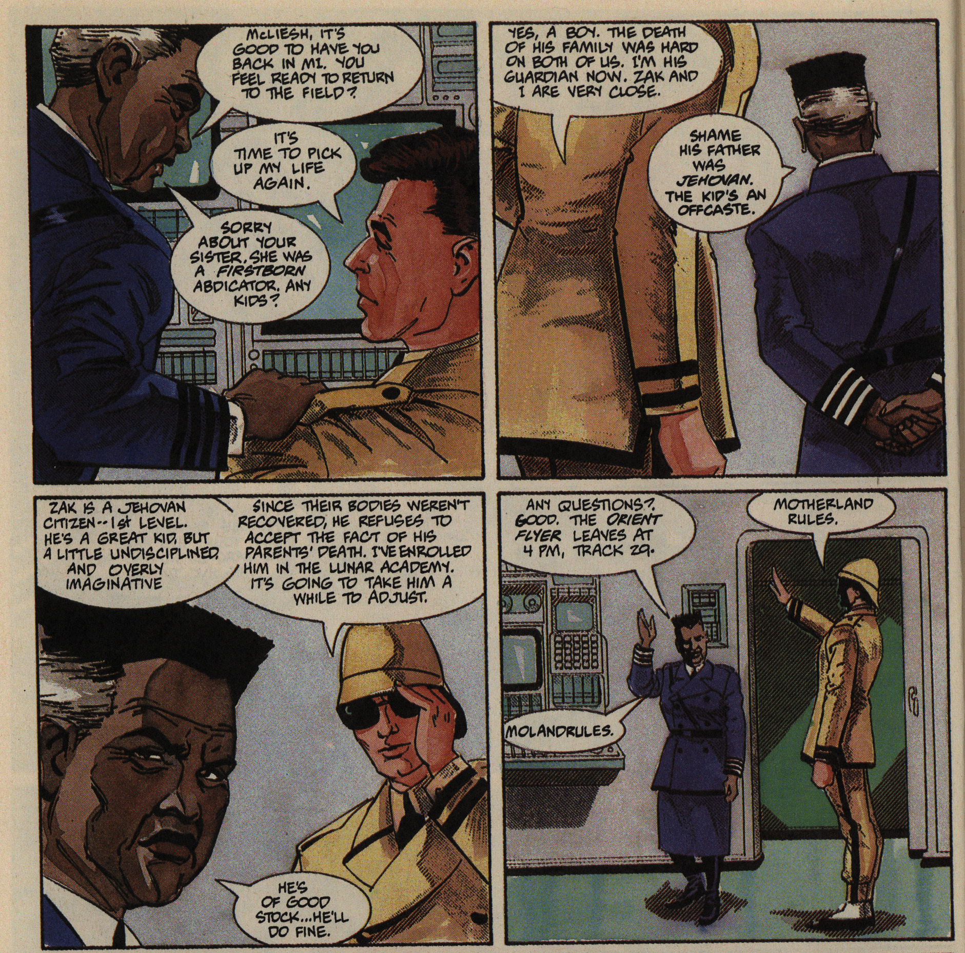
I’m not going to go into the plot at all (as usual), but just note that things grow more and more complicated in a very satisfying way, and we focus more on the kid character who’s the one who understands most of what going on, and is the most powerless character. We spiral inwards into a very tense ending.
It’s pulled off in a most excellent way… even though the ending is pretty bleak. (And I’m not totally sure that it really makes sense, but…)
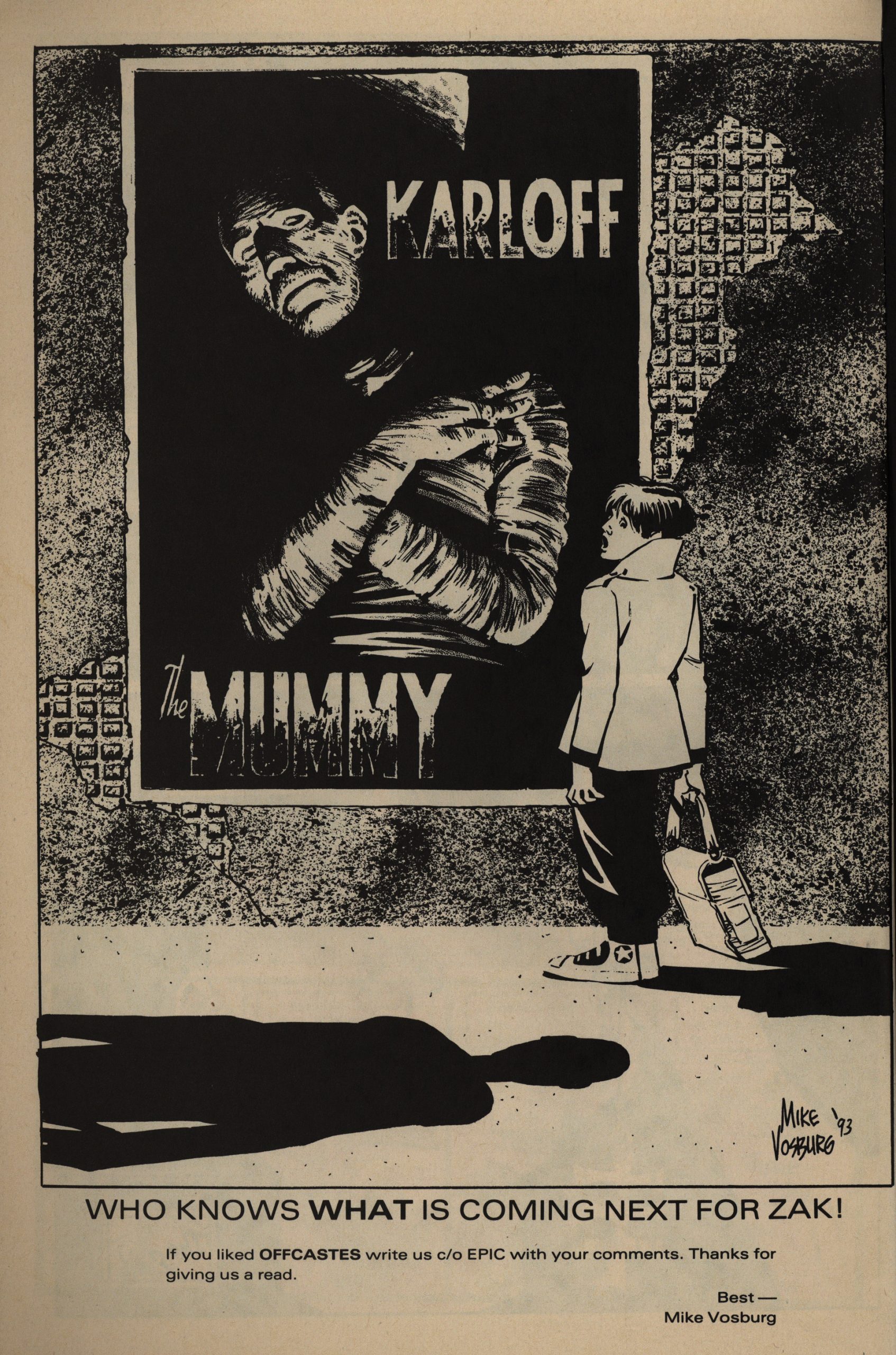
I’m guessing there’s not anything more for Zak, because the era for comics like this had been over for half a decade when this was published. It feels like a throwback to the mid-80s wave of indie comics (in all the best ways): A very personal, original project that doesn’t conform to many of the clichés that a reader would expect.
I’m going to go ahead and guess that it bombed sales-wise, but most of the Heavy Hitters books apparently did…
The book has unfortunately never been collected or reprinted, but Vosburg started a Kickstarter to make that happen in 2019.
Huh:
Originally printed in 1993 in a three issue series, this reprint will collect them all in one graphic novel, completely digitally recolored and with enhanced printing shot from the original Duo-Shade pages. It was the first chance I had to do an entire project on me own: writing, penciling, inking, and coloring. I was very proud of the work. Unfortunately, the printing process that we used was not advanced enough at the time to handle the color work that was done, and the finished books looked pretty murky at time.
I liked the colouring! Well, just goes to show…

Looks like it was funded successfully, but I’m not sure whether you can actually still buy a copy…
You should, though. It’s interesting.
I couldn’t find any reviews (or talk) about this series at all on the web.