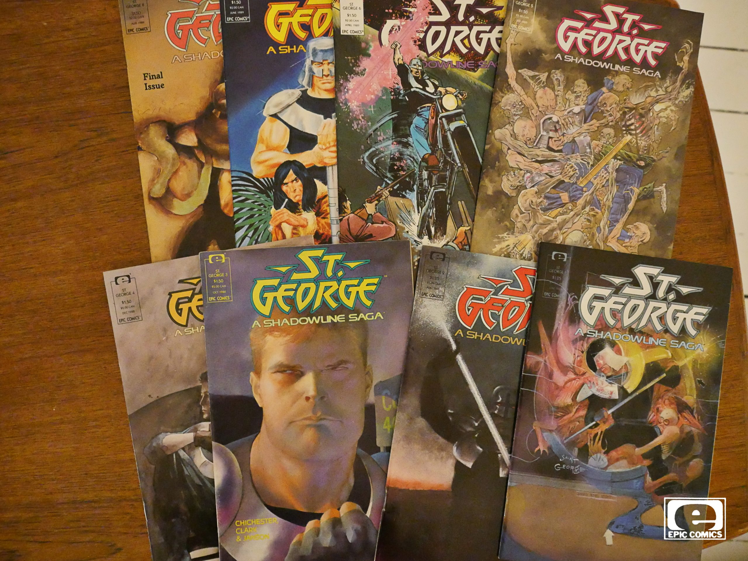
St. George (1988) #1-8
by DG Chichester, Margaret Clarke, Klaus Janson and a whole bunch of people
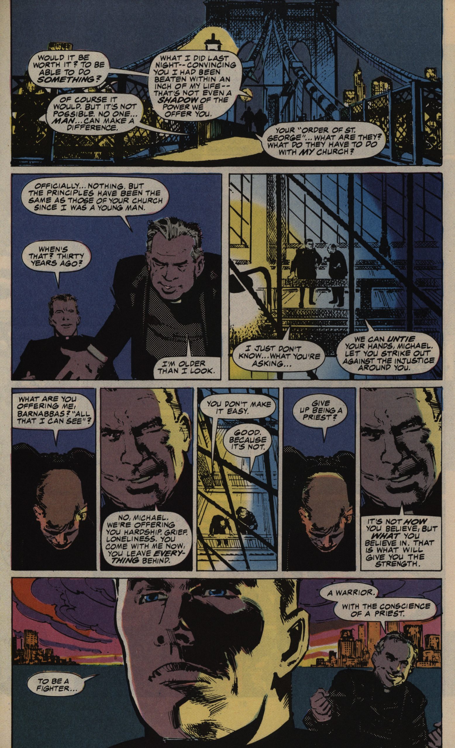
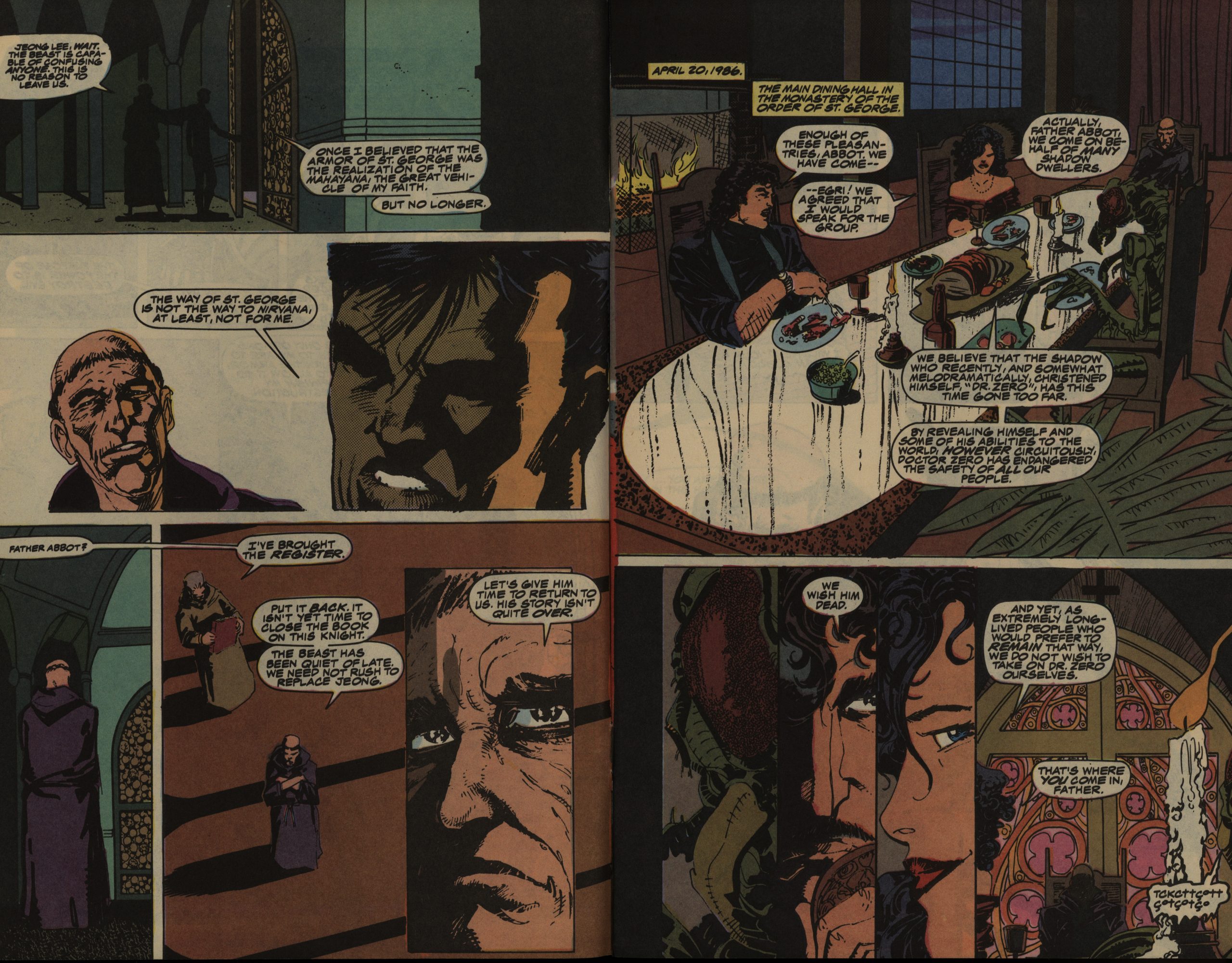
This is the third and final Shadowline series. The concept was cooked up by Epic editor Archie Goodwin, but then farmed out to Chichester and Clarke, both editors at Epic, to write.
Doctor Zero had some formally interesting qualities, but Powerline didn’t, at all, so I assumed that all that came from Denys Cowan, the penciller on Doctor Zero. But here again, we see some of the jagged storytelling that was all the rage at the time, so perhaps I should give the writers some credit.
But it all goes AWOL pretty soon, and most of the series uses quite traditional storytelling.
Janson is most known for inking Frank Miller, and there’s worse things to be known for. I think he does a respectable job here: There’s some striking imagery and it reads well.
The only problem is that it’s almost incomprehensibly boring. I don’t think I’ve ever struggled this much just getting through an eight issue series.
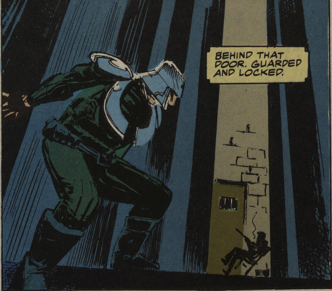
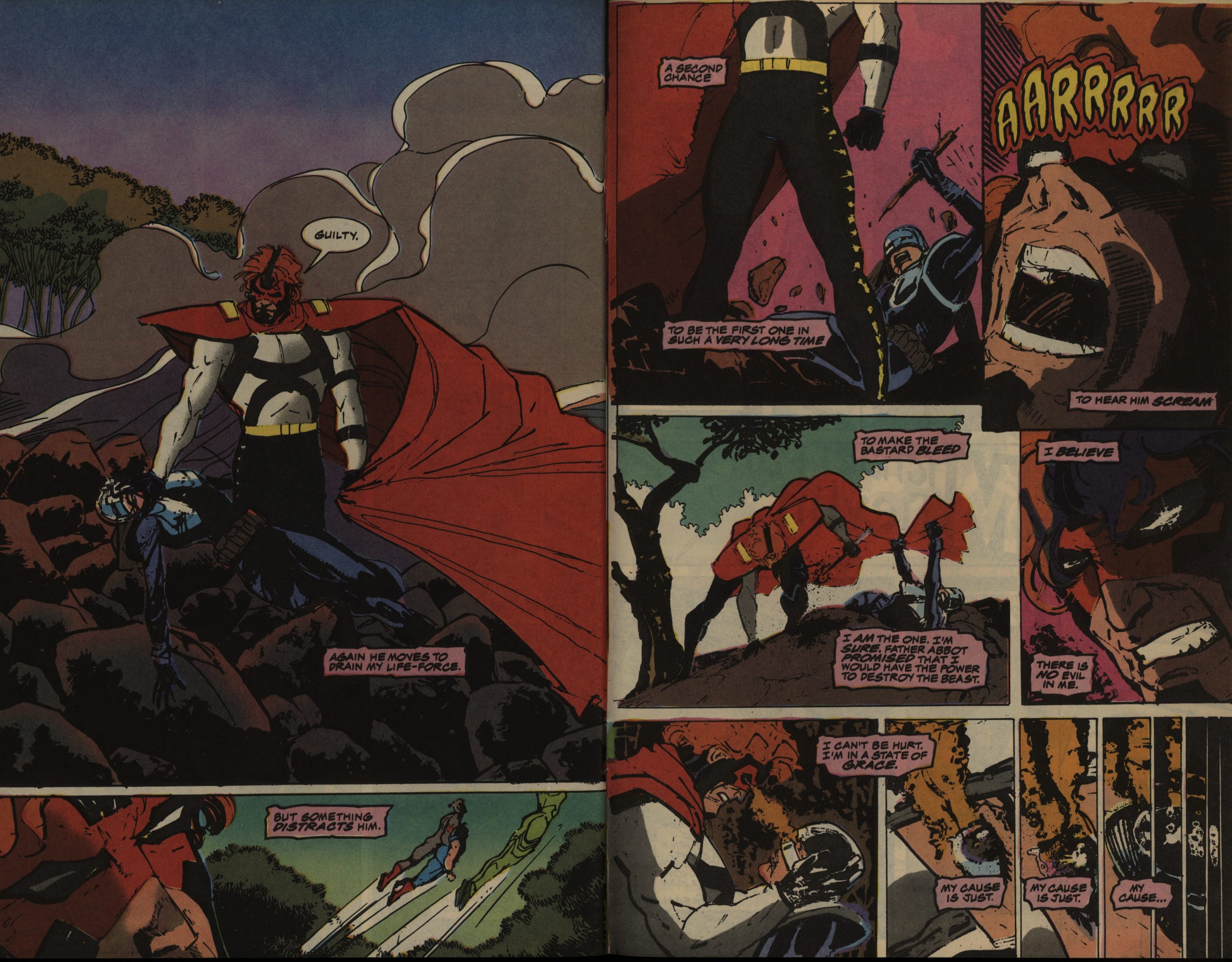
Some things help, though, like having the hero wear a toilet seat as his costume.
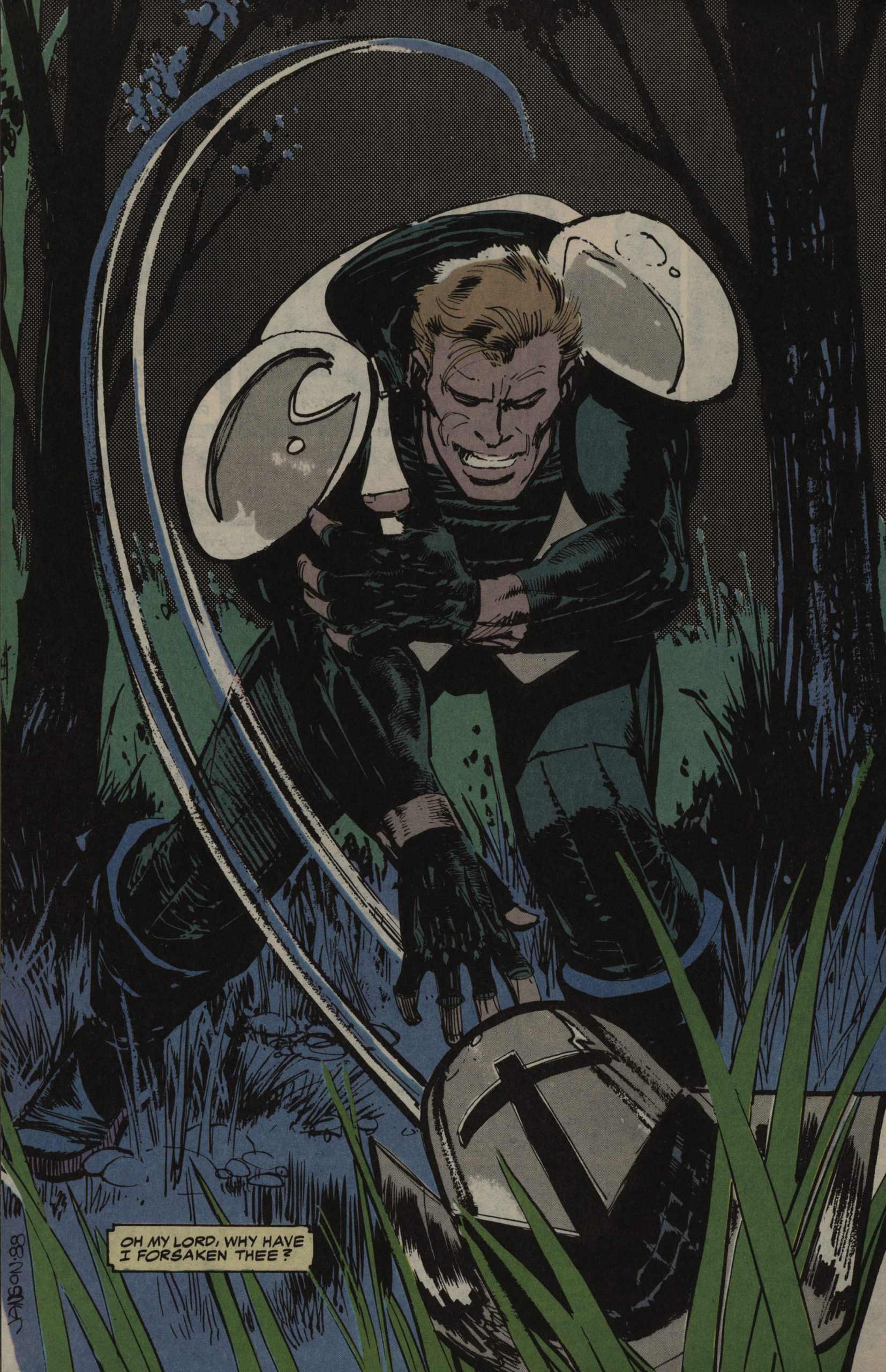
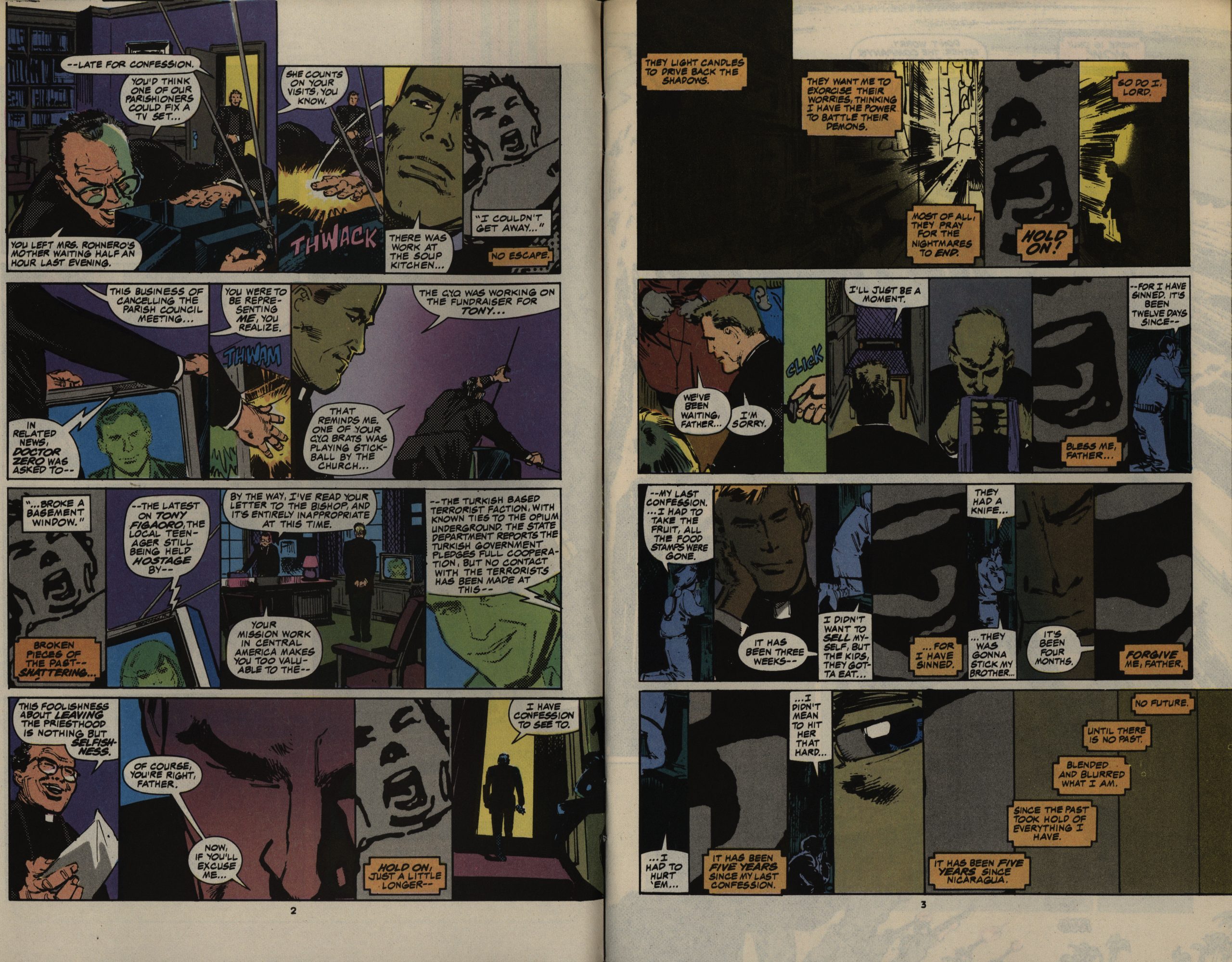
The religious bits do not help. At all.
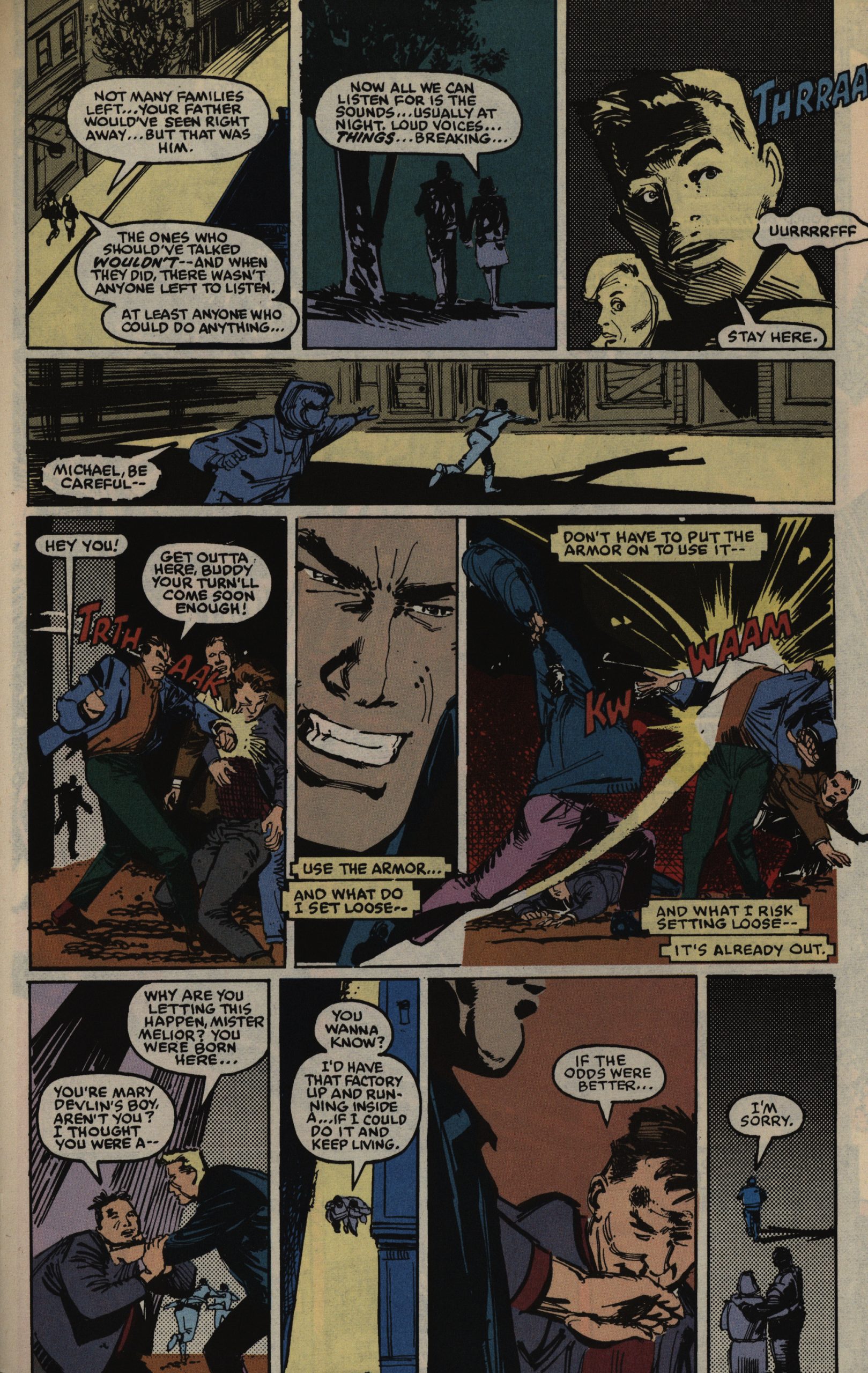
When you’re this bored, it’s hard to tell whether things don’t make sense because your eyes glazed over, or because… they don’t make sense. “Why are you letting this happen”, our hero asks somebody who was just getting beaten up. Because… because…
Janson almost does it all on the first six issues; pencils, inks and the colours (with some help on a couple of issues). I wonder whether that made him rush a bit, because his anatomical proportions get out of what here and there.
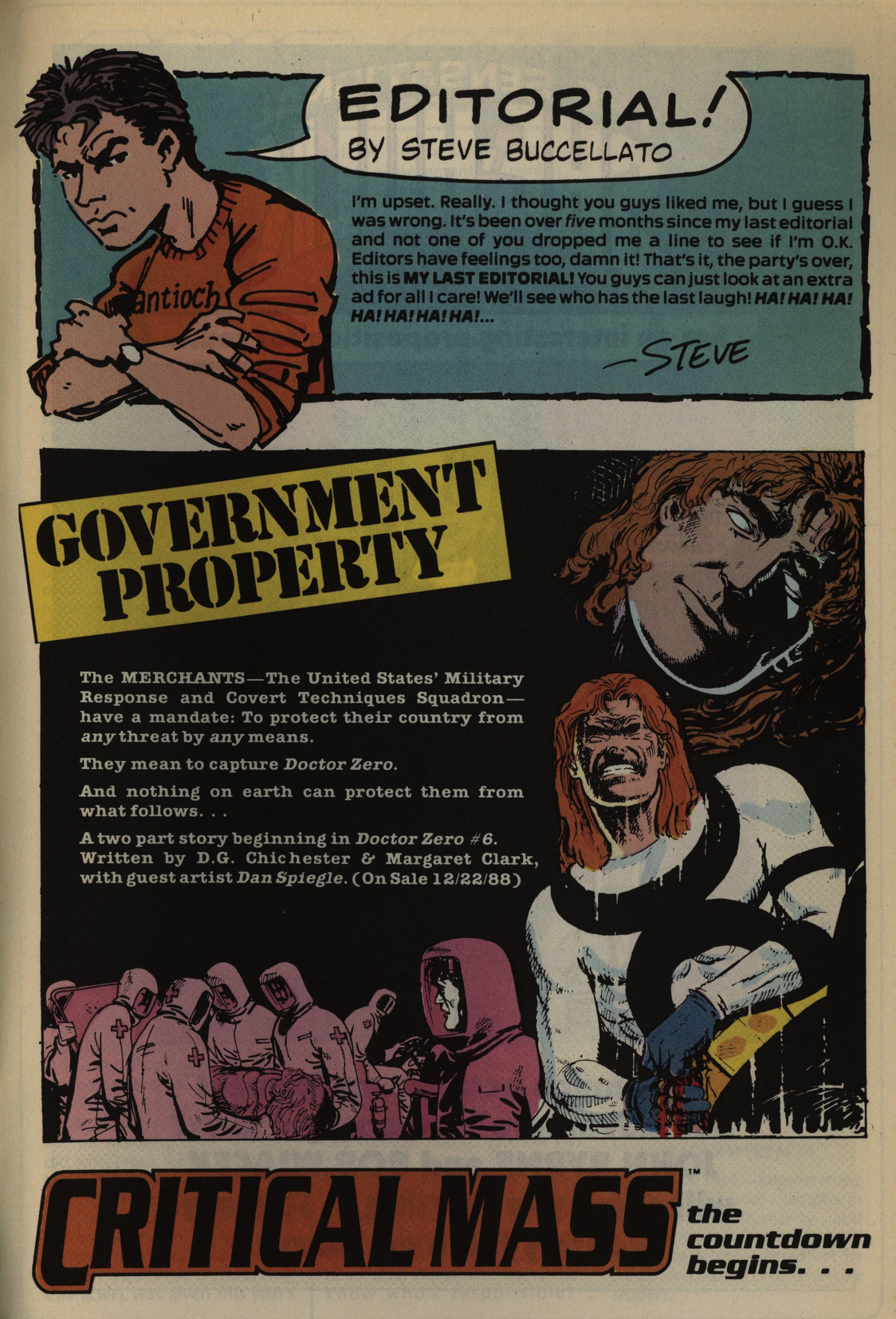
Critical Mass is announced as a crossover thing. It didn’t happen, but instead became an anthology.

There’s not much synergy between the three Shadowline series, but it is kinda fun with these small call-backs. (The chili guy is a guy from Doctor Zero.)
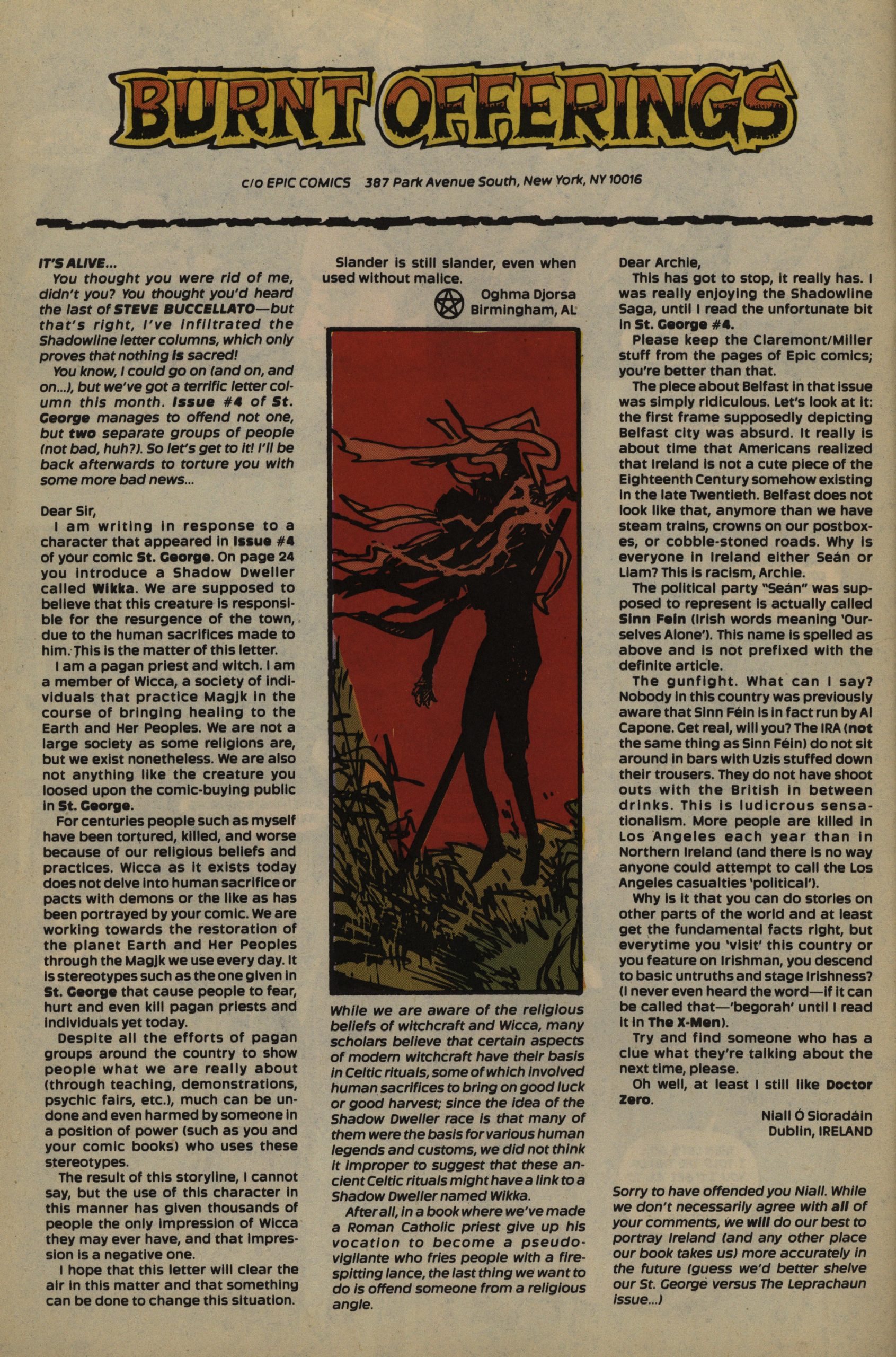
Without me noticing, there had been two major controversial bits in St. George. A Wiccan is terribly upset at the portrayal of er a character called “wiccan”, and an IRA enthusiast is upset that it was implied that the IRA sometimes made bombs go off.
Janson leaves, and the seventh issue is drawn by Dan Spiegle. He does a good enough job, but it’s still… not very interesting.
Oh, the verbiage. And we already know all this! The tedium!
At least there’s no controversy in this issue. I mean, the hero kills a boatful of evil Contras, but then he… fights… the Sandinistas afterwards? Again, I’m not sure whether this all just doesn’t make any sense, or whether it’s just because I’m not bothering to read it with anything like a quarter of my attention.

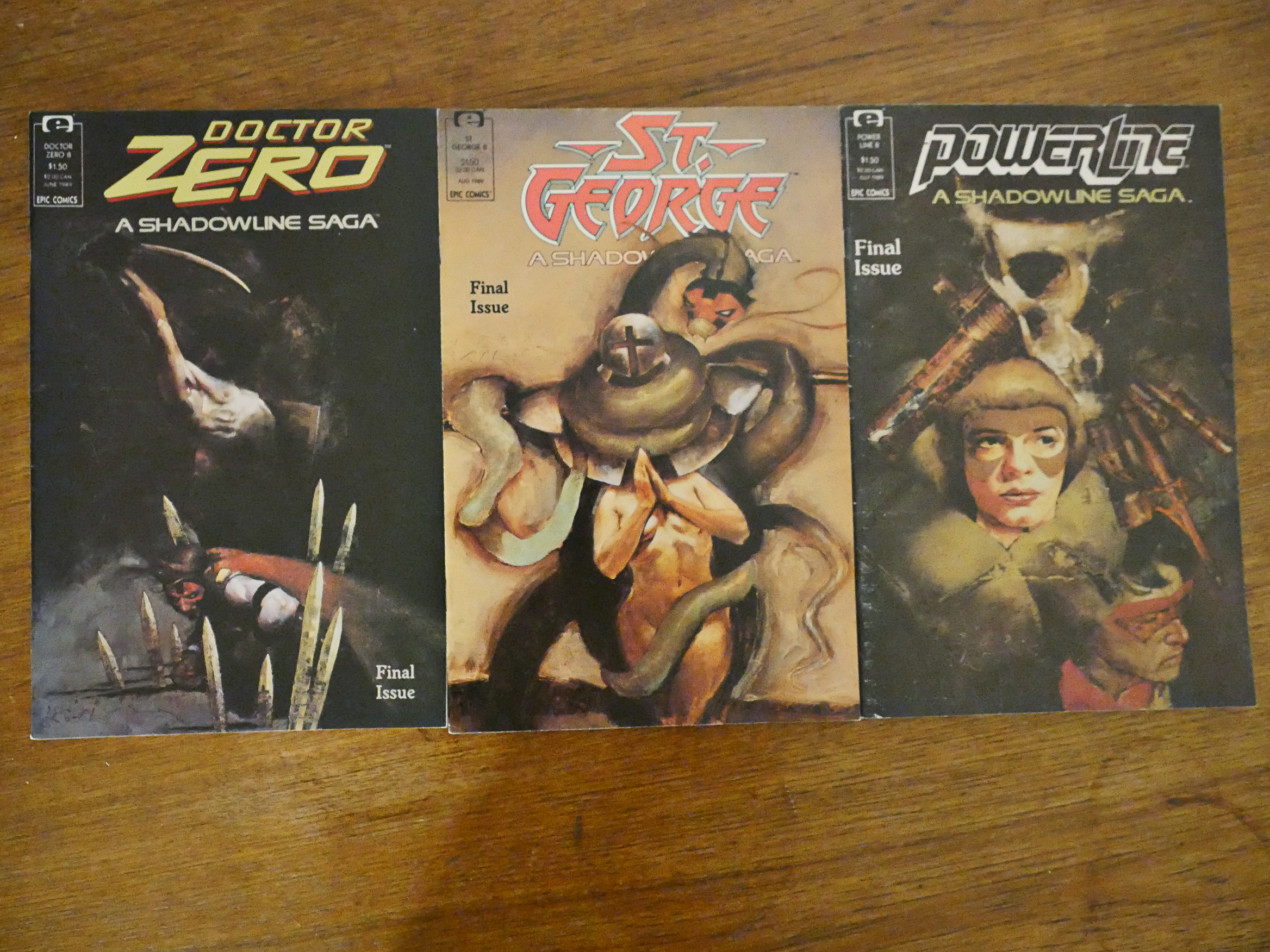
The eight issue was planned as a fill-in issue before the line-wide crossover, but instead it’s the final issue.
The point of interest here is Jim Lee, a soon-to-be superstar. And the artwork is clunky here and there, but you can see that he’s got something.
One fun bit here is that we see a scene from the first (I think) issue of Doctor Zero told from the point of view of his opponent, so we finally learn what that was all about.
So, weirdly enough, this turns out to be the most entertaining issue of the series, but that’s, unfortunately, not saying much.
But what did the critics think?
Andy Mangels writes in Amazing Heroes #149, page 48
Granted, most comics these days do
not stand as stories unto themselves,
but are we to accept this as status quo
and not raise our voices in protest?
And by the second issue, shouldn’t we
have some answers to questions, and
some hint as to the direction of the
book?
St. George has none of these. It
raises a lot of questions that I really
am not very interested in sticking
around and finding the answers to. It
has no sense of direction, nor does it
seem as if it is rapidly heading in any
direction. Combined with Chichester
and Clark’s annoying habit of cross-
cutting first person word balloons and
wer-using double-entendres as scene-
switchers (a phenomonon for which
we have Alan Moore to thank), this
directionless anti-plotting seems too
pointless.
Klaus Janson’s art is perhaps some
of his more uninspired work in recent
years, although this is not as boring
as that in St. George #1.
Klaus has a problem differentiating
characters, resulting in the inability to
tell characters apart unless it is by
hairstyles or clothing. His ultra-gritty
artwork is largely his appeal for the
projects he is hired for, although the
grit on this book gets a little over-
whelming sometimes.
However, Janson’s storytelling tal-
ents are virtually impeccable, and his
current work shows more and more
just how much influence his inking
had on the overall look of Dark
Knight. Since Janson also colors St.
George, some of the artistic problems
can (and probably will) be cleared up
in the printed version.
I can’t really find any reviews on the interwebs, but here’s something:
St George is grittier than Doctor Zero or Powerline with a more noirish feel to it. I like the fact that the main character is a priest who is also a tough guy and doesn’t make apologies for it. He is capable of brutality and impulsive actions but there is none of the hand wringing or self doubt that you might normally expect with this type of character.
St. George has never been collected or reprinted.
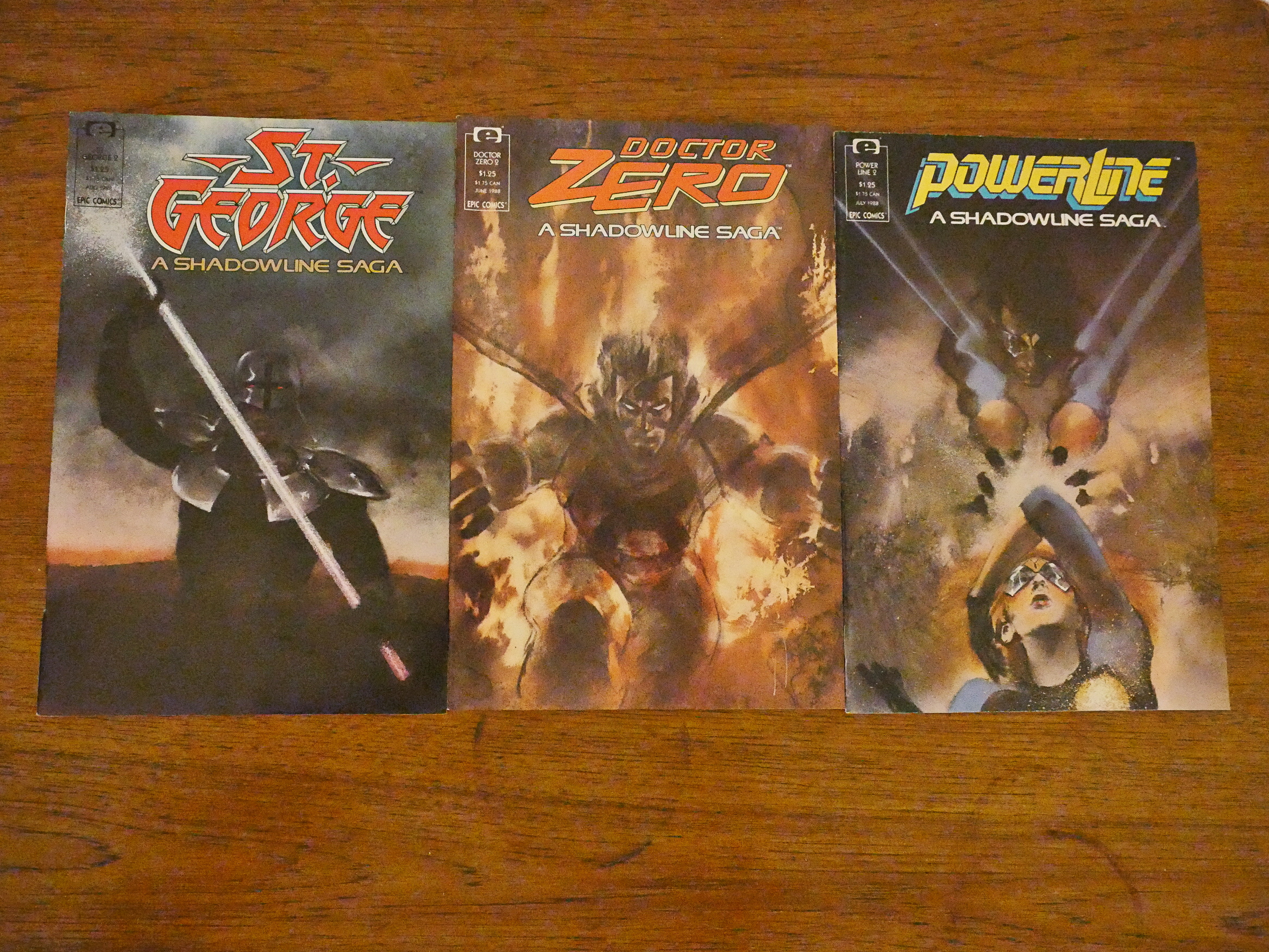
But let’s take a look at the covers. Uniquely enough, the entire line had the same cover artist every issue, which gives extra visual unity on the shelves, you’d imagine. Let’s see how that goes.

Bill Sienkiewicz is first out, and I think that’s stunning.
Jon J. Muth is next, and I think… it’s probably a bit too muddy? Especially the St. George thing.
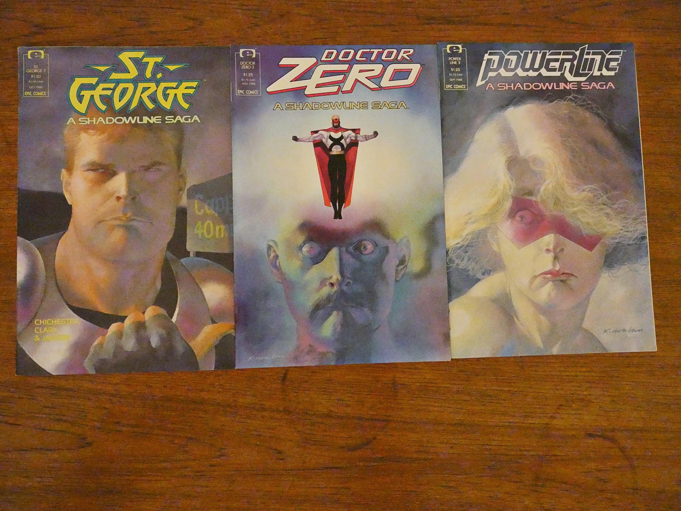
Kevin Nowlan absolutely rocks! Look at those faces! Those expressions! It’s totally not what you want on a line of super-hero comics, but it’s wonderful.
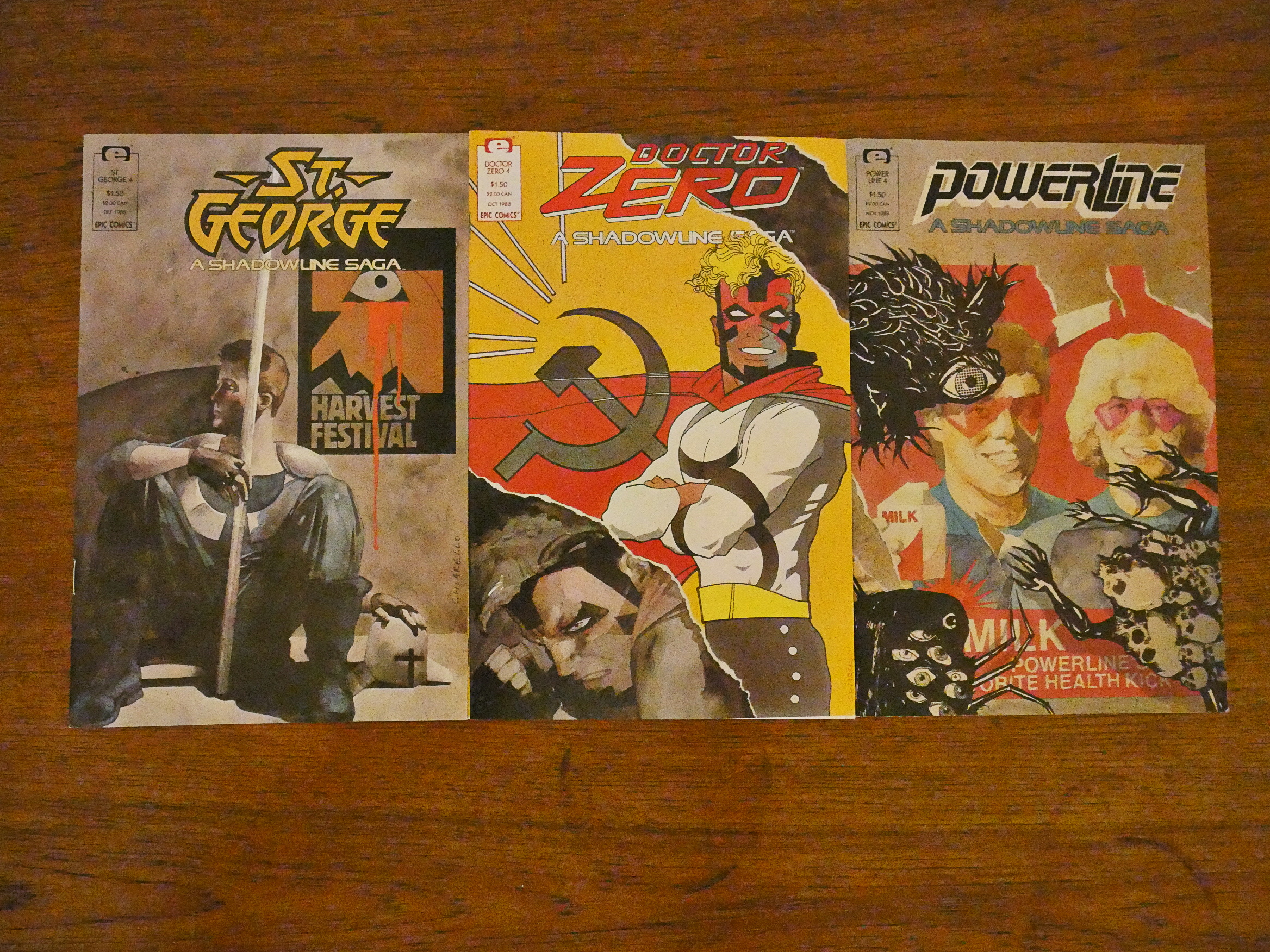
Mark Chiarello’s covers are interesting, but they don’t look much like a line of comics, do they?
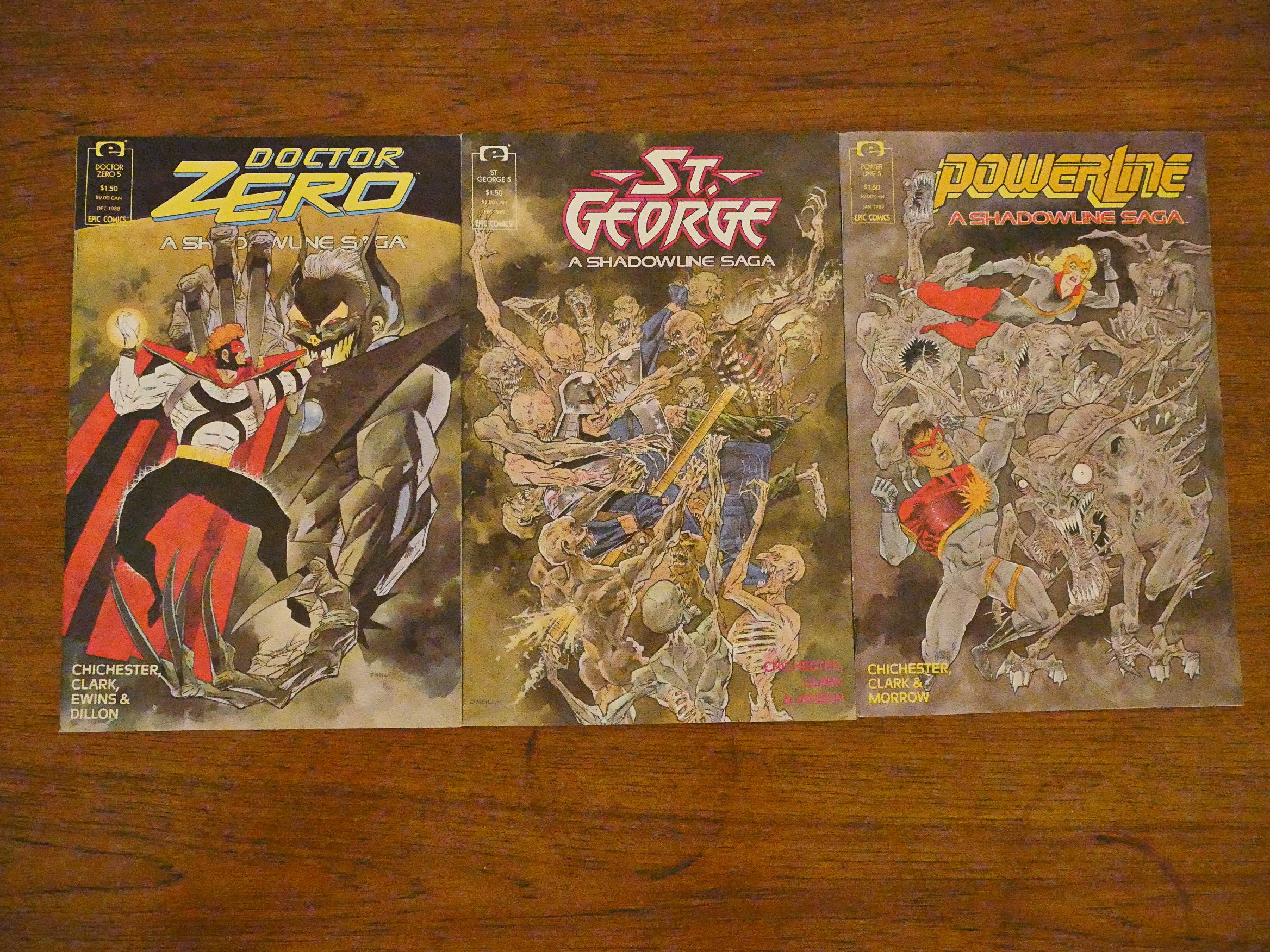
Kevin O’Neill does some very, very busy covers that are a bit hard to read. But they’re fun.
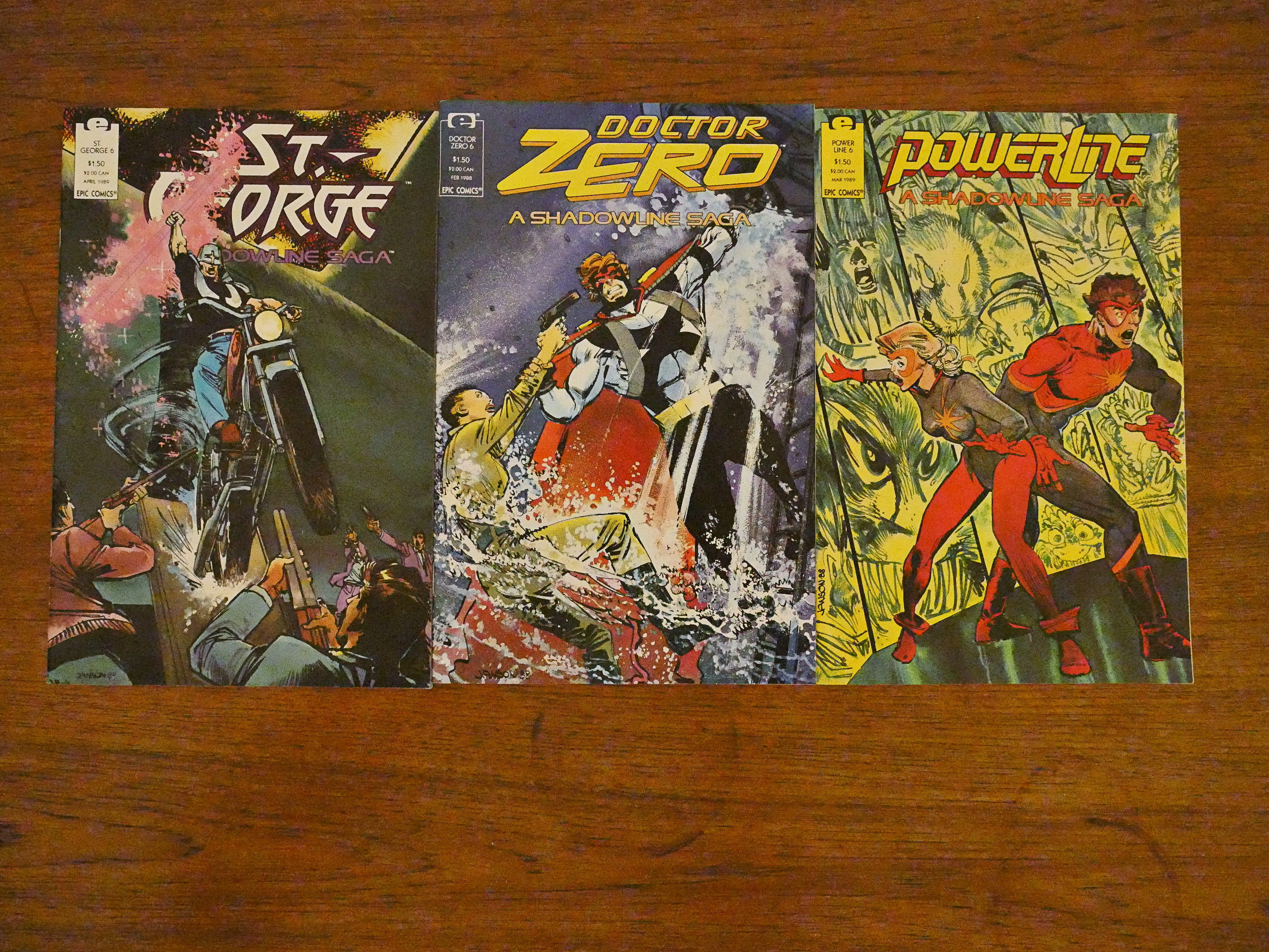
Klaus Janson does the most traditional covers of the bunch.
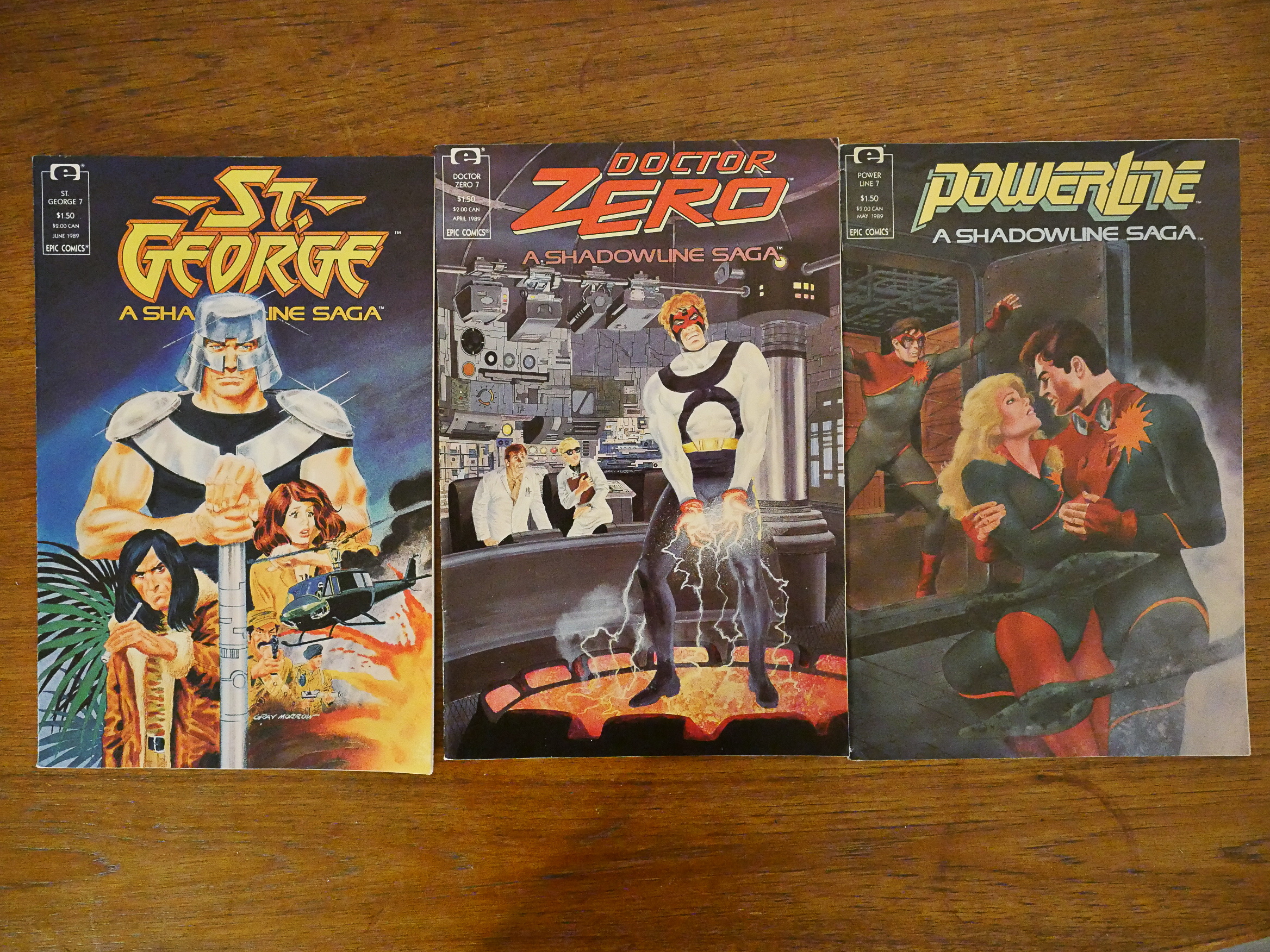
Gray Morrow’s romance parody for the Powerline book is fun, but the St. George thing is rather a mess and the Doctor Zero cover isn’t very exciting.
Kent Williams’ covers show great unity and are pretty striking, but are perhaps not a very good indication of what these comics are like.
OK, that’s it, but I have a lot of Shadowline pages to get through before it’s over: I have to read the Critical Mass series, which combines these three series into one seven-part 64-page series. But not for another couple of weeks, I think.
Are you not going to mention the fact that Terror of Terror Inc. made his first appearance here? He was called Shrek in St. George, then somehow made it to the 616 universe (perhaps the same way Justice traversed from the New Universe to Marvel 2099?)