1981: Epic Illustrated

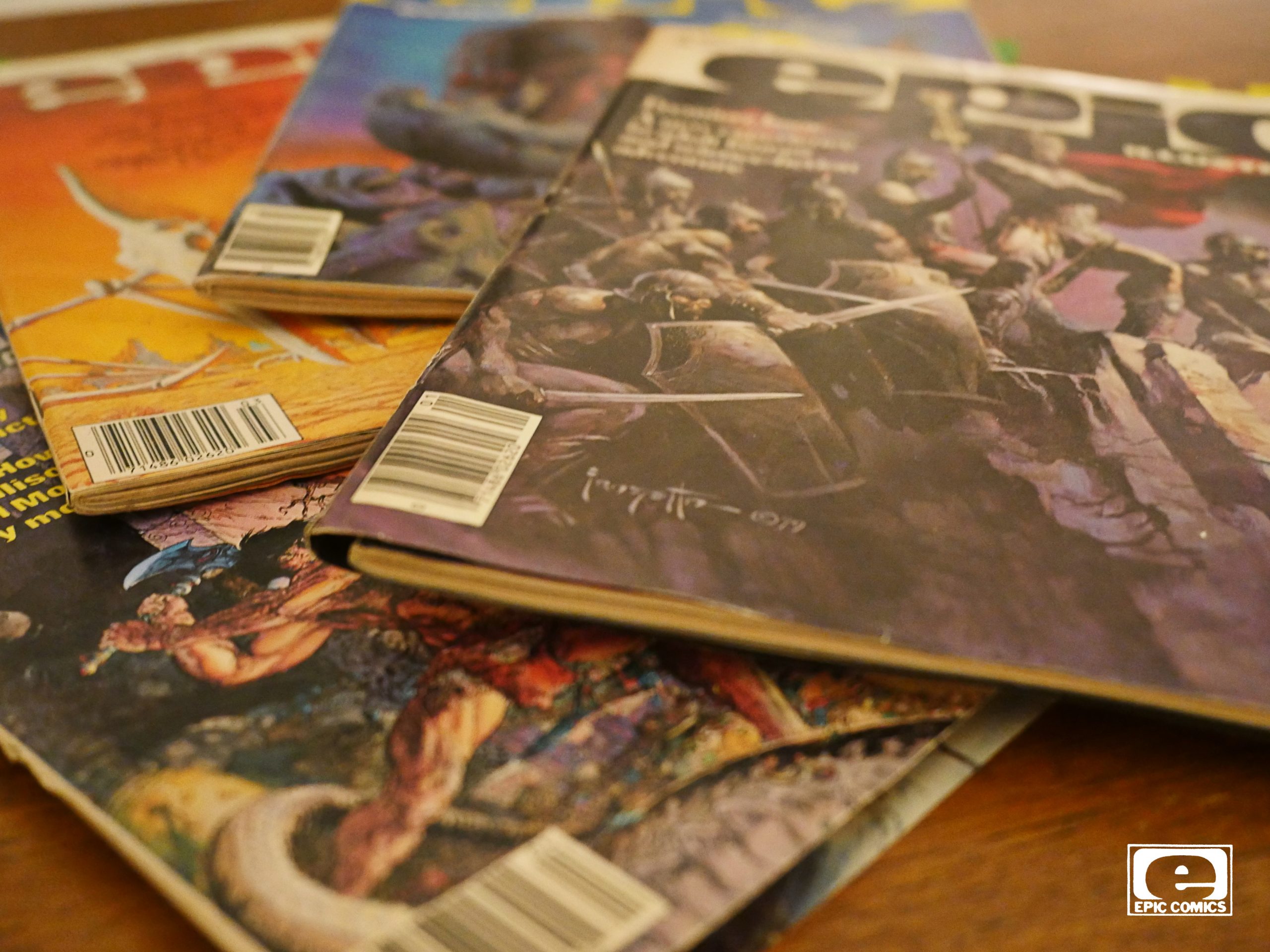
Epic Illustrated (1980) #5-9
edited by Archie Goodwin.

OK, I meant to do one post per day, really, but finding time to read these comics has proven problematic. These magazines are chock full of material, so it’s taking even longer than I thought it would take, and I thought it would take twice as much time as I estimated.

(I’m in software.)

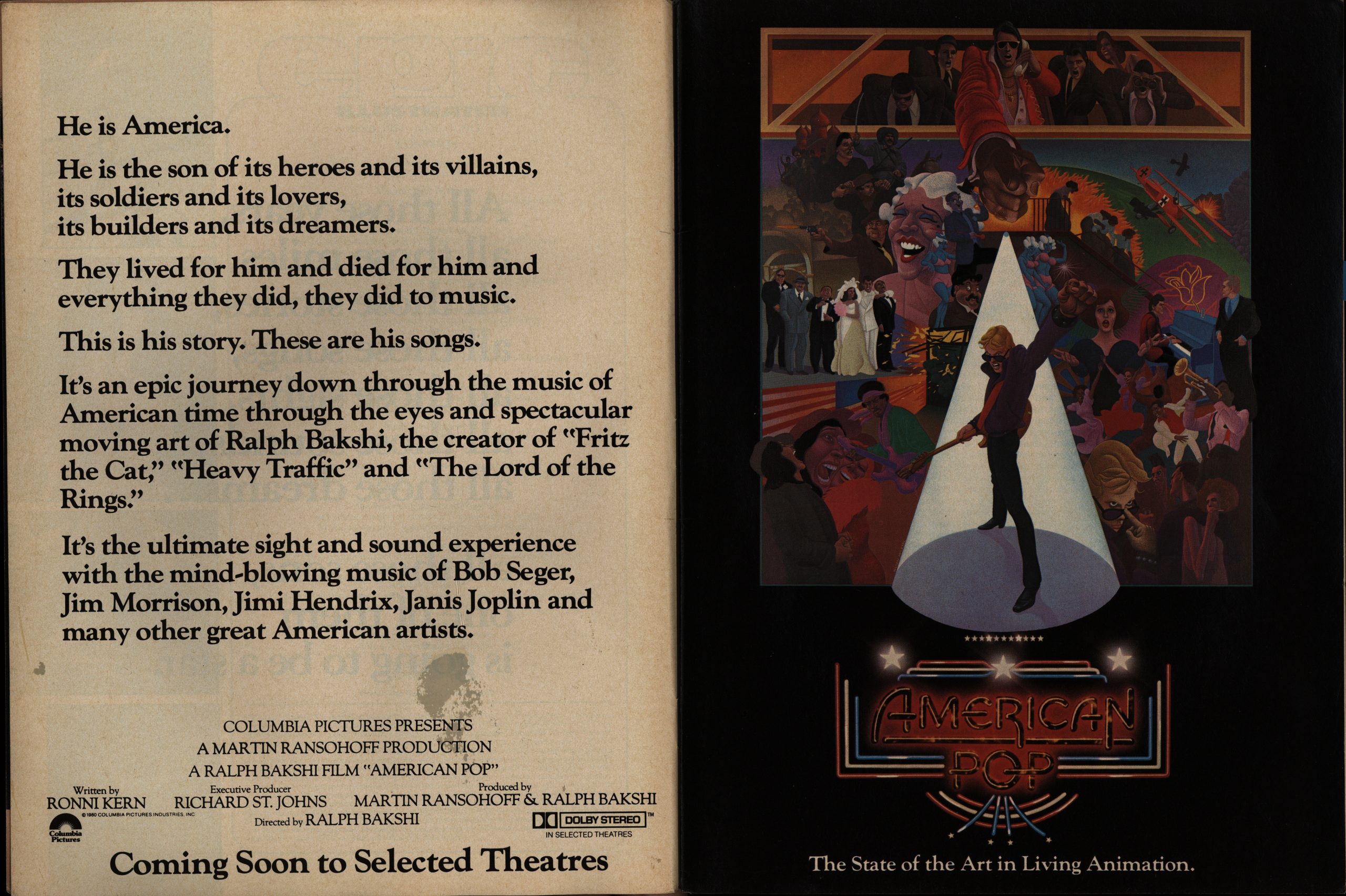
Anyway! We’re in EI’s second year, and about half of the ads are now for movies (mostly sci-fi and humour). I had no idea that the movie above existed: American Pop? Is that it? (It’s a three page ad.) By Ralph Bakshi? I thought he went bankrupt after Lord of the Rings?

No, it exists:

Seems like it’s well-liked, too?

Anyway! EI steps up the publishing rate and it’s now bi-monthly (so I’ll be aiming for plowing through six issues per blog post, which means *gets out sliding rule*) four more of these posts before we get started with Epic Comics proper.

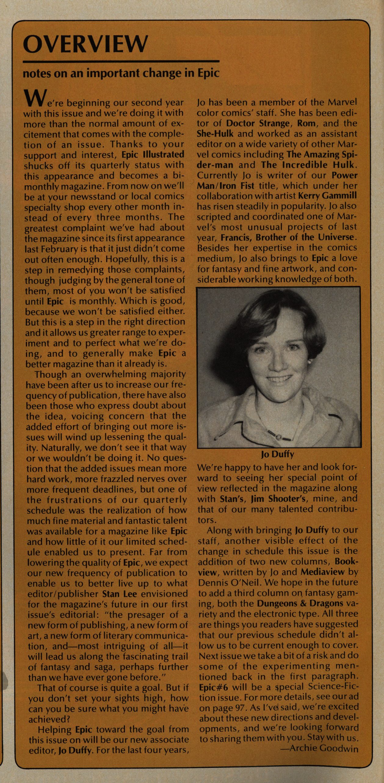
Oh, and Jo Duffy joins the editorial team.

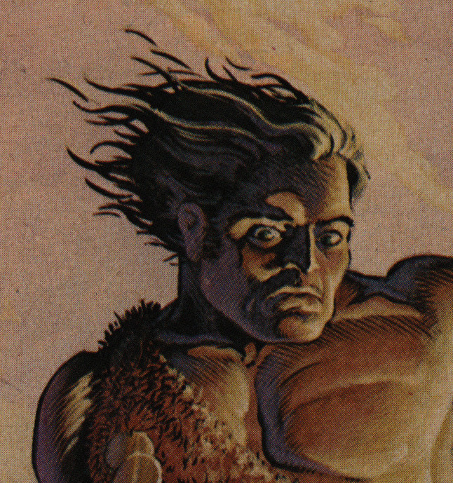
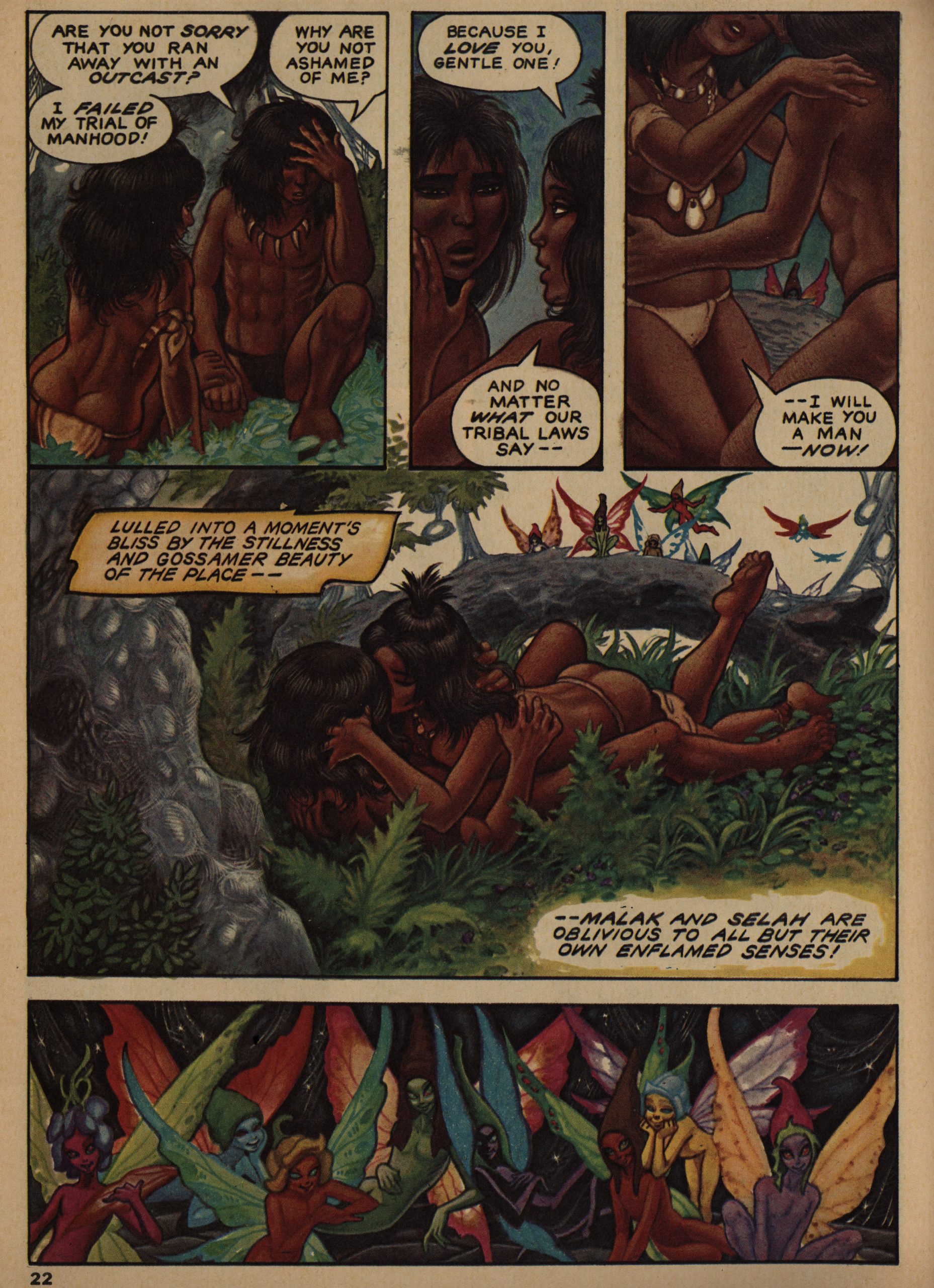
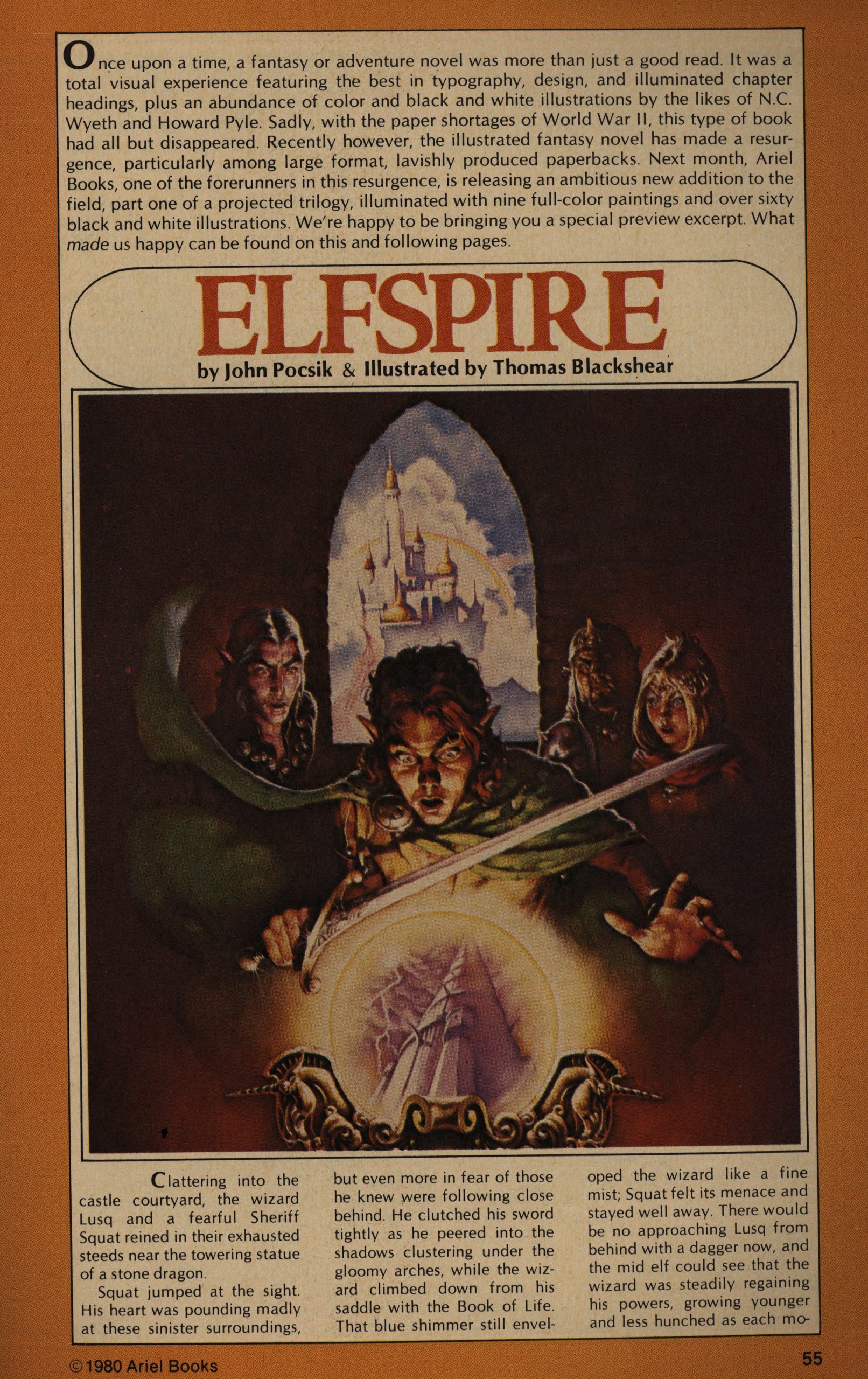
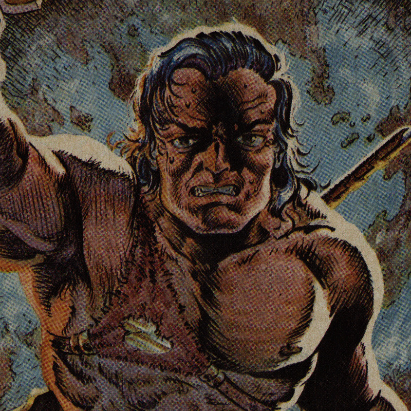
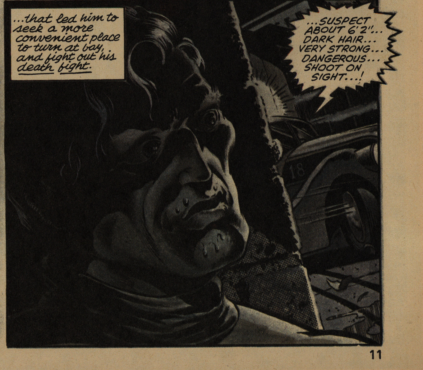
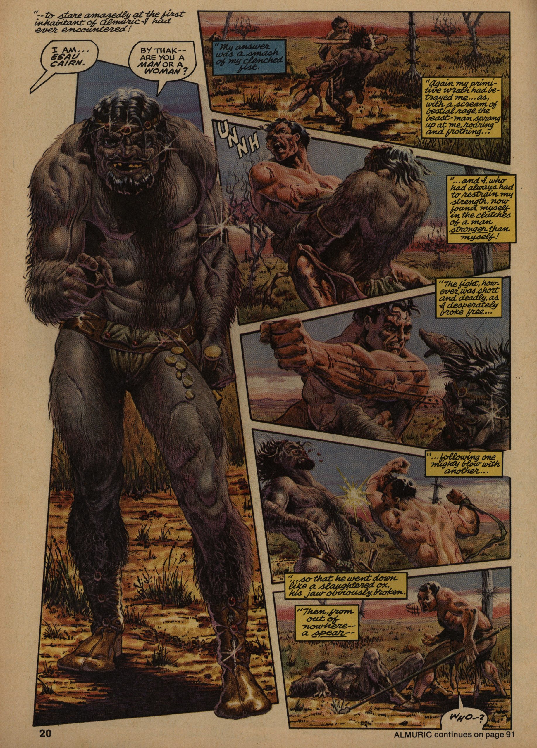
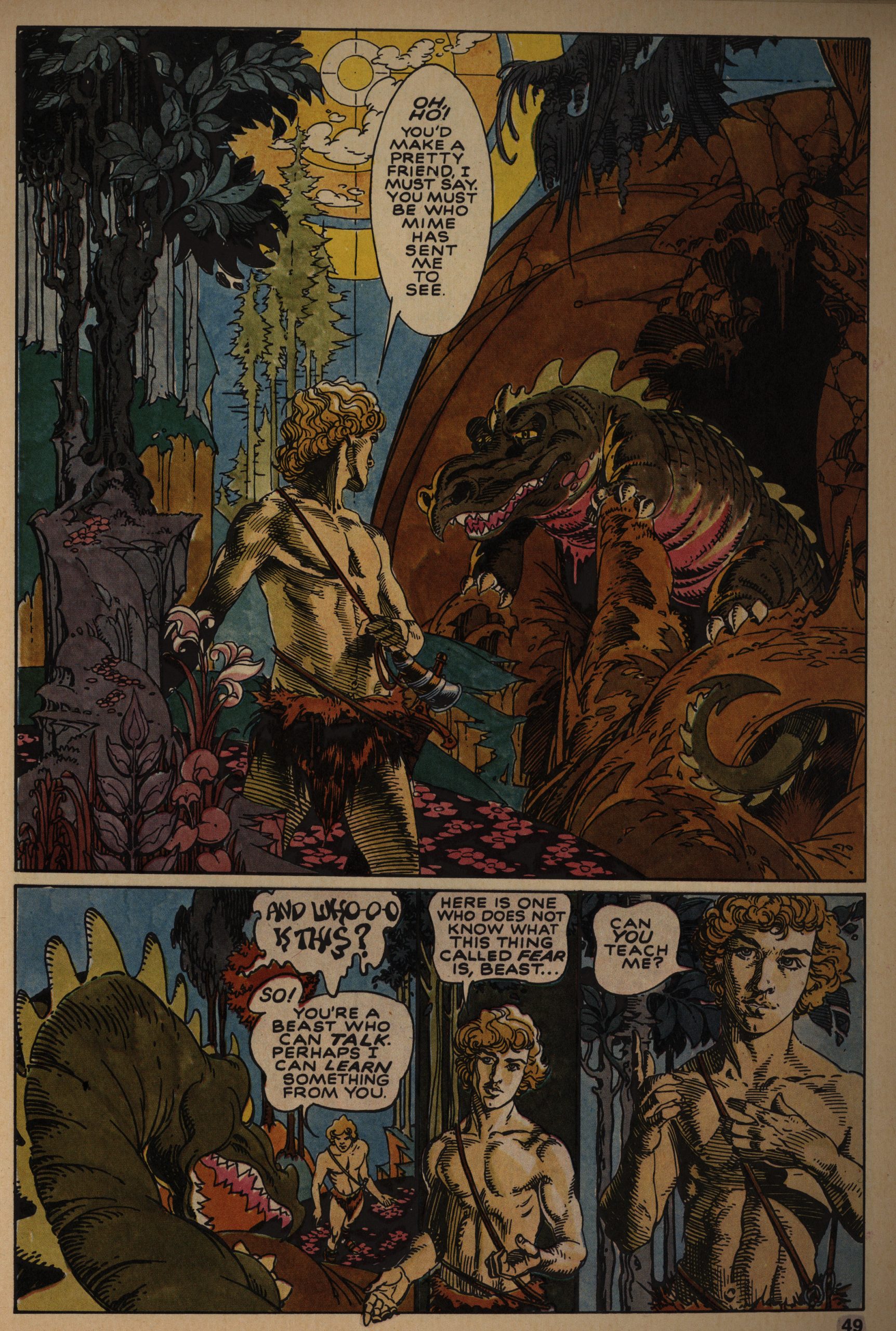
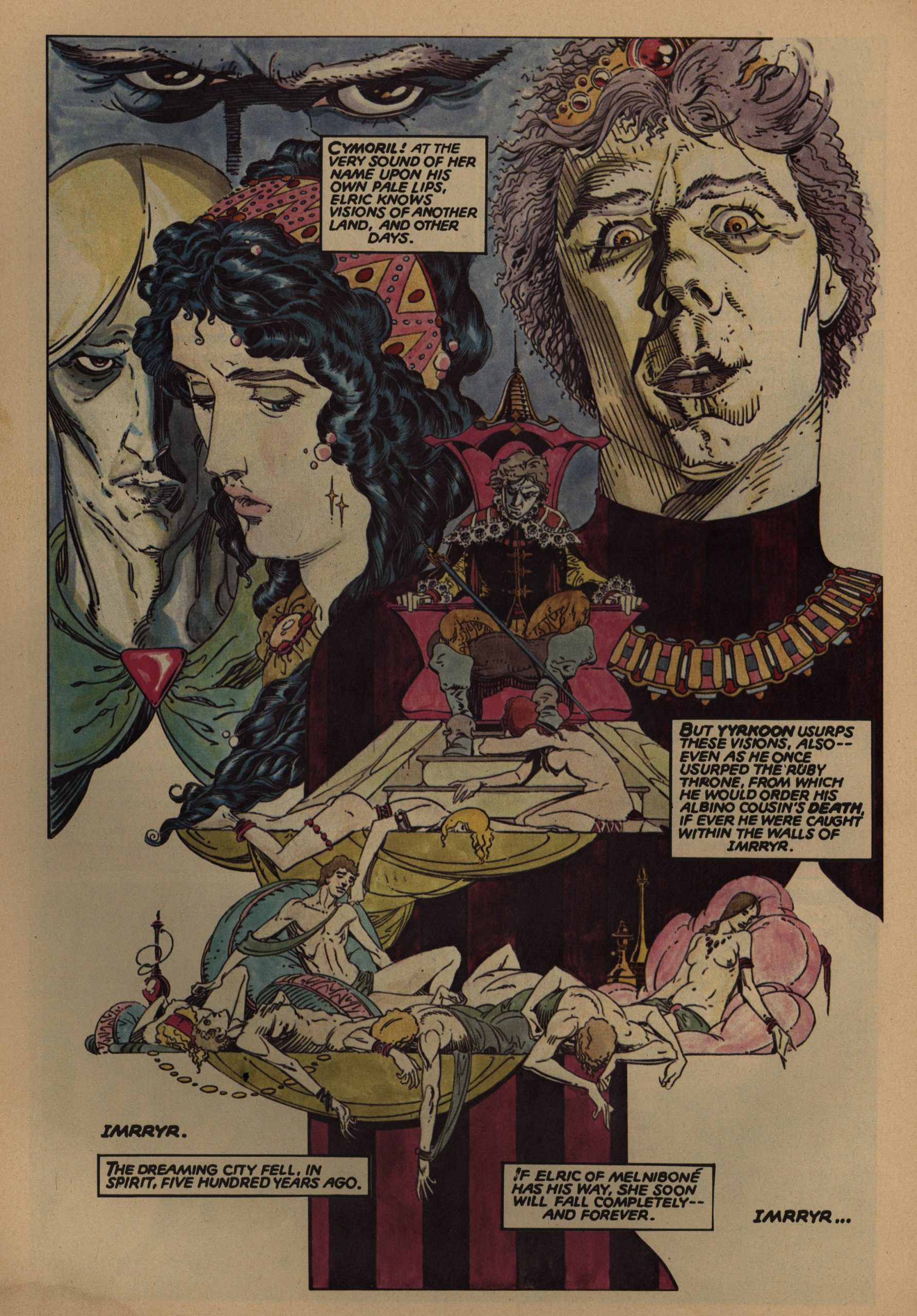
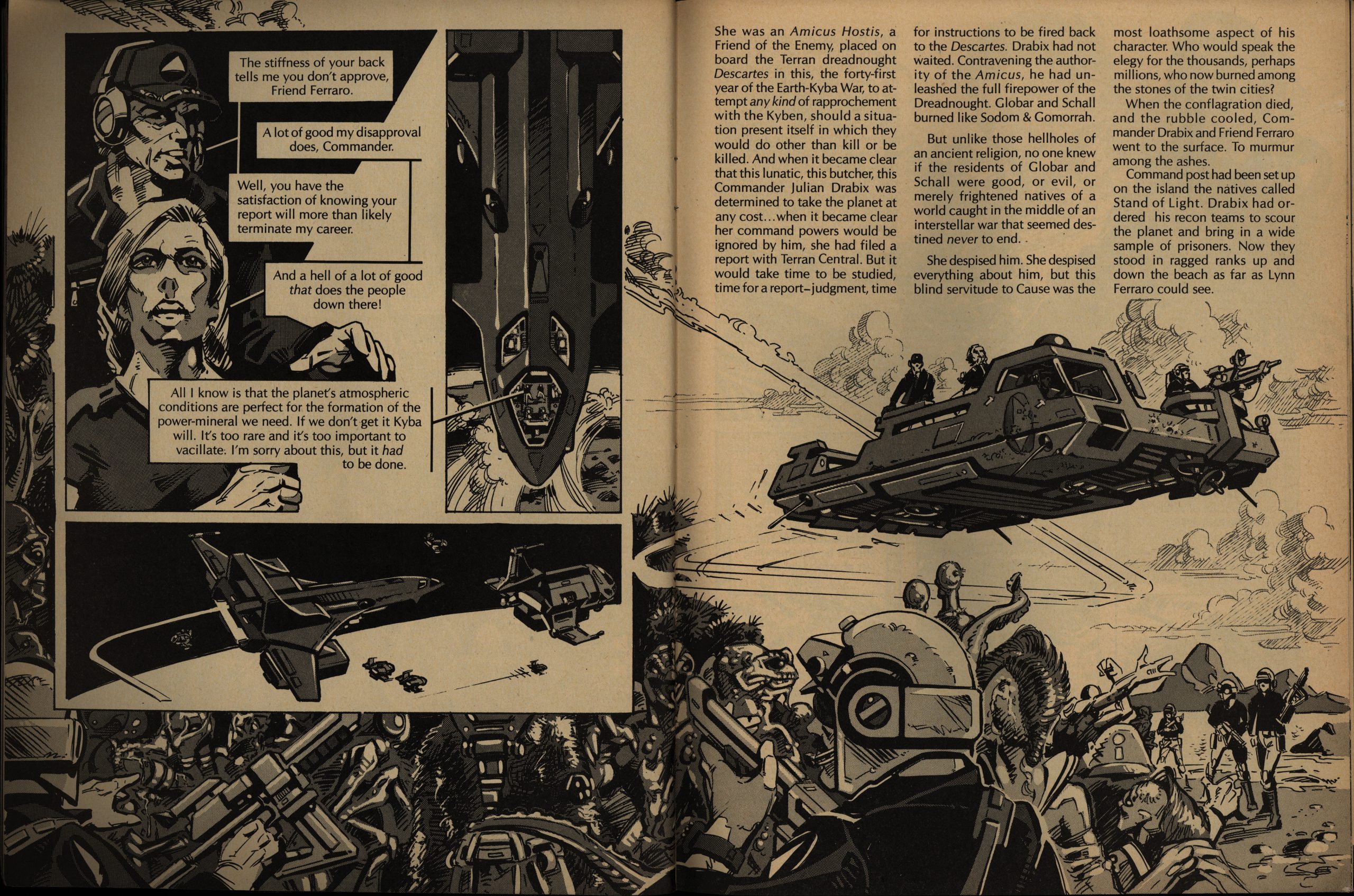
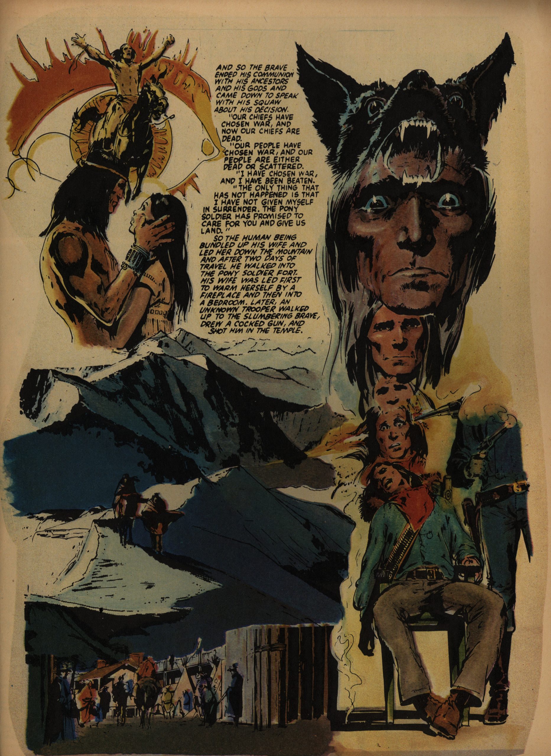
We get the conclusion of Almuric, which means that that’s the last Tim Conrad barbarian face we have to look at.

I normally enjoy Roy Thomas barbarian stuff just fine (I mean, I don’t seek it out or anything, but it’s usually readable), but Almuric was just a non-starter. Basically nothing of interest happens: It’s just a bunch of pointless running around until they’ve filled the required number of pages. It’s not Robert E. Howard’s most famous property. For a reason.

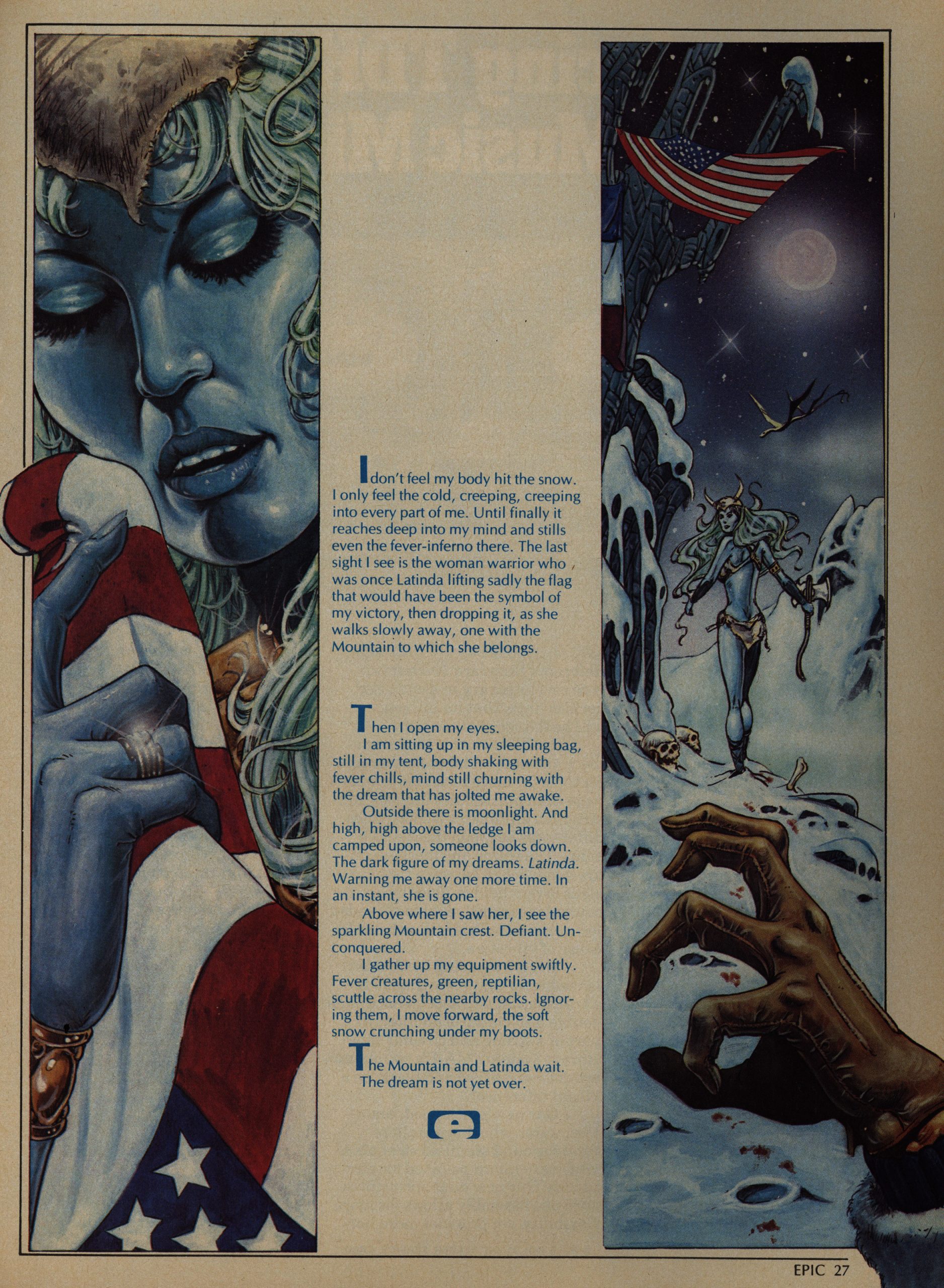
The text pieces remain EI’s weakest point. Reading a comic with an eye-rolling twist ending is somehow much more acceptable than when it’s prose? Here’s Ralph Macchio… not doing a riveting story.

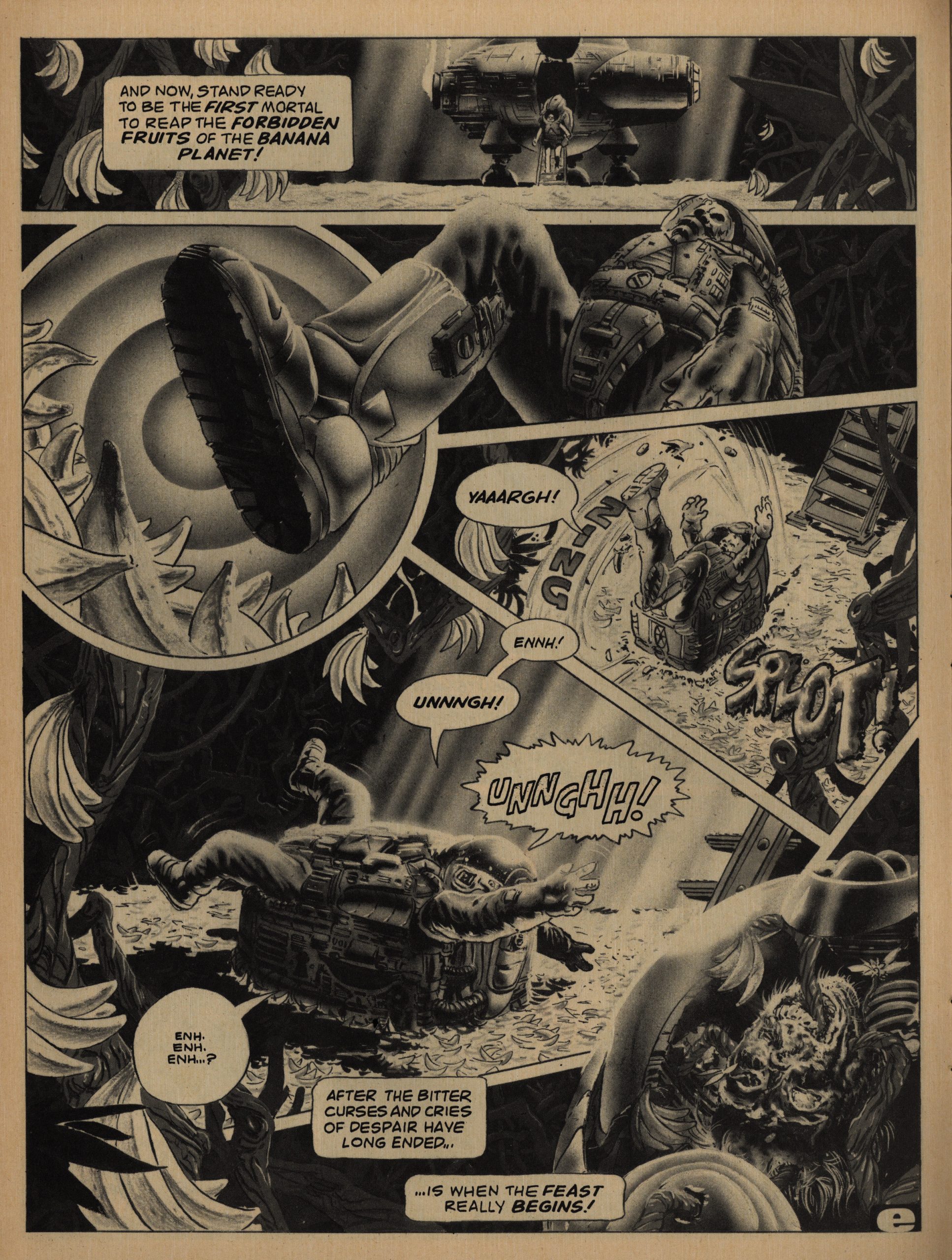
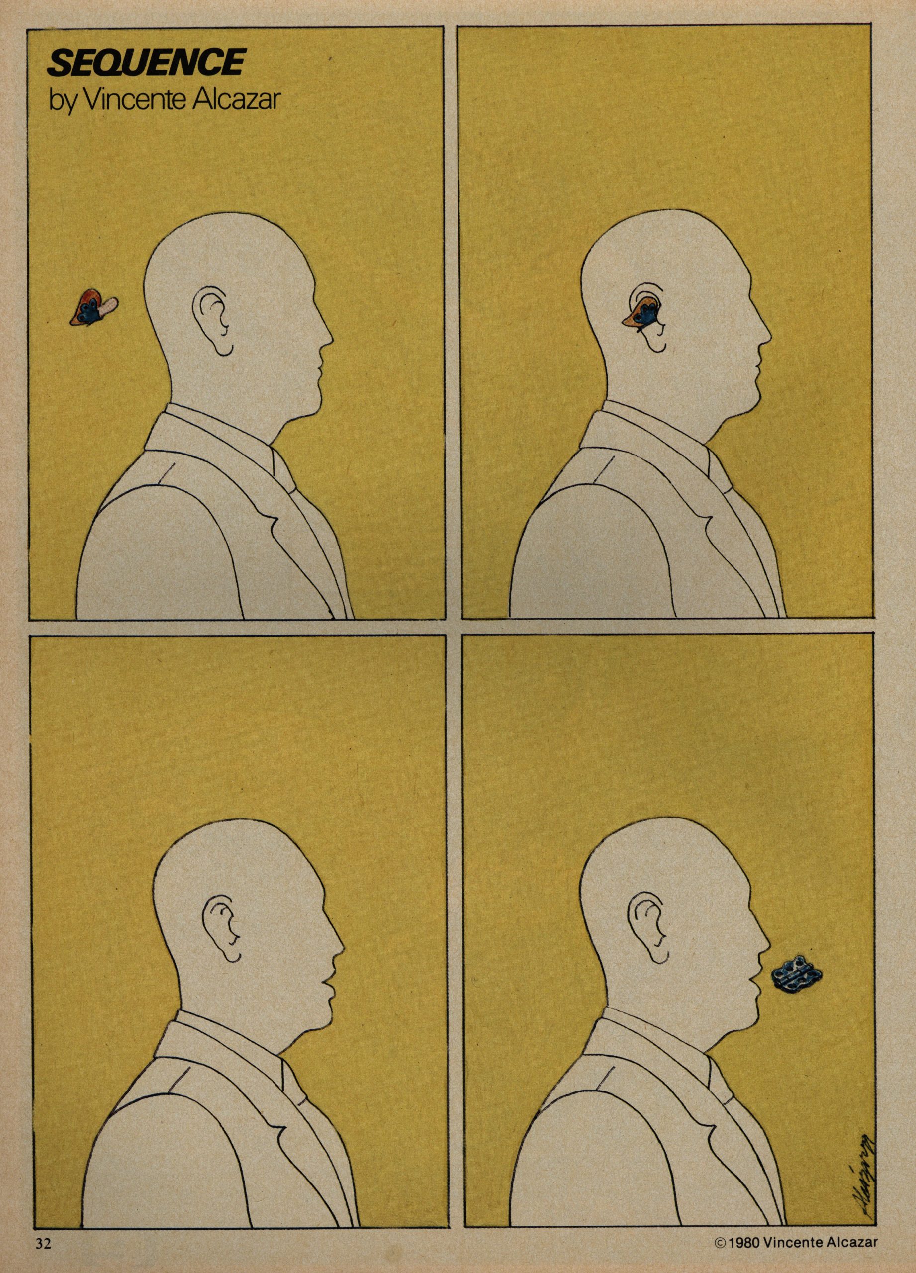
I mean, like this Rick Veitch story: It’s basically just a gag, but that’s fine. There’s just something about the panel arrangement of the guy stepping on the bananas that just makes it.

50% more issues per year means that you can put more non-comics (i.e., cheaper to produce) stuff into the issues without people feeling let down, I think? Well, OK, or perhaps it just feels more well-rounded to have other things in here, too. One can be too cynical sometimes, right?

RIGHT?!?

I think it kinda works. While reading this, I just skimmed these columns (there three of them; one about books, one about movies and one about games), and I think I would have liked them when I was a teenager. But I just don’t have time to read them now. So busy!

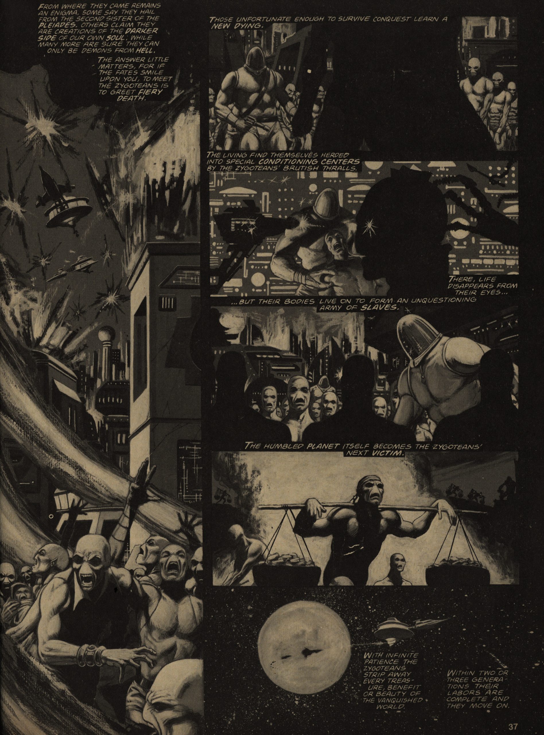
Speaking of busy, Jim Starlin is busy experimenting with new painting techniques in every segment of his Metamorphosis Thingy. I wondered whether this might just have been a printing accident, but… it’s hard to imagine what accident would have this solarising effect? I mean, it looks nice, doesn’t it?

And it does help having a continuous story going through these issue: Just reading one short piece after another after another is fine as far as it goes, but some longer pieces does help with the… texture.

But putting in 18 pages of interviews with The Brothers Hildebrandt is pushing it. I mean, they’re not really comics artists, are they? Mostly illustration?

Hm. Perhaps it really is about the budget.

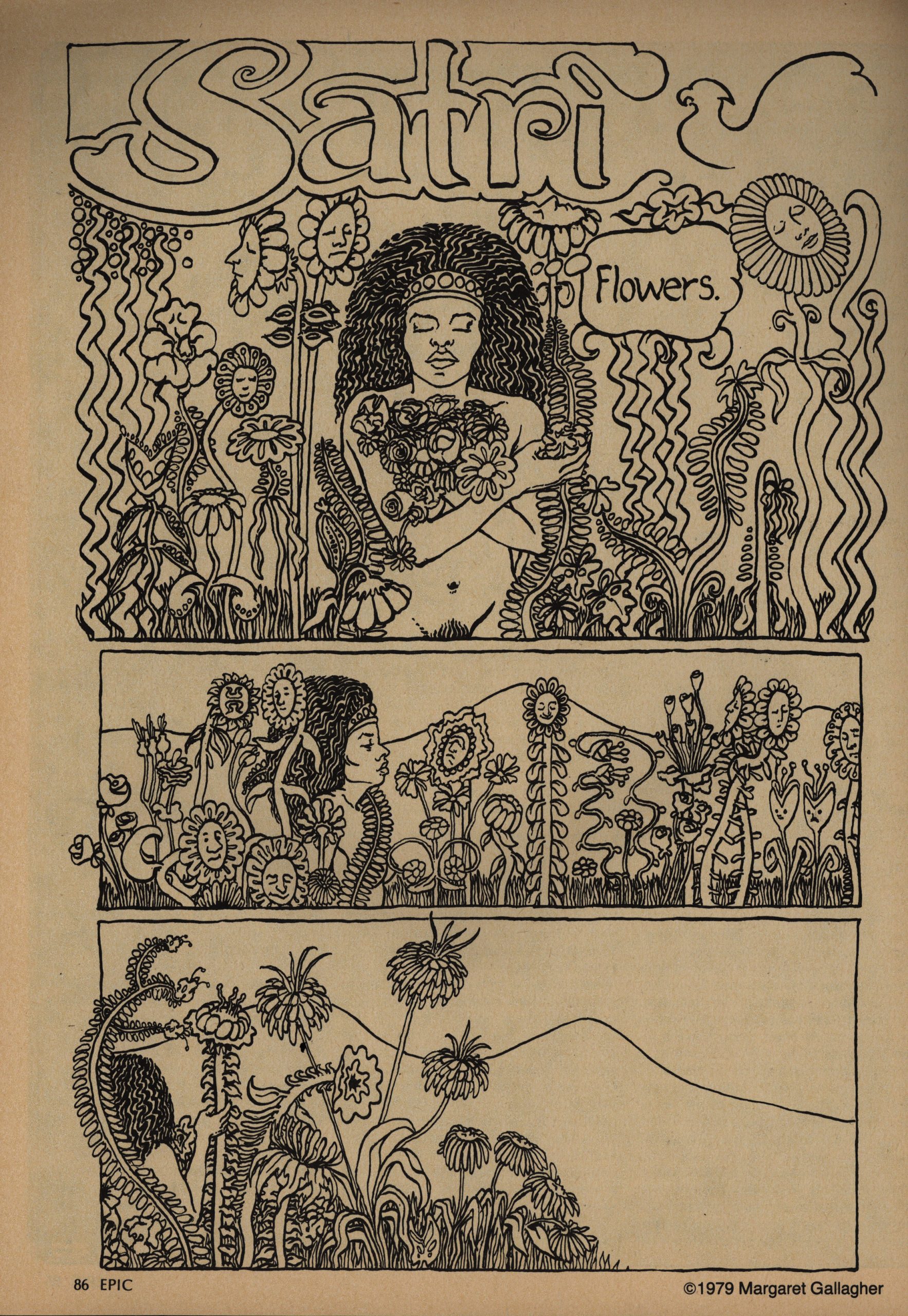
The vast majority of the creators employed by EI are men, but the occasional woman does show up, like Margaret Gallagher here in a very flower-powery style. It’s unusual in an EI context, too, in that it doesn’t end with the protagonist getting horribly mutilated and killed on the final page.

EI is way into “edgy, ironic” endings. I guess it’s the insidious influence of EC Comics by way of Warren? It does get a bit grating after a while, at least when reading these issues like this.

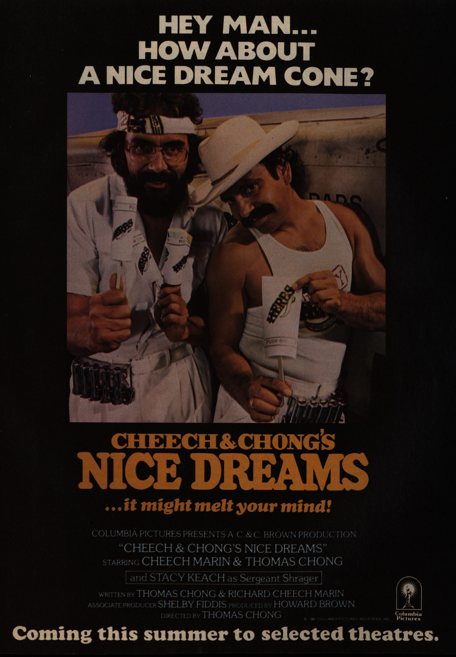
Wow! An ad for a movie that’s not sci-fi!

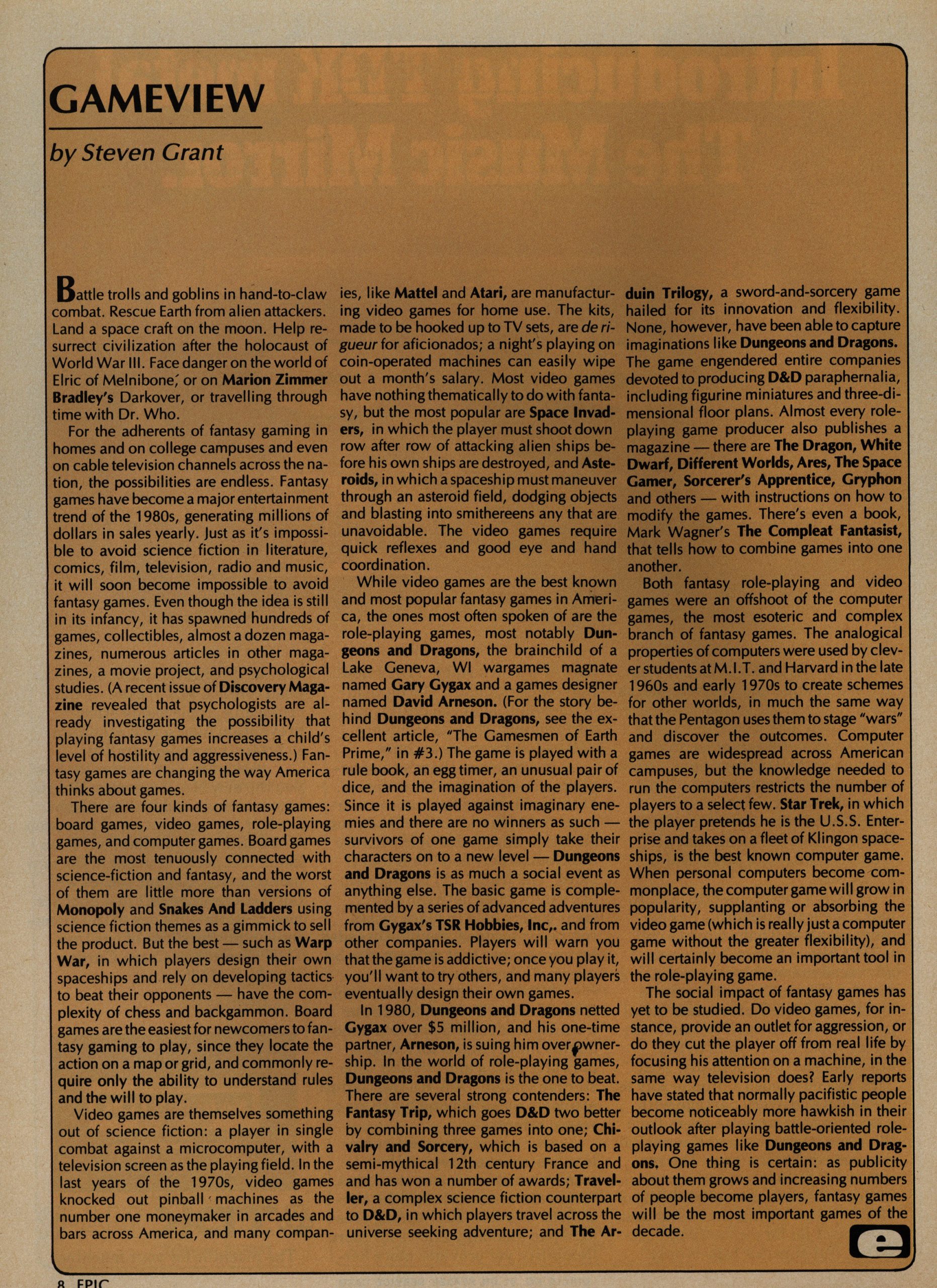
“The social impact of fantasy games has yet to be studied.”

I guess that’s still true?

Bob Aull does a quite undergroundish thing that follows the template of the protagonist getting reamed (sort of), but in this instance, he totally deserves it, so it’s a gleeful, happy ending. In the context of the other stories, that’s a twist.

Wow. Starlin’s way weird.

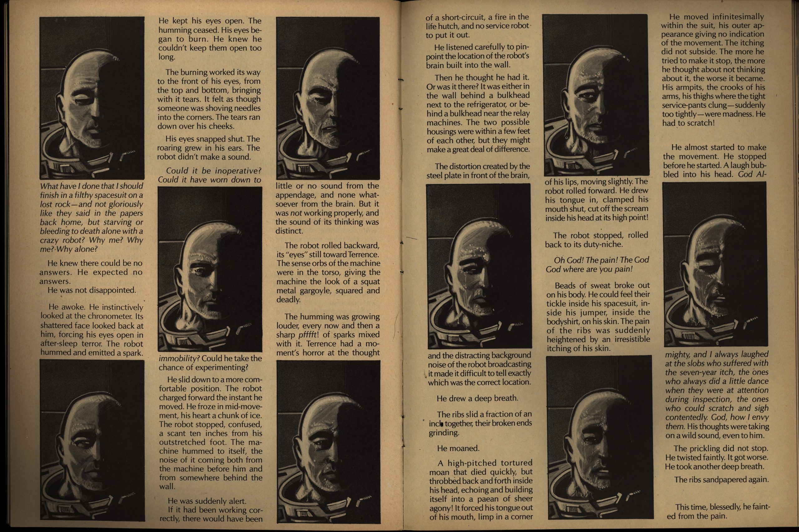
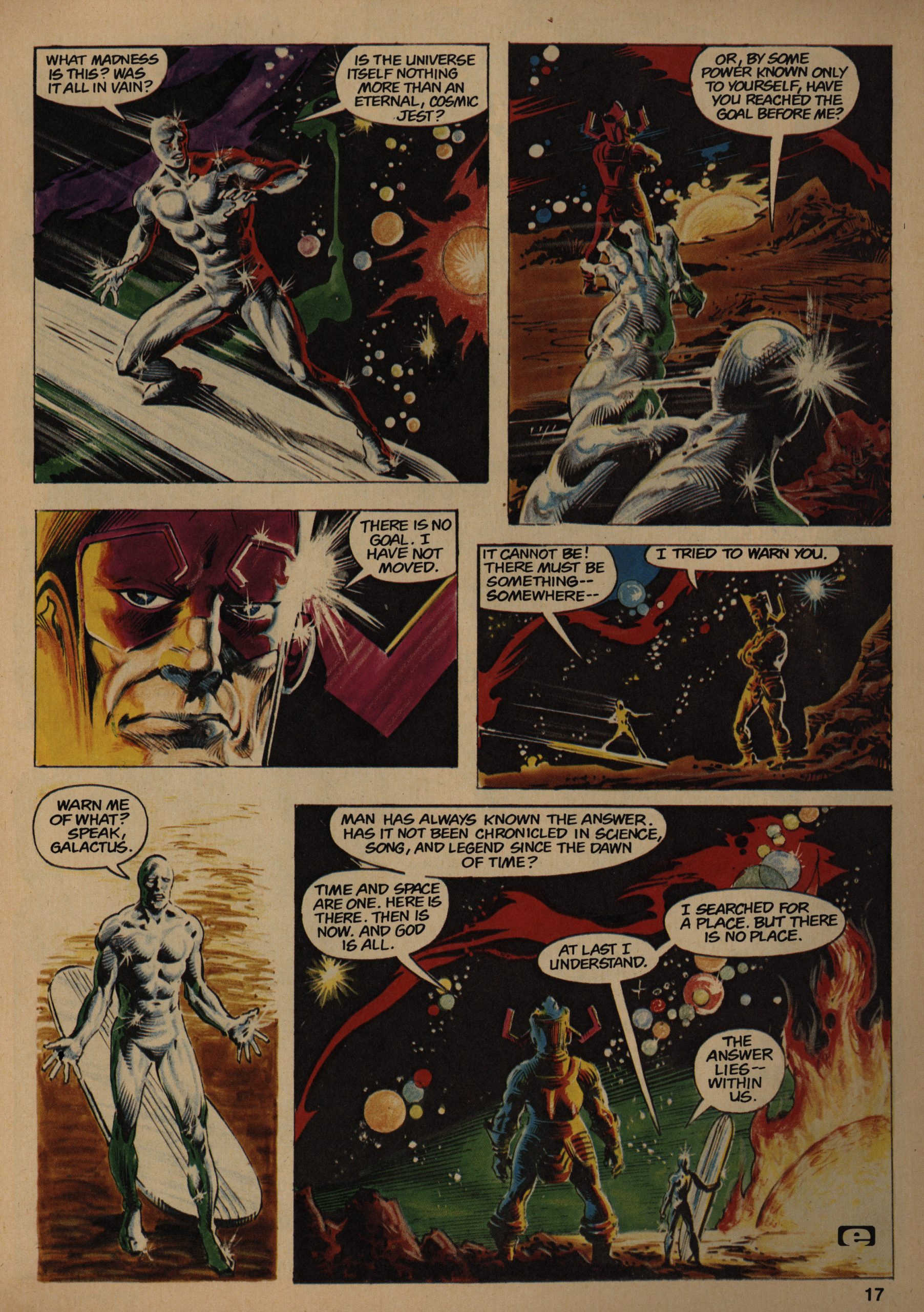
Ken Steacy illustrates another Harlan Ellison story, and these are the best illustrated stories in the magazine, still. Steacy leans into having a lot of text on the page, but still manages to be graphically interesting, while making that design be relevant to the story. This story is about who can’t move because a robot will kill him if he does, so it’s basically just a guy sitting on the floor, which is a challenge to make arresting visually.

And the story’s pretty satisfying, as these stories go.

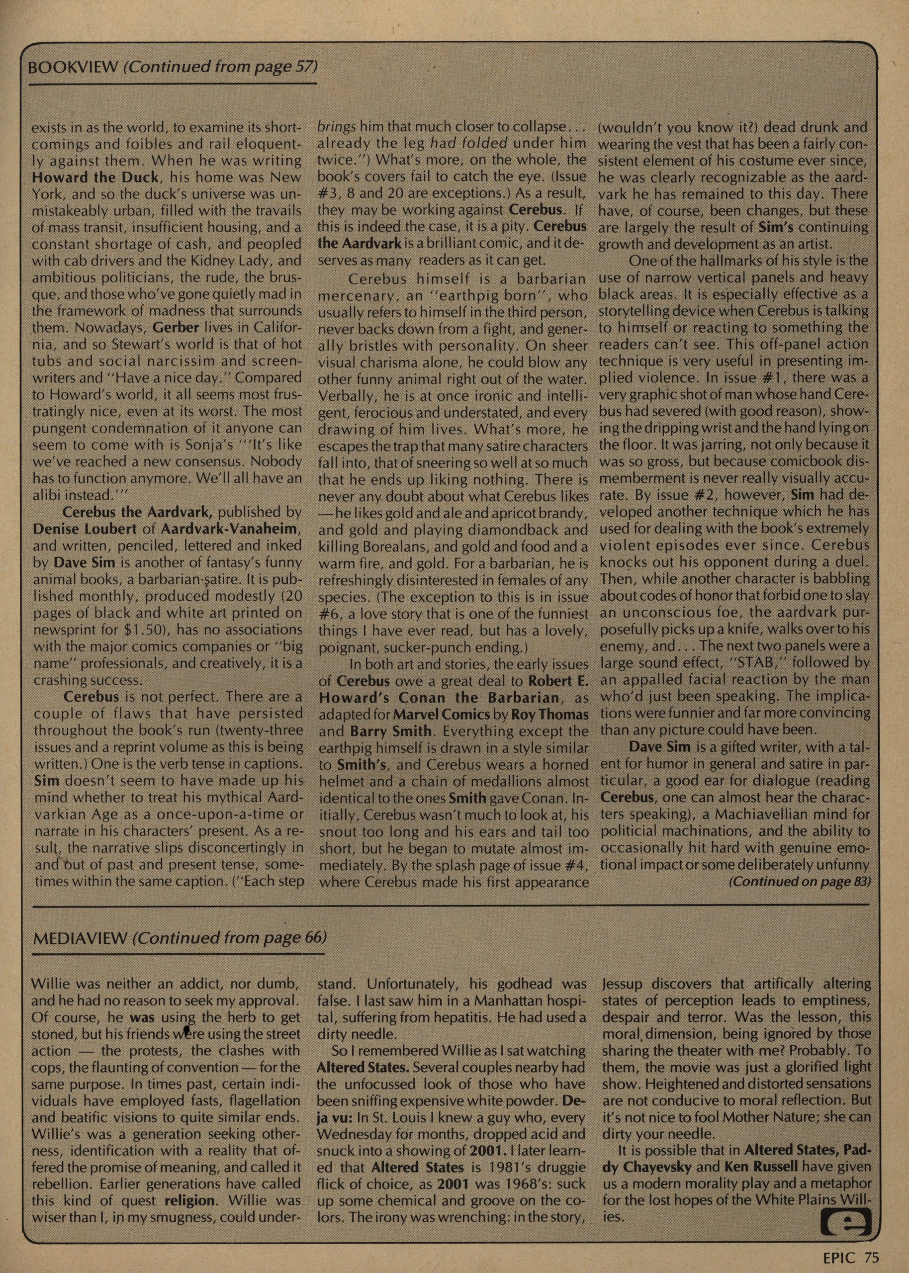
Jo Duffy’s column is about books, mainly, but she also writes about comics. Here’s her take on Cerebus, and basically the only negative she can find is the inconsistent verb tense in the captions.

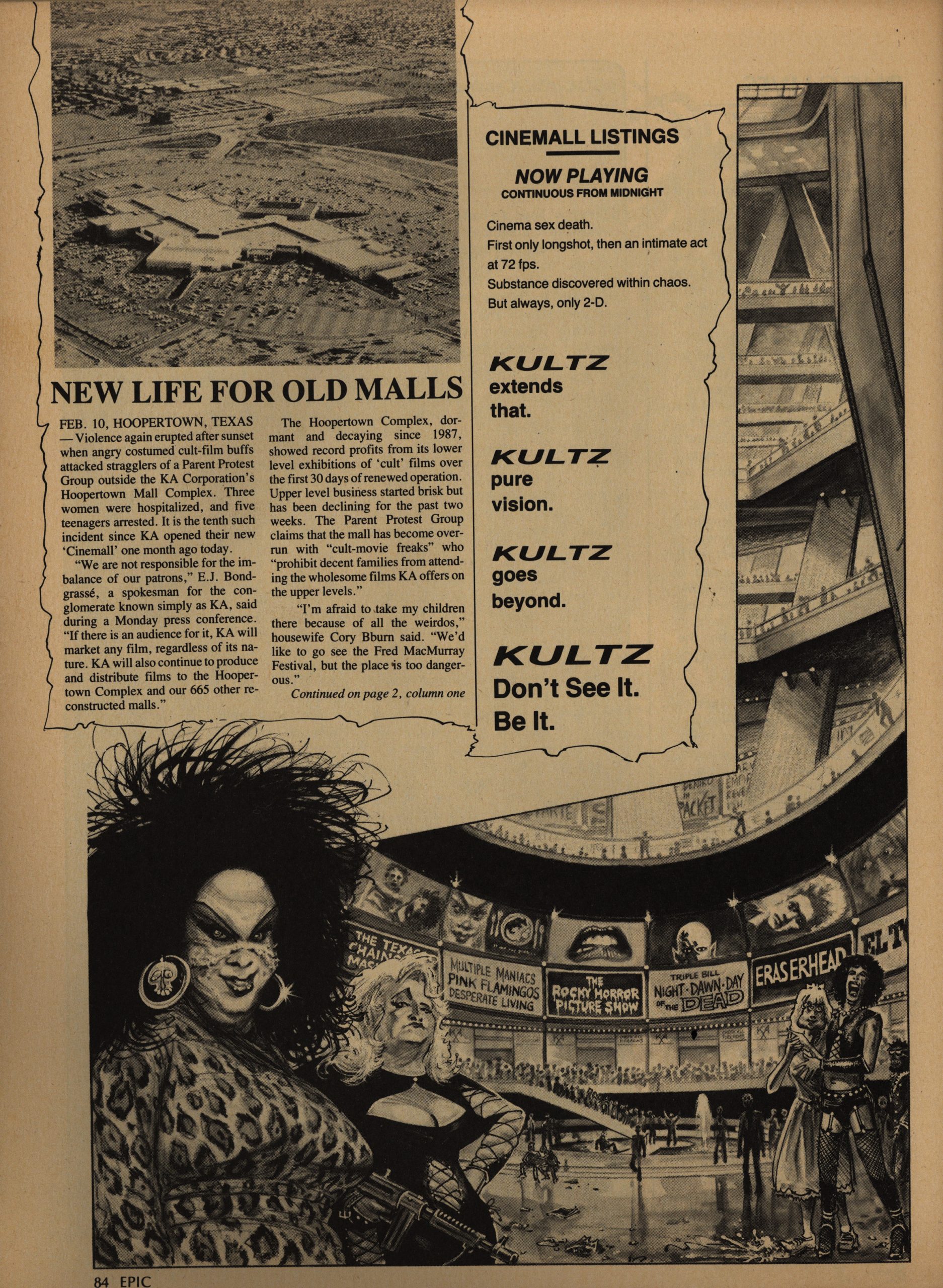
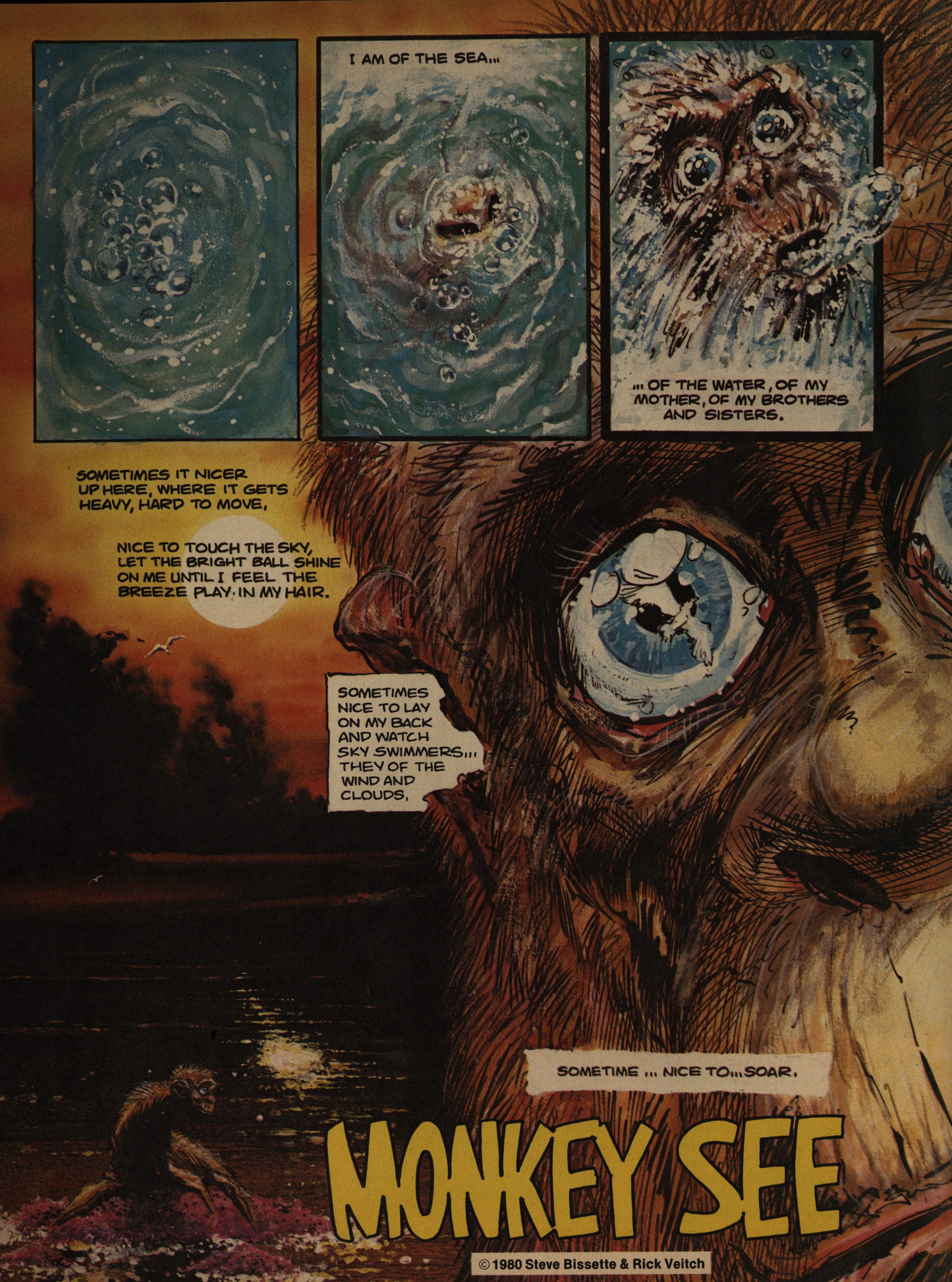
SR Bissette and Steve Perry do an inventive story about cult movies. I mean, I didn’t really… understand what it was all about in the end? Was it a Groundhog Day thing? But how can you not like a comic with Divine in it?

And that’s an excellent movie lineup there in the background.

There’s a long thing by Neal Adams called Holocaust that I couldn’t quite make out what was about. I mean, I know what it’s about about, but it didn’t really make much sense on a page to page basis. And the reproduction is really bad, which is unusual for EI. It was done (apparently) as a record booklet in the 70s, but never used, so it was dusted off here. Didn’t Adams have the originals any more, and it was shot from photocopies? That’s what it looks like.

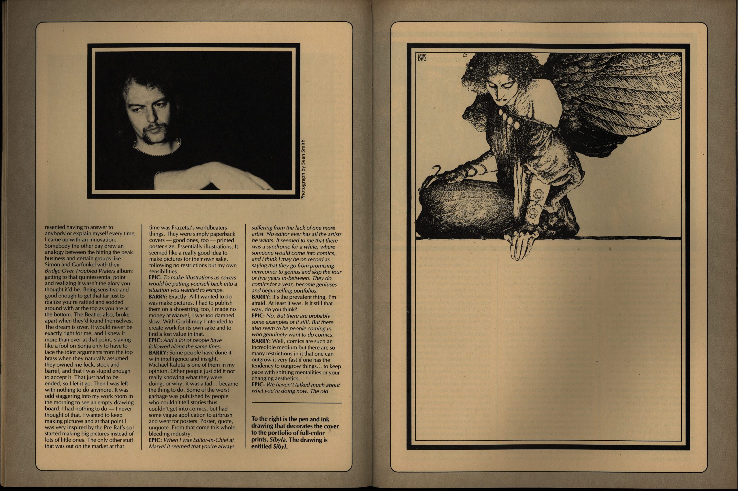
We get 17 pages of interview from Barry Windsor-Smith, which makes more sense.

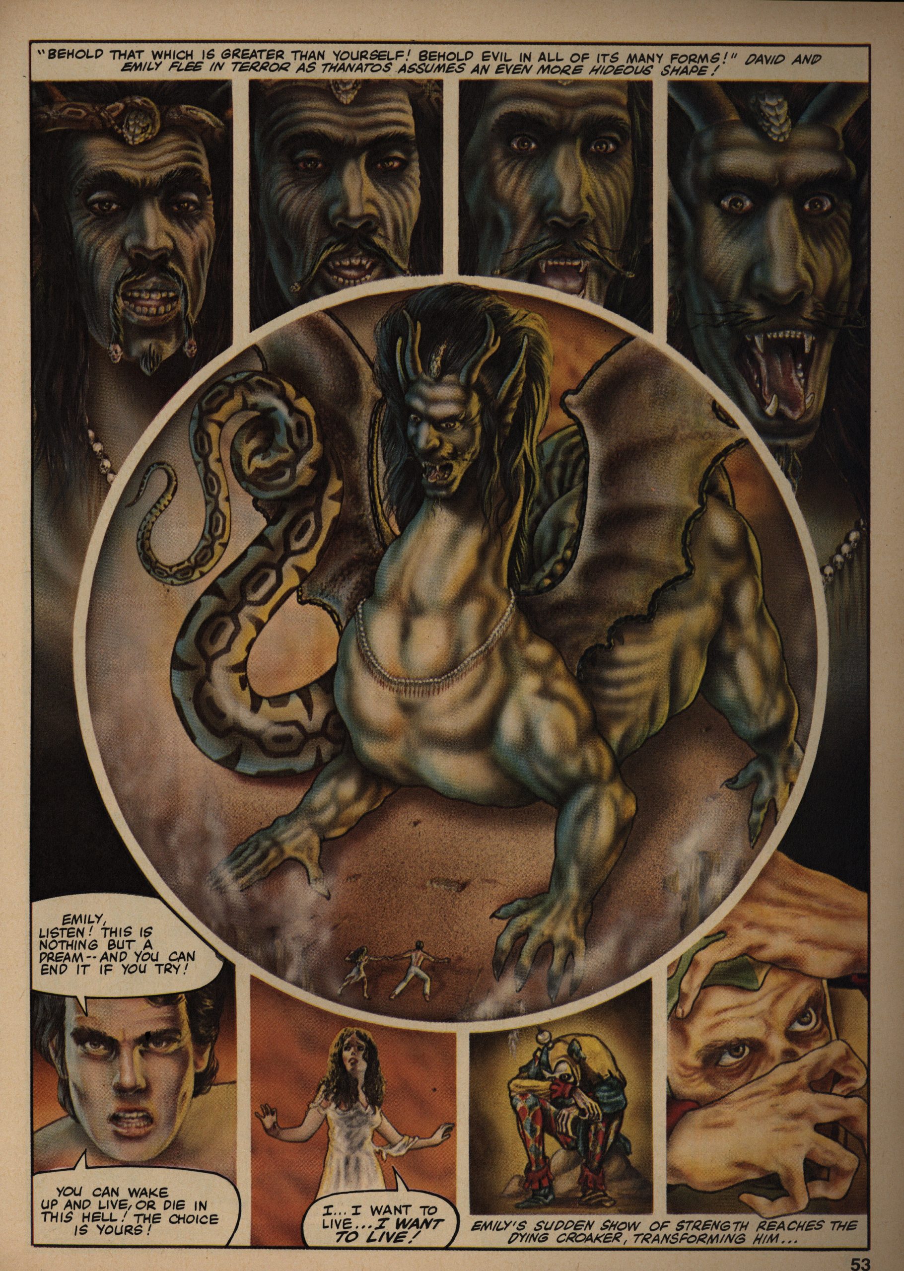
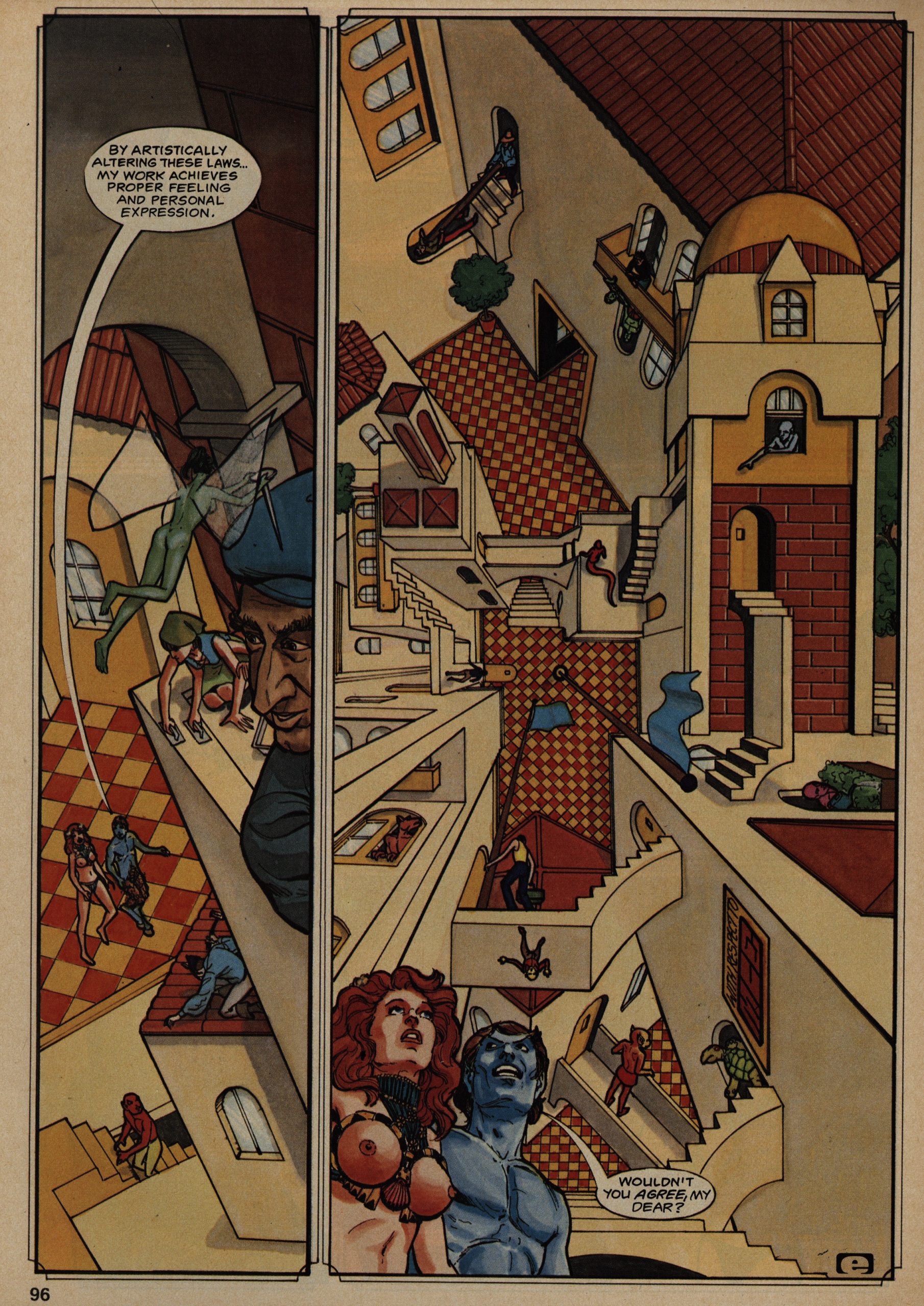
This is by JK Potter and Tim Caldwell. Is that any relation to JK Rowling? Anyway, I think I’ve seen Caldwell’s stuff around in the undergrounds, and it’s this hyper-realistic photo-based fumetti-like thing… that’s really offputting.

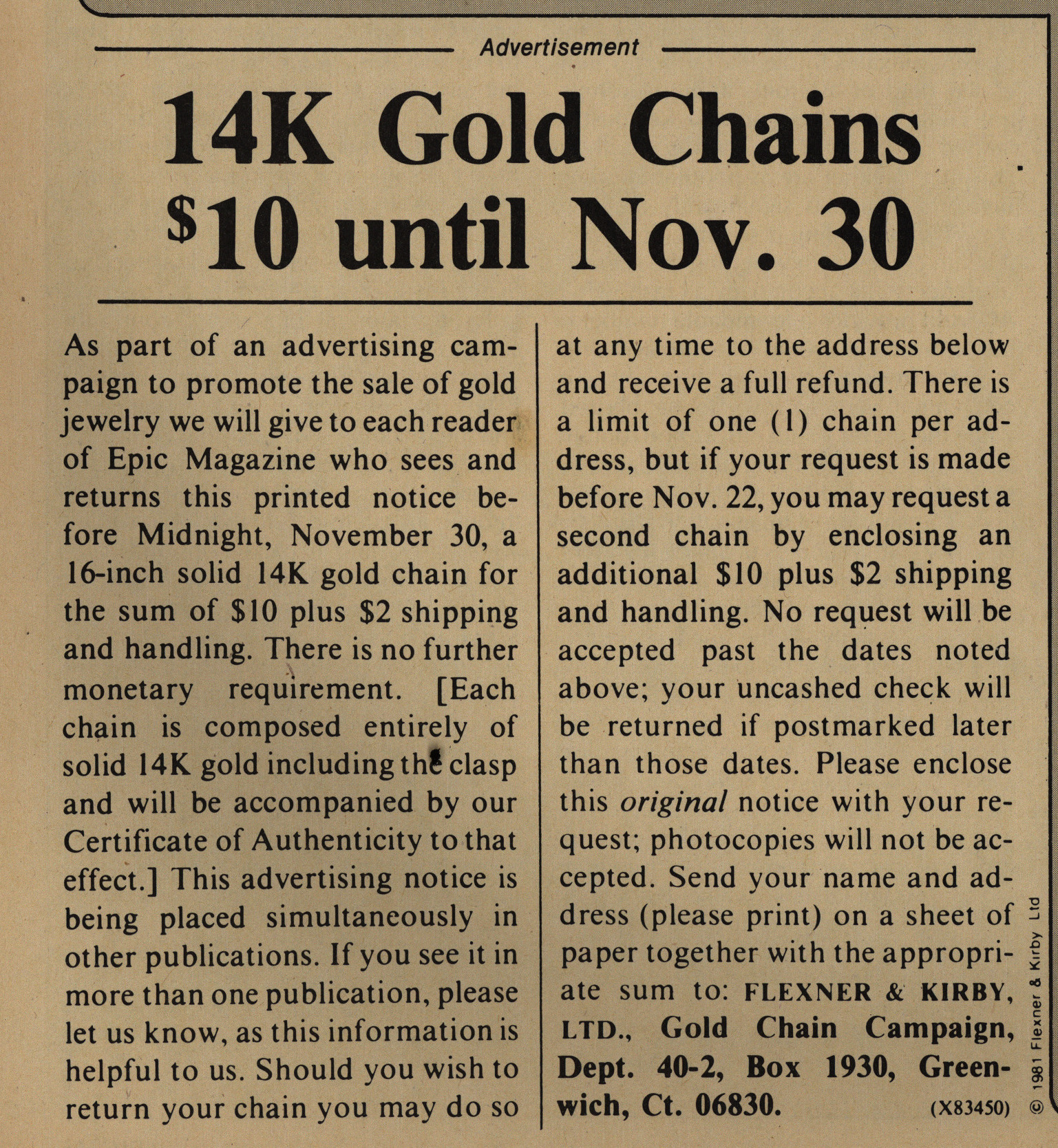
Yes! It’s not Nov. 30 yet! Get your 14K gold chain for $10 plus $2 shipping! Quick!

That’s a weird ad to have in a magazine like this, so I’m guessing it’s a scam?

People are clamouring for more serials, which is surprising in one way…

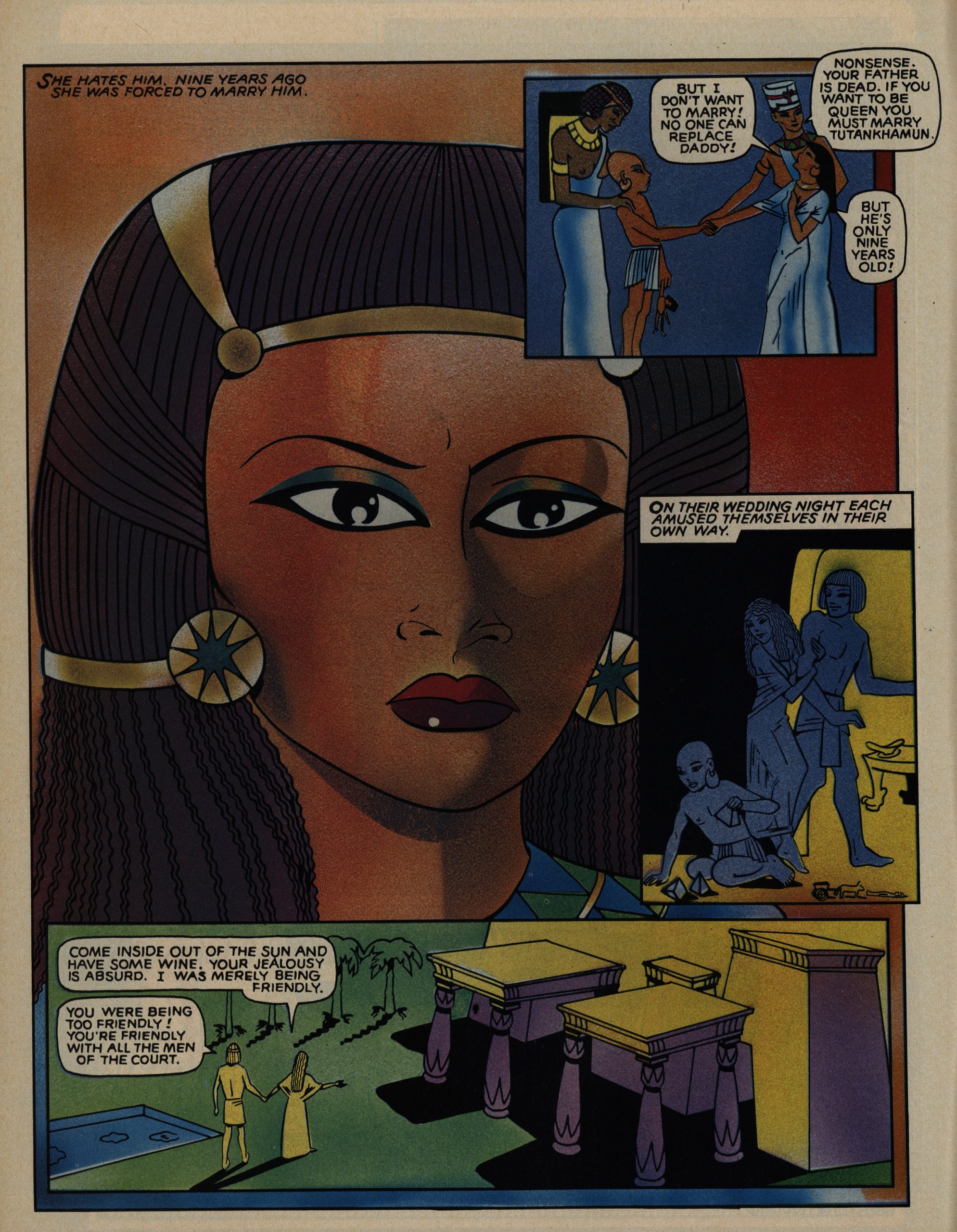
Hey! Trina Robbins! Her art style is well suited for some Egyptian pharaoh thing.

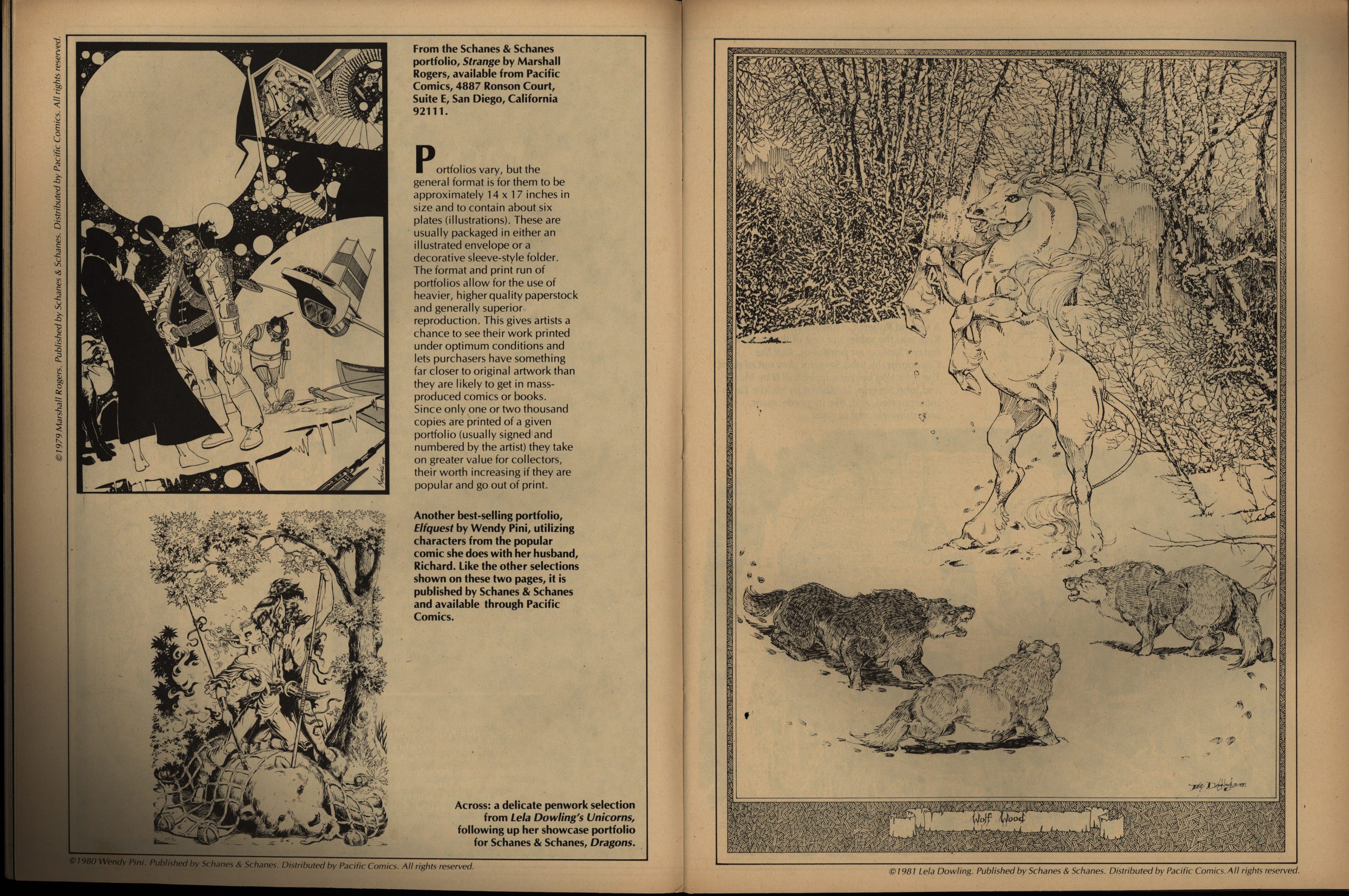
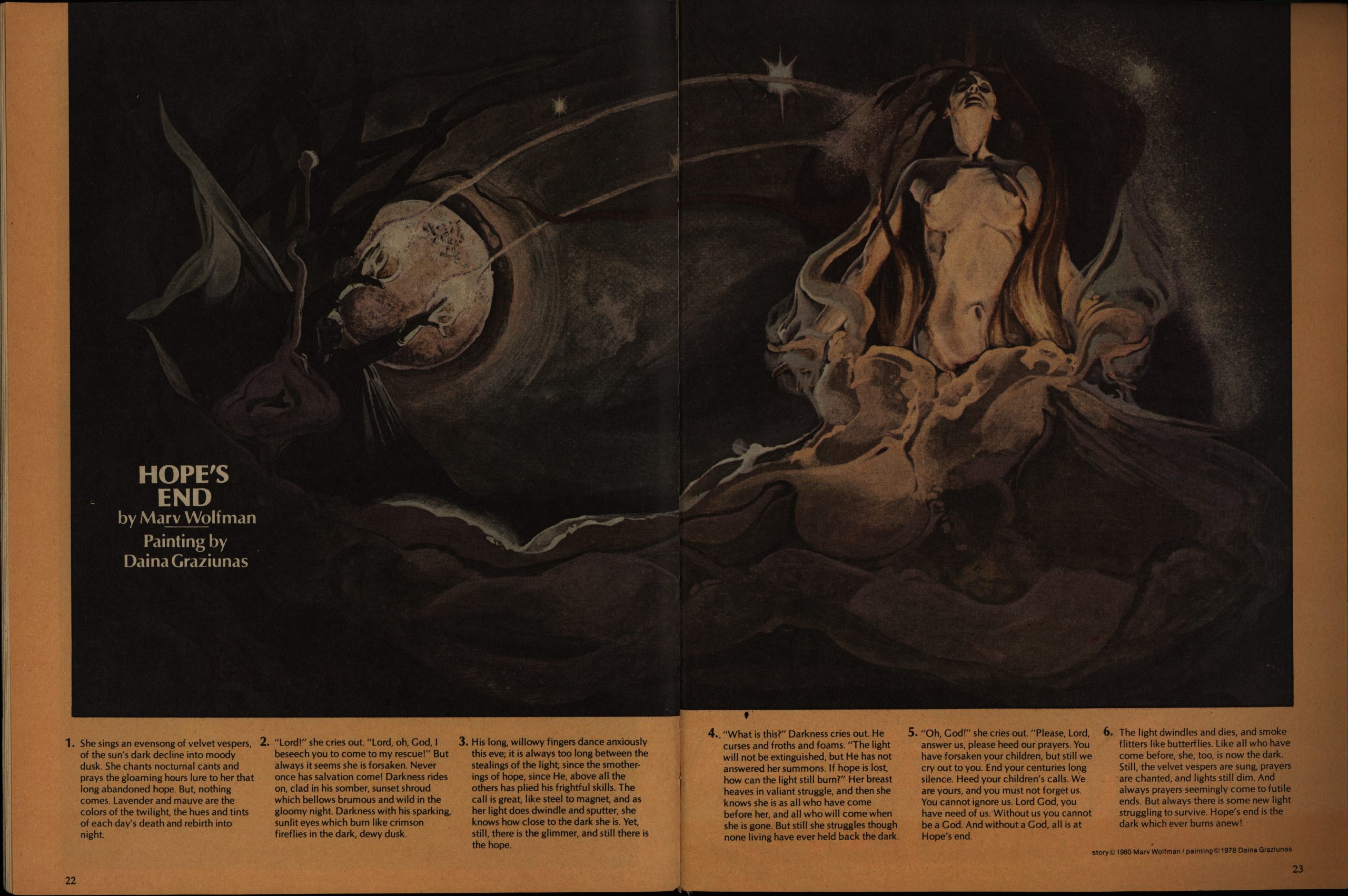
In the first few issues of EI, Goodwin desperately tried justifying printing some nice artwork by having people come up with accompanying prose stories. He’s fortunately given up on that by now, and instead we just get some nice artwork with some chatter. This article is about the “portfolio” phenomenon which was all the rage around this time.

I wonder whether there was an editorial change of policy, because there were no penises in this magazine up until now? I mean, even that character was devoid of one in earlier issues.

Perhaps they just got more daring as they realised the rules on the “adult” magazine newsstand marked was radically different from the comics stands.

I’m always up for some Charles Vess, but I feel the story here wasn’t very engaging.

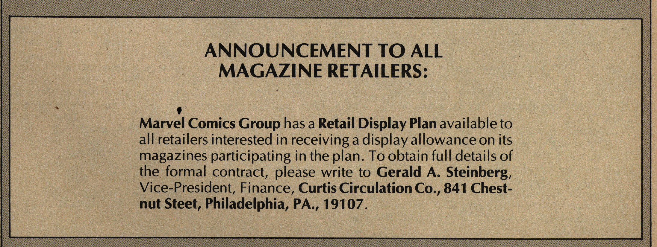
Hm. A “retail display plan”? Is that like a Marvel-branded stand or something? It was apparently a big deal, because they even alerted the retailers about it on the cover:

Perhaps Marvel didn’t have any other way to reach the retailers? Independent distribution was mysterious.

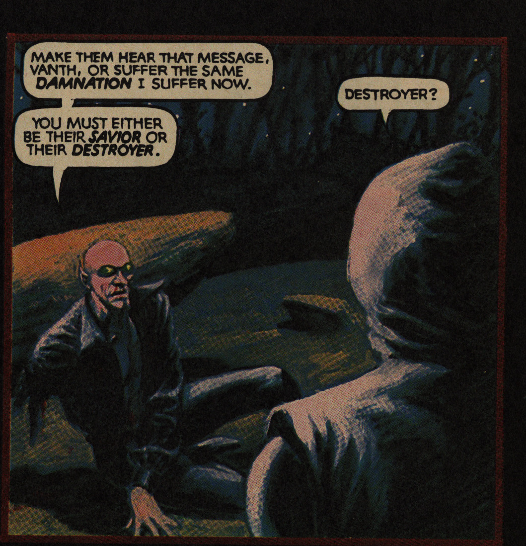
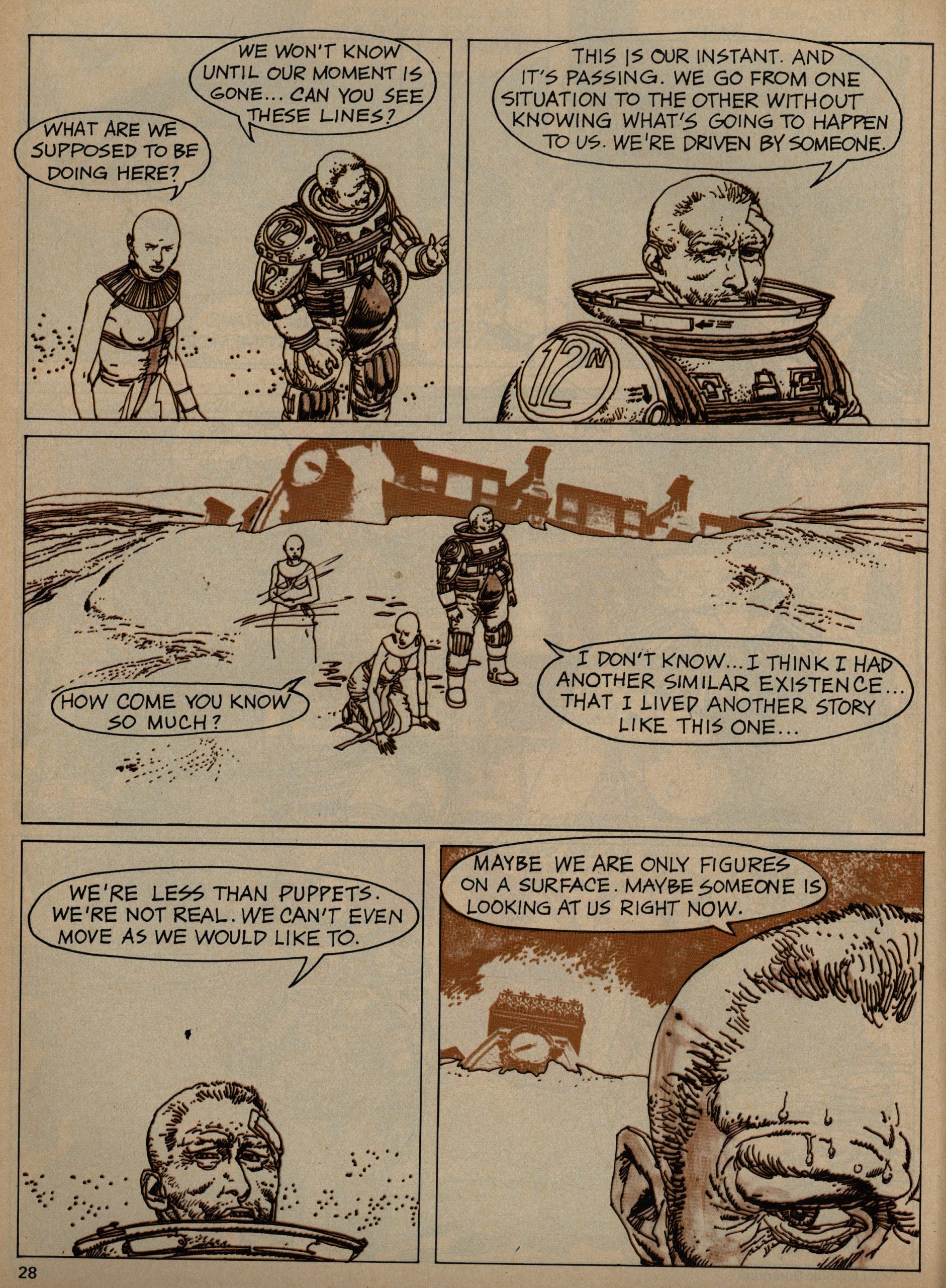
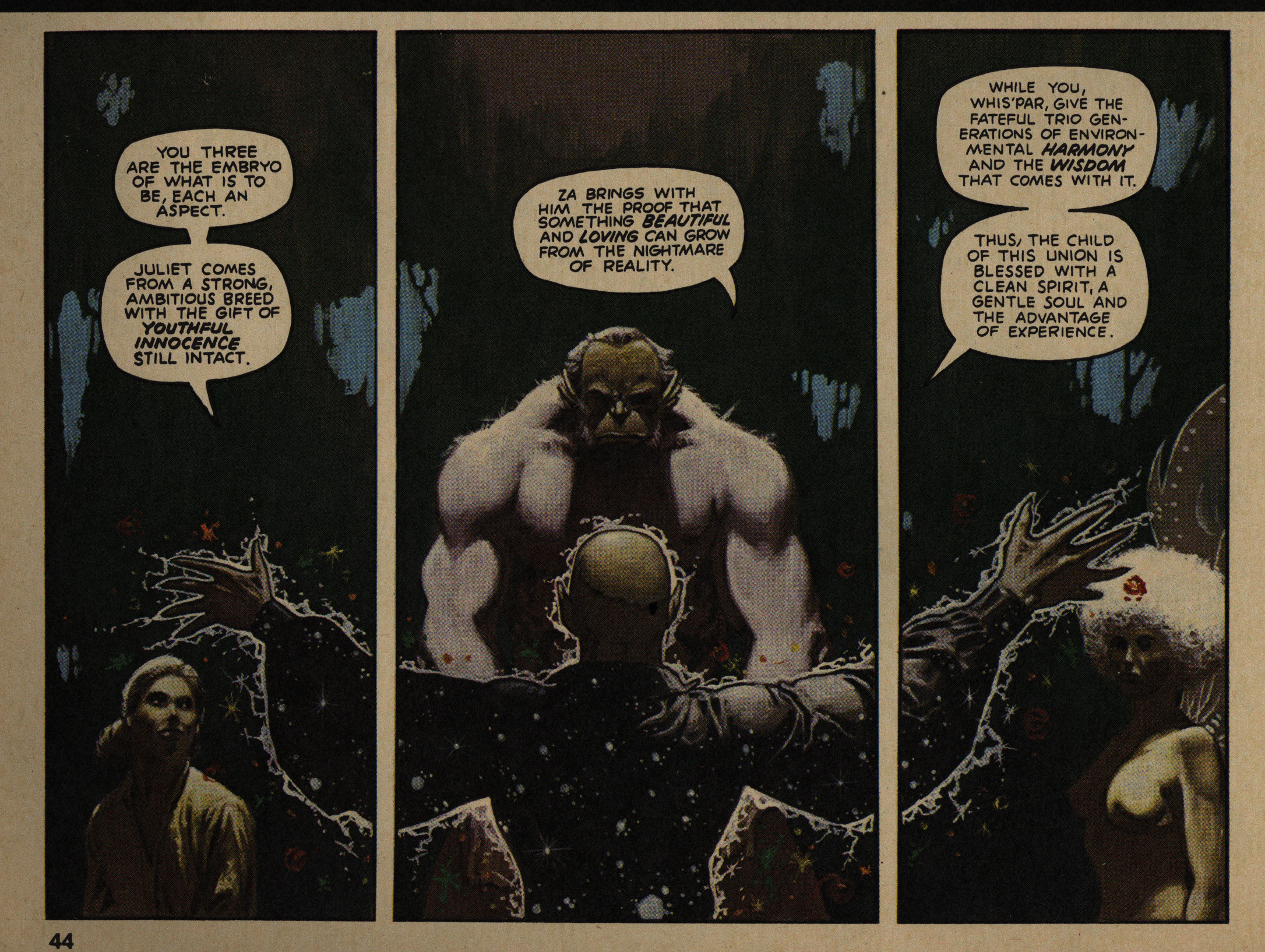
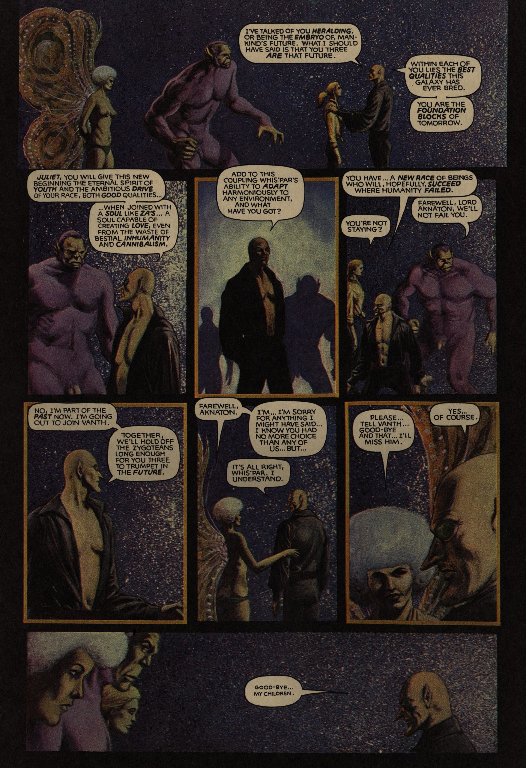
In the ninth issue, The Metamorphetc ends, and it turns out that the entire thing was rather underwhelming. Spoilers: After collecting four people, the bald guy blows up the galaxy and then a million years later they surface in another galaxy. He had to blow up the galaxy, see, because some space aliens were evil and etc. It doesn’t really make much sense dramatically. But it’s a good read nonetheless.

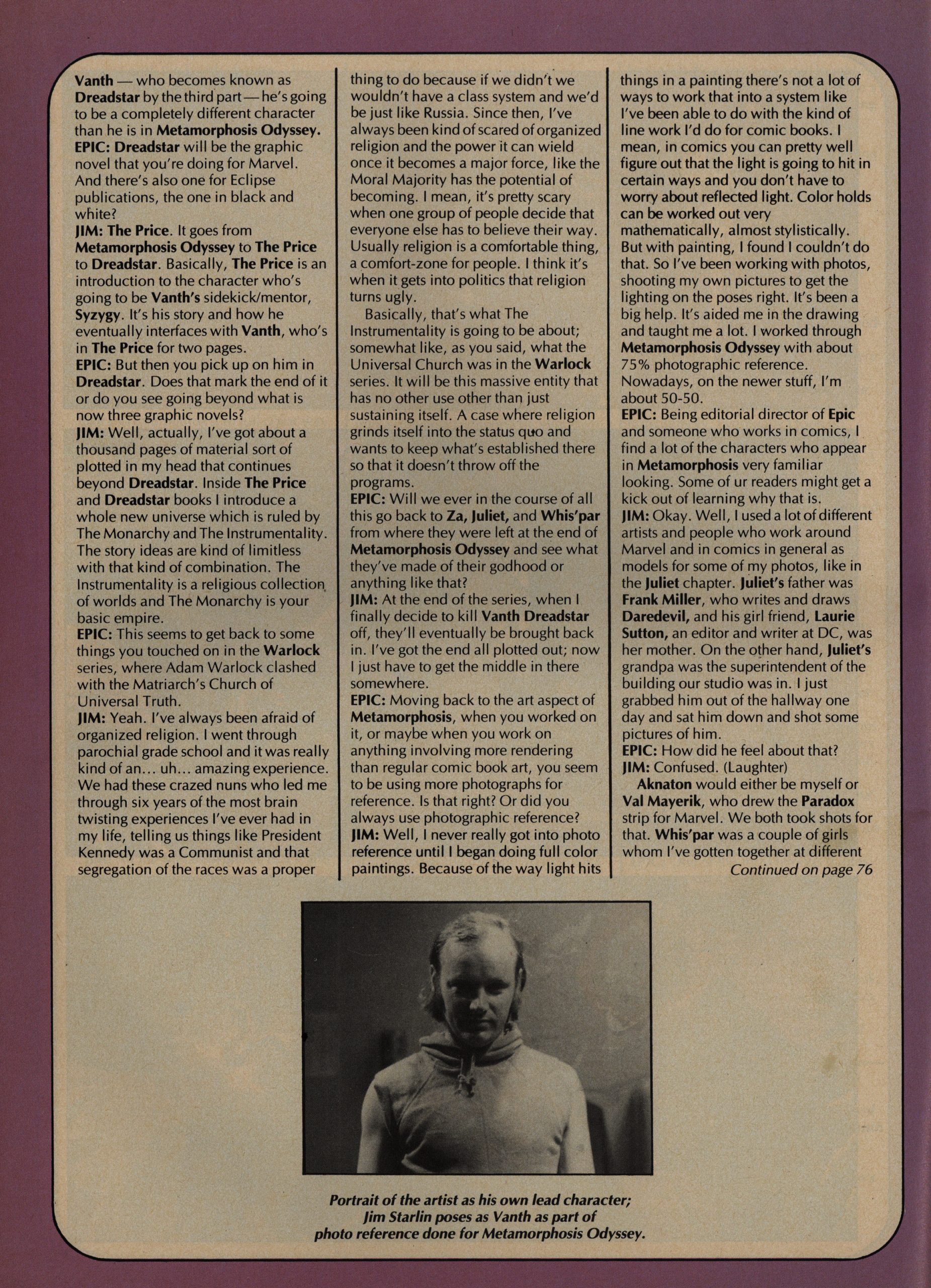
We get an interview with Starlin, who doesn’t look at all like he’s a caretaker at a remote hotel in the middle of the winter, and he tells us what he’s got planned for the Odyssey thing now. He says that the “Vanth” character is a different character now, which is what I remember from reading Dreadstar as a teenager. But we’ll see: Dreadstar is the first Epic Comics comic proper, so I’ll be reading it in… er… a week’s time?

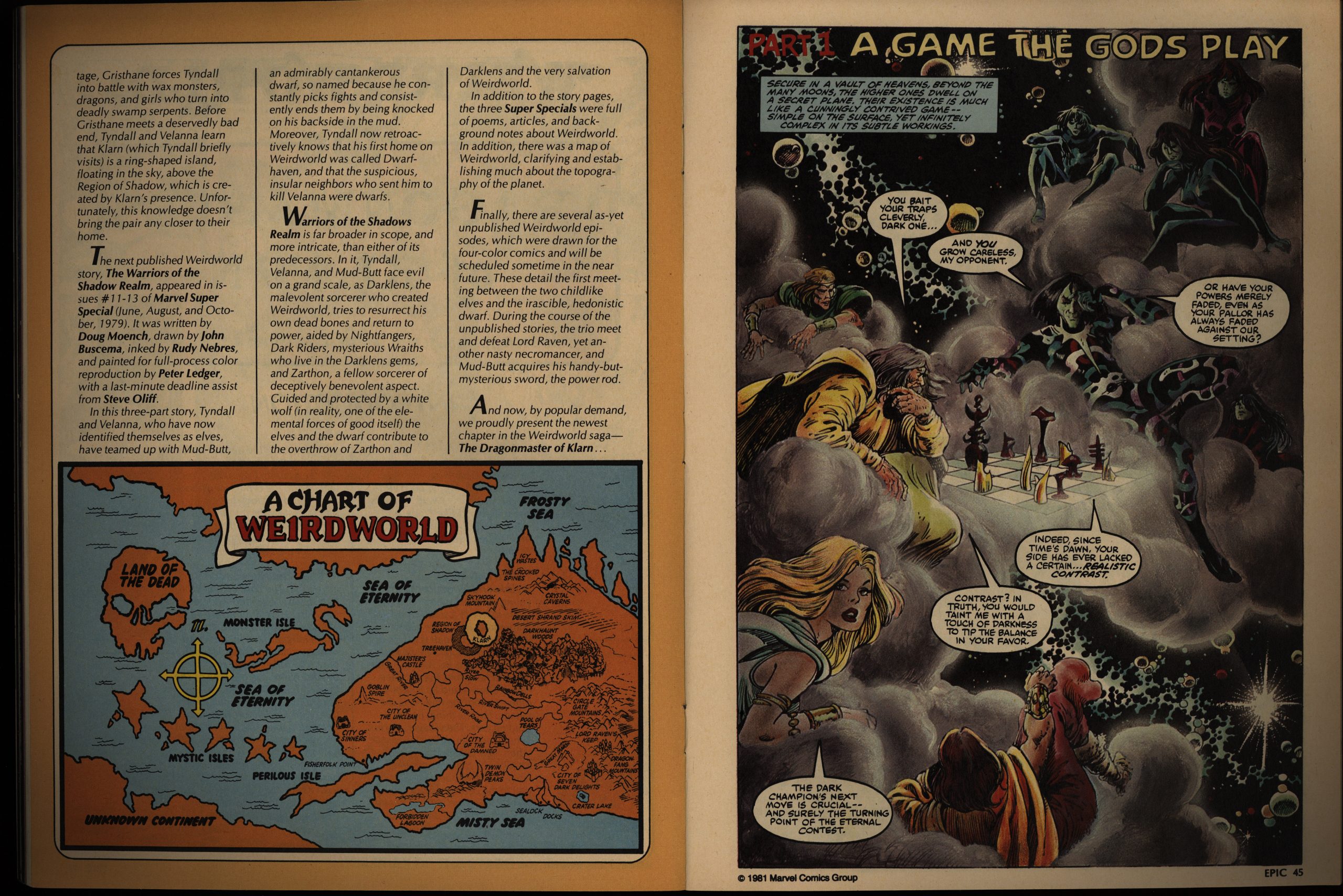
Virtually everything Epic Illustrated published until now has been creator-owned. The exception was a Silver Surfer story in the first issue, but now we get Weirdworld, which had been published by Marvel before. This iteration is written by Doug Moench, and it’s pretty entertaining.

I love the style Lee Marrs uses here. Coloured with crayons? I have no idea, but it looks great, and very different from anything else in EI. (And, yes, the story has a twist, but it’s fun without being a straight-up joke.)

Hey! I don’t think I’ve seen this P. Craig Russell thing before. “The Ideal: Opus 11”. It’s quite unusual for being reproduced from his pencils: He usually inks his linework. And it’s usually in colour. This is very lovely, and expertly printed here.

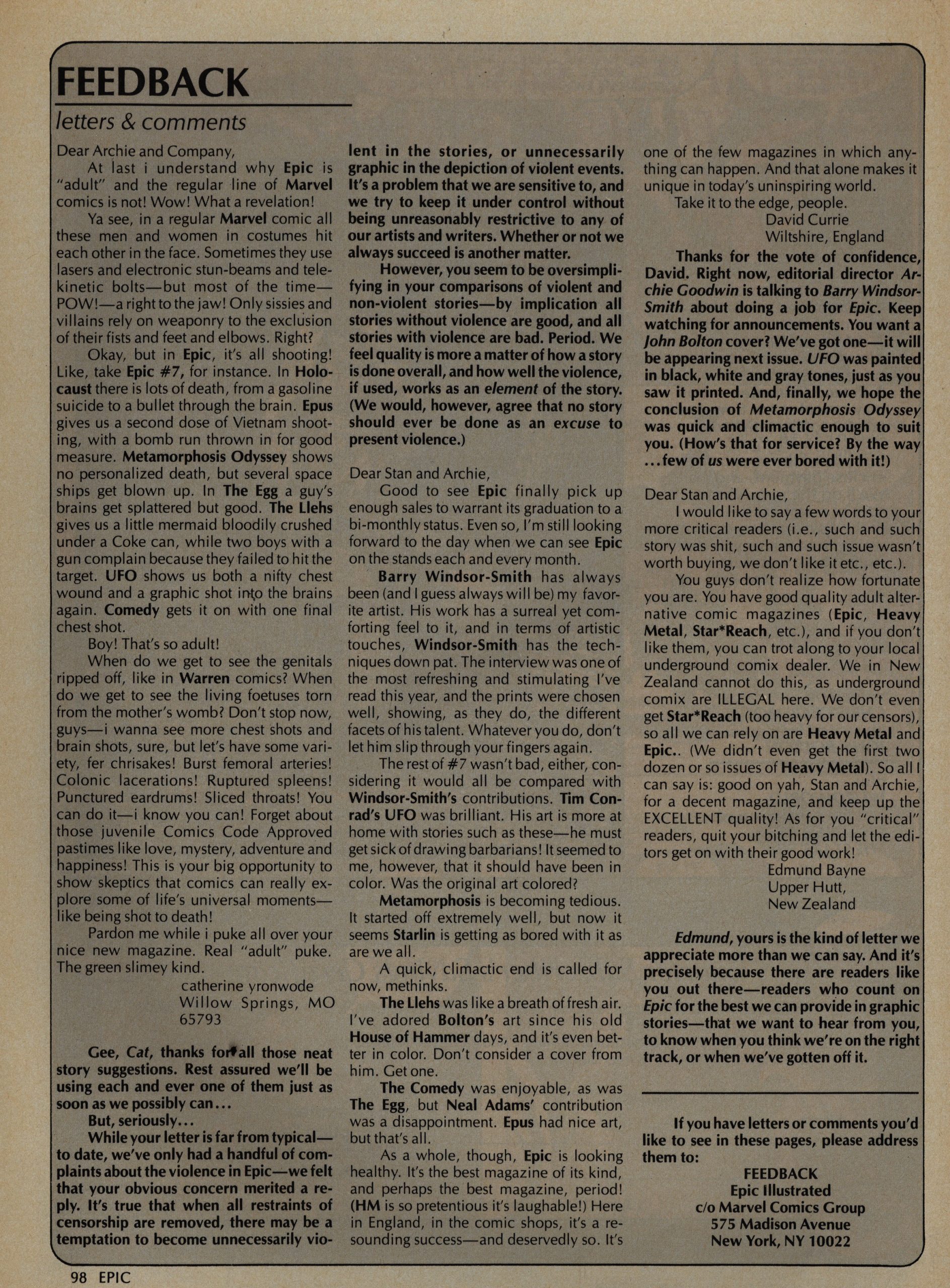
A letter writer isn’t impressed by all the violence in the book. Oh! It’s catherine yronwode! Is this before she started working for Eclipse Comics? I guess it must have been, but not by long.

Goodwin counters, disingenuously, by claiming that yronwode must think that all stories without violence are good stories, which is something she did not say at all.

*sigh*

Anyway, that’s the end of Day Two of my Journey into Epic Illustrated. It was, again, a very pleasant way to spend the evening.

1980: Epic Illustrated

Epic Illustrated (1980) #1-34
edited by Archie Goodwin

“What?!” you’re saying. “Isn’t this supposed to be a blog about Epic Comics? Epic Illustrated wasn’t published under the Epic Comics imprint! Epic Illustrated a couple of years before Epic Comics was created! I feel cheated and I’m angry!”

Yes, I agree. I’m a bad, bad blogger.

However, Epic Illustrated’s editor, Archie Goodwin, was the main guiding force for Epic Comics, so I thought it might be interested to look how Marvel handled the concept of “creator owned properties” before they turned it into a line of periodicals.

So: Epic Illustrated. If you’re not interested, you can skip the next handful of posts, because it’s going to take me a while to go through these.

It’s 3200 pages, in total, so it’s going to take me at least a week to read these comics, and I’ll do… let’s say… one post per EI year? That’s about 4-600 pages per post for me to read?

OK? OK.

Of course, Epic Illustrated is a rip-off of Heavy Metal. Marvel tried tipping off everybody who seemed to make money, which explains the mid-70s Comix Book magazine, where they tried to publish undergrounds (after the entire underground thing was over). And, of course, they couldn’t be as raunchy as real undergrounds were, so it didn’t really appeal to anybody much.

The attraction of Heavy Metal was that you had sexy sci fi stuff, but again, Marvel couldn’t really get into the “sexy” bit beyond showing some boobs, but it’s interesting how they’ve sold the concept to advertisers. Above you have a smarmy Kawasaki ad about “making a pass” (ha ha, I’m dying no seriously), and then you have

this nice ad for Cotler Jeans. So the Marvel salesforce had obviously been on the phone to everybody saying “it’s going to be like Heavy Metal! People will be jerking off to it for sure! I promise you!”

But this is Marvel, and that’s not realistically going to happen. I think?

Stan Lee is credited as the editor, and Goodwin is the “editorial director”. I think this means that Lee got some money but was otherwise not involved much? I’m just guessing: All the input seems to be very Goodwin-ey otherwise.

Yes yes, we are going to get to the comics, but not yet. I’m just fascinated by this ad. What is it even for? Was there a loudspeaker system called “Hartley”? Or is this an ad for a shop that sells stereos?

It exists! It has a very… minimal? Web page.

Not at the same address, though.

They have a letters page in the first issue, and it seems like they’ve sent a request to some famous people to get some feedback on what they think about their publishing plans. Neal Adams seems positive, but a bit standoffish: “Will Marvel really go through with a creator-owned magazine?” I think is what he’s trying to say.

This style of American ad has always befuddled me. Did anybody ever read these walls of text? For… I don’t even know what, because I didn’t read that wall of text, but it’s for a… filter? Oil filter? I don’t know.

But from the ads, you can see the demographic they’re going for: Over 18, male, no taste, somewhat dumb. And that’s fine.

Oh. Comics!

The very first story of the very first issue of a magazine of creator-owned stories is… A Silver Surfer story written by Stan Lee (art Buschema and Veitch).

Isn’t that ironic?

Don’t you think?

But more problematic is that it sucks. Looks nice, though.

The first issue (as Goodwin points out in the editorial for all subsequent issues) isn’t quite what he’d hoped for, and I see what he means (the mixture of bits is odd). But I think it’s a fine read. Wendi Pini, for instance, contributes some backstory on a pair of lovers found in Elfquest, if I remember correctly? It’s pretty and sweet and ironic and stuff.

One thing I wondered about was whether Goodwin would try to avoid using European creators in EI to differentiate wrt. Heavy Metal more, and… he does mainly stick to Americans, but he does drop in shorter pieces by furriners, like this Leo Duranona piece. Which is very unusual in other respects, too: It’s a metatextual goof, basically. Goodwin seems to be very focused on narrative pieces, so formal playfulness isn’t EI’s thing. (In Heavy Metal, of course, it was all over the place.)

The major serial in EI is “The Metamorphosis Odyssey” by Jim Starlin, and I’m going to go ahead and guess that luring him back to Marvel was one of the reasons EI was created. Starlin had left Marvel for greener pastures over at Eclipse (and elsewhere), but he was successfully brought back into the fold: After doing this serial for a dozen issues in EI, he continued it as an Epic Comics periodical as Dreadstar.

As expected, most of the other stuff are professionally drawn but not very interestingly written fantasy shorts, like this Ray Rue thing.

And, my favourite: Really badly written prose stuff with bog-standard fantasy illustrations. Here’s a preview of… something to be published by Ariel Books? It’s unreadable.

More random European stuff… and it’s pretty random, dude.

Deep.

But I do like the artwork.

Rounding out the issue, we get a shaggy dog story by Ernie Colon, which wouldn’t have been out of place in any of the Warren magazines, which surely isn’t what they should be aiming for here.

So much text! Americans are weird.

In the first issue, we get three chapters of Starlin’s Epic epic, which initially seemed odd, but Goodwin explains the logic in a later editorial: Since EI is published quarterly, he wanted to draw people in by hooking them on Starlin, which I think makes sense.

The other thing I wanted to point out here is: No penises.

The worst part of EI is this kind of stuff: They bought an illustration, and then asked the illustrator to write a little story to accompany it. The result is usually a kind of lame joke told way too slowly.

Carl Potts delivers a nonsensical three-parter, and I mention it for two reasons: Potts would later become the Epic Comics head honcho (if I remember correctly), and: A boob harness. There’s a lot of boob harnesses in EI, and none of them really make much sense from a support standpoint.

OK, back to the ads, just to nail the projected audience: Rich Lights from Viceroy…

… and Champale… A Malt Liquor… that’s Champagne quality but cheap enough that people who read comics can afford it (I’m translating)…

… and Brut for men by Fabergé, which apparently is an aftershave!? That looks like a champagne bottle? This is apparently still a thing.

Goodwin explains what’s up with these illustrations and accompanying texts. Here’s the piece he’s talking about:

It just seems like a bad idea to me.

Goodwin starts putting in more serials. By issue four, about half of each issue is taken up by serials, which I think it pretty strange. I mean, for a quarterly. Tim Conrad illustrates yet another Roy Thomas adaptation of some Howard nonsense, and it’s the worst of the bunch. Conrad can draw some wonderful sci-fi stuff, but his barbarians just look like they have to use the toiled all the time.

Or is he going for a super-modelled homage to Fletcher Hanks? It’s bonkers, but not in a good way.

This barbarian is very nearsighted, I think.

But what I wanted to mention here is the “continued on page 91”, sort of. You don’t see that any more, but back in the days, colour printing was expensive, so if they had some black and white pieces, those were printed separately, and then everything was bound together. So you have to make the stories skip around to skip past the black and white signature pages.

Kids these days won’t believe that if you tell them.

I mean, paper and stuff.

I’ve read more than a handful of the pieces here before: Not because I’ve read EI (I haven’t), but because they’ve been reprinted in collections afterwards. Which is good: It means the creators really were able to take their stuff and make more money off of it after Marvel had published it once.

And I want to mention the printing: It’s really good. Just zoom in on the page above. Oodles and oodled of colour details have survived the printing process. The pages are glossy, but not super-glossy, which I think is the right compromise; it’s pleasant to read (without too many reflections), but it holds the ink well.

Hm. Yeah, like I said, I don’t quite know what made Goodwin choose these furrin pieces to print.

Every issue (that I’ve read today, which is just four) have an essay, and they’re usually about comics. I think that’s interesting: Goodwin was really interested in the art form, and not just in putting together an anthology.

Oo! A P. Craig Russell opera adaptation snippet. Pretty.

Not all the text pieces are about comics. The rest are about popular culture stuff, like this interview with the guy behind Battlestar Galactica and Buck Rogers. That sounds really dire, right? But he seems like a smart guy and it’s an interesting peek into making sci fi for TV back in the 70s.

Goodwin said they suddenly had four pages they needed to fill, so he reprinted a story he wrote and draw back in the early 70s (I think). He didn’t draw that many comics, so I think that was a fun thing to include. I love the art style: It’s so completely of its time.

Starlin finally explains what the Odyssey thing is going to be about: There’s this guy who gathers a kick-ass force to defend the Galaxy against some evil aliens. Which was a bit disappointing, but… At least the art’s fun to look at.

Goodwin lays out his editorial vision pretty clearly: He likes narrative pieces.

I liked this Samuel Delany/Howard Chaykin piece. Not because the story was that interesting, but look at that artwork! Just look at it!

Archie Goodwin writes a story about fantasy. Of course, it turns out to be a double O Henry, but it’s cute.

Goodwin printed that long and savage beat-down by Richard Ellis on the letters page. The thing is: Ellis is pretty much right about everything he writes, and still… Spending an evening with these 400 pages of Epic Illustrated was perfectly nice. I want to see where Goodwin’s editorial tastes are going to take us, and it’s refreshingly Catholic so far.

I also want to see what company Marvel’s sales dept gets to place ads with them, because over the first four issues, there’s a total nose dive in price ranges. From a Kawasaki in the first issue to Bic lighters in the fourth… That’s not a good look.

It would be an obvious thing to do to reprint all the serials as graphic novels, but that didn’t happen with too many of them. This Thomas/Russell Elric serial was reprinted toot sweet, but I don’t recall too many more. Marada? I guess we’ll find out.

This Doug Moench/Paul Gulacy thing was intriguing (unusual storytelling elements), but is probably the harshest thing in these issues. And all for an “ironic” twist ending.

Kirchner used to pop up in Heavy Metal all the time, didn’t he? His artwork is supernaturally sharp, and so at odds with his stories. Really enjoyable.

OK, I’m not going to mention everything in every issue or something. That’d be insane. But this story written by Bruce Jones was very Bruce Jones, complete with groan-worthy twist ending and all, but still an enjoyable read.

Aha, using mostly American material isn’t an editorial edict, really, and they’re going to branch out from now on. I guess we’ll see in future issues.

But it’s not like they’re totally American as it is. Suddenly you get a random page of random images from a Japanese artist. Yes, OK, it’s filler, but it’s pretty forward-thinking for a magazine from 1980.

Goodwin writes a long essay about the “graphic novel”.

That ad just made me laugh out loud. Something about the expression on the face of the guy to the left.

OK, I’m fading. I have no idea what I had planned to say about this piece. (It has a twist ending.) Was it something about… boobs? I don’t know.

Rick Veitch appears more than I had expected. I think he’s done something in every issue so far. This is his first solo piece, and it’s got… yes… a twist ending.

This was pretty good: It’s a short story by Harlan Ellison (no great shakes in itself), but illustrated in this way by Ken Steacy, who I’ve always liked. Somehow it works, even when it seems it should be overpowered by the prose.

OK! We’re done for today! That took longer than I imagined: I’m out of practice.

Remember back up there when I said it may take a week to go through Epic Illustrated? Could we extend that to a month?

Thanks.