1984: Crash Ryan

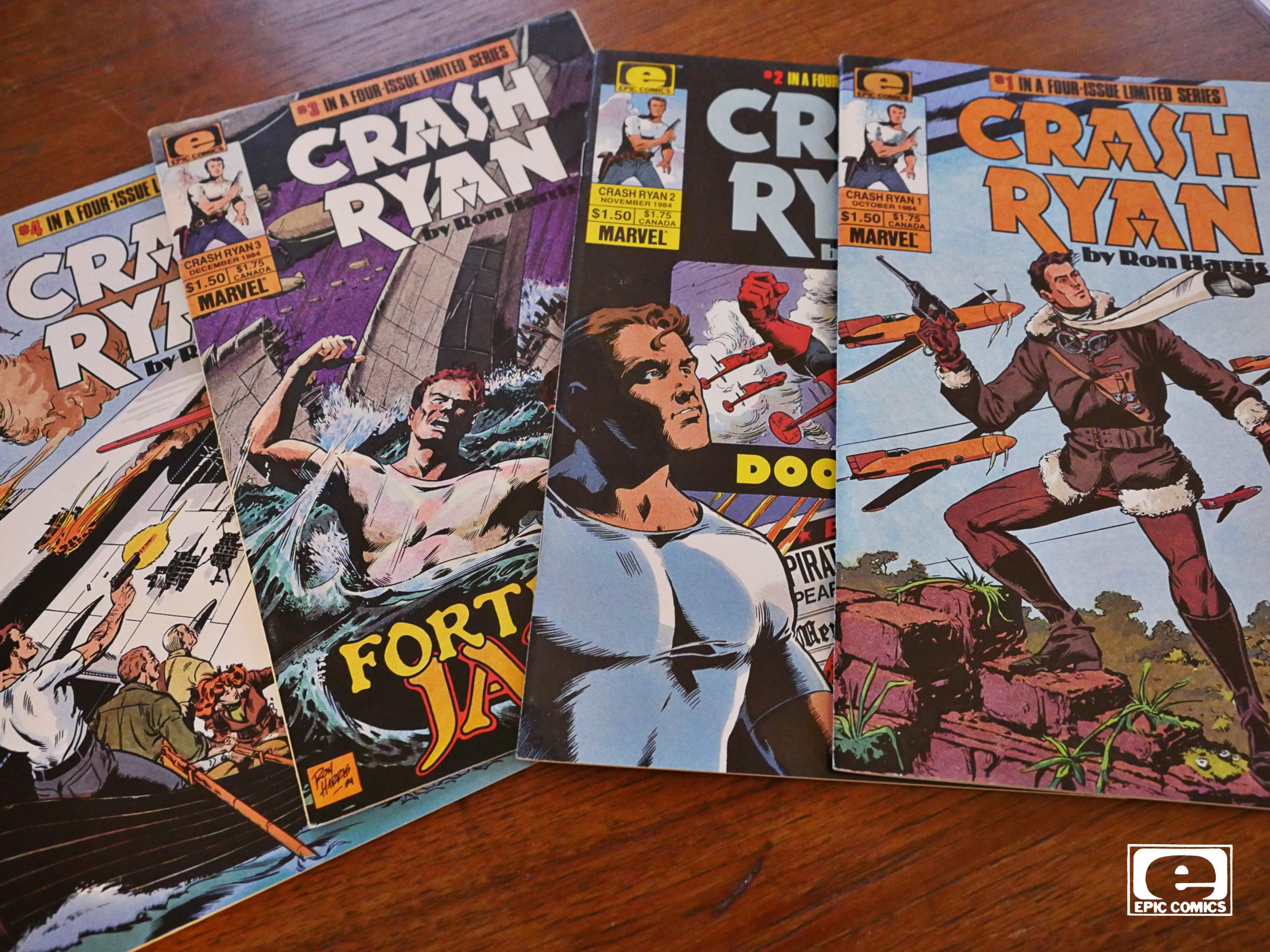
Crash Ryan (1984) #1-4
by Ron Harris

I was supposed to do Six from Sirius today, but the package containing that series hasn’t arrived yet, six weeks after I ordered it. So I guess I’ll have to do that one out-of-sequence.

But you know when you’re reading something and you can’t quite make out whether it’s a parody of something or whether it’s indeed that something? That’s the Crash Ryan reading experience.

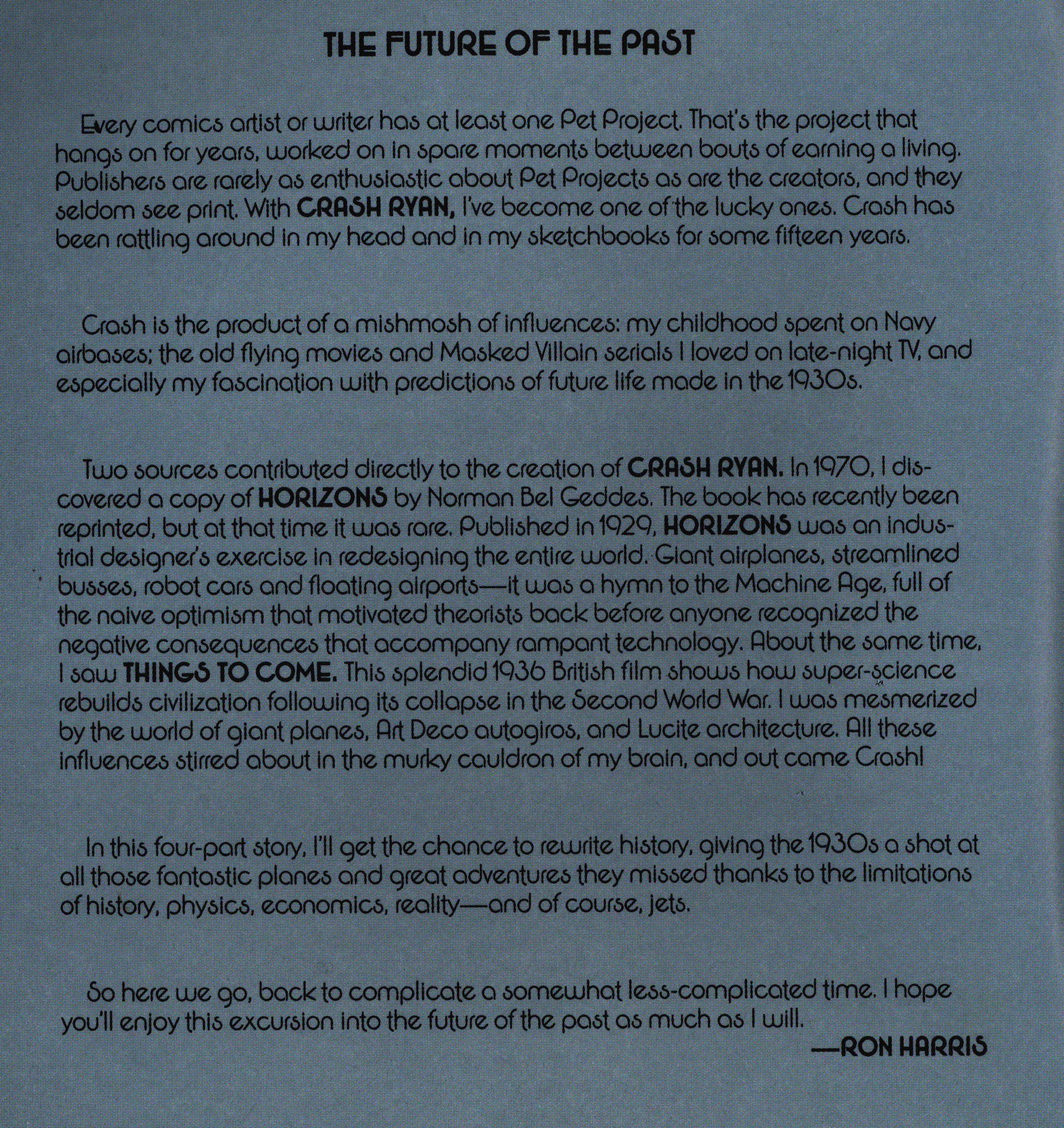
I don’t know who Ron Harris is, but he seems to have an affinity for oldee tymee comics, doing various Roy Thomas DC projects. And the seems like a natural fit, because he seems to have an enthusiasm for 30s/40s adventure stuff. He explains in the introduction that Crash Ryan was something of a passion project for him: He wanted to do a comic about what futurism looked like in the 30s.

So we get a story based on that concept: Outlandish planes that would never actually be practical, but that (hopefully) looks cool. Coupled with a story about a scrappy fighter pilot and a maniacal and evil villain. Sounds like a good setup, right?

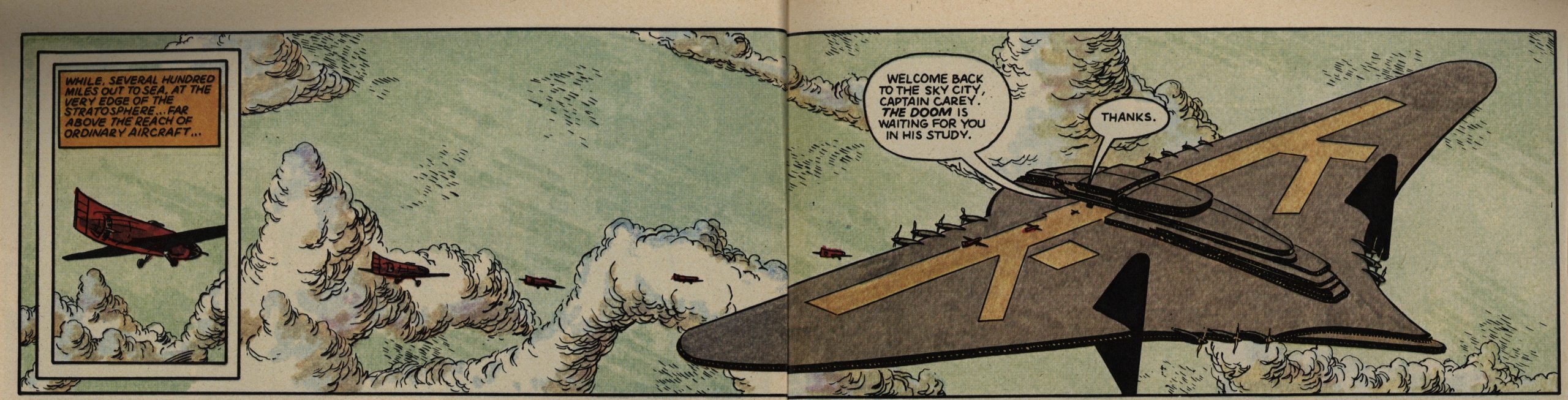
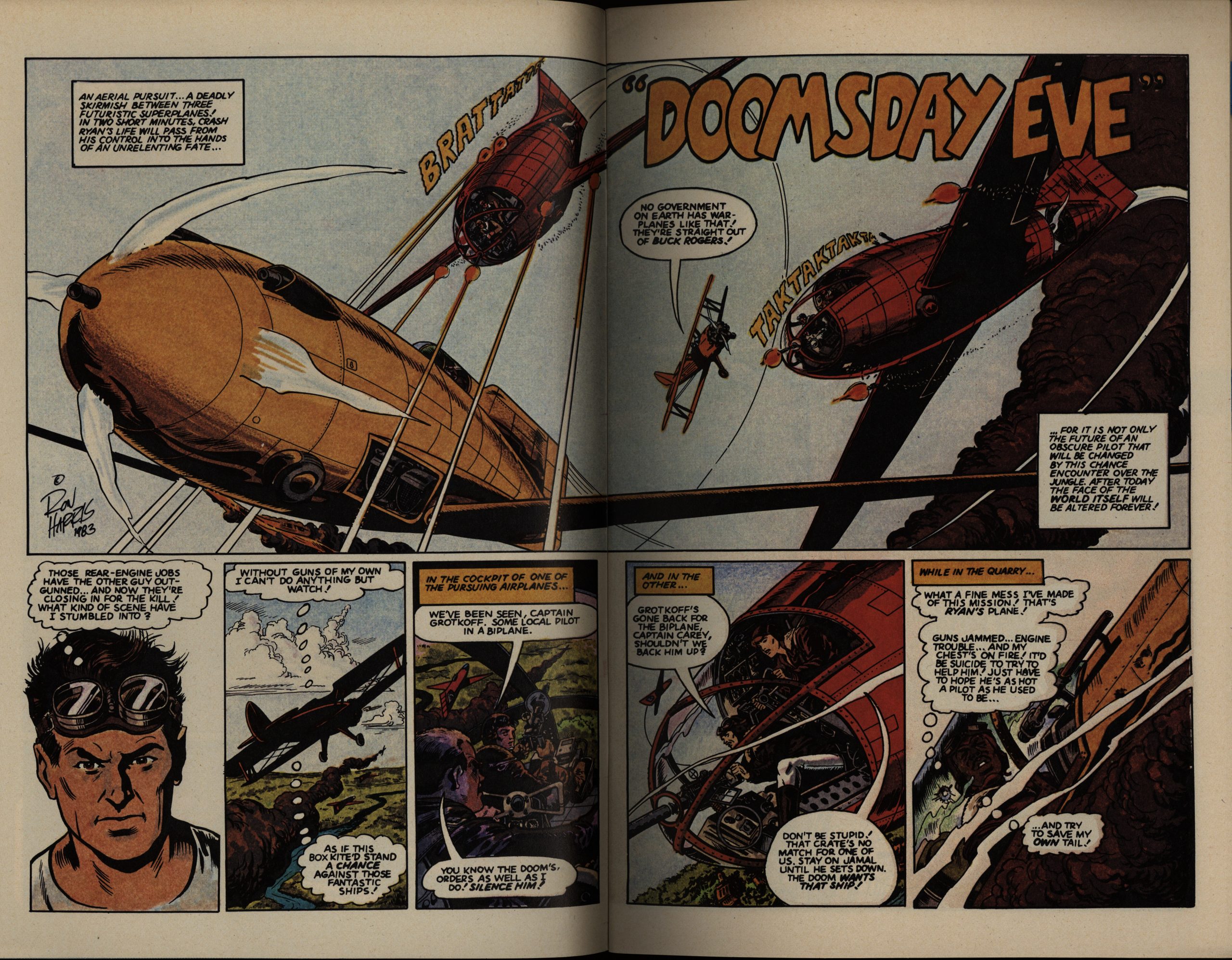
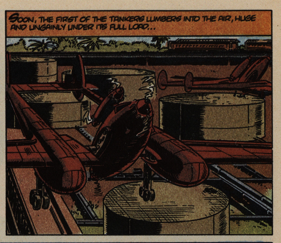
One of the problems is that instead of being outlandishly futuristic, each design just raises all these questions. Like — how are planes supposed to land on a runway that’s moving perpendicularly to the direction you’re trying to land in? And that’s a gigantic plane — wouldn’t some bigger propellers have been a good idea? Or is the concept that these planes have anti-gravity installed and are just hovering there? That would make sense, but in a different scene the pilot was warning of stalling the plane, so it’s not that either?

I KNOW I KNOW IT”S NOT SUPPOSED TO BE PLAUSIBLE. Sorry caps lock. But it’s just a lot to take in, and every other page presents a conundrum like this, and the only way to get past it is to try not to think about what you’re seeing on any level.

For reference, here’s a couple of pages from the book he references:

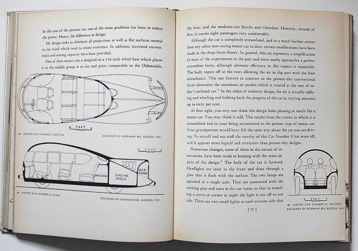
See? Not violently stupid, just … impractical. There’s a difference.

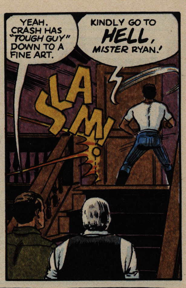
OK, I’ve whined enough about the designs of the planes, so how about bitching about how weird the cartooning is? Sure, there’s heroic stances and there’s heroic stances, but is that guy sinking into a split? Is he really a ballet dancer limbering up while arguing? Is that what “tough guy” means? Being able to drop into a split at any moment? That’s the only way I can interpret that panel.

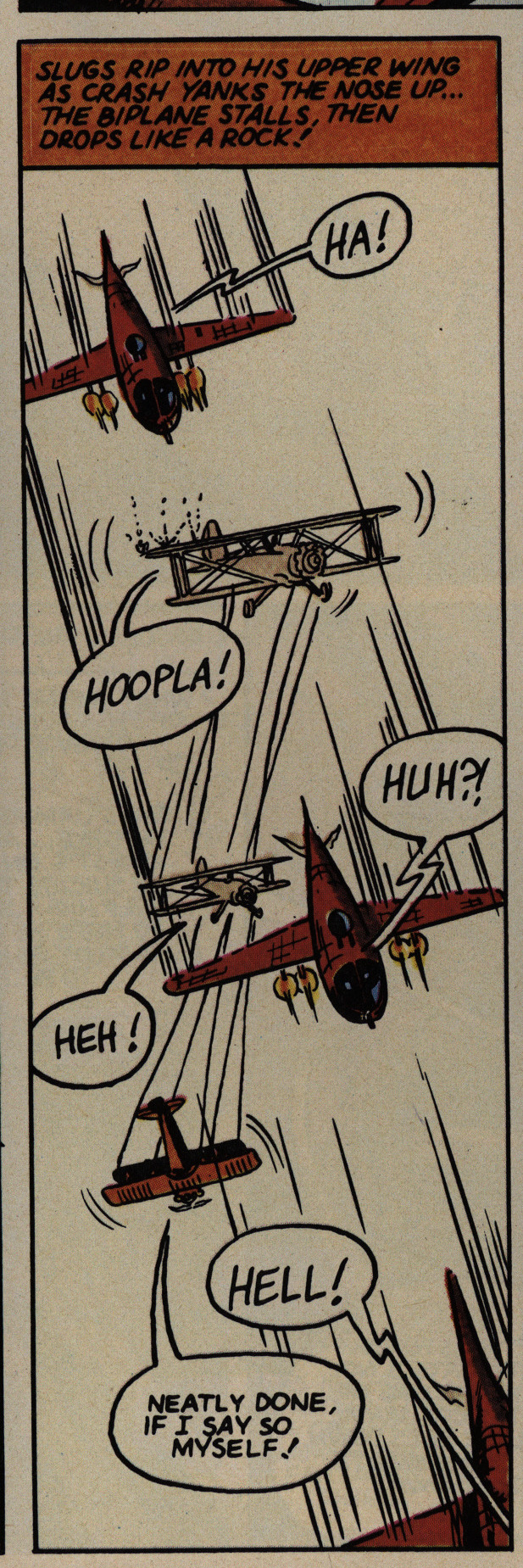
But we didn’t come to this book for the postures, did we? Aerial combat, that’s where it’s at. And to quote on of the villains: “Huh?!” Because they’re mostly like this: Not very exciting, mostly because they’re … bad. And confusing. I mean, could you have made out what’s supposed to be going on in that panel without the caption? And why does the biplane change colour anyway?

Le puzzlement.

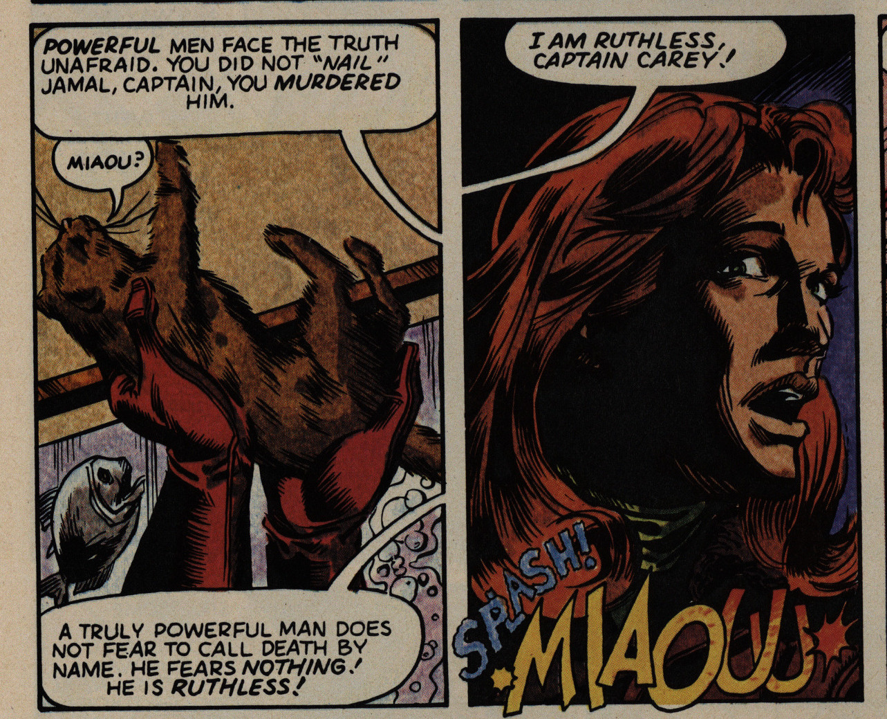
The villain, helpfully called “The Doom” is easier to read. Above you have him feeding a kitten to his piranha, because what else would villains do?

So we return to the question I started with: Is this a parody of a 30s adventure comic, or is it trying to grittily up the stakes? Because I can’t tell. If it is a parody, it’s not really a very effective one, and if not, it’s kinda embarrassing.

And dear lord, the verbiage. It goes on and on and

While we’re nitpicking: That’s a weird way to draw propellers. When you look at propellers in real life, outdoors without any electric lights, you see either a blur or (blinking your eyes) the propellers as they really are, right? It’s only in movies you get the interference patterns with the frame rate. So these… murder spikes… are just weird.

But, OK, drawing propellers isn’t really a solved problem.

And neither was colouring at this point. All the publishers were trying out new methods to get away from mechanical seps… but whatever unholy technique Marvel was using here, it’s horrible, horrid and horrendous.

Unless she’s meant to have leprosy. In that case: Carry on.

I’m all for doing outlandish designs, but coupled with Harris’ inability to distinguish foreground from background in any way (line weight, colouring, good perspective, anything) panels are frequently very difficult to read. I first interpreted that as a VTOL plane sitting on one oblong box and one round box, before reinterpreting it as a plane hovering far above structures on the ground.

It makes reading a slog.

You have to applaud Harris for his diverse cast, though. For instance, here you have a pilot who has an arm growing out of his chest, and nothing is more diverse than that.

Harris presents some examples of fun designs from the past, and I can definitely see the inspiration.

It’s not just the hero who’s a dancer: The villain is also training for Swan Lake, apparently.

OK OK, me could continue kvetching about just about any panel in this series, but some of we have better things to do. (Obviously not I.)

So I’m going to stop this performance of Old Man Rants About Thirty-Five Year Old Comic Nobody Has Ever Heard Of right now.

The story was continued:

Harris would bring back the characters in a four-part story that ran in Dark Horse Presents #44-46 (September 1990 – November 1990)

But it’s never been reprinted, for some odd reason or other.

What did the critics think?

Somebody writes in Amazing Heroes #60, page 61:

Action is the byword in this
newest limited series from the Epic
Comics line. Creator Ron Harris
was strongly influenced in his work
by both the speculative fiction and
motion picture serials of the 1930s.
There seems little doubt that the
success of, Indiana Jones also
played a hand in the decision to
give this project a green light.
The story fails on many levels.
There are long, sustainwed action
sequences, but they fail to generate
any real excitement. Dialogue is
forced and contrived. As a char-
acter, Crash Ryan comes off as
vain, selfish, reckless, irresponsi-
ble, and often shockingly indif-
ferent when it come to placing the
lives of others in danger. He is
more stupid than heroic.
It was a perfectly viable idea for
Harris to attempt to emulate the
pulp fiction of 50 years past, but
unfortunately his pencils also draw
substance from the comic art Ofe
that era. It is stiff and simplistic,
with dark coloring that often nearly
obscures the pencils.
This series also raises a question
in my mind. t thought one of the
purposes of Epic Comics was to
provide a platform for artists and
writers with established, note.
worthy credentials (such as
Moench and Gulacy on Six From
Sirius). What are Ron Harris’s
credentials? Or, for that matter,
Steve Perry’s on Timespirits? Before
learning of this book, I had never
heard of Harris.
In the final analysis, though, Hare
rists past credits, or lack thereof,
are irrelevant. What matters is the
material at hand. Crash Ryan
doesn’t have wings, and I feel its
flight would soon be aborted if it
wasn’t a limited series.

Harsh, dude.

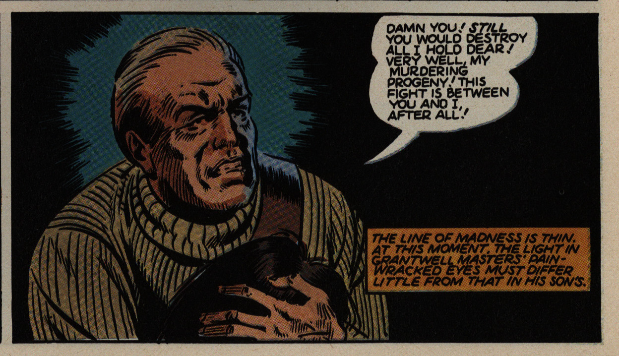
R. Fiore writes in The Comics Journal #96, page 34:

I like it, it’s screwy. Crash Ryan is a cross
between ’30s adventure serials and (though
writer/ artist Ron Harris may not know it)
the apocalyptic fantasies of the turn of the
century. The plot involves a war between
the huge private airqeets Of the mysterious
Mr. Masters and arch-villain the Doom,
who turns out to be (gasp!) Masters’s son.
The Oedipus Airman angle can be over-
looked in favor of Harris’s love for yester-
day’s technological dreams, particularly
the ones that didn’t work. To be sure, Har-
ris.is not quite as good at drawing people as
he is at machines, but since this is the big
battle issue that’s less of a problem than it
might be. Won’t make anyone forget The
Rocketeer, though.

Mellow, dude.

1984: The Alien Legion

Alien Legion (1984) #1-20
by Carl Potts, Alan Zelenetz, Frank Cirocco and a whole bunch of people.

While Epic was set up to lure away certain Marvel creators who had defected by promising them ownership of their works and less editorial interference, Alien Legion doesn’t fit that narrative completely. Sure, it’s creator-owned… if you think of Carl Potts as the creator. But he’s not actually making this comic: He came up with the concept (back in the 70s), but he’s not the writer or the artist. (Although he inks one back-up story.)

So are the rest of the people involved work-for-hire?

Anyway, we start off with an infodump…

… and bunch of pages giving the stats and the background to most of the major characters.

I seem to recall Frank Cirocco having a more noodly art style back in the 70s? He did a bunch of posters and stuff? He’s more restrained (or streamlined) here, but still, his character designs are most pleasing. The… let’s call them codpieces… are a bit weird, though. They seem to be protecting air on most of the characters, and … a random part of the abdomen on the snakey guy (probably the best design of the bunch).

¯\_(ツ)_/¯

Zelenetz starts off very wordy indeed. And he has a tendency to have the characters state (and restate) their background incessantly, which is somewhat offputting. But I guess that’s a quite normal style.

Oh, and the first issue is a 48 page special — I guess Epic was experimenting with how to start off these series. Many of them got their first shot as a graphic novel before moving to a series, which is pretty odd, but I’m guessing the idea was to pull readers in by giving them a substantial chunk to sink their teeth into.

Oh, yeah, the storyline. It’s basically The Foreign Legion… in Space (as pointed out by 90% of the people who appeared on the letters pages), but they’re in the employ of the galactic UN who tries to protect planets (and their ecologies) from exploitation and stuff. The people they fight are really bad. And capitalists. But I’m repeating myself.

Yes, who!

The thing I wanted to mention here wasn’t really the oh-so-realistic thought process of that soldier, but the colouring: Epic (as many of the indies who published in colour) didn’t quite know what was the right way to do “high class” colour comics at the time. Offset printing isn’t an option, but flat “mechanical” colour separation looks too cheap, so here we see them experimenting with… I don’t know. Laser separations? It basically looks like they’re scanning watercolours (for the colours), and the colours don’t always stay within the lines.

Yes, there’s a bunch of stuff about ecology here.

Just typical soldier talk.

Fortunately they have at least one psychopath on the team so that they can get the gritty stuff in.

Oh, the irony.

OK, my snark here is a somewhat unwarranted. I actually had this issue as a teenager (but didn’t keep buying, because I didn’t think this was worth reading), but it’s a perfectly nice mid-80s sci-fi comic book. The artwork’s better than average and the storyline isn’t totally derivative, and most surprising of all: For such a large cast of characters, it’s possible to distinguish between them, and not just because there’s one jock, one nerd, one hero and one girl. For one, there’s no girls, but the main reason is that they all seem to have… character.

In the second issue, Epic editor-in-chief Archie Goodwin starts his er editorial cartoons (which are a staple of the Epic line until he’s fired er I mean left Marvel in 1987).

I had hoped the thought balloon data dumps would stop… and they do taper off, but dude. Dude.

The colouring approach changes completely, though. Instead of the vague aquarelle thing, we get more traditional colouring… but with a lot of gradients.

We also get the start of an interesting storytelling approach. I thought the scene up there was a total non sequitur, because it’s never followed up on in the storyline. But then, there’s a backup:

The moment is expanded upon! I don’t think I’ve ever seen anybody do something like this in comics, but it’s a staple throughout the first third (or so) of the series, and then grows rarer. I think it’s kinda neat: It’s obviously because Cirocco can’t draw very fast, so to maintain a bi-monthly schedule, they have to pad out the pages with somebody else doing the artwork. That’s a very common problem in periodical comics, but they usually solve the problem by having a vaguely-related backup series. Doing it this way they can delve into characters from the main storyline in a pretty organic fashion. I think it really works and it adds complexity.

Did I mention that Potts had been thinking about this series for quite a while? So there’s a whole bunch of … background stuff, and we get an encyclopedia.

Here’s another example of the main story/backup thing with a totally different transition: The main story (on the left-hand side) ends with a character we’ve never seen before (I think?) being reported dead, and then we get his story. And it turns out that his story explains a whole a plot point in the main story that I just took as just one of those things. Fun.

A correspondent asks why there are no women in this comics, and the editor, while smirking, asks why the correspondent can be sure that there’s no “females” in the Legion, what with all the alien physiognomy. Heh heh heh, so clever.

BECAUSE YOU”VE PUBLISHED STATS PAGES FOR ALL OF THEM WHERE YOU REFER TO THEM ALL, WITHOUT FAIL, AS “HE”, ASSHOLE.

That’s how you can tell even if there are no penises on display.

Smirk on that.

Not all the early Epic comics stick to the Marvel characters-in-a-box cover design thing, but they did choose the most striking character here, at least.

Heh heh. That’s actually funny.

The thought balloon recap action is starting to get on my tits by now. But you have to like a character that has so fabulous hair that he doesn’t want to wear a helmet in outer space. Look at the winds of vacuum tousling his ‘do.

But more serious is the fact that I usually can’t really tell what’s going on in any of the fight scenes. Cirocco may draw a pleasing figure, but his action sequences are just all kinds of “uhm, er”.

Perhaps it’s good that there’s a dearth of female characters in this book if these are the kinds of scenes we’d get in all the issues otherwise…

And then Cirocco leaves (to draw the Alien Legion graphic novel), and Chris Warner takes over for a few issues.

“Gonna play like binary stars”. Zelenetz (or Potts?) tries very, very hard to come up with futuristic slang and… it doesn’t really work. It mostly just makes things a chore to read, especially as many characters in Yoda speak do. I mean, they’re supposed to come from all parts of the galaxy and talk different, but it generally just feels weak.

They kill off basically half the troop over the span of these twenty issues, which means that one is killed every three issues. I think I understand what they were going for (the gravitas of Ferro Lad being killed, right?), but when you do it at that clip, it starts to cut into your attachment to the characters (as it is).

Goodwin weighs in on the lack of women in the book. Which is more than a bit bizarre. I think until this (we’re up to issue ten), there’s been two female characters with names: The sister of the commander (a total ditz) and the wife of a diplomat (who’s summarily killed off after trying to get into the pants of the hunkiest soldier).

That’s weird.

Generally, Alien Legion is a one-thing-per-issue plot-wise, but with a bunch of threads that keep progressing, but there’s one longer sequence where they use this sort of summing-up strategy. Not practical these days when everybody’s aiming for the collection to mix recaps and new elements on the same page.

I may be kvetching a bit too much while I’m typing. Reading this series was a totally pleasant way to spend an evening, and the plots and characters are superior to, say, most TV series. And there’s the ecology.

Sometimes it’s a bit incoherent, though. The Legion tries to torpedo an operation by some evil businessmen that are exploiting some fishermen, and demonstrates that they can just use, like, a fishing net instead of the poison and dynamite the businessmen wants them to use. “This is our largest catch yet.” So using the net is even more effective than using poison… but still the evil businessmen forces them to go back to poison and dynamite.

I guess that’s capitalism?

¯\_(ツ)_/¯

We get a third named female character… who turns out to be a hooker.

A hooker without a heart of gold.

But it’s a very nice story, and it uses the major feature/expansion in the backup technique in a most successful manner. It’s a strong issue.

But then! We finally get a female legionnaire. Goodwin interprets her armour as a flotation device.

One of the letter writers complained about her being too stereotypically super-competent, but she worked out quite well, I thought. They basically treated her like any of the male characters, and she had as much (or little) character as any of them, I think.

But note her costume: Spiked heels, flotation device front plate, and no dangly crotch bits. And no practical pony tail.

Finally, Epic introduces a “proper” editorial page. Goodwin didn’t want to do it, but reading between the lines here, it’s easy to interpret this as him having gotten a firm order to start doing them.

Then next issue, he talks about how he didn’t want to do super-hero comics under the Epic banner, but that he’s now seen how successful they were, so he’s now all gung-ho about it, and they’re going to start doing a bunch. (He left a couple years later.)

I haven’t mentioned who’s the penciller on the last half of the series: Larry Stroman. He starts off well enough, and then starts getting more and more like Neal Adams with every issue. Which isn’t a bad thing. He’s also got a better eye for action scenes, so the book becomes easier on the eye all over.

And then it’s over: Goodwin announces the end of the series…

In a nice touch, we get a recap of all the characters they’d killed off.

But wait! There’s more! We get a new #1, so I guess I’ll have to continue with those issues in the next part of this blog series.

Amazing Heroes had a long article about the series. Here’s the first few pages:

But what did the critics think?

R A Jones writes in Amazing Heroes #48, page 59:

The story, in a nutshell: a
band of greedy evildoers has
started a mining operation on a
moon designated as an ecologi-
cal preserve. The Legion’s job
—-to put a stop to that operation
without disturbing the moon’s
environment or native inhabi-
tants.
What follows is 38 pages of
almost non-stop combat. Forget
little things like plot and
character development—we’ve
got a war to win. In fact, that’s
exactly how this book reads—as
nothing more than a war story
transplanted into outer space.
Throw in a few obvious alien
types, use lasers instead of
bullets and—voila!–you can
call it science fiction.

Oh, well.