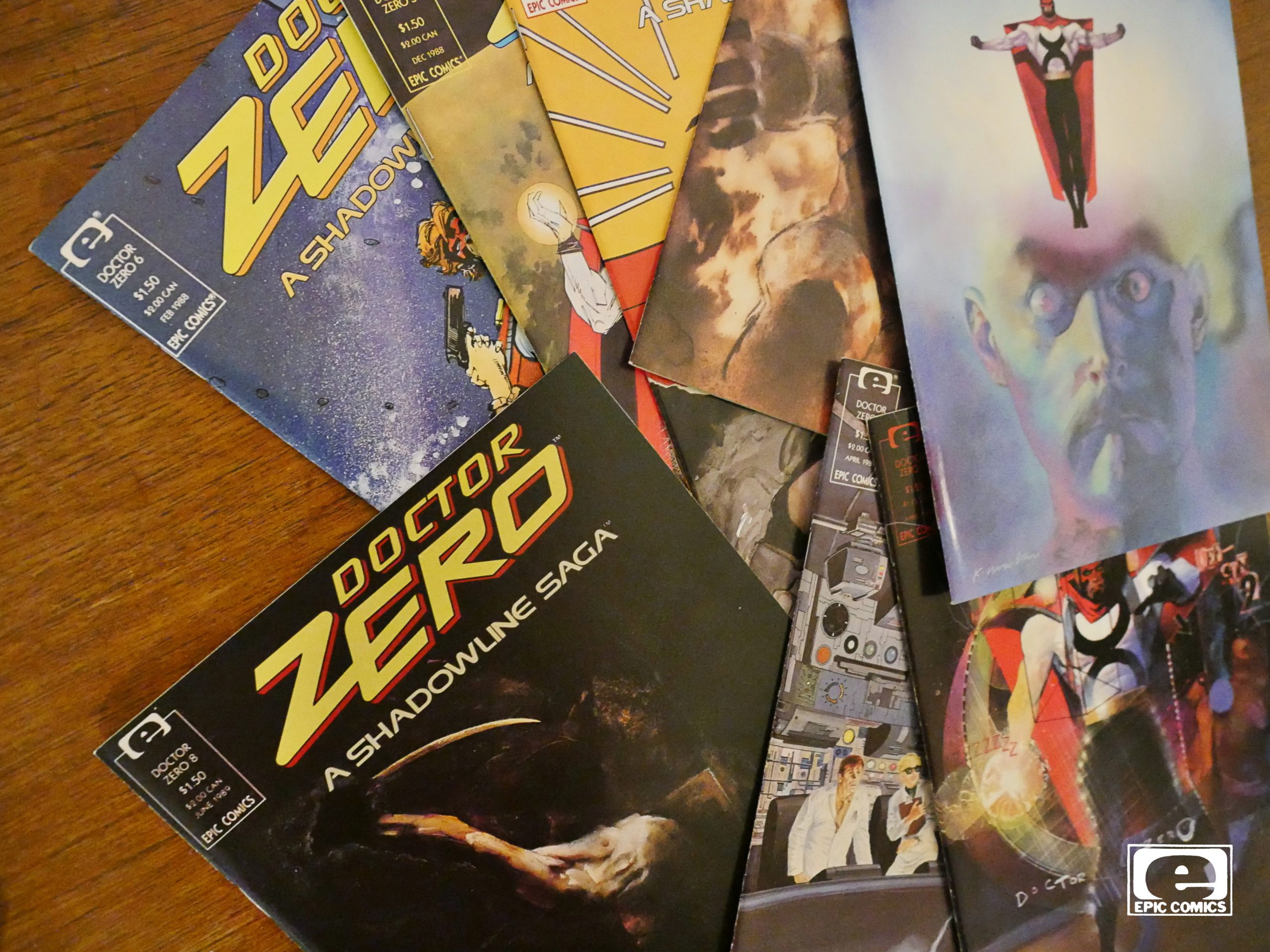
Doctor Zero (1988) #1-8
by DG Chichester, Margaret Clark, Denys Cowan, Bill Sienkiewicz and a bunch of people
Marvel was big on trying to establish new super-hero universes around this time. They’d done New Universe a couple of years earlier (to no great success), and now they tried to do one under the Epic banner…
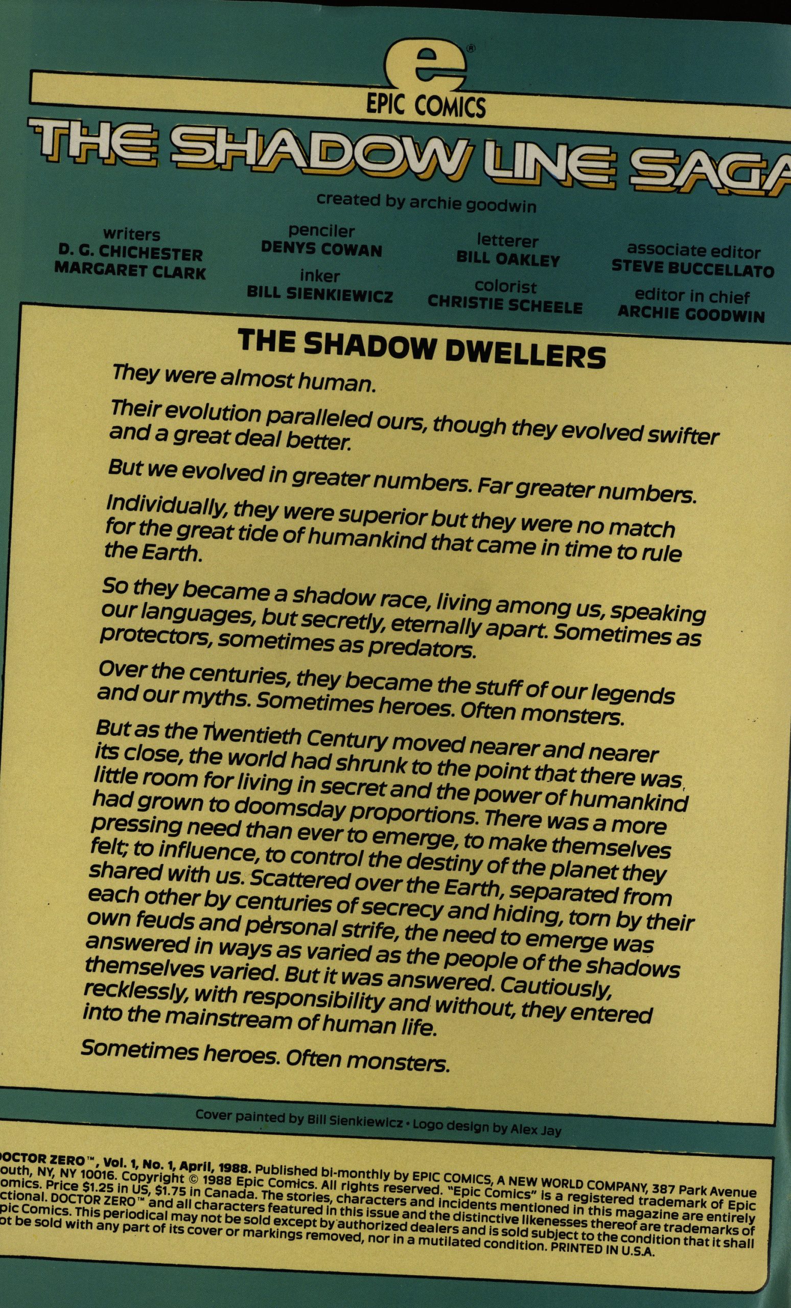
I do not know why. The copyrights here are assigned to “Epic Comics”, by which I guess Marvel owns this stuff? Archie Goodwin is credited with being the creator, but doesn’t seem to be involved with actually making the books.
I love both Denys Cowan and Bill Sienkiewicz, and they have styles that work well together, I think. It’s got a dark, stark quality to it, while being eminently readable. But when I saw them in the credits, I immediately thought “uh-oh; they’re not going to stay on something like this for long”. Let’s see whether my guess is right.

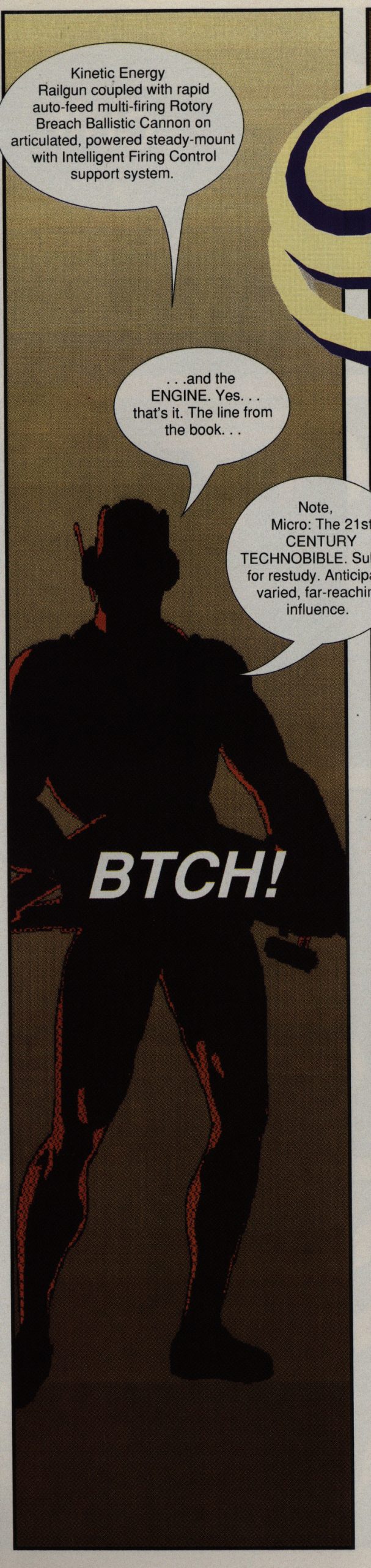
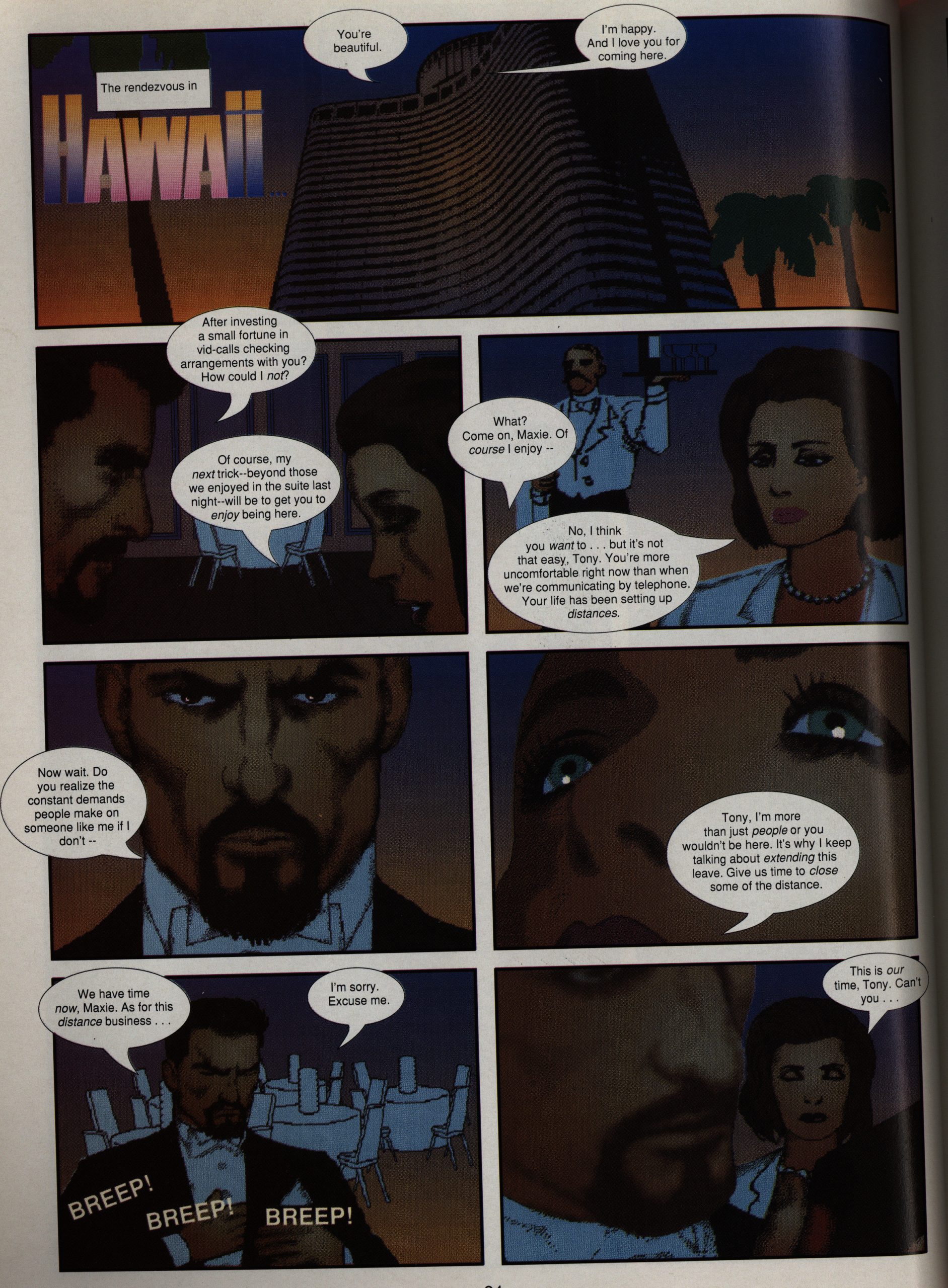
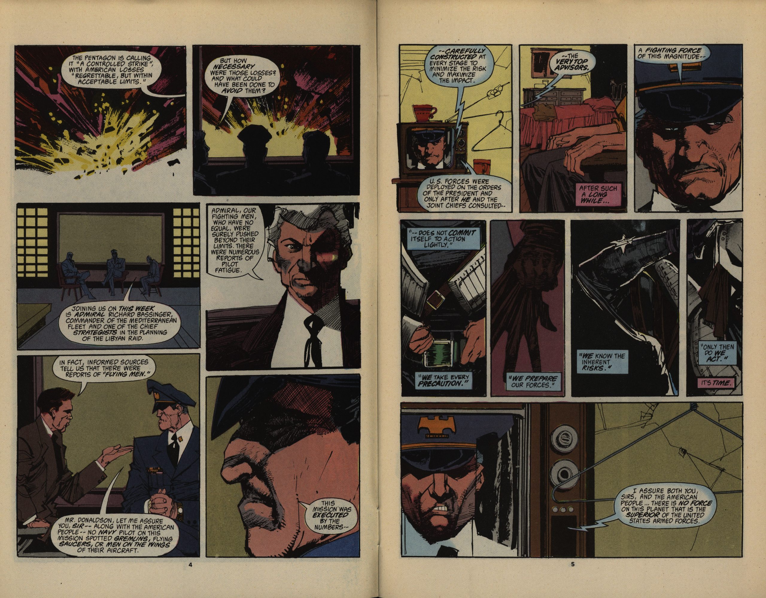
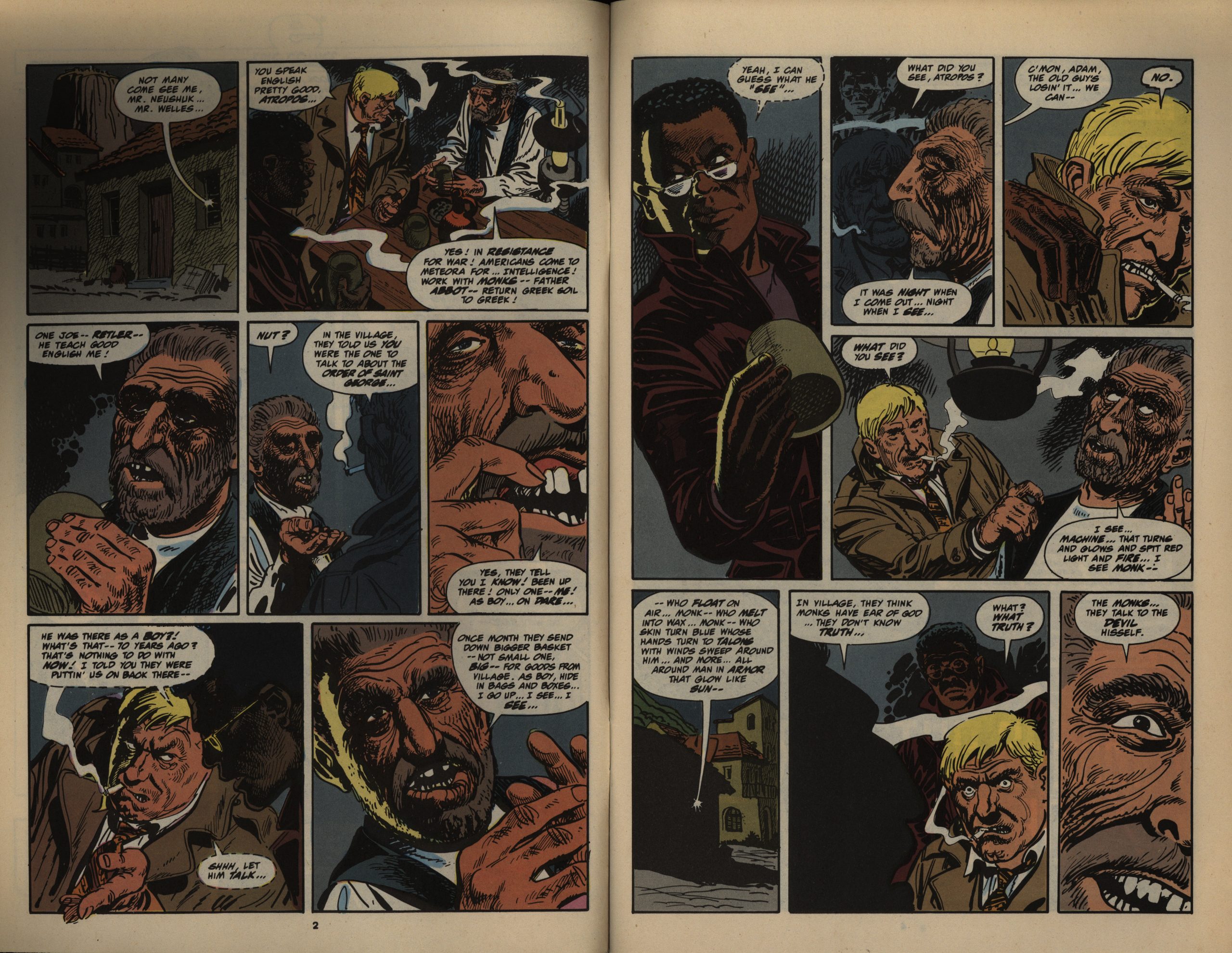
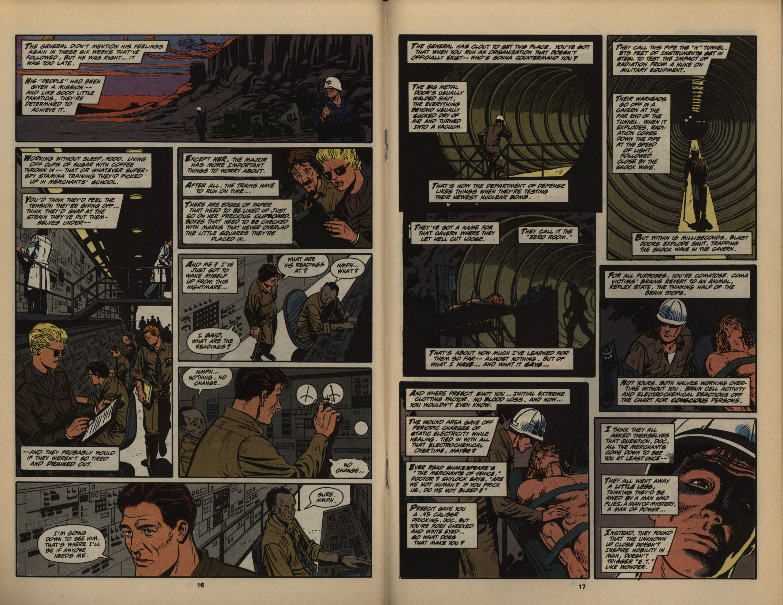
It’s a very 1988 comic: It’s a post-Dark Knight comic, using some of the less overtly confusing storytelling techniques. I’m not going to do an exegesis on the concept of this comic here, but it’s about a separate super-human species that has lived on Earth forever, and they’re now dressing up like super-heroes to save the world.
OR ARE THEY.

Beyond the great artwork, that’s the pleasure in reading this book comes from. Everything is slightly ambiguous, and we don’t know whether this Doctor Zero guy is the hero here or not. It’s not a Deep And Important Comic or anything, but as these things go, it’s a good read.
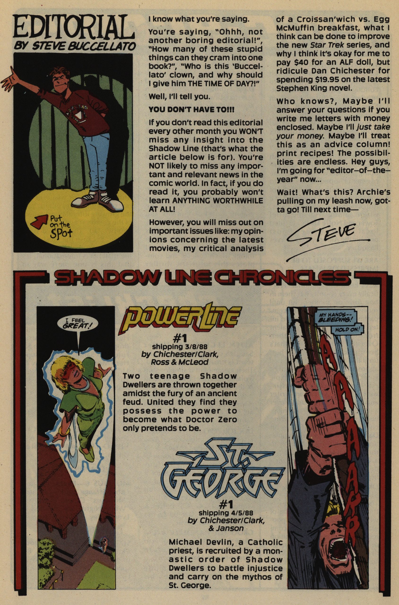
The editor here is Steve Buccellato, and he does these editorials across the three Shadowline comics.
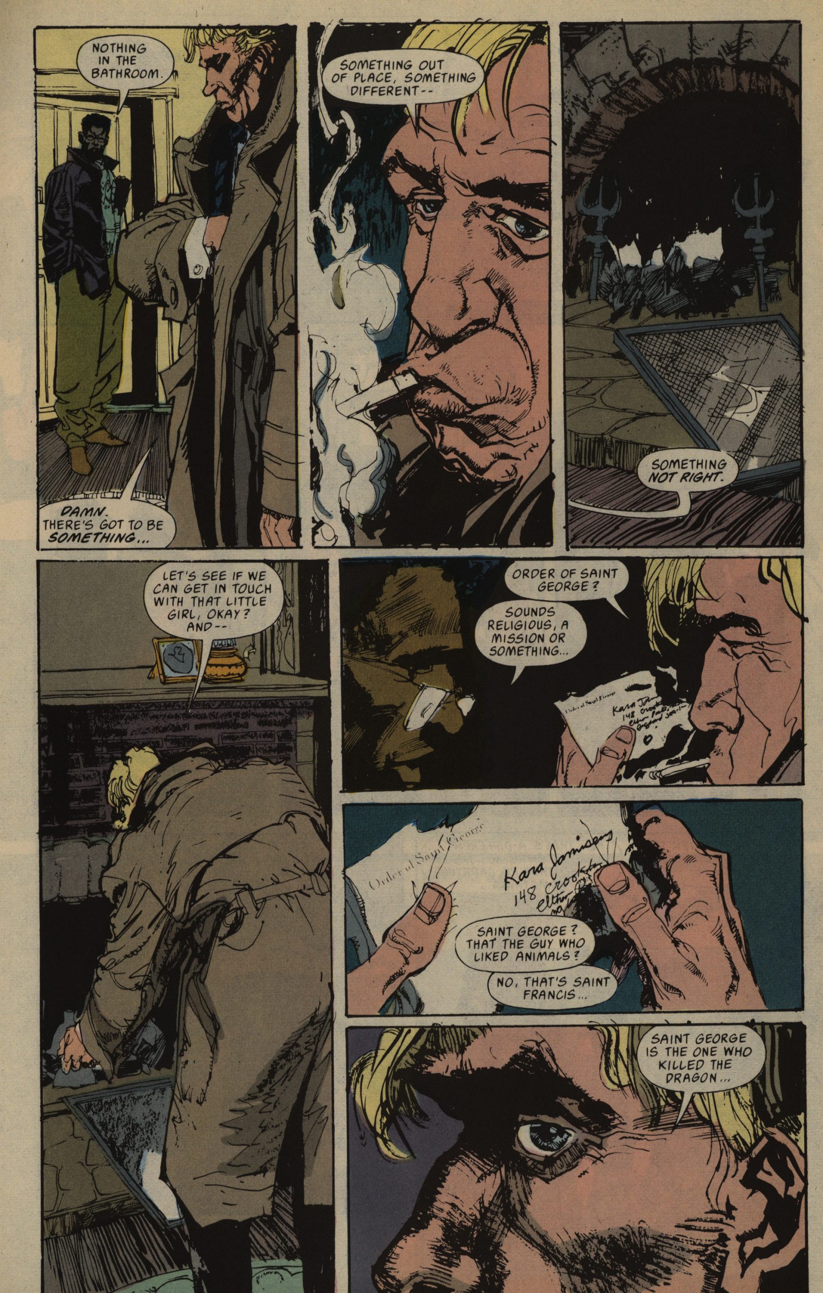
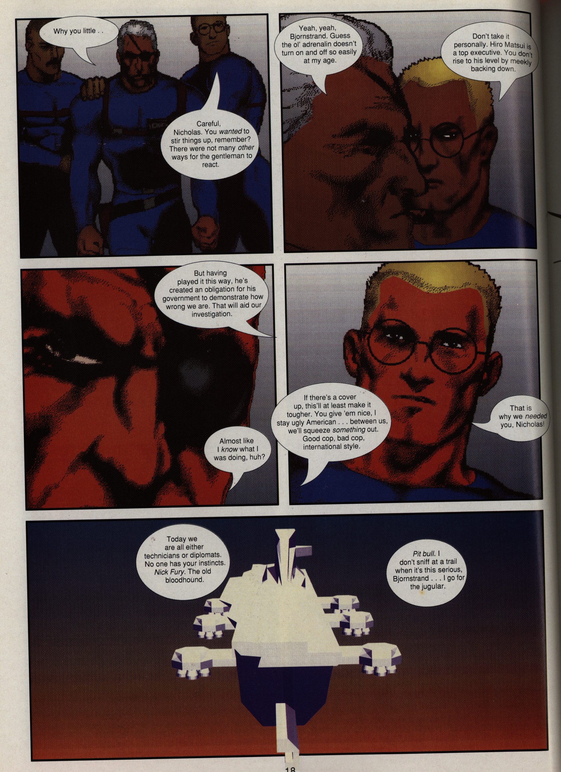
While I’m going to read the other two books the next few days, I was slightly worried that this one was going to be incomprehensible without reading the other two books simultaneously. But, no, there’s very little overt crossover action going on. We just get a mention of “St. George” here and there, especially in this sub-plot where some journalists try to investigate all of… this…
But, basically, you don’t have to read the other books to understand this book.

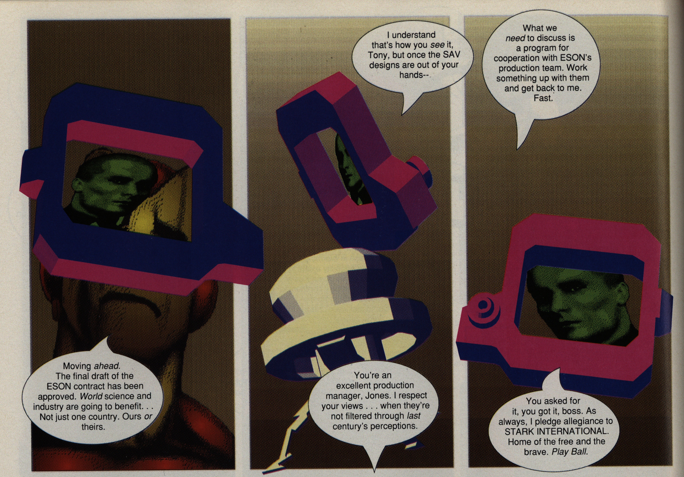
These are not “decompressed” comics. They pack a lot of story into each issue, mostly by these slightly oblique shorthand scenes. I think it works beautifully.

Tsk tsk. Melting the North Pole ice doesn’t make the ocean rise. Tsk.
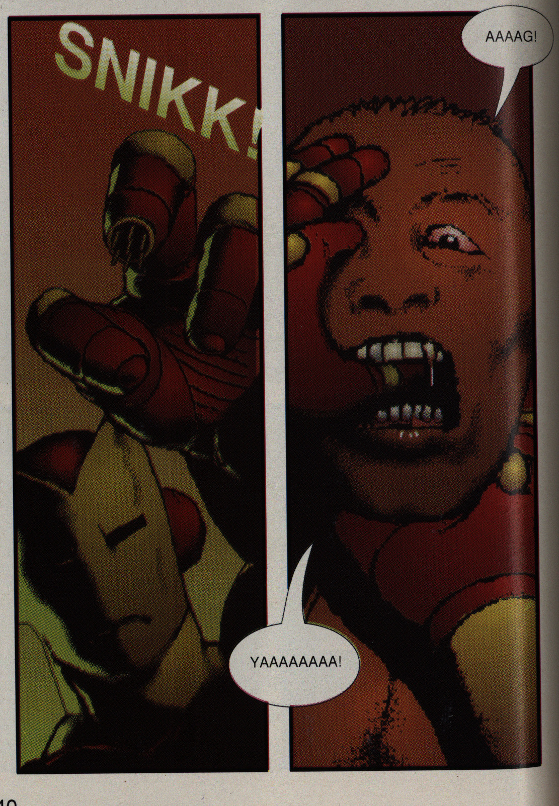
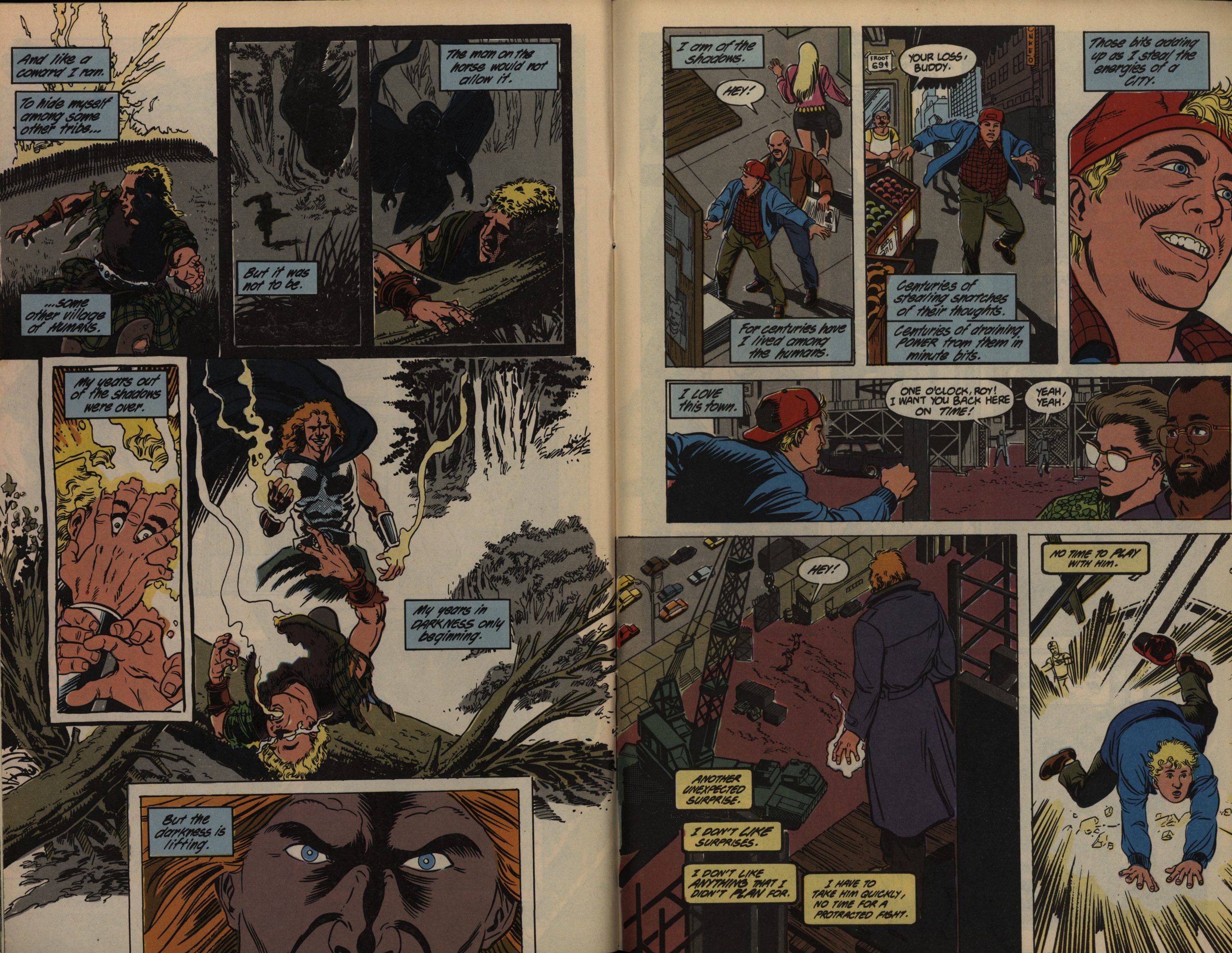
And as I guessed, Cowan and Sienkiewicz bowed out. Brett Ewins and Steve Dillon do one issue, and my interest dropped like a stone. It seems like they changed the storytelling approach a lot, and things are now totally straightforward. This isn’t helpful, because the plot itself isn’t really that clever once you clearly know what’s going on.
Veteran Dan Spiegle does the sixth issue. I do like his artwork, but the issue is a straightforward agent/super-hero bash fest. While it’s fine in and of itself, it’s not particularly interesting.
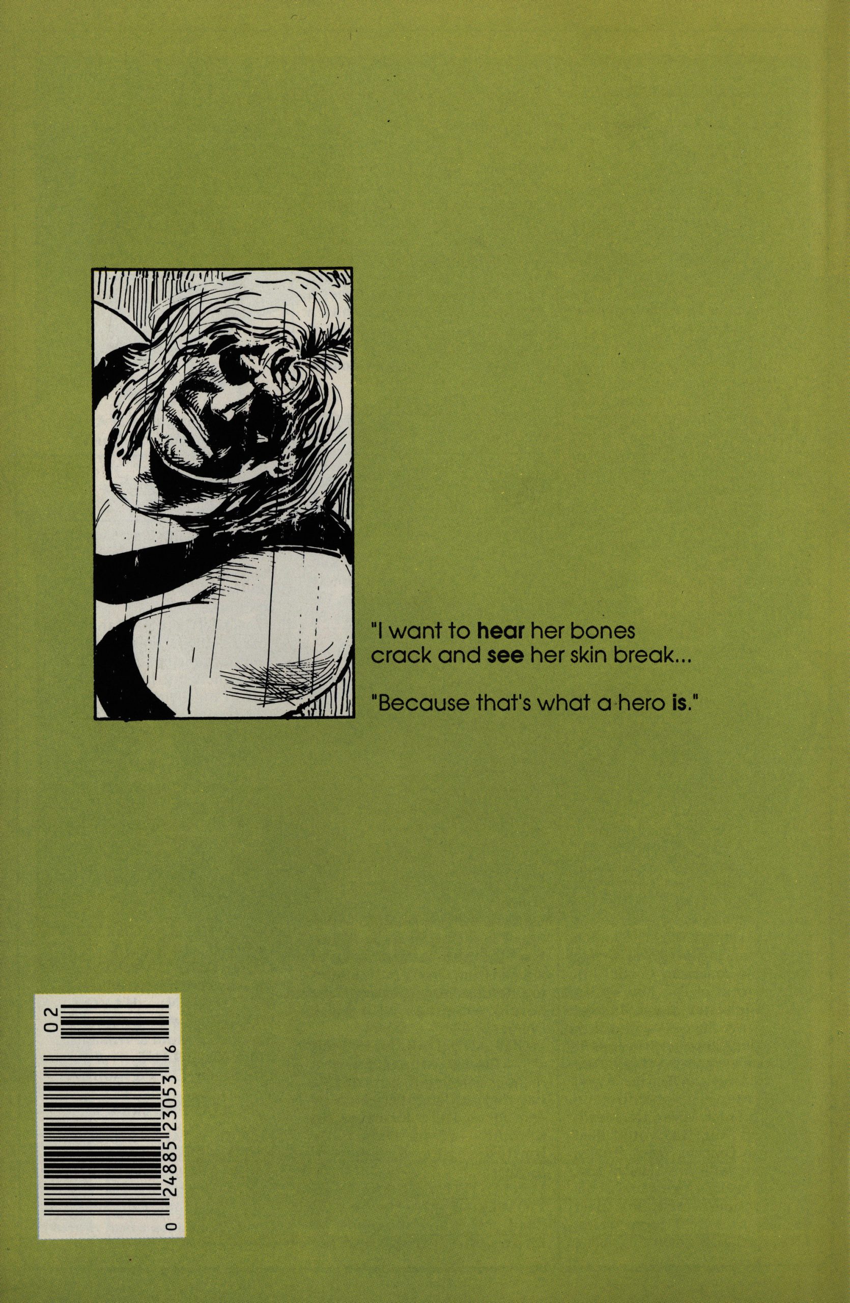
Perhaps they try to make things interesting by adding these back covers.
Hm… Whut? Is there supposed to be eight issues of this? I only have six! Crisis! I guess I’ll have to buy the last two issues and edit this later…
Edit! It’s now five months later, and I’ve done (almost) all the other comics, so I now return to the final two issues:
Artwork by Dan Spiegle again, and it’s pretty gnarly.
However, the writing is a turgid mess. It’s the issue where we learn all the deep secrets of Doctor Zero, and they turn out to be tedious as fuck.
The final issue is by Chuck Dixon and Gary Kwapisz, and it’s… better? The artwork is serviceable, and as single-issue setups to a fight scene (and then killing off the character introduced), it’s fine.
End of edit!
But what did the critics think?
Jeff Gelb and Brad Munson write in Amazing Heroes #142, page 64
BRAD: Ah. Shadowline. The new
saga from Epic—or Epic from Saga,
I lose track after a while. Well.. .the
Sienkiewicz covers are nice. And the
logos are cute. And those are just
about the nicest things ‘I can say.
JFÆT: I’ll agree on the logos.. .but
I don’t like Bill’s little chicken-
scratching letterings of who the
characters are. I think it’s pretty
obvious who the characters are, except
maybe Power Line.
BRAD: Actually, I think the covers
are symbolic of a lot of the stuff going
on in these books. They’re based on
a marketing impulse instead of a
creative impulse—an attempt to create
a Sienkiewicz/Miller/Mazzucchelli
sort of Dark Knight/Batman Year
One/Elektra: Assassin-style Universe
that can sell to that same audience.
Getting Sienkiewicz to do the covers
was part of that strategy.
JEFF: He inked one of the books, too.
BRAD: The problem is, once you get
past the covers the whole thing
crumbles. The story is your basic
“hidden race” concept, and it’s been
done to death. I mean, how many hid-
den races are there in comics? This
is like an Eighties version of the
Inhumans.
JEFF: .or you could substitute
“mutants” for “hidden race.” What it
really is is a pretty package that is less
than the sum of its parts.
BRAD: yup. Very pretty wrapping,
but at the center… nothing’s there.
JEFF: Exactly.
BRAD: The one minor interesting
thing in here might be the Doctor Zero
premise—that he is actually an evil,
anti-human madman who is posing as
a great hero. Why? Who knows? But
still..
JEFF: Yeah, of the three books only
Doctor Zero has a premise that made
me want to go back for the next
issue… but even there, Doctor Zero
owes a lot to Ozymandias of Watch-
men—the concept ofa guy who is all-
powerful, and who, at this point, may
be a good guy or a bad guy. Every-
body else says he’s a bad guy, but I’m
not sure he’s proved that yet.
Oh, now I’m not looking forward to reading the other two books.
Cowan was interviewed in Amazing Heroes #163, page 38
AH: What was your experience like
working on it? It doesn’t sound like
it was a great one.
COWAN: In fact, it was a great one.
I like Dan Chichester and Margaret
Clark a lot, plus I was given pretty
much free reign to do whatever I wan-
ted to on it. The experience vvas defin-
itely rewarding in that way. They’re
very nice people and talented writers.
And, I got to work more with Bill,
which was definitely a gas.
Doctor Zero has never been collected or rereleased. Even stranger, I can’t find any reviews of it on the webs, either, so I guess nobody remembers it fondly. Perhaps if Cowan and Sienkiewicz had stayed on it, it would have been a more attractive proposition for a collected edition.