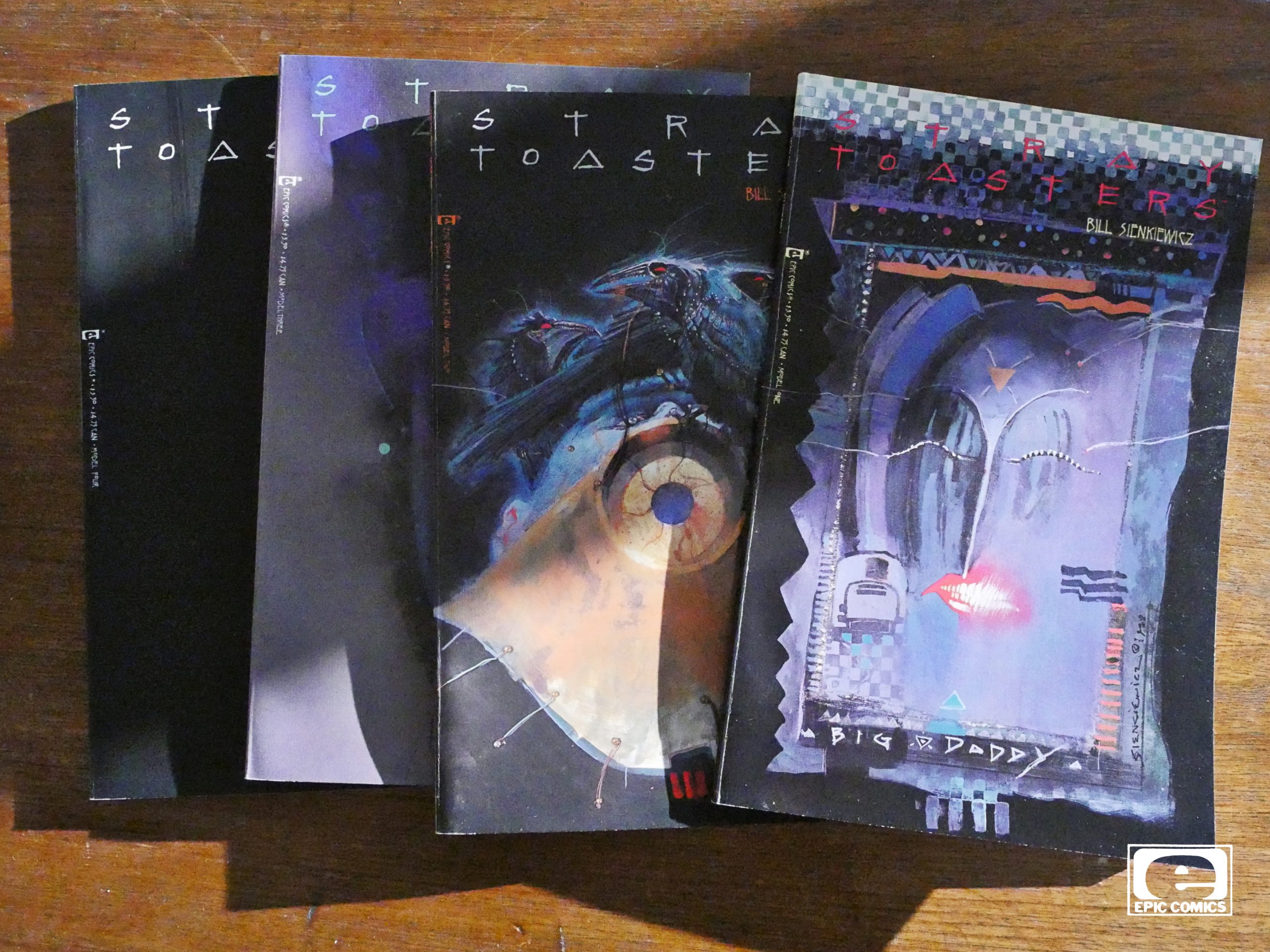
Stray Toasters (1988) #1-4
by Bill Sienkiewicz
For some reason or other, I only had the three first issues of this back in the 80s: I could never find the fourth and final issue. So while I was quite taken by it all, I never got to see how it ended.
Until now.
I believe this is the only longer thing that Sienkiewicz has written himself, which is a shame, because it’s a blast.
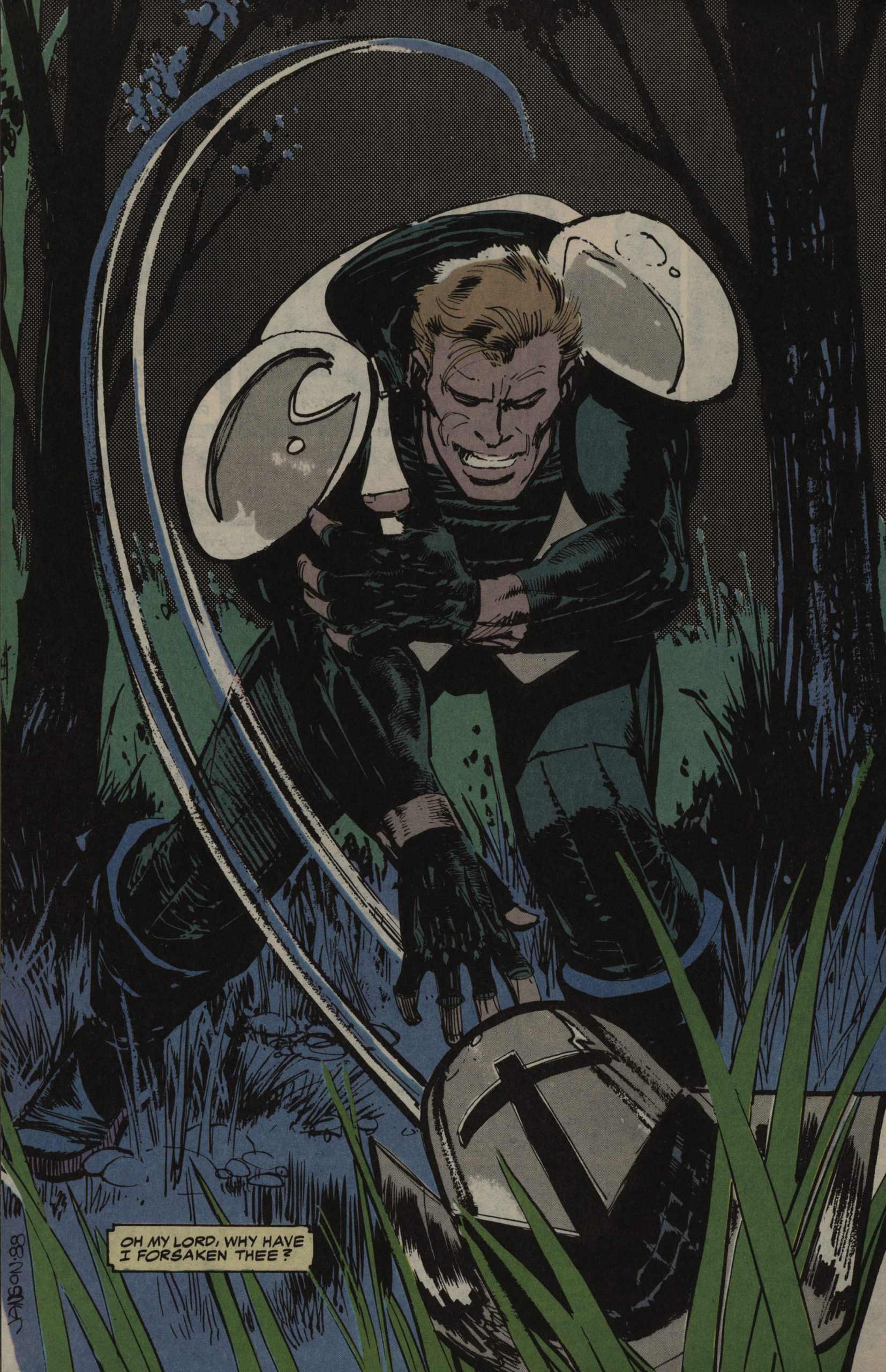
This is printed in the “prestige” square bound format, printed of 48 shiny pages. Sienkiewicz’ artwork is reproduced wonderfully here; all dark and spooky. Sienkiewicz also integrates a some electronic circuitry into the artwork, but the repro camera picks it all up and makes it look unnaturally natural.
It’s mostly arranged around a twelve panel grid, which other artists had been experimenting with before.
But Sienkiewicz will explode it at the drop of a hat, sometimes to wonderful effect.
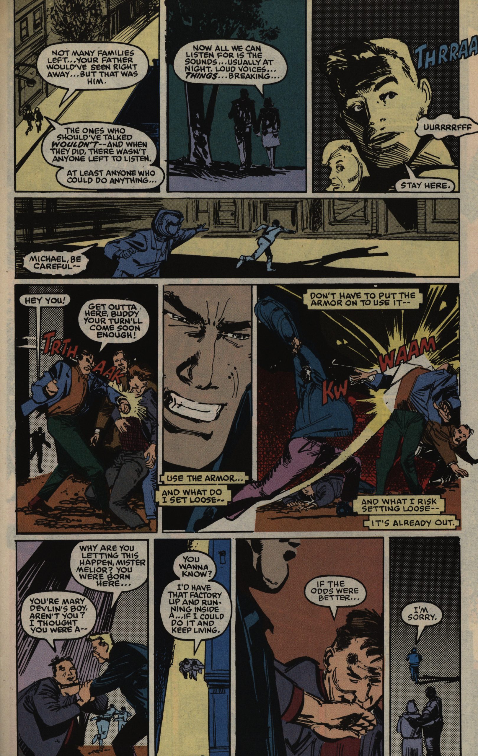
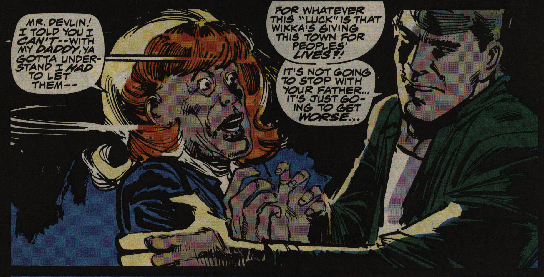
Oh, yeah, the story… It’s structured as a serial killer noir thing, with a private dick (sort of) and dames. And it is a real mystery, too: There are reveals, but that’s not really the point of it all: I mean, there’s not much detecting going on; everything just sort of happens to tie together instead. But I guess that’s also a noir trope.
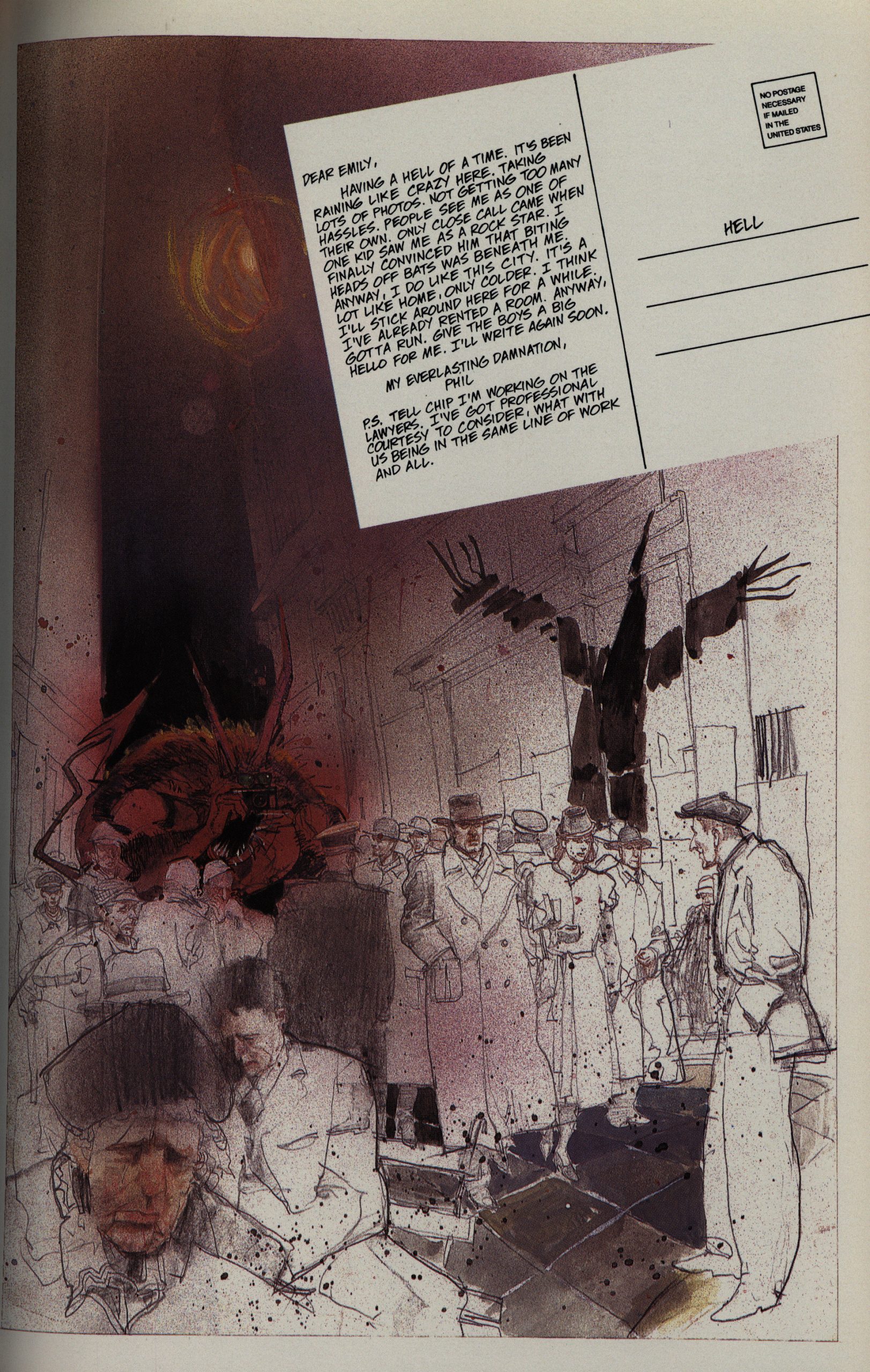
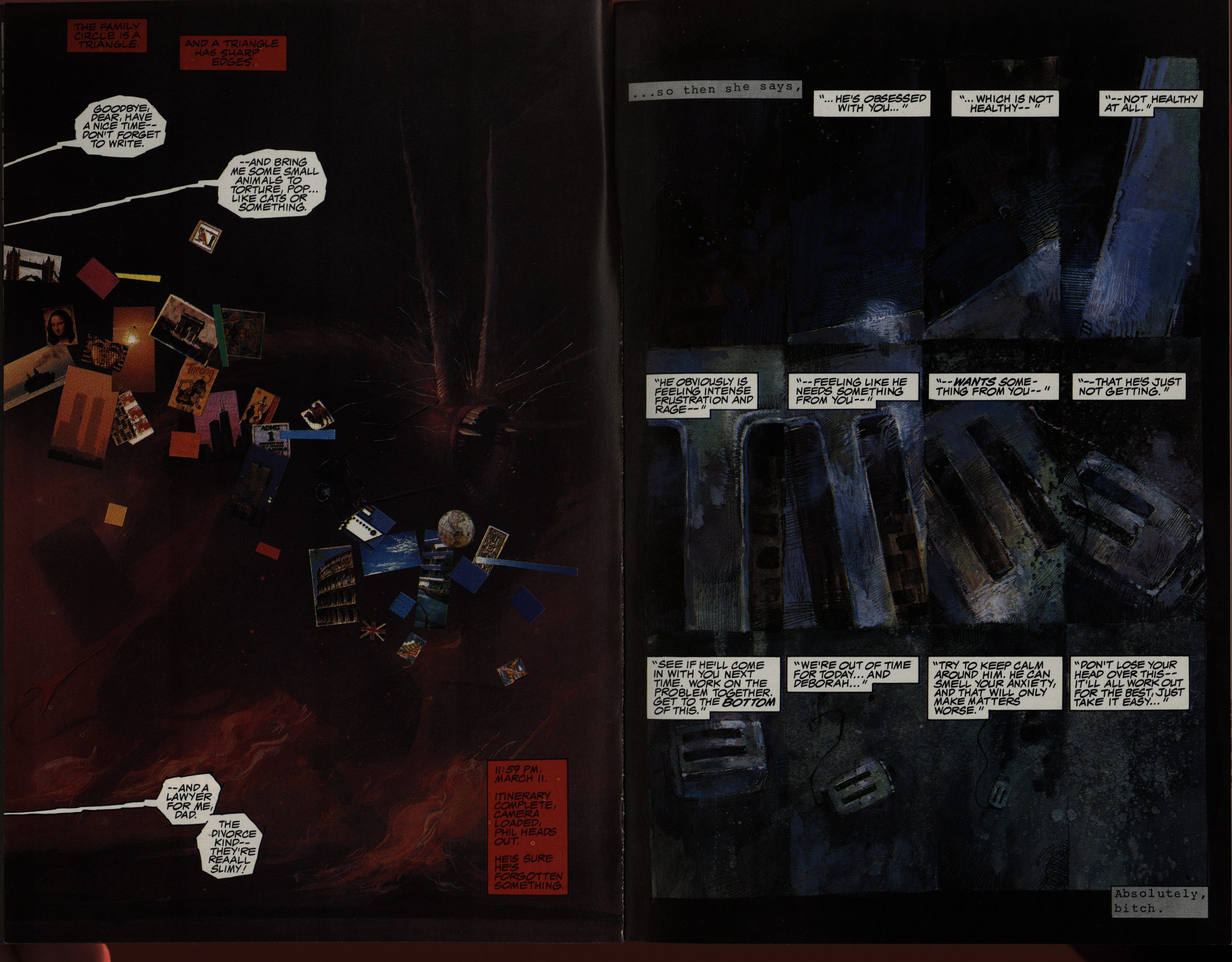
What isn’t a noir trope is how much humour there is in here. Much of it comes from these postcards the devil is sending back to his family.
I really want that bedroom!
You’d expect everything to be all allegorical in a work like this, but there’s isn’t that much. That guy’s got flowers coming out of his mouth, and that’s easy to interpret, but beyond the fabulously imaginative artwork, it’s really mostly quite straightforward.
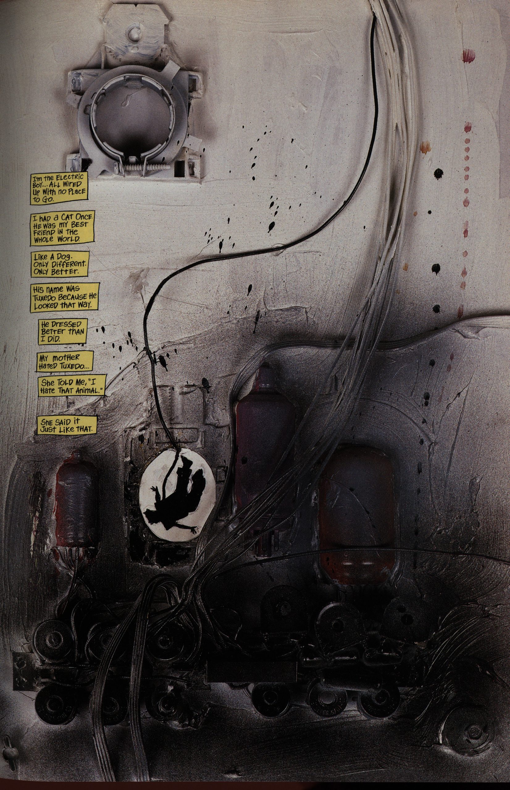
Well, OK, not totally, but that’s a nice… machine? Makes me wonder whether Sienkiewicz was scouring the city dump or whether he was just painting the appliances in his own kitchen.
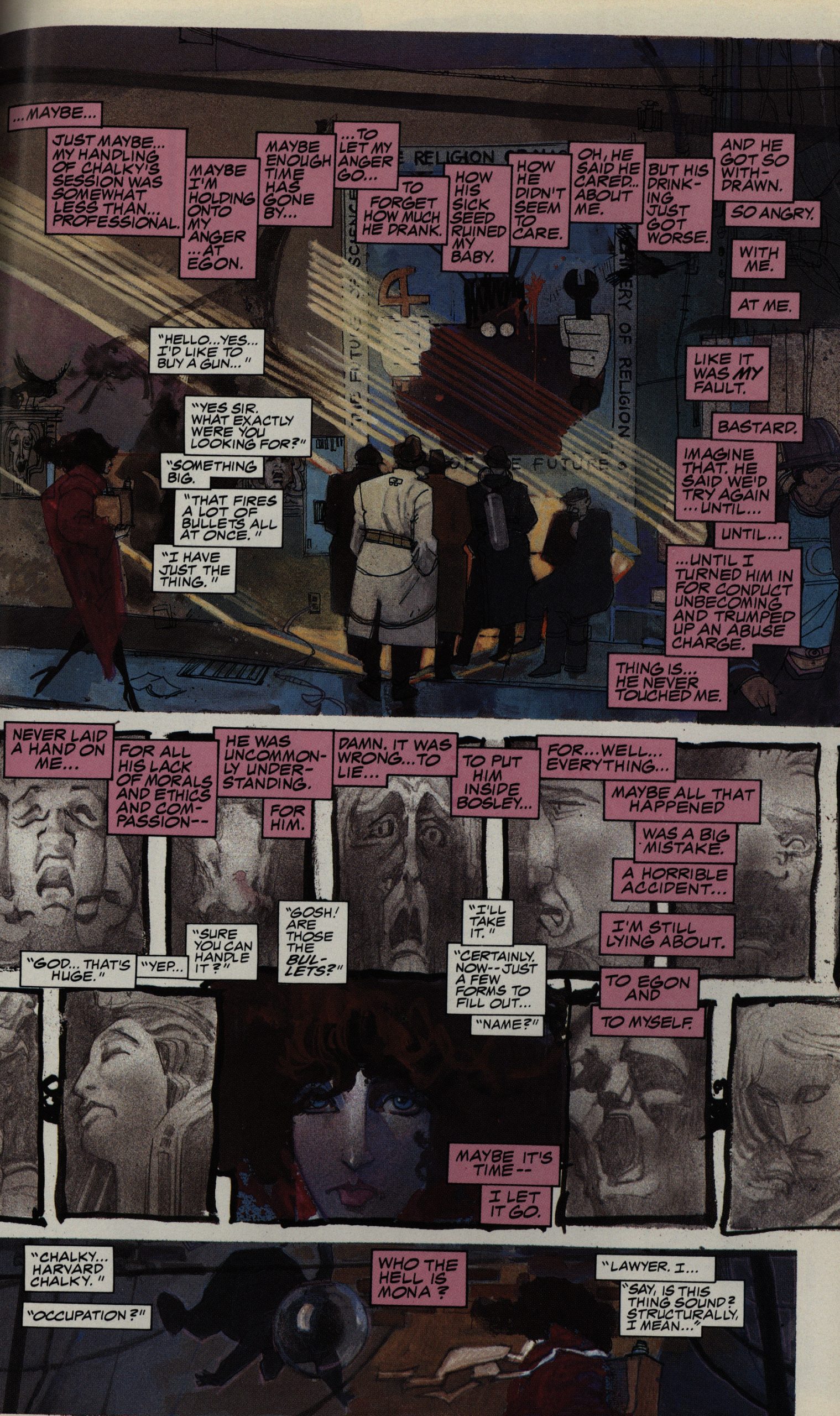
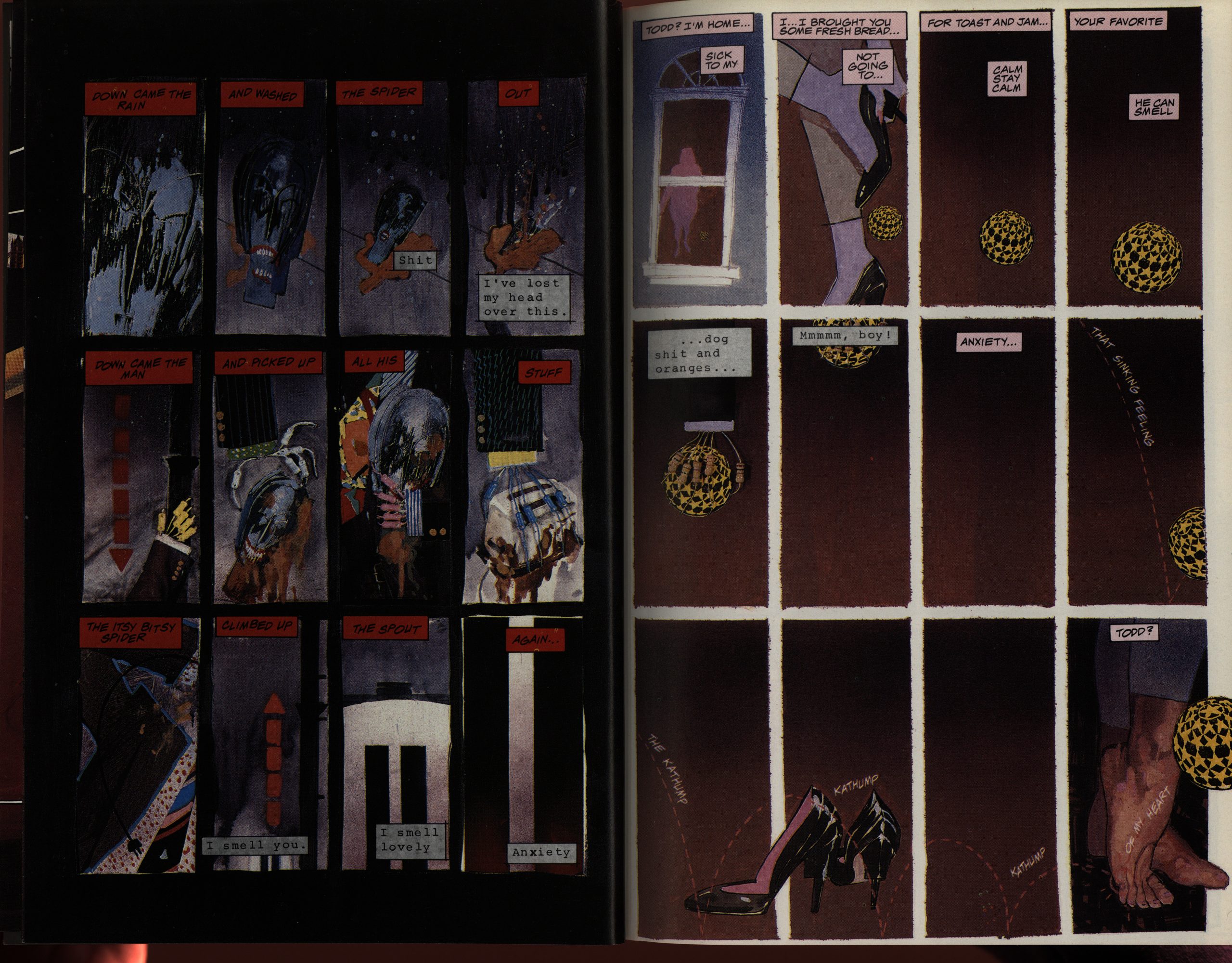
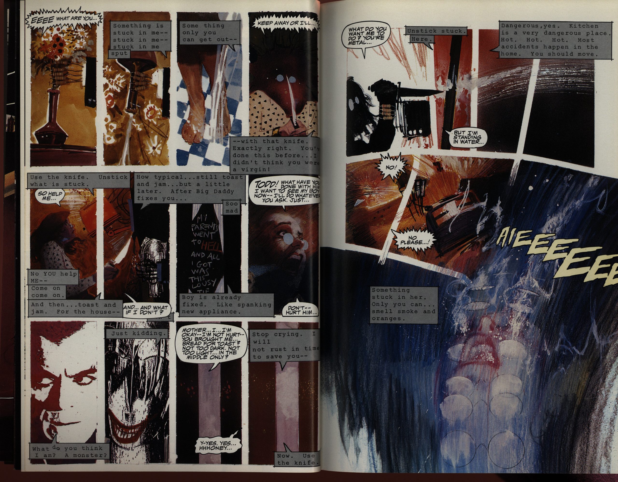
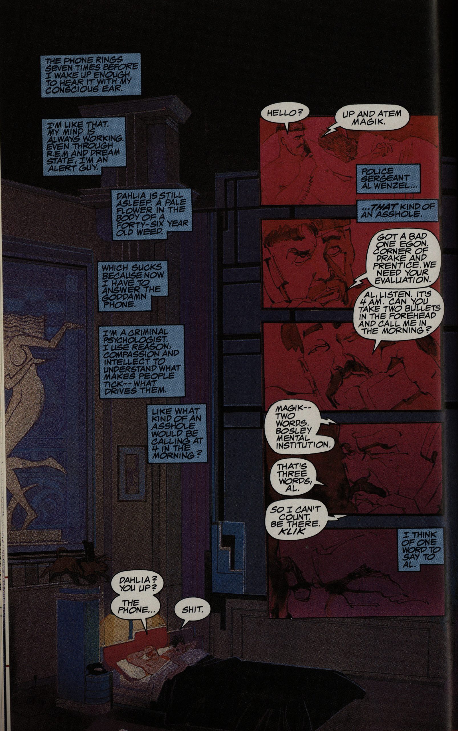
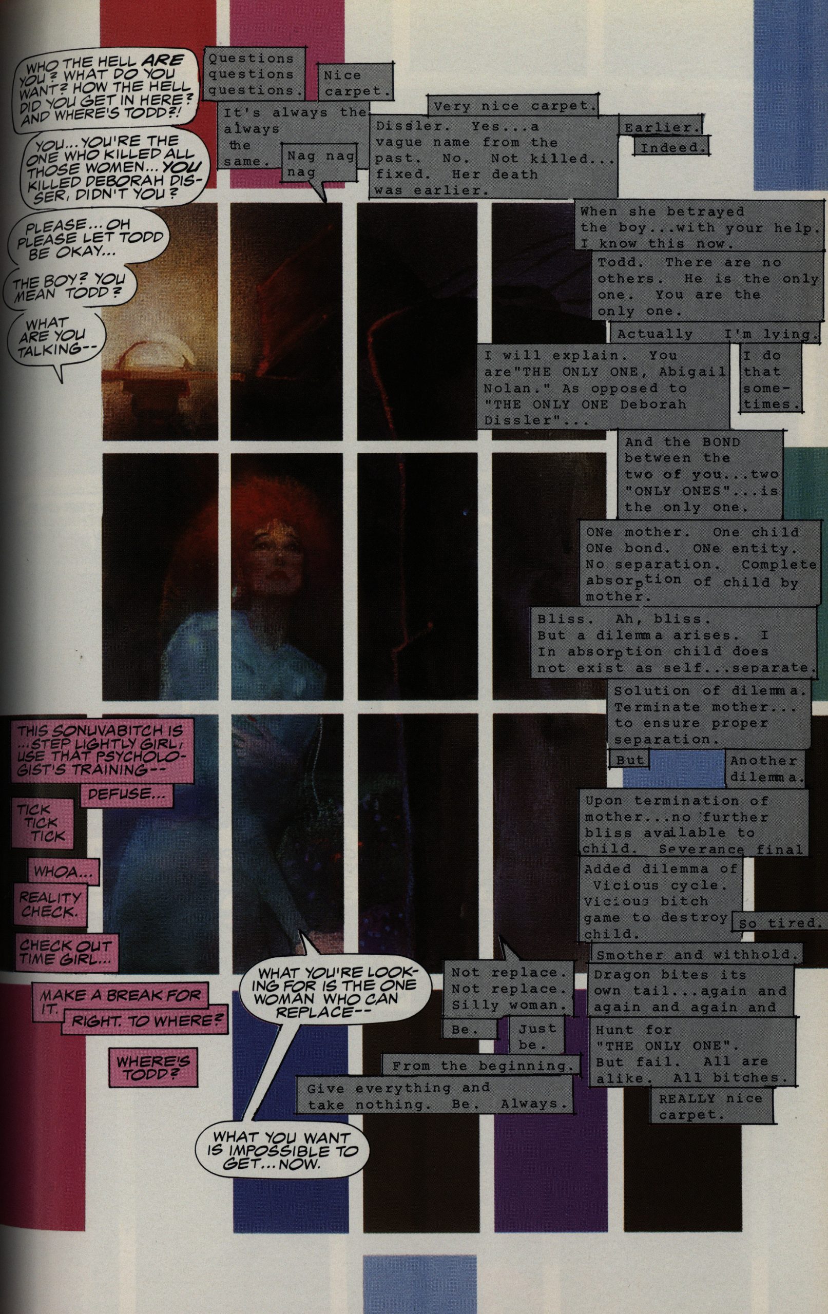
The major storytelling mode used here is having a multitude of voices, set apart using different colours. It’s something that had been popularised since the mid-80s in US comics, but I don’t think I’ve seen it used as aggressively as Sienkiewicz does here. And it totally works: What could have been a confusing mess is never really bewildering. Sure, we’re not always told what’s going on immediately, but it always somehow becomes clear after a page or two.
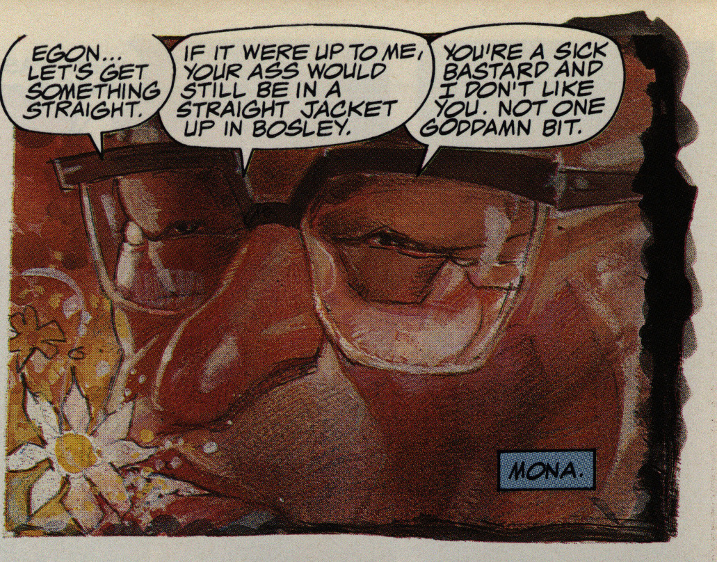
However, Sienkiewicz sometimes does the clearing-up and tying-up in a somewhat hamfisted way: Characters will semi-“as-you-know-Bob,-you-were-hospitalized” each other as the way to let the readers in on details, and that feels sloppy. But it’s a shortcut, I guess: These 200 pages are jam-packed with stuff. It’s eminently readable, but it’s dense, and having characters explain to themselves what their backgrounds are is… easy.
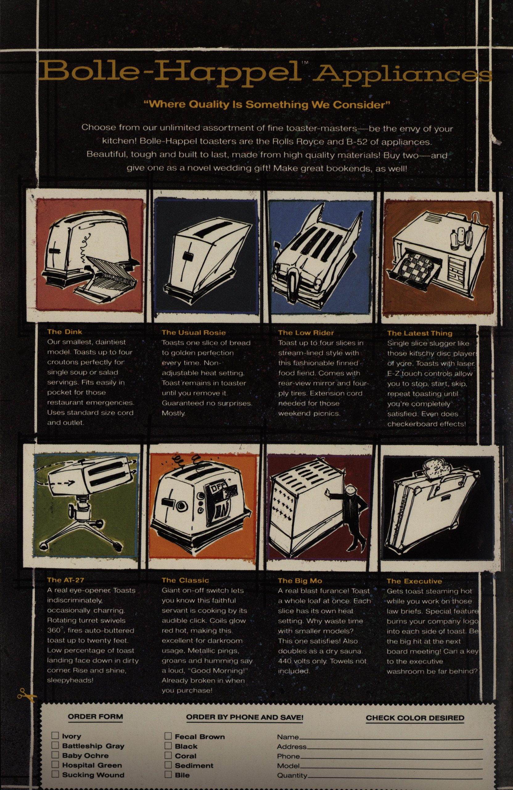
“Where quality is something we consider”. Love that slogan. But Sienkiewicz uses even these four back covers to tell a story: The rise and fall of the Bolle-Happel company in four chapters. It’s just way and beyond. These four objects are just a joy to read.
I love the shrunken twelve panel grid here with the half conversation/half interior thing going on here.
The final cover is black on black, but the story has an old-fashioned happy ending, which I totally didn’t see coming.
So… did Sienkiewicz put everything he had into this one story (about families, I guess), and then wanted to go back to just doing artwork? It’s really weird: I can’t think of anybody in his position who’s done that. I mean, after doing one highly artistically successful long work like this, completely going back to illustrating other people’s stories.
Here’s from an interview in The Comics Journal #107, page 79
SIENKIEWICZ In the past 1 knew where
my bread was buttered basically, and I was
afraid to write. Writing stuff in my sketch.
books and working On “Slow Dancer,” I
thought for sure I was going to get laughed
out of the business. I think was also afraid
I didn’t have anything to say or I wasn’t sure
how to say it. But what realized was there
are certain stories that I want to tell, cer-
tain images that want to get down. When
I did “Hit It” in Moon Knight, a story Doug
[Moenchl did that was a framework in
which I could go in and play around, it
scared the living piss out of me. I found out
I could get exactly the effects I wanted. It
was like, “Wow! It could feel like this? I could
do this again?” I couldn’t believe it, the feel-
ings that came over me.
Now I’m trying writing because I’ve got
ideas I want to do, and I feel there’s only
so much I can do with just doing visual
images for other people’s stories, as much
as I love it, it’s still not 100 percent mine.
SANDERSON: What is “Stray Toasters”
about?
SIENKIEWICZ: It’s still too fetal to discuss
in depth. I’d like to do “Stray Toasters” as
a graphic novel. I’ve got II pages of it drawn:
the initial meltdown sequence.
SANDERSON: The anti.SPie1berg sequence.
SIENKIEWICZ: Yeah. It’s a good image.
I have a particular antipathy towards cute
little things, which the toasters are. I don’t
trust ’em. I find people fall prey to that stuff
way top easily.
Robert Stanley Martin writes in The Comics Journal #299, page 134
Bill Sienkiewicz was easily the most visually striking
and idiosyncratic adventure cartoonist of the 1980s.
He came into his Own when he eschewed the house
styles of Marvel and DC and embraced a multitude
Of visual approaches in his work. And he generally
mixed them up in the same project; whatever struck
him as appropriate for a given scene or panel was what
he used. It often seemed there were more art styles on
display in his books than one would find on a tour of
the New York gallery world, but Sienkiewicz almost
never failed to make them work. Neo-Expressionism
had come to comic books, and triumphantly.
Stray Toasters, first published in 1988, was the only
extended effort that he wrote as well as illustrated. He
tried to give the Story the same eclecticism he brought
to his art — it’s a hallucinatory mishmash Of detective
fiction, monster movies and dream narratives, with
bits of media satire and absurdist humor through-
out.[…]
However, no matter how often the story falters, the
art is nothing less than remarkable. Every scene has
its own distinctive look, with the rendering running
the gamut from watercolor and pencil to found-object
collage. Some sequences are so visually eloquent that
they almost don’t need words, like the scene in chapter
one where Abby takes Todd into her home, or Dahlia’s
whacked-out cathartic ritual in chapter two. Sienkie-
wicz was a tremendous cartoonist and illustrator in his
prime. Even when the libretto is gobbledygook, his
images soar.
Peter Sanderson writes in Amazing Heroes #151, page 22
On previous comics projects,
Sienkiewicz has almost always
worked in collaboration with
writers. Apart from a short story,
“Slow Dancer,” Stray Toasters is the
first comics project to be published
Another mom bites the.dust in Stray Toasters.
that Sienkiewicz has written him-
self. It is a work of science fiction,
but it is not the kind of adventure
fantasy familiar to readers of super-
hero comics. Stray Tbasters is, in-
stead. a psychological thriller more
concerned with exploring the dis-
torted psyches of its characters than
in staging super-powered battle
scenes. “I’m not so much concerned
with people who rip stars in half.
I’m going completely to the other
end. Stray Toasters is going down
into a dark little microcosm, the
family unit. Y/hat you start with is
a cancerous family unit that grows.”
On. the surface Stray Toasters
takes the form of a thriller and a
murder mystery, but the whodunit
aspect of the plot is not really the
point of the series.
“I don’t want to
come across as a mystery. A lot of
it [the solutions to the mysteries) is
almost telegraphed. There’s not go-
ing to be any major surprises, but
what I want to delve into is the
motivating factor. I really want it
[Stray Toasters] to be more an ex-
ercise in showing that beneath the
horror there exists a human being
regardless of shape, age. or sex.[…]
“I still feel I may look at all of this
at some point and I may cringe and
think. “This is Bill showing his guts
for everyone to see: But then I’ll go
on from there. I’m not done yet.”
“T M Maple” writes in Amazing Heroes #154, page 60
This is more or less the situation I
find myself in with Stray Toasters #1.
In many ways I find it both gripping
and thought-provoking. It is certainly
powerful and intense. But I don’t feel
I have the “big picture” yet.
Let’s see now. Deborah Dissler is
consulting a psychiatrist named Abby,
about Deborah’s problem with her
mate. (Or is it his problems with her?)
Arriving home after a session, Deb-
orah finds that her mate has been
eavesdropping on her session with
Abby and he’s not pleased—not
pleased at all. He is also, it seems,
a toaster. (Why is he a toaster? Or is
he a toaster, “really?’ ‘) I)eborah seems
concerned about her “boy,” Todd. But
the Toaster demands that he “unstick”
him and she is electrocuted in the
process.[…]
So, I’m confused.
For instance, this toaster business.
Is the Toaster really a toaster? At
times, this seems clearly metaphor-
ical: The Toaster talks about Deb-
orah’s mind as a blender, her heart as
a refrigerator, and of her “oven,” not
to mention his own “drill.” But then
at other times it seems so very literal.
Deborah tells the toaster: “you’re
metal,” and she is electrocuted by
him. The police say the murderer is
seven feet eight inches tall and weighs
six hundred pounds—and that he left
screws. and nuts (and oil stains)
“everywhere.” Just like Egon, we
readers would seem to have difficulty
distinguishing the real from the
unreal.
Dave Sim writes in Amazing Heroes #157, page 10
STRAY TOASTERS. 1 think Sienkiew-
icz might have gone too far. But that’s
the only way you that can find out
where far enough is. I’d also have to
wait to see how it is when it’s all done
because I didn’t think Elektra read
very well when I was reading install-
ments and then when I got a copy of
it from Frank [Miller] last time I was
[in California] and read it on the way
back, I was really really impressed
both with the storytelling and the story
being told. It was a real high water
mark for both Bill and Frank. I think
Stray Toasters may be the same way.
A definite vote for Stray Toasters.
Stray Toasters has been reprinted (several times, I think), and you can probably find a copy at a web site near you. Some reviews:
Sienkiewicz has spent much of the last decade producing commercial art, from album covers to movie storyboards, which is something of a loss for comics fans. At the same time, graphic novels don’t come much more ambitious, accomplished, or distinctive than Stray Toasters. Having set the bar this high, Sienkiewicz may have felt he was ready for new challenges elsewhere.
On the other hand, Sienkiewicz exceeds in storytelling, not only visual but literary as well. It helps greatly that there is a conventional, generic detective fiction wind its way through Stray Toasters. But this genre-piece is simply one track at play. Sienkiewicz offers regular excursions away from this well-trod literary path.
But some people found it confusing:
I appreciated Sienkiewicz’s fierce pursuit of a specific style and tone with Stray Toasters, but the result is a comic that doesn’t make for easy reading. Worse, taking my time and rereading confusing sections didn’t result in a greater understanding of what was really taking place. I like comics that require that I invest myself in order to fully appreciate the story, but comics that don’t reciprocate my efforts leave me disappointed and a little annoyed.