1988: The Silver Surfer

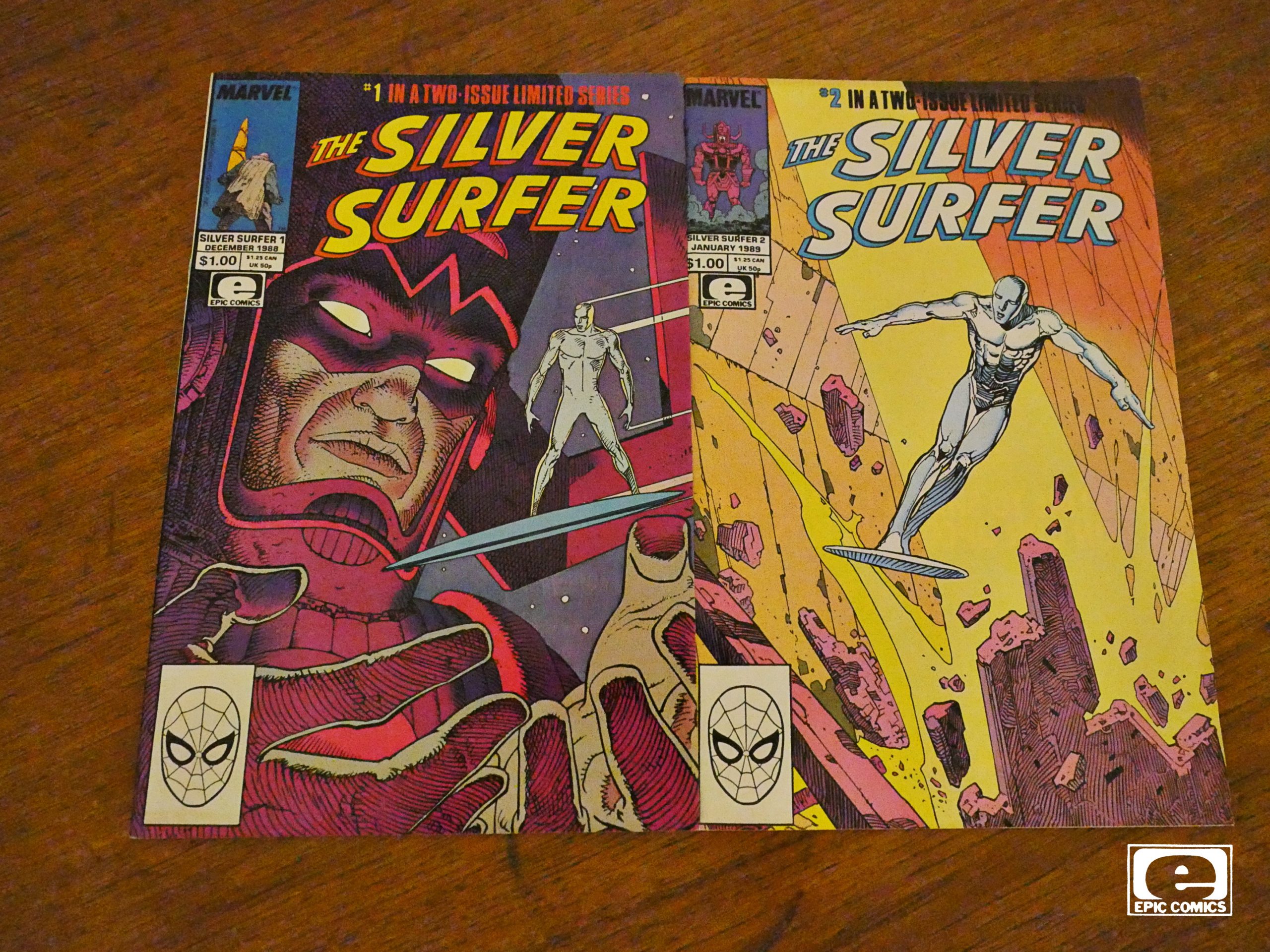
The Silver Surfer (1988) #1-2
by Moebius and Stan Lee

The reason for this book existing was allegedly Moebius seeing a preview of his Epic graphic novels in Marvel Age. He was intrigued by how his drawings reproduced on cheap newsprint, with mechanical colour seps.

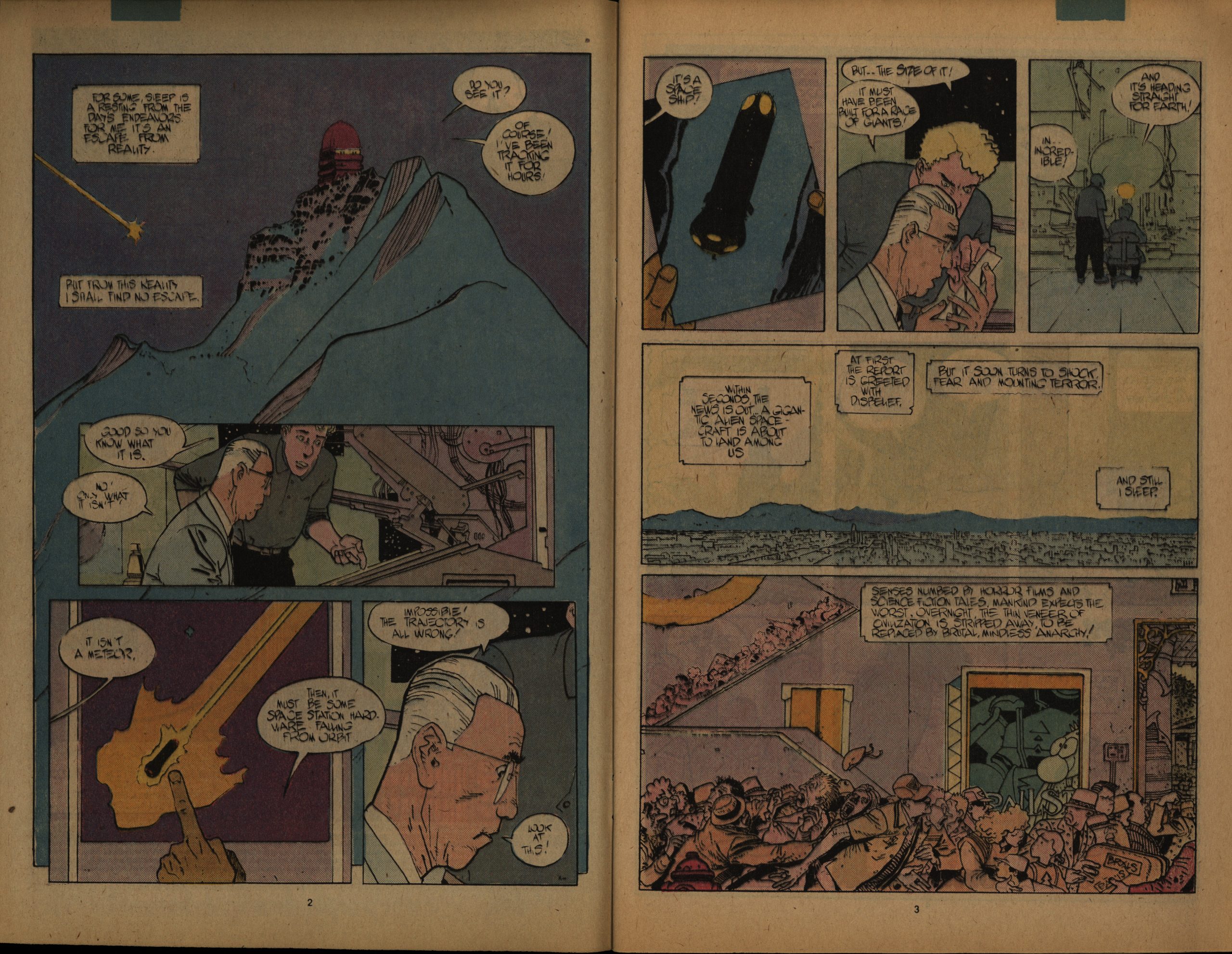
And so we have this, which is very newsprintey indeed.

Stan Lee is credited as the writer, but I’m not quite sure what that means. Perhaps that he did (some of) the dialogue? It’s lettered by Moebius himself, though, so perhaps he was only involved with some of the plotting?

There’s a preview in Amazing Heroes #145, page 208

” ‘Parable’,” says Stan Lee, “has more
religious overtones and more philosophy
than the graphic novel [John Buscema
is drawing]. There’s a TV evangelist
whose philosophy is very different from
the Silver Surfer’s. He has a daughter,
and the daughter gets involved with the
Silver Surfer. Galactus enters into it, too.
And the world turns against the Silver
Surfer; in the end, the Surfer has to make
the world hate him.
“I don’t want to say too much about
it because there are a lot of suprises. It’s
not the typical Silver Surfer. I think it’s
one of the best stories I’ve come up with
in years! It’s very dramatic, and I
absolutely cannot wait to see how Moe-
bius illustrates it!”

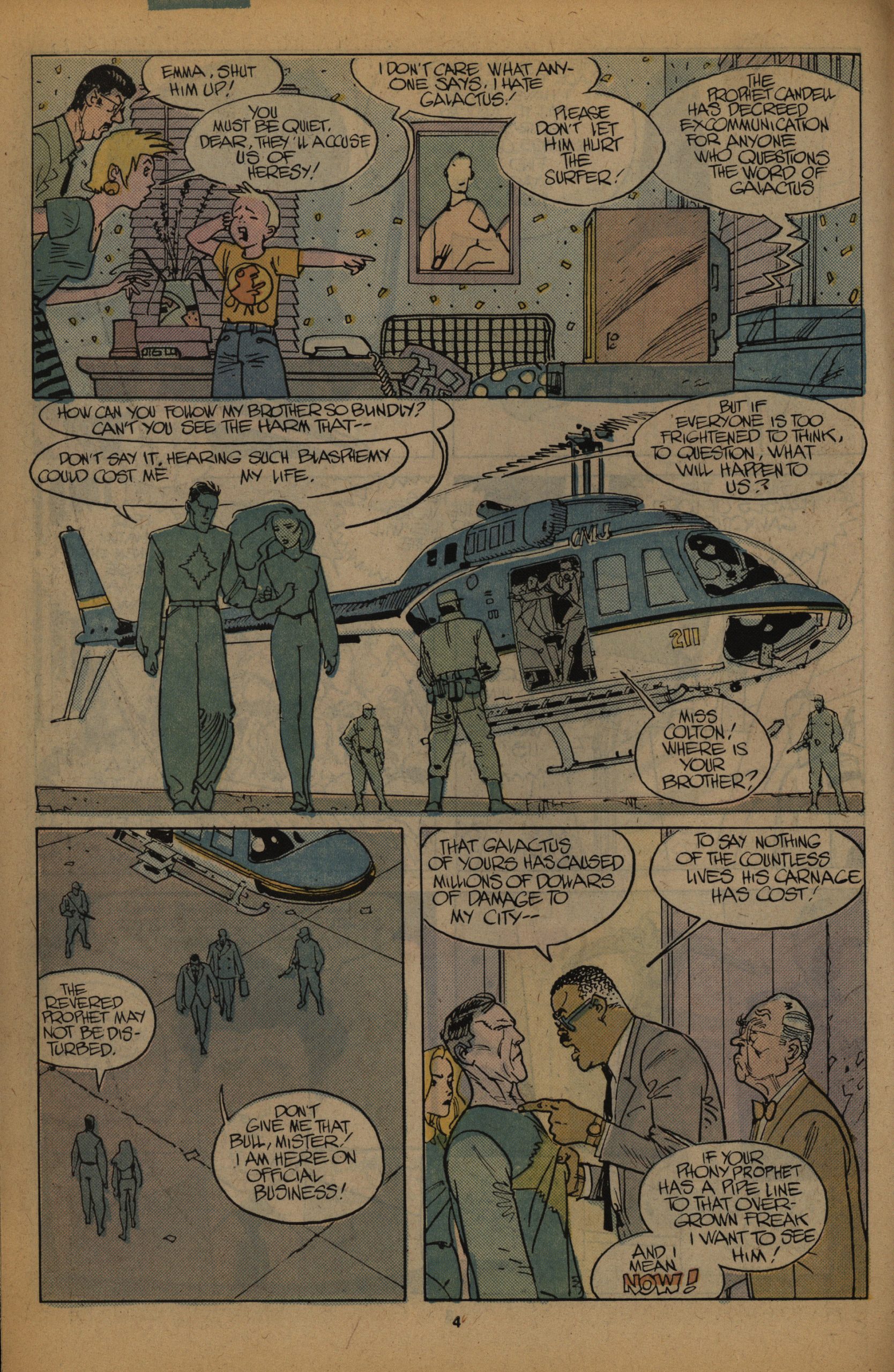
Anyway, as Silver Surfer/Galactus stories go, it’s rather off-model, but Moebius is having fun, I think. It’s a trifle, but it reads well, and Moebius’ artwork is great as usual.

Marvel didn’t wait many months before reprinting this in one volume, on bigger, bright shiny paper, and my guess is that that’s the format most people have seen this in, but I thought it made more sense to read it in the intended format for this blog series.

Charles Lieurance writes in Amazing Heroes #150, page 72

Galactus is such an
intrinsically Kirby character, and with
a towering mass of omni-functional
scaffolding that takes infinitely
circuitous routes around the
character’s power-gorged frame,
Moebius is helpless to do anything but
trace. Secondly, the tale is all too
familiar to Surfer fans, making it
harder for the intensely personal style
of Moebius to win converts who might
not be familiar with the artist’s work
in more elitist anthologies.
But the Moebius Surfer is a lovely
thing to behold. Not that the Surfer
has any trouble being rendered in the
most aesthetically beautiful terms
imaginable. His very presence–
perfectly pale, bereft of features—cries
out for the artist who can subtly
achieve emotions in his face, sinews,
and his sleek arms. He is a dream for
the bad artist and the good artist alike.
When the artist is awful, the Surfer
can appear detached, lost in secret
melancholy. When the artist is great,
as Moebius is, the Surfer can be a
beautiful mural of messianic intent.
Moebius’ is much different than
any the Surfer has yet inhabited, a
world of spooky pinks and blues
suffused with unearthly pastel light,
like the religious statuary your
grandmother used to buy that showed
Jesus kneeling next to an open wind(N’
at sunset, with midnight blue and
flourescent pink shining upon his face.
This two part mini-series may not
convert the wetbrains (although the
Surfer is clearly soaring too close to
the violent maw of Galactus on the
front cover), but it stands, to those
already converted to both Moebius
and the Surfer, as a monument to
both.

Not everybody is as enthusiastic:

So, being a glutton for punishment, I’ve read a good deal of Surfer comics, usually gritting my teeth while thinking about how awesome it should be, and how not very good it is. That same thing happened while reading this volume. Famed European comic artist Moebius, one of the key visual storytellers of the 70s, whose work frequently graced the pages of Heavy Metal issues I’d sneak peaks at when I was a boy, is a perfect match for the cosmic nomad, and there are some beautiful panels. But Stan…Oh, Stan.

But some are very:

Most importantly, it fits the story. This is “literary” superhero fiction.

There are profound things being said left and right, and all in context of the story.

In modern parlance, the book is filled with panels that are begging to be their own memes to explain the world today. Remember: This book is 30 years old.

1988: Havok & Wolverine – Meltdown

Havok & Wolverine – Meltdown (1988) #1-4
by Walter Simonson, Louise Simonson, Jon J Muth and Kent Williams

Marvel experimented with doing a few more upscale Epic books featuring Marvel characters, and I still don’t quite understand the logic. Surely these books would have sold better if they’d have the “Marvel” logo on the covers? Was the point to use these as a way to bring more attention to the other Epic books; enticing Marvel fans to buy Stray Toasters by publishing an X-Men spinoff in the same format?

Whatever the reasoning, this would seem to be (conceptually) the most perfect Marvel/Epic crossover book: It’s got writers with impeccable Marvel credentials, and the artwork is done by two of the most accomplished creators of painted artwork that Epic had employed (Muth, for instance, on the much-lauded Moonshadow series and Williams on, for instance, the less lauded Blood: A Tale series).

The odd thing here is that the artists are apparently not cooperating, but instead drawing separate scenes? Muth is doing the Havok scenes and Williams is doing the Wolverine scenes. How’s that going to work out?

And even more oddly, among the first few pages we get a spread by Sherilyn VanVankenburg.

We start off in a very topical way: It turns out that the Chernobyl disaster was the result of sabotage by anti-Glasnost Soviets. (And a horny technician.) I don’t know… is it crass to use such a recent catastrophe as a plot point?

I didn’t know whether Muth and Williams would strictly keep drawing their “own” characters, but… I think the inset is by Williams and the Havok panel is by Muth?

But this must by all Muth, I think? Anyway, Muth’s artwork does display some of the common problems with fully painted characters: They look a little less dynamic than super-heroes should do. I little stiff? But it’s pretty fun.

The main problem with the storytelling is actually the speech balloon placement. Way too often the tails seem to point to the wrong character, or are ambiguous. (It’s the woman saying “now that you’ve demonstrated” etc.)

It makes for choppy reading when you have to backtrack.

Oy vey. There’s way too much of dialogue like this: I know it’s not meant to be naturalistic, but even in an Evil Russian Scientist Convocation way, it’s just beyond stilted.

I wonder whether Williams really disliked the Wolverine character. I mean, look at that scraggly beard, and the hair-like-a-horn thing going on here…

He’s having fun, at least.

The character design for the big-jawed villain is rather… well… Sat next to the panels that are obviously photo-referenced, it’s rather jarring, isn’t it?

Heh. Is that a felt sickle and hammer?

I think I’ve neglected to say anything about the plot, but I’ll just let the panel above spoil you: It tells you the entire nefarious scheme. Yes, they achieve their goals with the most convoluted means possible. No, it doesn’t make any sense, even as super-hero comics go.

But what did the critics think?

Sheldon Wiebe writes in Amazing Heroes #158, page 74

This is a weird one.
In the space of a few, beautifully-
painted pages, we learn what really
happened at Chernobyl; see Wolverine
engaged in a barroom brawl; watch
Havok dismantle a most peculiar
vehicle; see Wolverine and Havok
gunned down (sort of); and much,
much more.
There are lots of things I liked about
this too-often delayed book, and a few
I didn’t.
The art is pretty good. Both Muth
and Williams are excellent painters.
That said, I must add that while
Williams’ work on Havok was terrific,
Muth’s portrayal of Wolverine did not
totally agree with me.
The tufts of hair that are Logan’s
trademark, here are elongated to the
point that they become almost surreal
and give him a strange quality that
defuses his violent character. Not that
he isn’t violent, but he appears more
of a violent cartoon than a near-homi-
cidal maniac.
Still, perhaps the contrast with the
more “normal” appearance of Alex/
Havok will grow on me.

[…]

one can only throw up
one’s hands and mutter, resignedly: ’61
may not know art, but I fer damn sure
know what I like.
And I like Havok and Wolverine:
Meltdown #1.

The series was recently collected in a new edition from Marvel:

Havok & Wolverine: Meltdown isn’t a bad story, but it sure is inconsistent. The pacing is all over the place, and while there are interesting plot points, the characters’ actions and motivations don’t always make sense. It’s good enough that it’s a little surprising it’s been so forgotten, especially given the creators involved, but it’s not going to break any ground for a modern reader, either.

Here’s another review:

Of course, Meltdown also features absolutely gorgeous, fully painted art. Often times, painted art in comics comes too close to being abstract and hard to follow, sacrificing the storytelling elements in favor of a wow-factor, but Muth and Williams thread that needle carefully. Wolverine is perhaps, at times, a bit off model (particularly his hair wings), and the series features its fair share of attractive pages more concerned with mood or abstraction than characterization or storytelling, but for the most part, the art manages to tell the story while still being artistic.