1989: The Punisher: Return to Big Nothing

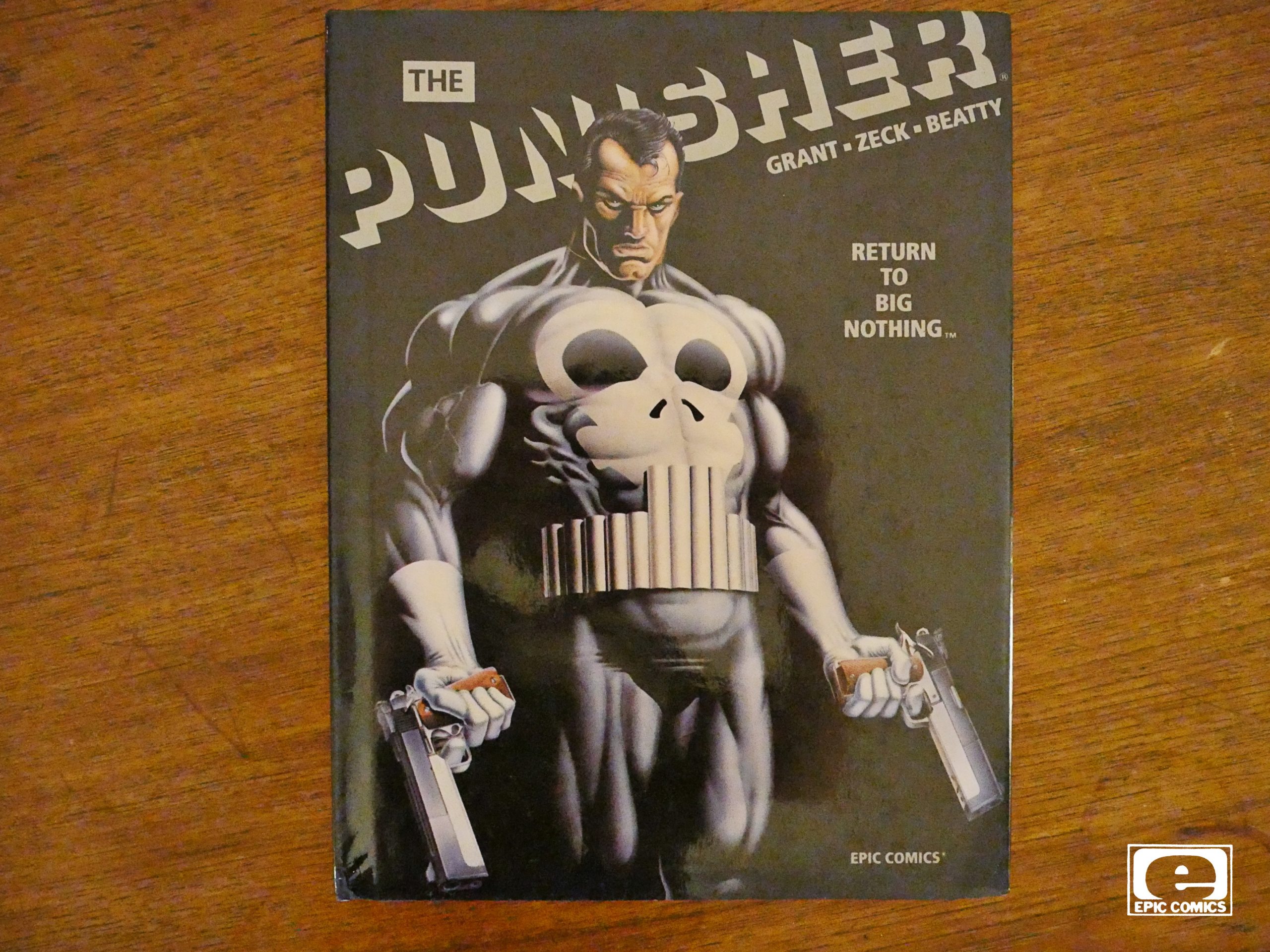
The Punisher: Return to Big Nothing (1989)
by Steven Grant, Mike Zeck and John Beatty

If I’ve got the chronology right, Epic would only publish one single Marvel character after this (the Elektra Lives Again graphic novel), so I take it that the experiment with publishing slightly more upscale (or “mature”) Marvel comics under the Epic label was a failure.

And it’s really difficult to understand why they didn’t just publish this as a Marvel graphic novel:

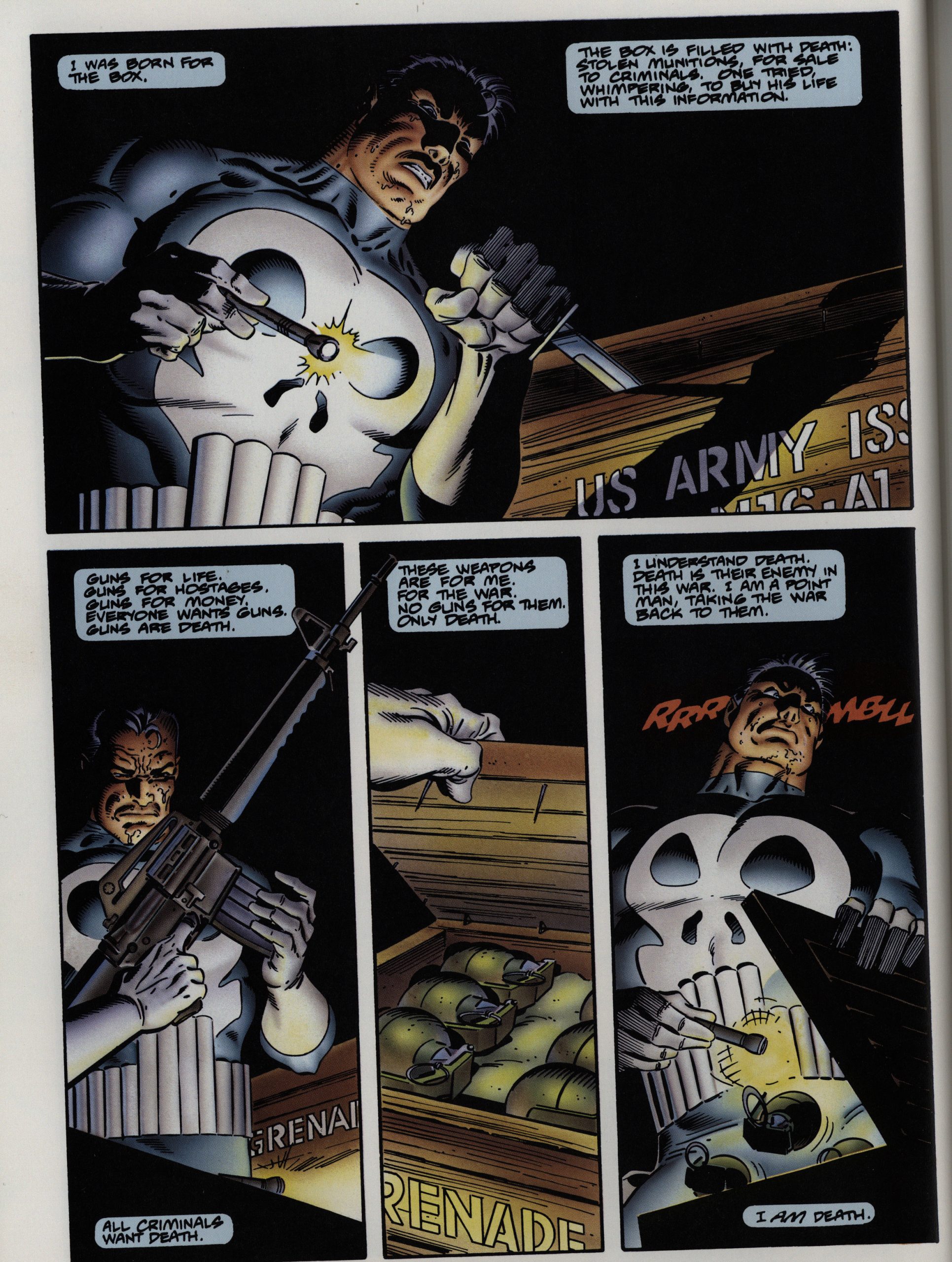
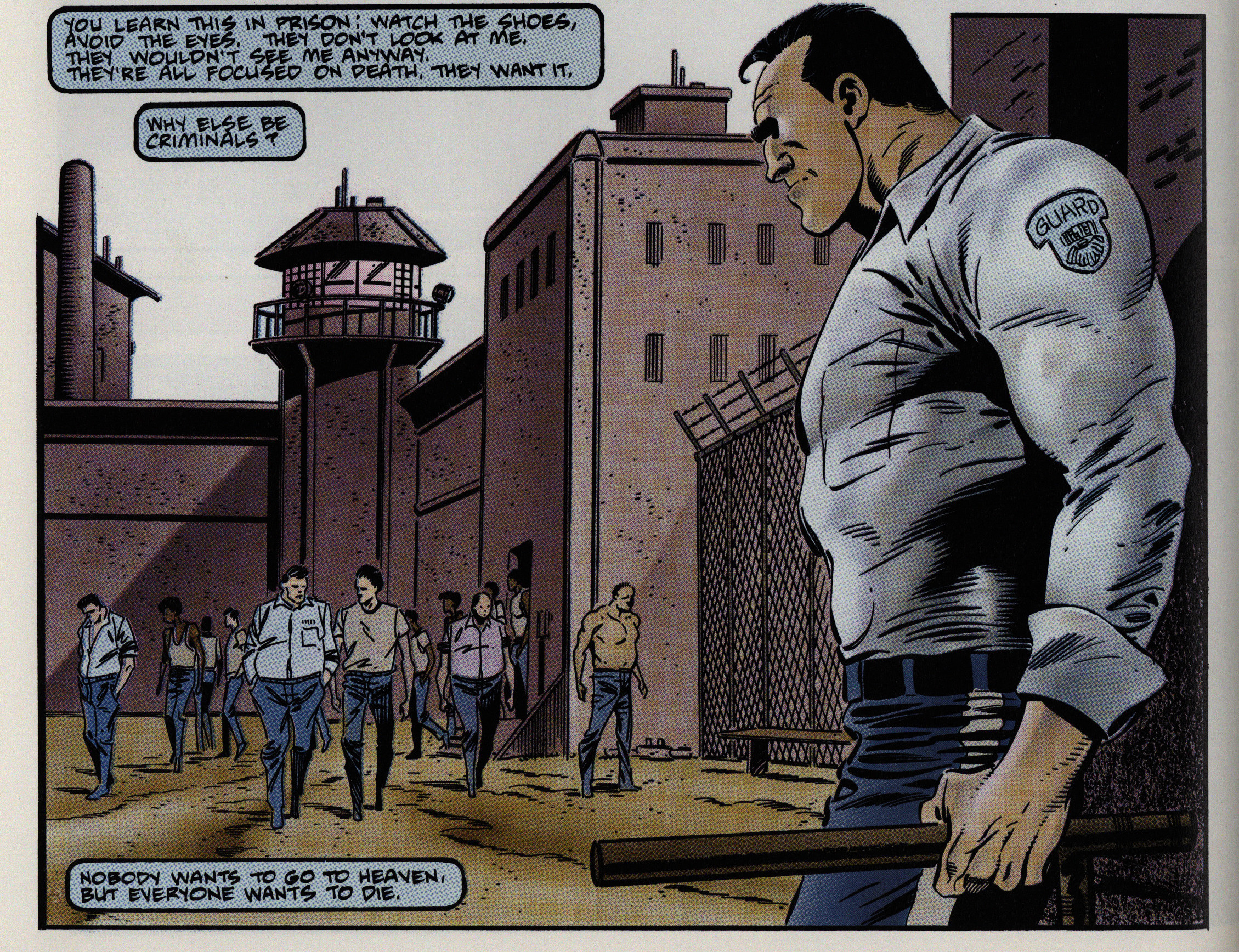
It looks just like a normal Marvel punisher book, only with better colouring (for its time). Reading this page (the second in the book) I thought I had the explanation: The Punisher wasn’t just a psychopath here (which was a normal trope in later Punisher books, I think?), but I thought that Grant was writing him as developmentally challenged, too, and this was going to be a scathing critique of the entire Punisher concept.

And, I mean, Castle’s drawn as microcephalic, too, so I thought I was really on to something here.

(What’s with the weird coughing between the speech balloons? That doesn’t really RAAAK! work.)

And it’s about him getting even with a sarge that humiliated him before friends back in the army?

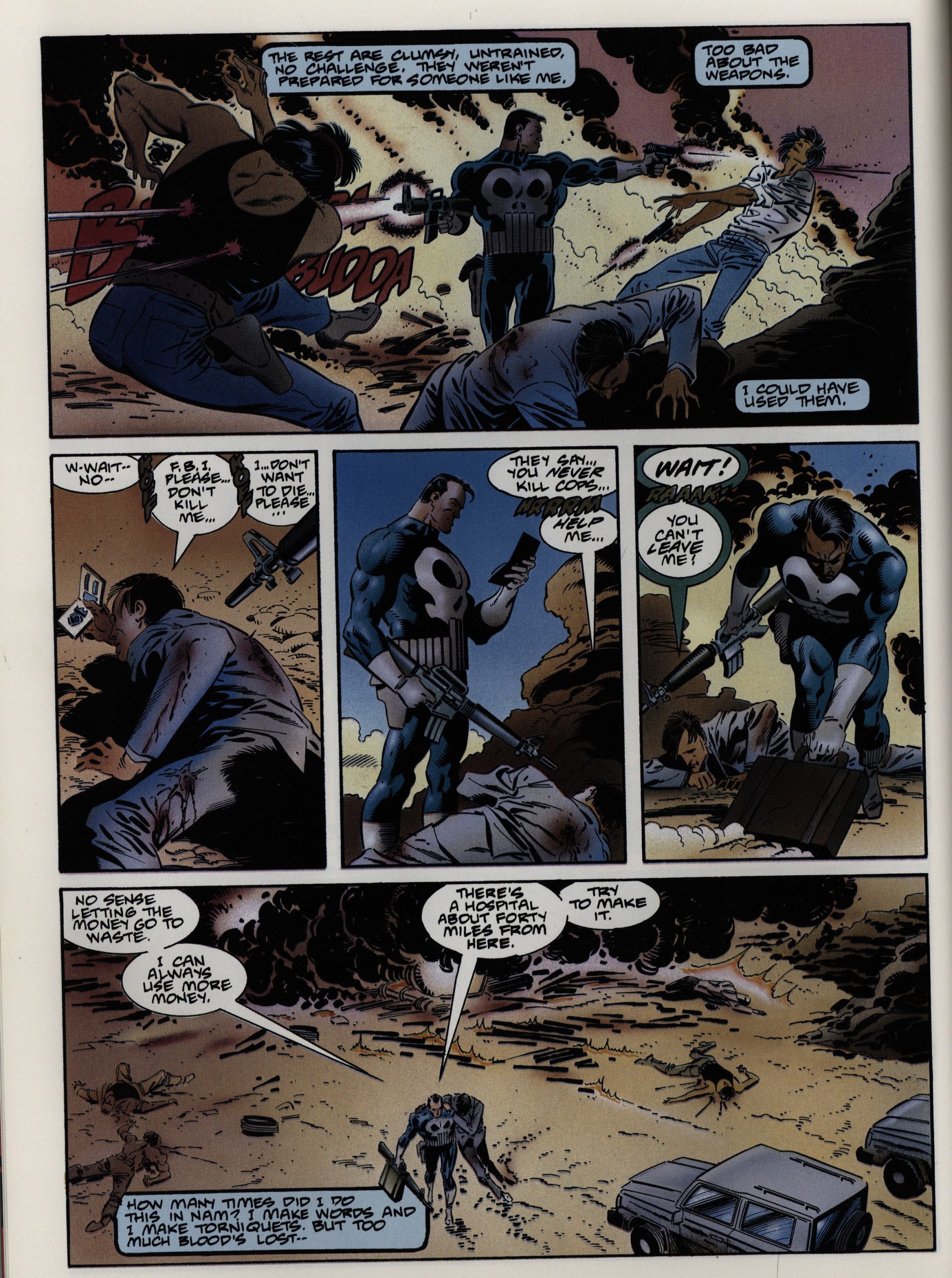
But… no. It’s a bog-standard Punisher story about him killing some drug runners, and I guess he isn’t stupider here than he is in any of the books. (Of which I haven’t read that many.)

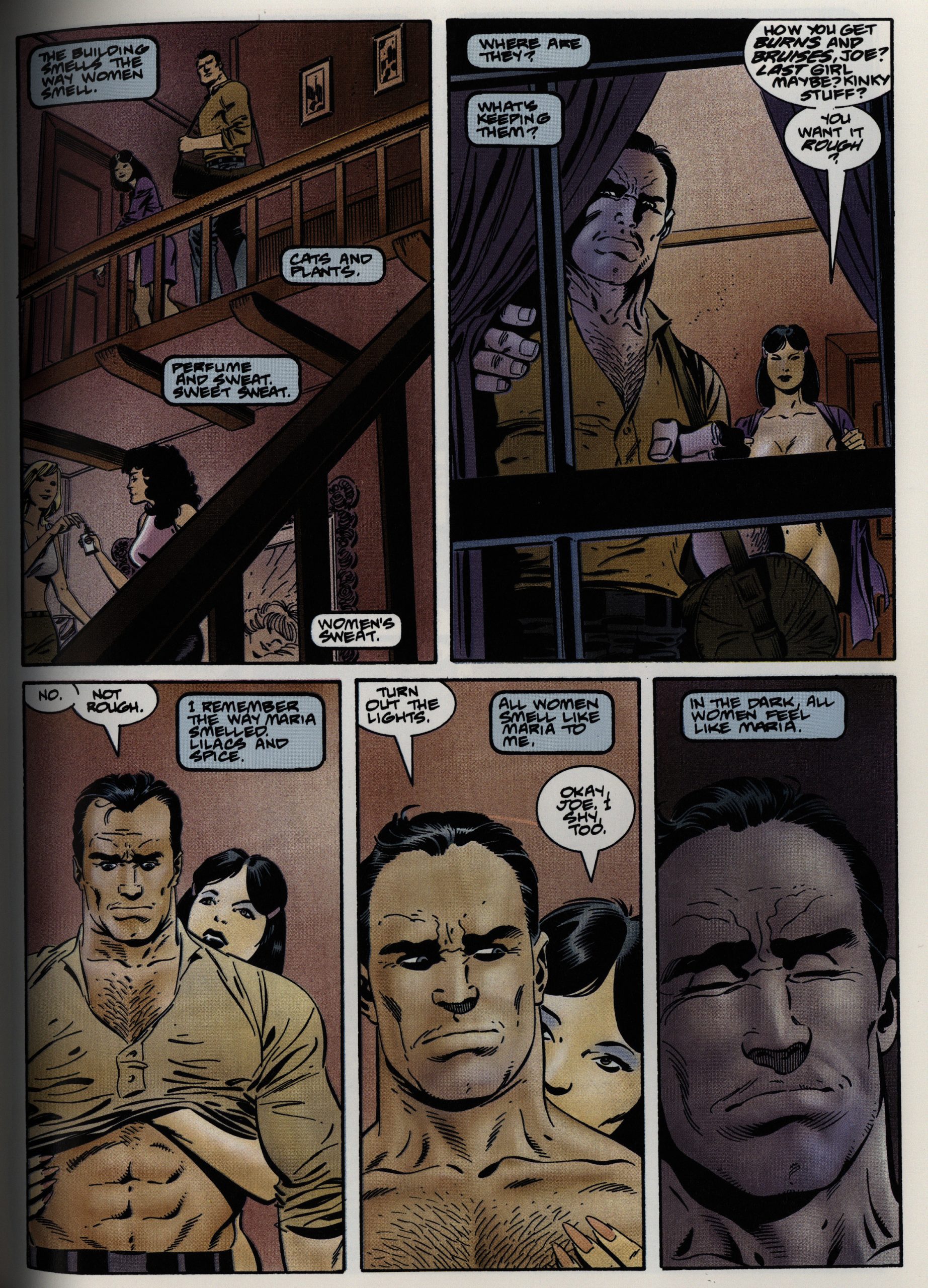
The artwork’s competent enough, but again, it’s just so standard. It does read well, and it feels like a modern (i.e., post-85) comic book, what with the voiceover and everything.

But there’s only so much of this a body can be expected to take.

Hm… I’m still not sure whether my initial take on what Grant was going for here was incorrect.

Fred Patten writes in Amazing Heroes #171, page 87

Marvel’s long-awaited hardcover Pun-
isher graphic novel has many of the
same virtues and flaws as the long-
awaited Batman movie. That’s super-
popular, so let’s hope for Marvel’s
sake that the public looks at this Pun-
isher novel in the same way; worth-
while for its intense emotional mood
and lots of cathartic violence, rather
than a story that makes much sense.

[…]

You ought to be able to fill a couple
of pages with plot-logic holes from the
Batman movie, and you can do the
same here.

[…]

But don’t uorry about that. The
Punisher’s fans don’t, you know. Ste-
ven Grant’s dialogue is simultaneously
punchy and brooding, realistic yet in-
tense, dripping with corrosive irony.
Practically every panel that isn’t an
action scene has the tautness of a fire-
fight that’s just about to break loose.
Mike Zeck’s artistic layouts capture
this tension excellently. Sweating mces
seen from dramatic visual angles. Ac-
tion scenes into single pan-
els of frozen frantic motion. Superb
shadowing and lighting, especially
around the eyes. Rich coloring with
careful, realistic highlighting. It looks
like the artists put $16.95 worth of
work into the highlighting alone.

He’s right about Punisher fans not worrying about plot holes:

The violence is detailed and the imagery graphic at times (one of the goons is seen riding a naked prostitute like a horse). At one point a guy gets his legs blown off by a bazooka. It’s uncompromising and for an older audience, but it captures the bloody violence that should be part of a series like this.

And:

After bouncing around the Marvel universe for a good few years a 1986 miniseries by Steven Grant and Mike Zeck (which I must review sometime soon) swiftly led to a plethora of “shoot-‘em-all and let God sort it out” antics that quickly boiled over into tedious overkill, but along the way a few pure gems were cranked out, such as this intriguing and absorbing graphic novel which reunited the creative team, mysteriously released in 1989 under the generally creator-owned Epic imprint.

It looks like the book was recently coupled with a Jo Duffy-scripted graphic novel and re-released.

1989: The Art of Moebius etc

The Art of Moebius (1989),
Metallic Memories (1992),
Chaos (1992)
by Moebius

After publishing the first six Moebius collections, and the Incal series, Epic turned into a little Moebius publication factory. I’m not sure how many Moebius-related things they ended up with publishing, but I’m guessing about a dozen? We’ll cover them all in this blog series, but this post is about the Moebius art books.

The first one, simply called The Art of Moebius, is in the same format as the Moebius albums Epic had already published, which makes sense. Somehow Byron Preiss is involved here: He was an editor and packager of publications that were then usually published by somebody else, but he’d not been involved with any of the previous Moebius things…

The Lofficiers, on the other hand, were intimately involved, and provide a historical overview.

So this book is basically like this: Drawings and paintings beautifully reproduced…

… and then some notes, mostly written by Moebius himself, about what he was trying to do with the piece, and whether it’s successful or not.

I think it’s interesting, but he does perhaps heap more praise upon himself than some people will feel comfortable with.

But I find his honesty refreshing, both when he puts his work down and when he thinks it’s a success.

We only get a handful of these process pages, which is a shame.

The other two books are published three years later, and are hardback books in an almost square, oversized format.

Most of the pages are bits from early in Moebius’ career, so it’s jokey stuff instead of his later cosmic stuff.

And I didn’t know that he was this influenced by American underground comics (and strips). It’s great.

There’s also more recent, sci-fi illustrations.

And oddball things like this list of SF novels (and films) he likes.

The book is divided into sections on some loose theme. Here’s a page from the “erotic” section.

The first book was scrupulously annotated, but this (unfortunately) only has this index.

The final book is the weakest one.

It seems oddly slapdash. I mean, it’s a good-looking book, but it’s got oddities like a too-big fond.

But, you know, there’s also drawing like this, so whatever.

But it’s basically, I think, what was left over from the other two books?

And again with the huge font.

Metallic Memories was on the HIT LIST in The Comics Journal #156, page 104

Of all the uorld•class cartoonists, Moebius may be
the most playfully eclectic. This quality may have its
occasional drawbacks (his narratives sometimes nun-
der and stagnate as he follows his whims. and some
of his longer works feature distracting stylistic fluc-
-tuations), but it has done his work as an illustrator
nothing but good. as this handsome 96-page hardcover
collection prwes.
Despite an unappealing, inappropriately cyber-
punk-ish title and a bland cover (crystals again?),
Merallic Memories is a delightful Odds and Sods-
type compilation offillustrations. short and/or aborted
strips. sketchb«’k dcx»dlings, and plain old farting
around that ranges from 1970 to yesterday afternmn.
Starwatcher Graphics’ Jean-Marc atwi Randy Lofficier
have done their usual thorough job, as evidenced by
the meticulous source listings in the back. Some of
their contributions, such as their creative translations
Of puns and non-sequiturs, are downright inspired.
Metallic Memories also offers some clues as to why
the only cartoonist to have
made significant inroads into American comics: his
work is saturated with our pop culture. This volume
alone includes many illustrations and covers for SF
books by Hamilton, Z*lazny, Bloch. VOnnegut, and
of course, Dick; a Jimi Hendrix album cover; •70s
illustrated reviews of SF books from the magazine
Pilote; and a transcendent Peanuts tribute. (And what
is Blueberry, really. but John Ford plus Milton Caniff
with a ’60s sheen?) In a sense, Moebius has become
the first global cartoonist. arul Metallic Memories is
a consistently enthralling jaunt through his world(s).

I don’t think any of these have been reprinted, but there’s been a bunch of Moebius art books lately, so I’m guessing they’d recycle a lot of the material.