Plastic Forks (1990) #1-5
by Ted McKeever
I always get this series gets mixed up with Bill Sienkiewicz Stray Toasters. Mostly for superficial reasons: Stray Toasters was also a squarebound painted single-creator limited series from Epic.
And they both have a final issue that has a (mostly) black cover.
But I guess that’s where the similarities end. Sienkiewicz’ series was quite experimental and modern, while this is a pretty straightforward mad scientist tale. If you squint a bit (OK, a lot), you could see this as being a 50s B movie.
Only with more grisliness and a more … sexually odd plot.
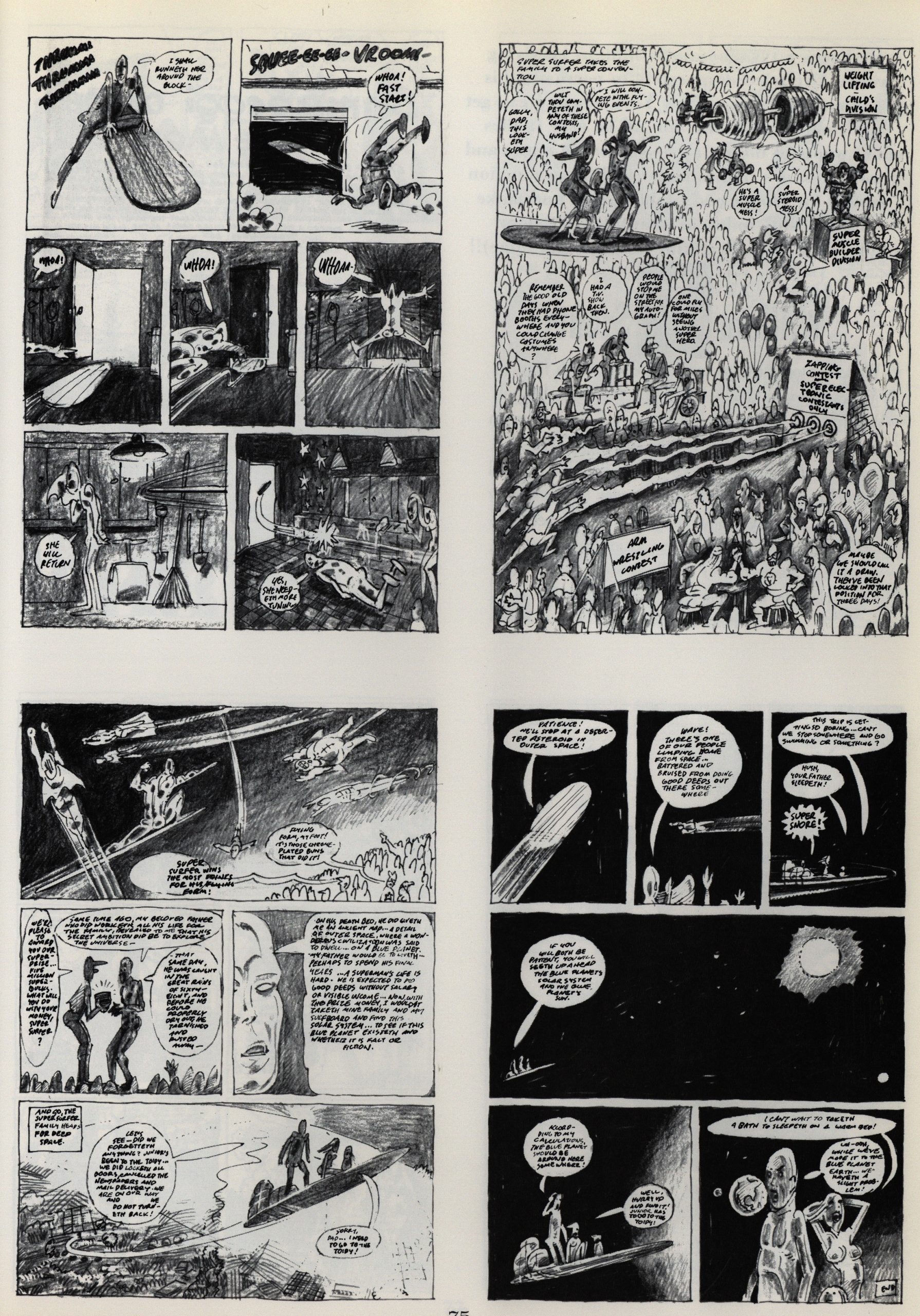
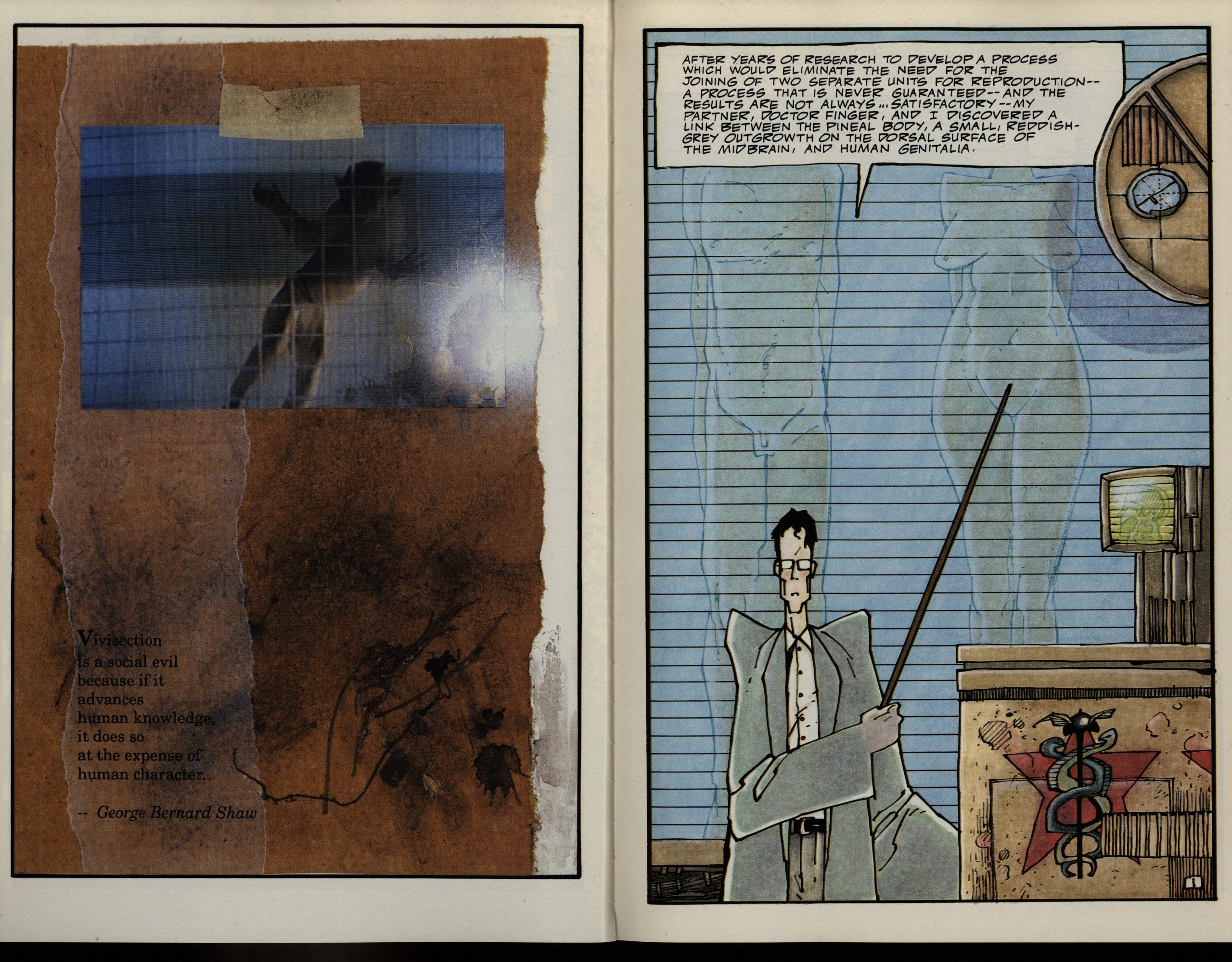
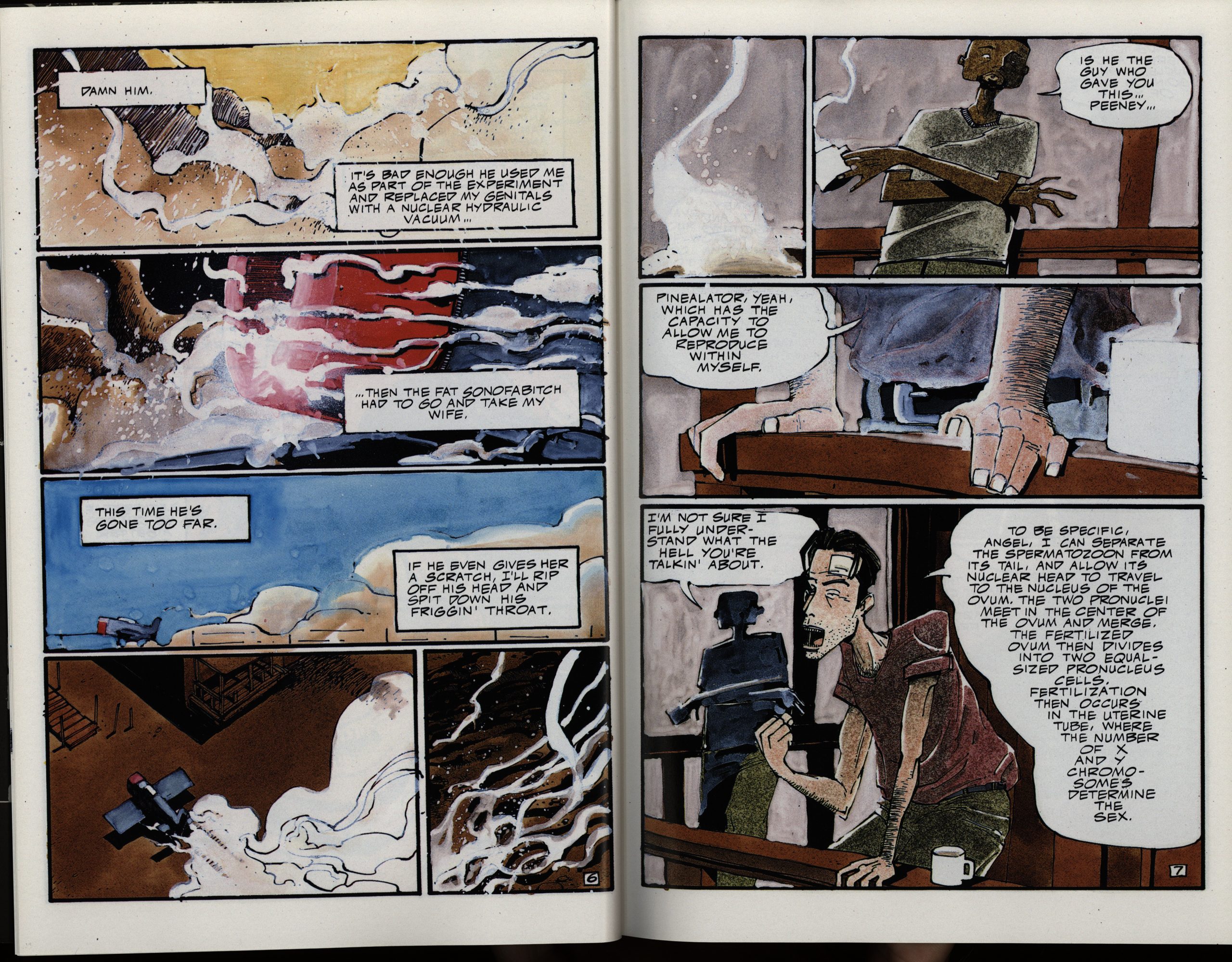
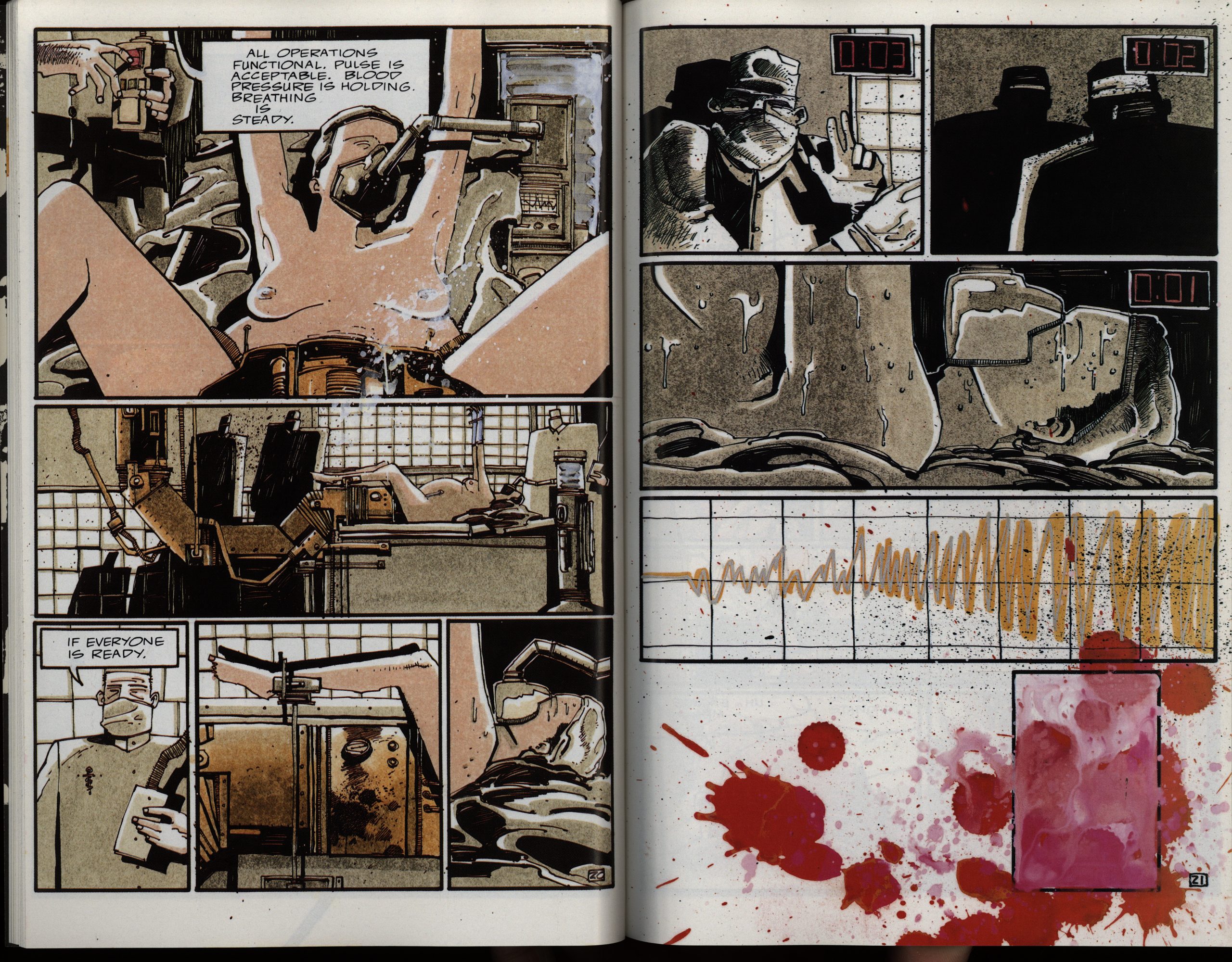
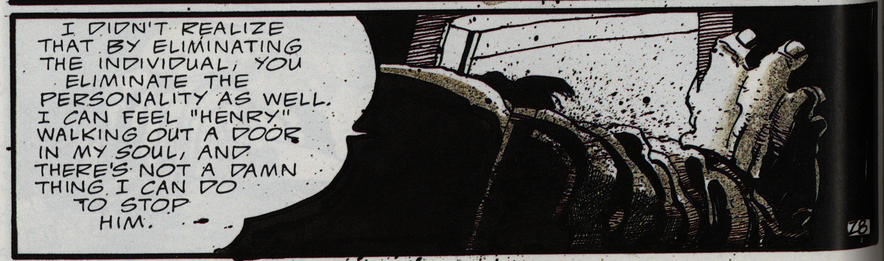
OK, I hate recapping plots of comics I write about (I don’t find it interesting to read or write that stuff), but I think I have to here: For some reason or other (never really explained), there are these two scientists that think it would be really cool to have creatures that are able to self-impregnate. It turns out that one of these evil scientists is even more evil, and does the procedure on the other scientist. Hijinks (and revenge) ensue.
Now, this doesn’t really make sense on any level: Even if you lop off somebody’s genitals and then install a device that makes self-fertilisation possible (through woo-hoo science), there’s still no uterus there, for instance, so… and… what’s the upside here, financially? Somebody’s paying for all these laboratories, surely?
So it’s a book that leans really hard into having as stupid a plot as humanly conceivable, which makes me wonder: Why? Is this supposed to produce some counter-intuitive frisson that pushes the reader over the edge into just going along with the ride?
If so, it kinda works, because when you can’t think about even the premise without having a mental prolapse, then you get sort of swept away by the rest. That is, it’s a logic off switch thing, which may allow other reactions to the work.
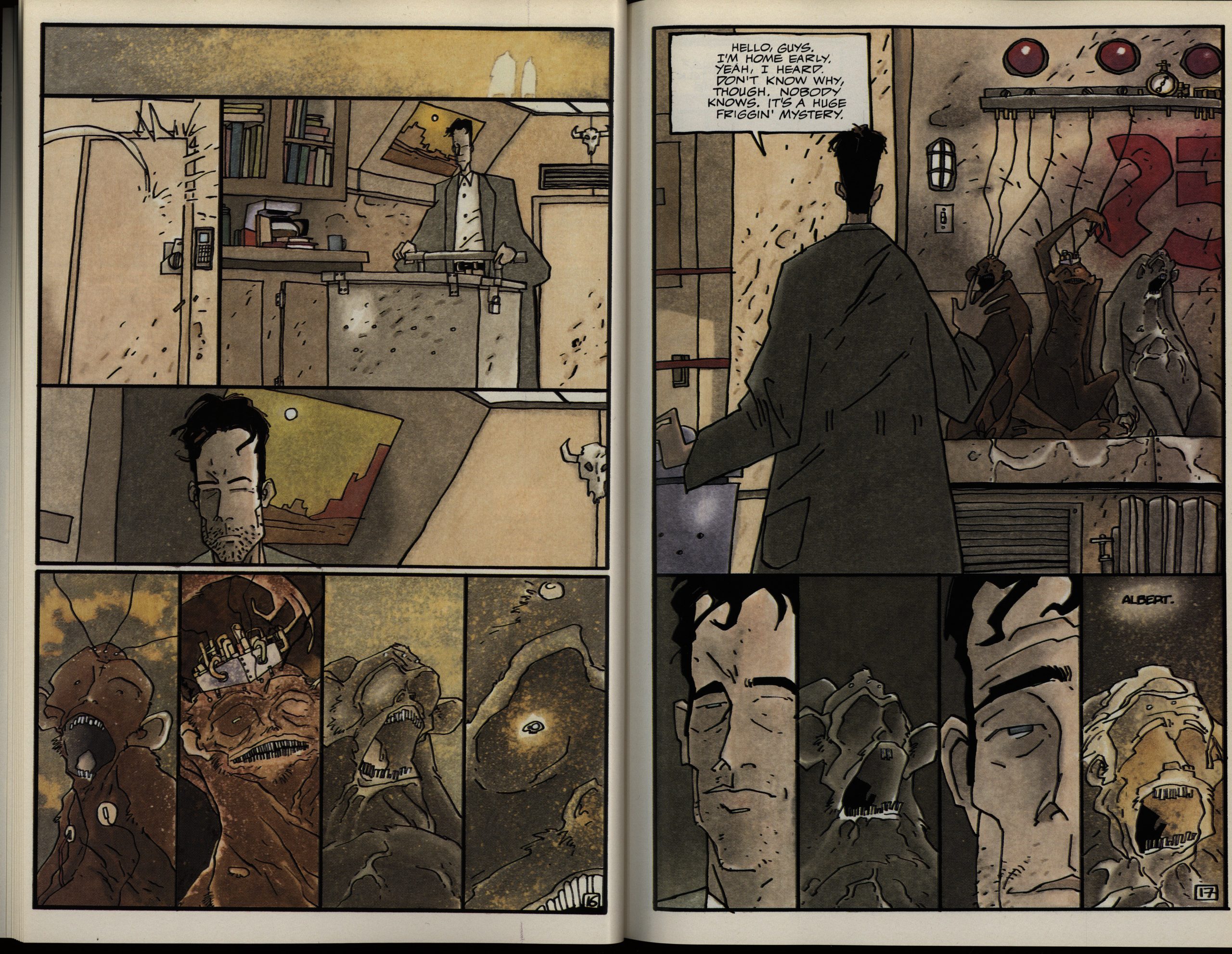
Anyway, I’ve always loved McKeever’s artwork: Since when I was a teenager, whenever I doodle, I always doodle McKeever heads, teeth and all. This is his first fully-painted colour series, I think?
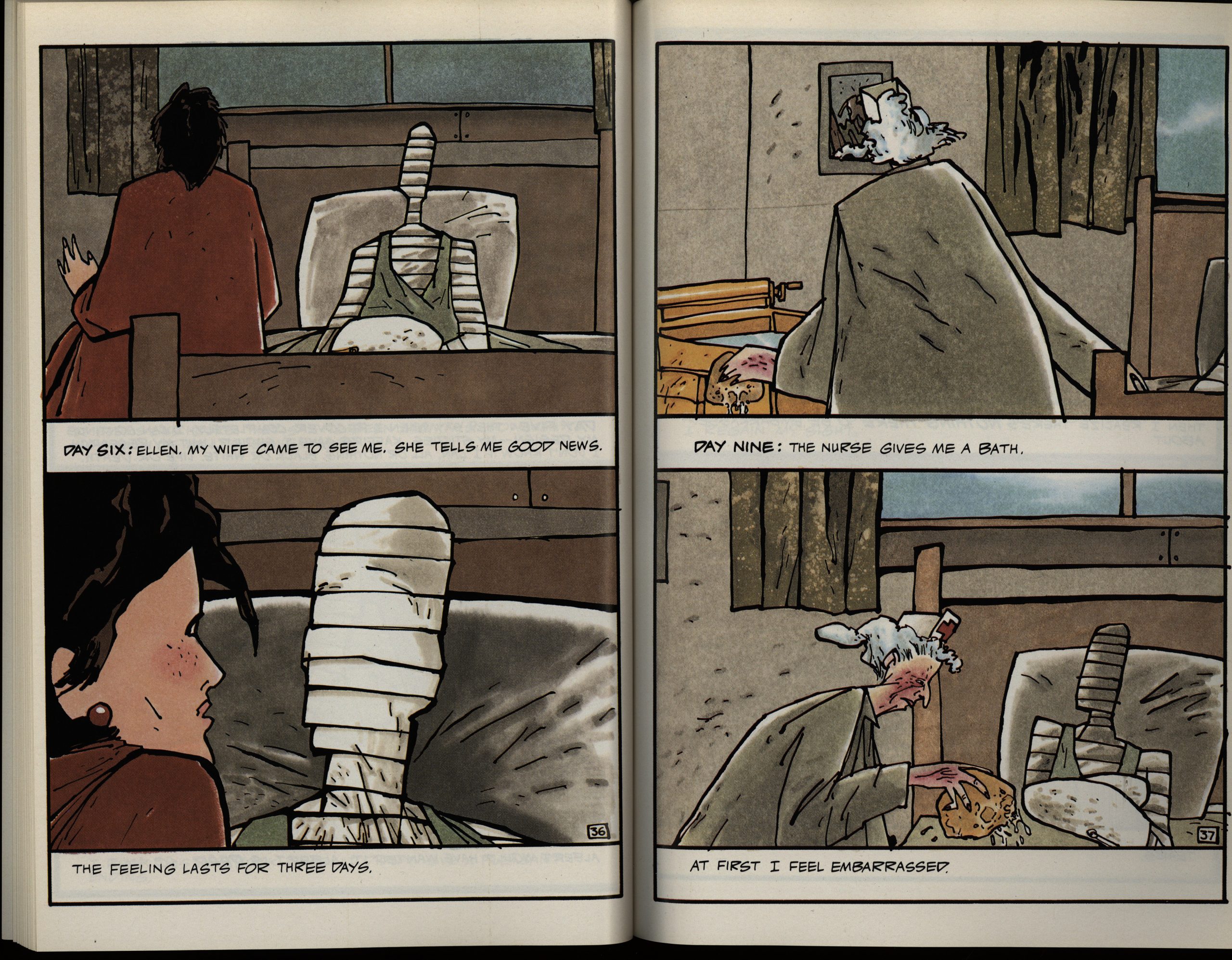
When he switched to this two panel per page layout during the hospital scene, I thought we were in for some formal experiments throughout the series, but there isn’t that much beyond just that.
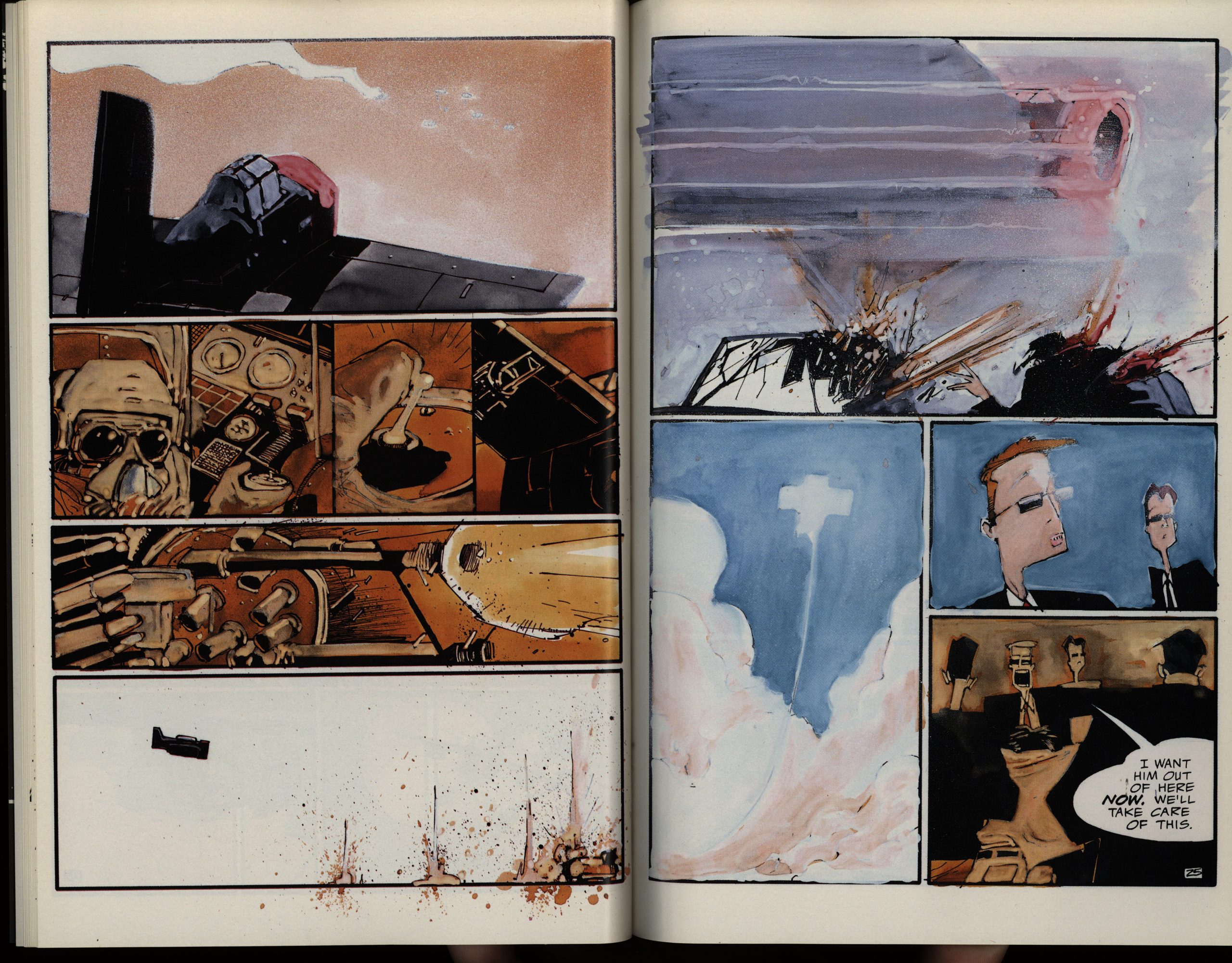
There’s a lot of fight scenes in this series, and there isn’t a lot of witty repartee during those scenes, so it’s a pretty brisk reading experience, even though it’s over 300 pages long in total.
I do love it when McKeever goes into manic mode. Perhaps he should have pushed that even further.
One thing that I just find weird is that every issue has one of these recap scenes. I think the likelihood of anybody picking up the third issue of this series without having read the first two would be approximately nil.
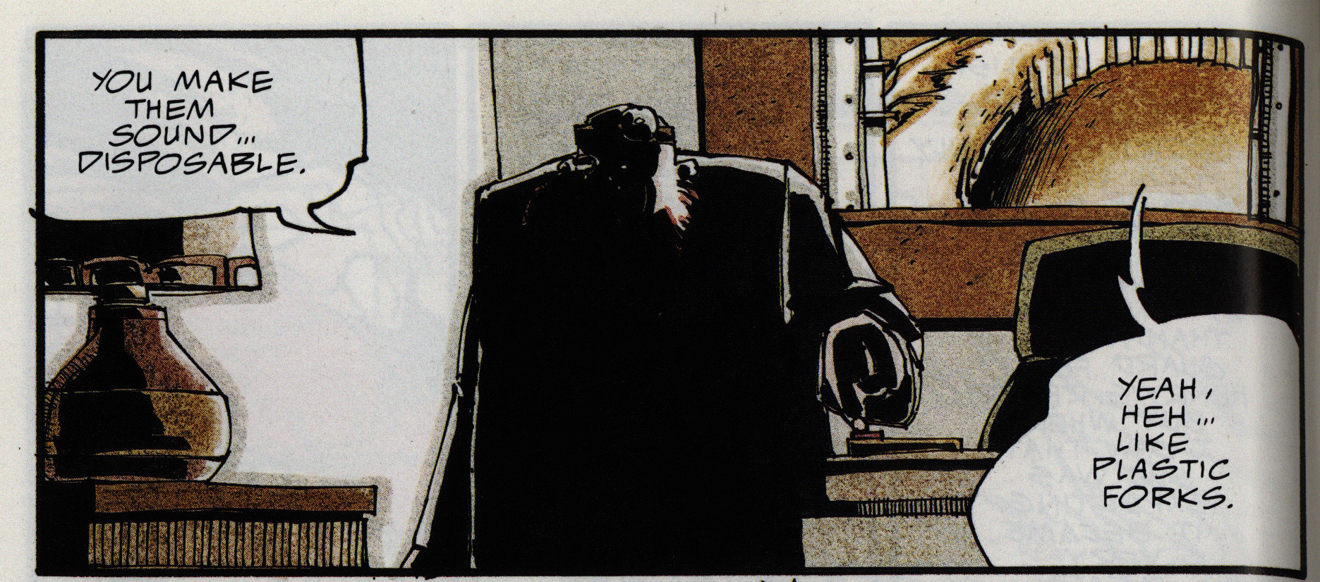
There isn’t much left for the reader to figure out on their own: The storytelling is exceedingly clear, and everything is explained. Like the title: People are disposable.
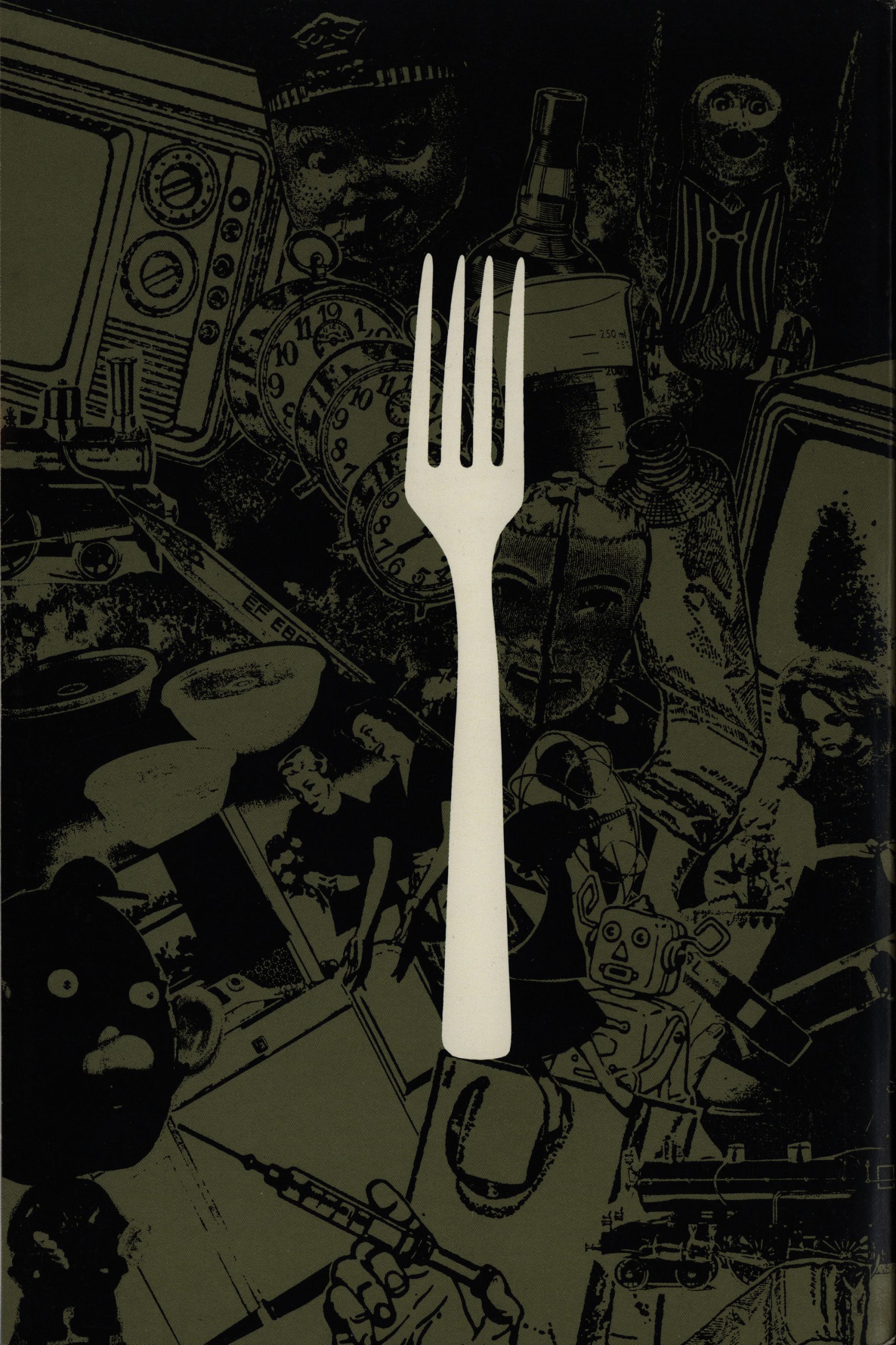
The design of the series is pretty nice. There’s no extraneous stuff to distract, and even the back cover is nice and stark.
There aren’t a lot of female characters in this book, but the protagonist’s wife does get put through the wringer.
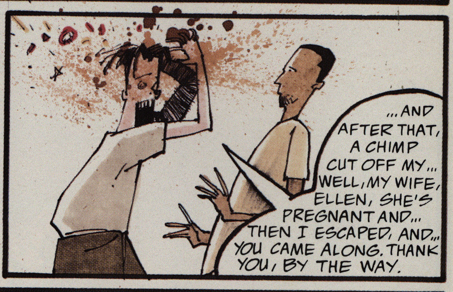
Ah yeah. That’s some McKeever teeth!
If you look at this as a 50s B movie, speeches like the above (which are fortunately far between) make sense, I guess?
OK, here’s what I think of the book: It’s an entertaining read, and McKeever’s artwork is uneven, but pretty brilliant here and there.
In a preview in Amazing Heroes #157, page 174
I asked McKeever about the meaning
of the title. “What’s the ultimate dispos-
able item? A plastic fork: you use it and
you throw it away. The way the human
race is threatened is that it becomes
disposable. It was either plastic forks or
vacuum bags.” By the way, he’s getting
awfully tired of the comparisons to a
certain other kitchen appliance.
Oops! I guess I shouldn’t have compared it to Stray Toasters…
In another preview in Amazing Heroes #170, page 82
Getting droppd from Comico’s line-up was
a rrversely lucky break for McKeever. Not
only does he get more money and probably
more exposure, but Plasdc Forks benefits
from the hefty forrnat change, as uell as from
the germination priod Biblishers. “I
was excited he “but nmv—well,
this is the way I to do it in the first
place. It’s much mster; the format
makes it much He feels that the extra
time has allowed him some much-needed
breathing after Eddy Current. “I didn’t
want to tell another story of a guy running
through tings, and just change the buildings
to cactus. I want it to be something more than
that.”
What Forks has into is a comic
reminiscent of one of McKeever’s fivorite
childhood authors, Jules %rne. “It deals a lot
more with epic scale and %rne type adven-
ture,” he says, “Even though it deals with
vivisection–[Henryl is still a scientist and
there’s still animal experiments; there’s still
loss of geniulia—what it surrmlnd.s itself with
is more in line with something like Master of
the world or Mysterious Island.” The grand
scale extends to the props, the settings and
even to the bolder of the protag-
onist, “There are planes in this, there’re
there’re hordes of hermaphrodites.
It deals a lot more with heroics and sacrifice
than before.
“Henry before a victim of circum-
sunce, where nmv I find that he’s much
stronger than I had originally thought. He
takes what they do to him in the first issue,
and rather trun uke as a ruson to go after
them for revenge, he utilizes it and adds on
to it.. then goes after them!”
The more psitive bent to the series is
immensely plasing to him, “They can’t
promote it comparing it to anything. I
that with and Meltdown and Blood
that Epic has enough of the self-indulgent,
pity-me-I’m-laying-in-blood-and-sand-and-l-
snrll-oranges attimde. nose are bk.s,
but I figure thw already have ü’træ. don’t
need more.”
That’s some bad OCR! But he does compare the book to Stray Toasters himself… as a way of distancing himself from those kinds of boring books.
TM Maple writes in Amazing Heroes #179, page 85
This is one of those comic series
that is very difficult to judge after just
the first issue. You’re not sure if the
series will break through to the great-
ness that you can see in the initial
episode or just eventually fall flat on
its face.[…]
McKeever’s artistic style is as bi-
zarre and idiosyncratic as ever but he
also demonstrates again his fine sense
of pacing and presentation. All in all,
the effect is rather disorienting, which
is a splendid way of easing us into the
strange and disorienting world in
which Apt exists.
The production values are up to
Epic’s usual high standards, making
for a very appealing package.
The outlook is still a bit scrambled
but all the signs are good. Let’s hope
that McKeever can come through on
this. Right now, I’m optimistic about
it all.
McKeever explains how it ended up at Epic in The Comics Journal #163, page 66
Afterwards, I went ahead and did book one of Plastic
Forks. It was originally supposed to come out as an eight-
or 12-issue series from Comico, and it was going to be a
standard 24-page or 32-page thing. So I did the first issue
and I did the cover for it, and that went into their files. I was
doing it ahead oftime, so there were three issues in the can
before it started coming out. I sat down to do #3, and I got
a phone call from Comico. ‘Oh, by the way, we’ve gone
bankrupt. We’re out of business.” Which was probably
one ofthe worst days of my life. It was like flying high, and
then the wings fall off your plane, “Okay, we’re going
down, folks!” At that point I turned around and said,
“Okay , the contract is now null and void, andl can take this
anywhere I want.” So I went to Epic with it and I said,
“Look. Here’ s an idea thatl want to do. Here’ s the first two
issues; I have them ready to go.” And they looked at them
and said, ‘ ‘Wow! They’re painted and everything!” “Yeah,
they’re ready to go — which means I’m that far ahead.”
And they said, “How did you want this to come out?”
Originally, I wanted them to come out as a five-issue, 64-
page book — but Comico had never done anything like
that before, so they basically wanted to go with what
they’ve done, tried and true, which was standard comic
book format. I said, “Well, what I’d really like to do is have
it be a five 64-page book series.” And they said, ‘Okay,
fine.”
But between me turning in the artwork and them
saying, “Okay, fine,” it was three months. And that was
because they had to turn it in to Marketing, and then
Marketing had to establish there was an audience, and
Promotion had to make sure they could promote it, and
then there was a sales thing where they wanted to make
sure how much they should price it for and the whole profit
margin thing. And that took three months to do.
Or in a more recent interview:
After “Transit,” you made two series with Marvel’s Epic line, “Plastic Forks” and “METROPoL.” What was it like working at Epic? Who were you working with there?
I had originally signed with Comico to do “Plastic Forks” as a 12-issue miniseries. I had the first two issues, and the first three covers finished, when Comico went bankrupt. Having no idea what I was going to do, or where to go, I ended up talking with Archie Goodwin, who was EIC of Epic at that time, about a series I had started, and the situation at Comico. He said he wanted to see what I had done so far. So, I brought in the first two issues of original art, and the three covers, to his office at the Marvel building in New York. He went through every page, and said, “I want this. Only instead of 12 issues, it’s going to be five issues, 64 pages each, and fully paint every page.” And that was it. I signed the contract that week. Never once did he, or anyone there, tell me what to do, how to work, change the title, or alter a word. I was just given the keys and let loose. It was an awesome time for me.
Plastic Forks was published in a collected edition by Image some years back, but I’ve been unable to find any reviews of that.