Clive Barker’s Night Breed (1990) #1-25
by too many people to even try to summarise
OK, this one nearly broke me. It’s not that these comics are, on the whole, that much worse than most comics: It’s that there’s no direction, no point, no charm, no character to these comics. It took me four days to get through these 25 issues just because I would find constantly find doing something, anything else than reading these more interesting.
So whatever I have to say about these issues will be even less er insightful than normal, because in the passing of time, I’ve probably forgotten everything I was going to say.
Let’s do a quick recap: In 1990, Clive Barker was hot shit. He’d made two low budget movies that had made a boatload of money; his Books of Blood were genuinely new and fresh takes on the moribund horror genre; and adapting his work was keeping Eclipse Comics alive, and making new series made on his work was highly successful for Epic.
Then 20th Century Fox gave him a larger budget (but not a large budget) to make a proper movie, and that was the end of his golden period: It bombed at the box office, and no critics liked it, either. He was given another opportunity five years later with Lord of Illusion, with much the same result. He’s never made a movie since.
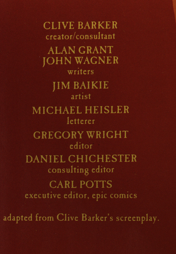
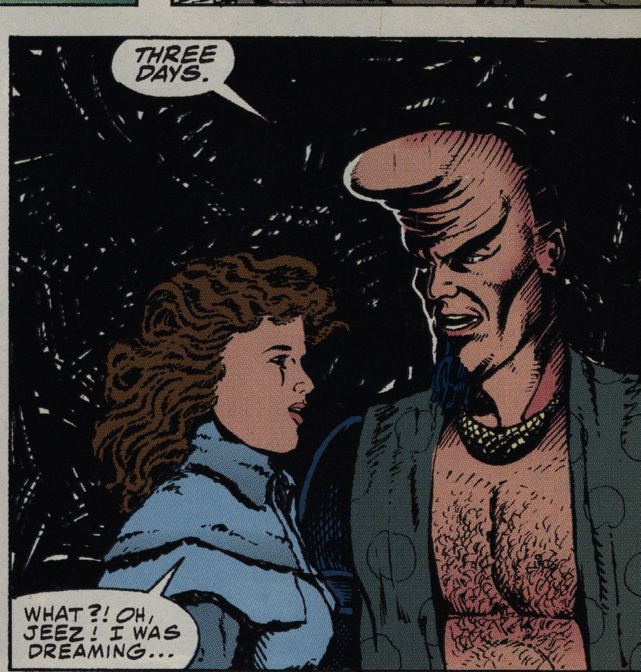
But when this series was started, everything was hunky dory in Barker-land, and we start off with four issues that adapt the movie itself. Both Alan Grant and John Wagner (the writers) are solid, and I like Jim Baikie’s artwork.
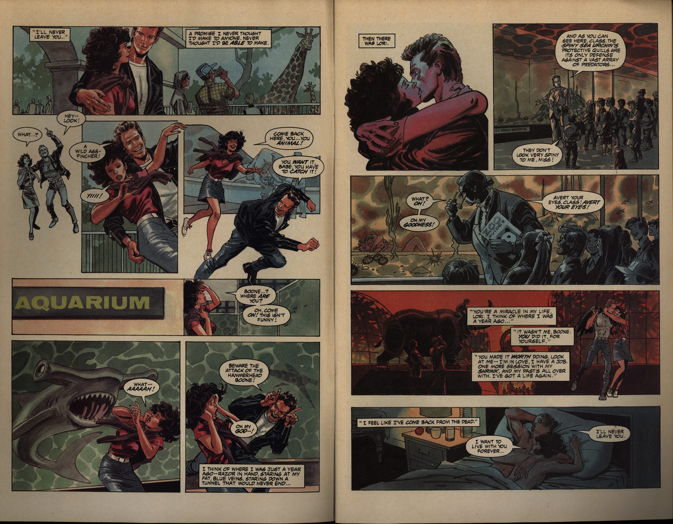
But… Baikie on a Clive Barker horror adaptation? Baikie draws lanky, attractive, slightly stiff figures… which means that he’s not somebody I would have thought anybody thinking of when talking about Barker.
But I mean… It does kinda work? It’s more thriller-ey than horrifying.
He has a very limited repertoire of faces, which makes some things slightly confusing, but his other qualities make up for it. It’s a pretty good adaptation, and if I recall the plot of the movie, they basically cover it all without feeling rushed.
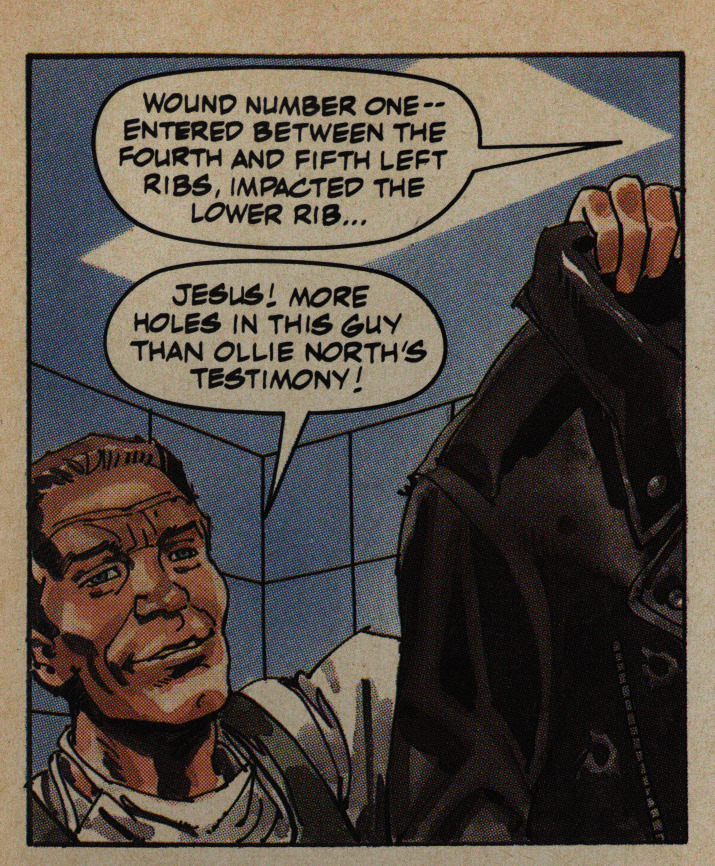
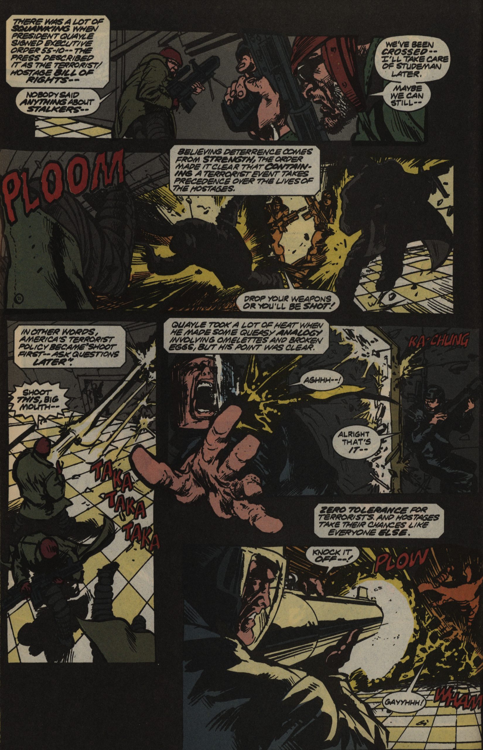
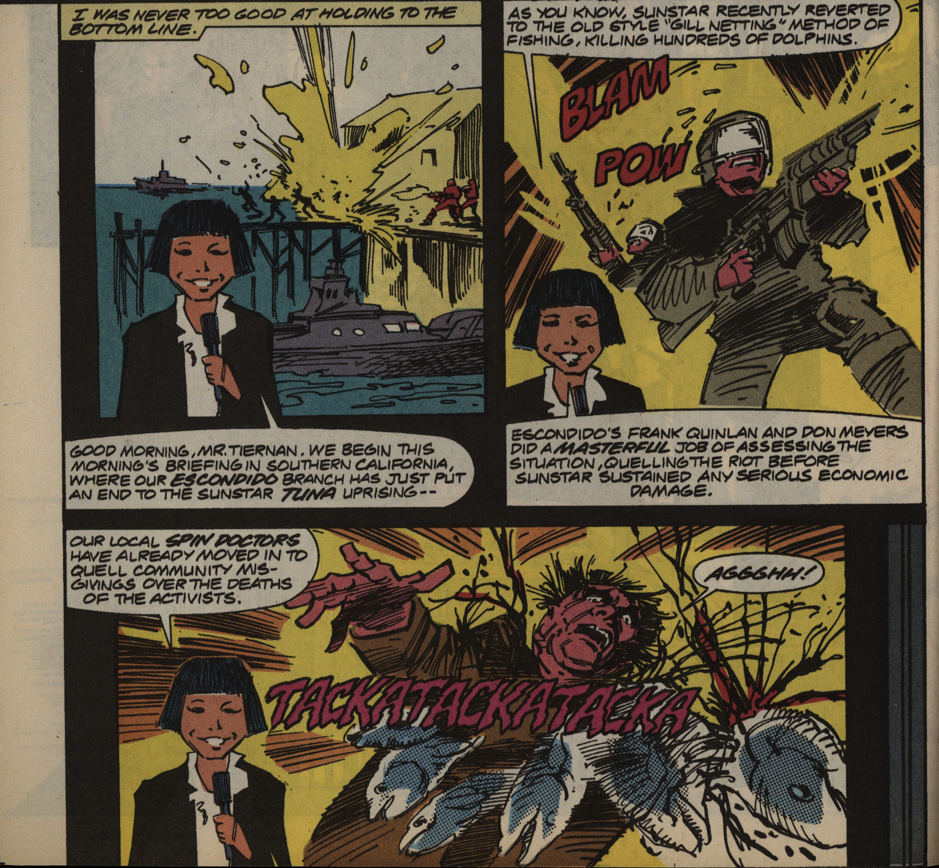
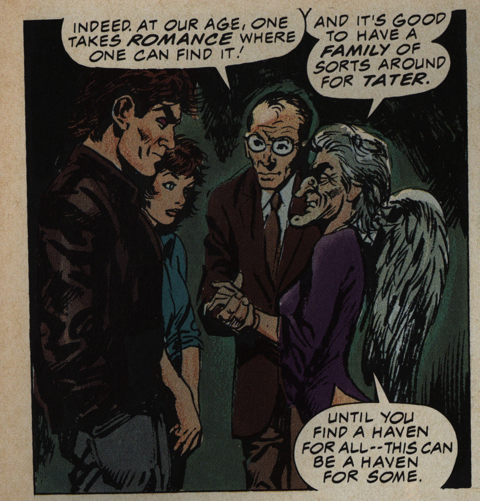
So topical!
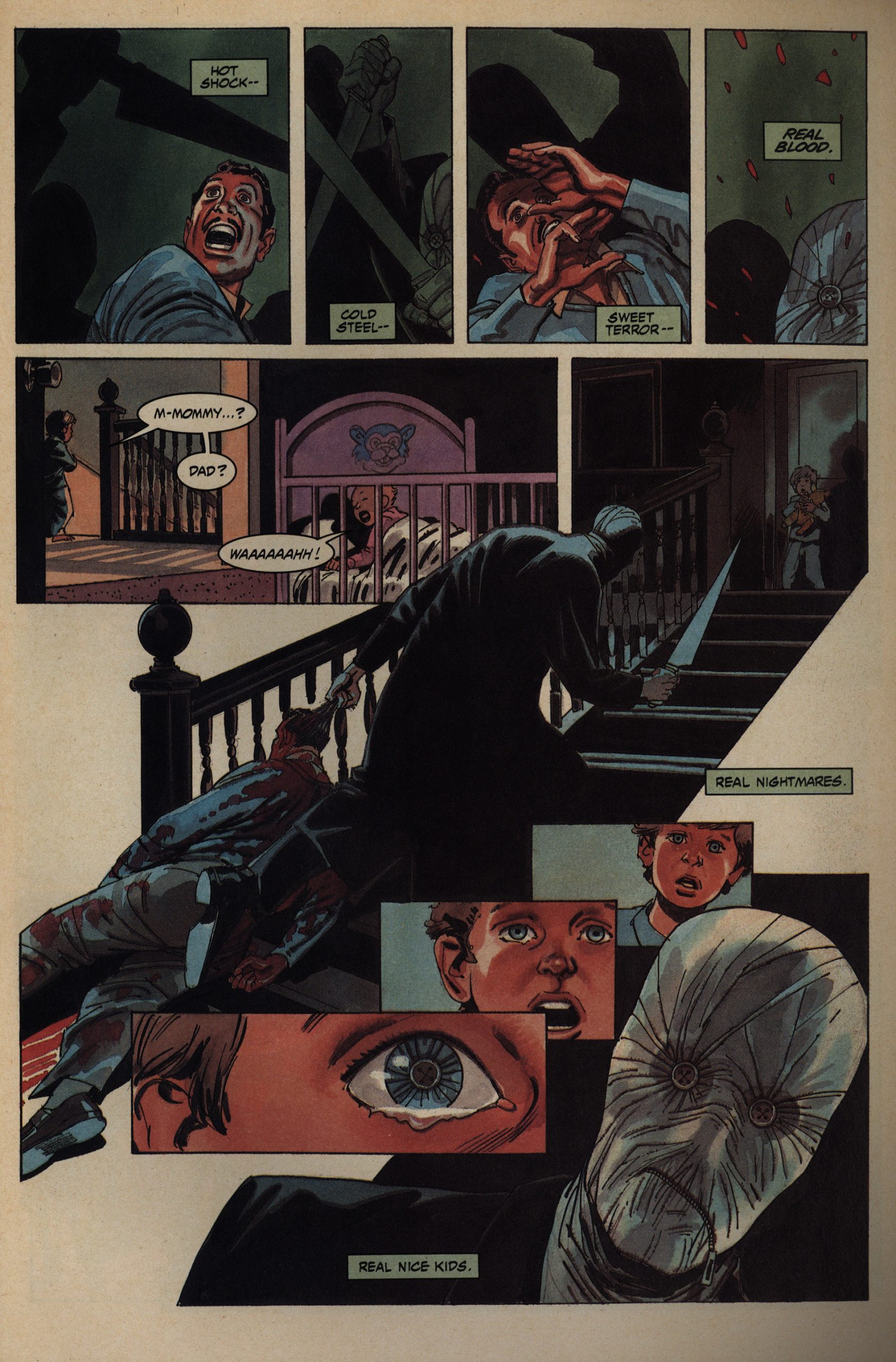
The problem is, of course, that the movie sucks, and there’s not that much this comic book version can do about that. It’s about hillbillies fighting declassé monsters, and there’s no charm, no interest, no humour, no nothing.
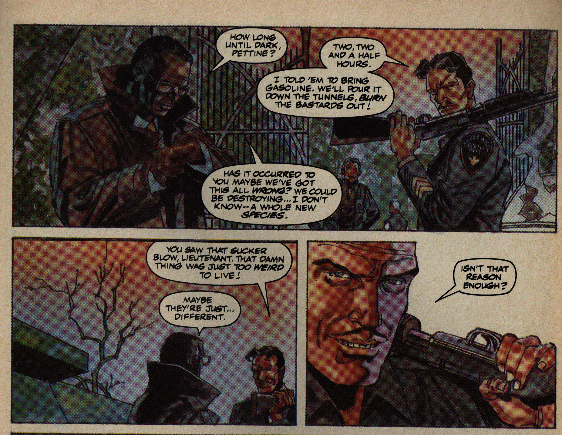
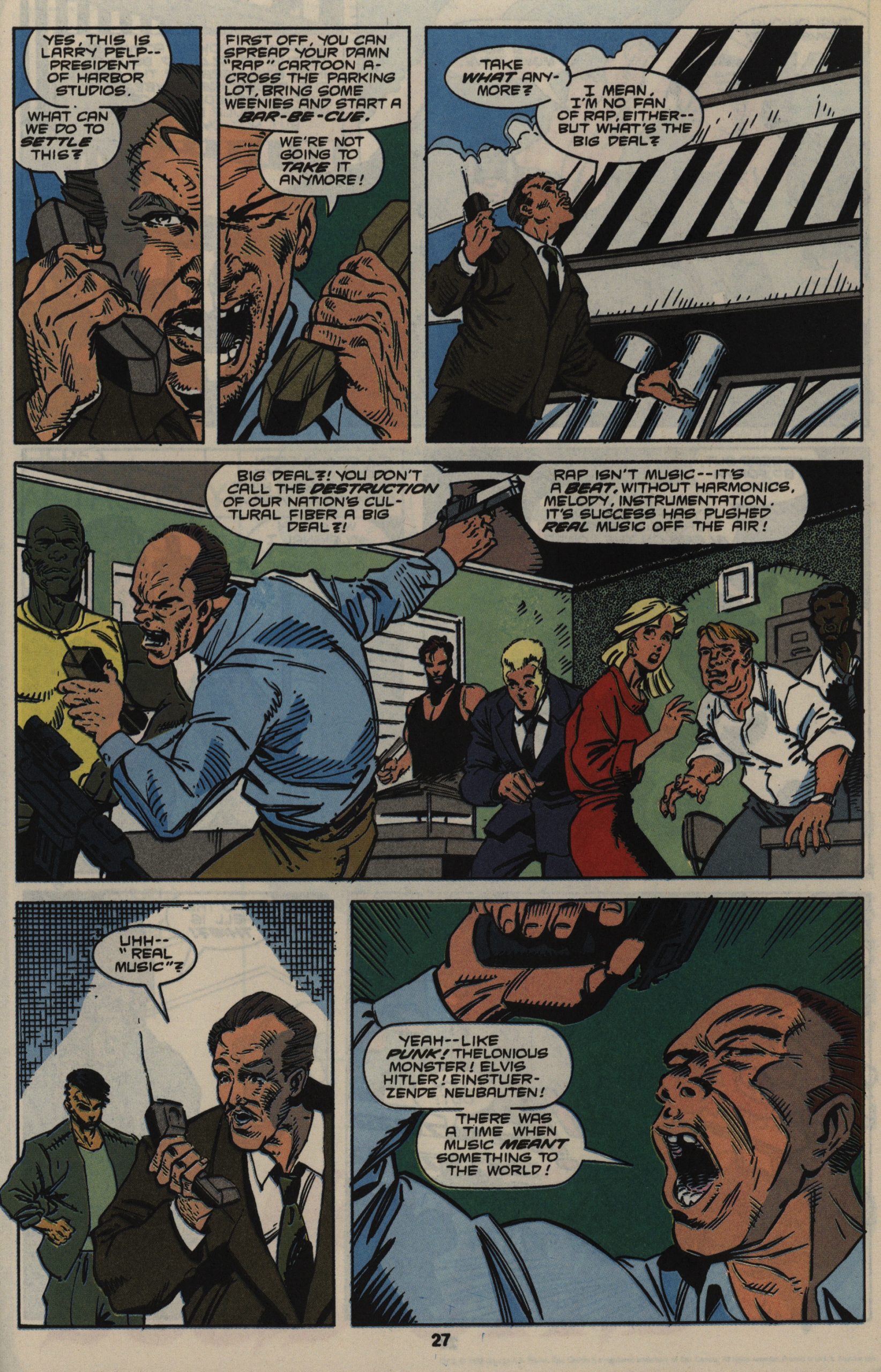
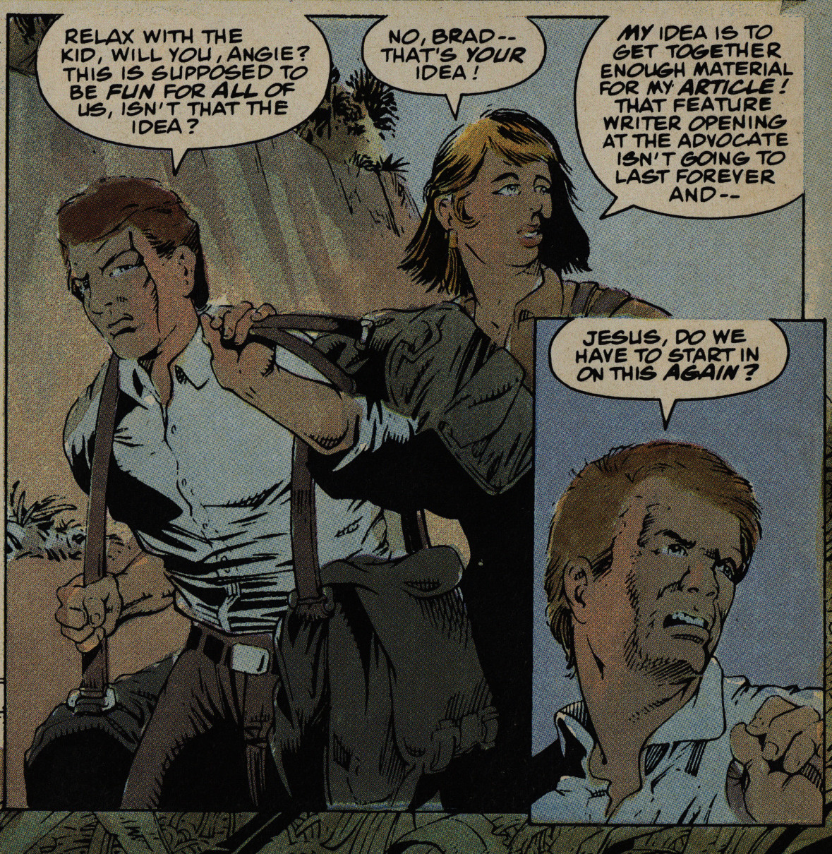
Look at all this character motivation. Look at it!
Nightbreed, like most Epic comics, is well-printed, but there’s occasional fuck-ups like this.
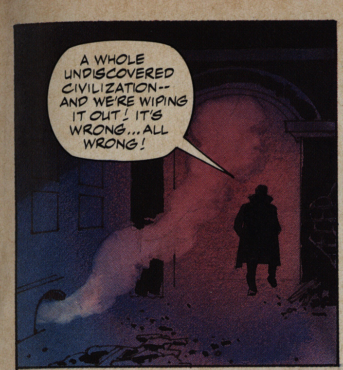
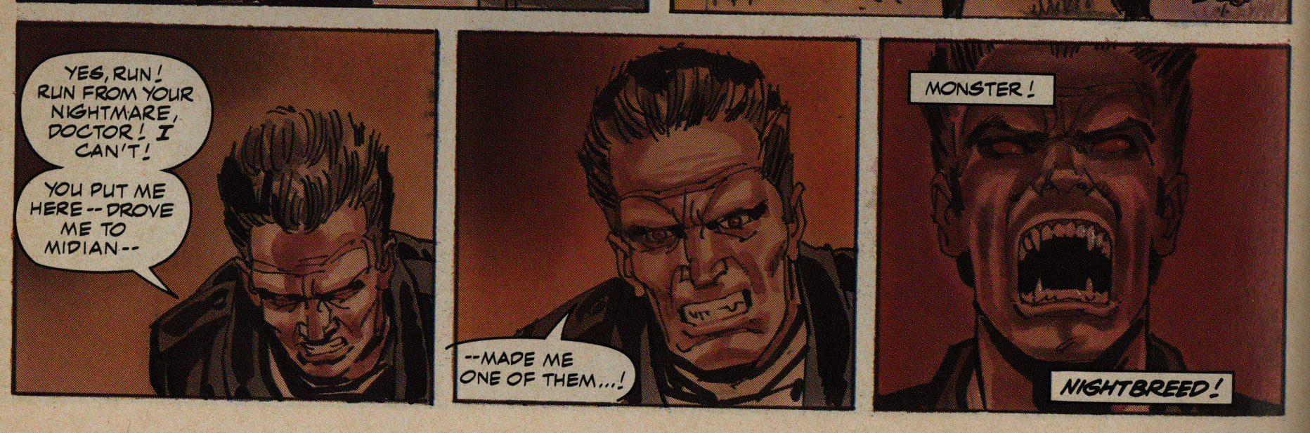
Oh the morality.
But, OK, the adaptation is a fine start to the series. It moves along briskly, and it’s pretty exciting, even if it’s hard to care all that much.
But then we come to the bits that spin out of the series, and we get a revolving cast of writers and artists. Well, Chichester is the writer for the first dozen issues, but the artists seldom last for more than an issue. Which is just plain strange for a somewhat high-profile gig like this.
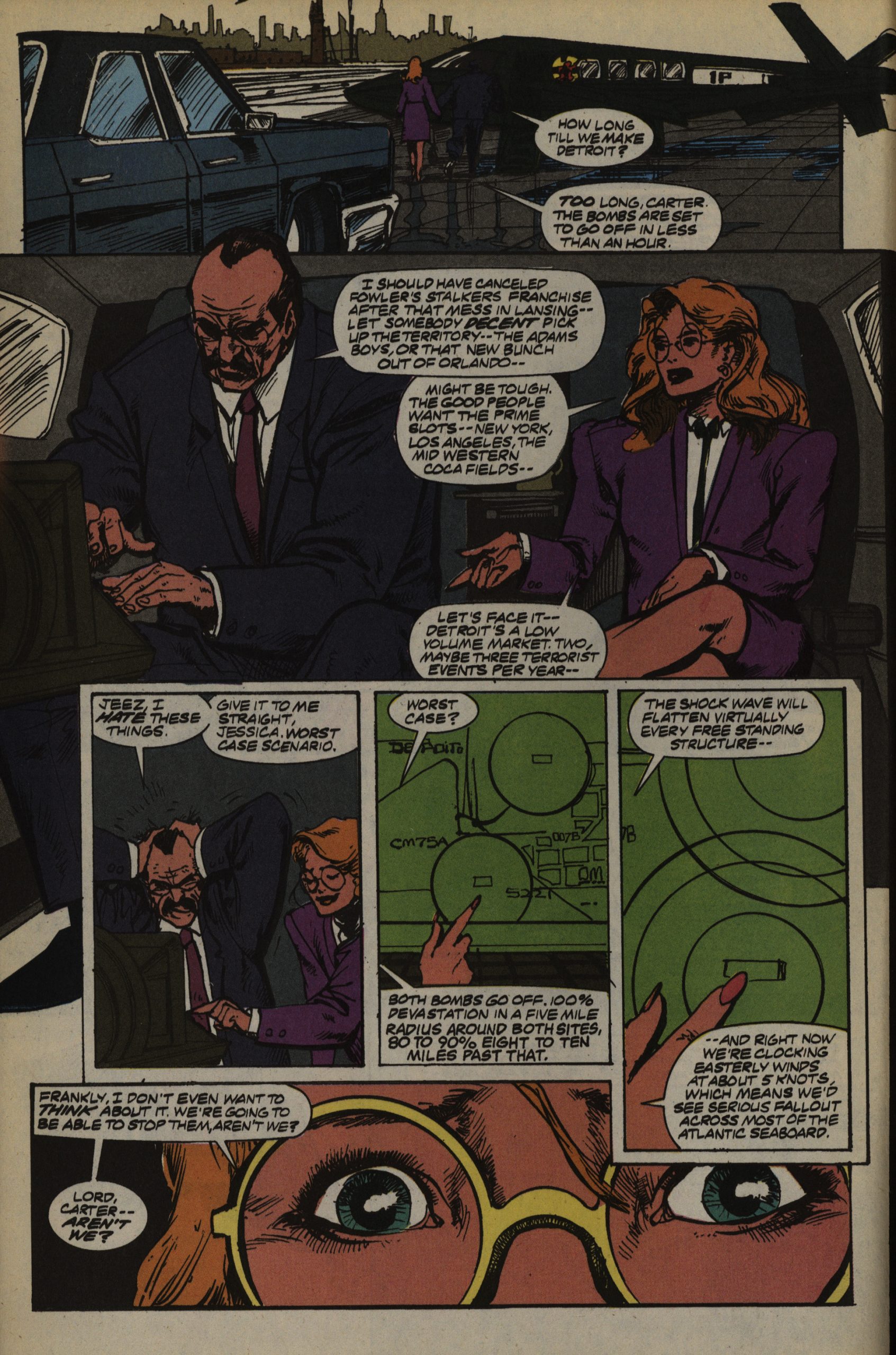
But what’s the series going to be about? In the movie, the monsters’ home was blown up, so there’s a diaspora, and Boone is going to find them a new holy land; and meanwhile there’s these monsters that are… worse than the other monsters? So we get fighting between the groups? All the while everybody’s killing the humans?
You can just read the page above. I think that explains the concept.
In issue six, they stop calling it an adaptation of the script.
And, oh boy. Is it ever not adapted from the screenplay.
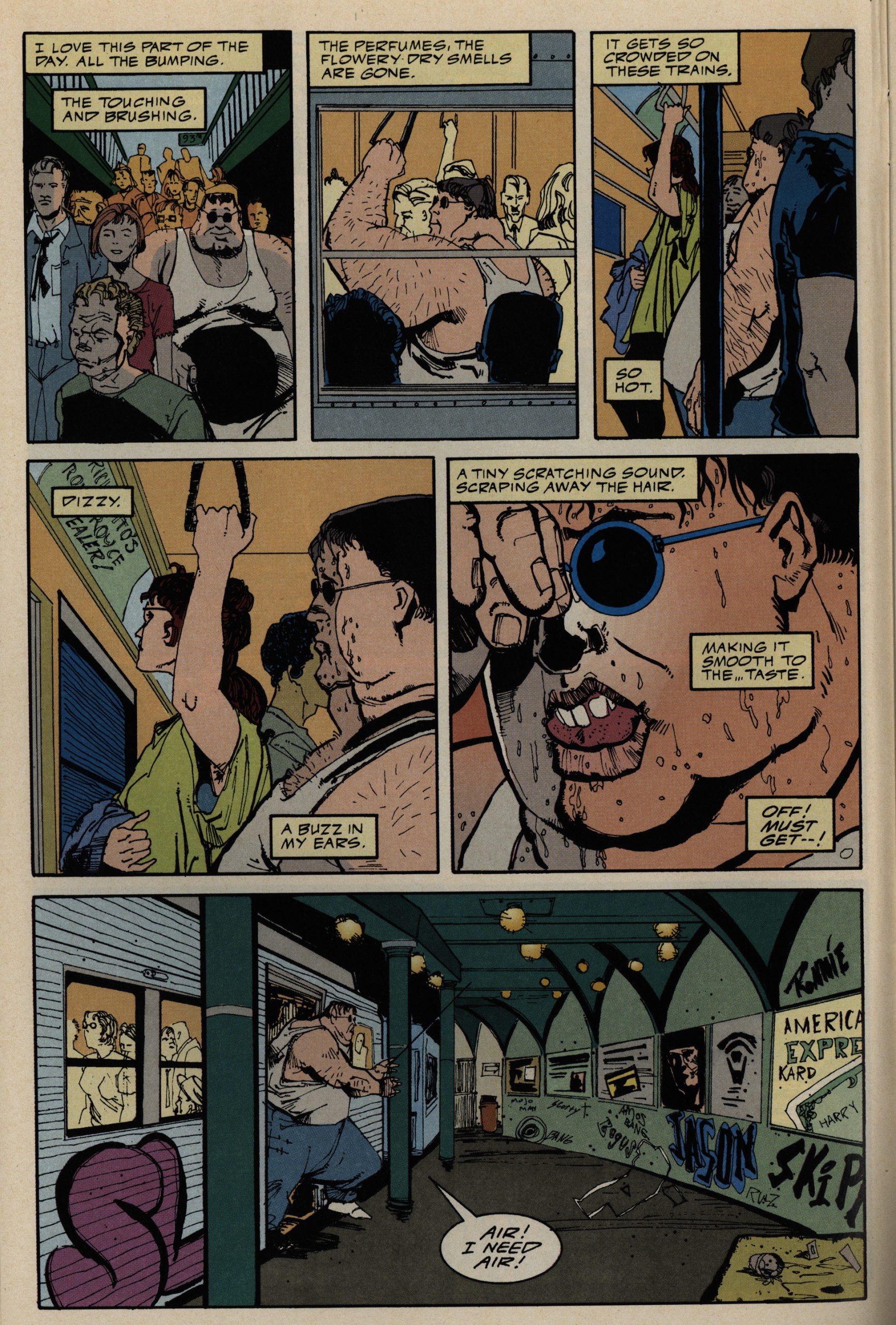
It’s more like Gremlins 2? The monsters are now happy-go-lucky assholes who go around terrorising people. Even over the phone.
If there’s anything further from the feel of Nightbreed, the movie, it’s this. Which might perhaps be a good thing, since the movie isn’t any good, but this is … awful.
Does it? Does it really!?
…
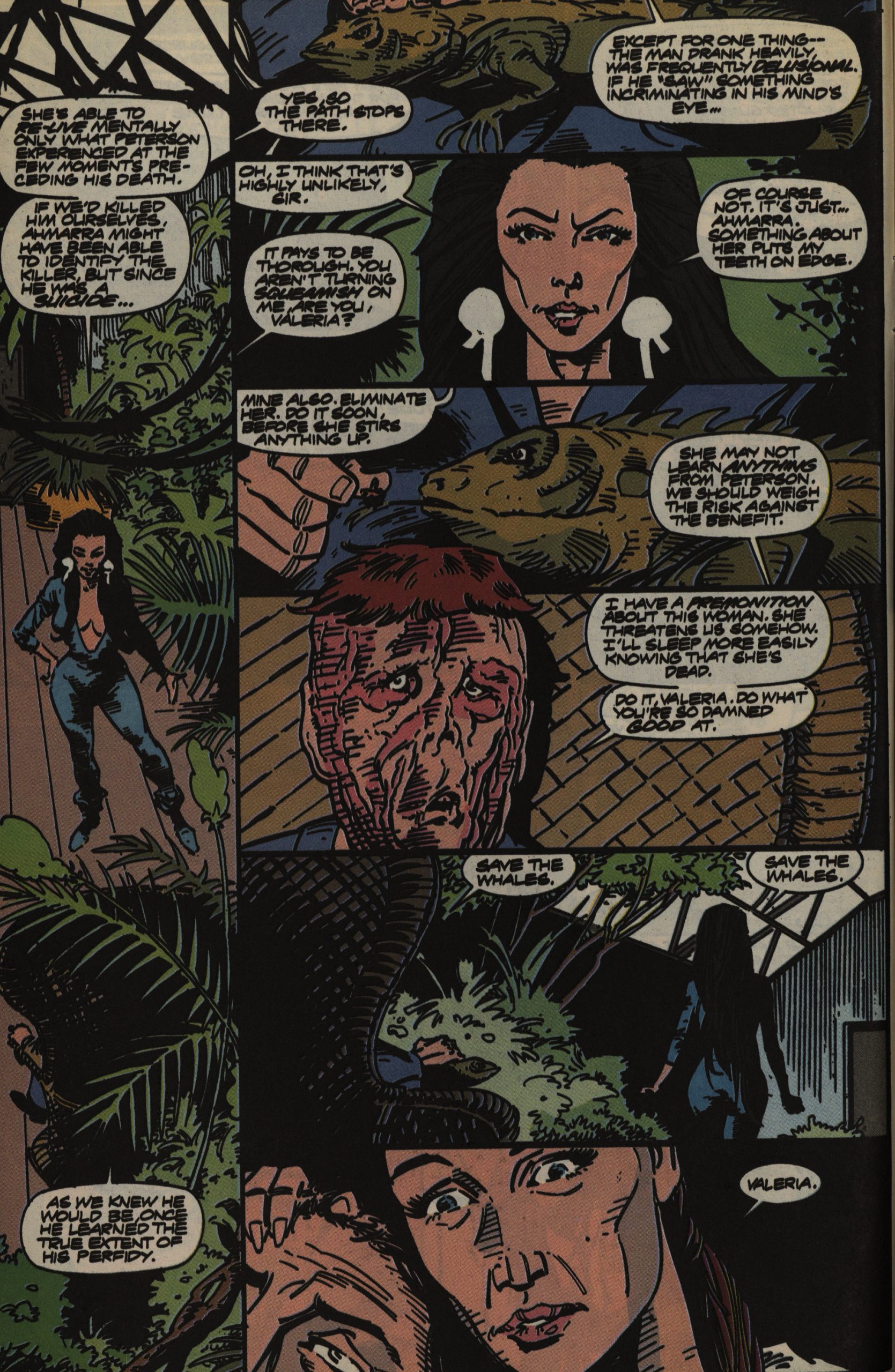
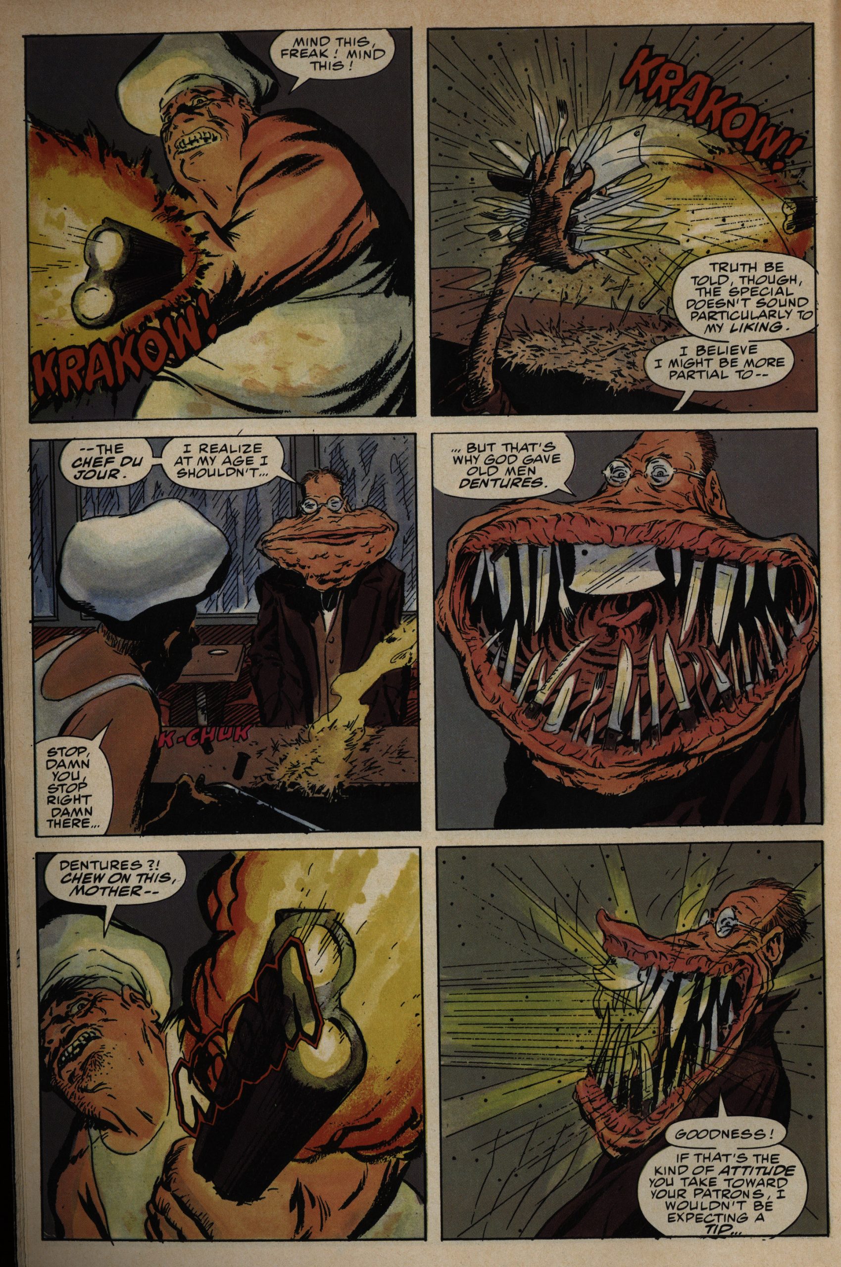
What’s even more annoying than the unfunny jokes and the plots that make no difference is the artist merry-go-round. Characters look wildly different from issue to issue, and much of the artwork looks rushed and ugly. Mark Nelson above.
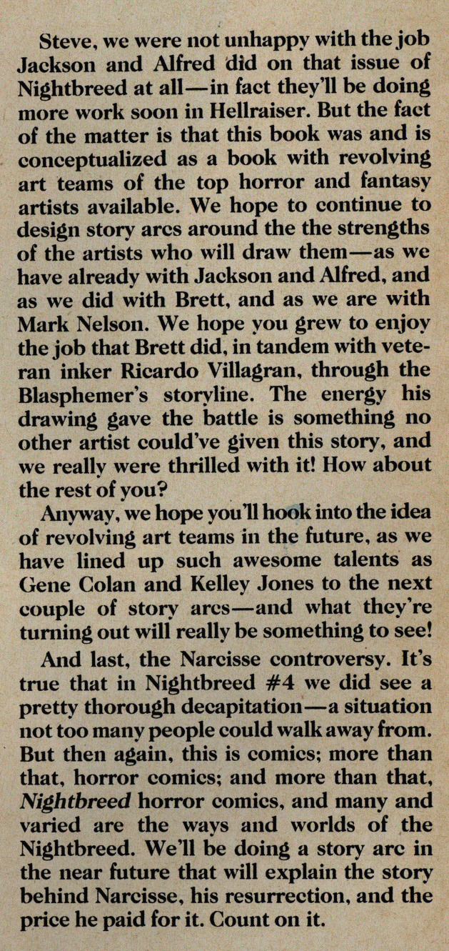
“The fact of the matter is”… Have you ever noticed than when people lie, they have a tendency to say “actually” or “in fact”. So, yeah, sure, when the book was “conceptualized” they did mean for it to have a different artist every issue. Sure.
But this does mean that we sometimes do get some very nice artwork indeed, like this issue from Mark Texeira. The pages toward the end of the issue does look rather rushed, though.
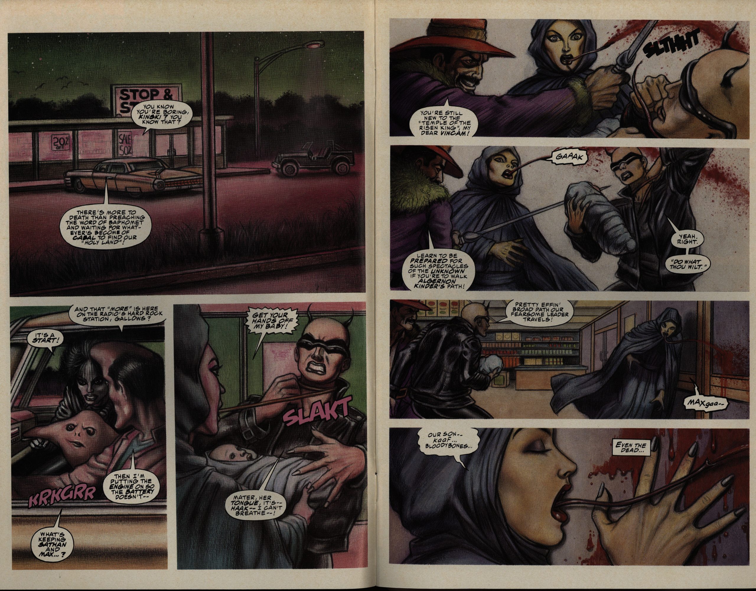
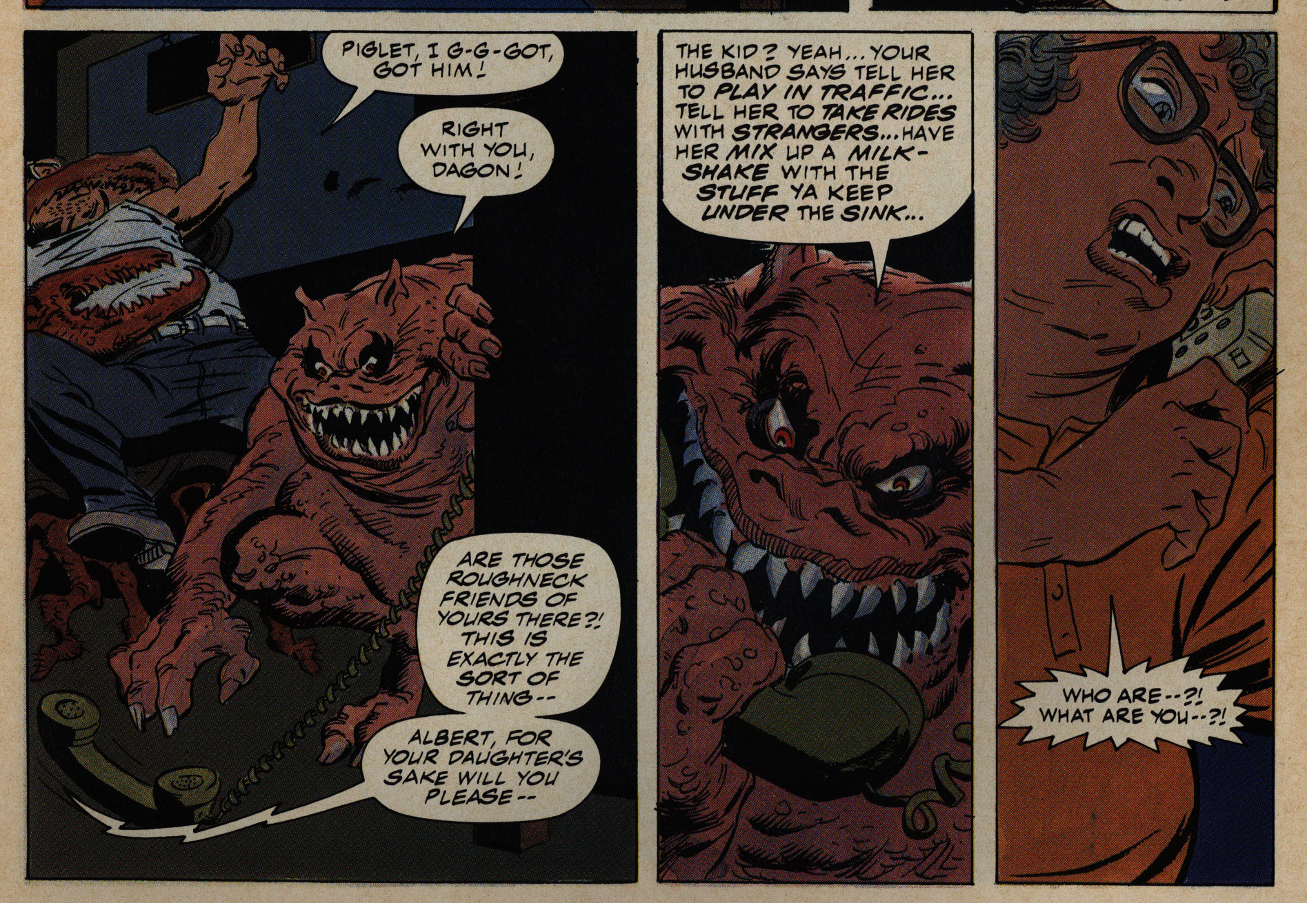
And this is kinda fun, I guess? Dan Lawlis and John Rheume, possibly. It’s really, really bad action comics, though, but you can basically make out what’s happening. (And, yes, that woman with the tongue somehow dies from having it shortened a bit.)
They don’t just change artists between issues, but in the space of one issue, too.
So I have no idea who this is by.
This has a certain something, I think?
Packaged with Dirt Magazine!? Aimed at young men…
After Chichester leaves, the storyline (as it was, and it wasn’t a lot) totally disintegrates, and we get some issues of random monsters and then some more plot, and then it turns out that all the plot had happened in a crossover with Hellraiser called Jihad. A very Marvel move: Making the big plot points happen somewhere else.
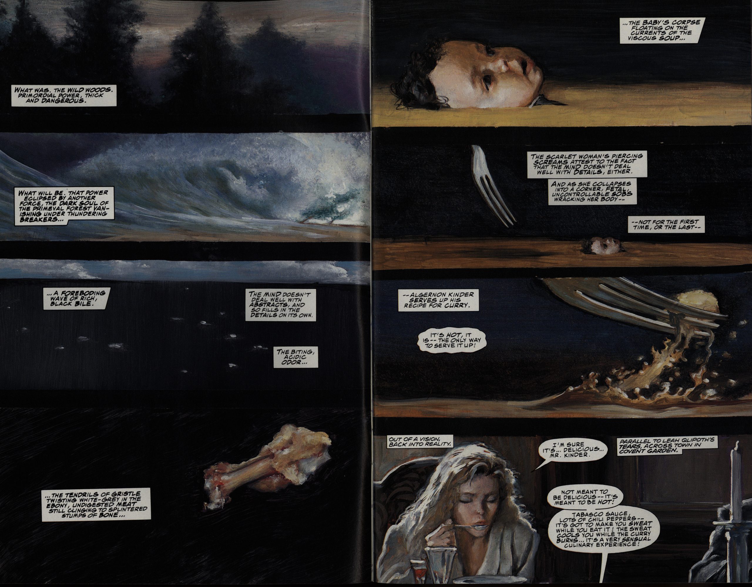
Anyway, this means that you can bring in writers like Larry Wachowski for an issue, and it’s the most disgusting issue in the series. In a good way.
The letters are mostly positive, but we’re promised that Barker does supervise the storylines.
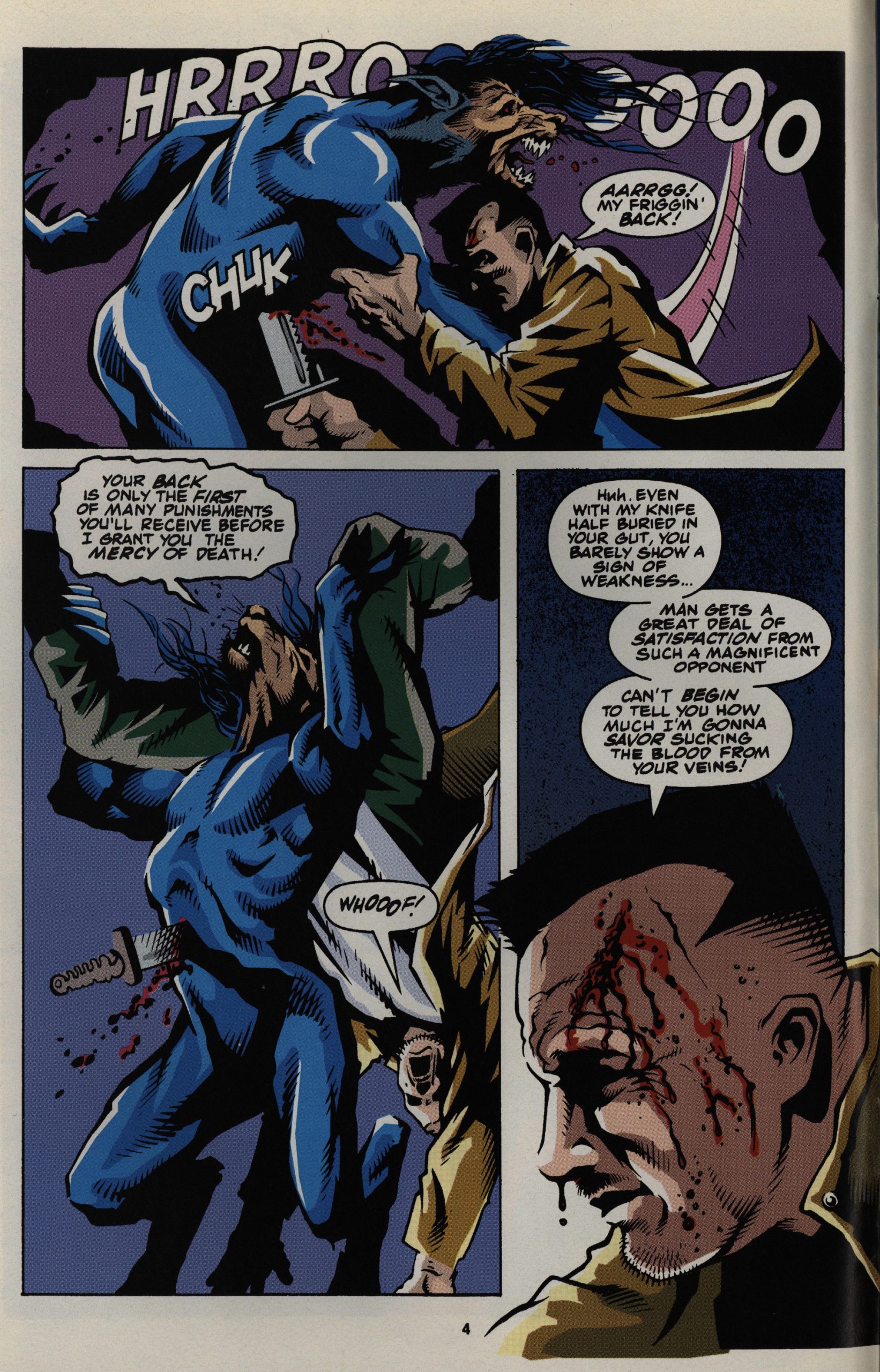
Tony Harris’ artwork certainly has some stark qualities, but doing fight scenes is not one of them.
Colleen Doran is roped in to do the pencils on two issues, and as much as I like Doran, this is pretty er ropey work. Perhaps it’s the inker, but this is probably the worst stuff Doran has ever done.
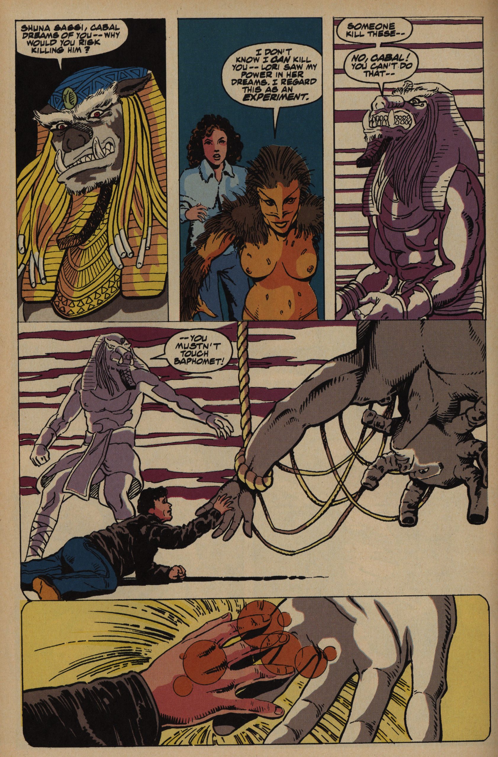
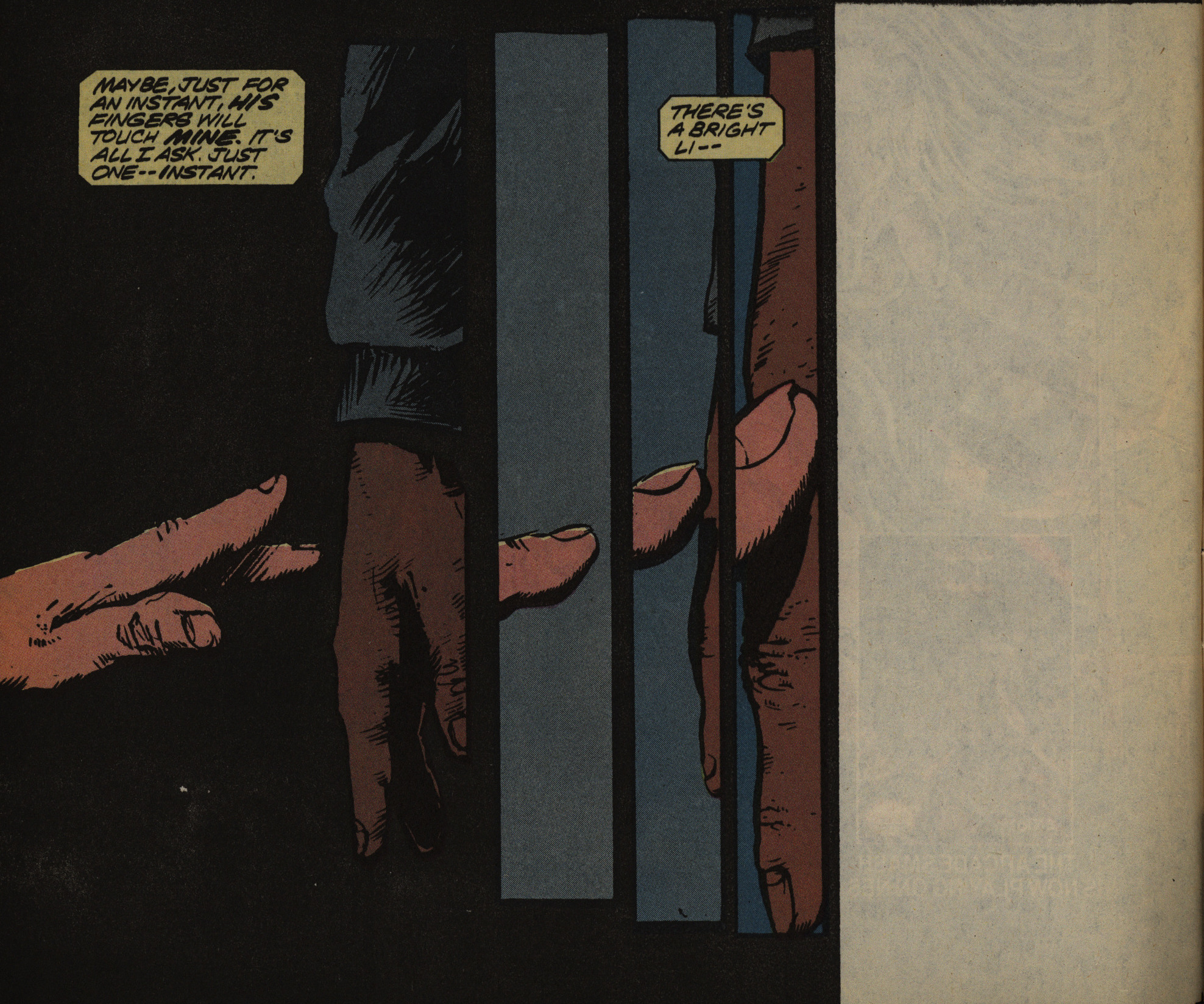
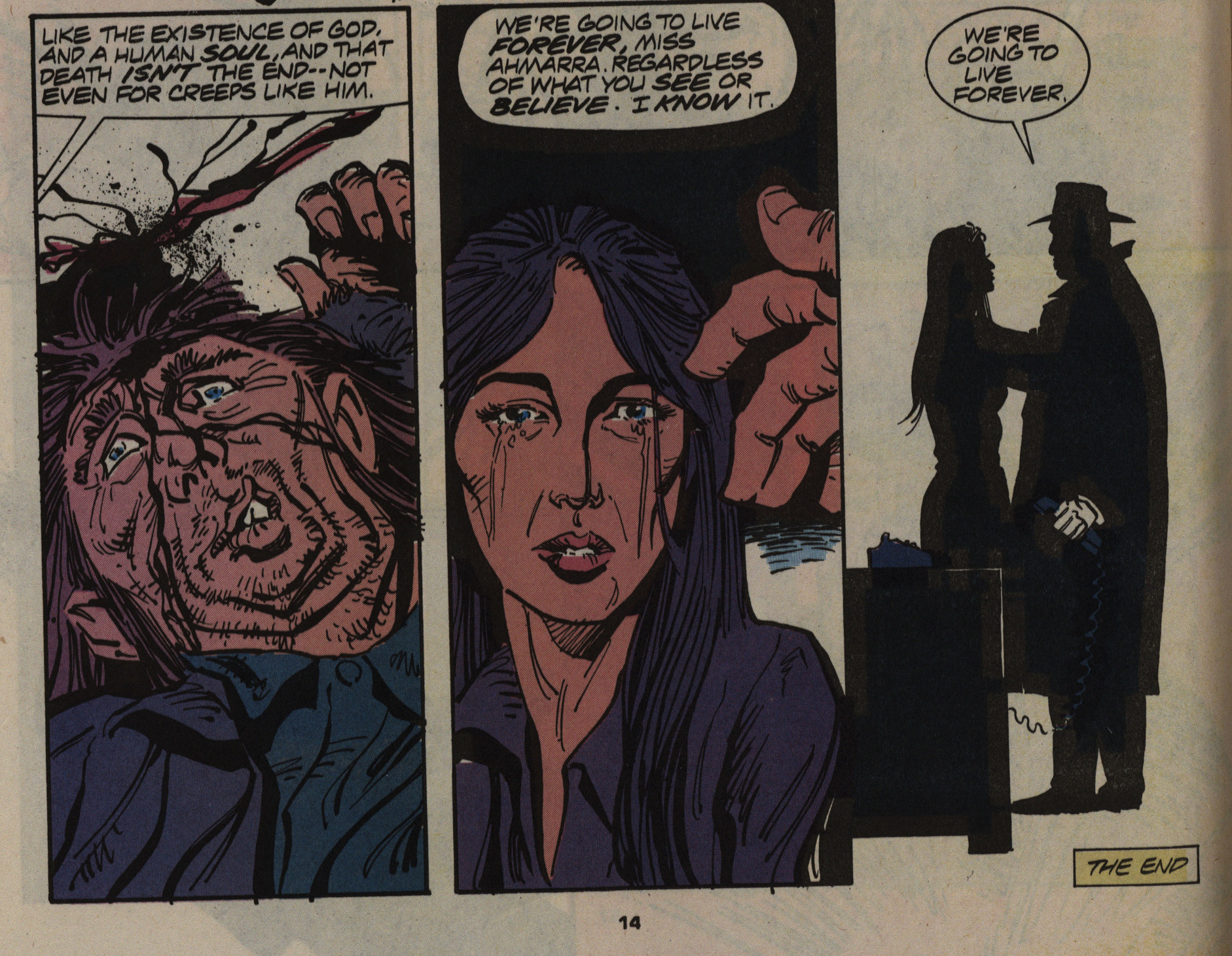
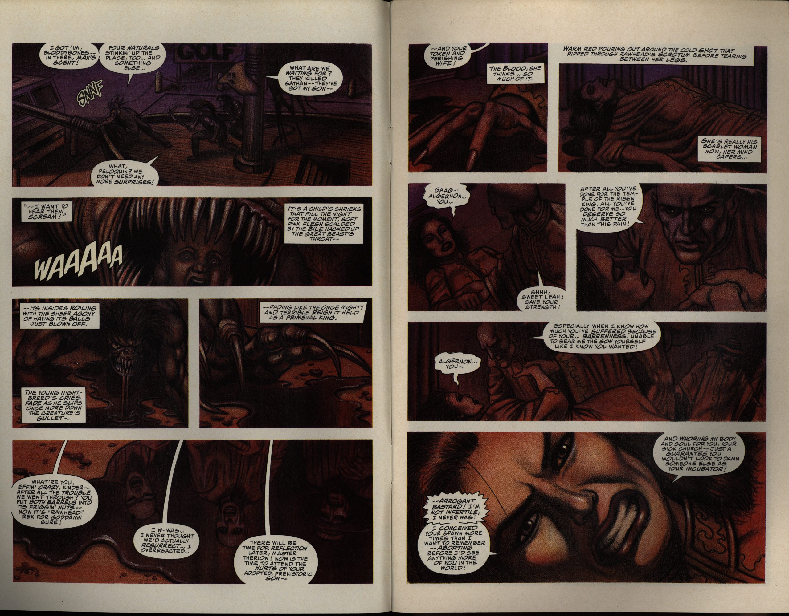
No touchy the Baphomet! Oh, right, spoilers: This scene is the climactic resolution to an epic storyline of etc etc. Yeah, it’s boring.
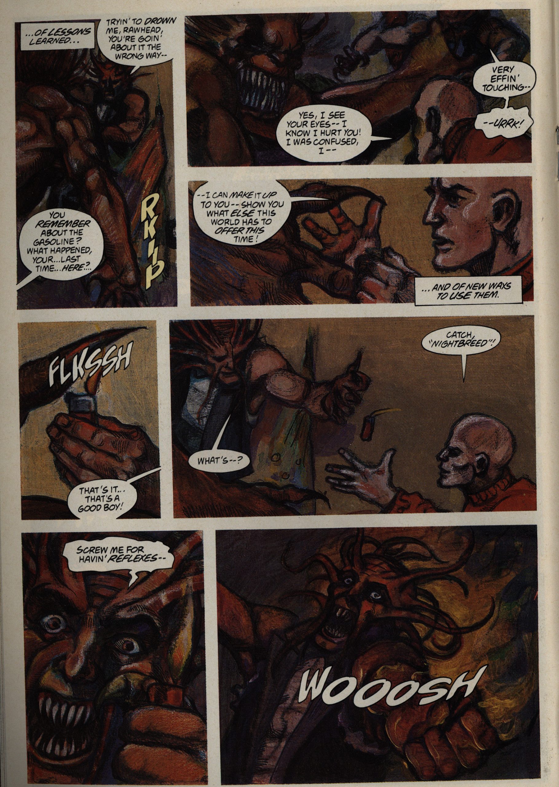
I like what Max Douglas is doing here, what with the spattering and the lines and stuff.
But this shifting-focus thing is less sucessful.
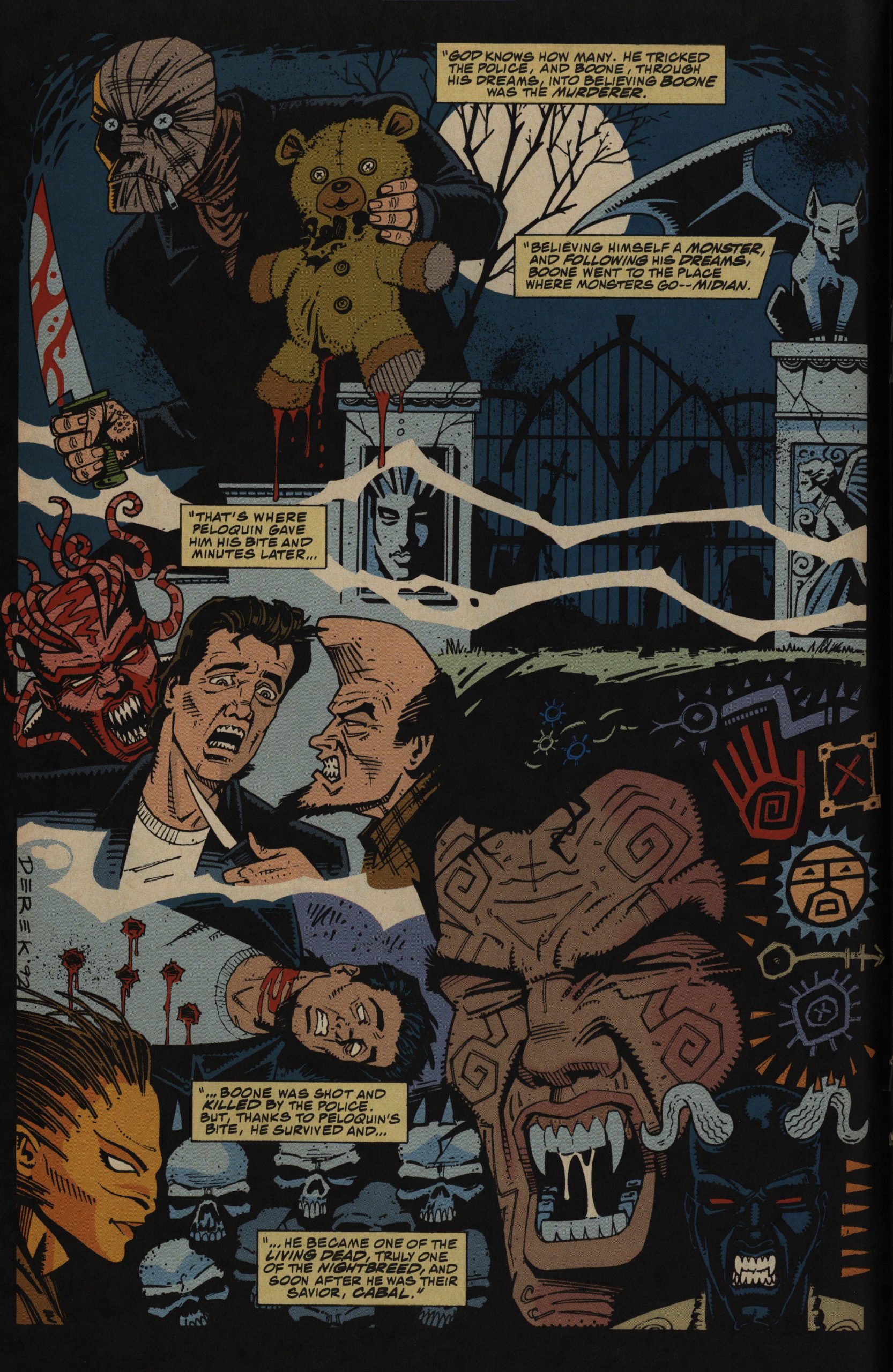
Then we’re at the home stretch! Two issues to go, and … we spend the last-to-final issue getting a recap of everything that’s happened before?!
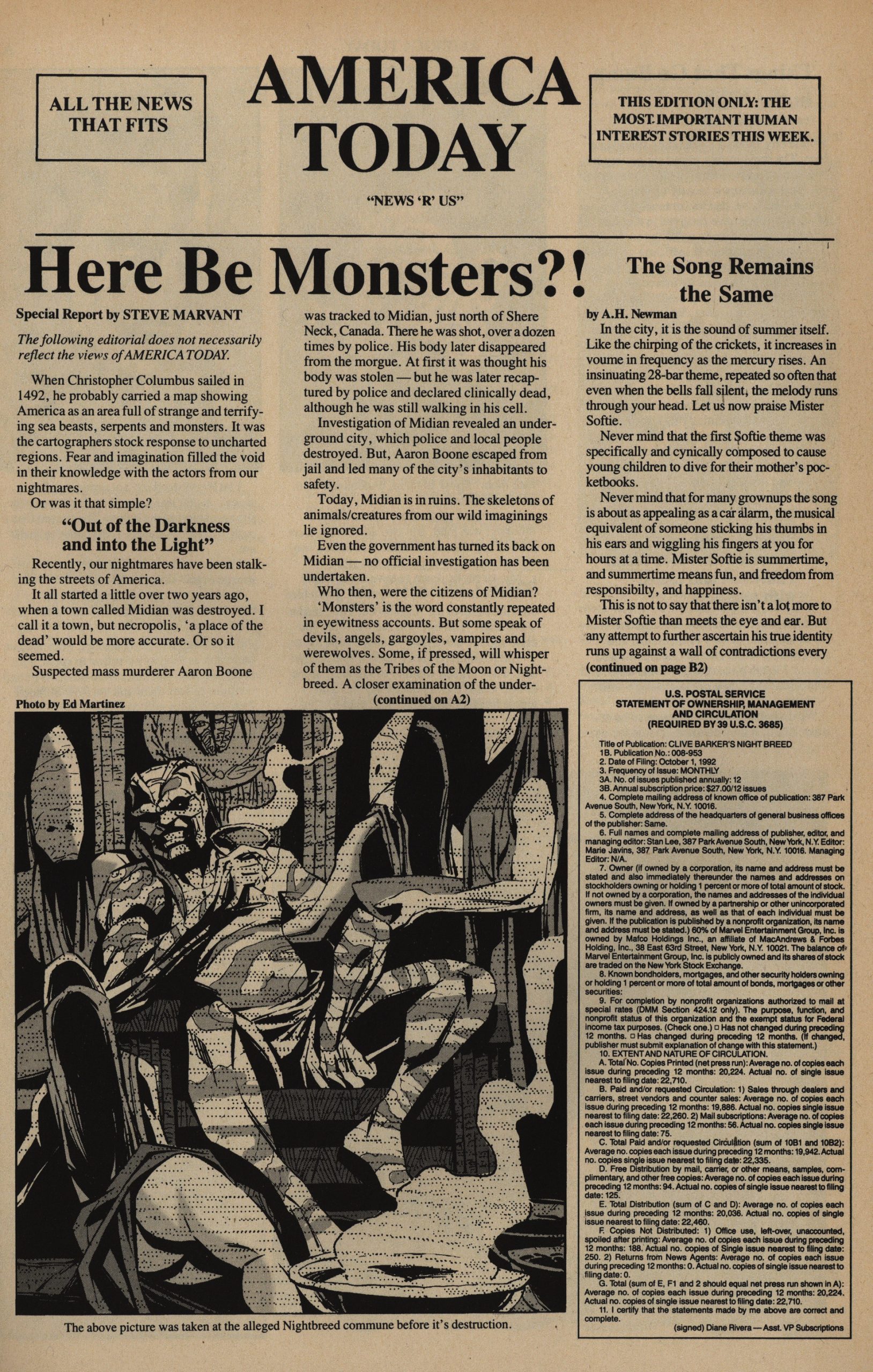
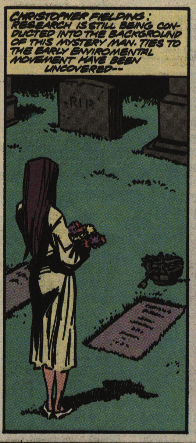
And then the final issue starts with several pages of newspaper cuttings!? (Oh, and we’re told that the circulation of the book is about 20K.)
I think this panel sums up the final issue: We do get a resolution to the entire er plot, as it is, but it happens so quickly as to feel like a *thud*.
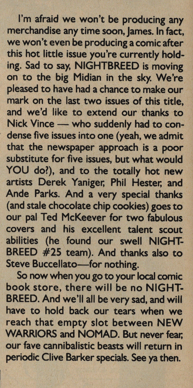
And then we find out the reason why: The wrap-up was supposed to be five issues, but everything had to be squeezed into a single issue, because the book had been cancelled.
Larry Stark writes in Amazing Heroes #178, page 93
Nightbreed opened in a moviehouse
half the distance to my local comics
shop two days before the first issue of
the comic arrived on the shelves.
Since the title had already been de-
layed for months, I was to see
the flick before reading the book since
I had seen two newspaper reviews—
one that loved, one that hated it. But
I’m not spending six or seven bucks
to review a comic! Besides, it stands
on its own or it doesn’t, right?
Well, in this case it doesn’t. After
reading through the first issue, I
remembered some things from those
reviews that made more sense of the
comic than anyone uould have had
from the pages themselves. In other
words, if I’d seen the movie, I would
have understood the comic. Since I
hadn’t, everything came very quickly
and sketchily. Things happen in this
comic so swiftly and with so little
preparation that, apparently, the
creators expect that anyone paying
$1.95 are only hoping to be reminded
of the flick they’ve already seen.
And if you have, why bother?[…]
Jim Baikie’s “art” .is garishly col-
ored on slick paper, but it has the look
of illustrated film in every frame, and
not always well-chosen frames at that.
At least there are backgrounds in most
panels, and I suppose IEople who have
seen the flick will be reminded of
scenes which must have much more
punch on screen than they have here.
Some (or all?) of these comics have been reprinted in a hardcover series called Clive Barker’s Nightbreed Archive. I couldn’t find any reviews of them.