The Elsewhere Prince (1990) #1-6
by Moebius, R. J. M. Lofficier, Eric Shanower and others
What’s this then? Yes, it’s the first series from the projected Gruberverse we were teased in the Moebius graphic novels Epic had published earlier.
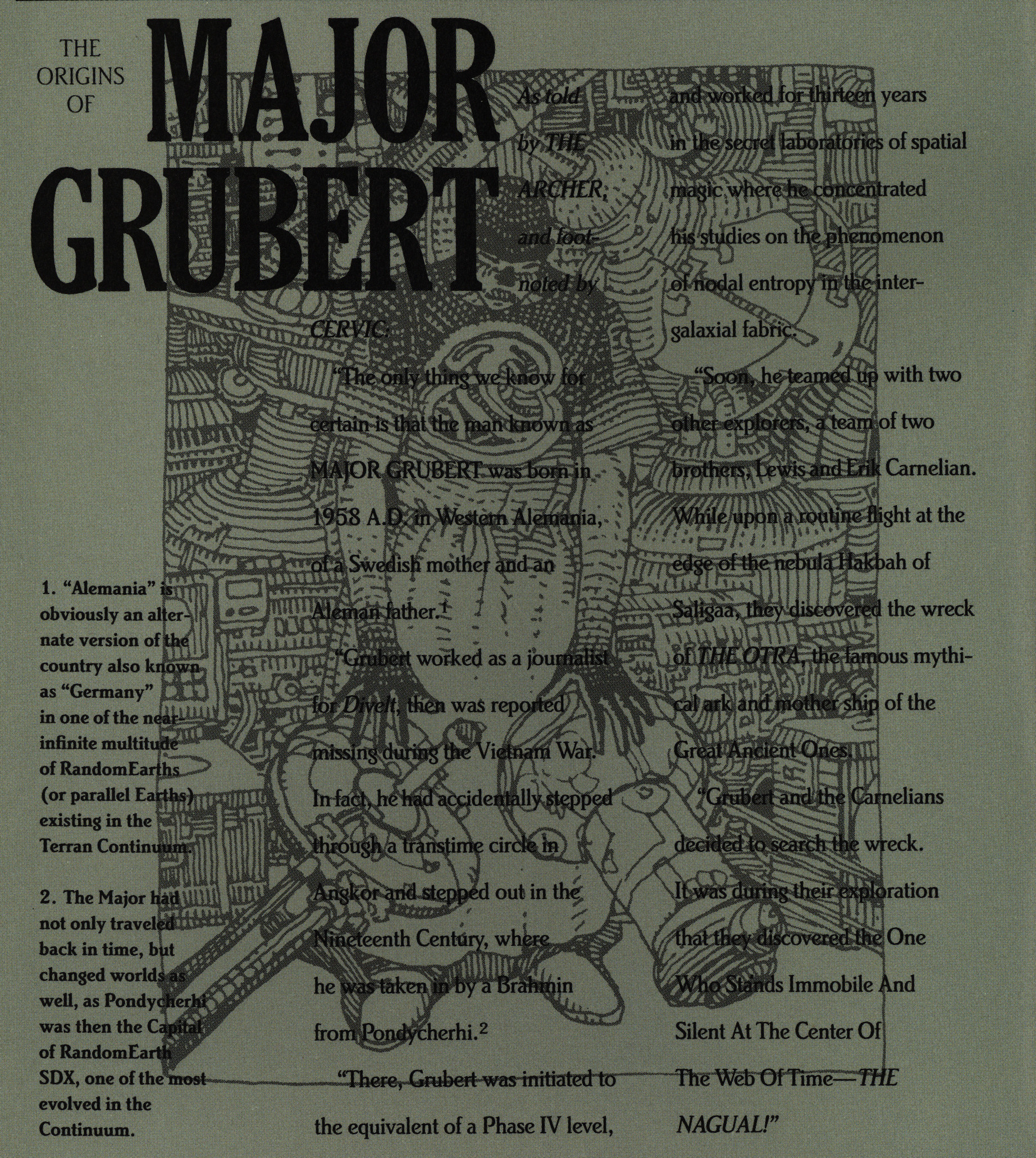
Fortunately just one of the pages of expanded/backstory is printed in the illegible way…
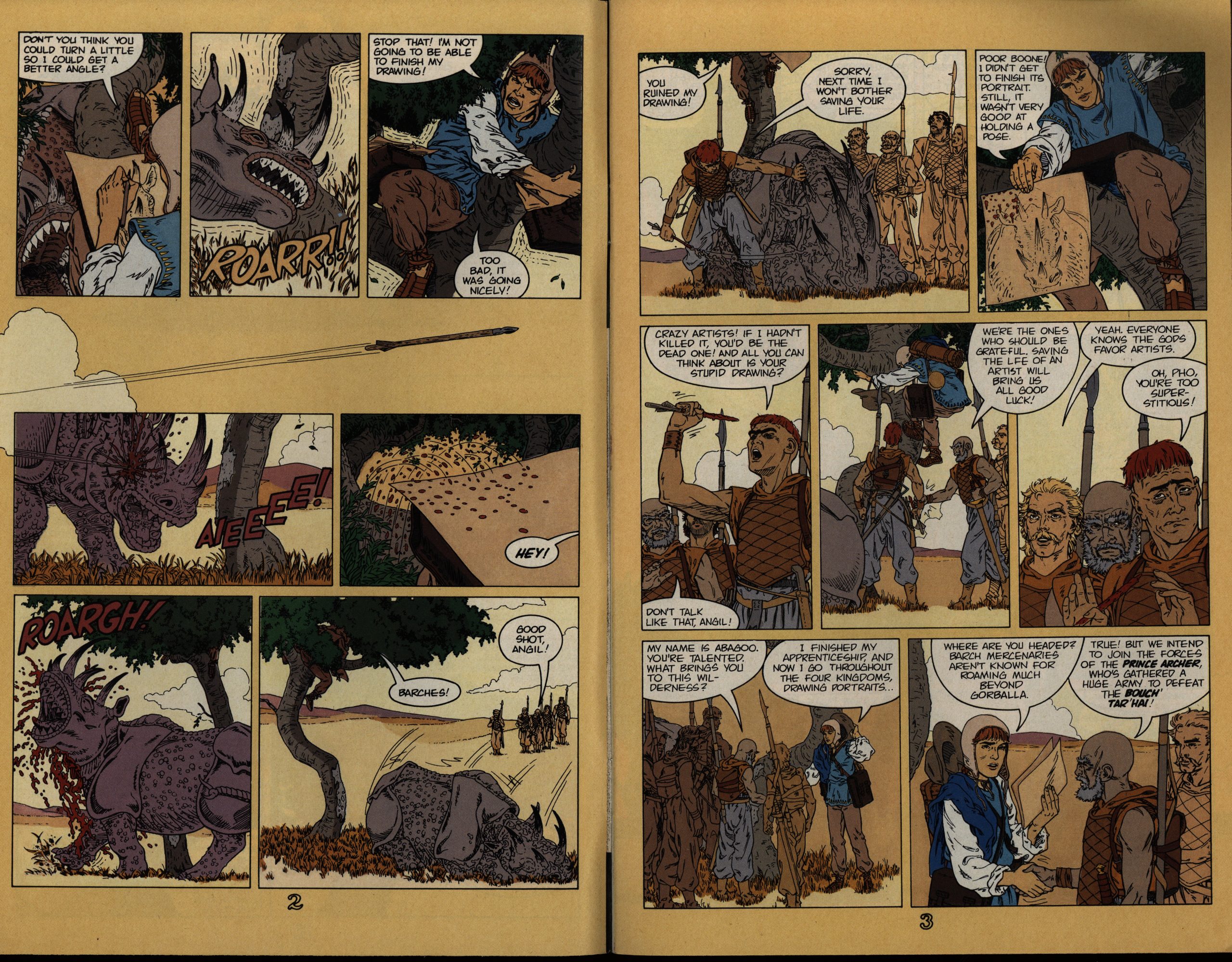
Anyway, the artwork is by Eric Shanower, who had previously done a bunch of Oz adaptations. He seems like a natural choice — his artwork doesn’t seem influenced by Moebius, but he’s also got that open, clear, attractive style going on, and mixes adventure with goofiness brilliantly. But… there’s some really odd choices going on here with the colouring. I mean, one thing is colouring the gutters…
Another is that, since Shanower doesn’t vary his line widths a lot (or any), it needs some help from the colouring to make central characters stand out from the backgrounds. And the colouring here does absolutely nothing to help there.
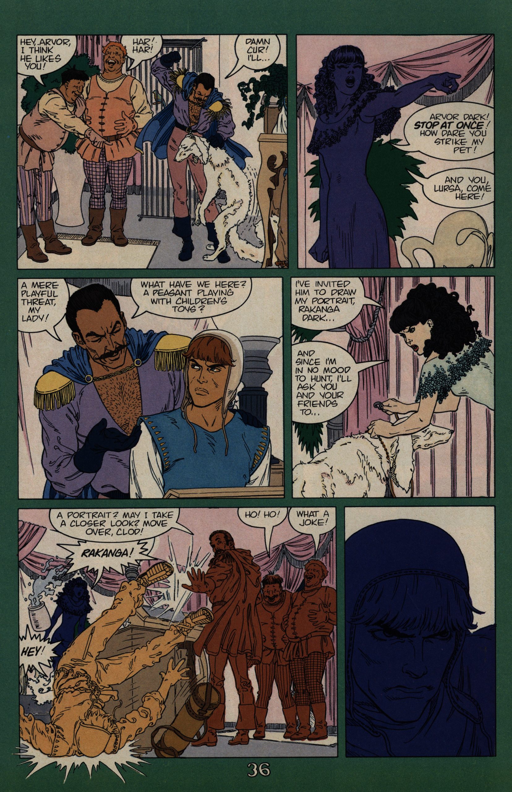
I mean, look at that hysterical guy running around there: That’s solid, funny, goofy running-around. It’s perfect, and nobody from Hergé’s studio could have done it better. But you really have to squint to actually see that. And I bet you didn’t even notice the dog?
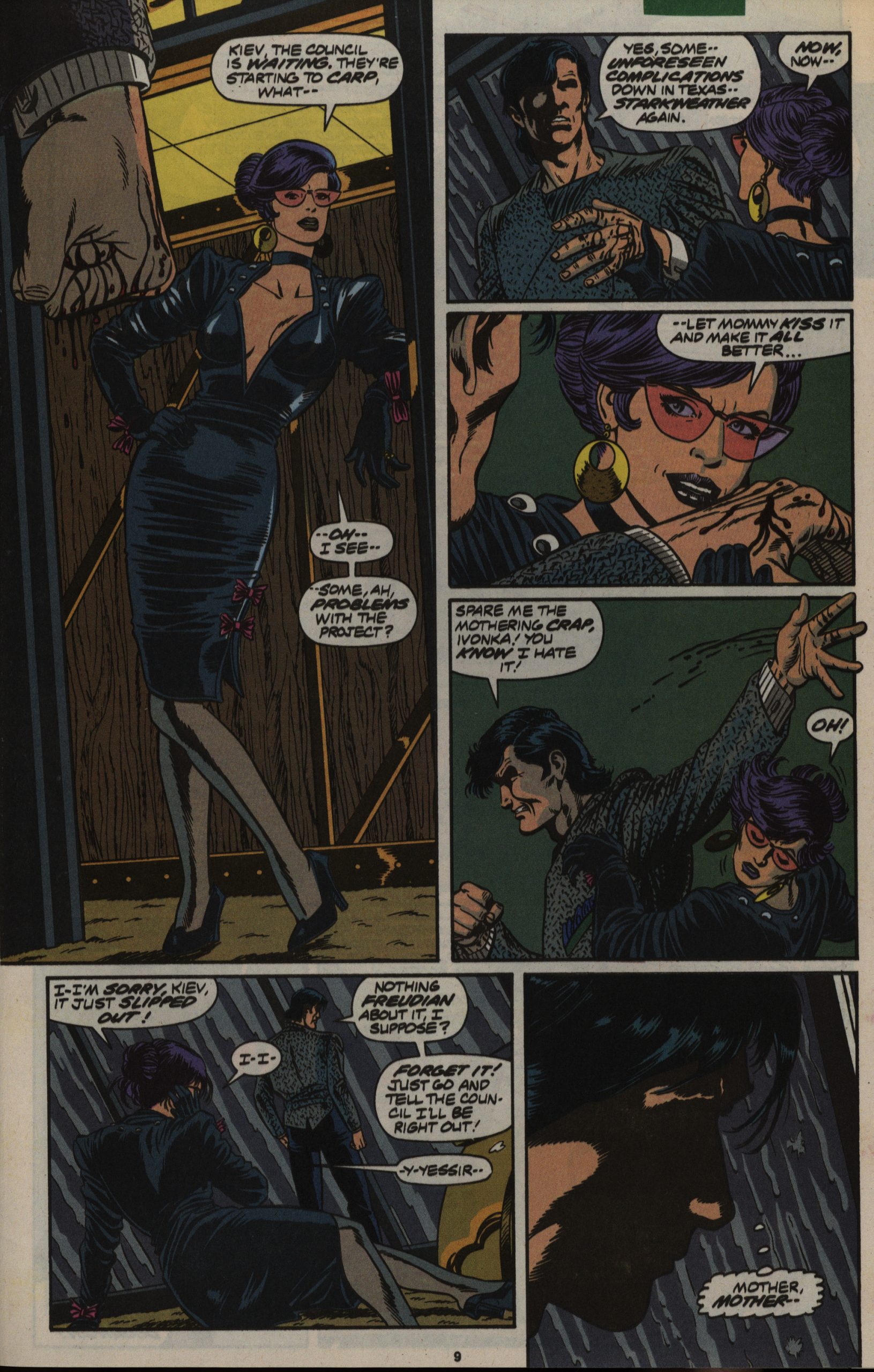
The colourist(s) frequently just colour the foreground figures with almost the same shade as the background. It’s bizarre, and rather takes away from the enjoyment of reading this series…
… which is substantial. I was totally ready to be like “eh, a Hermetic Garage spin-off? HOW DARE THEY!” But this is a real, proper adventure, with mystery, intrigue, meta stuff, different dimensions, and slapstick.
I’m shocked.
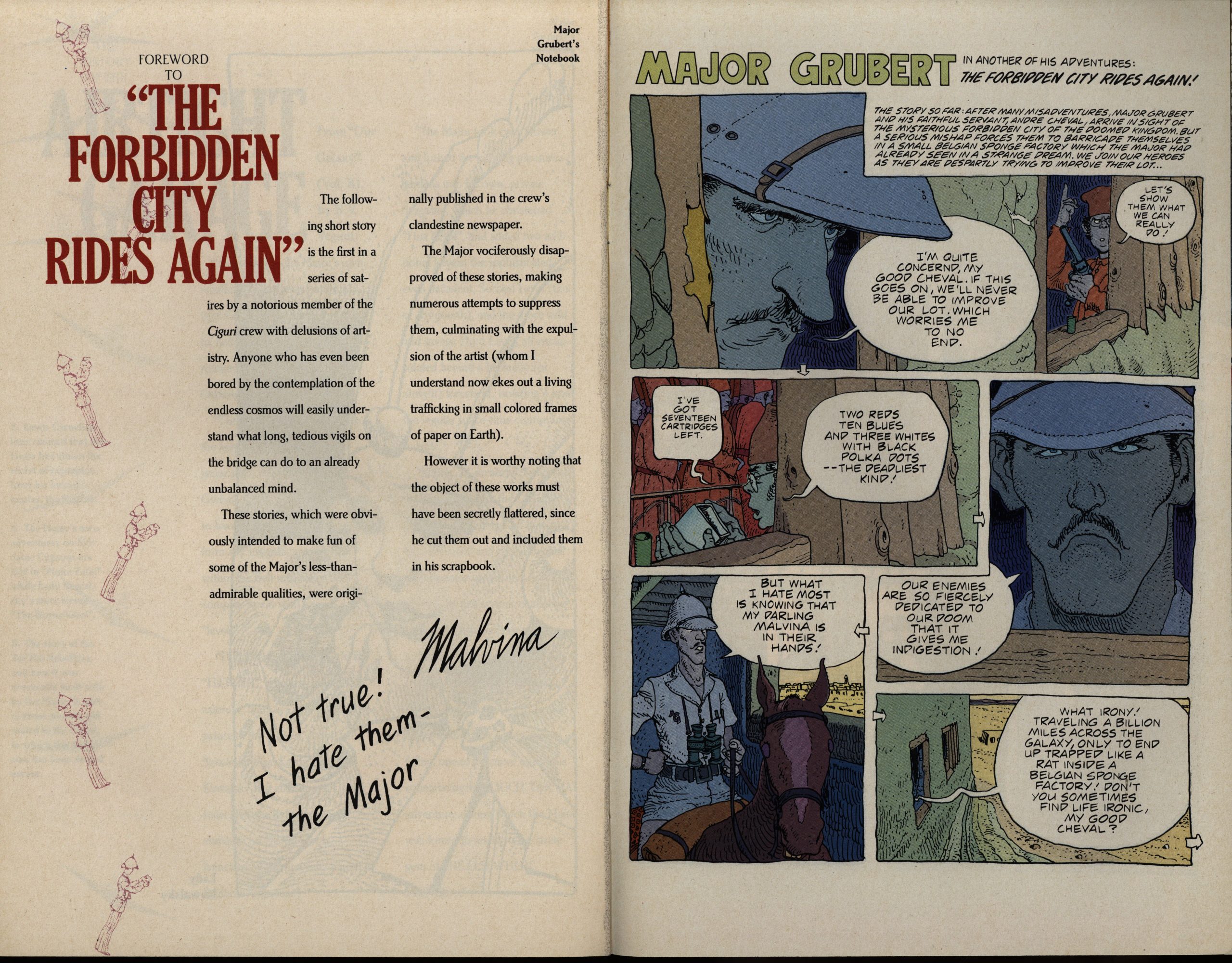
There’s backmatter in each issue, mostly giving more details on the Gruberverse, but also reprinting Moebius stuff that I haven’t seen before.
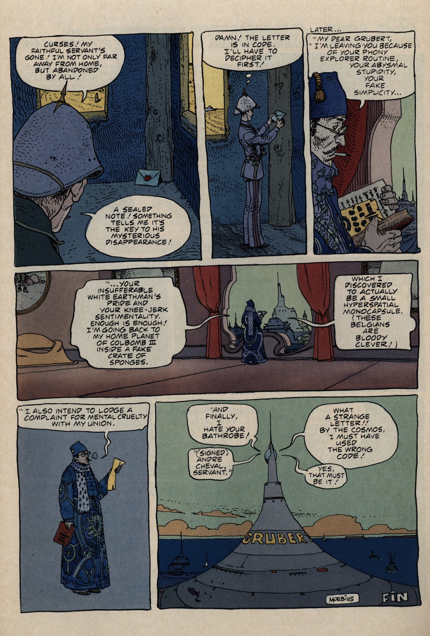
And it’s good Moebius stuff!
This is a solid package, so let’s get back to my kvetching about the colouring: Is the colourist going for… illustrating emotions by colours or something? Whatever it is, it just doesn’t work. And definitely gets in the way of Shanower’s handsome line work.
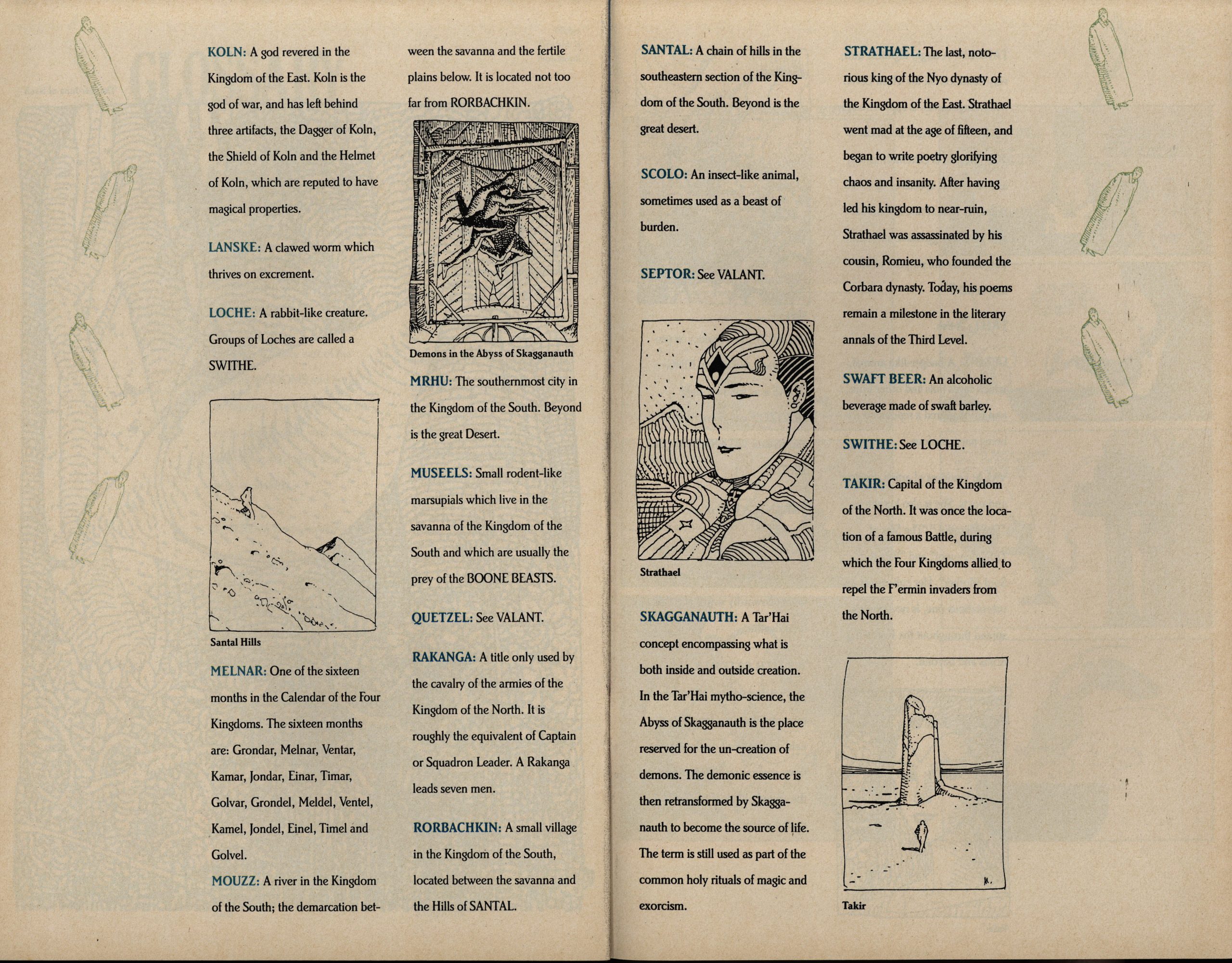
Ah, yeah, the backmatter… I usually enjoy this kind of stuff, but only when it’s fun in and of itself. Here it isn’t, so I started skimming after a while.
Look! Is this meta? I have no idea who that’s a picture of… perhaps Moebius and wife or something? I’m just guessing, but it would make sense, sort of.
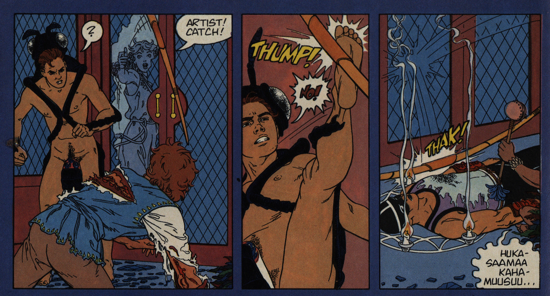
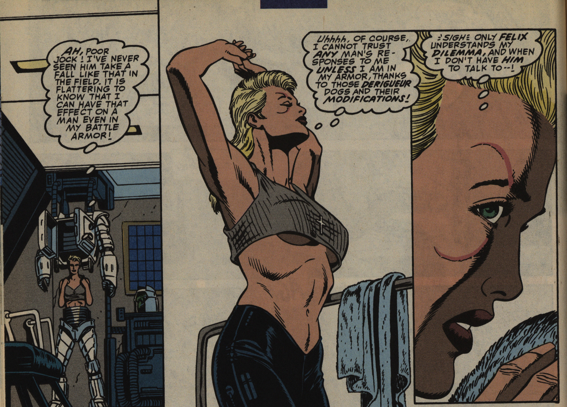
If there’s one annoying thing about this book (except the colouring), then it’s how totally ineffective the female characters are (and there aren’t a lot of them). For instance, here the Princess (you can see her coloured slightly lighter blue in between the slightly darker blue panes back there if you make an effort) seems to be perfectly capable of firing that bow herself (she tried earlier but was struck down). So why throw it to the guy hero, who’s only fired it once in his life before? And then the villain just thumps it away?
It’s sloppy and lazy and annoying.
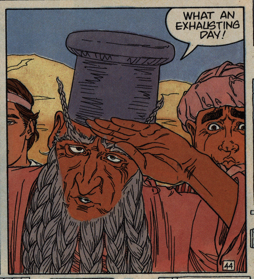
The mayor sums up the story.
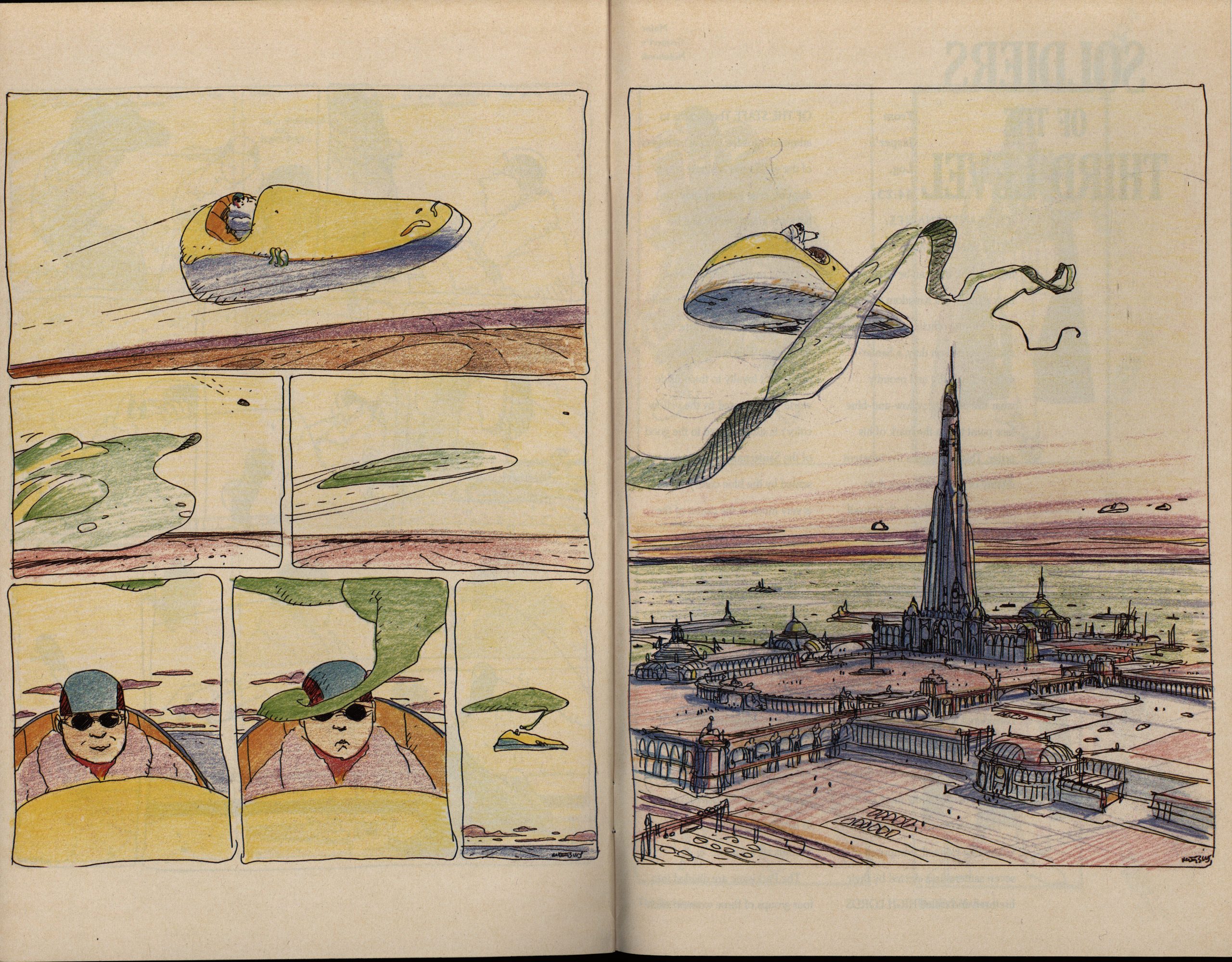
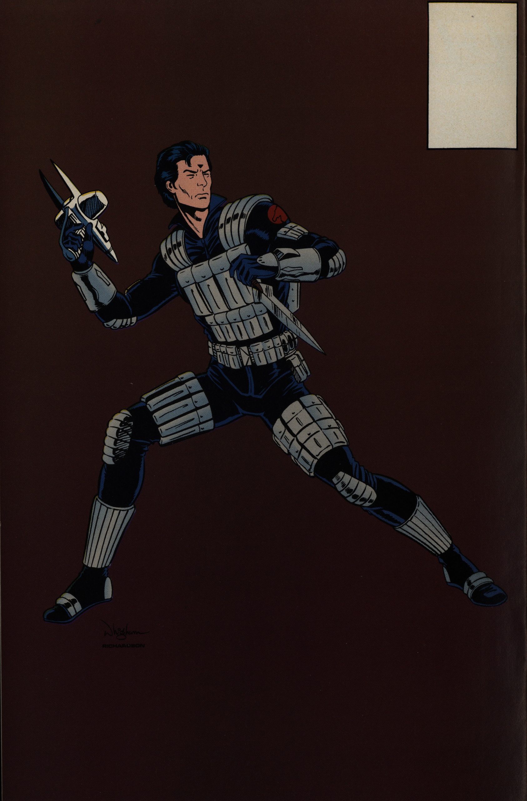
As a final bonus, we get a coloured sketch of a Moebius story, and it’s very nice indeed.
What a great read on this blustery, cold, Corona Monday.
So let’s see what the critics had to say…
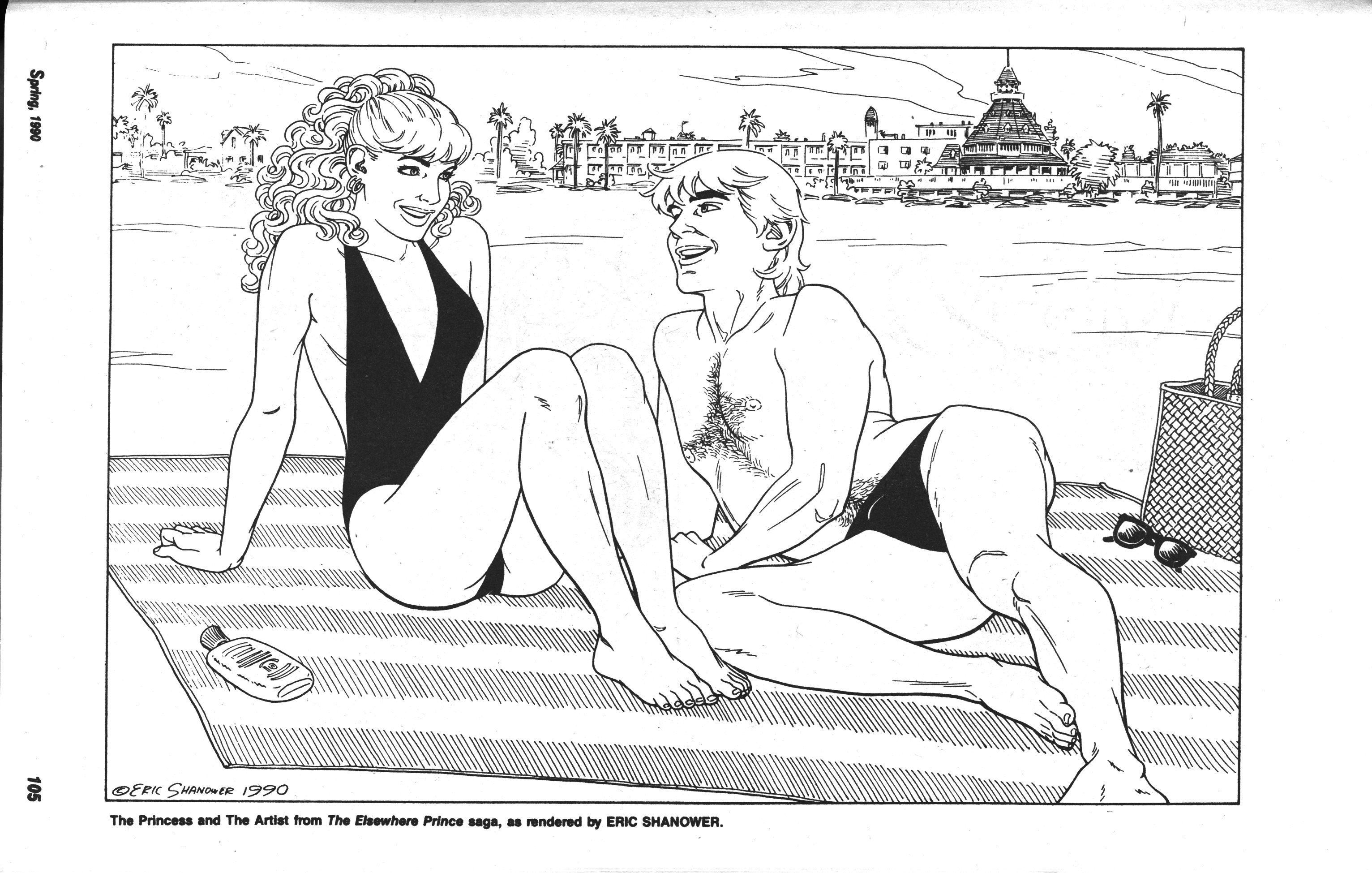
Oh! Shanower contributed a page to a swimsuit issue of Amazing Heroes featuring the main characters from the series.
Richard Deppey interviews Shanower in The Comics Journal #265, page 148
DEMY: so, Where in all Of this does The
Elsewhere Prince
SHANOWER: The Elsewhere prince? That was
between the fourth and fifth Oz graphic
novels. I’d finished the fourth graphic
novel, and Dave Scroggy represented
Starwatcher Graphics, Which was basical-
ly Jean-Marc and Randy Lofflcier, who
represented Moebius’s work in the
United States. I lived a couple blocks
from Scroggy, and one day he just called
me up and said, “Would you be interest-
ed in doing this miniseries, spun Off of
Moebiues project The Airtight Garage?” I
was familiar With Moebius’s work, and I
had never actually read all Of The Airtight
Garage, but I had seen it in Heavy Metal.
certain episodes, and I had seen a lot Of
Moebius’s Other work — and I was, Of
course, incredibly flattered, and so I said,
“Sure. Send me the plot.” so they sent
me the plot and I didn’t know what to
do. But I said yes, and so I did it. I think
I should have said, “No.” The good
things that came out of it were that I met
Moebius a couple times and worked with
him a little bit. I’ve had a lasting relation-
ship With Jean-Marc and Randy, which
has been good, and it also made me a lot
Of money and got me printed all over
Europe. So, those are the good things
that happened. I think it was my
best work, although I was trying my best
at the time. I don’t think I was right for
the project.
DEPPEY: It is, so far as know, only
comic with a giant disemh’died vagina
running around
SHÅNOWER: [I—qughs. Oh, my God! It was
supposed to not just be a vagina. It was
supposed to have overtones Of a vagina,
as well as overtones Of a scrotum. It was
supposed to be .
DEPPEY: Did ‘be script call for this?
SHANOWER.• The script called for an incredi-
horrible monster, and I think it was
supposed to 100k something like a tyran-
nosaurus rex. But I just thought chat’s so
. And it was not a script. This was
Marvel style. It was just a plot. And they
gave me leeway to do what I wanted if I
thought something needed to be
changed. I just thought drawing a giant
tyrannosaurus rex seems really unimagi-
native. so, I thought, what’s the most
horrible, disgusting thing I could come
up with that people would just run from
and be horrified looking at? so that’s
What I came up With. I don’t know. It
was supposed to be colored pink. The
colorist, who was of French extraction,
called me up and said, “l can’t color this
pink. I’m going to color it green. I start-
ed coloring it pink, but it just looks like a
female sex.”
DEMY: Did you tell her at any point that
that’s exactly what you wanted, or … ?
SHANOWER: I was probably too embarrassed,
and she wasn’t coloring I like the
coloring for that book. I thought she and
I were totally not coloring the same
work. I wanted it colored like the Oz
graphic novels looked. I wanted no flat
color. I wanted gradations. wanted
tones. I wasn’t putting in any blacks, or
very few blacks, so it needed weight in
the color. And I didn’t have any say in
Who was going to be the colorist. Jean-
Marc and Randy hired her. I met With
her a couple times. Finally, I had to just
Start coding everything so that she would
know exactly what color to make some-
thing. In the first issue, they’re walking
through this mountainous area in the
desert, and I said, “Color it With browns
and reds.” She was coloring on bluelincs,
which was how most Of these things got
colored back then. And We met, and she
had colored this mountain really dark
brown, and she said, “This isn’t working.
This isn’t working.” And I said, “You’re
right. It’s not working. It needs to be a
lot lighter.” She said, “Can you give me
the code?” So, I just gave her the codes
for what it should be, and the way
we worked from then on. She wouldn’t
put in shadows. She was a colorist; she
v,asn’t an illustrator. tried to teach her
to blend one color into another and to
vary tones, but she wouldn’t try. She was
very nice about it, bur she said she wasn’t
getting paid enough for all that work.
She just filled in the lines. so I would
send her Xeroxes with all the color codes
written on all the shapes. I drew in all the
shadows on the photocopies for the last
issue. And some Of them she used, and
some Of them she didn’t. The last issue, I
think, looks the best. But by that time,
the first couple of issues had come out,
so I knew what to expect, so I could try
to compensate for what she was doing. I
was actually very disappointed with the
first couple issues’ coloring. I’m mostly
happy With the last issue overall, and
think I was finally getting a handle on
the atmosphere of the book, but it was a
bit late. Artistically, the project wasn’t
very satisfying in the end.
OK, now I feel better about moaning and whining so much about the colouring.
As far as I can tell, The Elsewhere Prince has never been reprinted or collected? At least not in English? That’s a real shame. Am I the only one that likes it? I couldn’t find any reviews for it, either.
Somebody should definitely publish a collected edition, and with better colouring.