1990: Atomic Age

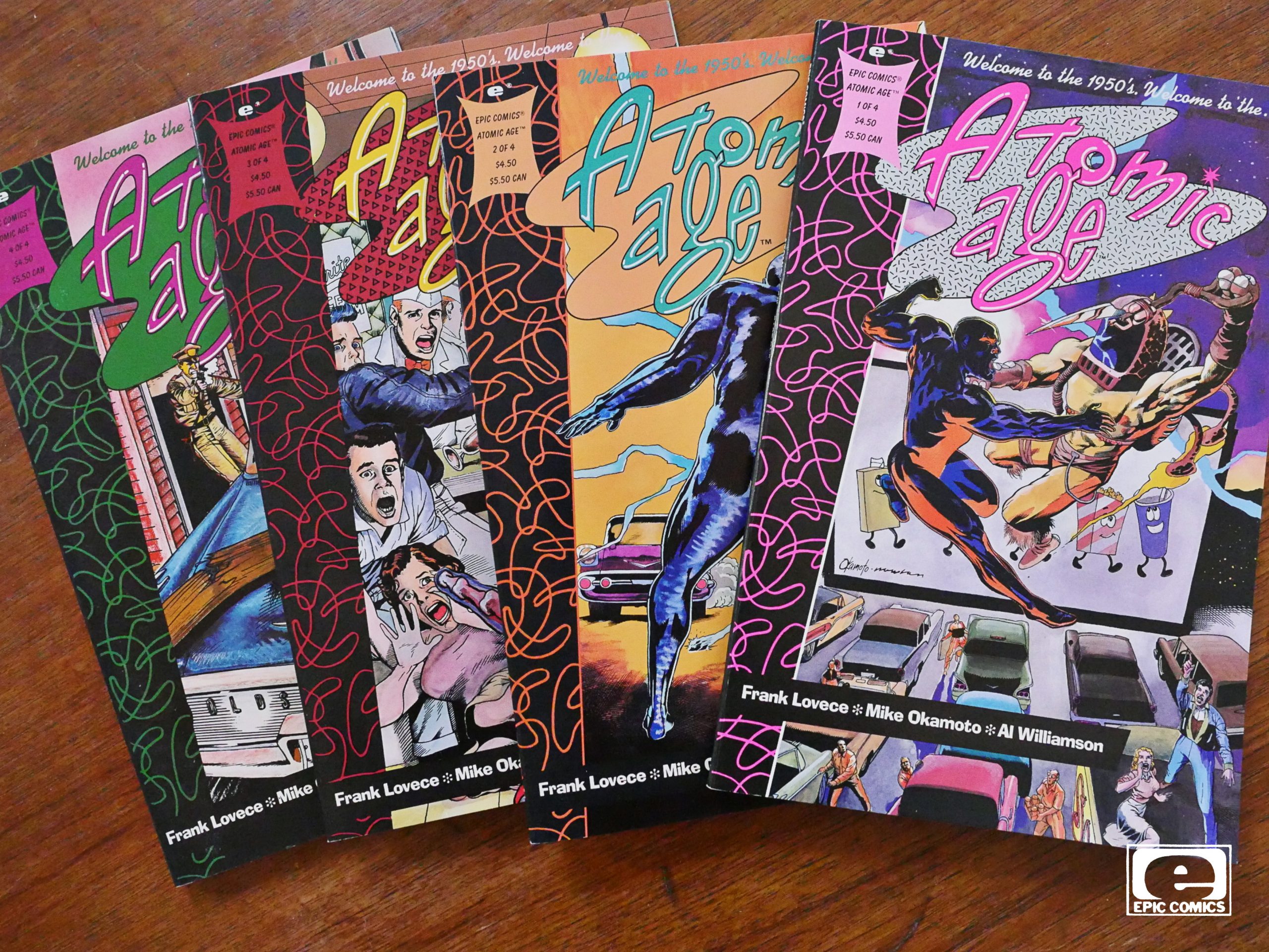
Atomic Age (1990) #1-4
by Frank Lovece, Mike Okamoto and Al Williamson

Man, where to even start…

This is a really bad book. It’s like one of those comics that showed up during the black & white boom, where nobody involved had any idea how a comic even worked. But here they’ve got Al Williamson (!) inking and Steve Oliff (!) doing the colours, and it’s a four part squarebound “prestige” publication from Epic comics.

How did this even happen?

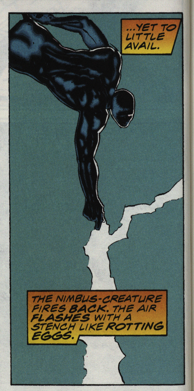
Because electricity smells like rotting eggs.

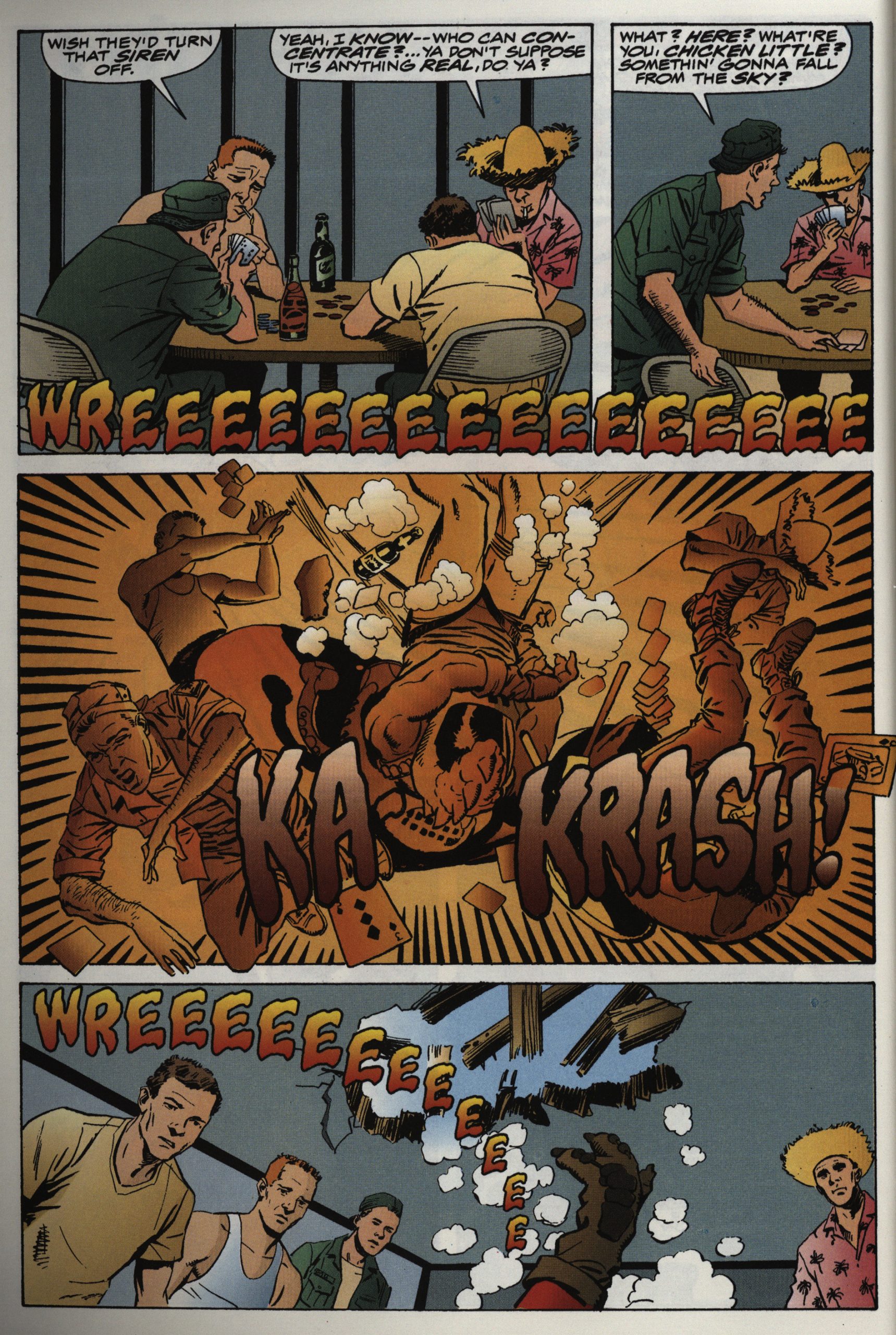
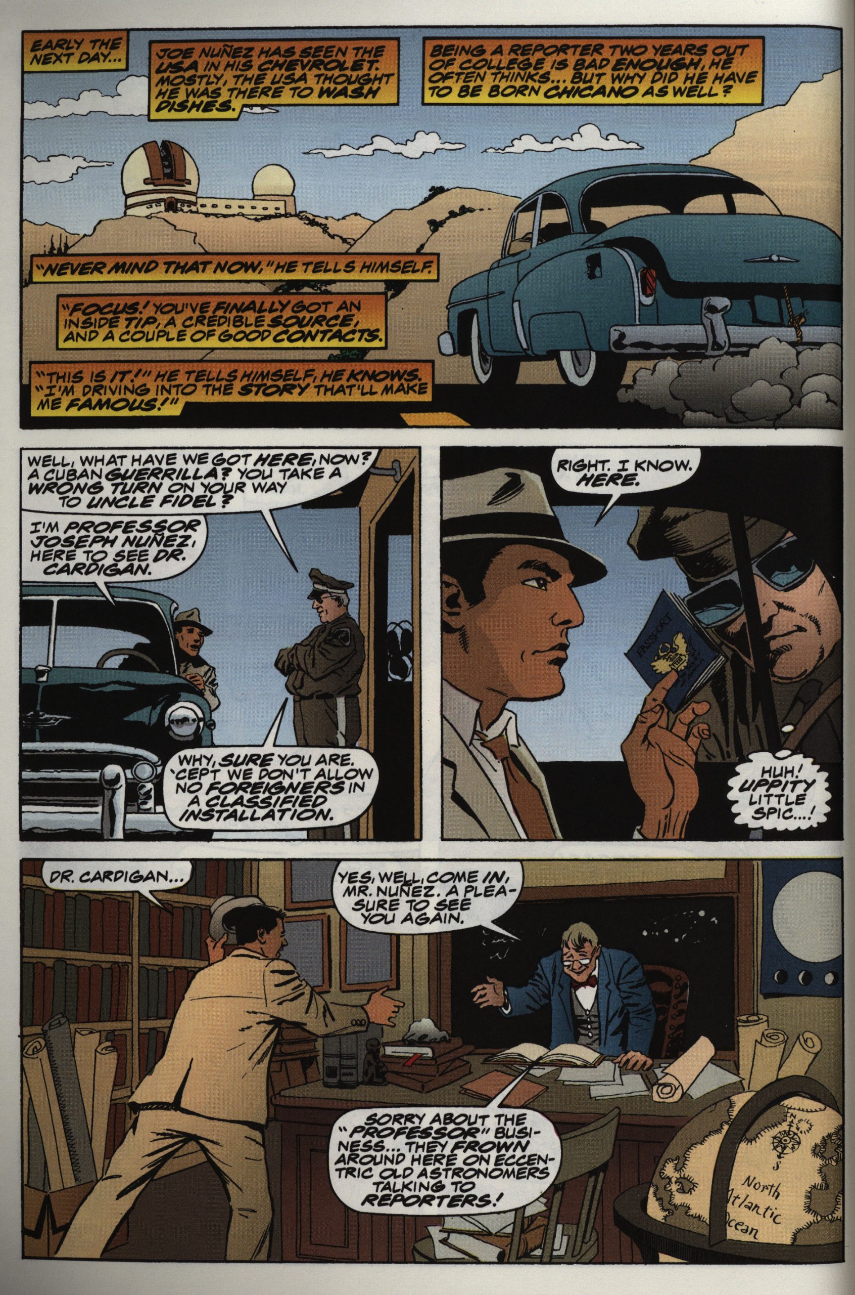
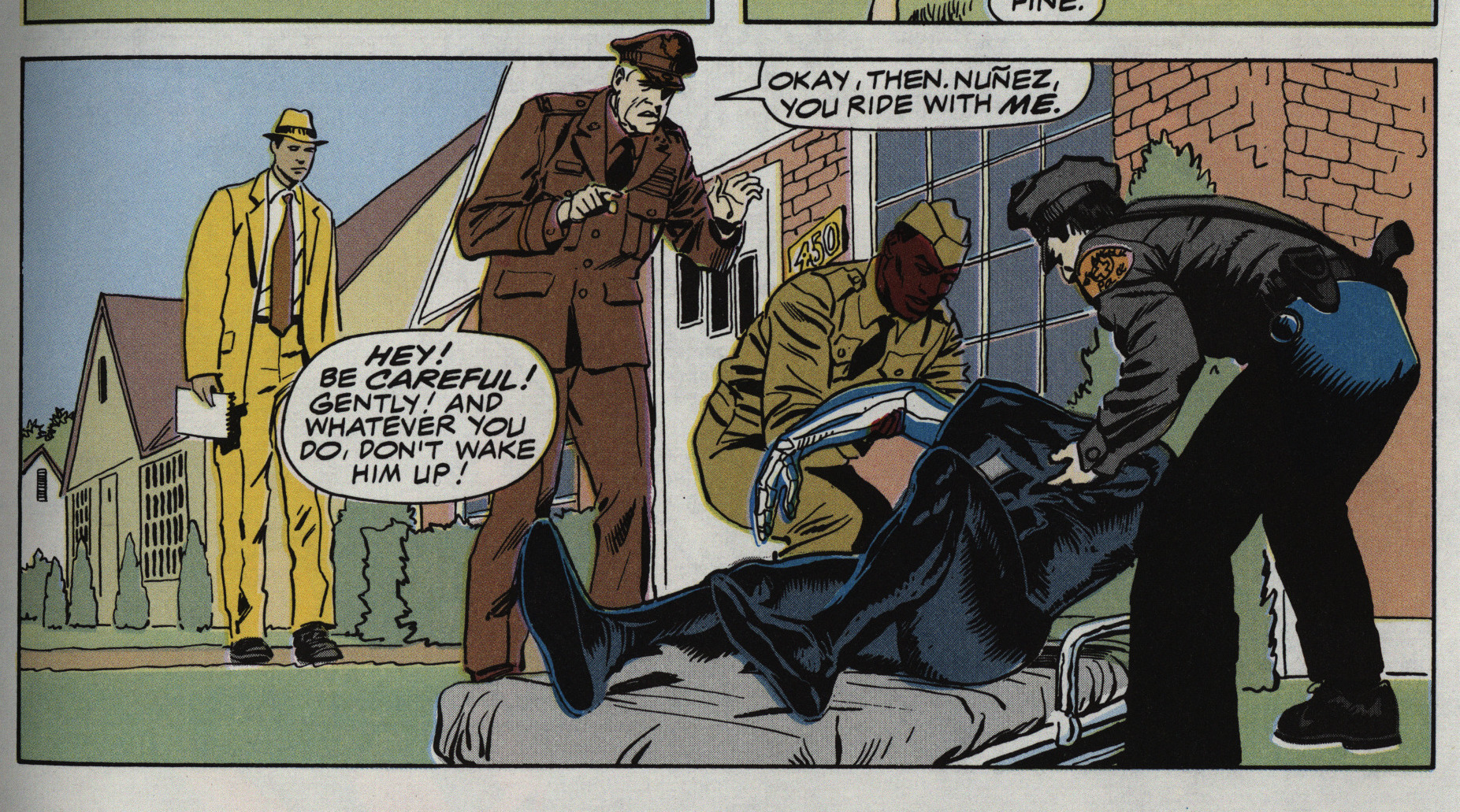
There’s a lot going on in this story. There’s Earthly racism (the protagonist is Hispanic), alien racism (it’s about one group of people keeping another one as slaves), aliens zapping each other, a spunky reporter, a love plot, a Colonel who’s plotting, some scientists…

But it’s all tedious. There’s a lot of jokes in here, and I think I picked the very best above. Yes, they’re that bad.

There’s endless exposition, and we go over the same plot points again and again.

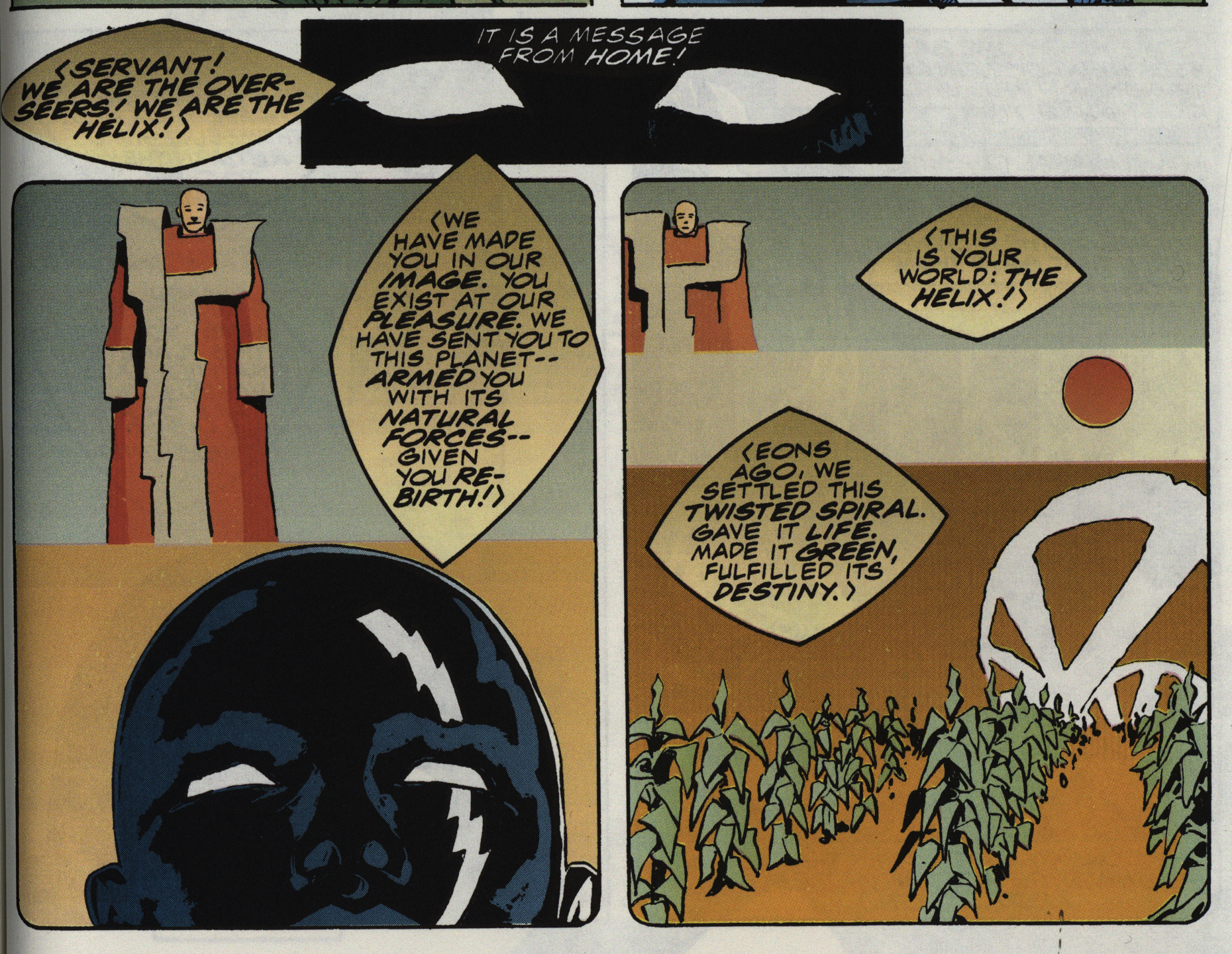
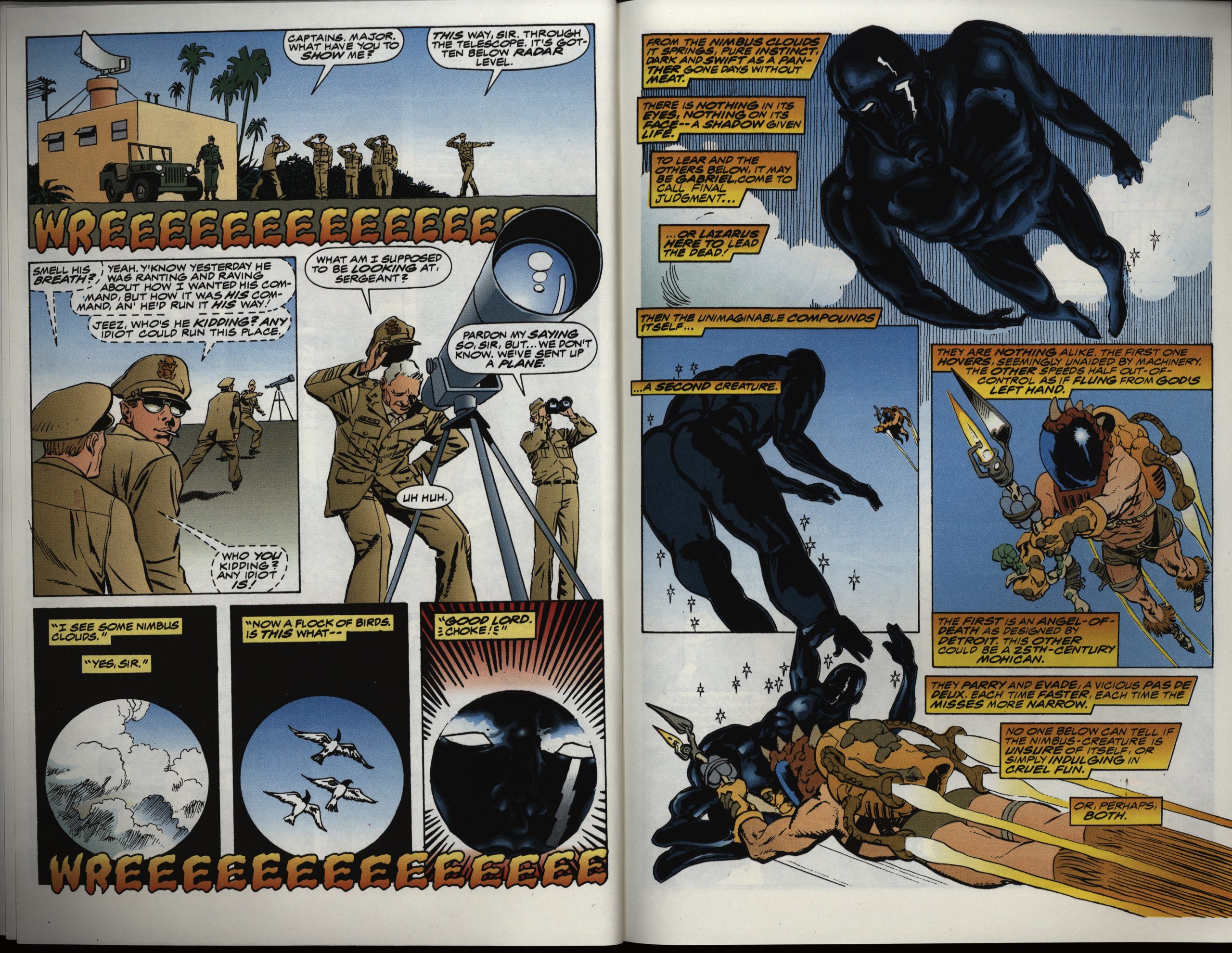
The artwork is mostly amateurish and awkward, but I have to say I do like the design of the aliens and their outfits.

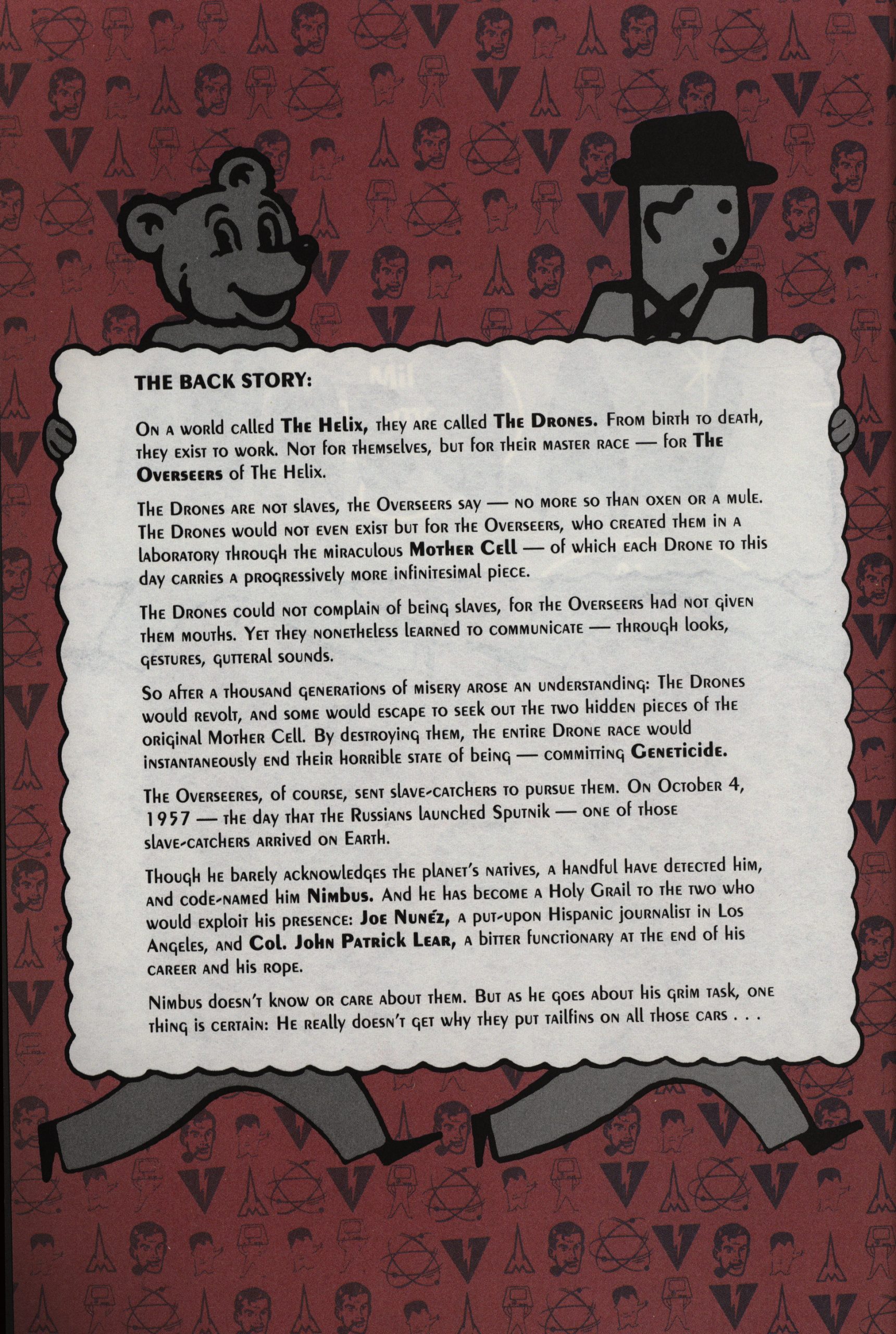
I didn’t really want to subject you to the backstory, but I just wondered: Are those figures from the 50s or something?

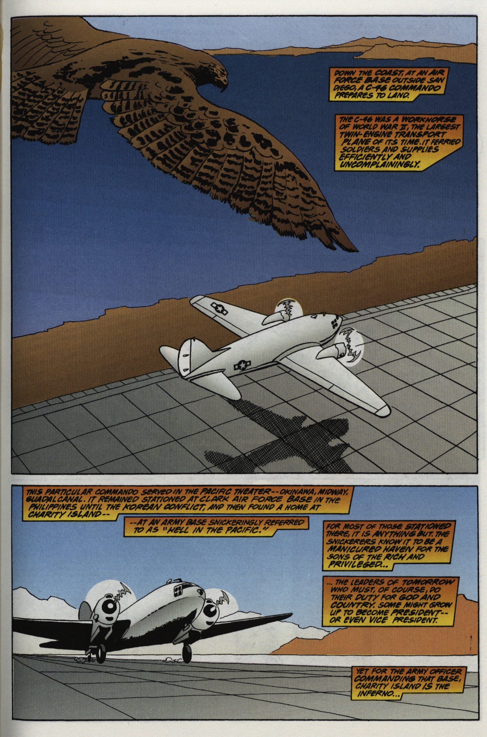
The artwork is mostly really uninspiring, but all the missing backgrounds and details at least meant that Williamson didn’t have to spend a lot of his precious time on these pages. But that’s a nice bird.

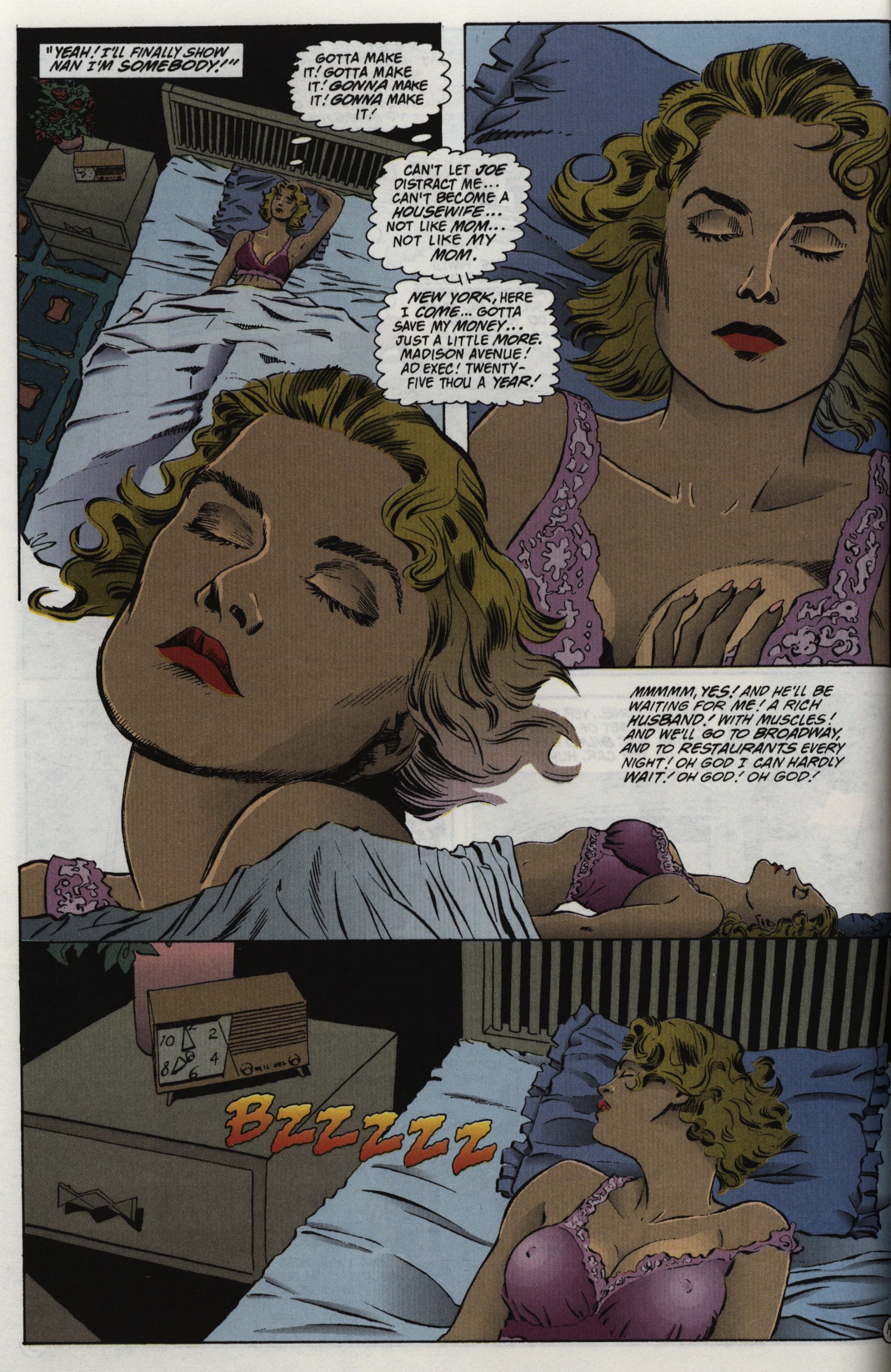
And this is the only page in the book that’s competently done, and it’s… a page of that woman masturbating, for some reason or other.

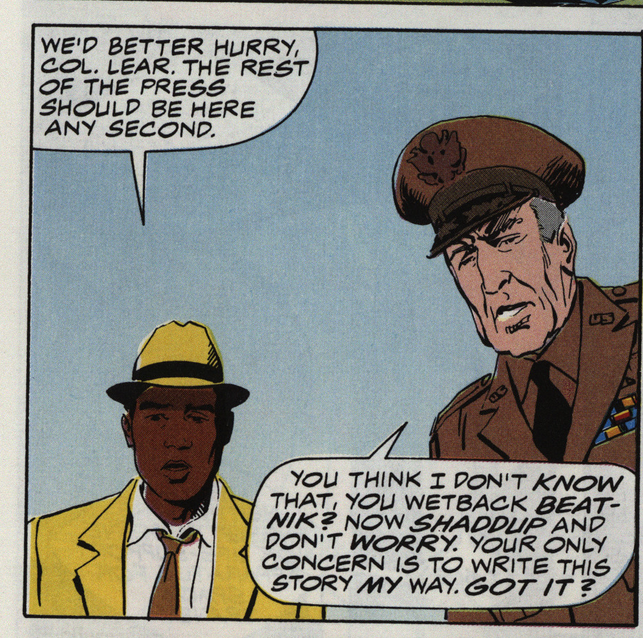
They get a new colourist in issue #3 who apparently didn’t get the memo that the reporter is Hispanic. And, oh yeah, there’s racial slurs all over the series… but it’s the bad guys doing them, so it’s OK, see?

Well, the colourist has covered all the skin colours here…

Getting through this series was a chore.

But what did the critics think?

Kevin W Hall writes in Amazing Heroes #192, page 73

While I’m usually a fan of science
fiction, that was the least appealing
aspect of this mini-series, The straight
scenes of. 1950s life, with its racial
problems, romantic tangles, and gor-
geous cars were very realistic, and the
highlights of the three issues. Person-
ally, I felt it would have been more
interesting as a straight look at 1950s
America.
Artistically, newcomer Mike Oka-
moto is greatly aided by the most un-
derrated inker in comics, A1 William-
son. Together they give Atomic Age
#1-3 a snappy layout, nicely drawn
characters, and a well-formed flow of
action.
Finally, while Atomic Age #1-3 isn’t
perfect, it does possess an intelligent
story and some excellent art by
Okamoto and Williamson. Maybe
Marvel can be persuaded to do a
straight series about 1950-60s
America. I’d buy it.

Paul Carbonaro writes in Amazing Heroes #191, page 117

Atomic Age is a pretty worthwhile
series, encompassing thoughtful writ-
ing and attrpctive art,’ smartly pack-
aged for the slightly steep price of
$4.50. My contention that the price
is steep is on the cost in relation
to the quality of writing and art.
Certainly, all efforts on the series
are earnest. Yet the most striking thing
about Atomic Age is Nimbus, the cen-
tral character. Visually arresting, his
entire body is as black as coal, and
probably much harder. After using his
powers, parts of his skeleton show
through as signs of energy depletion.
Also striking is the cover logo—
especially on issue It has flair and
style and captures the character of the
’50s well. Further, it hints strongly at
the topsy-turvy adventure to be found
inside each issue.
Writer Frank Lovece should be
commended for striving to make every
one of his characters highly distinct
from one another. He achieves this
through individual motivation and
dialogue and personal background. Of
course, he is aided in this endeavor by
the art team of Okamoto and William-
son.

[…]

A fair deal has been written about
Lovece’s efforts. The armork comple-
ments it quite effectively, and is
downright attractive at times (the
splash page of issue #2 is the best
example, I think). However, Okamo-
to’s pencilling seems crudely simplis-
tic in places. It’s fair to say, perhaps,
that the experienced refinements of A1
Williamson’s inks help overcome the
weaker sides of the pencilling. An-
other rather negative aspect is that the
art appears static more often than not.
Still, things could be woqse. At least
Okamoto creates an effective ’50s feel.
Credit must go to Jim Novak for
typically fine lettering and to ‘Steve
Oliffand Olioptics for splendid color-
ing that enhances the series’ presen-
tation considerably.

I have no words:

Collaborator Al Williamson won the 1991 Eisner Award for Best Inker for his work on it and other series that awards-year, with Okamoto winning the Russ Manning Award for most promising newcomer.

The series has never been reprinted.

1990: Fafhrd and the Gray Mouser

Fafhrd and the Gray Mouser (1990) #1-4
by Howard Chaykin, Mike Mignola, Al Williamson and Sherilyn van Valkenburgh

That’s some list of creators. I like all of them, but this is an adaptation, and they usually go awry, anyway. On the other hand, this isn’t a Byron Preiss production (he’s usually involved somehow when somebody adapts something to comics in the 80s, and particularly when Chaykin does some work).

But let’s look at page 2 and 3:

Wow! It’s good! No, it’s more than good: It’s funny! And it drops us right into the story without a lot of tiresome exposition, and without an origin story of every character involved. Instead we have a great meet cute between Fafhrd and the Gray Mouser in the middle of a hold-up. And we get hints at dark things happening with the other guys, and a feeling for the city, and…

It’s dense, but it’s playful and light and really readable.

I mean, it’s just so seemingly effortless. The CRAKAKATRASSHH where we can fill in ourselves what’s going on, while the repartee keeps pattering on.

I don’t see a lot of Williamson here in the inking, but then Mignola’s pencils usually overpower anybody working with him. But his style is so well-suited to this sort of picaresque pseudo-medieval stuff… I mean, look at that ramshackle house.

I had forgotten how small Mignola draws feet. It’s amazing how much it just looks like a part of Mignola’s style and not like… deformities.

It’s a perfect little romp of intrigue and danger and excitement and romance. I mean, look at that fight scene. Just look at it!

(Stop scrolling now if you don’t want spoilers on this thirty year old comic book.)

Which is why this horrorshow of a reveal took me completely by surprise. I mean, as shocking and revolting developments go, it’s a shocking and revolting development, and comes completely out of the blue (at least for me). That is: Lieber (or Chaykin; I haven’t read the original books) fridges both Fafhrd’s and Gray Mouser’s girlfriends in the most horrible manner.

They then go out and finally exact revenge on the culprits, but… It’s pretty gratuitous, and makes sense only in a meta-story way: If we’re to have story after story with swashbuckling happy-go-lucky guys, they surely can’t have girlfriends? Right? So they have to be killed off. Besides, it gives them a reason to kill the bad wizard, right?

It’s pretty lazy and somewhat icky.

But that’s only the first issue of this four-parter, and it feels like I’ve read an entire novel already, because there was so much in there. The remaining three issues carry on in much the same manner, but with shorter stories with more compact casts, for the most part.

I could basically put any page from the series in here, and you’ll find some storytelling detail to squee over. Like here, with the effortless parallel progress of the two main characters’ experiences. I mean, it’s not an unique way to do something like this, but it’s just so… assured. It reads so perfectly well, and everything is so clear, even if what’s happening isn’t completely straightforward. Basically most anybody else would have dropped some kind of explication in there to assure themselves that the reader gets it, but the creators here have complete trust in both themselves and the reader.

I even like the title pages. And the colouring’s perfect.

In short: I loved this adaptation and it makes me want to read Lieber’s books, but I’m going to go ahead and guess that they’re not as good as this adaptation is.

The series was collected in one paperback by Dark Horse in 2007.

But what did the critics think?

Fred Patten writes in Amazing Heroes #186, page 73

[…]
The climax is suitably dramatic.
The story condensation is good.
Howard Chaykin has kept as much of
Leiber’s witty and semi-archaic dia-
logue as possible. He has also written
new dialogue to compress several
pages of narrative description into a
few succinct speech balloonsamd it
is indistinguishable from Leiber’s own
writing. There are a few spots where
the condensation is’ confusing. The
poisonous smog cloud is shown as a
“What was that?” object of mystery,
but its deadly nature is unclear. The
scene from the original story in which
Fafhrd takes Vlana•s silver dagger
(proof against magic) for their con-
frontation with Hristomilo is not
shown, so when Fafhrd pulls it from
his belt as he is losing his final battle
against the wizard, it seems like a
hasty and sloppy deus ex machina
addition.
But, all in all, Fajhrd and the Gray
Mouser is still better than most comic
books of sword-and-sorcery adven-
turee
GRADE: ! ! ! !

Well, that was… a review.

Confusing? Pah:

Mignola’s called this his favorite pre-Hellboy work, and it’s easy to see why. His artwork is fantastic, and the dirtied-up high fantasy setting is within his general wheelhouse but not quite like anything else he’s done before or since. I know people complain about Chaykin’s scripts being choppy or somewhat difficult-to-follow, but that did not bother me. It reminded me of the feeling I got from reading a random Fafhrd and the Gray Mouser short story collection when I was 14-years-old, thrown into the deep end of a strange fantasy world full of crime and magic.

Yup:

While this isn’t Mignola’s earliest work (which was actually with Marvel in the early 1980’s on Daredevil and Power Man & Iron Fist), Fafhrd and the Gray Mouser does present a great deal of the style—the use of black space and shadow, unusual angles, stylized presentation and frequent use of symbolism—that would become trademarks of Hellboy three years later. This style is an ideal fit for Leiber’s work, echoing all the shadow and view askance that characterize Lankhmar.

It’s good!