Ted McKeever’s Metropol (1991) #1-12,
Ted McKeever’s Metropol A.D. (1992) #1-3
by Ted McKeever
I’ve been a fan of McKeever ever since Transit, so this was one of the rare Epic comics of its era that I bought at the time. I remember nothing about it, though, so let’s get reading.
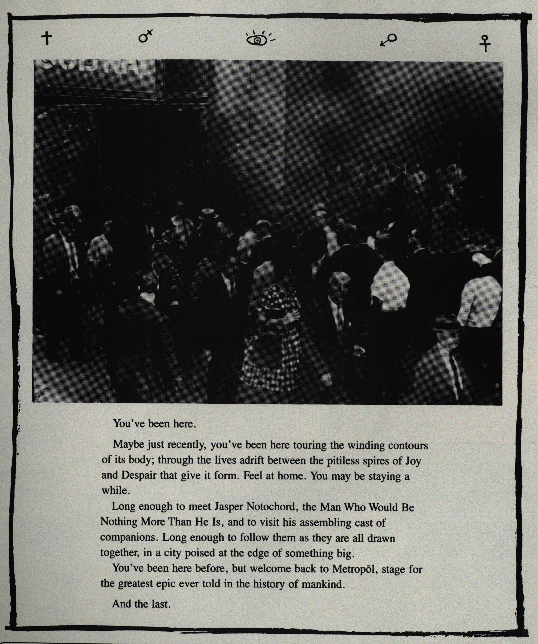
I think there was a law mandating an intro page like this for all mature-ish genre comics at the time.
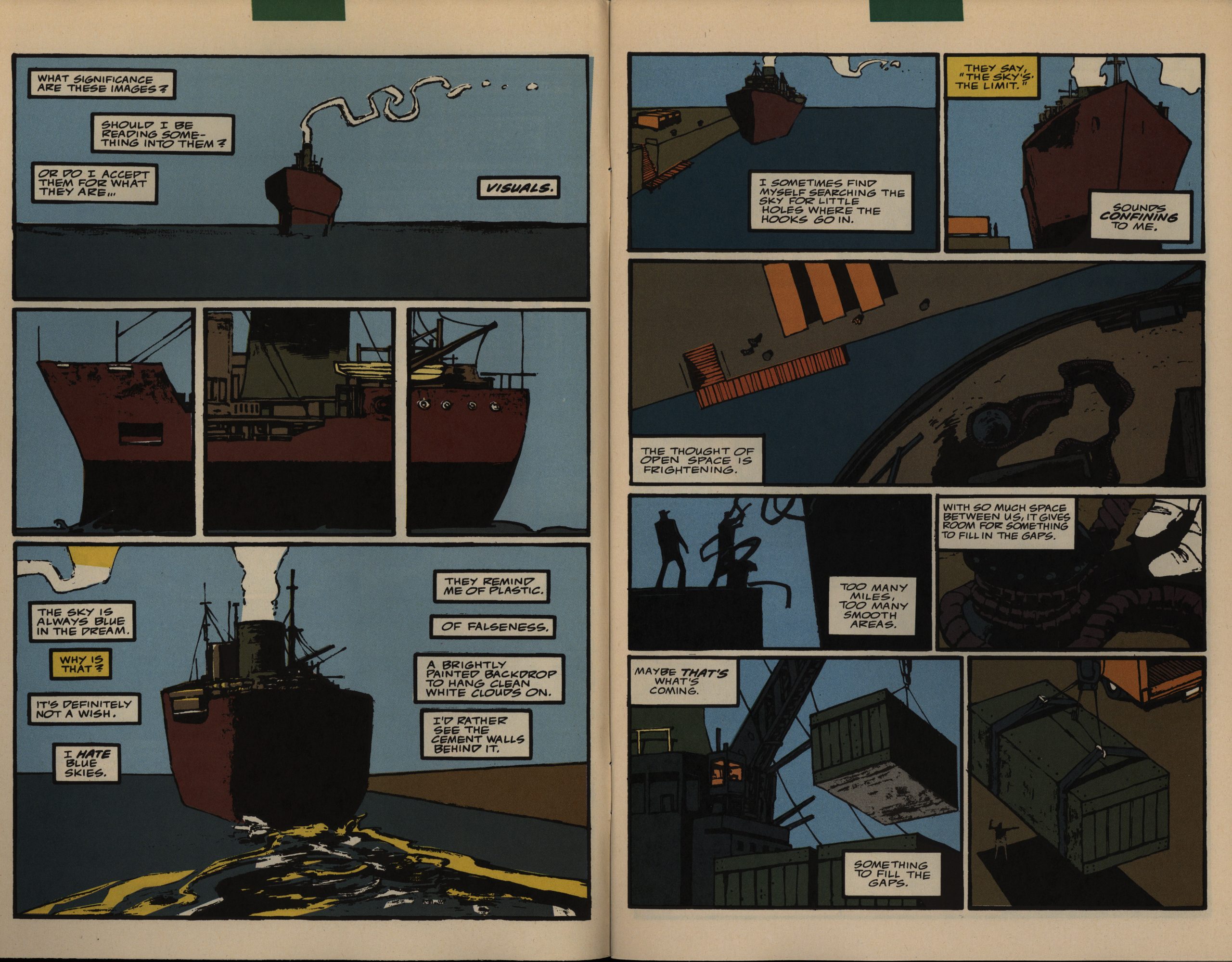
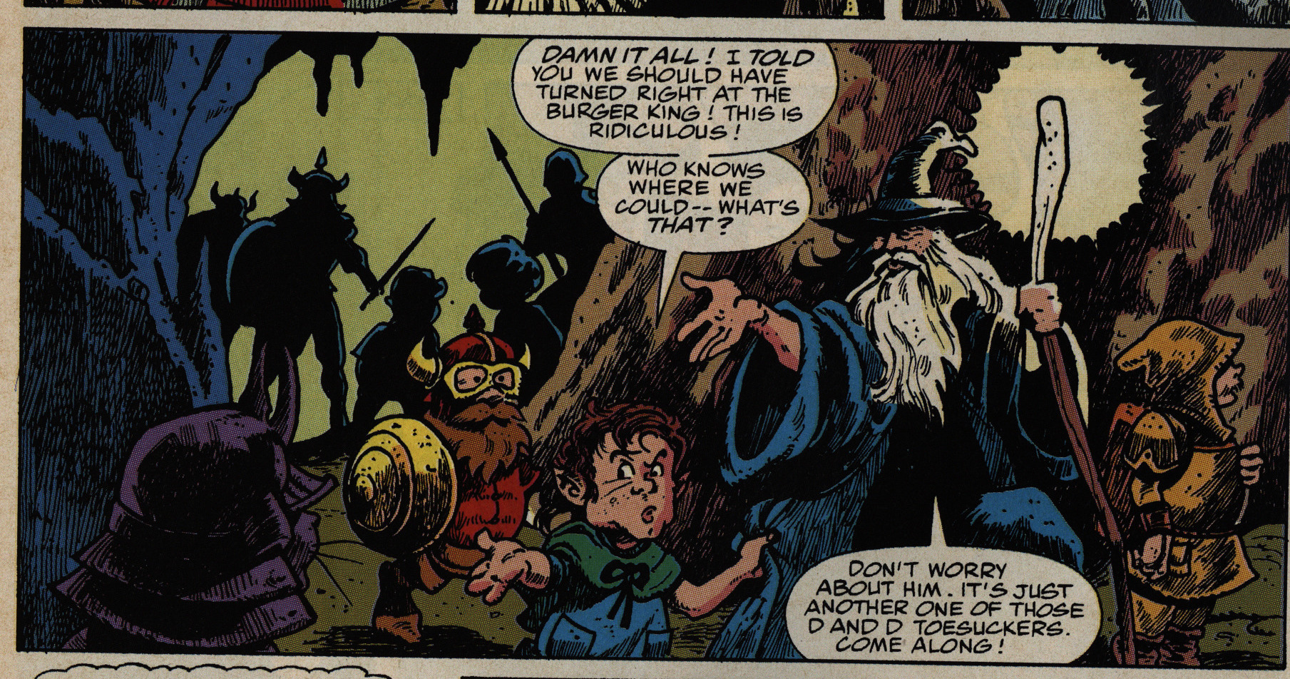
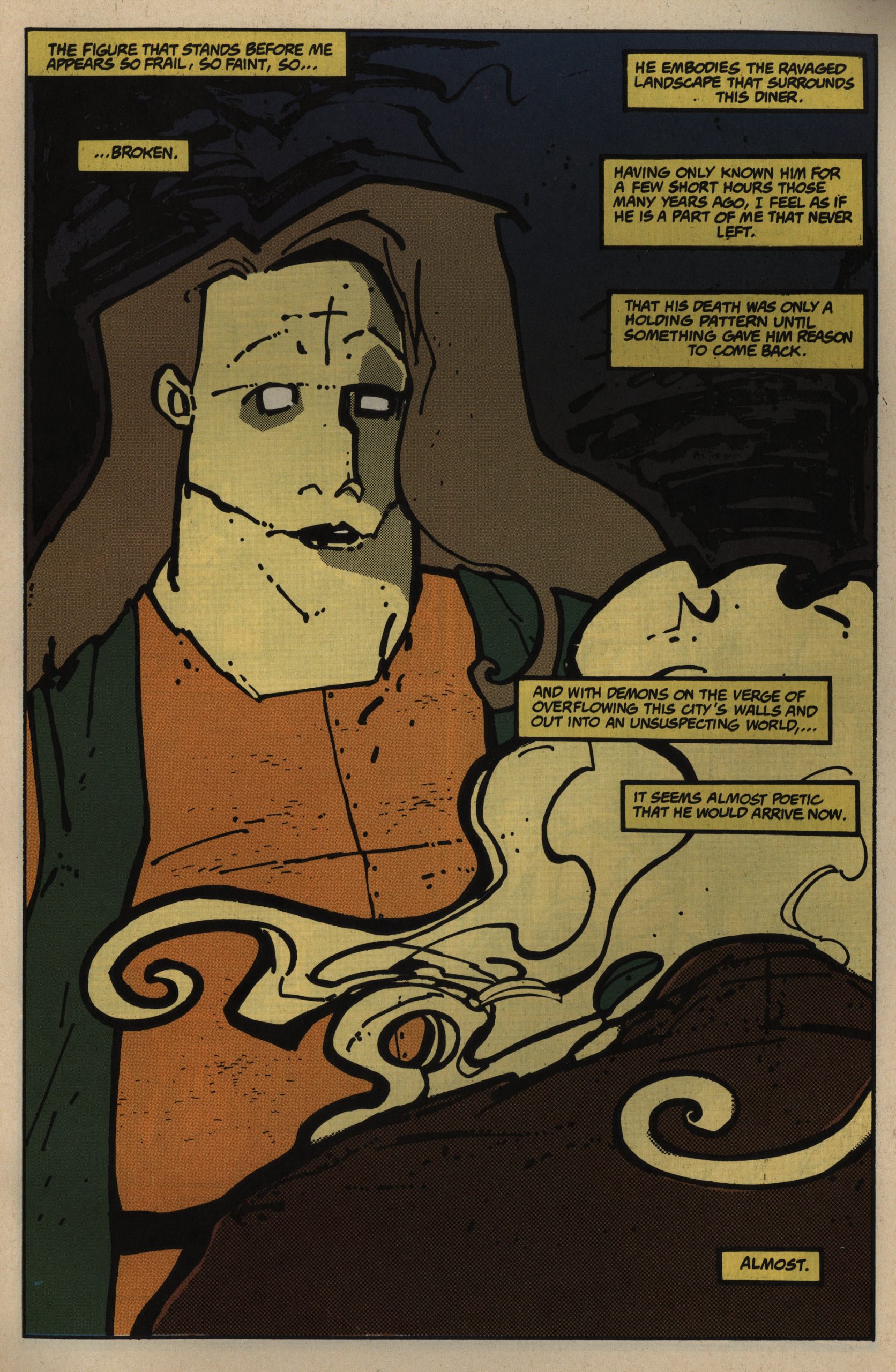
Oh, wow! I love the colouring here. And the graphics are so… stark? A very pretty way to start off a series. And I guess the colour thingies at the top of the pages means that Metropol was given newsstand distribution, too.
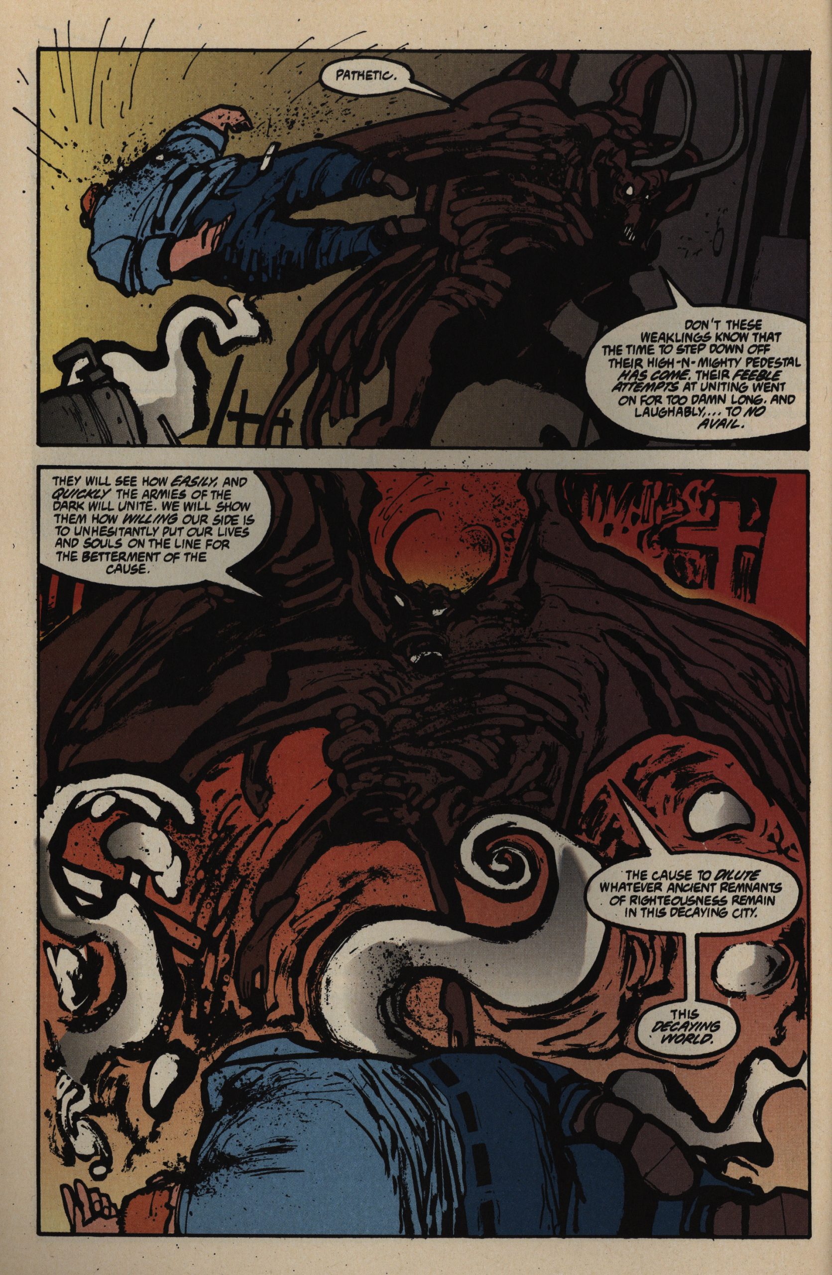
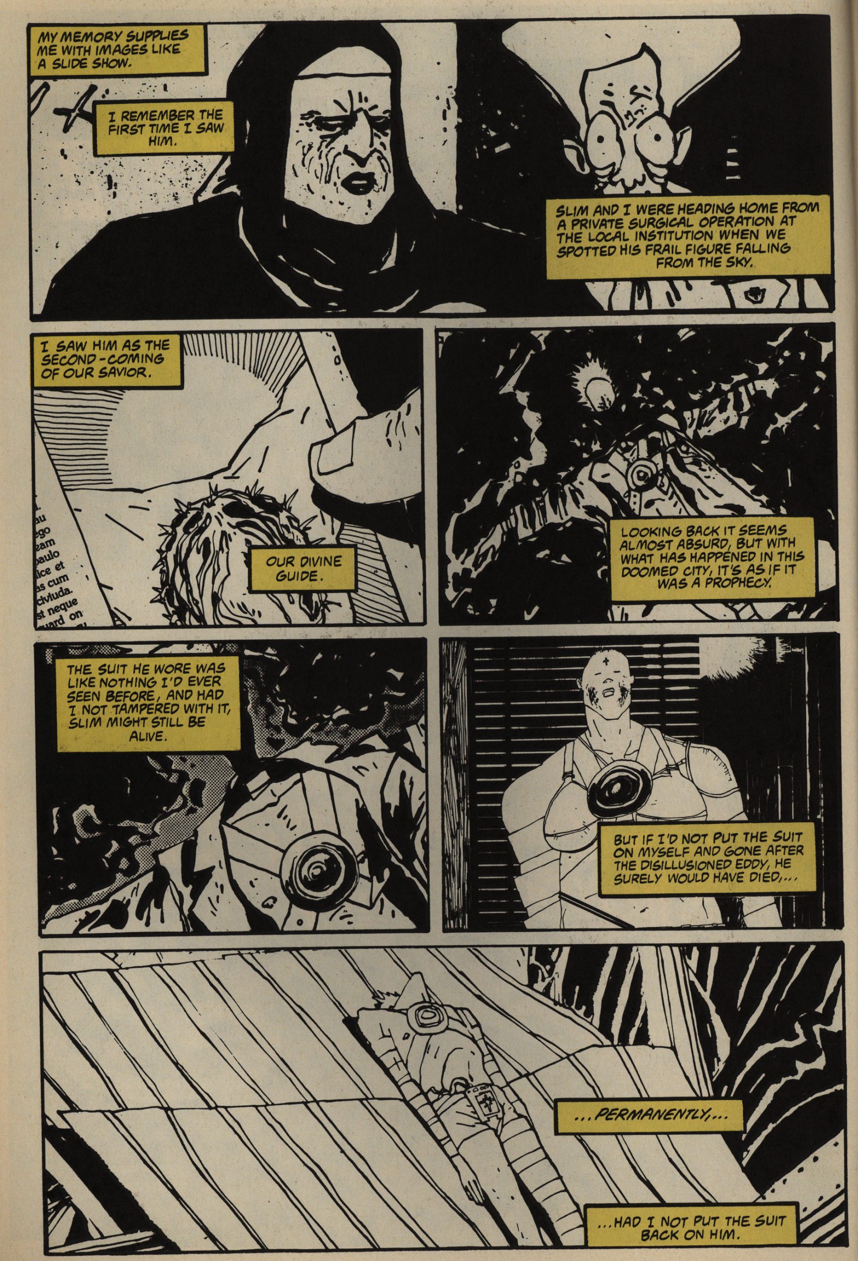
McKeever’s artwork used to be very detailed and with lots of thin thin lines, but then he moved in this direction… a sort of late-Muñoz/Tardi kind of thing? But even more exaggerated; with the mouths placed almost below the face. Very distinctive.
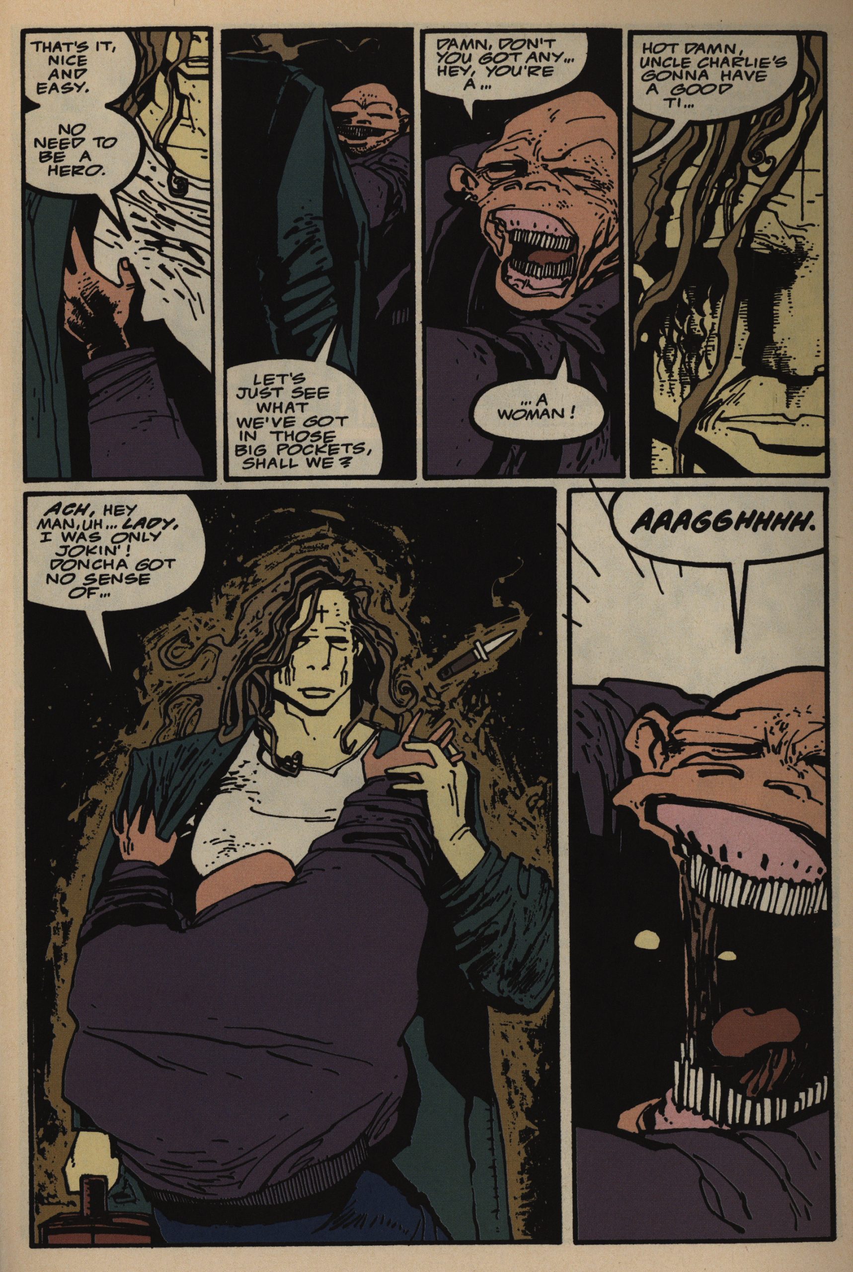
Anyway, the series is off on a really good start: We’ve got several mysteries swirling, and a plague on Manhattan (very timely reading for April 2020), and lots and lots of unexplained stuff. And with the latest in storytelling techniques (from 1991). It’s exciting, it’s fun, and it’s compulsively readable.
It’s a monthly comic, though, with 28 story pages per issue, which is a hellish schedule for a single person. Perhaps he had some lead time and didn’t have to do 28 pages per month?
And, of course, there’s text pages that gives vague background information, if you’re willing to use your decoder ring on the text.
And fortunately: No lengthy recaps. If you’ve read a few of these Epic blog pieces (why!!!) you’ll know that my most frequent complaint about them is that the Epic house style was to spend up to four pages per issue doing a recap, in many a hamfisted and annoying manner (“as you know, Robert, we were just being chased down by the Mafia…”). But the nightmare is over! No recaps!
Now that’s the kind of McKeever teeth we know and love.
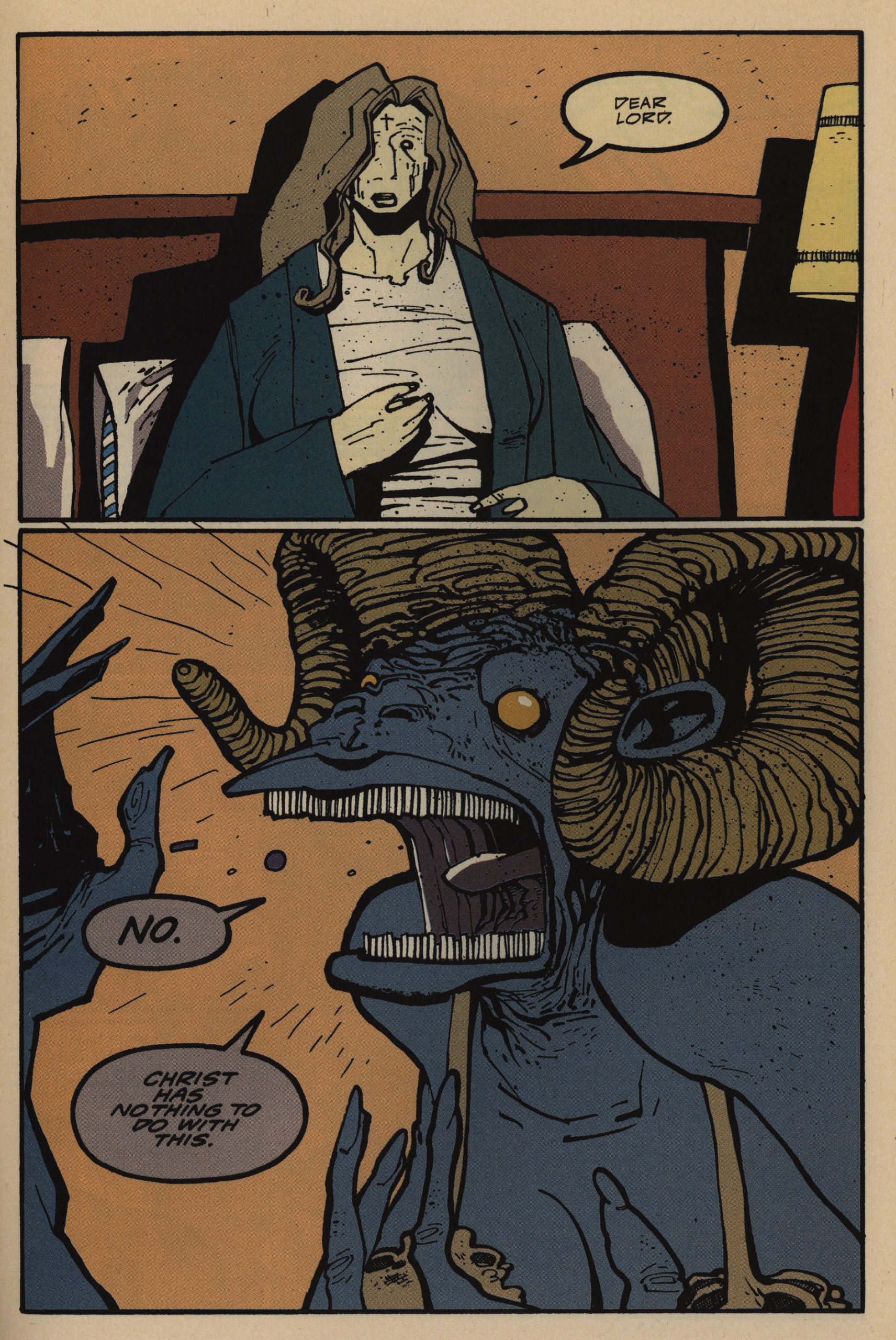
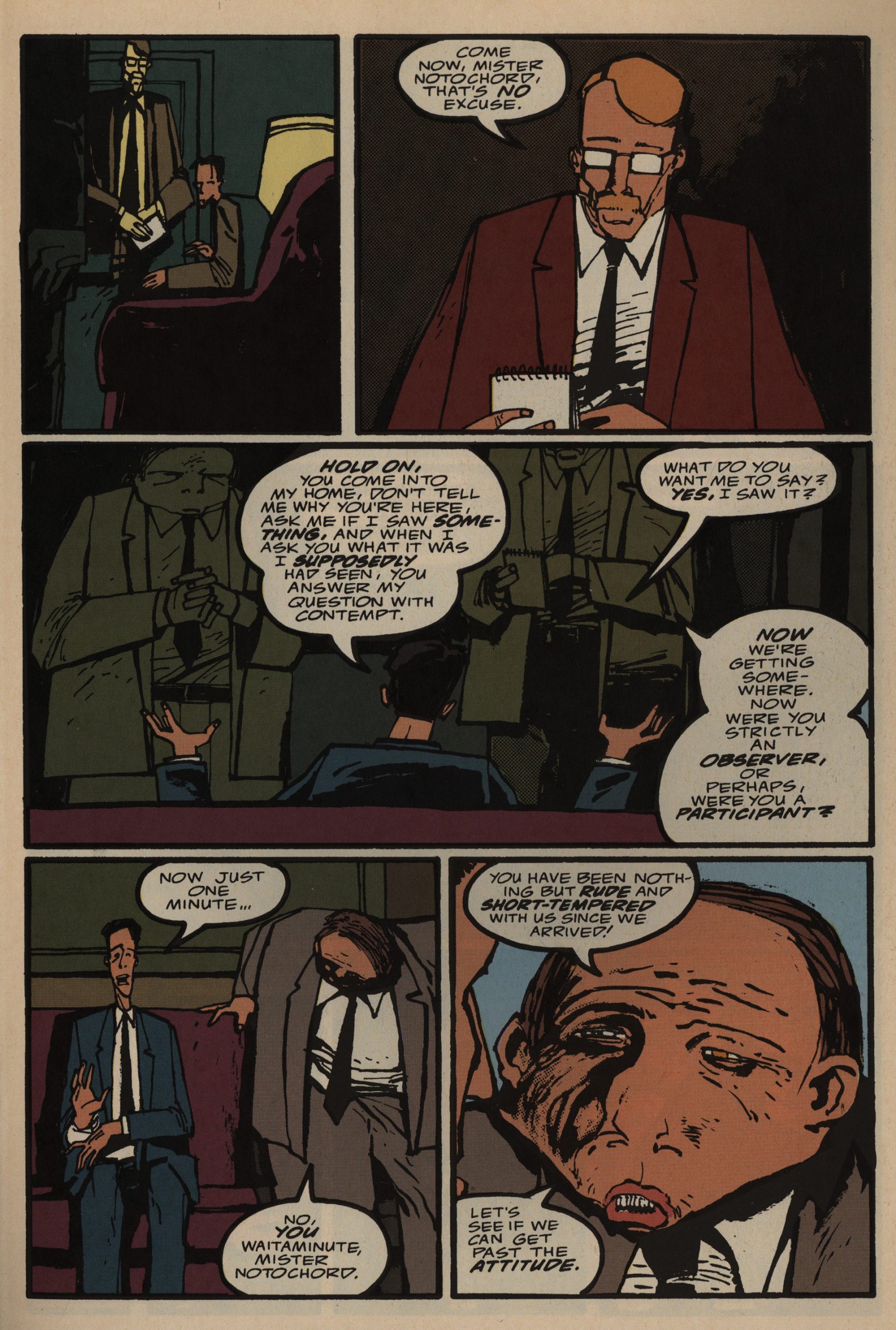
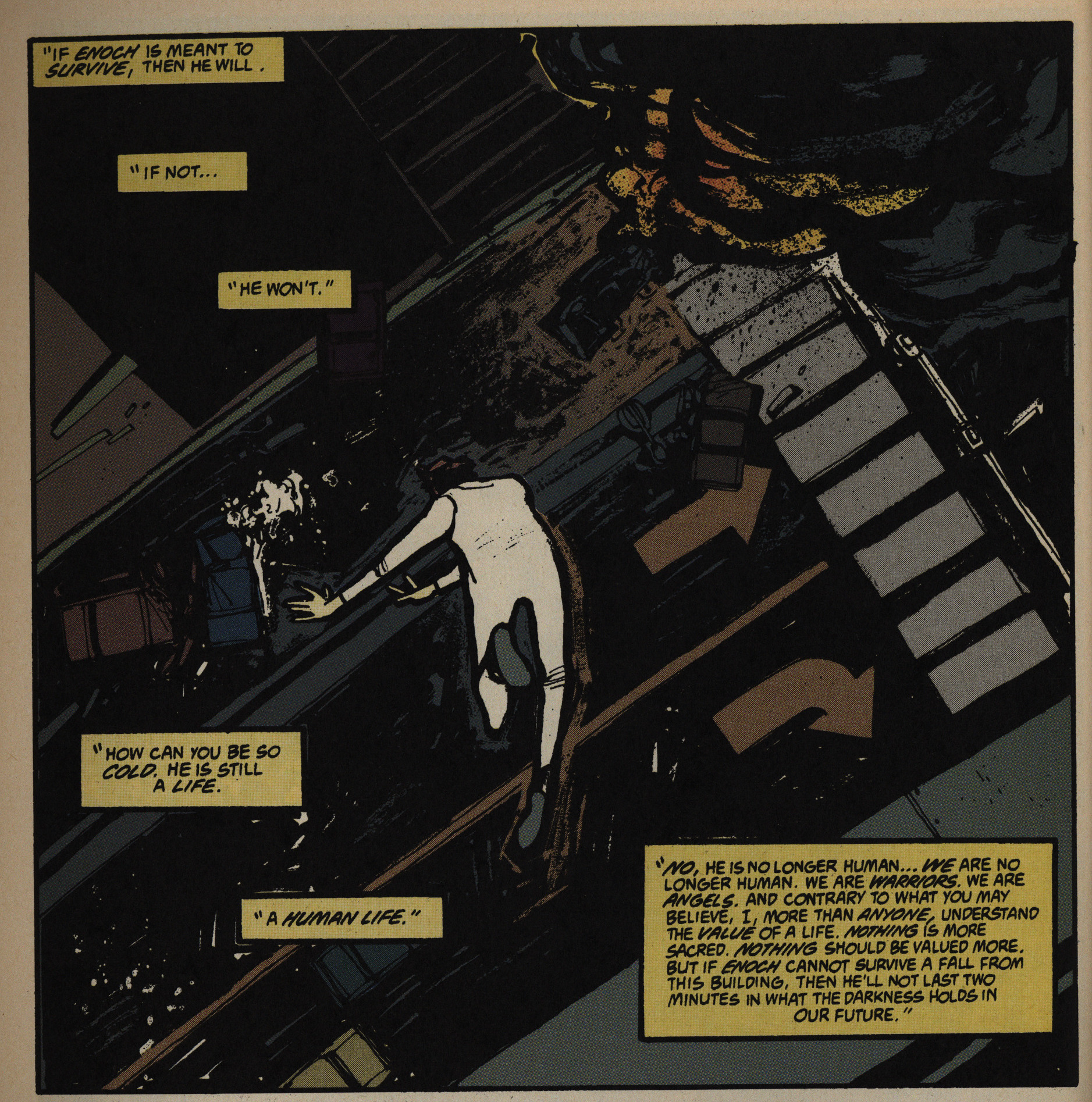
Unfortunately… after a handful of issues, what the series is about has been made clear, and most of the excitement has gone out of the series. The hinting and mystery was what was fun, and when that’s gone, the plot turns out to be the standard dopey horror plot we’ve seen too many times before: Demons and angels are fighting. That’s basically it. The structure is also the normal one: You gotta gather the troupe of good guys to kick some demon ass, or something.
Many of the letter writers appreciate the mysteries of the initial issues, too.
Quite a few letters also wonder what techniques McKeever uses for the artwork, but McKeever remains coy in his answers. I wonder, too: The dirty smooshed effect is really striking… stencils? Scratchboard that’s then reversed? He does seem to be using a photo copier to blow up certain elements, and perhaps that’s somehow involved here, too…
The portentous style of writing is pretty on point for an angel/demon slugfest, I guess, but I find it somewhat grating. McKeever does mix it up with humour, though, so it’s not just this kind of stuff.
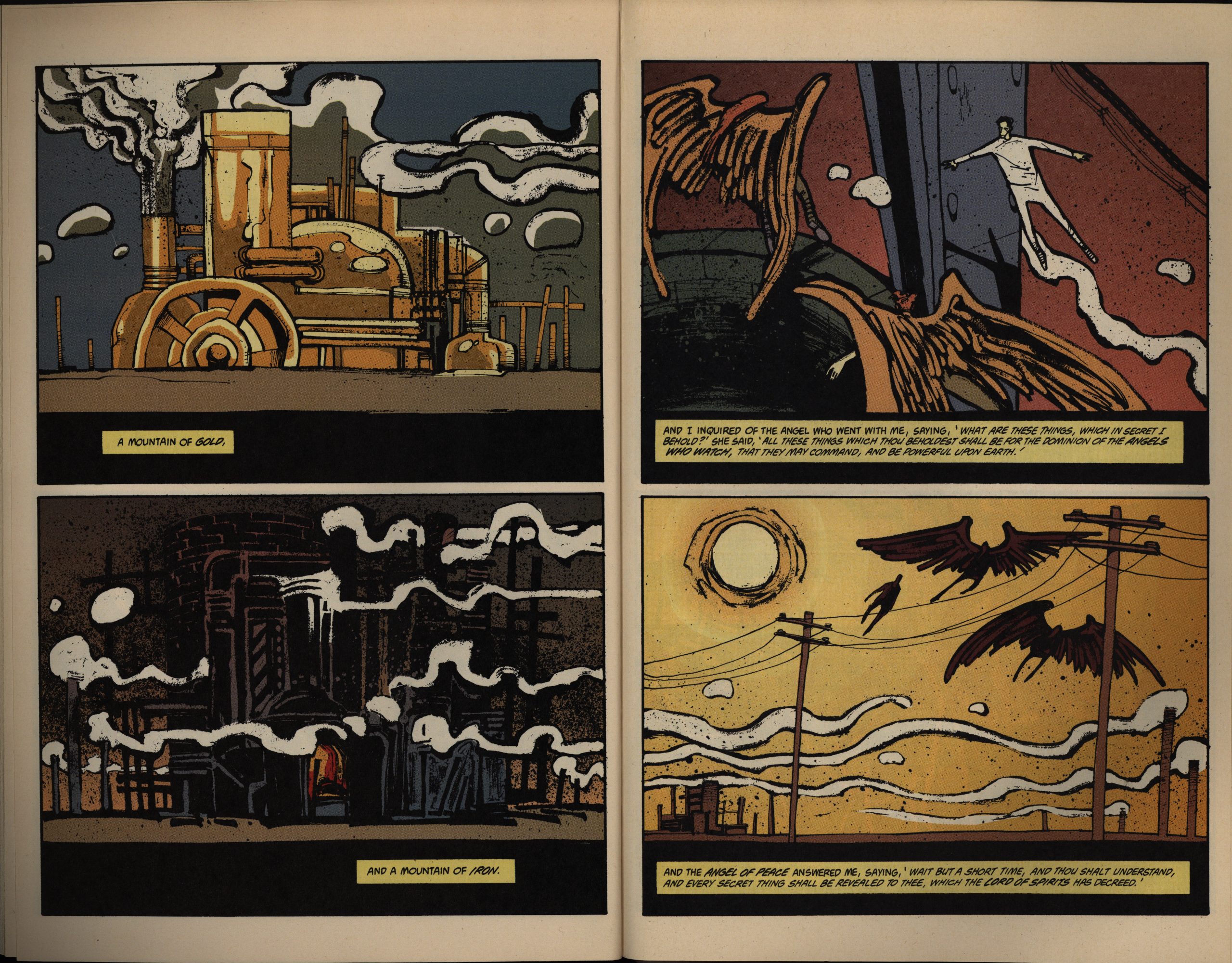
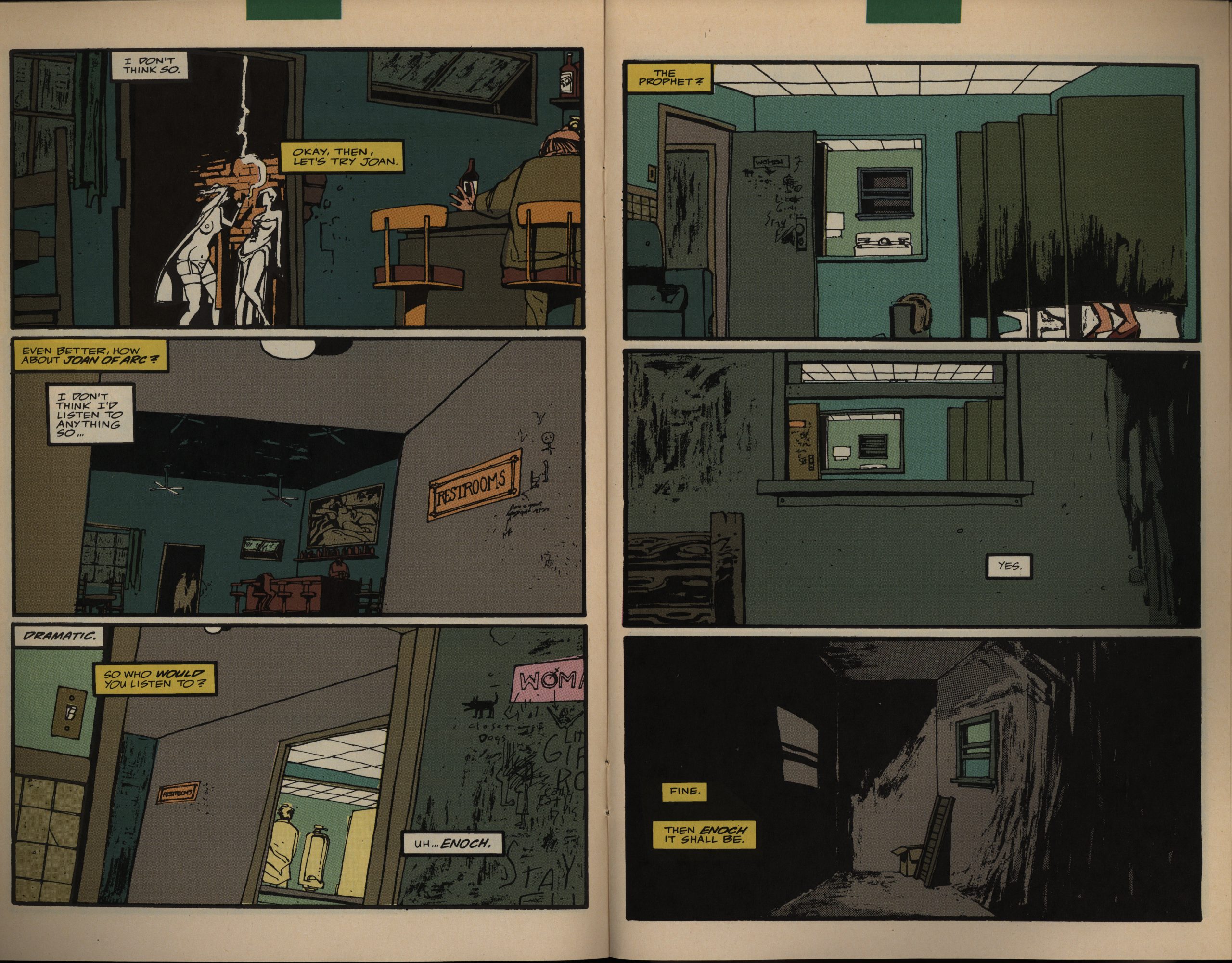
Except the issue where it’s mostly … is this a quotation from der bible? I guess I could look it up… No? “Book of Enoch”? Probably not part of the bible, but I guess I’m not really that interested.
McKeever also seems to lose some faith in his narrative after a while. That is, he feels it necessary to use more and more space to explain stuff at us.
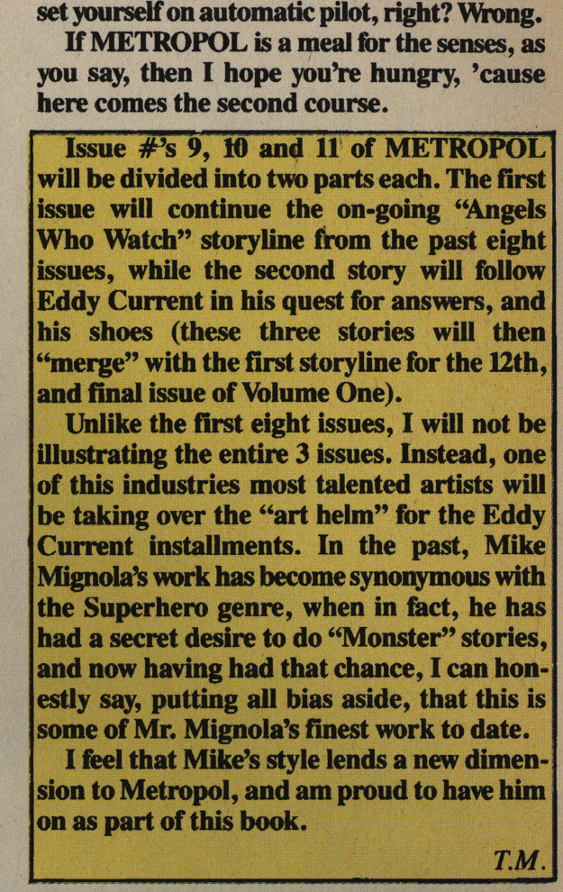
Uh-oh. McKeever announces that there’ll be a back-up feature for three issues. Drawn by Mike Mignola. I guess the schedule got to McKeever?
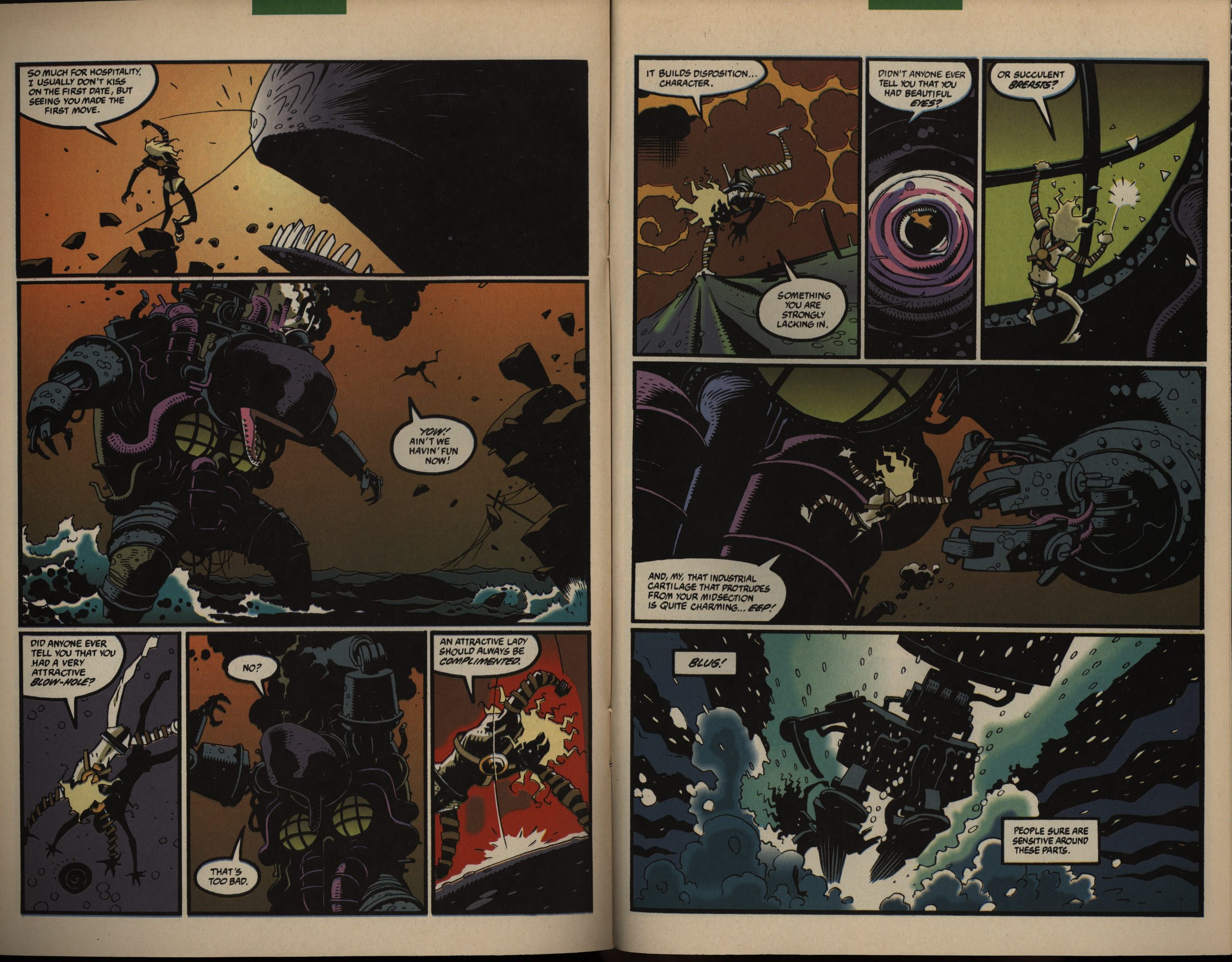
But, hey, it looks pretty great. Mignola knows his monsters. Unfortunately, not much of interest happens in these three (8 to 10 page) vignettes: It’s just Eddy Current (yes, he’s back from the dead) fighting some monsters.
While there’s nothing wrong with these pieces in and of themselves, it means that the main narrative gets fewer pages, and things sort of grind to a halt. It definitely feels like there should be… more… but it just ends (spoilers!) with all the characters having been manoeuvred into position so that they can finally start doing something of importance.
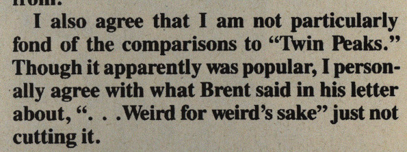
I don’t get the comparisons to Twin Peaks, either, and McKeever didn’t like them. Because… Twin Peaks sucks? I think that’s what he’s saying.
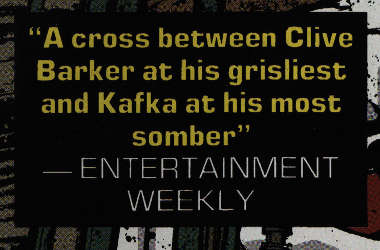
It’s nice that you get a good review in Entertainment Weekly, I guess, but when it’s this moronic, should you put it as a blurb on your cover?
Yes. This is Kafka at his most sombre. Definitely. Or is this the Clive Barker part?
I mean, it’s fun and all, but…
KAFKA!?
Oh, yeah, there was a guy being arrested in issue one, and the cops wouldn’t tell him what he was being arrested for. I guess that’s all it takes for somebody to pull out the Kafka card…
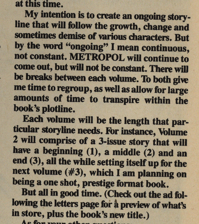
McKeever announces that he’s going to be taking a break before returning with three further issues, and then possibly a final (?) one-shot. I guess he could use some rest after writing/drawing/colouring over 300 pages in one year…
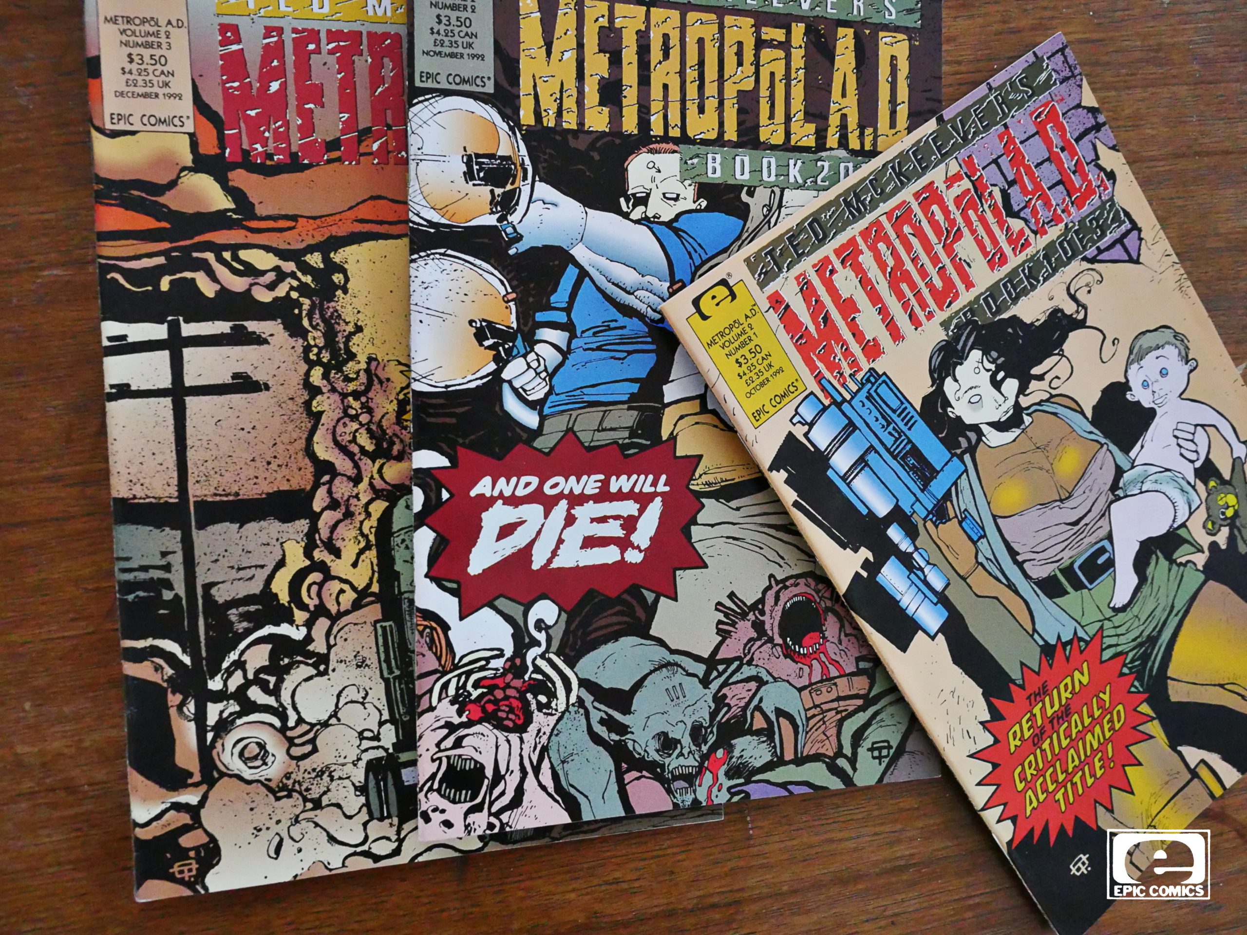
So then there’s the three part series, half a year later. Still 32 page floppies on “mando” paper. But possibly not newsstand distribution any more? $3.50 was probably too much at the time…
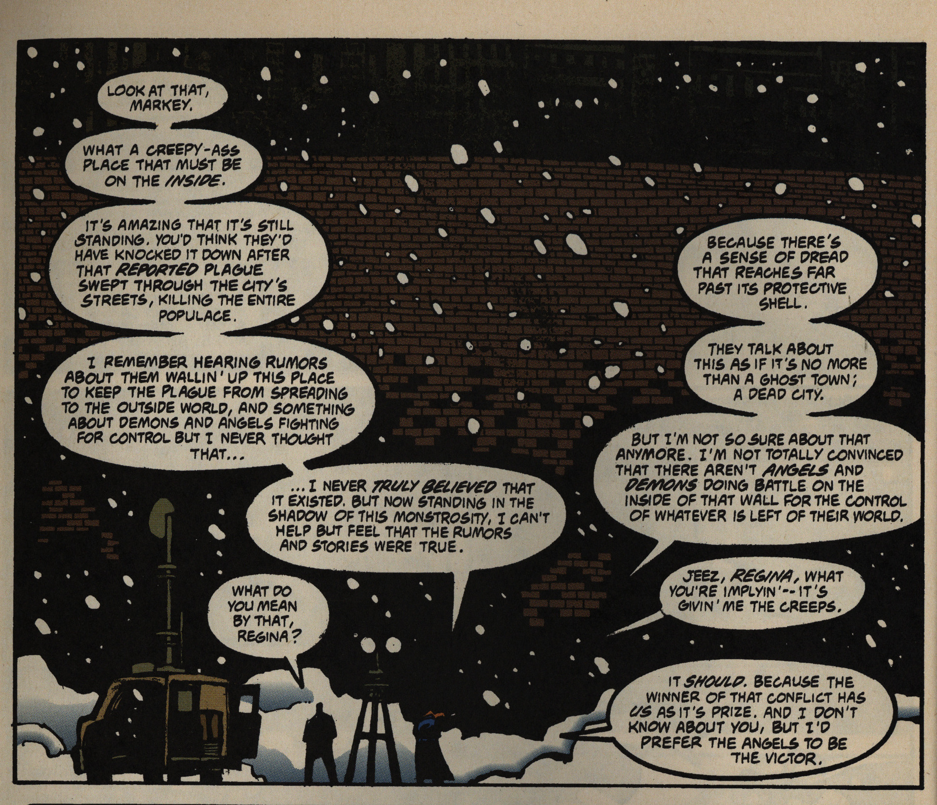
So we open with a scene that helpfully brings us all up to date on the new status quo, and something like a year has passed. It’s… efficient? But not very exiting.
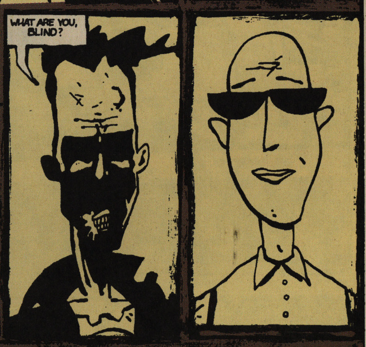
McKeever’s style is sometimes a bit too much. I mean, I love it, but that drawing of the nun (the one with the cross on the forehead) is just… I mean, her neck is most easily interpreted as a huge chin instead, but it’s just her mouth that’s on the underside of her face, and there’s no chin. If you know his style, you can interpret it, but otherwise it’s a bit eh.
As if to remind us what his style used to be, we get a recap of the Eddy Current series, and there’s even the same nun character included, with his old style (that includes a chin).
The final issue, we finally get an explanation how this all ties in with McKeever’s first series, Transit.
Oh, yeah, I forgot to mention what the second series is about, and… er… It’s basically what should have gone into the original issue 12? It’s the big climax that series lacked.
Image Comics released a collected edition of the entire Metropol series in 2009, but in black and white, I think? Or do I misremember?
Indeed:
As a physical object, the heaviness of this reprint of the Metropol series as the hardcover volume three edition of McKeever’s anthologized works is pleasant to hold. Unlike the original series, however, the book is in black and white, without the strange colors that gave Metropol its dark tone. The original inking was done for color, and the reprint lacks the contrasted shading required for a black and white work. Further, in the first issues of the original, some caption boxes were different colors to help the readers recognize whose voice they were reading in conversations between two consciousnesses occupying one body, which is confused or lost in this edition. A few of the original issues also contained extra stories at their ends setting up the return of Eddy Current, written by McKeever and illustrated by Mike Mignola. These stories did not make it into this volume and cause for a strange jump of the character into the main narrative.
But what did the critics think?
Thomas K. Dean writes in Amazing Heroes #191, page 115:
[…]
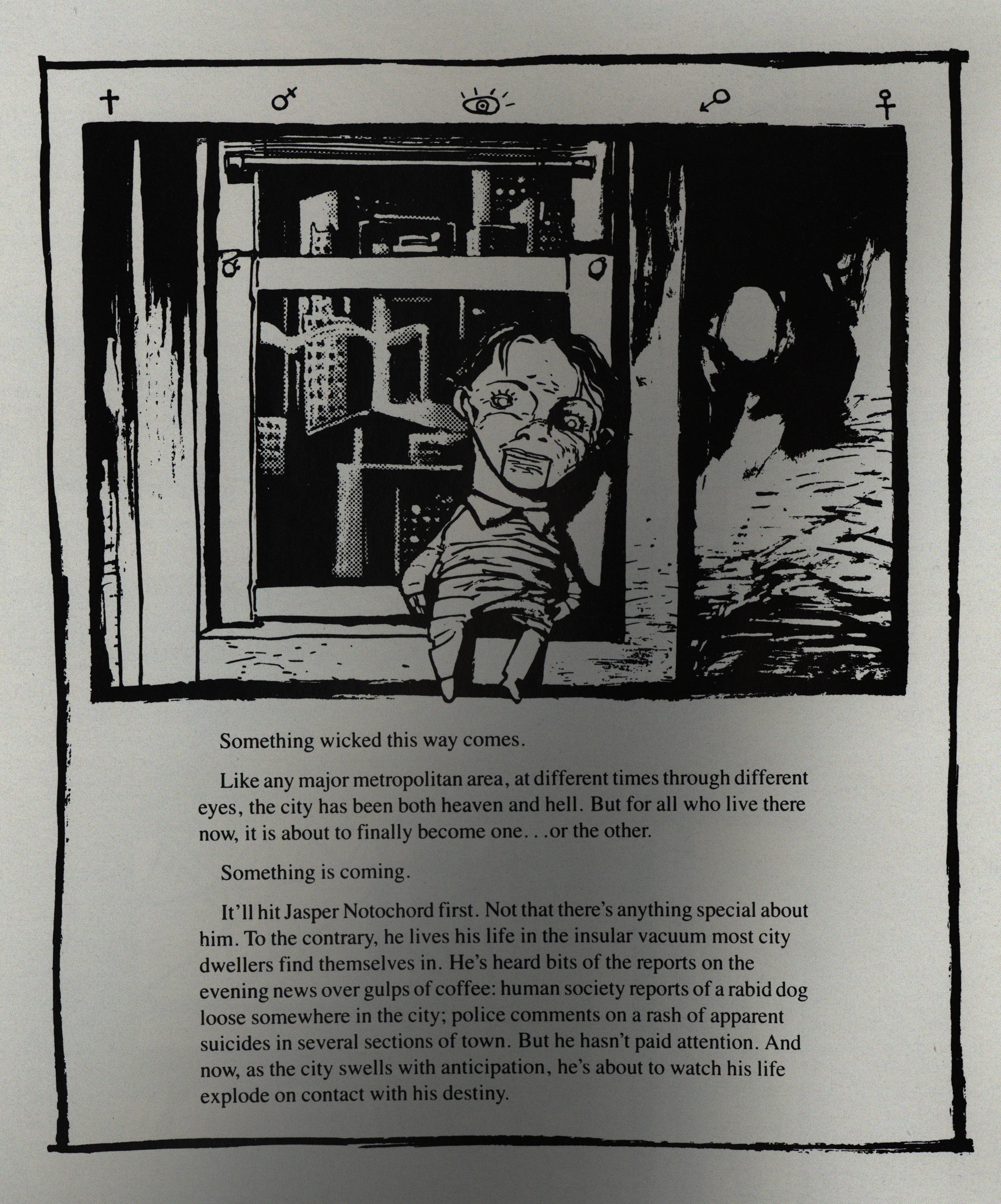
It begins with a hanged man in a
window. I think of David Lynch: a
severed ear, or a dead girl wrapped
in plastic. There are layers to this
nightmare we haven’t begun to peel
back. I think of Borges: labyrinths
within labyrinths, starting and ending
nowhere.
Something is coming.
I think of the narrative pace of Jap-
anese manga, or of Daniel Clowes’s
“Like a Velvet Glove Cast in Iron.”
At first, hints, confusion, a series of
puzzling and disturbing images, no
linearity, no secret origin, no back
story, no explanations. How can we
judge?
[…]
The images are sketchy, distorted.
I think of Kyle Baker. I think of Keith
Giffen.
Perhaps Metropol makes me think
of too many other things? Too many
other people? Does this mean lack of
originality? I don’t think so. How are
we to judge, though? There is some-
thing very frightening going on here.
I give Ted McKeever the benefit of the
doubt. I must slow down to look at
the accident. I can’t help it, Mr.
McKeever has seduced me to look
more closely at his urban nightmare.
Er, ok.
An interview in The Comics Journal #163, page 69:
So, I’ve come to terms with scheduling years to
come. When I used to work at the Herald and at ABC,
there was, on a daily schedule, “We need this by noon
tomorrow.” Now I say things like, “I’ll have it for you
in December of ’94!” I’m booking years like it’s an
hour. so I will say “yes” — there’s going to be a
sequel to Metropol, there will be Metropol 3, there
will be a continuation ofit. It might bein either a book
called Metropol 3, Orit might be in a book called Eddy
Current. But without a doubt, yes, it will continue
and, yes, I’ll bring them back — it’s just a matter of
exactly when.
Did that ever happen?
Apparently not:
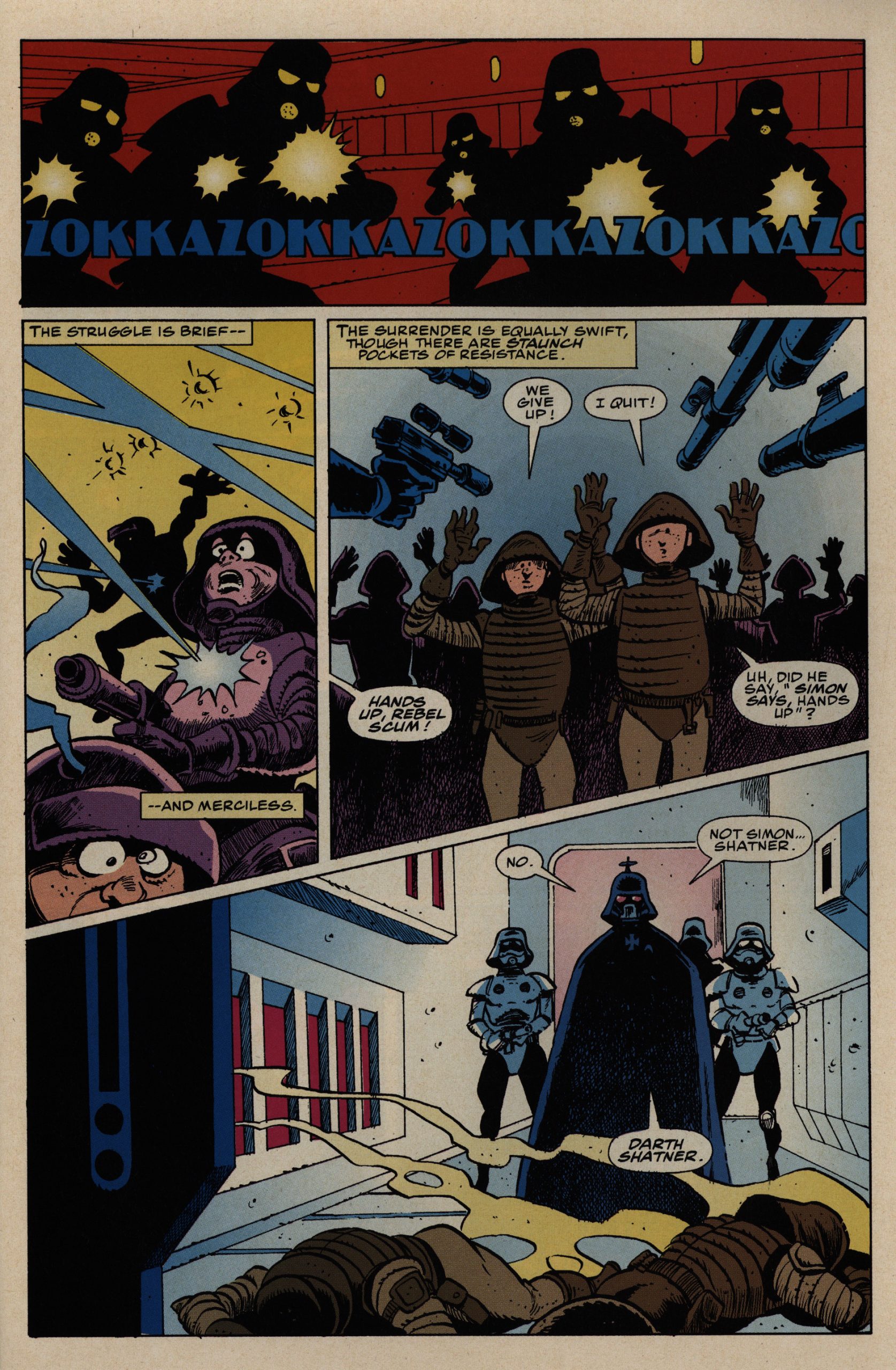
Metropol was followed by a three-issue coda, Metropol A.D., also included in this collection. It tries to neatly tie too many plot threads together and the new pace short-changes both the Lynchian mood and the spatial effectiveness. Even worse: POW! KABOOM! ETC! sound effects were added to the art by the publisher — without McKeever’s approval. When only one artist is writing, illustrating, and even lettering the book, it’s amazing how freaking loud these foreign objects seem.
The parting from Epic wasn’t amicable:
Then, after the completion of “Plastic Forks,” I approached Archie with “METROPoL.” And once again, he took a look at what I had, and gave me the green light. Twelve issues later, I decided to take a brief break, and get the next three-issue “epilogue” of “METROPoL A.D.” in the can, so they would come out consecutively, with no delays. But, it was around this time that Archie had left Marvel/Epic and moved over to DC. And, that’s when the whole ball of yarn started to unravel. With new editors stepping in, all my previous established plans with Archie were thrown in the toilet, because these new editorial “heavy hitters” came barreling in like a wrecking ball, with absolutely no intention of honoring what Archie had worked so hard to establish. Not only with me, but Epic in general. So, needless to say, “METROPoL A.D.” turned into an aggravating shit-show, where the new editor and his lackey assistant, made working there a miserable experience, and the sole reason why I walked away from Epic.