1993: Midnight Men

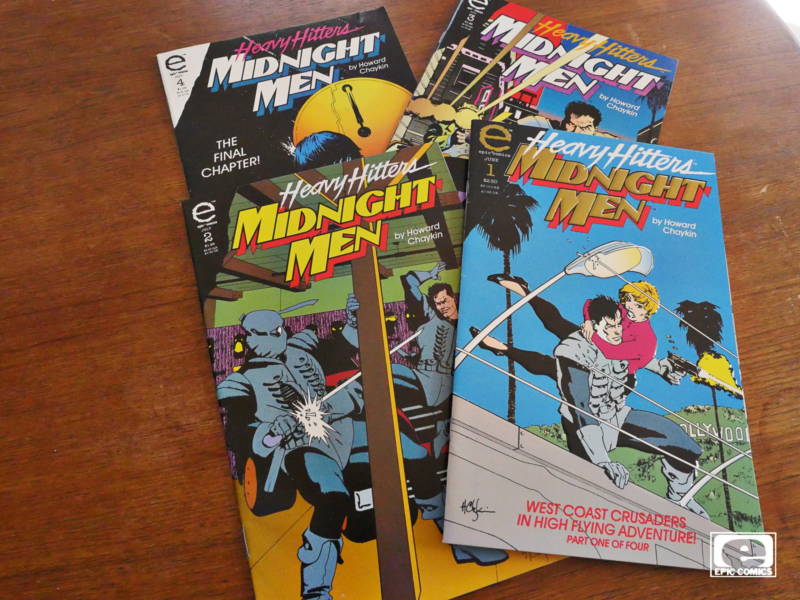
Midnight Men (1993) #1-4
by Howard Chaykin

Oh, I thought the “Heavy Hitters” thing Epic re-launched as in 1993 was going to be all about trying to out-Image Image? But it’s hard to imagine someone further from the Image aesthetic than Chaykin — he’s all about dense, intricate storytelling; not endless splash pages.

As usual, the first issue has an embossed cover with metallic inks… but this metallic ink is the least metallic ink I’ve ever seen. It’s less gold than just… brown… Perhaps it’s lost its lustre over the years?

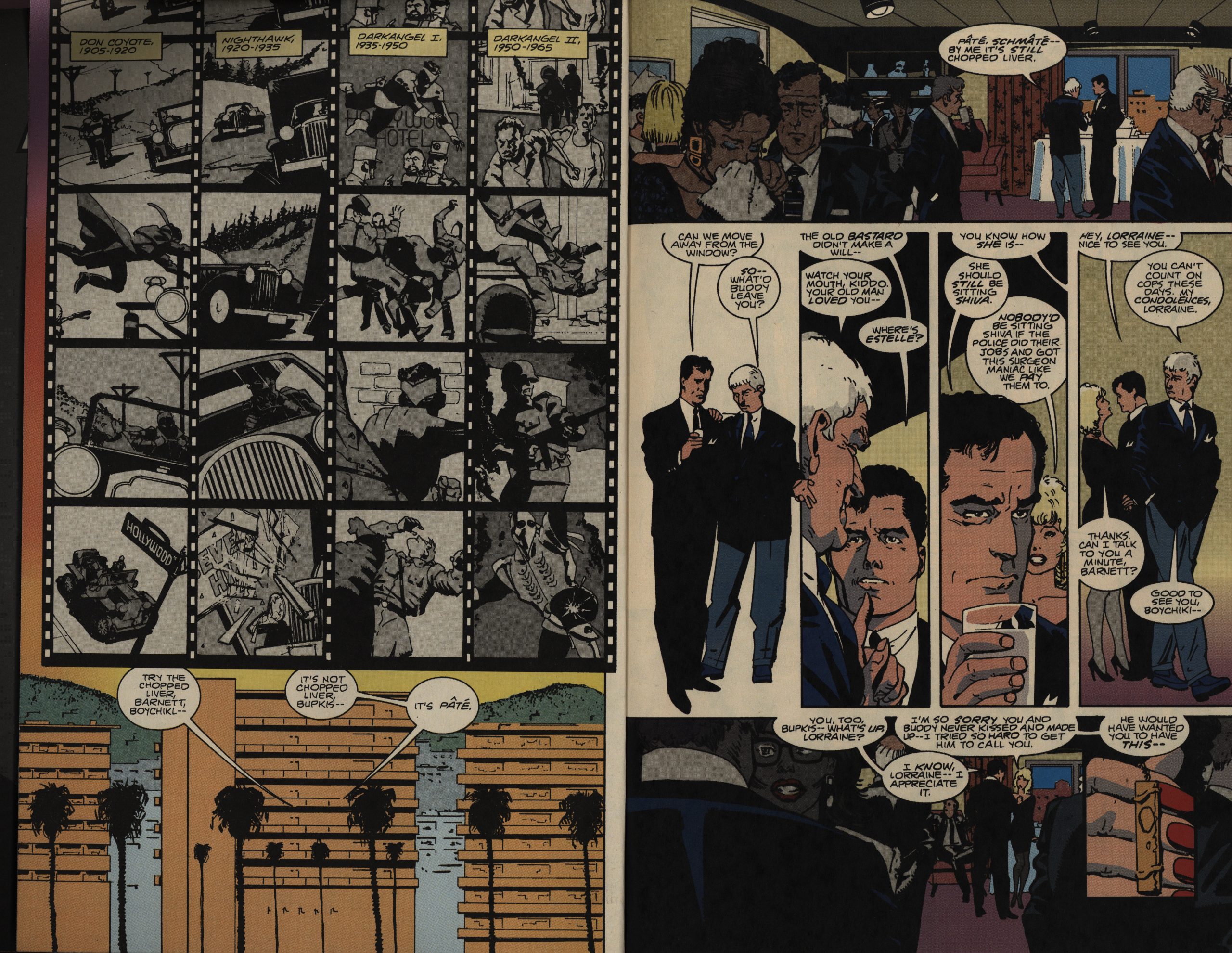
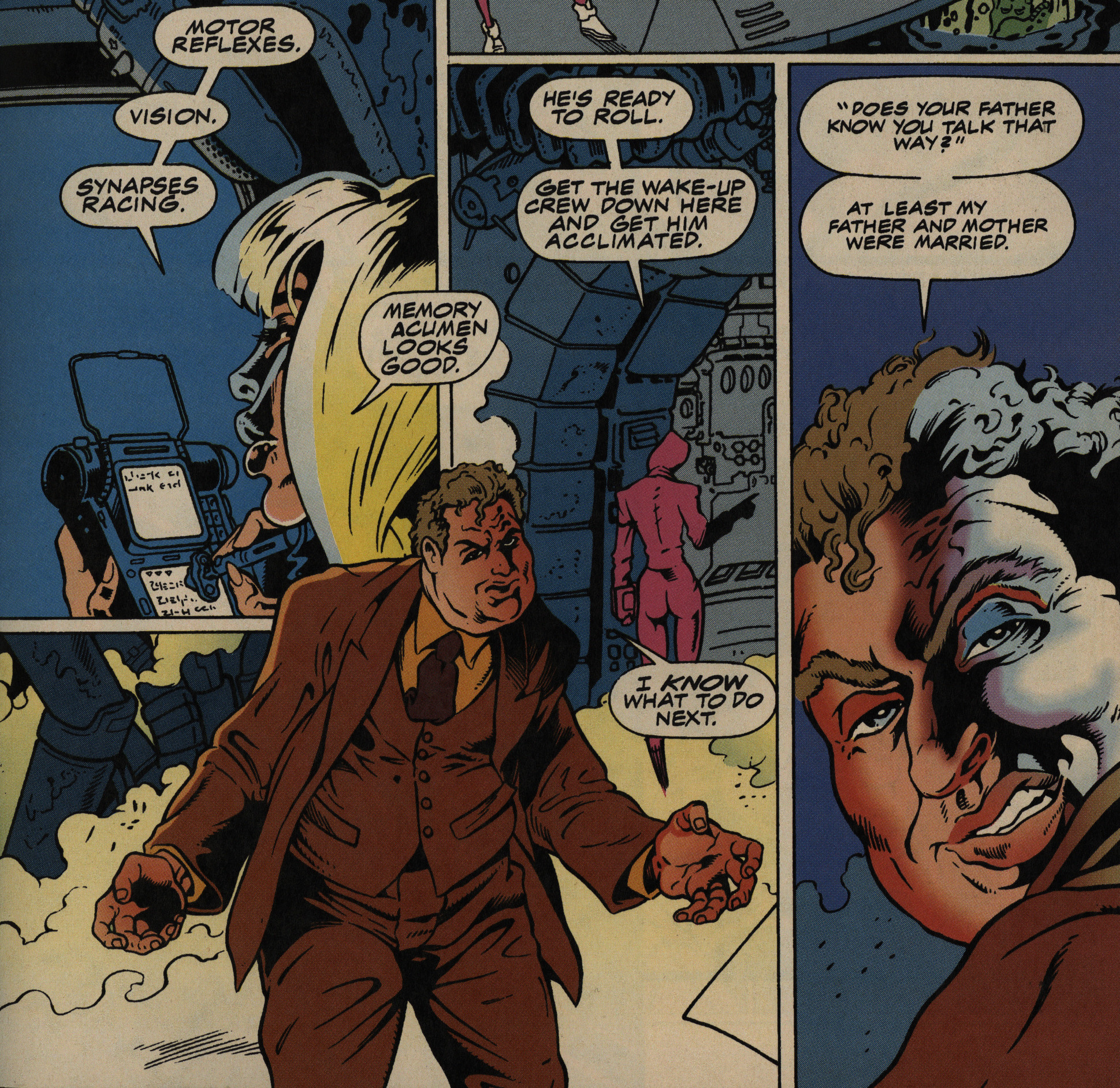
ANYWAY! We’re off to a classic Chaykin start, with people being introduced very er efficiently (with some nod to intertextuality)…

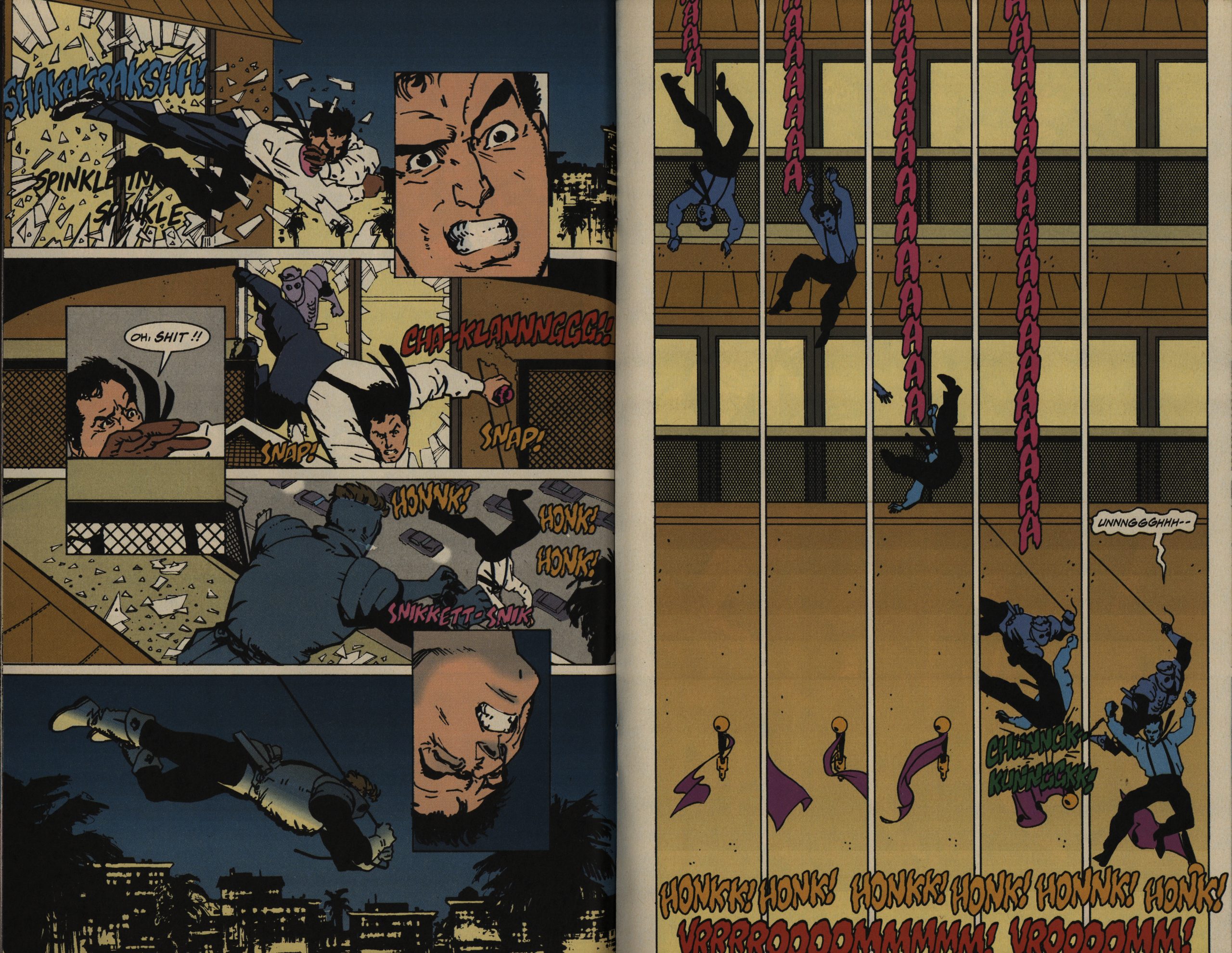
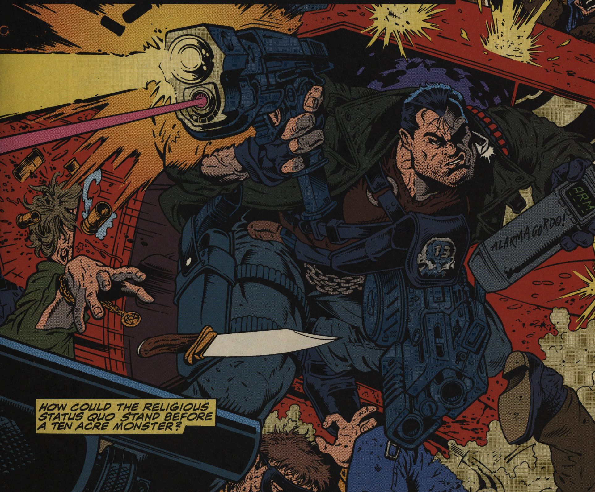
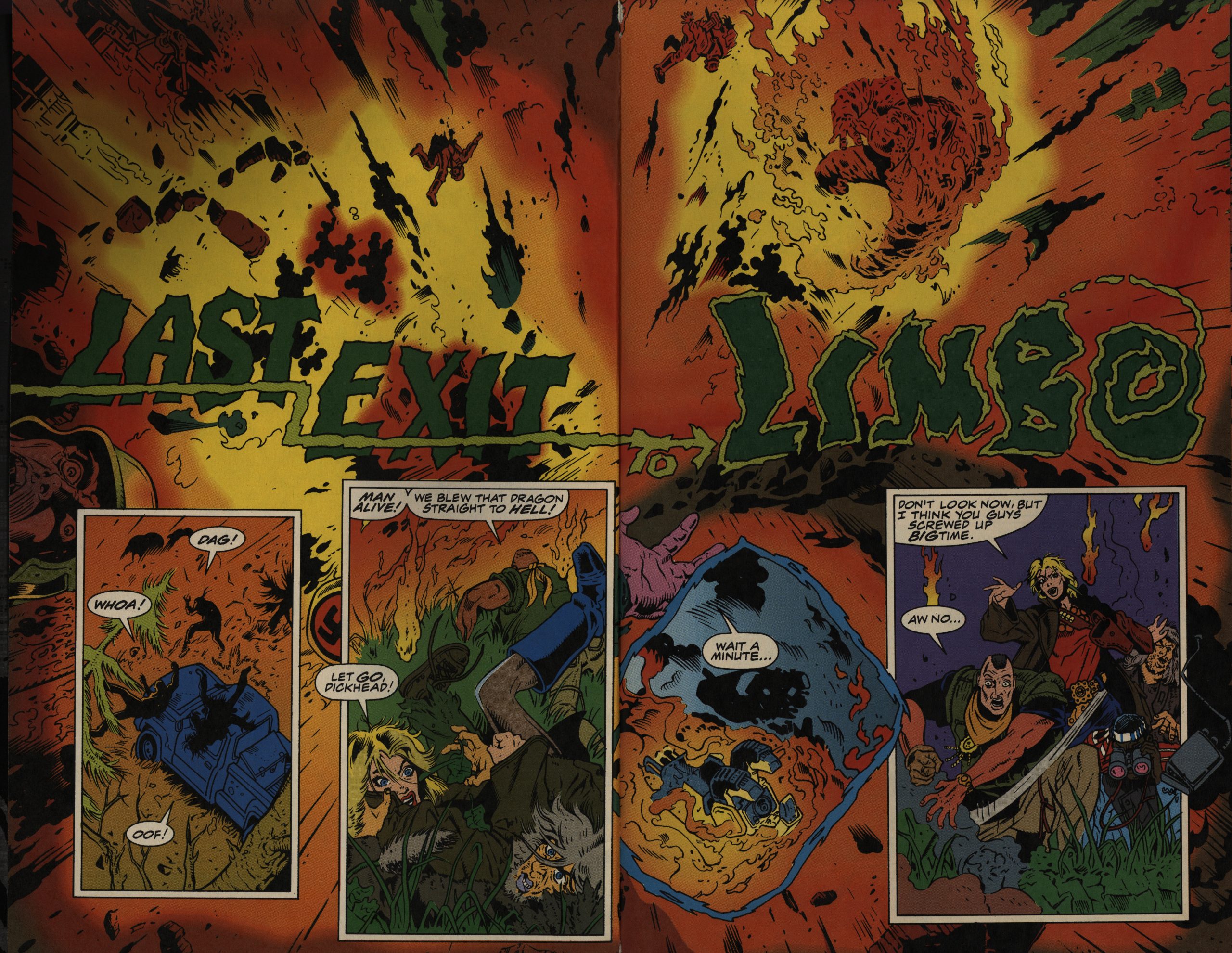
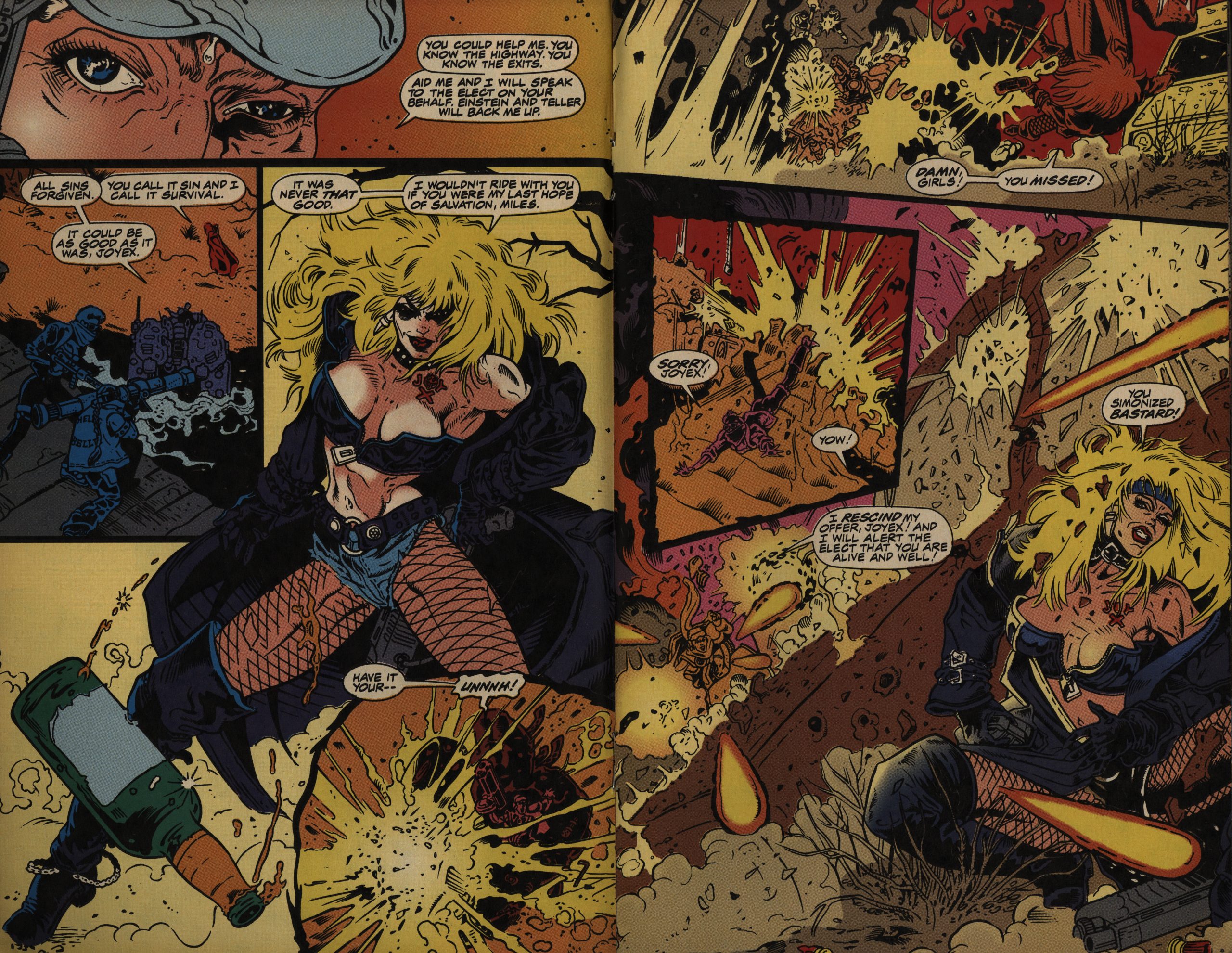
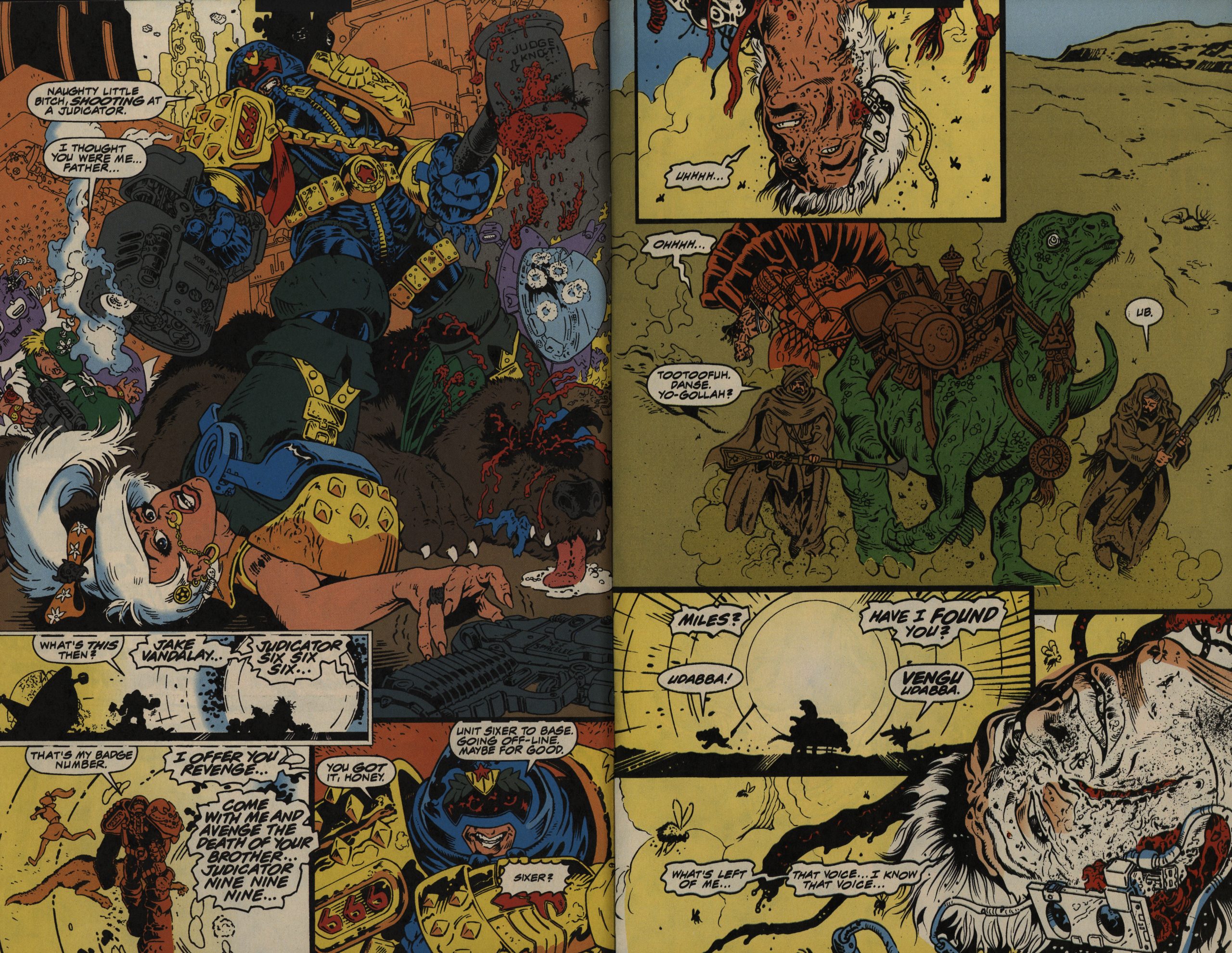
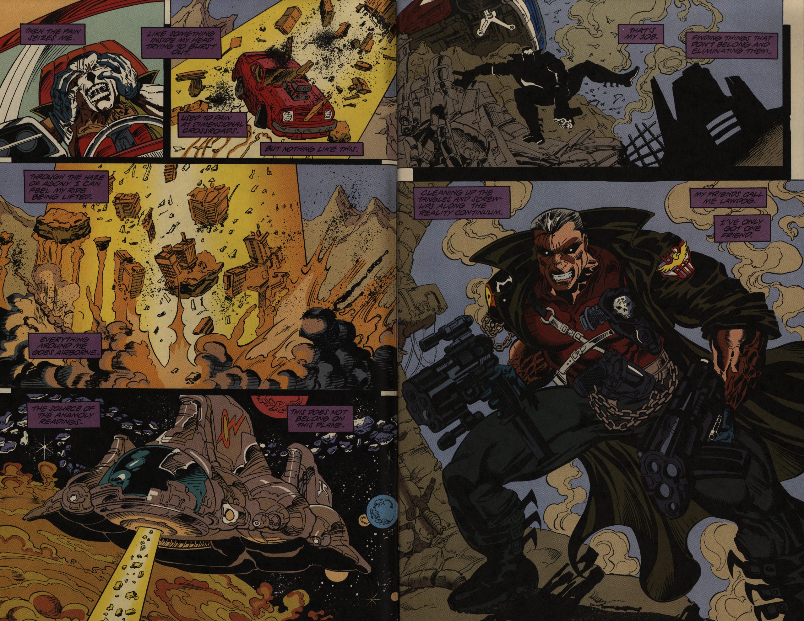
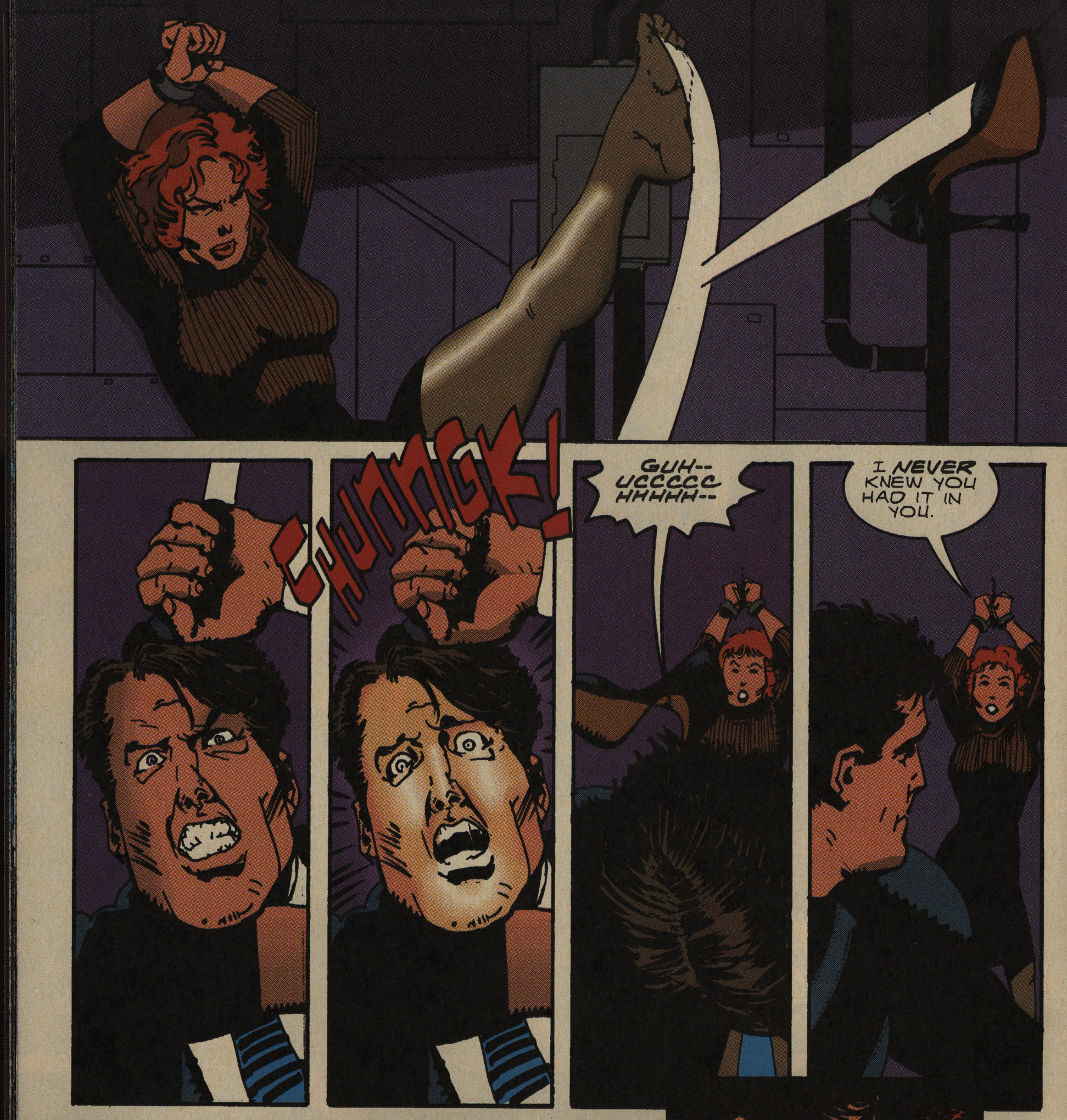
… and then straight into some very inventively laid-out action. (And I’m not going to spoil how this scene ends, because it’s… not going to end as you’d assume.)

At this point, I’m totally in on this series: This seems like prime Chaykin, with stylish characters, somewhat witty repartee, and what looks like is going to be an interesting plot.

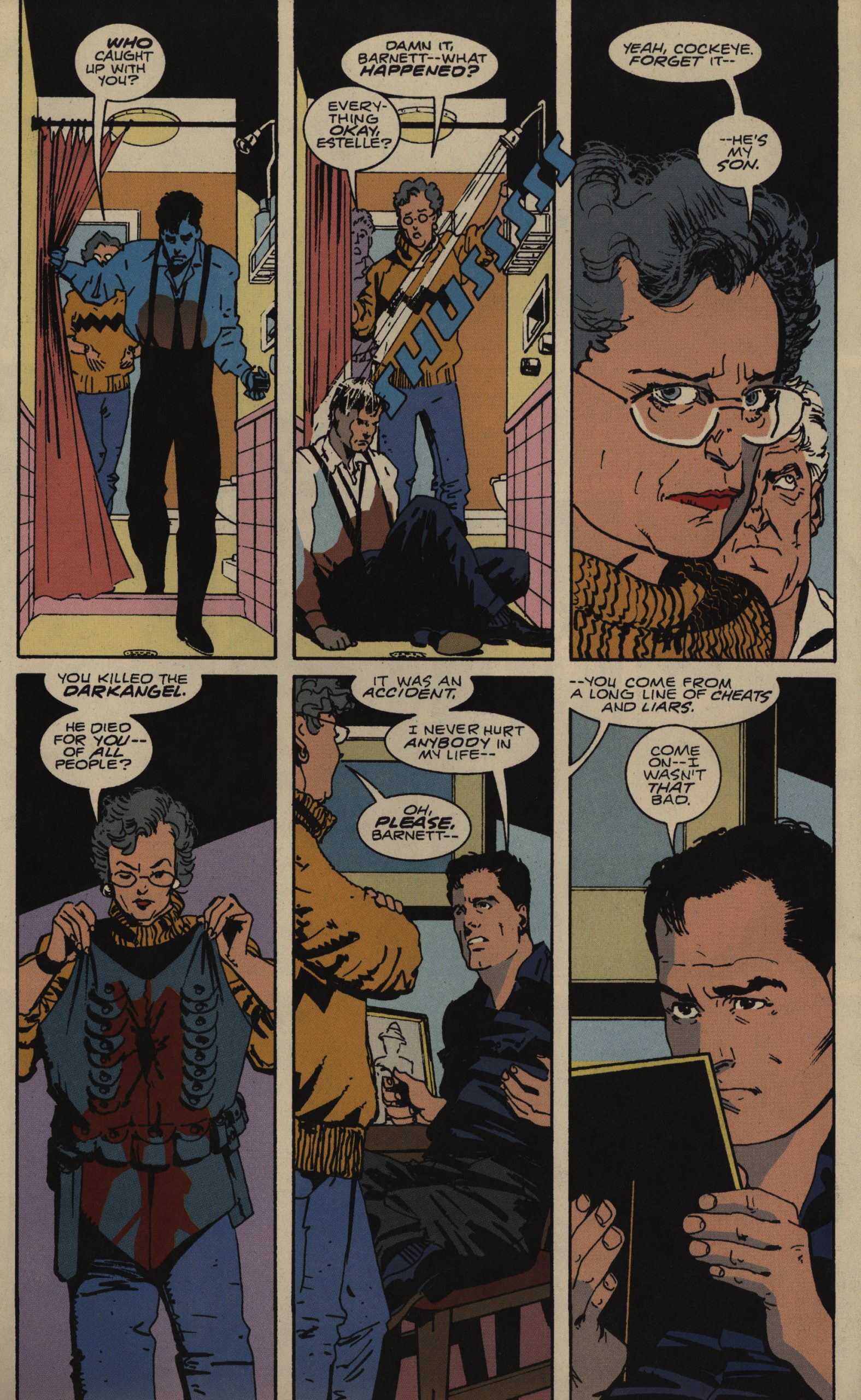
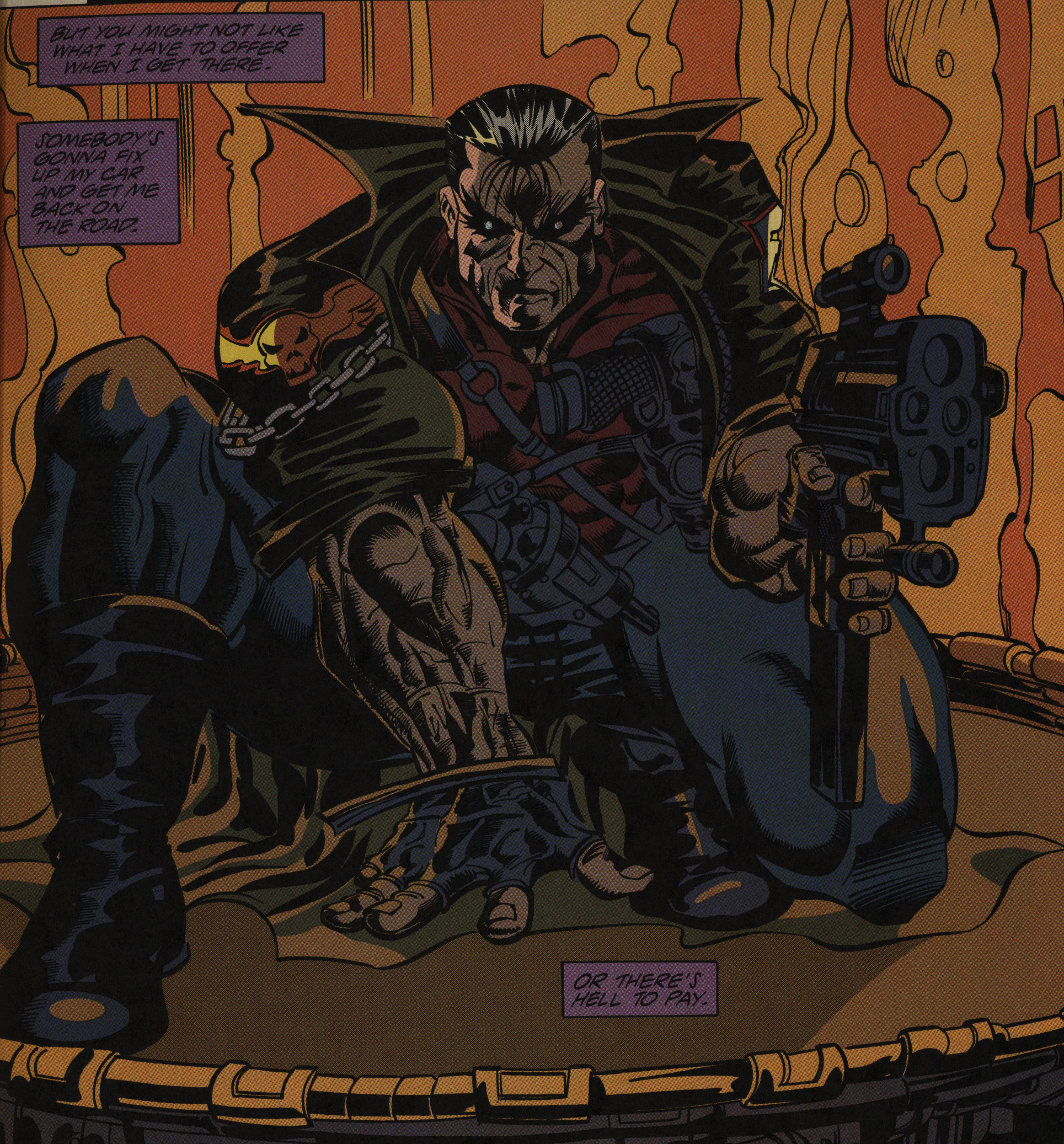
Chaykin can get so much characterisation done in so few words; I love it. Perhaps he invests a bit less in his artwork than he did in the 80s (fewer backgrounds and slightly more rough-hewn lines), but it’s still very on point.

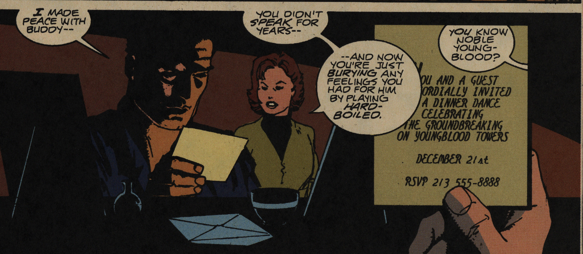
Oh, yeah, the villain is called Noble Youngblood, which is as close as we get to an Image reference here.

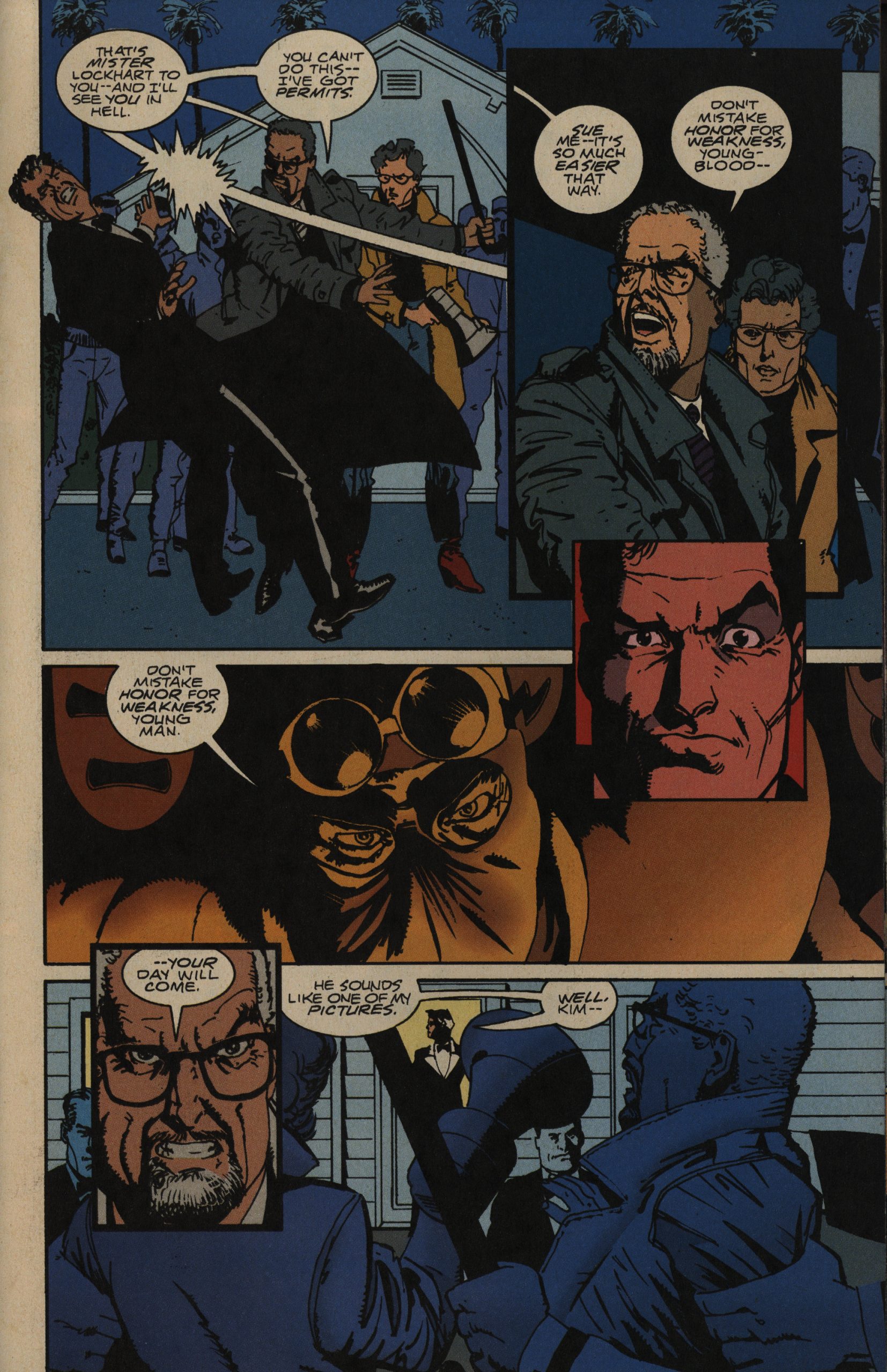
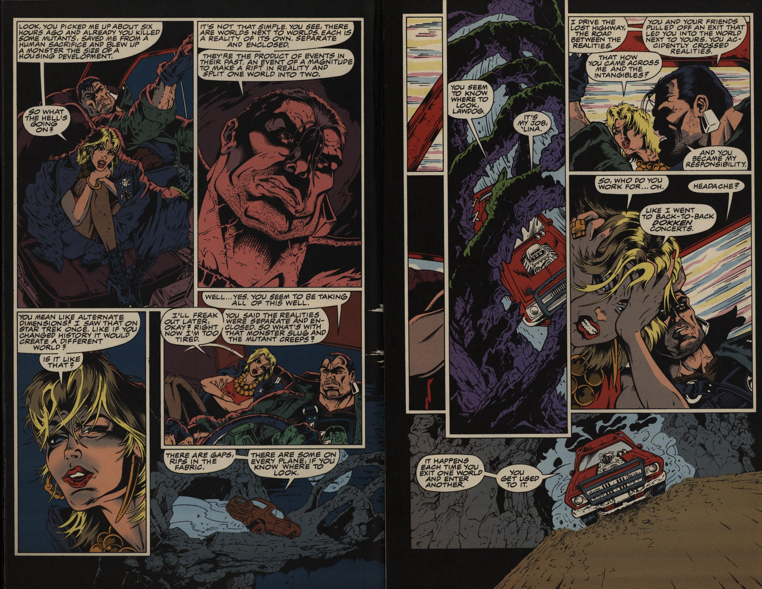
I think the series does seem to come apart a bit in the second half. For instance, earlier in this issue, we have that bearded guy doing that line, and then he repeats it, and then our protagonists flashes back to that first instance — which we just read a few pages ago! It shows a lack of confidence in the reader that’s really unusual for Chaykin.

Chaykin usually uses confusion as a storytelling tool. I remember writing about how important confusion can be in drawing a reader in; by not spelling things out you invest the reader more in co-creating the narrative inside the reader’s brain. I got a reaction as if I were either insane or retarded, because “clarity” is what’s heralded as the apex of comics storytelling. Or, really, the only way to do a comic book; anything else is a failure.

But it’s what Chaykin does so well, and having the characters spell out what any reader that had been paying attention must already have understood is just boring.

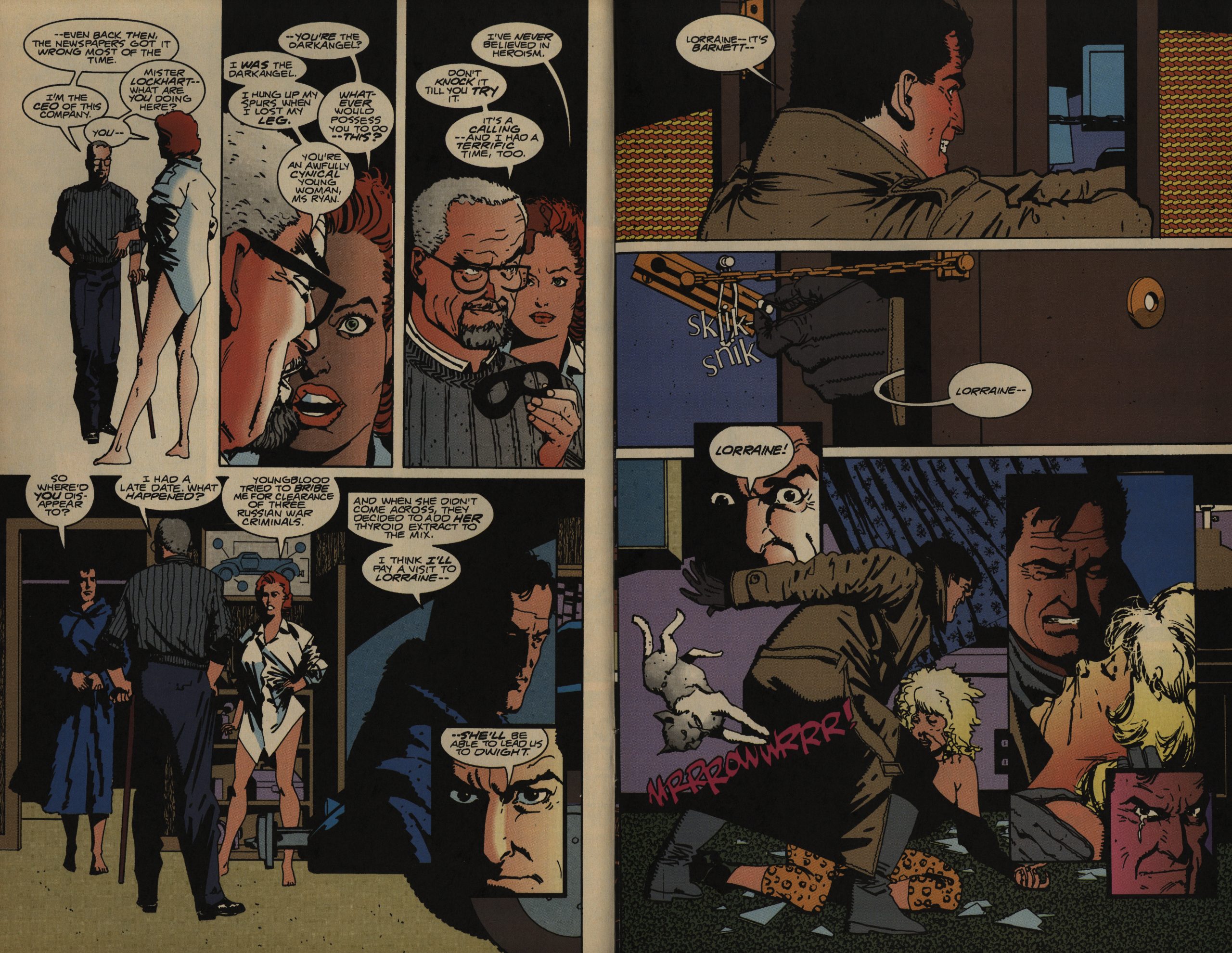
Not to mention that Our Protagonist goes to visit his girlfriend all of a sudden, because she’ll lead him to Dwight, apparently, and then find her fridged, and then on the next page he’s apparently found Dwight, anyway, and then he’s beating him up?

Now, that’s not confusion, that’s just really, really bad storytelling.

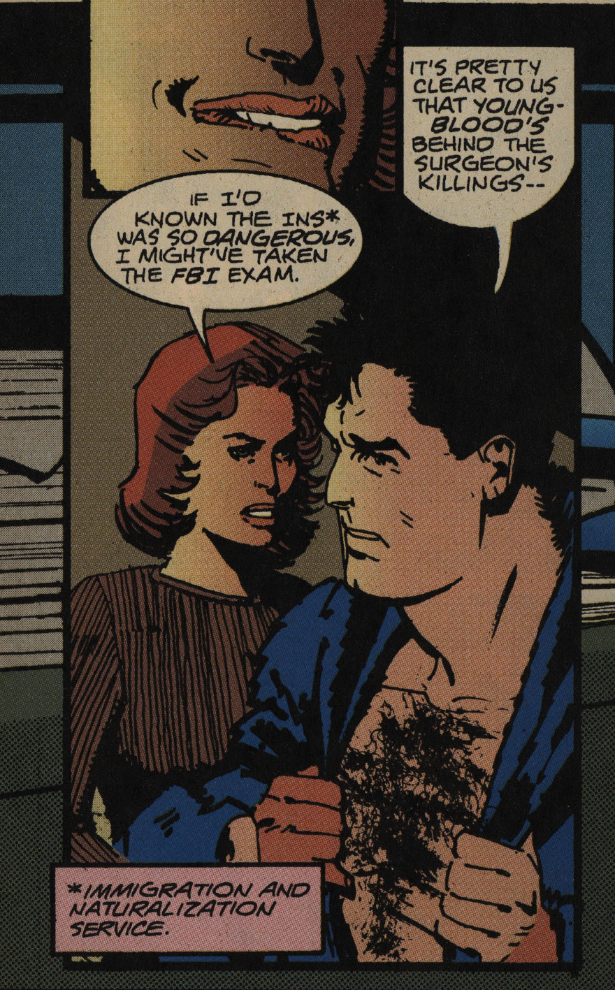
I wonder whether Chaykin was starting to get notes from Marvel to make things more easily digestible — in the previous issue, they talked about “INS” a lot, but didn’t asterisk anything. Weird. Is that the reason the first issue was awesome and then things took a more boring turn?

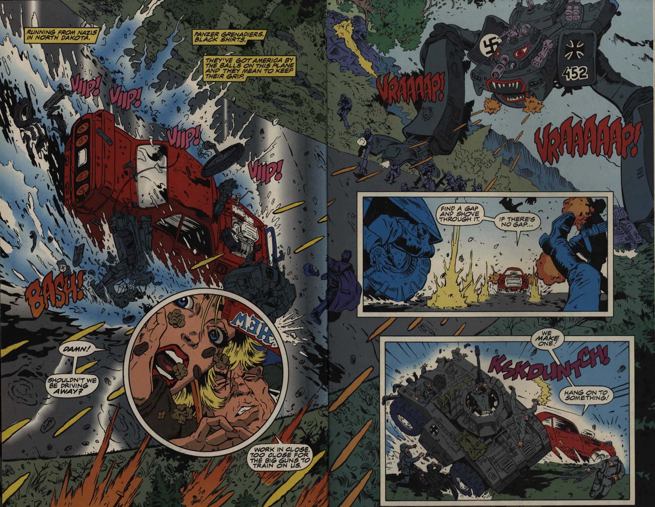
The final issue makes up for the mid-series doldrums by having a very er original (and long) action sequence climax. Some of the original bits (like killing a guy with a shoe that seems like it would mass approx. zero) don’t really make any sense, but eh whatevs.

It doesn’t look like this has ever been collected or reprinted? Weird. It’s a good read despite its flaws.

But… he’s in a DC role playing game?

I think that it had originally been pitched as the script for an action/thriller movie, then became a comic book.

It was originally a Batman pitch?

The biggest problem with MIDNIGHT MEN is that it is a HVC comic. This means that people who don’t like HVC comics won’t like it (it is very HVC) but that’s their loss. For people who like HVC comics the fact that it is very much a HVC comic is also a problem. Because this means it is incredibly slick with every one of the elements under the author’s control working to the sweet end of entertaining the audience. It is so good at doing this that it is easy to overlook how clever it is. It’s ultimately too good for its own good.

1993: Lawdog

Lawdog (1993) #1-10,
Lawdog/Grimrod: Terror at the Crossroads (1993)
by Chuck Dixon, Flint Henry and others

Before starting doing these comics blog thingies, I vaguely connected Chuck Dixon only with right-wing super-hero comics, but after reading a good number of his 80s/90s work with Eclipse and Epic, my brain always goes “oh yay!” when I see that I’m reading something he’s done next. Always well-written action, and with Flint Henry on the artwork, it’s going to be bonkers action, right?

Ah, yes, this is 1993, so we’re in Image action territory…

… but, yes, this is indeed bonkers! Exactly what I needed today.

The first issue can hardly be improved upon: We’re dropped straight into the action, and after a few pages, the unnamed protagonist has picked up a sidekick (the blonde above) who’s named him Lawdog. And then they’re off having adventures in different dimensions; above we’re on in a place where they worship hell or some such nonsense. It’s perfect!

Henry’s artwork is so over-the-top that every single panel is a wonder to behold. He does the inks himself on the first issue, and then has a couple of other people on the next two, before settling on an inker for the last seven issues.

Providing this amount of bonkers energy on a monthly 28-page book is just insane. It’s artwork that makes you go “whoa!” and “tee hee” at the same time; it’s audacious. But perfectly readable, which is a rare combination.

Midway through the second issue, we get some info about what’s up with stuff here, and again — what could have been a boring infodump comes at exactly the right point where we’ve become involved with the characters and really do want to know what’s going on. But we absolutely aren’t told everything, so there’s still stuff to come.

The setup for the series (the only continuing series Epic would publish during its Heavy Hitters phase; all the other books launched in 1993 are mini-series) is classic (i.e., well-used): It’s about a cop patrolling the dimensions, fixing things that need fixing. But it’s classic because it’s so useful: The creators can drop us into any fun universe they think up.

And look at that layout up there — I really like the two horizontal panels that are overlaid by that vertical one. The vertical panel is so thick that this shouldn’t work, and perhaps it doesn’t, really, but it just adds to the feeling of unhinged action.

So since we’re dimension-hopping, we drop into a Nazi dimension, right? Because you have to have a Nazi dimension; very handy for some guilt-free ultraviolence.

And… and… a Nazi monster tank thing…

This is exquisite.

In issue 4, John Stangeland takes over the inking, and… it’s bit shaky at first. Look at those faces in the lower right panel there.

There’s four pages of ads in each issue (at the end, as normal with Epic comics), and… Always stay classy, Marvel.

Stangeland’s inks on the first few issues have a tendency to make Henry’s bonkers figures look weird in all the wrong ways. I mean… that pose there just looks wrong, and his fleshy over-the-shoulder smirk doesn’t really fit here (although it’s supposed to be repulsive, I guess).

And then there’s a crossover with Alien Legion, and we’re told that what happens there doesn’t matter much in this way, which I guess is nice.

Stangeland shapes up after a few more issues, and we’re back on track with more Image-friendly rendering.

Not the way we think?

It’s exactly the way we thought.

Anyway, it’s a fill-in issue, but it’s (wonder of wonders) funny and the fill-in-artists are pretty spiffy — especially Ricardo Villagran.

Marc Hansen does a riff on Megaton Man, but since it’s basically just, well, Megaton Man, it’s not really that funny. (This story continues as a back-up feature in the next issue of Lawdog. I wonder whether that was supposed to be a continuing thing, but then Lawdog got cancelled?)

Oh yeah, I forgot to mention that (almost) all the back covers have this image, but coloured differently every time.

The final issue (it was even announced as such in the ninth issue) revisits almost all the characters we’d come to know over the series, so I assumed they’d all gather for a mega-slugfest ending. But then… nothing happens to them? Did I miss something reading this? I flipped back to the pages and re-read after finishing, and it really seems like a non-sequitur?

The ending of the series is all kinds of weird. The protagonist (SPOILERS!) turns heel over a couple of pages, and then THE END.

That’s so ironic? Don’t you think?

I have no idea what happened here… did Dixon just have to wrap things up much quicker than he’d imagined? Marvel basically shut down Epic around this time, so … he had to come up with something? Few of the plot threads were resolved, and it’s a downer of an ending.

But wait! We still have the crossover:

Artwork by Hoang Ngyuen and Bob Downs (and a bunch of others).

Jugger Grimrod was the most popular character from Alien Legion, also scripted by Dixon, so it makes a natural crossover.

And… The Lawdog series was a lot of fun, but this is more straightforward action. Very Image.

Man, those are some hefty thighs! Healthy ankles!

Grimrod hasn’t looked this fleshed-out before, either.

That’s some heroic angle!

Anyway, the book is a speedy read and it’s fun enough. And! It has a surprise twist that took me completely by surprised, just because I didn’t think there was going to be a surprise twist. Well done.

Well, so that was a pleasant way to spend today: Reading these books was a lot more fun than they had any reason to be. Not hard on the branes.

Weirdly enough, this has never been collected or reprinted. It’s a shame. There’s apparently a Kindle version out, but that’s all?

Heh, that’s true:

And then this weekend, it hit me: Lawdog is the American Doctor Who. Seriously.

That’s an interesting question:

By the time I finished my 10 issue read I was kicking myself for missing out on the series original release.

And I was wondering if all these years later, whatever became of the amazing artist, Flint Henry?!!! And could, Chuck Dixon be talked into a spinoff following, Lina?!!!

Oh, he’s worked some for DC

Dixon is working on getting a collection published:

If the remastered version is popular, Dixon tells us he’d “love to come back to it.”

Let’s hope he does, because it’s a fun read, even if the ending could use some work.