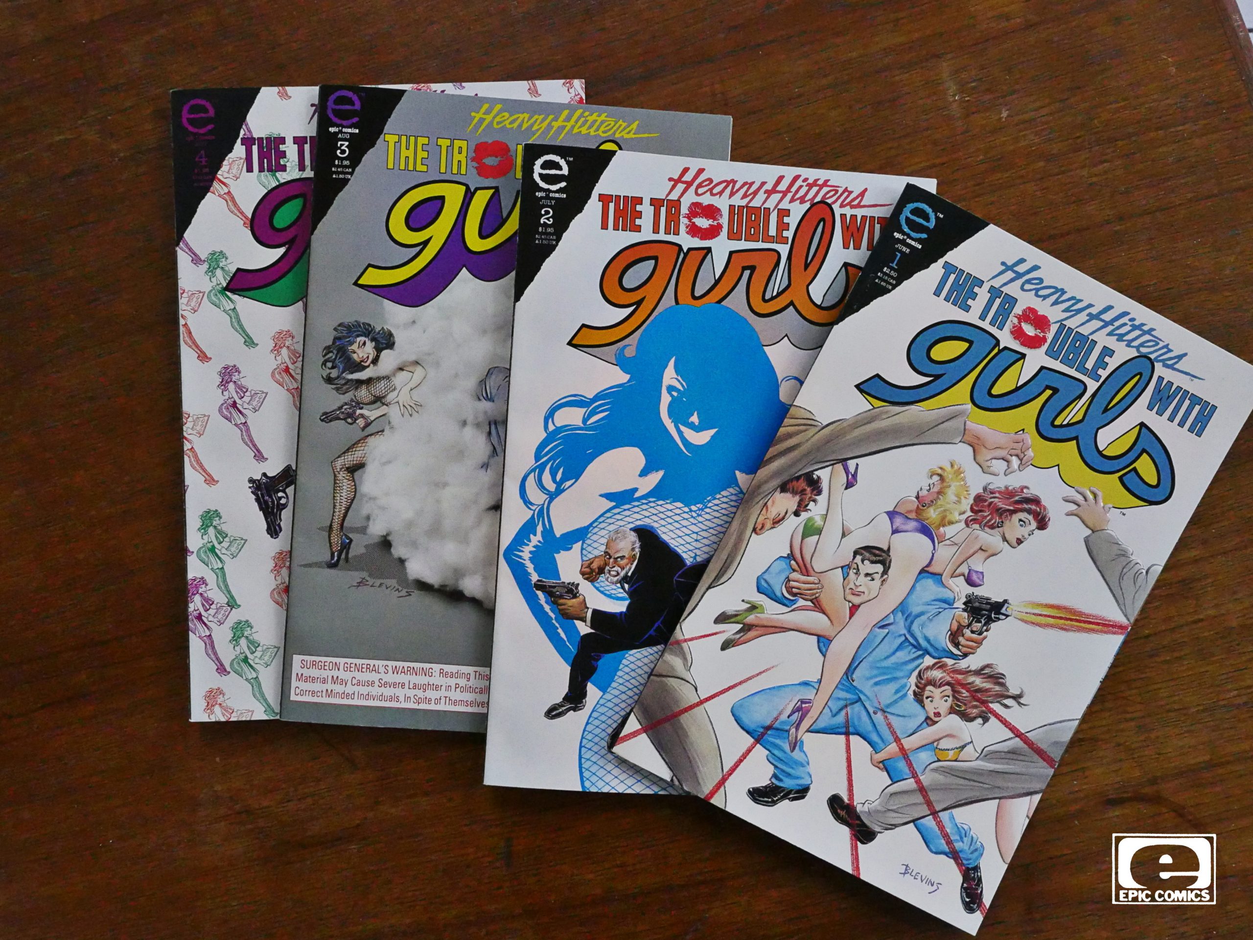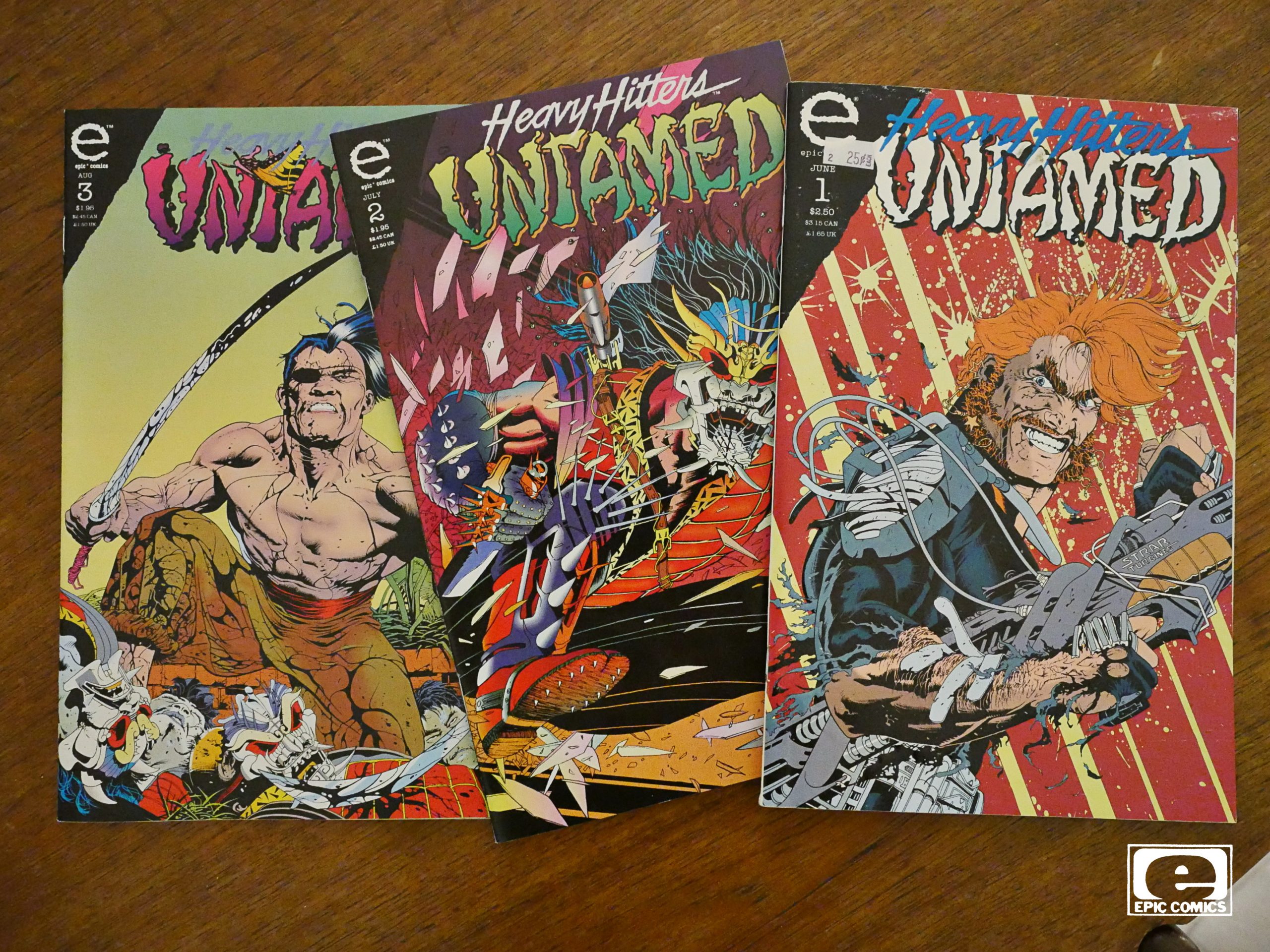
Untamed (1993) #1-3
by Neil Hansen
The name of the creator is unknown to me, but then again, I wasn’t really paying much attention to comics around this time (busy goofing off at the university, I guess). But the cover art certainly looks like it’s filling the remit of the “Heavy Hitters” re-launch of Epic: Lots of action.
Oops. Doesn’t look like the first issue became a collector’s item. Or is that collectors’ item?
Anyway. Let’s open the first issue.

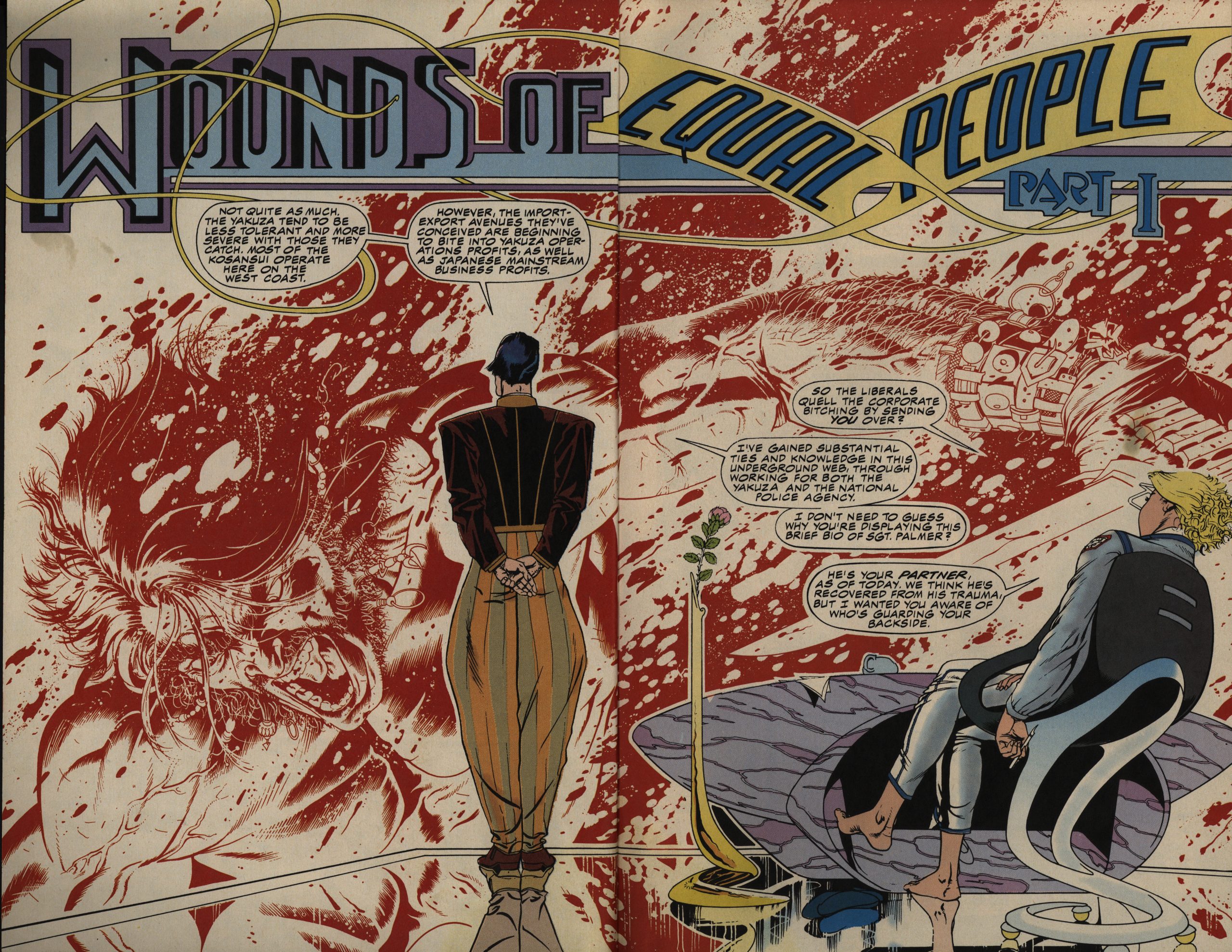
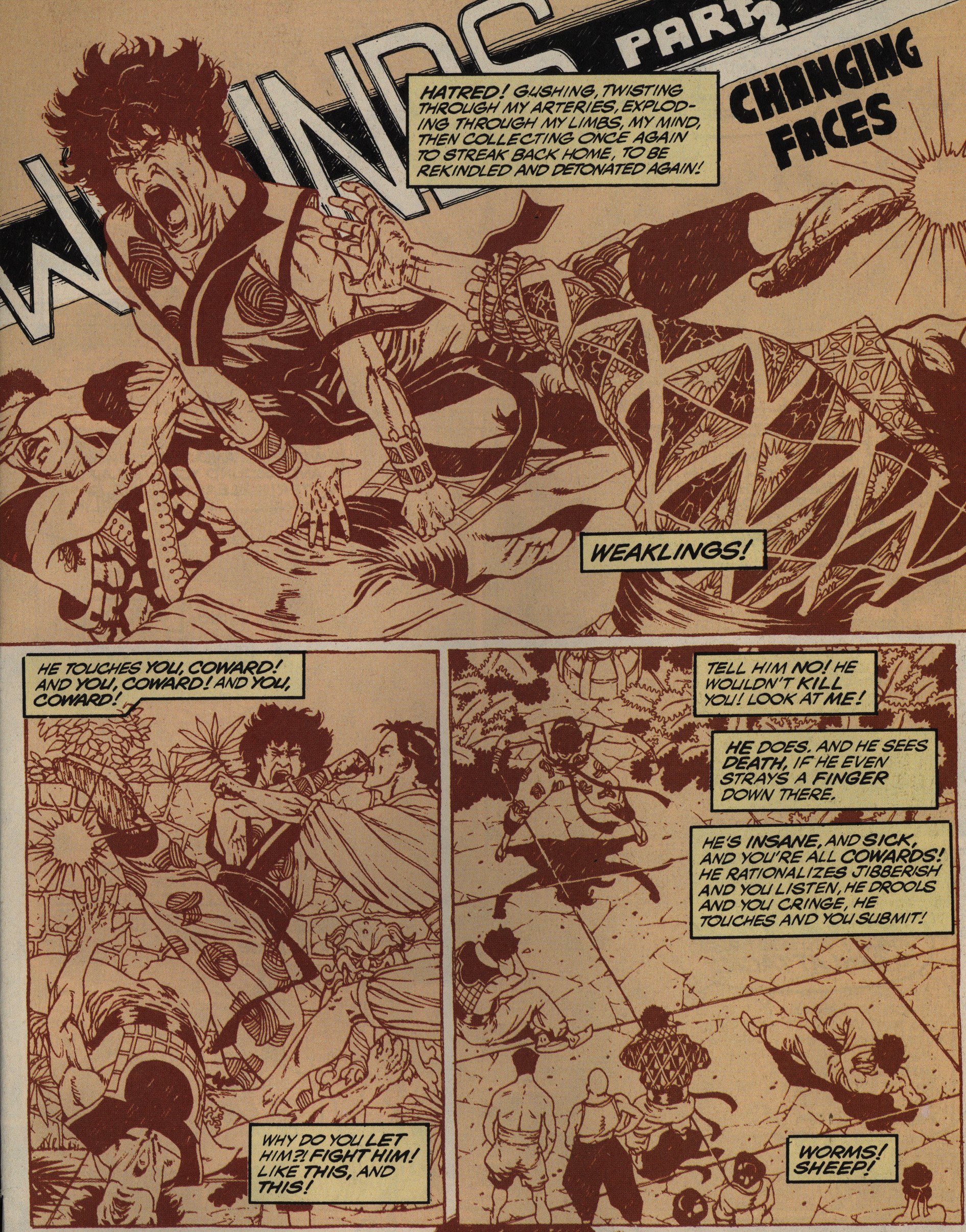
“Wounds of Equal People”? That’s a subtitle for sure, but the meaning seems obscure. Let’s read the first page.
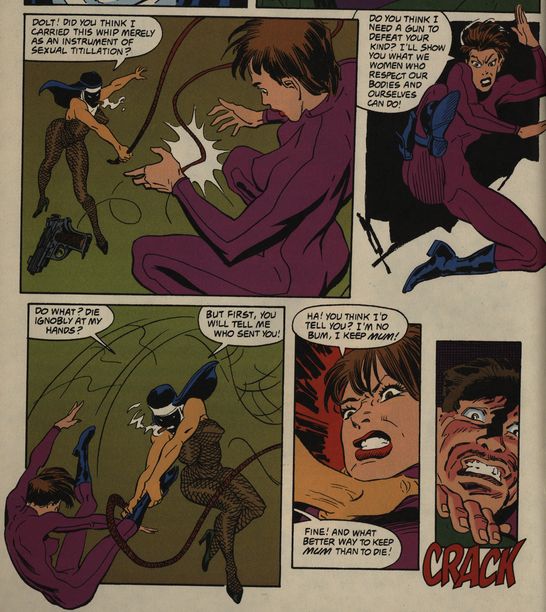
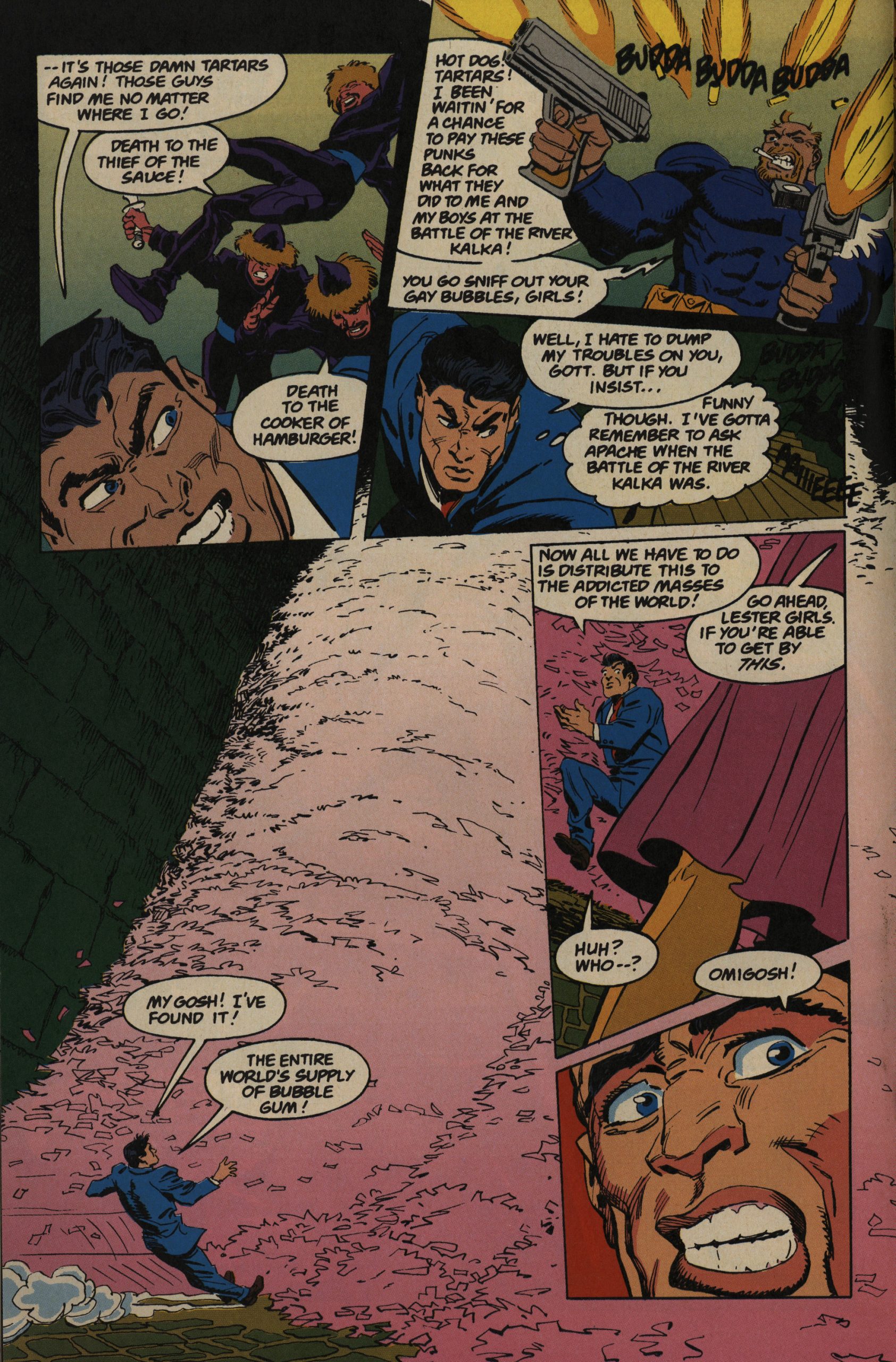
AAAAAH! HYPERVIOLENCE! Just like Epic promised in the “Heavy Hitters” ads. And it’s got that modern feel to it (ca. 89), what with the captions (apparently belonging to two people not actually seen) and all.
Let’s turn the page.
Aaaah! SCI-FI! I LOVE IT.
Sorry, I’m not going to continue this blog post in this style, page by page, but I’m just really fascinated by this way of starting the series. If you’re going to do a three issue self-contained action story, this compressed way of introducing the characters is perfect. And I love the contrast between the first page and the splash page; it’s really jarring in all the right ways. Even the strange clothes on the guy standing there work for me: It places us, very succinctly, in a universe that’s not this one, but closely adjacent to this one.
I think it’s a really accomplished opening.
The premise of the book is basically the standard unevenly matched cop partner thing (you’ve seen it in a thousand films and a hundred TV series). Here we have a very measured Japanese cop partnering up with a way out-of-control hyperactive Irish-American one. (Well, he’s not really Irish-American, but he went there once and it kinda stuck.) I love the jitteriness of the arm in the panel at the bottom there, and also the use of vertical panels for dizzying perspective.
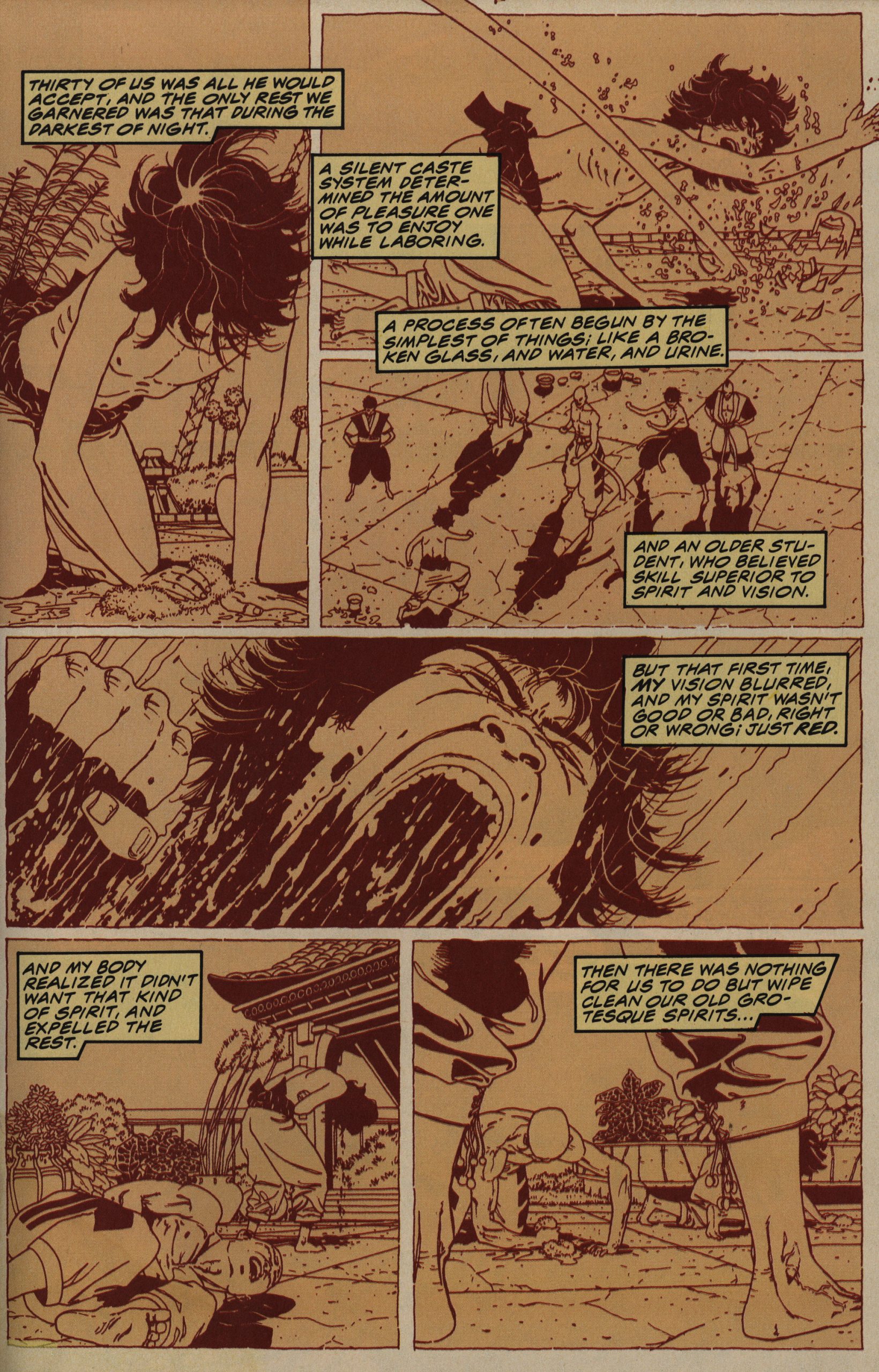
Then we get a bunch of backstory on the Japanese cop… who was apparently brought up in a martial arts camp? Well, OK, that’s perhaps one cliché too far, but I’m aboard…
Yowza.
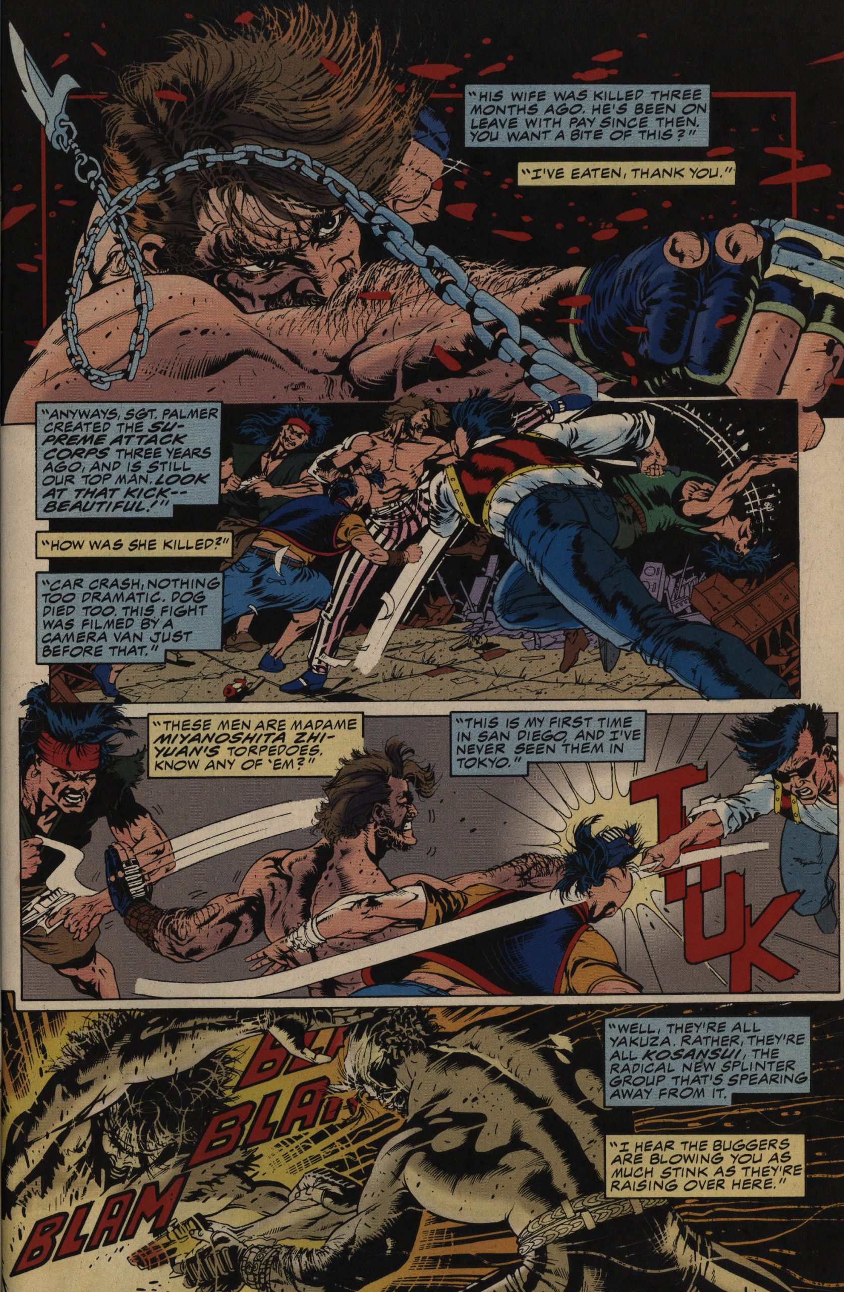
To explain what goes on here: The cops suffered an ambush, so the Irish cop went after the informant that he suspected of possibly having sold them out, pops one of his eyes, puts it in his mouth, and spits it out. Then he kills him. After telling him that he believed him.
This is so intensely deranged that it’s hard to know where even to start, so I’ll just note that in addition to being very confusing in and of itself, I didn’t really understand what was happening in the final two panels after flipping back to these pages later.
If you look at the panels, it’s clear that that’s what’s happening, but in the context of just having seen that eyeball in the mouth of what I assumed was the protagonist, it just kinda swept past me. The speech patterns used add to the miasma of a feeling of spinning out of control: Just what kind of book is this even?
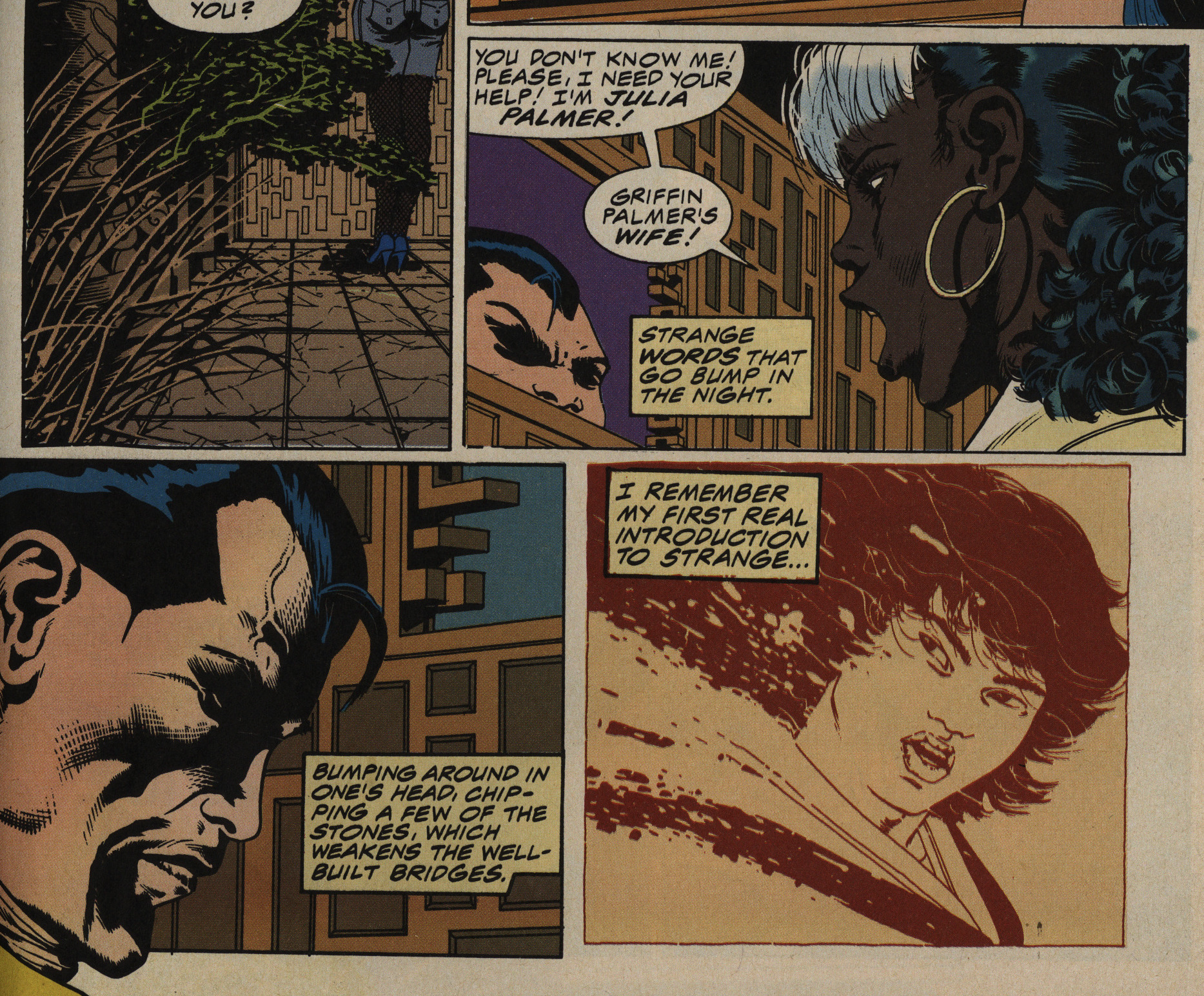
Take this progression: The Irish cop’s wife shows up, and the Japanese cop answers the door, and starts thinking “Strange words that go bump in the night” and then we’re into a flashback with “I remember my first real introduction to strange”.
And then, first panel on the next page, it turns out that the guy running the martial arts camp he grew up in molested the kids there!
Whatever I was expecting, I wasn’t expecting that. I mean, if that is even what Hansen is saying here.
What I’m saying is: Hansen unsettles his narrative constantly: Whenever you think you know what kind of story this is going to be, it shifts, and then it’s about something else. It’s… I think perhaps “exhilarating reading experience” would be one way to put it, but I can also see “befuddling”. I really wonder what the readers made of this at the time.
It’s a complex series — it’s amazing how much Hansen puts into these pages without the reading experience getting bogged down. For instance, here he depicts the Japanese cop (as a teenager) lashing out at his peers for allowing themselves to be molested, which sounds well-observed, but this two third page is all that he spends on that: Then we move on to him taking deeper stock of the situation. I know when spelling it out that way, it sounds forced, but reading it, it seemed natural.
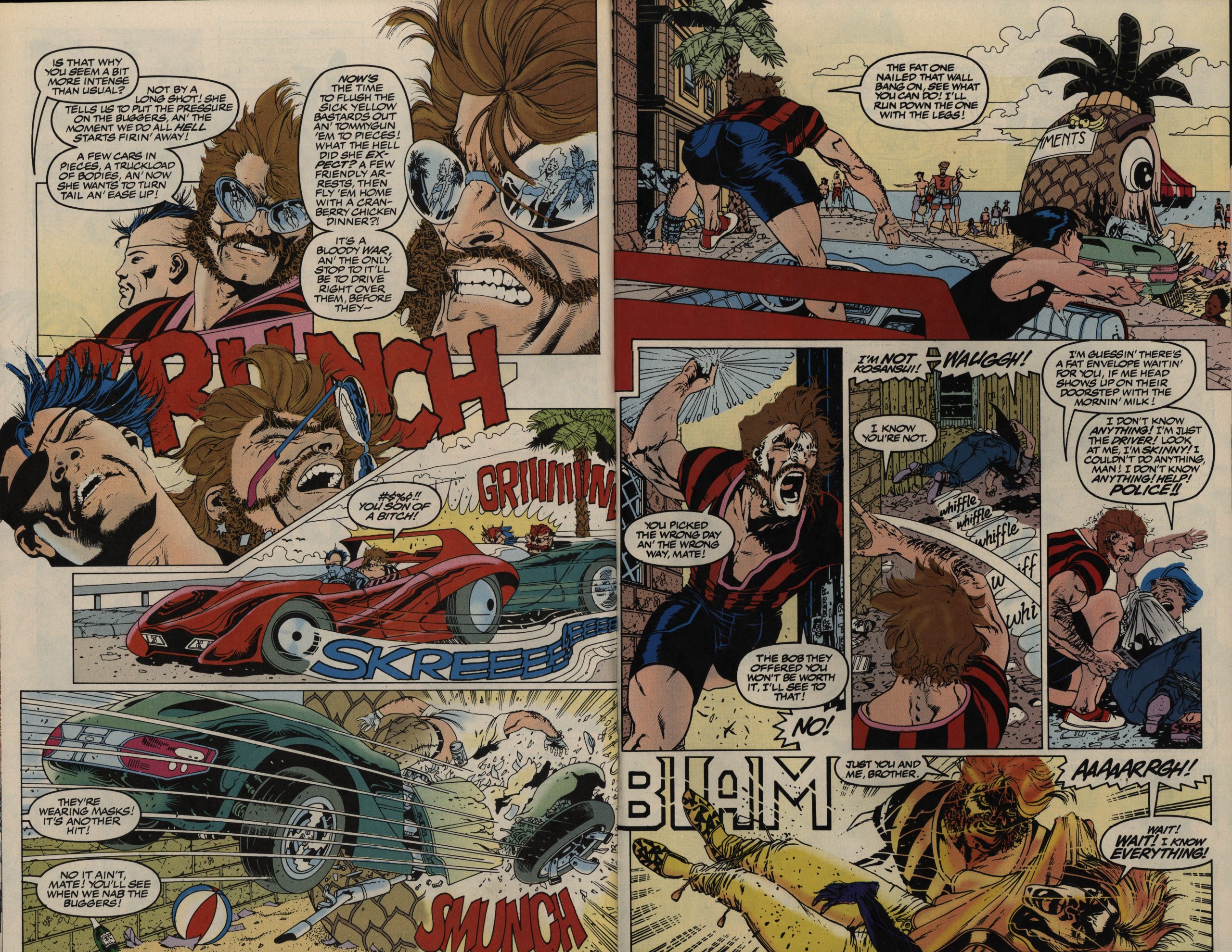
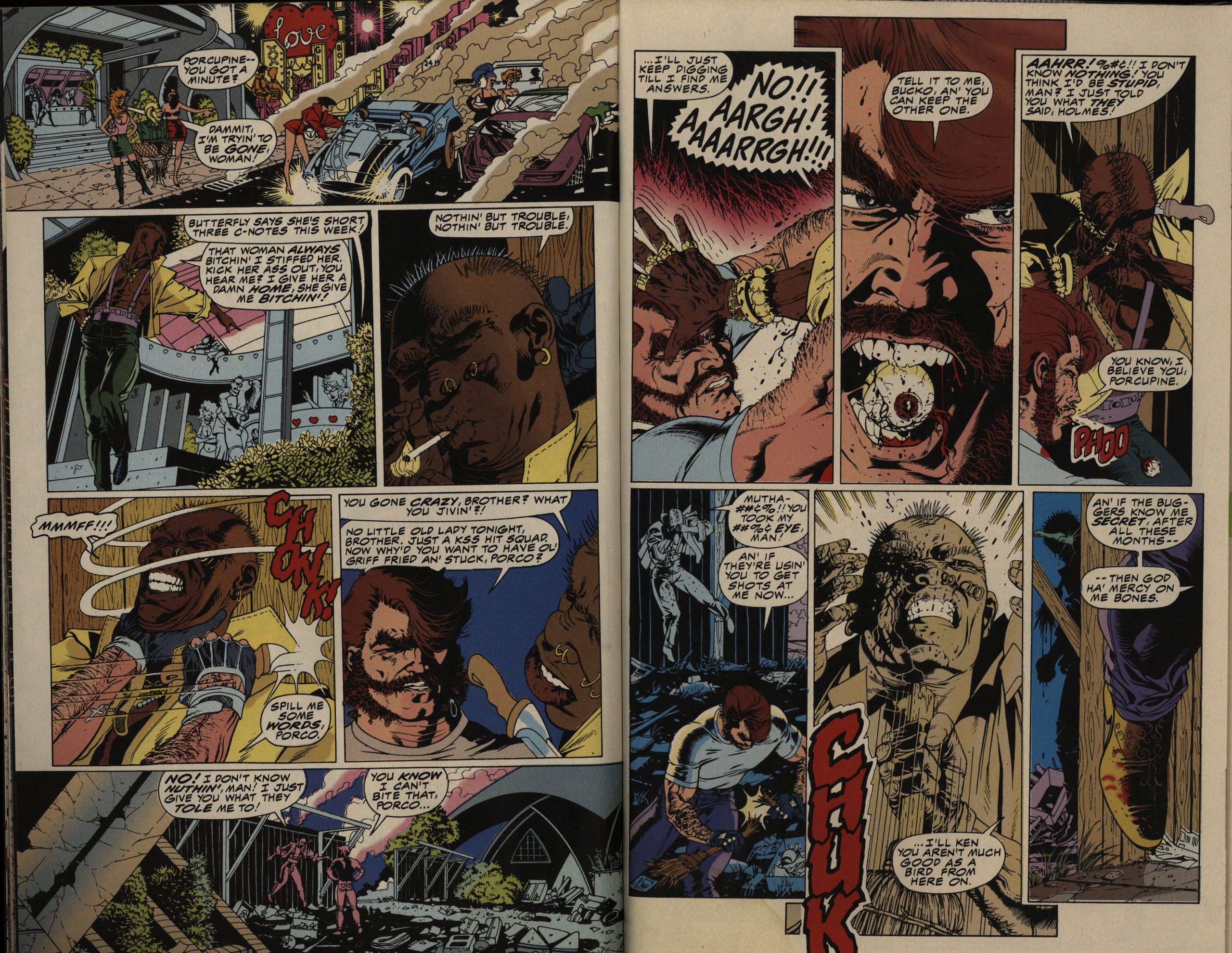
OK, let’s talk pacing: It’s wild. Hansen’s artwork is perfect for this over-the-top storytelling style, but he sometimes goes way to far, as on this spread. First of all, even deciphering what’s happening here takes more careful study than I think most readers would be willing to give, and it’s not the readers’ fault: The shift in angles is bewildering. In the CRUNCH panel, the cops are facing to the right (the only panel on the page where they are), so that’s an 180 degree shift, and then there’s another 180 degree shift between the last two panels on the left-hand page.
Which means that the green car somehow went outside the rails and collided with something. (Which we then see on the next page.) Then the Irish cop runs off and … uses a … bolo? To catch one of the guys from the green car? Who says he’s too skinny? And then he shoots him in the leg?
It’s a lot, and it’s not well done here, but basically most of the series is like this: Really, really compressed and chaotic.
Suddenly we get an interior page of ads? What’s that about? Did they censor a page? Or did Hansen just miscount and they needed to put in a page to make the later splash page this issue appear on the correct left and right pages?
Odd.
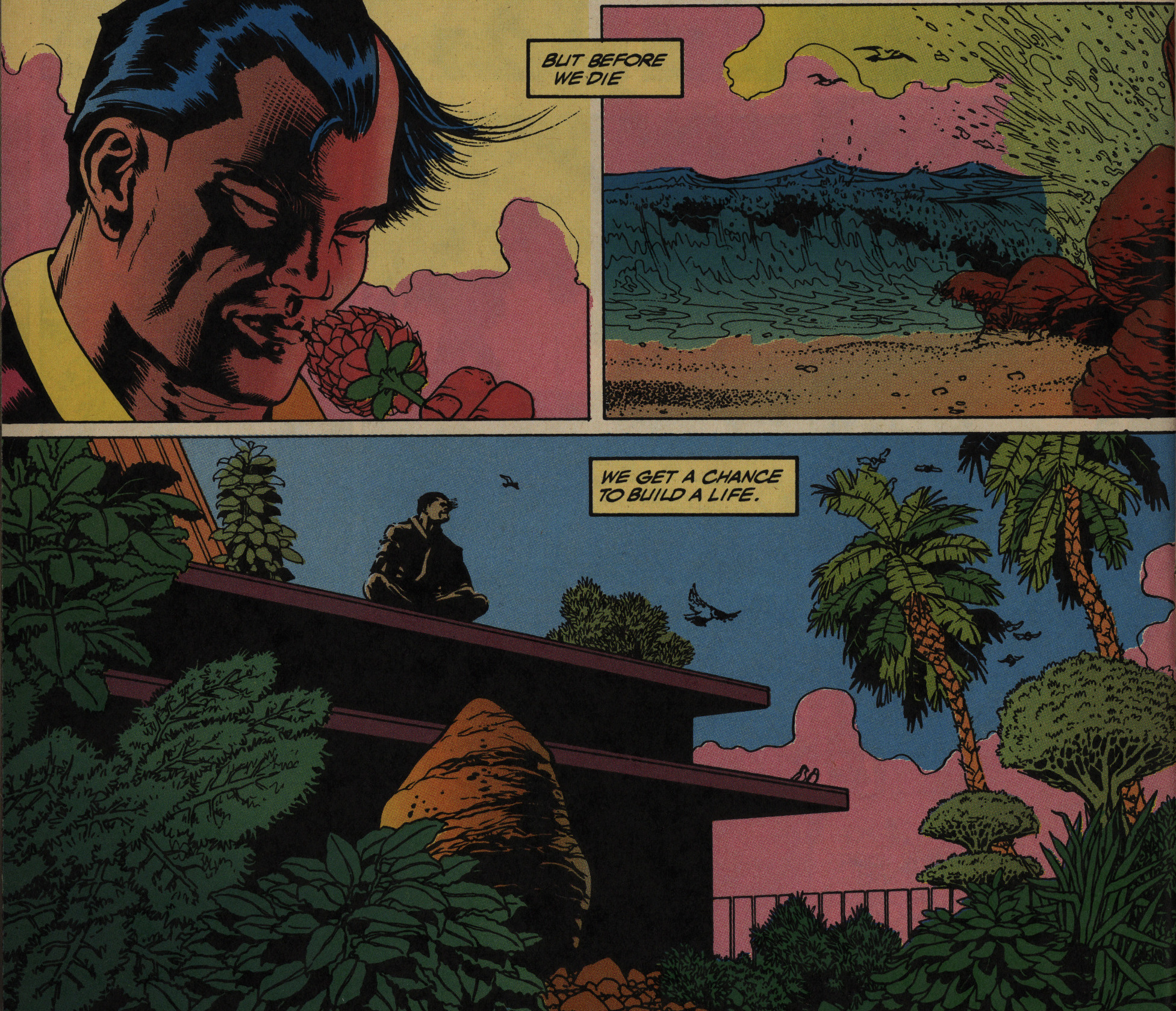
There’s a lot of plot twists (unexpected ones; it even makes the unhinged scenes I’ve described above make some sense) before we reach the end, and the end itself is even more unexpected. Did Ben Marra read this as a teenager?
Well!
These three issues are probably the most intense three issues I’ve read while doing this Epic blog. I won’t say that it’s a completely successful comic, because… it’s a lot… but reading it is a real experience. It’s the work of a singular mind.
This series has never been reprinted or collected.
I tried a creator-owned project with Marvel, one I created, wrote and drew called UNTAMED, and it felt a little better, but still wasn’t Icon Devil. Wasn’t fulfilling, wasn’t magic, full of inconsistency.
He’d apparently done a bunch of work for First Comics under the name “SPYDER”…
This person absolutely loathed it:
Let’s say you’re a first-time comic book reader who picks this up, thinking that as a first issue, it will be easy to follow. If, by the time you finish, your brain has not been reduced to mush, you might never read another comic book, and that’s too bad. This comic isn’t just bad, it’s awesomely bad in a complete train wreck kind of way. I don’t even know where to begin breaking this thing down.
Let’s start with when this book takes place. It’s the future, but Hansen never lets us know when in the future or even that it is the future – the first time we figure it out is on page 6, when a character mentions hovercars. Okay, so it’s the future. Good.
*rolls eyes* Sounds like a mouth-breather.
If you haven’t figured it out yet, this is quite possibly the most gloriously horrible piece of comics trash in recorded history. […] If this was the first comic book I ever read, I would probably lead a campaign to stop comics from being printed ever again!
It got a reaction, I guess?
And that’s the only review of this book I could find on der interwebs.
Untamed (three issues) by Neil Hansen: A rather ponderous martial arts-themed action comic. Originally solicited as a four-issue miniseries but forced to a hasty conclusion with its third issue cancellation.