Epic Illustrated (1980) #5-9
edited by Archie Goodwin.
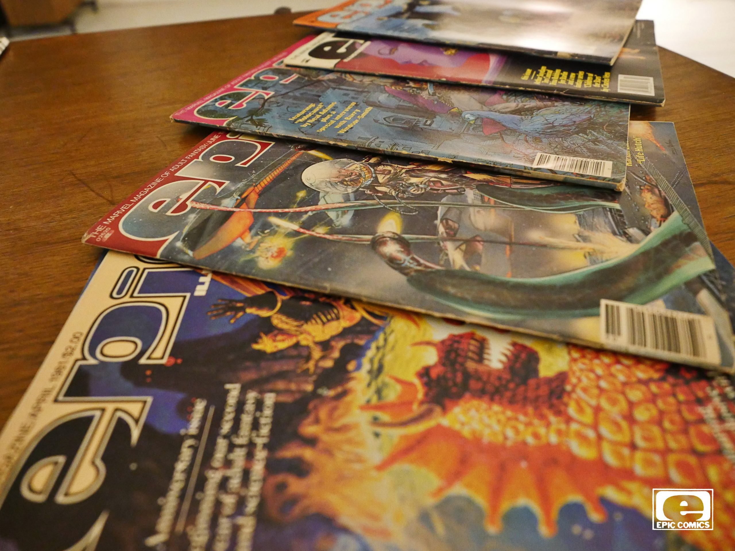
OK, I meant to do one post per day, really, but finding time to read these comics has proven problematic. These magazines are chock full of material, so it’s taking even longer than I thought it would take, and I thought it would take twice as much time as I estimated.
(I’m in software.)
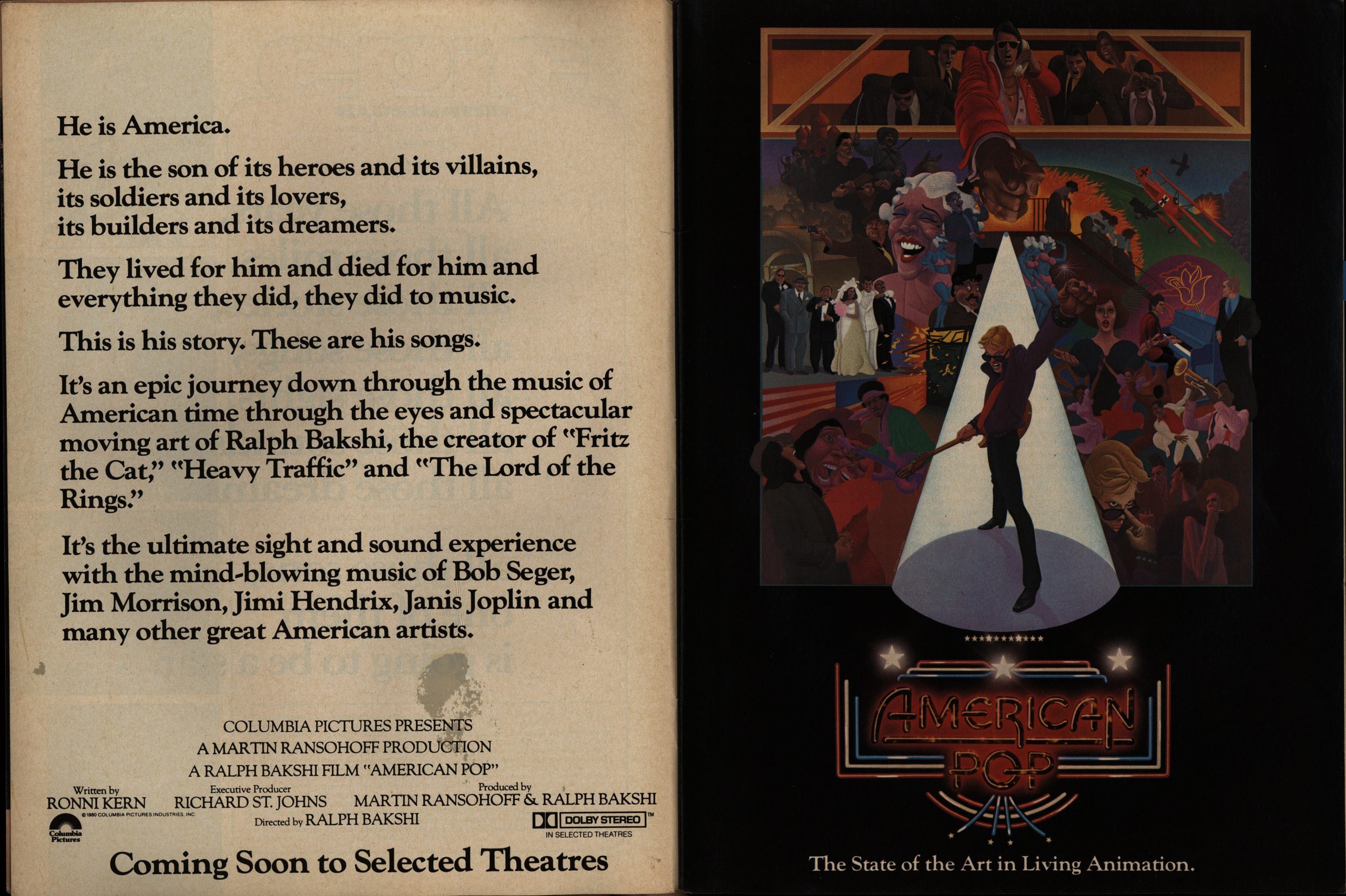
Anyway! We’re in EI’s second year, and about half of the ads are now for movies (mostly sci-fi and humour). I had no idea that the movie above existed: American Pop? Is that it? (It’s a three page ad.) By Ralph Bakshi? I thought he went bankrupt after Lord of the Rings?
No, it exists:
Seems like it’s well-liked, too?
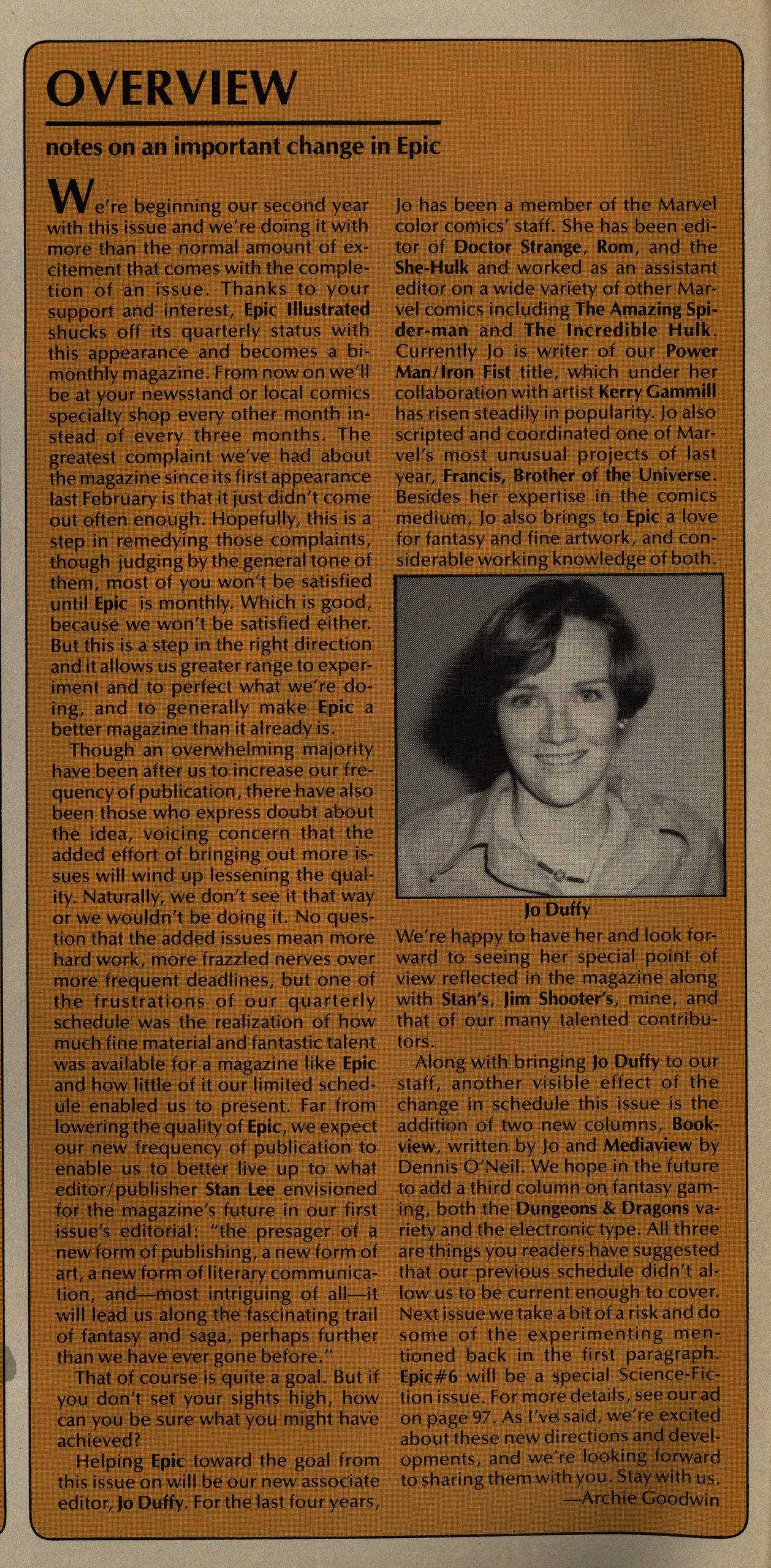
Anyway! EI steps up the publishing rate and it’s now bi-monthly (so I’ll be aiming for plowing through six issues per blog post, which means *gets out sliding rule*) four more of these posts before we get started with Epic Comics proper.
Oh, and Jo Duffy joins the editorial team.
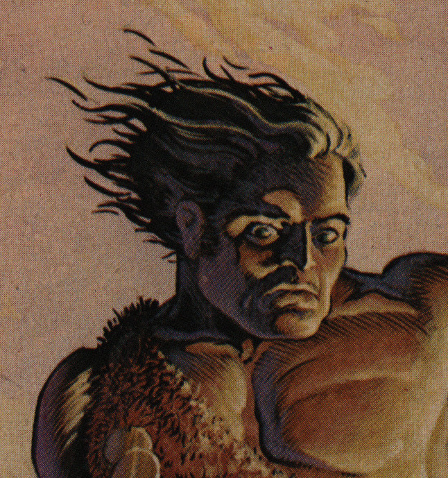
We get the conclusion of Almuric, which means that that’s the last Tim Conrad barbarian face we have to look at.
I normally enjoy Roy Thomas barbarian stuff just fine (I mean, I don’t seek it out or anything, but it’s usually readable), but Almuric was just a non-starter. Basically nothing of interest happens: It’s just a bunch of pointless running around until they’ve filled the required number of pages. It’s not Robert E. Howard’s most famous property. For a reason.
The text pieces remain EI’s weakest point. Reading a comic with an eye-rolling twist ending is somehow much more acceptable than when it’s prose? Here’s Ralph Macchio… not doing a riveting story.
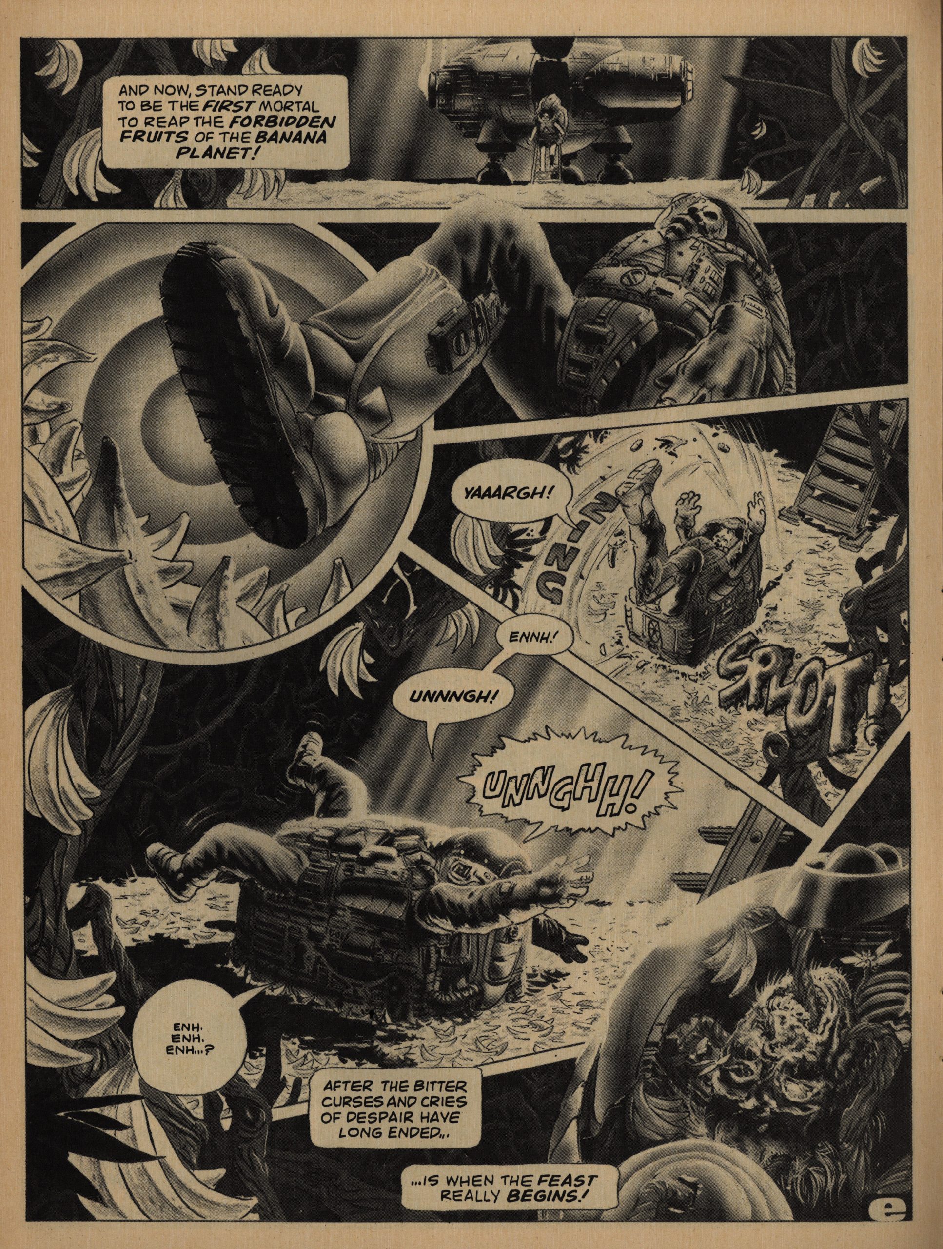
I mean, like this Rick Veitch story: It’s basically just a gag, but that’s fine. There’s just something about the panel arrangement of the guy stepping on the bananas that just makes it.
50% more issues per year means that you can put more non-comics (i.e., cheaper to produce) stuff into the issues without people feeling let down, I think? Well, OK, or perhaps it just feels more well-rounded to have other things in here, too. One can be too cynical sometimes, right?
RIGHT?!?
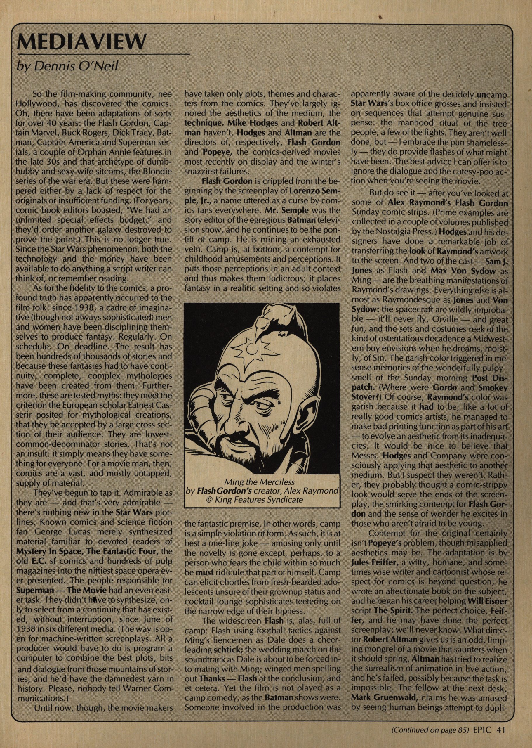
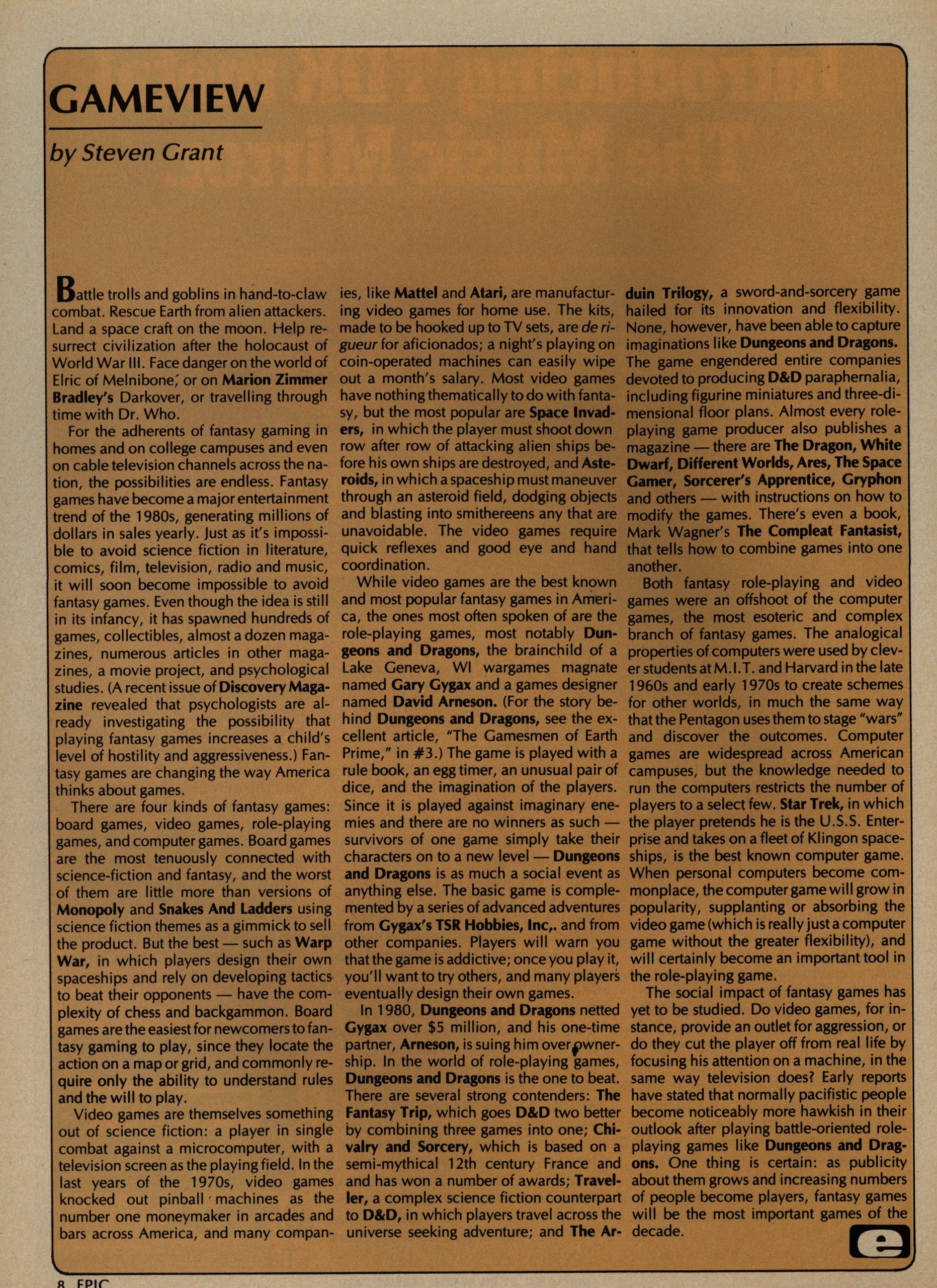
I think it kinda works. While reading this, I just skimmed these columns (there three of them; one about books, one about movies and one about games), and I think I would have liked them when I was a teenager. But I just don’t have time to read them now. So busy!
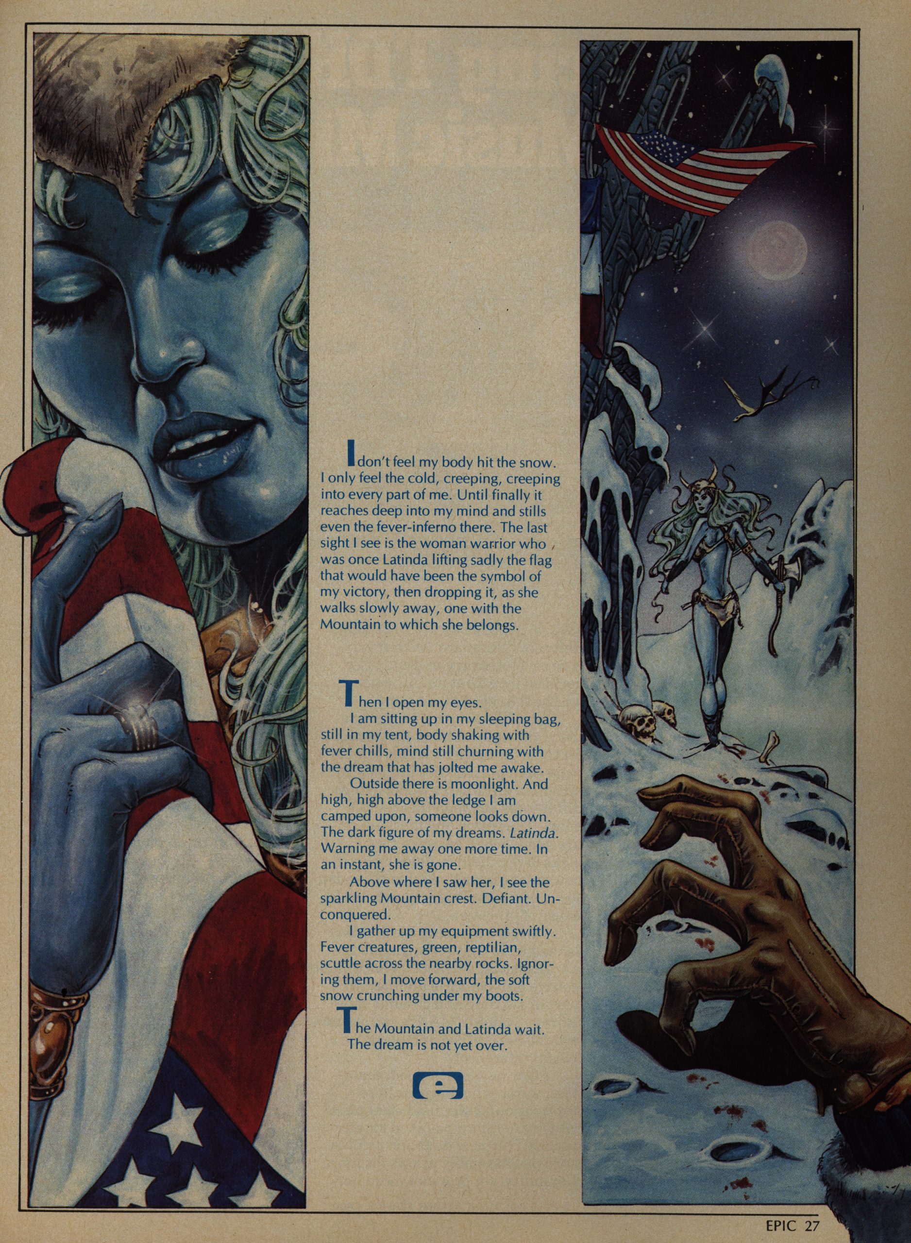
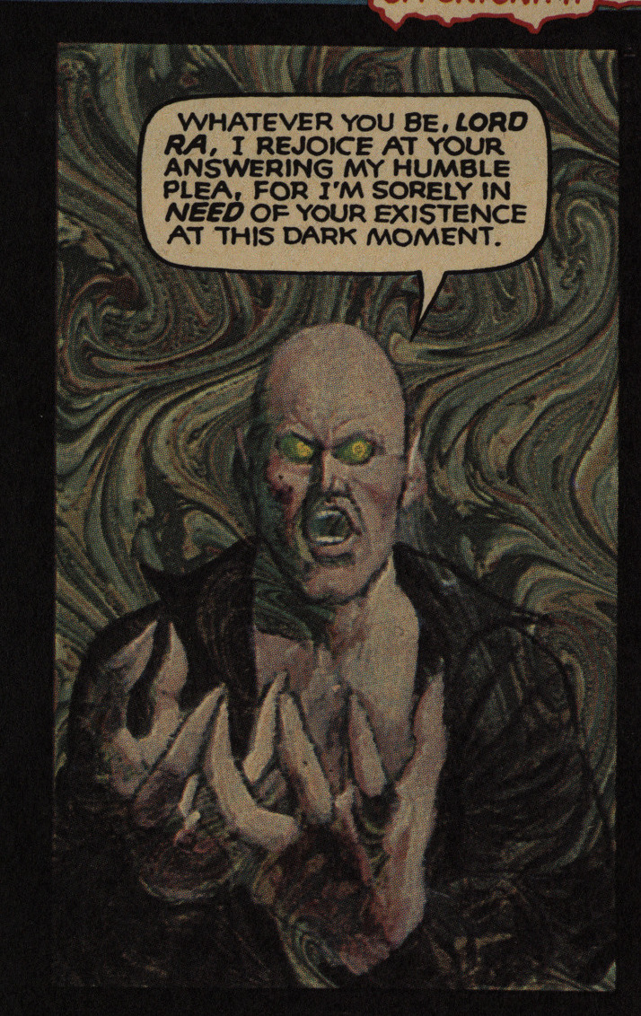
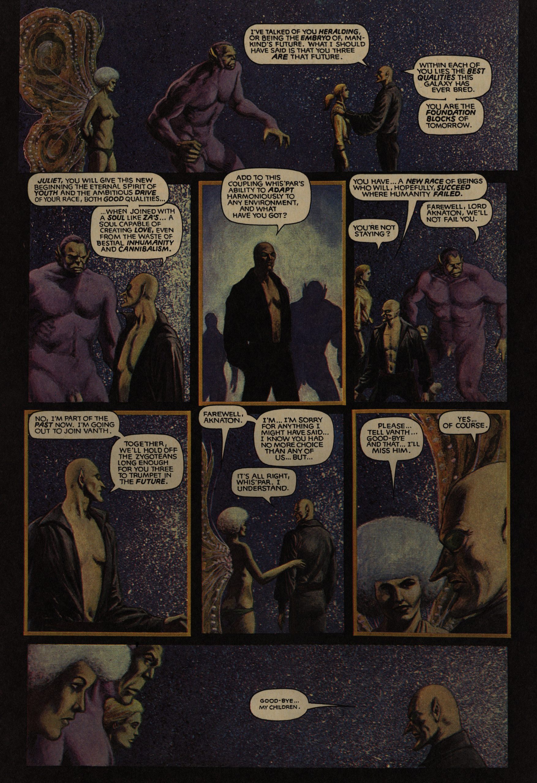
Speaking of busy, Jim Starlin is busy experimenting with new painting techniques in every segment of his Metamorphosis Thingy. I wondered whether this might just have been a printing accident, but… it’s hard to imagine what accident would have this solarising effect? I mean, it looks nice, doesn’t it?
And it does help having a continuous story going through these issue: Just reading one short piece after another after another is fine as far as it goes, but some longer pieces does help with the… texture.
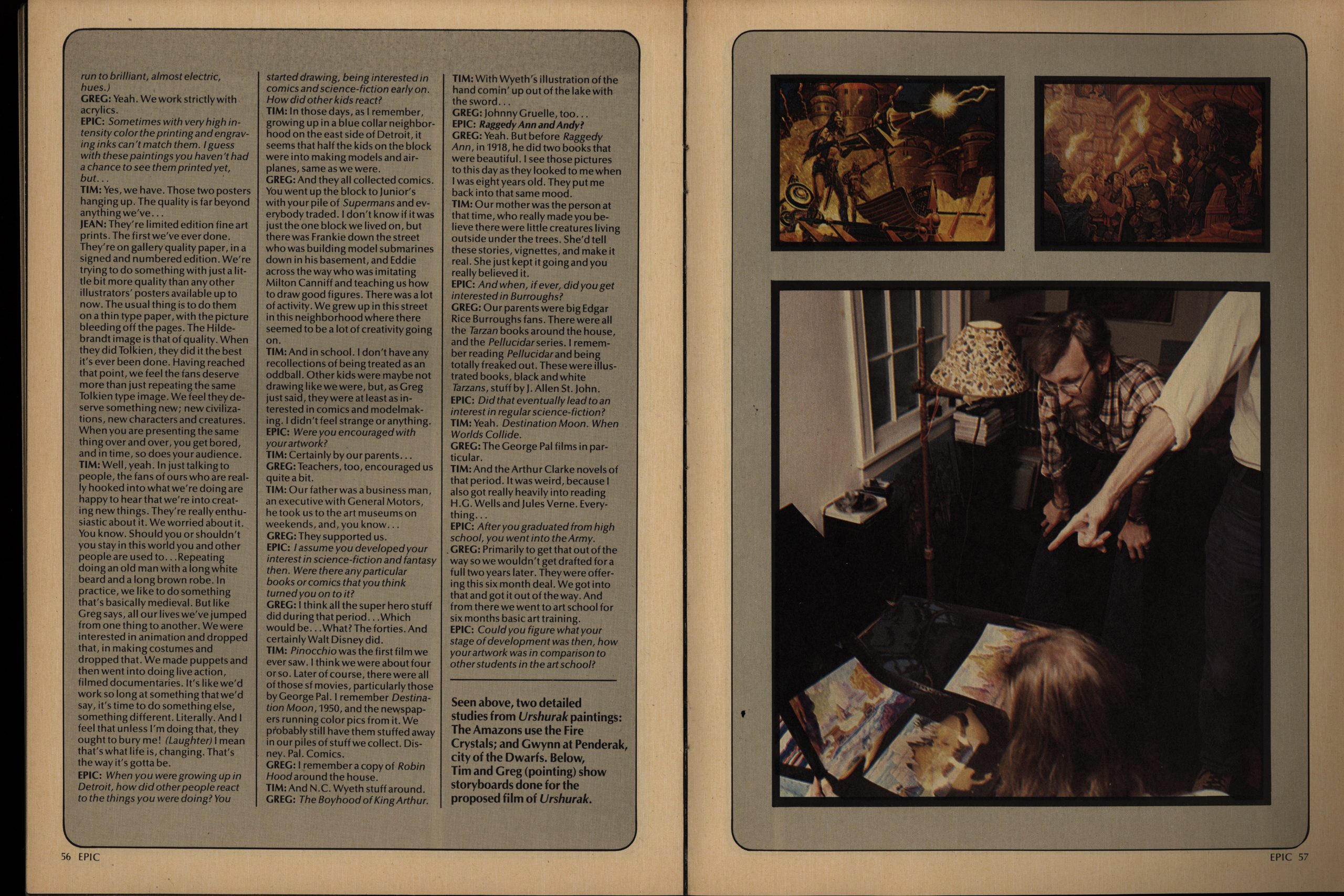
But putting in 18 pages of interviews with The Brothers Hildebrandt is pushing it. I mean, they’re not really comics artists, are they? Mostly illustration?
Hm. Perhaps it really is about the budget.
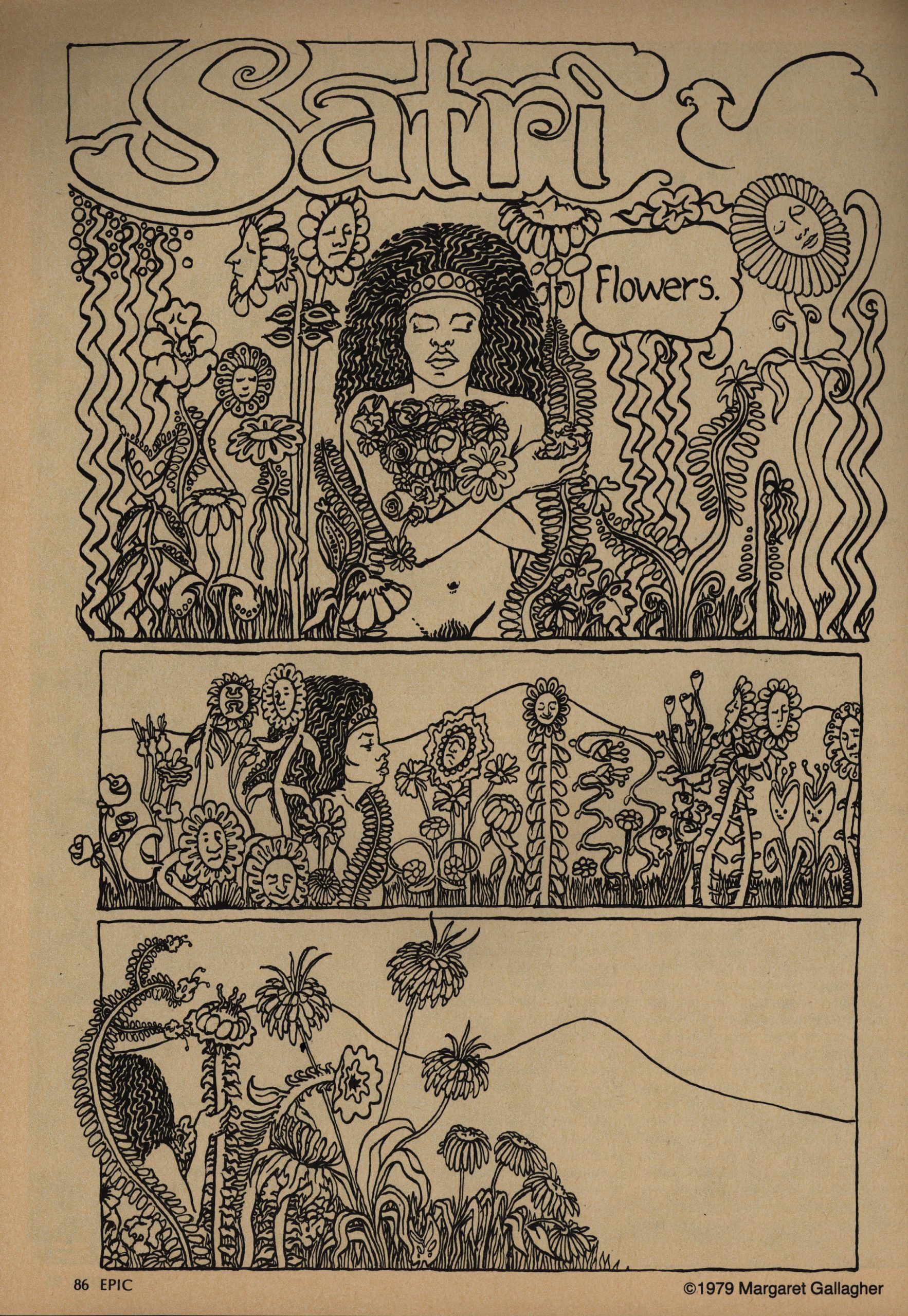
The vast majority of the creators employed by EI are men, but the occasional woman does show up, like Margaret Gallagher here in a very flower-powery style. It’s unusual in an EI context, too, in that it doesn’t end with the protagonist getting horribly mutilated and killed on the final page.
EI is way into “edgy, ironic” endings. I guess it’s the insidious influence of EC Comics by way of Warren? It does get a bit grating after a while, at least when reading these issues like this.
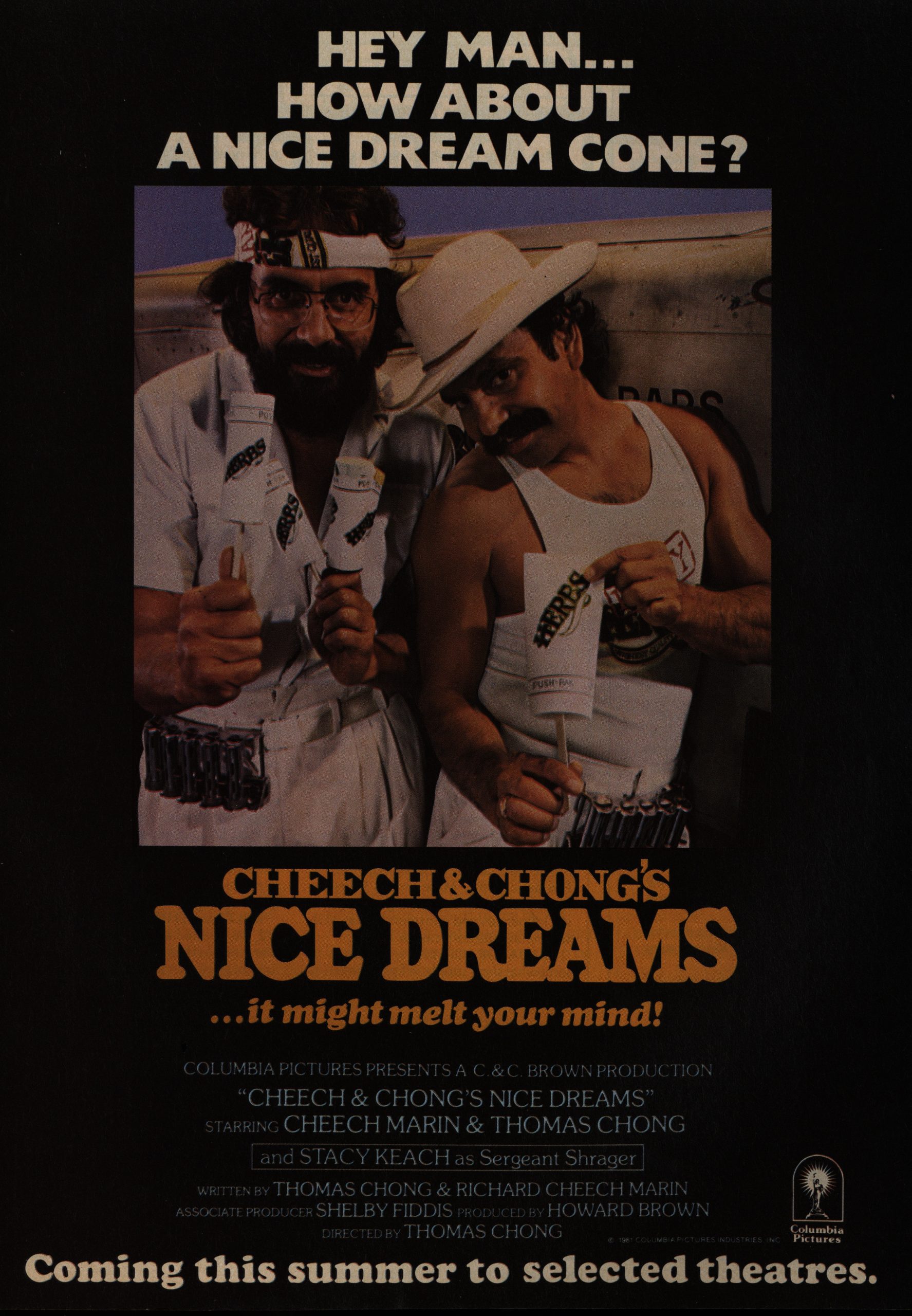
Wow! An ad for a movie that’s not sci-fi!
“The social impact of fantasy games has yet to be studied.”
I guess that’s still true?
Bob Aull does a quite undergroundish thing that follows the template of the protagonist getting reamed (sort of), but in this instance, he totally deserves it, so it’s a gleeful, happy ending. In the context of the other stories, that’s a twist.
Wow. Starlin’s way weird.
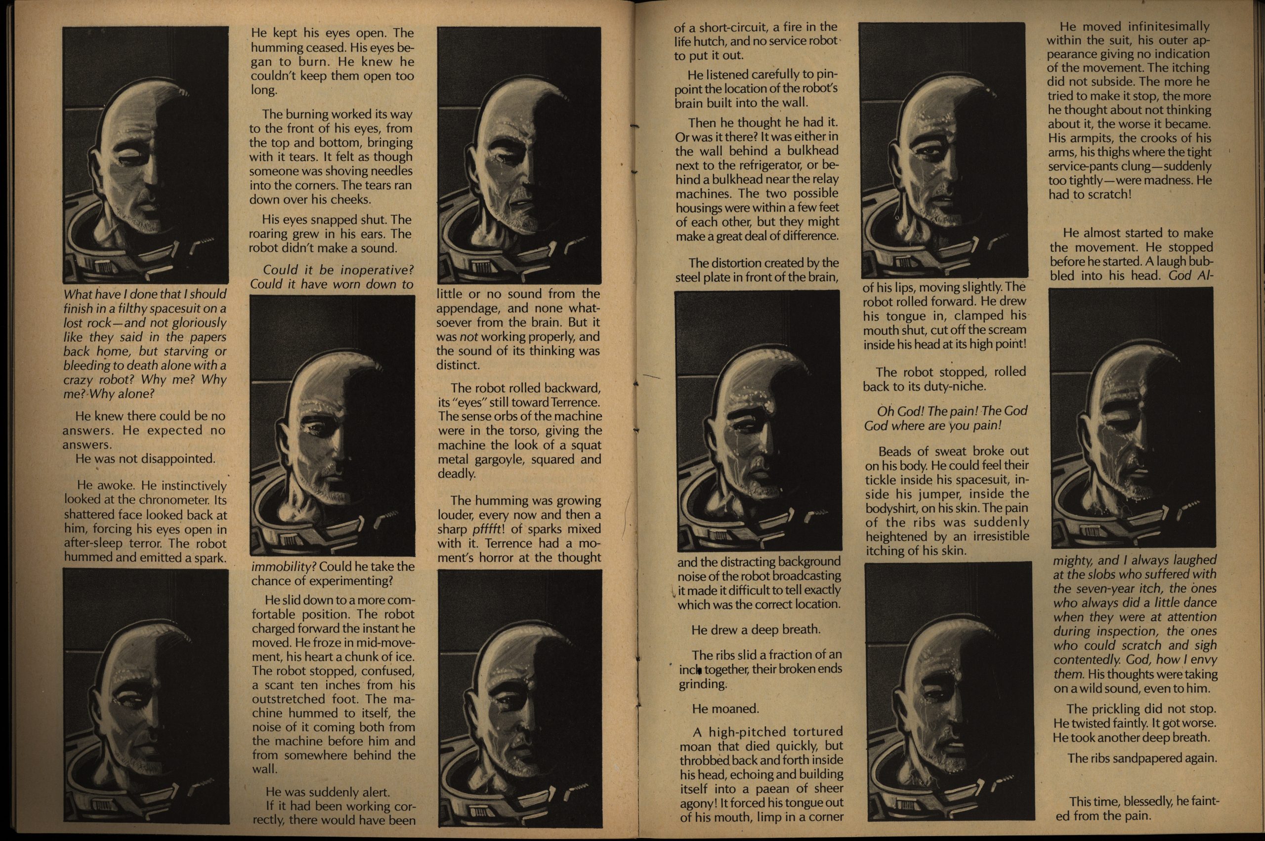
Ken Steacy illustrates another Harlan Ellison story, and these are the best illustrated stories in the magazine, still. Steacy leans into having a lot of text on the page, but still manages to be graphically interesting, while making that design be relevant to the story. This story is about who can’t move because a robot will kill him if he does, so it’s basically just a guy sitting on the floor, which is a challenge to make arresting visually.
And the story’s pretty satisfying, as these stories go.
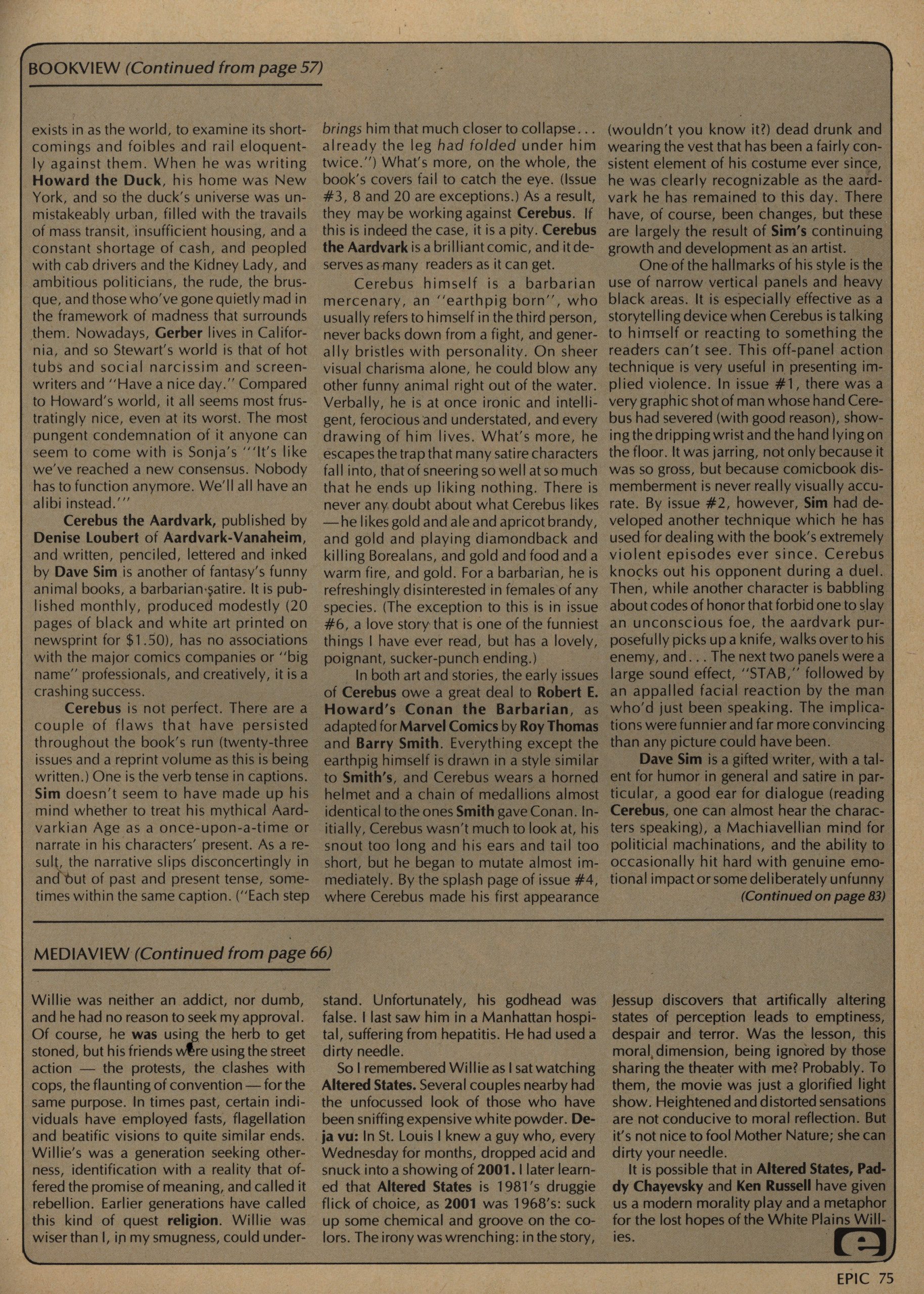
Jo Duffy’s column is about books, mainly, but she also writes about comics. Here’s her take on Cerebus, and basically the only negative she can find is the inconsistent verb tense in the captions.
SR Bissette and Steve Perry do an inventive story about cult movies. I mean, I didn’t really… understand what it was all about in the end? Was it a Groundhog Day thing? But how can you not like a comic with Divine in it?
And that’s an excellent movie lineup there in the background.
There’s a long thing by Neal Adams called Holocaust that I couldn’t quite make out what was about. I mean, I know what it’s about about, but it didn’t really make much sense on a page to page basis. And the reproduction is really bad, which is unusual for EI. It was done (apparently) as a record booklet in the 70s, but never used, so it was dusted off here. Didn’t Adams have the originals any more, and it was shot from photocopies? That’s what it looks like.
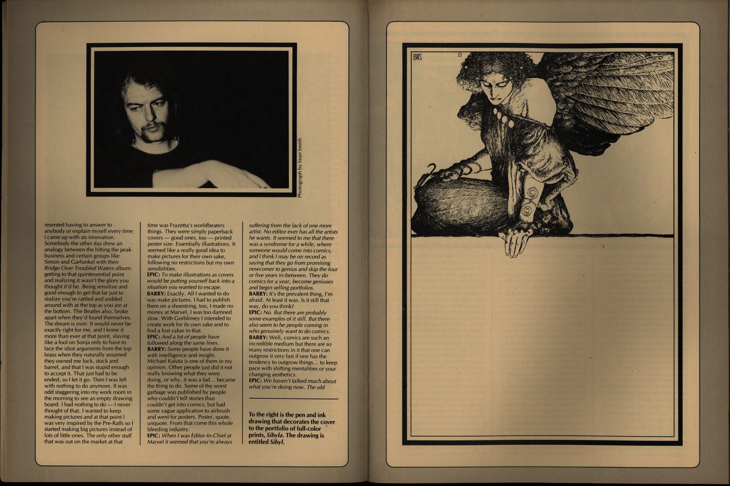
We get 17 pages of interview from Barry Windsor-Smith, which makes more sense.
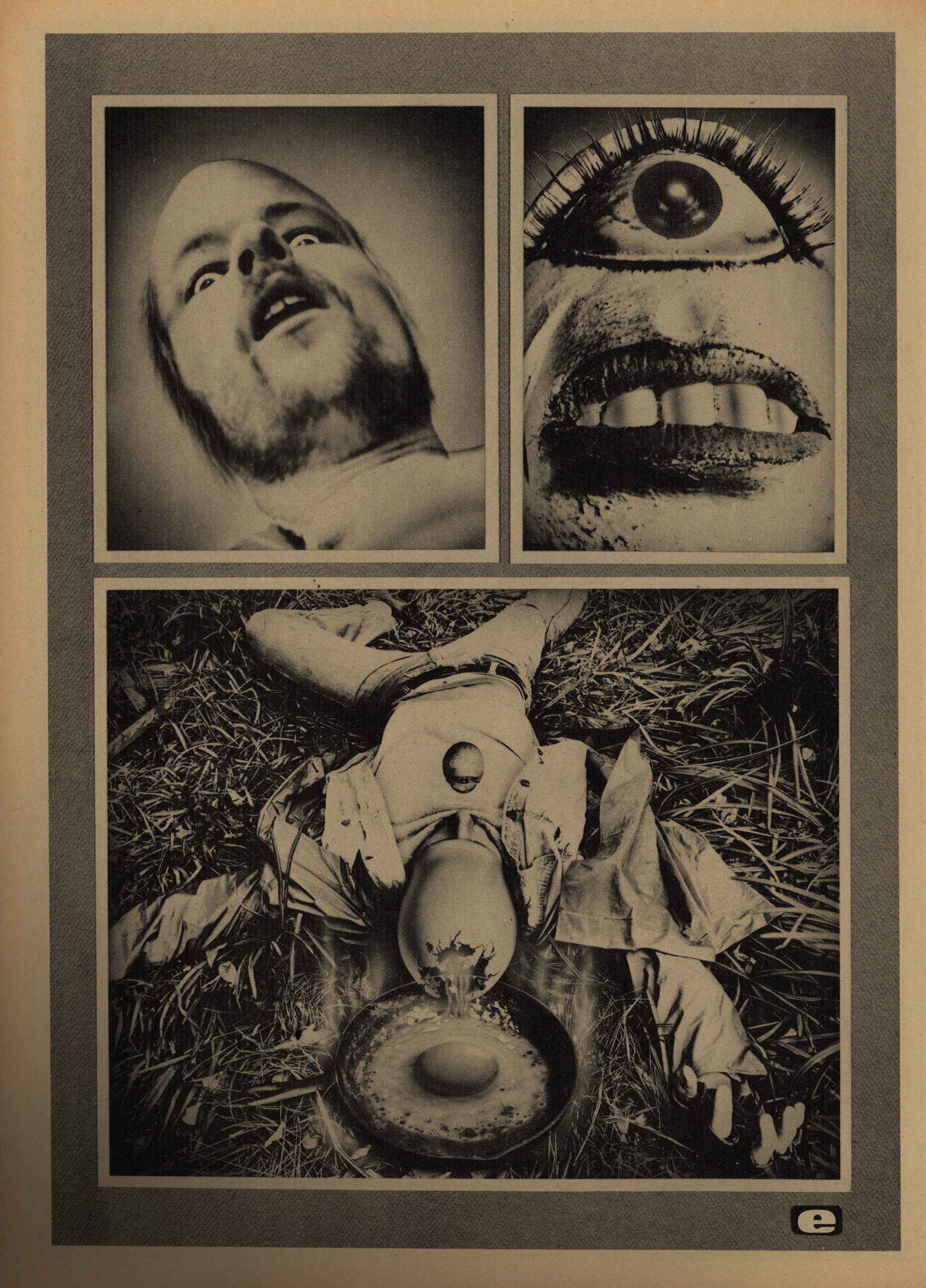
This is by JK Potter and Tim Caldwell. Is that any relation to JK Rowling? Anyway, I think I’ve seen Caldwell’s stuff around in the undergrounds, and it’s this hyper-realistic photo-based fumetti-like thing… that’s really offputting.
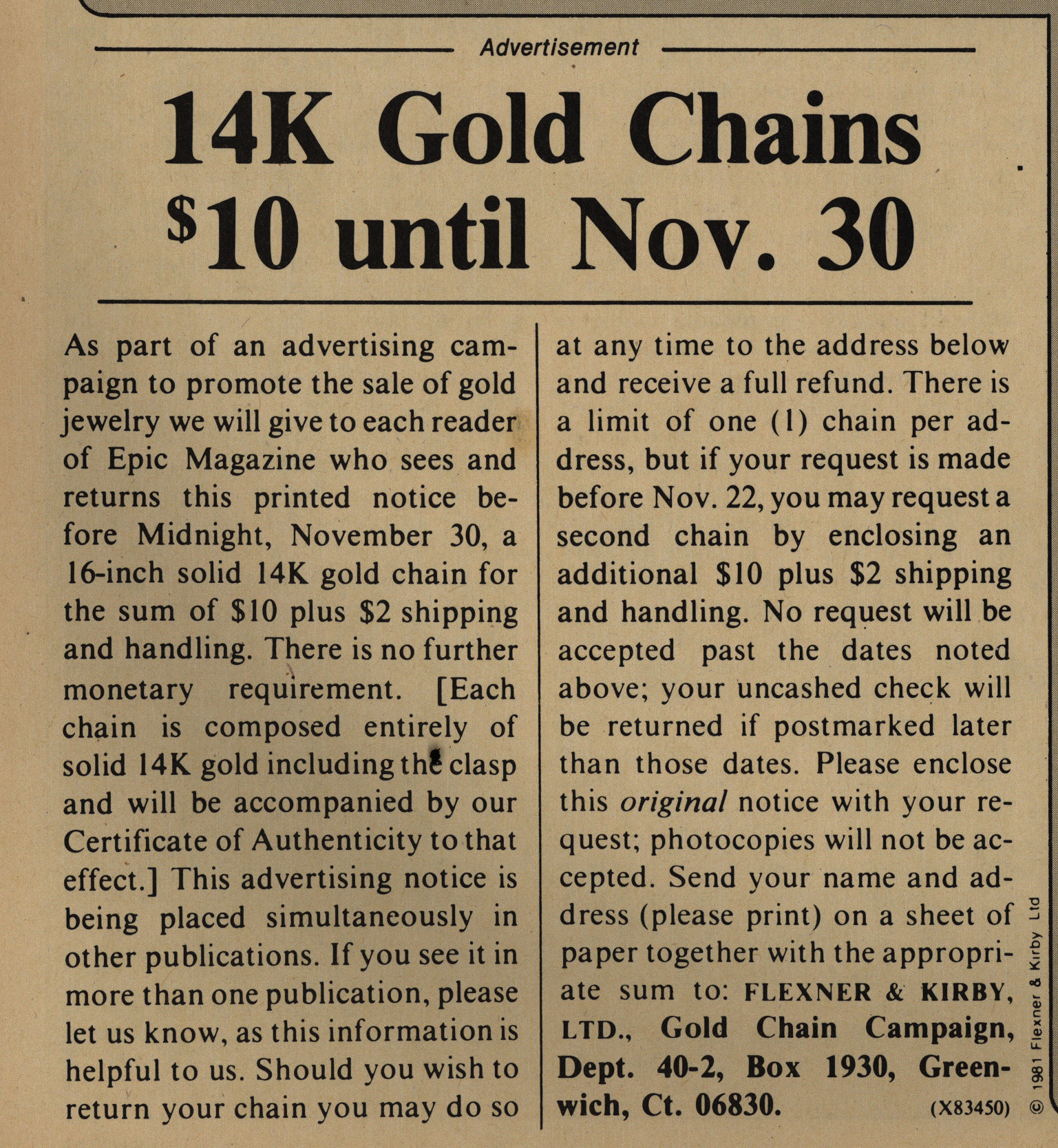
Yes! It’s not Nov. 30 yet! Get your 14K gold chain for $10 plus $2 shipping! Quick!
That’s a weird ad to have in a magazine like this, so I’m guessing it’s a scam?
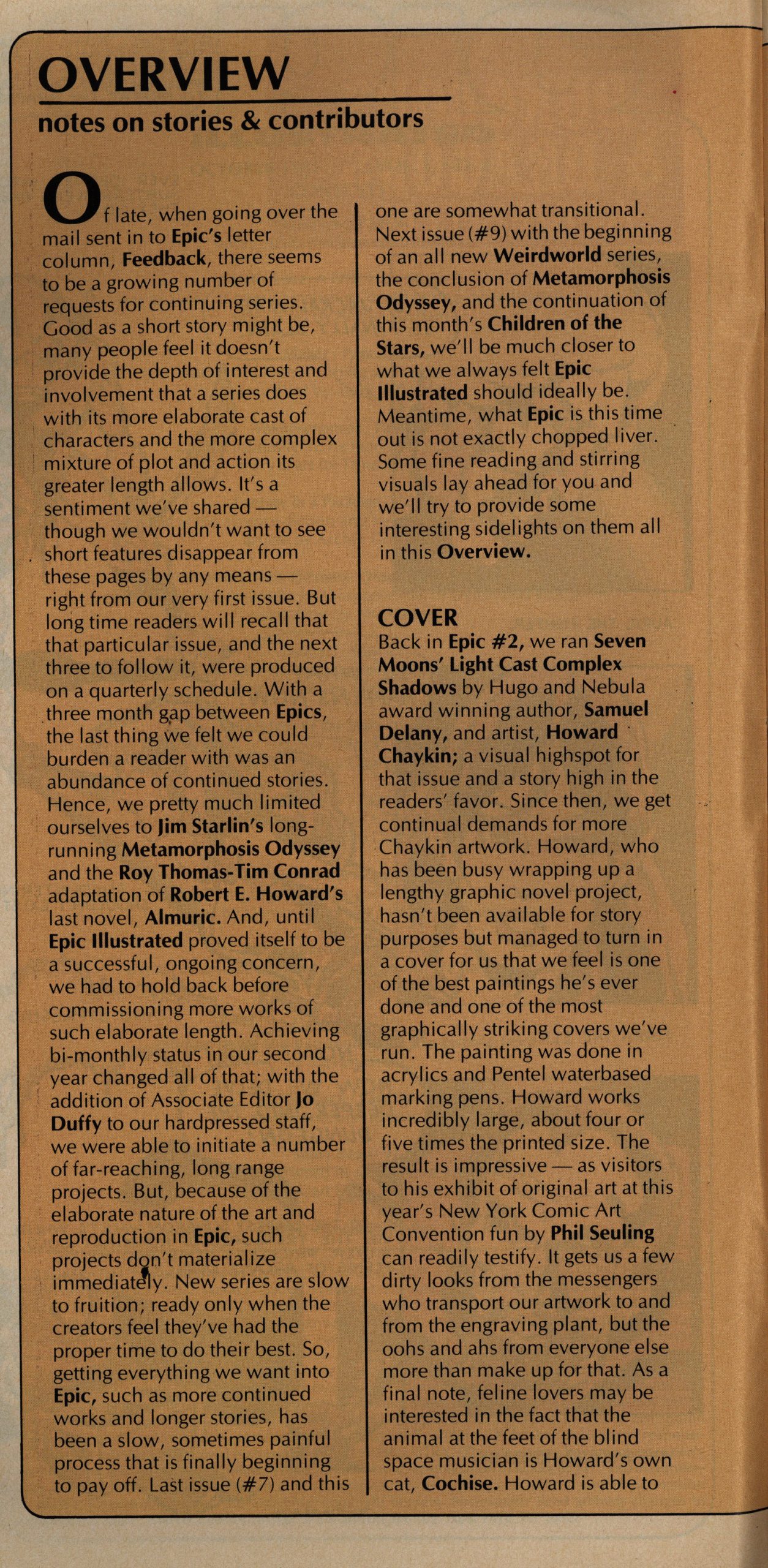
People are clamouring for more serials, which is surprising in one way…
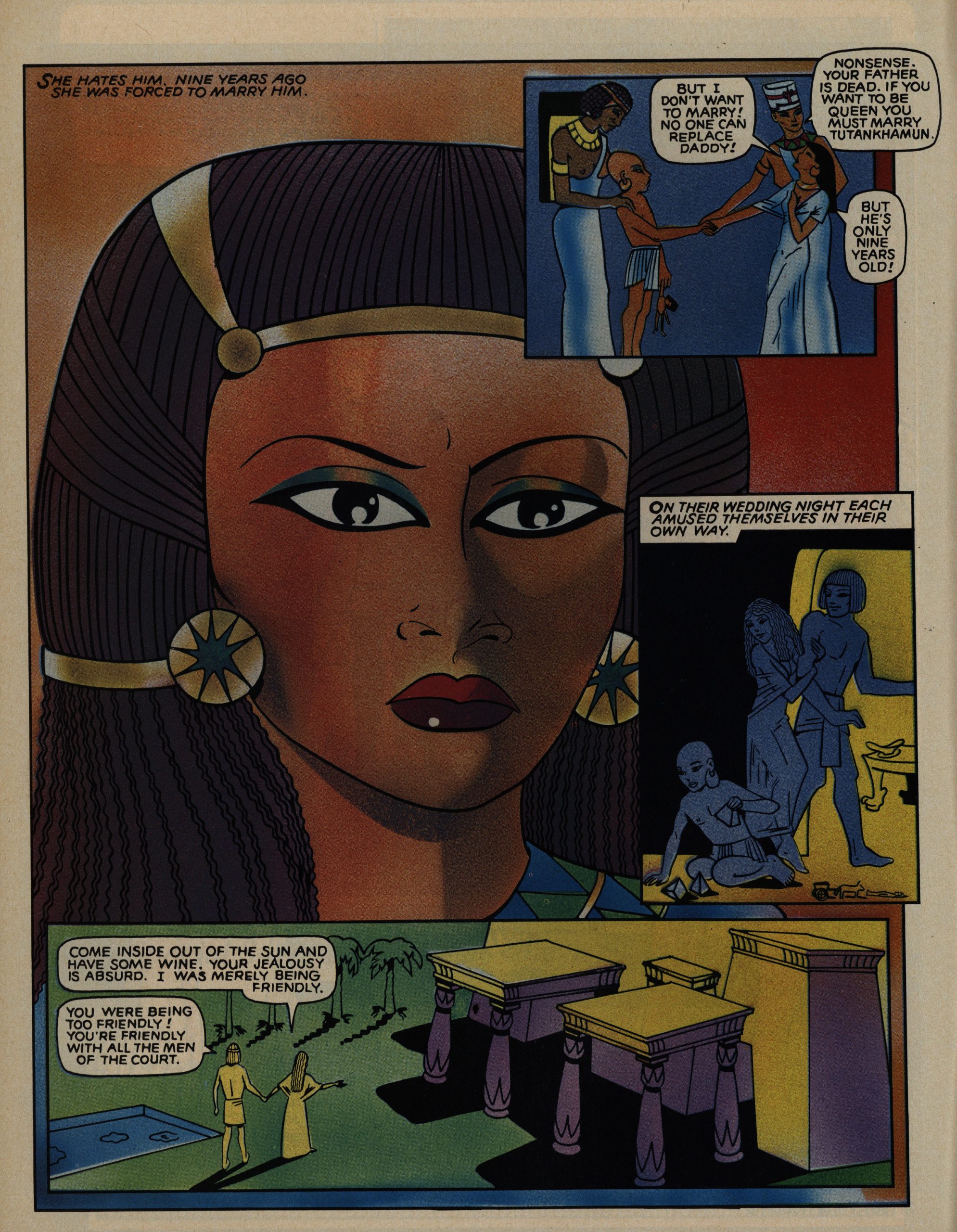
Hey! Trina Robbins! Her art style is well suited for some Egyptian pharaoh thing.
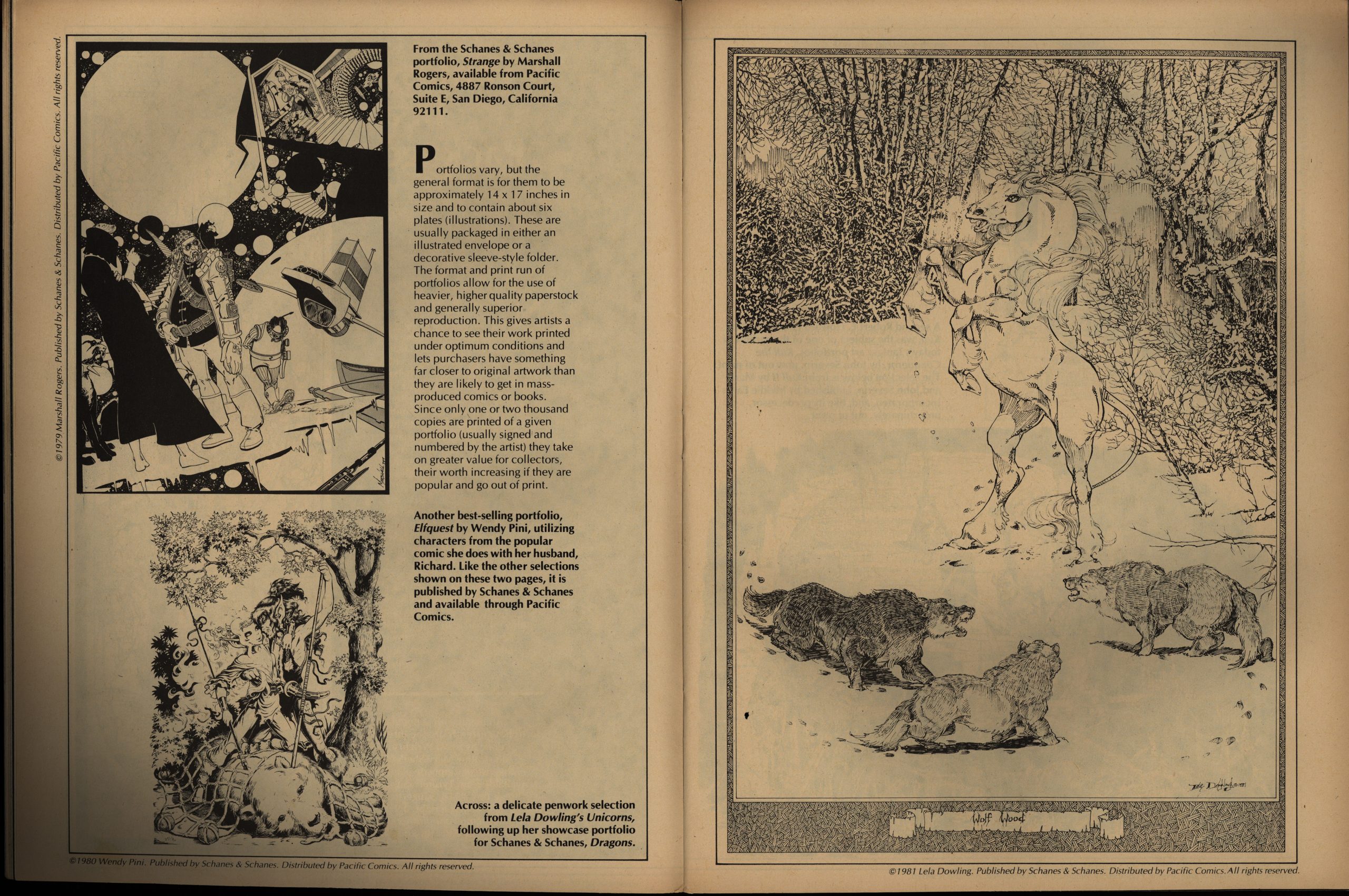
In the first few issues of EI, Goodwin desperately tried justifying printing some nice artwork by having people come up with accompanying prose stories. He’s fortunately given up on that by now, and instead we just get some nice artwork with some chatter. This article is about the “portfolio” phenomenon which was all the rage around this time.
I wonder whether there was an editorial change of policy, because there were no penises in this magazine up until now? I mean, even that character was devoid of one in earlier issues.
Perhaps they just got more daring as they realised the rules on the “adult” magazine newsstand marked was radically different from the comics stands.
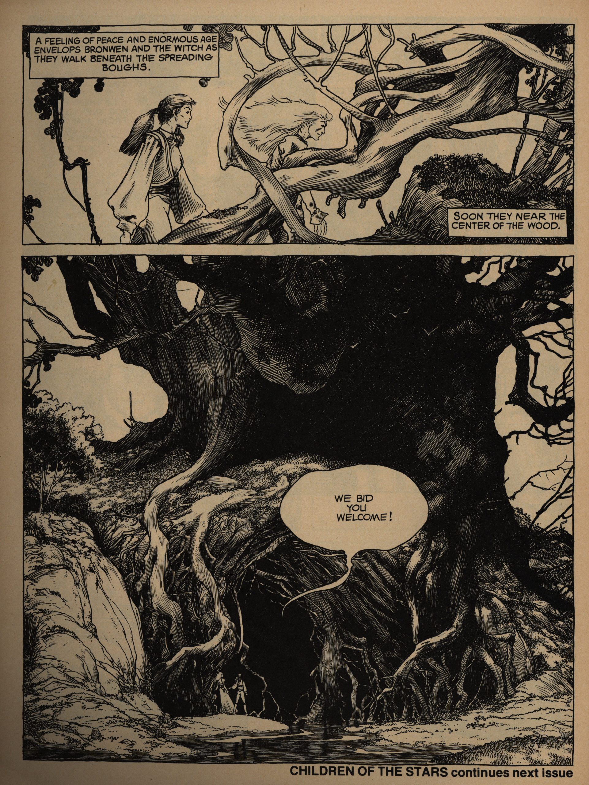
I’m always up for some Charles Vess, but I feel the story here wasn’t very engaging.
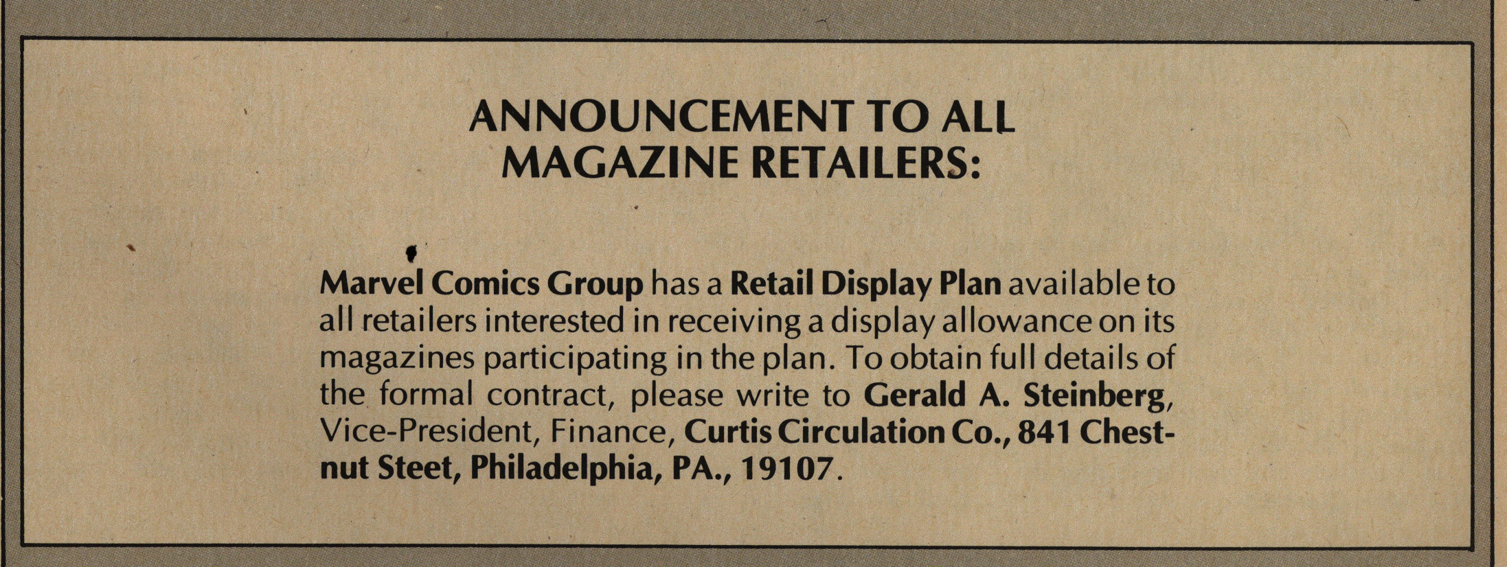
Hm. A “retail display plan”? Is that like a Marvel-branded stand or something? It was apparently a big deal, because they even alerted the retailers about it on the cover:
Perhaps Marvel didn’t have any other way to reach the retailers? Independent distribution was mysterious.
In the ninth issue, The Metamorphetc ends, and it turns out that the entire thing was rather underwhelming. Spoilers: After collecting four people, the bald guy blows up the galaxy and then a million years later they surface in another galaxy. He had to blow up the galaxy, see, because some space aliens were evil and etc. It doesn’t really make much sense dramatically. But it’s a good read nonetheless.
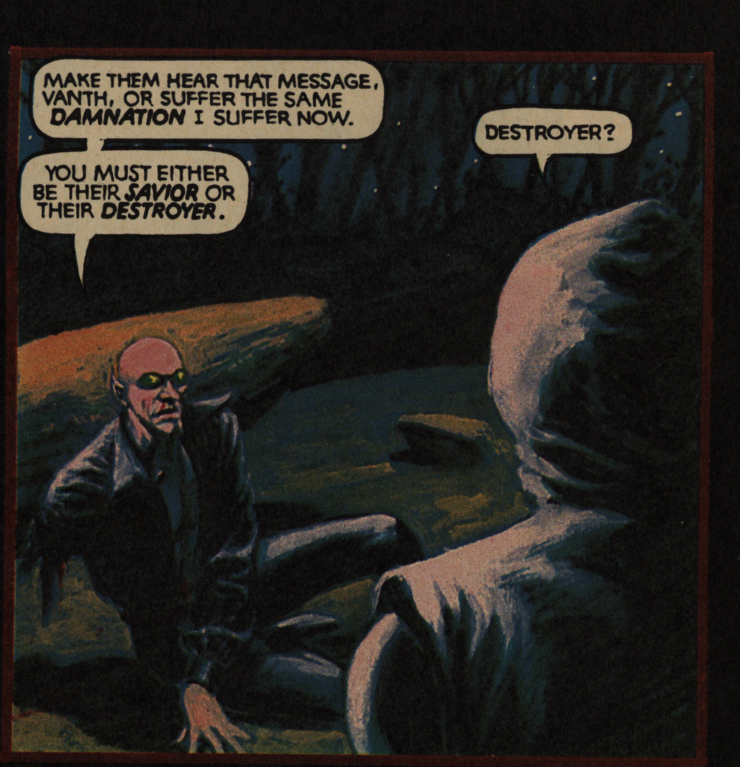
We get an interview with Starlin, who doesn’t look at all like he’s a caretaker at a remote hotel in the middle of the winter, and he tells us what he’s got planned for the Odyssey thing now. He says that the “Vanth” character is a different character now, which is what I remember from reading Dreadstar as a teenager. But we’ll see: Dreadstar is the first Epic Comics comic proper, so I’ll be reading it in… er… a week’s time?
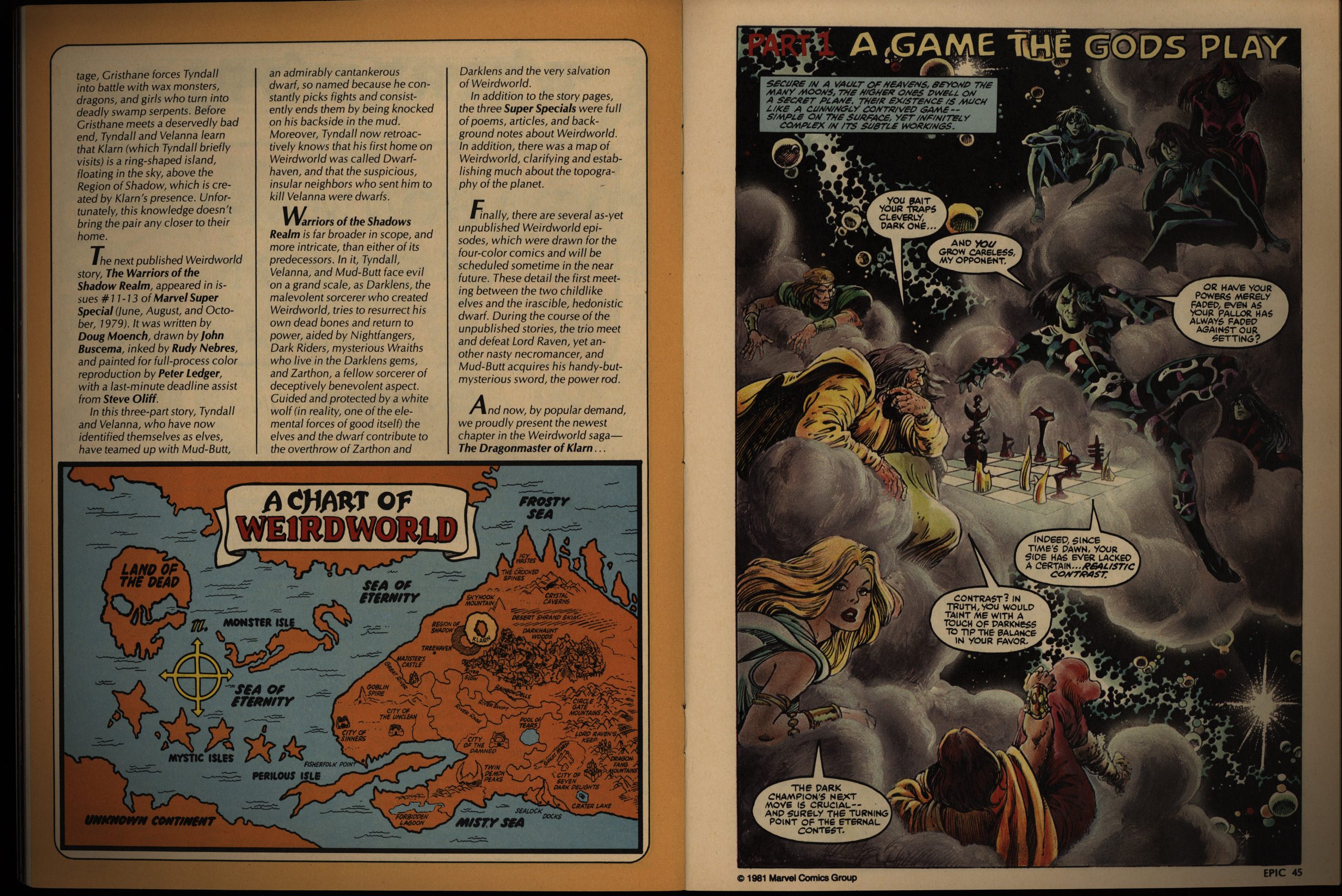
Virtually everything Epic Illustrated published until now has been creator-owned. The exception was a Silver Surfer story in the first issue, but now we get Weirdworld, which had been published by Marvel before. This iteration is written by Doug Moench, and it’s pretty entertaining.
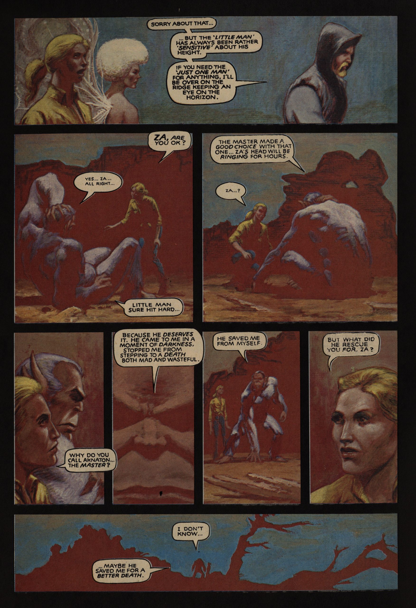
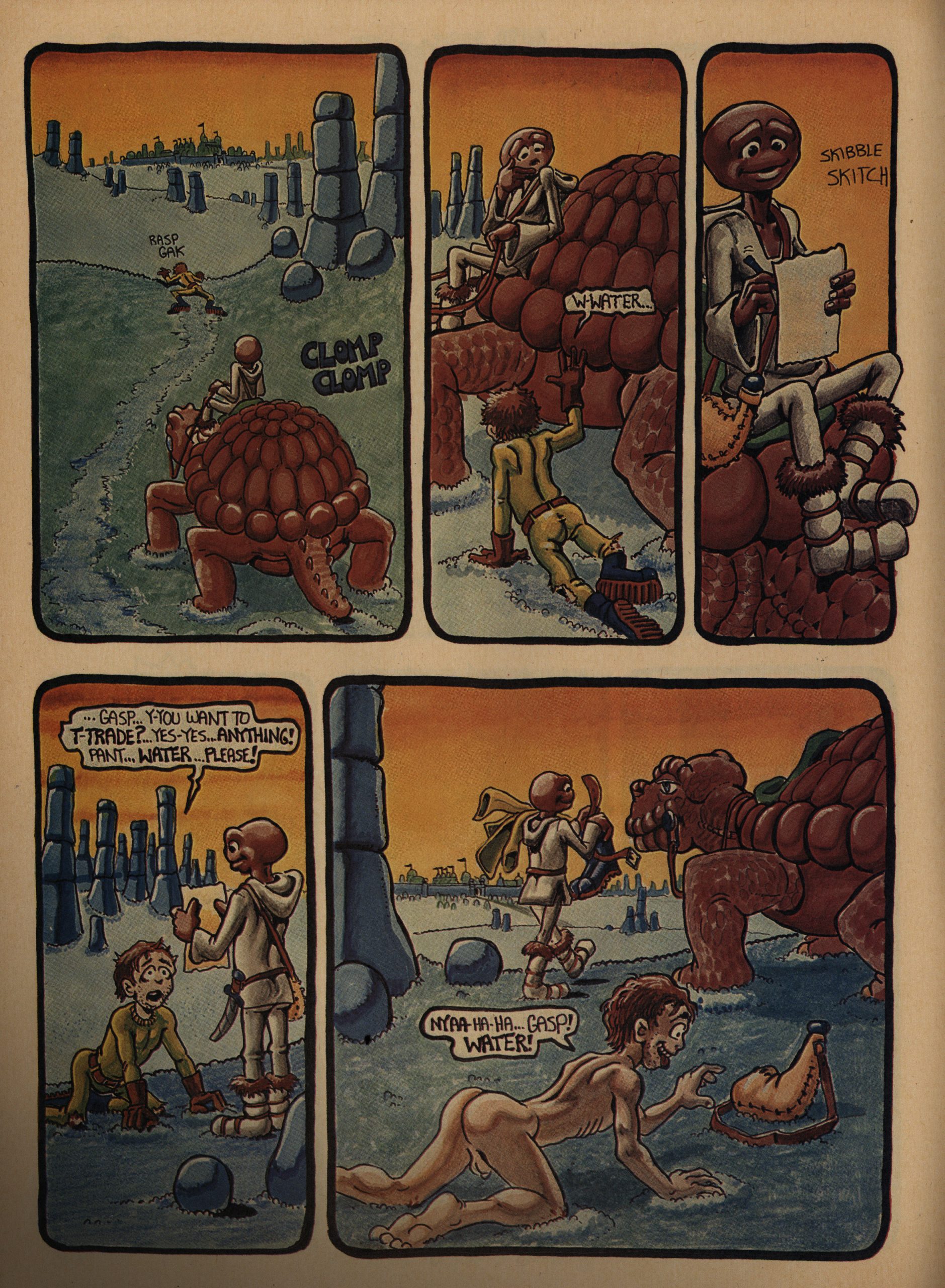
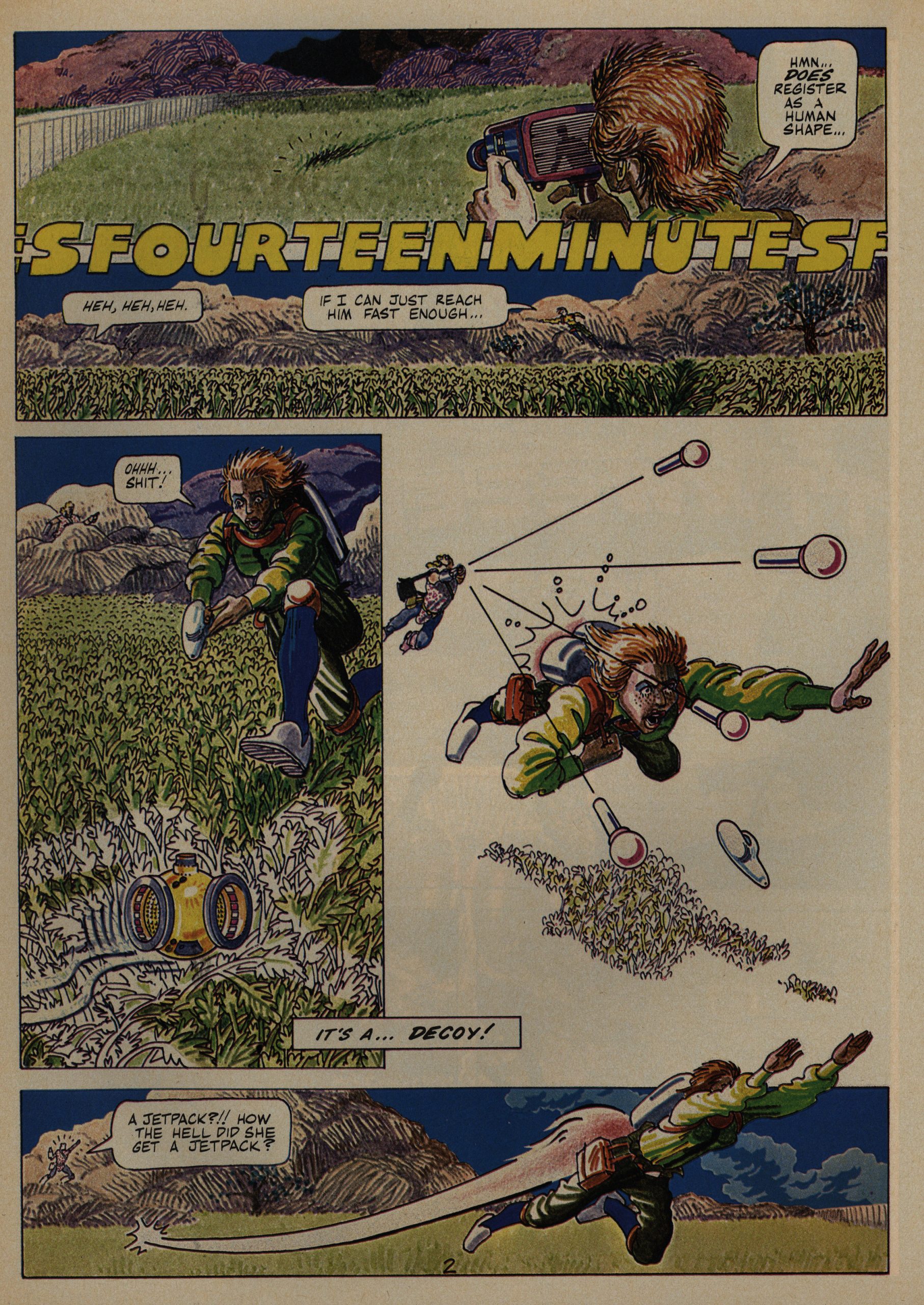
I love the style Lee Marrs uses here. Coloured with crayons? I have no idea, but it looks great, and very different from anything else in EI. (And, yes, the story has a twist, but it’s fun without being a straight-up joke.)
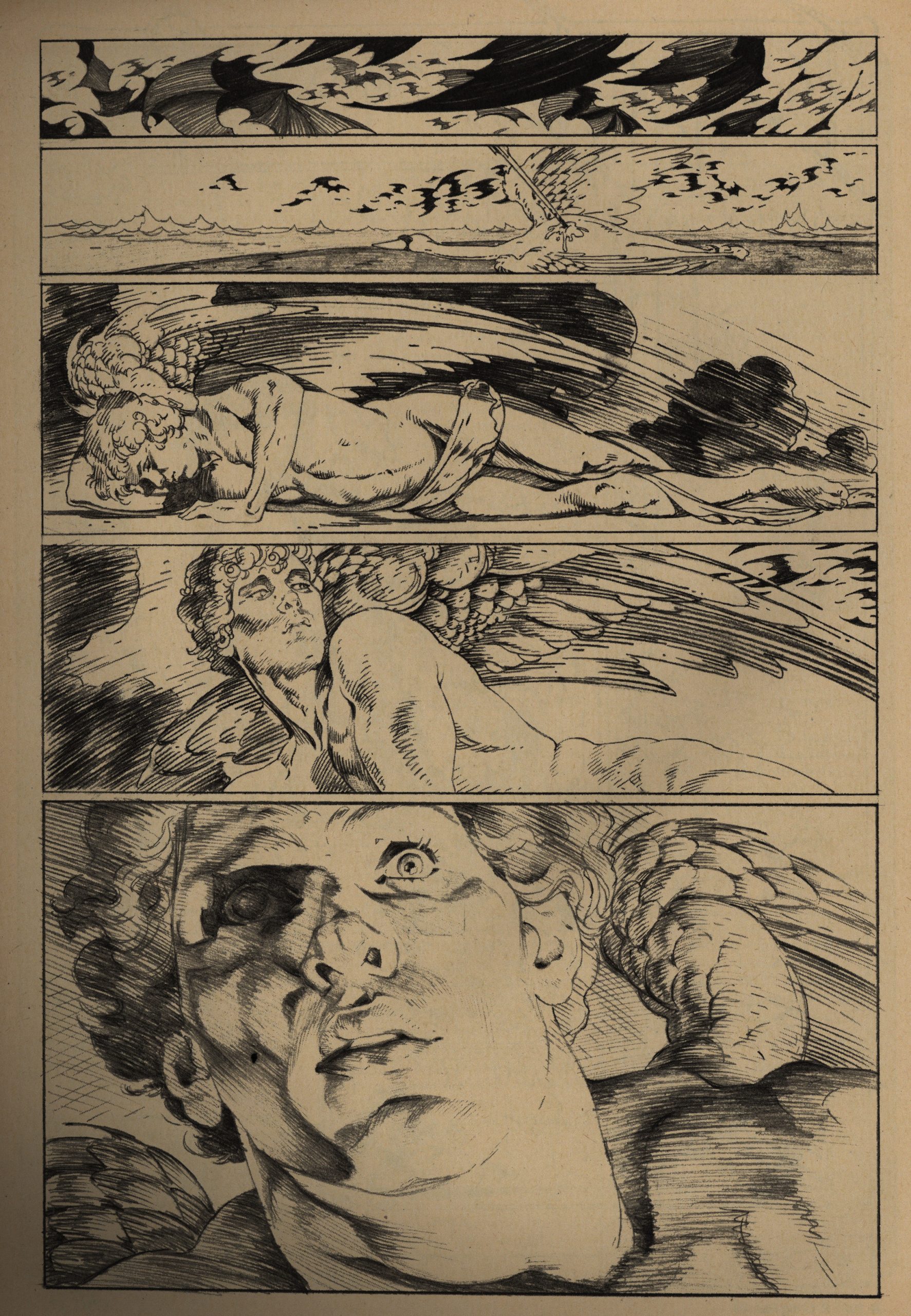
Hey! I don’t think I’ve seen this P. Craig Russell thing before. “The Ideal: Opus 11”. It’s quite unusual for being reproduced from his pencils: He usually inks his linework. And it’s usually in colour. This is very lovely, and expertly printed here.
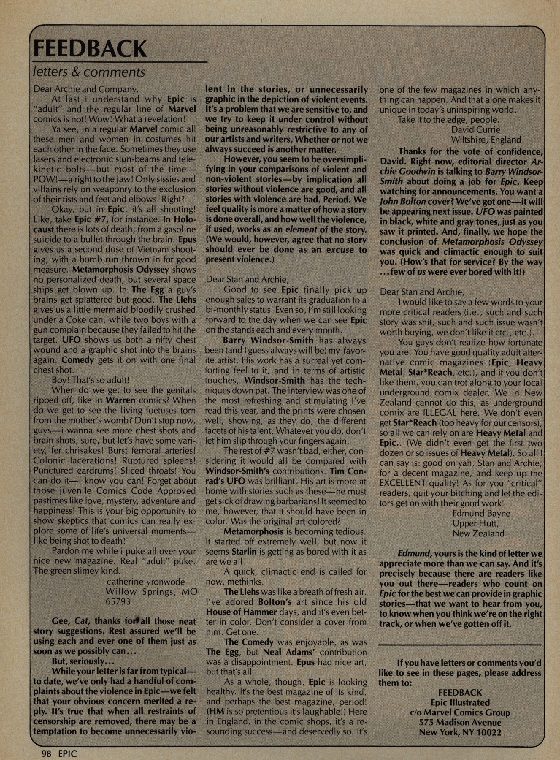
A letter writer isn’t impressed by all the violence in the book. Oh! It’s catherine yronwode! Is this before she started working for Eclipse Comics? I guess it must have been, but not by long.
Goodwin counters, disingenuously, by claiming that yronwode must think that all stories without violence are good stories, which is something she did not say at all.
*sigh*
Anyway, that’s the end of Day Two of my Journey into Epic Illustrated. It was, again, a very pleasant way to spend the evening.





A blast from the past!